
Search results for "Depression" in Home Design Ideas
 Native Plant Landscape Design Corp
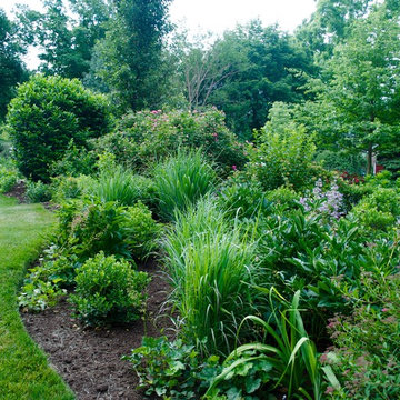
Inspiration for a mid-sized traditional full sun side yard mulch landscaping in DC Metro for summer.
 TVL Creative Ltd.
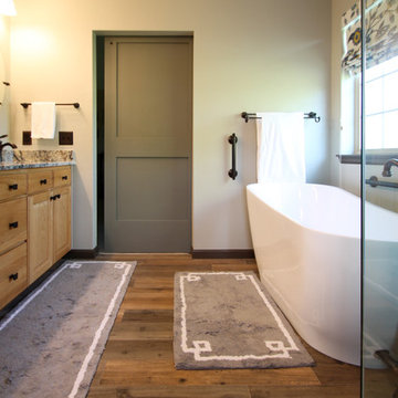
This remodel took a dated and cramped bathroom and transformed it into a classy oasis for our Lowry clients. The clients had a limited budget and wanted to leave the space as in-place as possible. However, the large drop in tub ate valuable floor space and a half wall between the shower and tub had become a holding place for random items without a home. The thick frame on the shower glass made the shower feel extremely small, and the dated lighting and fixtures further depressed the space. We proposed a traditional and elegant design that consider the client's budgetary and spatial constraints. We removed the existing drop-in tub and replaced it with a lovely free-standing soaker. The length of this tub is short, but the depth is exaggerated, making it an ideal replacement in this tiny footprint. The shower glass was swapped for framless glass that boldly expands space. We tore out the existing carpet and installed gorgeous wood-look tile that adds depth and warmth to the room. The clients opted to keep their existing vanity to save cost, so a new top was added to bring the aesthetic up to the level of the new additions. The wall paint was taken from a buttery yellow to a soft gray-green, accented by a darker version of this same color on the siding barn door and toilet room door. New vanity lights, faucets, and storage shelves were installed to help our clients organize and keep things off the counter tops. Finally, new custom up-down window shades were curated for the bathroom to add to the final touch. This space is a simple scope with a dramatic transformation that introduces a timeless look for years to come.
 Kitchen Design Services
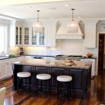
Large elegant u-shaped medium tone wood floor eat-in kitchen photo in San Francisco with an undermount sink, recessed-panel cabinets, white cabinets, granite countertops, white backsplash, stone tile backsplash, stainless steel appliances and an island
Find the right local pro for your project
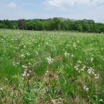
Photo: Joshua Mayer, via Flickr, licensed under Creative Commons Attribution-ShareAlike 2.0 Generic
University of Wisconsin Arboretum
Inspiration for a landscaping in Other.
Inspiration for a landscaping in Other.
 Revealing Redesign
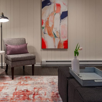
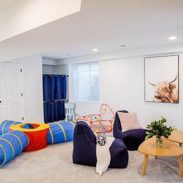
This basement renovation/playroom is a part of a whole house renovation we tackled starting in 2016, slowly and intentionally recreating each space in the house so it could be an updated, lovely space that FELT LIKE HOME to my clients.
Do you have a basement that feels dark and foreboding?
Do you long for a bright, airy, fun space to hang out in and entertain? A place for the kids to go play when it is cold and SNOWY or hotter than heck outside?
While this space previously had been quite dark and a little depressing, with fresh paint, new flooring and all the right colorful furnishings and accessories, we were able to create a fun, comfortable space for entertaining and for kids to romp & play.
A bright, happy place for this wonderful family to enjoy for years to come!
 Just the Thing Decorating, Staging, and Windows
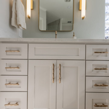
This 1980's home had a dark and depressing master bath. Now it s bursting with light and character!
Large transitional master beige tile and porcelain tile porcelain tile, beige floor and double-sink bathroom photo in Dallas with recessed-panel cabinets, beige cabinets, a one-piece toilet, green walls, an undermount sink, quartz countertops, a hinged shower door, white countertops and a built-in vanity
Large transitional master beige tile and porcelain tile porcelain tile, beige floor and double-sink bathroom photo in Dallas with recessed-panel cabinets, beige cabinets, a one-piece toilet, green walls, an undermount sink, quartz countertops, a hinged shower door, white countertops and a built-in vanity
 Markalunas Architecture and Design, LLC
Rachael Boling
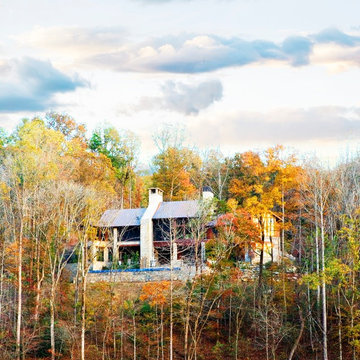
Inspiration for a rustic gray two-story stone exterior home remodel in Other
Inspiration for a rustic gray two-story stone exterior home remodel in Other
 Field Architecture
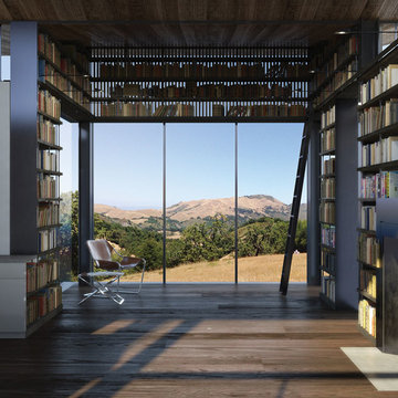
The Grasslands home was born out of and celebrates the beautiful but fragile grassland ecology of the Carmel Valley. Our client’s desire to actively simplify his lifestyle to the most essential elements inclusive of space clearly drove sensibilities in the design. In addition the home features a precision, derived from the client’s love of flight, a grounded-ness from his love of books and the love of his horse.
To meet the simplistic beauty of the scope, the home consists of three interconnected glass pavilions and a detached barn which wrap to the bowl shape of the land. The pavilions are comprised of a master suite, a library/living room, kitchen, and a meditation sanctuary; the barn, his horse and car.
The design focuses on preserving the delicate ecosystem of the surrounding grasslands, while concurrently incorporate views and maximize solar orientation. In support, the pavilions sit on the perimeter of an existing bowl shaped depression in the hillside. Three primary landscape walls run parallel to the topography, emphasizing the shape and spatial definition of the land as well as providing locations to anchor the structures. Pulled up and out of the landscape, the buildings jut over the anchor walls, hovering above the native grasses. In section, the land appears to flow through the pavilions, undisturbed and collaborative to the architecture.
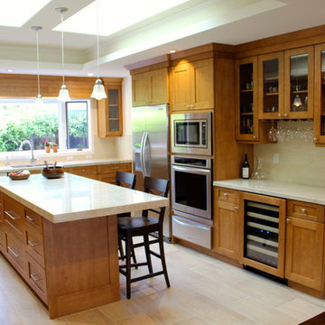 Kitchen Design Services
Quartz counter top and back splash.
Inspiration for a mid-sized modern u-shaped ceramic tile enclosed kitchen remodel in San Francisco with an undermount sink, recessed-panel cabinets, medium tone wood cabinets, quartz countertops, beige backsplash, travertine backsplash, stainless steel appliances and an island
Inspiration for a mid-sized modern u-shaped ceramic tile enclosed kitchen remodel in San Francisco with an undermount sink, recessed-panel cabinets, medium tone wood cabinets, quartz countertops, beige backsplash, travertine backsplash, stainless steel appliances and an island
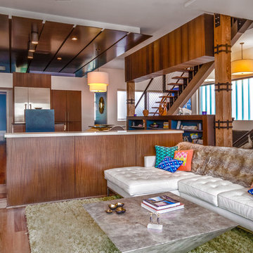
 Masa Studio Architects
As the primary public level, the second floor consists of the living room, kitchen, breakfast, and formal dining spaces. In order to maximize the spatial relationship between the rooms on the main level and the first floor, the living room floor is depressed two feet -- achieved because of the location of the garage below. [photo by : emoMedia]
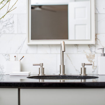 TVL Creative Ltd.
This newly purchased home was the perfect size for our client's growing family. The house, having been expanded on and renovated by the previous owners was the right size but not quite the right style. The house was full of design elements that may have been "cool" in the early 2000s but just didn't feel right for a young family. The master bathroom was in the most serious need of redo with many, many square feet of dingy and somewhat depressing deep red granite tile with diamond accents in black granite. The bathroom felt dark and dingy. Together with our clients, we set out on our mission to efficiently turn this room into an inviting and happy place for our clients. Thankfully the layout of the space was very functional, so we focused on an aesthetic overhall. At the top of the client’s list was to have a beautiful and comfortable freestanding soaker tub. Behind the Kohler tub and throughout the bathroom walls is polished Calacatta Gold marble tile. The new brushed nickel plumbing fixtures are timeless and unfussy, an important thing for busy young parents! The new bathroom is sleek but not stark. A welcoming space for our clients to feel at home.
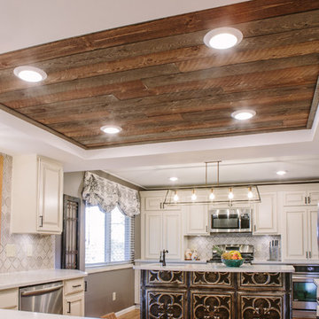 TVL Creative Ltd.
This challenging kitchen came our way at the same time as another similarly located Centennial kitchen. It was apparent that both houses had been built by the same builder: tight space, low ceilings, awkward arrangement, and poor building materials. Our client here is a single mother of three boys with an incredibly demanding work life. Once finally home at the end of a busy day, our client was virtually unable to use her kitchen. Cabinet doors were falling off, limited storage and workspace offered her little opportunity to cook and prep for her children, and the dark and low ceiling created an atmosphere that can only be described as depressing. Our client is also from Louisiana and has always dreamed of a kitchen that reminds her of home warmth and hospitality. Our goal was not only to expand functional storage and workspace, but bring in the southern NOLA appeal that reminds our client so much of home. To do this, we removed the wall between the formal dining room and kitchen to create an extended kitchen that runs the full length of both spaces. The back wall of what used to be the dining room is now the cooking zone for our client: we've relocated her range and microwave, and have created an island full of storage where her children can sit and socialize. We've also lifted up the low ceiling to create a tray ceiling that we have finished with ghostwood. The cabinetry is an off-white color with a hazelnut glaze that offers a more traditional, warm appearance. The island and mini work nook feature dramatic, handmade tin ceiling tiles for a dramatic texture and color. We've finished the space with functional quartz countertops and an arabesque two-toned marble backspalsh. The sinks, faucets and hardware are all in a matte black finish that offer a dramatic pop throughout the space. Little touches of Parisian flair add to this Cajun-French aesthetic and we are so thrilled with the final result!
 TVL Creative Ltd.
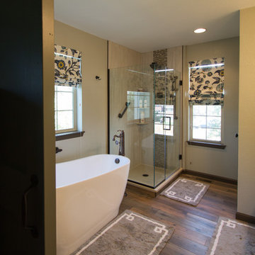
This remodel took a dated and cramped bathroom and transformed it into a classy oasis for our Lowry clients. The clients had a limited budget and wanted to leave the space as in-place as possible. However, the large drop in tub ate valuable floor space and a half wall between the shower and tub had become a holding place for random items without a home. The thick frame on the shower glass made the shower feel extremely small, and the dated lighting and fixtures further depressed the space. We proposed a traditional and elegant design that consider the client's budgetary and spatial constraints. We removed the existing drop-in tub and replaced it with a lovely free-standing soaker. The length of this tub is short, but the depth is exaggerated, making it an ideal replacement in this tiny footprint. The shower glass was swapped for framless glass that boldly expands space. We tore out the existing carpet and installed gorgeous wood-look tile that adds depth and warmth to the room. The clients opted to keep their existing vanity to save cost, so a new top was added to bring the aesthetic up to the level of the new additions. The wall paint was taken from a buttery yellow to a soft gray-green, accented by a darker version of this same color on the siding barn door and toilet room door. New vanity lights, faucets, and storage shelves were installed to help our clients organize and keep things off the counter tops. Finally, new custom up-down window shades were curated for the bathroom to add to the final touch. This space is a simple scope with a dramatic transformation that introduces a timeless look for years to come.
 Shaw Design Associates, P.A.
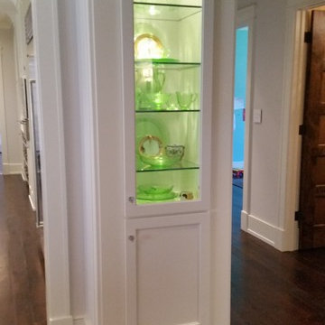
 The homeowner has a collection of green Depression-era glassware and other collectible dishes that she wanted to display in her new home. The end of a wall along the central corridor, directly across from the main entrance, provided the perfect place to tuck in a special display cabinet with interior lighting. The cabinet below provides storage for other pieces of her collection. (Photo courtesy Shaw Design Associates)
 Rhodes Architecture + Light
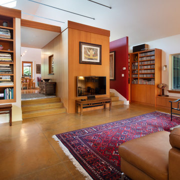
“Even during the gray days of winter, it’s still light and bright in the house. The right house can actually make you feel better, happier. It’s not like we were depressed at our last house–there’s just something about this one that’s cheerful–I think it’s light. It’s warm and comforting. Even with the concrete floors and open spaces, it still feels cozy. We feel like we’re living in a spa.”
 Stephen Coan Garden Design – Design/Install
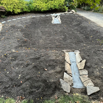
The rain garden depression is dug out and prepared for the plantings. In front is the overflow channel to allow excess water to flow out of the rain garden to be absorbed by the lawn. At the top is the entrance channel and stone work.
 Explore Your Spirit with Kala
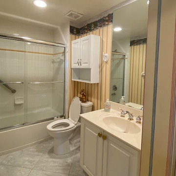
BEFORE PHOTO: Sometimes you get used to a room and don't even realize how much of an impact the old decor is affecting your mood. The old paper was dismal and while it was a light color, it didn't do anything to bring life or excitement to the room. The yellow hue created a sallow look that felt depressing and low energy.
And get a close up view of the border wallpaper:
 TVL Creative Ltd.
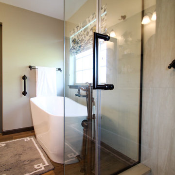
This remodel took a dated and cramped bathroom and transformed it into a classy oasis for our Lowry clients. The clients had a limited budget and wanted to leave the space as in-place as possible. However, the large drop in tub ate valuable floor space and a half wall between the shower and tub had become a holding place for random items without a home. The thick frame on the shower glass made the shower feel extremely small, and the dated lighting and fixtures further depressed the space. We proposed a traditional and elegant design that consider the client's budgetary and spatial constraints. We removed the existing drop-in tub and replaced it with a lovely free-standing soaker. The length of this tub is short, but the depth is exaggerated, making it an ideal replacement in this tiny footprint. The shower glass was swapped for framless glass that boldly expands space. We tore out the existing carpet and installed gorgeous wood-look tile that adds depth and warmth to the room. The clients opted to keep their existing vanity to save cost, so a new top was added to bring the aesthetic up to the level of the new additions. The wall paint was taken from a buttery yellow to a soft gray-green, accented by a darker version of this same color on the siding barn door and toilet room door. New vanity lights, faucets, and storage shelves were installed to help our clients organize and keep things off the counter tops. Finally, new custom up-down window shades were curated for the bathroom to add to the final touch. This space is a simple scope with a dramatic transformation that introduces a timeless look for years to come.
 TVL Creative Ltd.
This newly purchased home was the perfect size for our client's growing family. The house, having been expanded on and renovated by the previous owners was the right size but not quite the right style. The house was full of design elements that may have been "cool" in the early 2000s but just didn't feel right for a young family. The master bathroom was in the most serious need of redo with many, many square feet of dingy and somewhat depressing deep red granite tile with diamond accents in black granite. The bathroom felt dark and dingy. Together with our clients, we set out on our mission to efficiently turn this room into an inviting and happy place for our clients. Thankfully the layout of the space was very functional, so we focused on an aesthetic overhall. At the top of the client’s list was to have a beautiful and comfortable freestanding soaker tub. Behind the Kohler tub and throughout the bathroom walls is polished Calacatta Gold marble tile. The new brushed nickel plumbing fixtures are timeless and unfussy, an important thing for busy young parents! The new bathroom is sleek but not stark. A welcoming space for our clients to feel at home.
 Garden Nest Residential Landscape
Photo © Jude Parkinson-Morgan
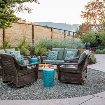
Patio - large transitional backyard concrete patio idea in San Francisco with a fire pit and no cover
Patio - large transitional backyard concrete patio idea in San Francisco with a fire pit and no cover
15