
Search results for "Dialogues" in Home Design Ideas
 Nar Design Group
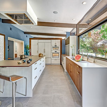
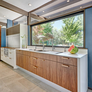
This mid-century modern kitchen was developed with the original architectural elements of its mid-century shell at the heart of its design. Throughout the space, the kitchen’s repetition of alternating dark walnut and light wood uses in the cabinetry and framework reflect the contrast of the dark wooden beams running along the white ceiling. The playful use of two tones intentionally develops unified work zones using all modern day elements and conveniences. For instance, the 5’ galley workstation stands apart with grain-matched walnut cabinetry and stone wrap detail for a furniture-like feeling. The mid-century architecture continued to be an emphasis through design details such as a flush venting system within a drywall structure that conscientiously disappears into the ceiling affording the existing post-and-beams structures and clerestory windows to stand in the forefront.
Along with celebrating the characteristic of the mid-century home the clients wanted to bring the outdoors in. We chose to emphasis the view even more by incorporating a large window centered over the galley kitchen sink. The final result produced a translucent wall that provokes a dialog between the outdoor elements and the natural color tones and materials used throughout the kitchen. While the natural light and views are visible because of the spacious windows, the contemporary kitchens clean geometric lines emphasize the newly introduced natural materials and further integrate the outdoors within the space.
The clients desired to have a designated area for hot drinks such as coffee and tea. To create a station that could house all the small appliances & accessories and was easily accessible we incorporated two aluminum tambours together with integrated power lift doors. One tambour acting as the hot drink station and the other acting as an appliance garage. Overall, this minimalistic kitchen is nothing short of functionality and mid-century character.
Photo Credit: Fred Donham of PhotographerLink

 Lorin Hill, Architect
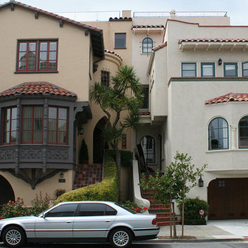
This essentially new Marina home is the result of a complete renovation with addition to a plain 2-story dwelling. The result is a 4-story Mediterranean home that creates a dialogue with, but does not mimic, the adjacent historic home in a similar style.
Find the right local pro for your project
 place architecture:design
Photo Credit: ©Tom Holdsworth,
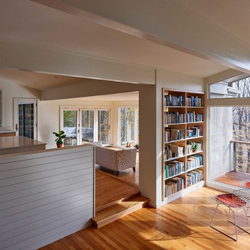
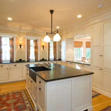
A screen porch was added to the side of the interior sitting room, enabling the two spaces to become one. A unique three-panel bi-fold door, separates the indoor-outdoor space; on nice days, plenty of natural ventilation flows through the house. Opening the sunroom, living room and kitchen spaces enables a free dialog between rooms. The kitchen level sits above the sunroom and living room giving it a perch as the heart of the home. Dressed in maple and white, the cabinet color palette is in sync with the subtle value and warmth of nature. The cooktop wall was designed as a piece of furniture; the maple cabinets frame the inserted white cabinet wall. The subtle mosaic backsplash with a hint of green, represents a delicate leaf.
 Misiaszek Turpin pllc
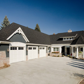
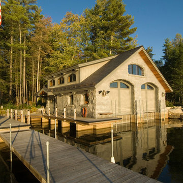
This 4,800 square-foot guesthouse is a three-story residence consisting of a main-level master suite, upper-level guest suite, and a large bunkroom. The exterior finishes were selected for their durability and low-maintenance characteristics, as well as to provide a unique, complementary element to the site. Locally quarried granite and a sleek slate roof have been united with cement fiberboard shingles, board-and-batten siding, and rustic brackets along the eaves.
The public spaces are located on the north side of the site in order to communicate with the public spaces of a future main house. With interior details picking up on the picturesque cottage style of architecture, this space becomes ideal for both large and small gatherings. Through a similar material dialogue, an exceptional boathouse is formed along the water’s edge, extending the outdoor recreational space to encompass the lake.
Photographer: Bob Manely
 LeichtUSA
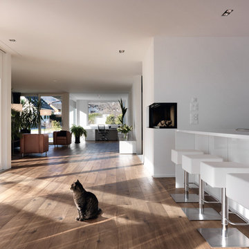
The present project, with its clear and simple forms, looks for the interaction with the rural environment and the contact with the surrounding buildings. The simplicity and architectural dialogue between form and function are the theme for inside and outside. Kitchen and dining area are facing each other. The isle leads to a made-to-measure corner bench that stretches under the wide windows along the entire length of the house and connects to the kitchen across the corner. Above the tall units with their integrated appliances, the window continues as a narrow band. The white high gloss acrylic surface of the kitchen fronts forms a decorative contrast to the wood of the floor and bench. White lacquered recessed handles provide a tranquil, two-dimensional effect.
 Misiaszek Turpin pllc
This 4,800 square-foot guesthouse is a three-story residence consisting of a main-level master suite, upper-level guest suite, and a large bunkroom. The exterior finishes were selected for their durability and low-maintenance characteristics, as well as to provide a unique, complementary element to the site. Locally quarried granite and a sleek slate roof have been united with cement fiberboard shingles, board-and-batten siding, and rustic brackets along the eaves.
The public spaces are located on the north side of the site in order to communicate with the public spaces of a future main house. With interior details picking up on the picturesque cottage style of architecture, this space becomes ideal for both large and small gatherings. Through a similar material dialogue, an exceptional boathouse is formed along the water’s edge, extending the outdoor recreational space to encompass the lake.
Photographer: Bob Manley
 Lorin Hill, Architect
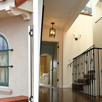
This 4-story Mediterranean home creates a dialogue with, but does not mimic, the adjacent historic home in a similar style. Note the detail in the wrought-iron throughout the home.
 Misiaszek Turpin pllc
 The 7,600 square-foot residence was designed for large, memorable gatherings of family and friends at the lake, as well as creating private spaces for smaller family gatherings. Keeping in dialogue with the surrounding site, a palette of natural materials and finishes was selected to provide a classic backdrop for all activities, bringing importance to the adjoining environment.
In optimizing the views of the lake and developing a strategy to maximize natural ventilation, an ideal, open-concept living scheme was implemented. The kitchen, dining room, living room and screened porch are connected, allowing for the large family gatherings to take place inside, should the weather not cooperate. Two main level master suites remain private from the rest of the program; yet provide a complete sense of incorporation. Bringing the natural finishes to the interior of the residence, provided the opportunity for unique focal points that complement the stunning stone fireplace and timber trusses.
Photographer: John Hession
 Nar Design Group
This mid-century modern kitchen was developed with the original architectural elements of its mid-century shell at the heart of its design. Throughout the space, the kitchen’s repetition of alternating dark walnut and light wood uses in the cabinetry and framework reflect the contrast of the dark wooden beams running along the white ceiling. The playful use of two tones intentionally develops unified work zones using all modern day elements and conveniences. For instance, the 5’ galley workstation stands apart with grain-matched walnut cabinetry and stone wrap detail for a furniture-like feeling. The mid-century architecture continued to be an emphasis through design details such as a flush venting system within a drywall structure that conscientiously disappears into the ceiling affording the existing post-and-beams structures and clerestory windows to stand in the forefront.
Along with celebrating the characteristic of the mid-century home the clients wanted to bring the outdoors in. We chose to emphasis the view even more by incorporating a large window centered over the galley kitchen sink. The final result produced a translucent wall that provokes a dialog between the outdoor elements and the natural color tones and materials used throughout the kitchen. While the natural light and views are visible because of the spacious windows, the contemporary kitchens clean geometric lines emphasize the newly introduced natural materials and further integrate the outdoors within the space.
The clients desired to have a designated area for hot drinks such as coffee and tea. To create a station that could house all the small appliances & accessories and was easily accessible we incorporated two aluminum tambours together with integrated power lift doors. One tambour acting as the hot drink station and the other acting as an appliance garage. Overall, this minimalistic kitchen is nothing short of functionality and mid-century character.
Photo Credit: Fred Donham of PhotographerLink
 Ernesto Garcia Interior Design, LLC
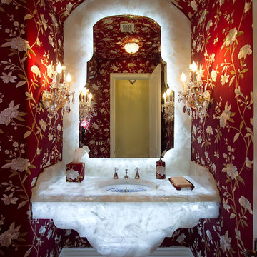
Scottsdale Elegance - Powder Room - Italianesque inspired silhouettes define the shapes of mirror and backlit quartzite creating an eclectic dialogue of old style and high-tech.
 Nick Pancheau, AIA
Photo credit: Louis Habeck
#FOASmallSpaces
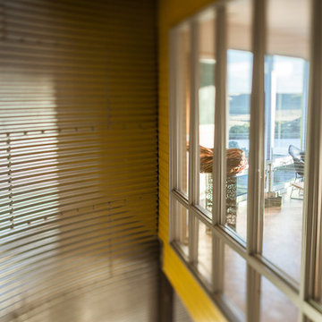
Home design - small industrial home design idea in Other
Home design - small industrial home design idea in Other
 Nar Design Group
This mid-century modern kitchen was developed with the original architectural elements of its mid-century shell at the heart of its design. Throughout the space, the kitchen’s repetition of alternating dark walnut and light wood uses in the cabinetry and framework reflect the contrast of the dark wooden beams running along the white ceiling. The playful use of two tones intentionally develops unified work zones using all modern day elements and conveniences. For instance, the 5’ galley workstation stands apart with grain-matched walnut cabinetry and stone wrap detail for a furniture-like feeling. The mid-century architecture continued to be an emphasis through design details such as a flush venting system within a drywall structure that conscientiously disappears into the ceiling affording the existing post-and-beams structures and clerestory windows to stand in the forefront.
Along with celebrating the characteristic of the mid-century home the clients wanted to bring the outdoors in. We chose to emphasis the view even more by incorporating a large window centered over the galley kitchen sink. The final result produced a translucent wall that provokes a dialog between the outdoor elements and the natural color tones and materials used throughout the kitchen. While the natural light and views are visible because of the spacious windows, the contemporary kitchens clean geometric lines emphasize the newly introduced natural materials and further integrate the outdoors within the space.
The clients desired to have a designated area for hot drinks such as coffee and tea. To create a station that could house all the small appliances & accessories and was easily accessible we incorporated two aluminum tambours together with integrated power lift doors. One tambour acting as the hot drink station and the other acting as an appliance garage. Overall, this minimalistic kitchen is nothing short of functionality and mid-century character.
Photo Credit: Fred Donham of PhotographerLink
 DHD Architecture and Interior Design
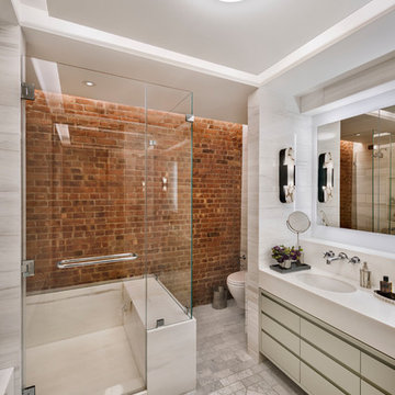
The Broome Street Loft is a beautiful example of a classic Soho loft conversion. The design highlights its historic architecture of the space while integrating modern elements. The 14-foot-high tin ceiling, metal Corinthian columns and iconic brick wall are contrasted with clean lines and modern profiles, creating a captivating dialogue between the old and the new.
The plan was completely revised: the bedroom was shifted to the side area to combine the living room and kitchen spaces into a larger, open plan space. The bathroom and laundry also shifted to a more efficient layout, which both widened the main living space and created the opportunity to add a new Powder Room. The high ceilings allowed for the creation of a new storage space above the laundry and bathroom, with a sleek, modern stair to provide access.
The kitchen seamlessly blends modern detailing with a vintage style. An existing recess in the brick wall serves as a focal point for the relocated Kitchen with the addition of custom bronze, steel and glass shelves. The kitchen island anchors the space, and the knife-edge stone countertop and custom metal legs make it feel more like a table than a built-in piece.
The bathroom features the brick wall which runs through the apartment, creating a uniquely Soho experience. The cove lighting throughout creates a bright interior space, and the white and grey tones of the tile provide a neutral counterpoint to the red brick. The space has beautiful stone accents, such as the custom-built tub deck, shower, vanity, and niches.
Photo: David Joseph Photography
 Lorin Hill, Architect
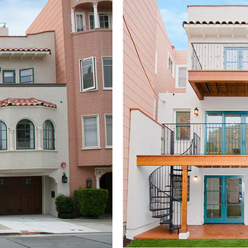
This essentially new Marina home is the result of a complete renovation with addition to a plain 2-story dwelling. The result is a 4-story Mediterranean home that creates a dialogue with, but does not mimic, the adjacent historic home in a similar style.
 JULIA WOOD ARCHITECT LLC
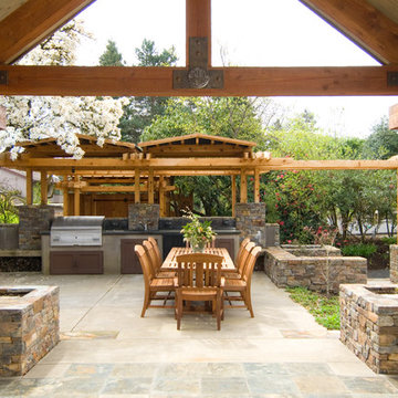
Magnolia is a mid-century house, reclaimed and enlivened for the next hundred years.
The house was owned for half a century by husband-and-wife horticulturalists, who built the house in 1954 from Better Homes and Gardens plan book, a warren of rooms now outdated for today’s way of living. The new owners sought to honor them the home and the site.
The house is in a temperate zone, surrounded by thriving gorgeous rare species, and with a dramatic view of Mount Hood, the house was completely re-envisioned and carefully expanded to be an elegant place to live, to entertain and to enjoy the comfortable climate and the lovely change of seasons.
The foundation was maintained, the roof was raised and a wing was added for master living suite.
The top floor of the house was sustainable deconstructed and recycled.
Dramatically, the front entrance was moved to the South side of the house, creating an entry sequence that received the guest into the new context through a persimmon tree-lined Tori gate, a nicely designed forecourt, articulated pond and patio, to an entry inspired by the philosophy of Japanese wooden buildings.
Only upon entering the foyer, are you first presented with the view of the mountain. The mountain is a guest in every living space of the house: at the hallway desk, you peek out from under the pendulous weeping cherry tree to the slope, at the Library/Guest room the new French doors and balcony present it for elegant dialogue, the guest room below and the master bedroom each have an intimate relationship with the iconic presence.
Nowadays, kitchens are the heart of the home and the energy area for entertaining. The main living space is a farmhouse kitchen, dining room and living room in one communal space, bookended by an outdoor living room. A pair of Rumford fireplaces stitch the rooms together and create an edge and hearth to the rooms, the mountain at your side. The Magnolia envelops this corner of the house.
Wire frame ‘chimneys’ lighten the load on the roots around the Magnolia tree, it is the largest and oldest specimen of the species known in the western hemisphere outside of Kew Gardens. The tree has developed a unique personality to it’s frame in the last half-century and as odd penile-looking see pods. The ‘chimneys’ are really trellises to allow the plantings to take over the home.
The entire home is grounded by Montana Limestone, sustainably gathered on the Takashima’s Montana property.
The front door, cabinetry and millwork are all built from knotty Alder. The island butcher-block is made from Madrone. Both are underappreciated understory hardwoods from local forests.
The craftsmanship of the millwork was accomplished through collaboration of the architects with local artisans. The cabinet maker, finish carpenter and custom door-maker all influenced the language of sharply stepped kerfs that are repeated throughout via dado cuts and rabbets. This careful detailing brings the elemental quality of the stacked trabiated structure through to the small details of the home.
Photos by Jon Jensen
 Natural Stone Institute
Tucker Design Awards celebrate the innovation and vision that designers bring to their projects through the specification and use of natural stone materials. For members of the Natural Stone Institute, acknowledgment as a contributor to a Tucker Design Awards winning project is a genuine tribute to their traditional values, physicality of work, and dedication to precise specifications required in the realization of such accomplished architectural design.
Landscape Architect
Design Workshop, Aspen, CO
Landscape Contractor/
Installer
Landscape Workshop, Carbondale, CO
Stone Installer
JD Masonry, Arvada, CO
Stone Suppliers
Coldspring, Cold Spring, MN
Gallegos Corporation, Vail, CO
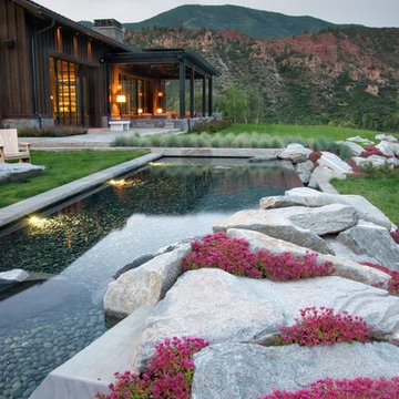
Through a collective dialogue between landscape, architecture and interior design, a new vision reimagines the disturbed site into a livable landscape, emblematic of our American West. The residence – an ensemble of structures designed in a modern ranch vernacular – is effortlessly unified through layered, interconnected outdoor gathering spaces and regional materials that elaborates upon the experience of moving between structures, heightening and renewing one’s sense of place. Upon entering the courtyard, one is immediately aware of seamless and unfolding relationships between architecture and landscape through a sophisticated, regional palette of natural stone, water, and plants. Set upon architectural focal points, two perpendicular sandstone paths descend into the space and converge upon a monolithic, hand-carved granite fountain. The design of the fountain is purposefully quiet, both in its detailing and operation. The feature includes a recessed interior, allowing water to become still before it reaches the surface, with lightly cleft sides, allowing the water to delicately bounce as it descends into the geometric lower granite basin. The landscape architect’s selection of various stone material extends the tones of the home’s granite walls and contextual surroundings into the garden, but also be detailed in a manner that balances rural and modern qualities. The majority of the paving is constructed of rectilinear gray sandstone with a natural finish and snapped edges, laid in a staggered running bond organization. Throughout the garden, thoughtful attention was also given to the configuration and layout of terraces, pathways, and steps. In doing so, this ensured that the edges of the terrace and its interface to other elements were designed so that no “leftover” stone paver pieces would be found. Within the central courtyard, split-faced stone stairs descend into a rectilinear plinth of lawn, punctuated by a carved granite fire pit. Leveraging the property’s existing topographic relief, a shallow infinity-edge dipping pool abstracts the transparent and cavity-like pools found throughout the Rocky Mountains. The design purposefully achieves the illusion of a larger water feature with the distant pond and offers a refreshing recreational element. Containing the infinity edge, a designed granite escarpment emerges from the meadow, juxtaposing the geometric water feature and providing informal seating ledges. The site’s prior use required the landscape architect to incorporate a highly technical and complex sub-surface structural system. The initial geotechnical report identified the building envelopes rested on 12 feet of man-placed fill. Assuming a 1 percent settlement, the team faced concerns that the terraces would settle up to 12 inches. In response, a grid of structural micro-piles provides the necessary foundation for the construction of terraces immediately outside of the architecture, under the water features and site walls. The solution enabled the crisp detailing and design resolution of the architectural structures to seamlessly connect with the horizontal stone terraces.
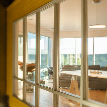 Nick Pancheau, AIA
Photo credit: Louis Habeck
#FOASmallSpaces
Home design - small industrial home design idea in Other
Home design - small industrial home design idea in Other
 Ernesto Garcia Interior Design, LLC
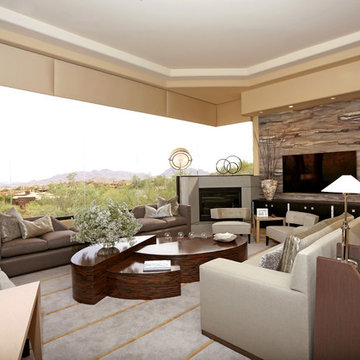
Appropriately scaled for the space, the table links and establishes a harmonious dialogue between the surrounding furnishings
Living room - contemporary living room idea in Phoenix
Living room - contemporary living room idea in Phoenix
 Nar Design Group
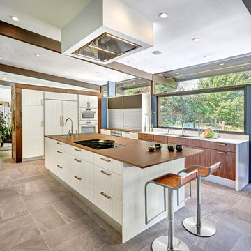
This mid-century modern kitchen was developed with the original architectural elements of its mid-century shell at the heart of its design. Throughout the space, the kitchen’s repetition of alternating dark walnut and light wood uses in the cabinetry and framework reflect the contrast of the dark wooden beams running along the white ceiling. The playful use of two tones intentionally develops unified work zones using all modern day elements and conveniences. For instance, the 5’ galley workstation stands apart with grain-matched walnut cabinetry and stone wrap detail for a furniture-like feeling. The mid-century architecture continued to be an emphasis through design details such as a flush venting system within a drywall structure that conscientiously disappears into the ceiling affording the existing post-and-beams structures and clerestory windows to stand in the forefront.
Along with celebrating the characteristic of the mid-century home the clients wanted to bring the outdoors in. We chose to emphasis the view even more by incorporating a large window centered over the galley kitchen sink. The final result produced a translucent wall that provokes a dialog between the outdoor elements and the natural color tones and materials used throughout the kitchen. While the natural light and views are visible because of the spacious windows, the contemporary kitchens clean geometric lines emphasize the newly introduced natural materials and further integrate the outdoors within the space.
The clients desired to have a designated area for hot drinks such as coffee and tea. To create a station that could house all the small appliances & accessories and was easily accessible we incorporated two aluminum tambours together with integrated power lift doors. One tambour acting as the hot drink station and the other acting as an appliance garage. Overall, this minimalistic kitchen is nothing short of functionality and mid-century character.
Photo Credit: Fred Donham of PhotographerLink
29