
Search results for "Dialogues" in Home Design Ideas
 Eugene Pintail LLC
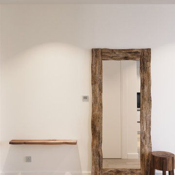
This design captures the spirit of eclectic modernity—boldly combining texture, form, and soulful detail. It embraces both clean contemporary lines and layered, curated elements, resulting in a space that feels thoughtfully collected, not predictable.
Textural richness is at the forefront—soft upholstery pairs with sleek surfaces, and mixed finishes (polished metals, matte woods, and plush textiles) create a tactile and visual dialogue. The contrast between refined and cozy elements builds warmth and sophistication.
The layout balances openness with intimacy. Thoughtfully placed furniture and visual rhythms guide movement through the space, allowing each area to feel both connected and distinct.
Lighting is composed with subtlety and intention—ambient fixtures and layered lighting gently sculpt the environment. Shadows and highlights enhance the ambiance without overpowering the architectural interplay.
This space tells a story of modern living infused with personality. It’s dynamic yet grounded—inviting curiosity, conversation, and comfort in equal measure.
 HR DESIGN DEPT
For years, early morning walks past this 1910 Craftsman in Houston's historic Avondale neighborhood left the new owners with lingering fantasies of making it their future home. When it became available, they acquired a home rich with history, but one nearly abolished. The home was once inhabited by Texas Governor (1931-1932) and founder of Humble Oil, Ross Sterling. But, renovations subdivided the home into multi-family rentals and destroyed original finishes. The developer driven modifications were abruptly halted by city red tags in 2018 after original windows were demolished and replaced with vinyl substitutes.
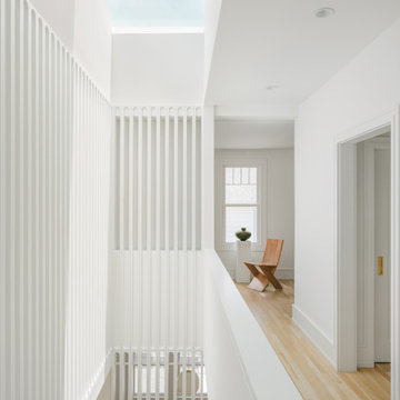
With a nearly clean slate on the interior, the HRDD renovation aims to be respectful to the original context while providing coplimentary modern surprises atypical to the era. One such example is a new opening that punctures through the second floor, extending to a roof skylight. Situated at the transition between formal and informal rooms on the first floor and common space on the second floor, this subtraction is lined with a scalloped wood screen. The screen is one of multiple moments within the home where texture will combine with minimal white surfaces, providing a backdrop to the owners' collection of antique Indian furniture pieces.
Additionally, a new detached replaced an existing dilapidated garage apartment and contains the owner's photography studio. Windows and a skylight are placed to capture coveted north light, ideal for photographing and editing. The main room remains an austere slate, with ceiling vaulting to a single aperture to create a dynamic moment that carries a dialogue to the opening in the main home.
 Axcellent Group
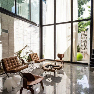
Design culture is the key to our success. This is what pushes us to create new collections that give spaces a new dimension. We create a dialogue between the environment and form. This is what it’s about, creating atmospheres where we can take hold of life and live it, enjoy it.
Find the right local pro for your project
 Shoshi Designs
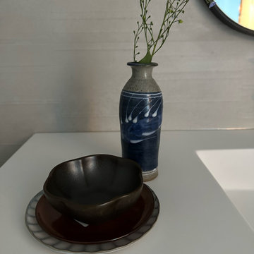
Immersed in the challenge of refining a builder-grade master bathroom, my focus on minimalism and serenity became paramount. Every design decision was a brushstroke, aimed at elevating the space into a spa-like retreat that transcends the ordinary.
With meticulous attention, neutral tones, clean lines, and purposeful design choices converged to redefine the essence of this intimate haven. The project unfolded as a dialogue between the serene waterfront surroundings and the nuances of minimalist aesthetics.
The result is a harmonious union, where the bathroom embodies the ethos of a spa-like sanctuary. It stands as a testament to the transformative power of thoughtful design choices, turning a builder-grade space into a canvas of tranquility on the waterfront.
 Landscape Design West, LLC
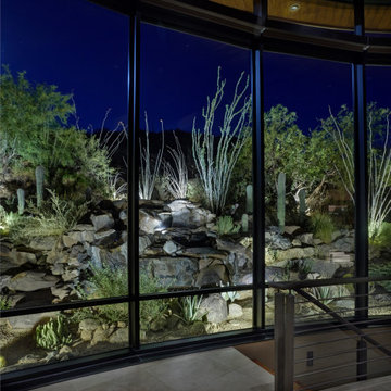
IN 2021, PETE AND BECKY MEIER HIRED LANDSCAPE DESIGN WEST, LLC, TO CREATE AN EXTRAORDINARY RENOVATION DESIGN FOR THE CANYON PASS HOUSE LOCATED IN THE GATED COMMUNITY OF CANYON PASS AT THE PINNACLE OF DOVE MOUNTAIN, IN TUCSON, ARIZONA.
EXISTING LANDSCAPE DID NOT COMPLIMENT THE OUTSTANDING ADJACENT DESERT NOR THE UNIQUE MARK SOLOWAY ARCHITECTURE. GOAL WAS TO CREATE A BEAUTIFUL DIALOGUE WITH THE ADJACENT DESERT AND RESIDENCE.
DESIRED OUTCOME:
INCREASE VISUAL APPEAL/LOWER WATER USE WITH NUMEROUS SPECIMEN SUCCULENTS AND A PLANTING DESIGN THAT IS INVITING, COLORFUL AND GRACIOUS, INCREASE YEAR AROUND COLOR AND BLOOMS TO ATTRACT NATIVE POLLINATORS SUCH AS BIRDS, BATS, HUMMINGBIRDS AND BUTTERFLIES MITIGATE DAMAGE TO PORTIONS OF THE PROPERTY PREVIOUSLY USED AS CONSTRUCTION STAGING AREAS
LOWER WATER USAGE REPLACING EXISTING FAULTY IRRIGATION
LOWER ENERGY/INCREASED NIGHTTIME LIGHTING AESTHETICS WITH A PROFESSIONAL DESIGN AND USING HUNTER/FX LED LIGHTING
CHALLENGES:
HILLSIDE/SLOPE
WILDLIFE
ROCKY SOILS
DIFFICULT ACCESS
Robin Stancliff Photography
 Klopf Architecture
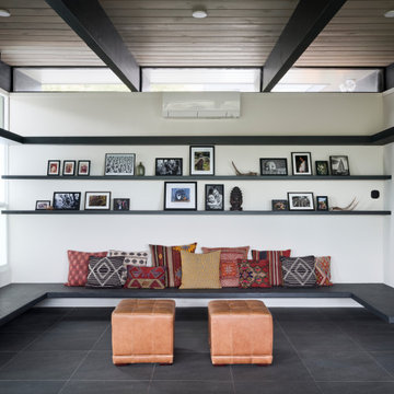
Set in a quiet neighborhood and framed by mature trees, this residence presented a unique opportunity: to thoughtfully evolve a custom mid-century modern home into a space that supports the everyday rhythms of a growing family. With a deep respect for the home’s original architecture, Klopf Architecture reimagined the house to better meet the needs of its owners—introducing functional improvements while preserving the spirit and character of its mid-century roots.
The clients approached Klopf Architecture with a clear vision: refresh their home while seamlessly integrating new programmatic elements. Key goals included clarifying and enhancing the entry sequence; connecting the detached garage to the main house with a practical yet architecturally intentional intervention; adding functional spaces such as a mudroom and laundry room; expanding and remodeling the primary suite’s bathroom and closet; and creating a more engaging outdoor space that capitalized on the site’s impressive views, featuring a fire pit and outdoor kitchen.
As a couple with distinct yet complementary perspectives—one focused on modern functionality and technology, and the other dedicated to preserving the home’s architectural integrity—their collaboration with Klopf Architecture resulted in a solution that harmonized both ideals. Their shared commitment to improving the livability of their home led to a design dialogue rooted in balance. This dynamic partnership shaped the direction of the renovation, ensuring that every decision honored the spirit of the original home while aligning with the practical needs of their growing family.
Designing within the constraints of the sloped site posed one of the project’s central challenges. The detached garage sat at a higher elevation than the main house, requiring a solution that ensured architectural and geometric compatibility between the two structures. Rather than create a purely utilitarian link, Klopf Architecture introduced an intentional connection that contributes to the overall architectural language. A notable pinch point in the plan—where differing geometries converged—was treated as a hinge point, turning a potentially awkward juncture into an architectural feature. This area now functions as both a transition and a moment of design interest that unifies the overall plan.
The design also addressed the underutilized outdoor area, which was located in a shadowed portion of the site with geometrical limitations. A new connection to the rear deck was created in this same area, making the outdoor space more useful and inviting. Klopf Architecture introduced carefully positioned openings and spatial improvements that forged a strong visual and functional connection between indoor and outdoor spaces. The outdoor area now reads as a deliberate extension of the home, embracing natural light and emphasizing the dramatic views.
Working through multiple design iterations, Klopf Architecture crafted a solution that preserved the architectural language of the original home while supporting the functional needs of modern life. The garage-to-house connection became more than a passage—it evolved into an architectural moment of transition. A new mudroom and laundry space enhanced convenience without compromising the clean lines of the design. The primary suite was expanded to create a private, serene retreat. The reimagined backyard, complete with fire pit and kitchen, now plays a vital role in the family’s daily routine and social life.
Outcomes and Lasting Impact
The result is a home that balances heritage with contemporary design, technical precision with design sensibility. The redesign not only met the clients’ initial goals but also exceeded expectations in its ability to seamlessly blend past and present, function and beauty, making the outdoor kitchen a favorite gathering place.
Beyond aesthetics, the renovation has significantly improved daily life for the family. The newly integrated garage connection has streamlined routines, providing a seamless transition between arriving home, storing belongings, and entering the main living spaces. The expanded primary suite offers a retreat-like atmosphere, creating a private space to unwind at the end of the day. The redesigned outdoor areas have also become an extension of their lifestyle—whether it's casual family dinners around the fire pit, entertaining friends in the outdoor kitchen, or simply enjoying the view from the reimagined backyard.
Through a thoughtful and strategic approach, the house has been successfully evolved into a home that remains true to its mid-century modern roots while enhancing livability, functionality, and the overall quality of life for the modern-day owners.
Klopf Architecture Team: Geoffrey Campen, Fernanda Bernardes
Architectural Interior Design: Klopf Architecture
Structural Engineer: Base Design Inc.
Contractor: Golden Snail Builders
Photography: Mariko Reed
Year Completed:2022
 HR DESIGN DEPT
For years, early morning walks past this 1910 Craftsman in Houston's historic Avondale neighborhood left the new owners with lingering fantasies of making it their future home. When it became available, they acquired a home rich with history, but one nearly abolished. The home was once inhabited by Texas Governor (1931-1932) and founder of Humble Oil, Ross Sterling. But, renovations subdivided the home into multi-family rentals and destroyed original finishes. The developer driven modifications were abruptly halted by city red tags in 2018 after original windows were demolished and replaced with vinyl substitutes.
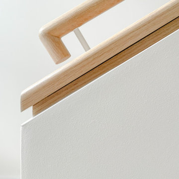
With a nearly clean slate on the interior, the HRDD renovation aims to be respectful to the original context while providing coplimentary modern surprises atypical to the era. One such example is a new opening that punctures through the second floor, extending to a roof skylight. Situated at the transition between formal and informal rooms on the first floor and common space on the second floor, this subtraction is lined with a scalloped wood screen. The screen is one of multiple moments within the home where texture will combine with minimal white surfaces, providing a backdrop to the owners' collection of antique Indian furniture pieces.
Additionally, a new detached replaced an existing dilapidated garage apartment and contains the owner's photography studio. Windows and a skylight are placed to capture coveted north light, ideal for photographing and editing. The main room remains an austere slate, with ceiling vaulting to a single aperture to create a dynamic moment that carries a dialogue to the opening in the main home.
 nC2 architecture llc
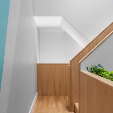
A new, ground-up attached house facing Cooper Park in Williamsburg Brooklyn. The site is in a row of small 1950s two-story, split-level brick townhouses, some of which have been modified and enlarged over the years and one of which was replaced by this building.
The exterior is intentionally subdued, reminiscent of the brick warehouse architecture that occupies much of the neighborhood. In contrast, the interior is bright, dynamic and highly-innovative. In a nod to the original house, nC2 opted to explore the idea of a new, urban version of the split-level home.
The house is organized around a stair oriented laterally at its center, which becomes a focal point for the free-flowing spaces that surround it. All of the main spaces of the house - entry hall, kitchen/dining area, living room, mezzanine and a tv room on the top floor - are open to each other and to the main stair. The split-level configuration serves to differentiate these spaces while maintaining the open quality of the house.
A four-story high mural by the artist Jerry Inscoe occupies one entire side of the building and creates a dialog with the architecture. Like the building itself, it can only be truly appreciated by moving through the spaces.
 Eugene Pintail LLC
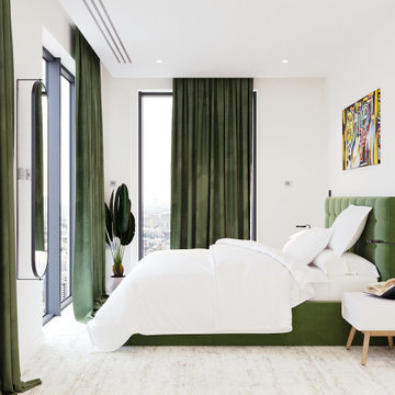
This design captures the spirit of eclectic modernity—boldly combining texture, form, and soulful detail. It embraces both clean contemporary lines and layered, curated elements, resulting in a space that feels thoughtfully collected, not predictable.
Textural richness is at the forefront—soft upholstery pairs with sleek surfaces, and mixed finishes (polished metals, matte woods, and plush textiles) create a tactile and visual dialogue. The contrast between refined and cozy elements builds warmth and sophistication.
The layout balances openness with intimacy. Thoughtfully placed furniture and visual rhythms guide movement through the space, allowing each area to feel both connected and distinct.
Lighting is composed with subtlety and intention—ambient fixtures and layered lighting gently sculpt the environment. Shadows and highlights enhance the ambiance without overpowering the architectural interplay.
This space tells a story of modern living infused with personality. It’s dynamic yet grounded—inviting curiosity, conversation, and comfort in equal measure.
 Tobin Dougherty Architects
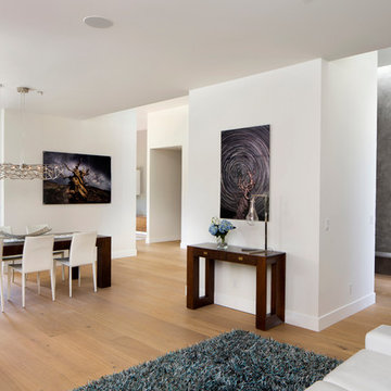
Sited on the existing footprint of a 1950 ranch house, this sustainably-designed suburban home offers vast yet modest living spaces that extend into its landscape creating a new modernist aesthetic. In this semi-rural atmosphere the sunlight is brought into the spaces through its hidden light wells, sliding glass panels, and large glass inlets. The ten foot high by twenty four foot sliding panel of glass provides a flowing connection between interior and exterior. Spaces within are edited with it’s carefully placed walls, colors, and light creating senses of openness allowing all the senses to engaged in this modern dialogue of contrasts.
www.bernardandre.com
 Inform Interiors
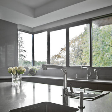
Thomas Wu at Dialog Architects and Engineers for master plan, design, and construction management; and Bob Ledingham and staff for the interior design.
PHOTO: Michael Young
 Boyenga Team / Compass
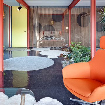
Eichler X-100 Family Room: The Social Core of a Modernist Vision
The family room in the Eichler X-100 is where the home truly comes alive—a space designed not just for gathering, but for experiencing architecture in motion. Created by A. Quincy Jones and Frederick Emmons for Joseph Eichler, it embodies the ideal balance between openness, comfort, and innovation.
A Structure That Disappears
At first glance, the room feels effortlessly open—but that freedom is the result of the X-100’s steel-frame construction, which eliminates the need for interior support walls. This allows the family room to function as a true uninterrupted volume, seamlessly connected to adjacent spaces.
The structure is still present—expressed through subtle steel elements—but it never interrupts the flow.
Light-Filled and Ever-Changing
The family room is bathed in natural light from every direction:
Floor-to-ceiling glass walls bring in expansive views and daylight
Overhead skylights soften and diffuse light across the space
Reflections from surrounding surfaces create a gentle, dynamic glow
From morning to evening, the room shifts in tone and atmosphere, making it feel alive and responsive.
Living Without Boundaries
One of the defining qualities of the family room is its ability to blur boundaries. Large sliding glass panels open directly to the outdoors, transforming the space into an indoor-outdoor pavilion.
Whether open or closed, the connection to nature is constant—air, light, and landscape are always part of the experience.
Designed for Everyday Life
Unlike more formal living spaces, the family room is grounded in functionality. It’s where:
Conversations happen naturally
Daily routines unfold
Relaxation and connection take center stage
The openness allows for flexibility—furniture arrangements, uses, and moods can evolve without constraint.
Views That Extend Through the Home
From this space, sightlines stretch across the home—often landing on interior gardens or atriums. This creates a layered visual experience where multiple zones are always in dialogue with one another.
The effect is subtle but powerful:
you are always aware of the entire home, not just the room you’re in.
The Essence of Eichler Living
The family room captures what made Eichler homes revolutionary—a focus on how people actually live. It’s not about formality or separation, but about connection, openness, and ease.
In the X-100, that idea is pushed to its highest level—creating a space that feels as relevant today as it did in 1956. image Sabrina Huang
 Nash Waters Architecture
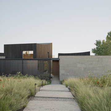
Embed within the contours of its sloping topography, Ledge & Light House is a retreat from the intensity of urban life—an Essex County home designed to embrace both serenity and openness. As a refuge from the city, it offers an immersive dialogue between architecture and landscape, where shifting light, framed views, and a careful balance of mass and transparency define the experience.
 STUDIO ENÉE architects
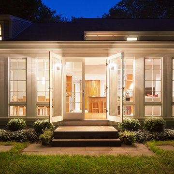
Overlooking an acre of land, this 1951 residence in Needham, Massachusetts was expanded and renovated to create a dialogue between the interior spaces and the exterior landscape. Two full height window walls look on to an expansive garden from the new kitchen and living areas. A skylight over the kitchen maximizes and brings natural daylight into the central core of the house. Access from the existing garage into the dining and kitchen areas is accomplished via a new mudroom and side entrance. The design reflects a flexible living space with framed views of the landscape and the use of natural and sustainable materials.
Photo Credit: Matthew Delphenic
 Klopf Architecture
Set in a quiet neighborhood and framed by mature trees, this residence presented a unique opportunity: to thoughtfully evolve a custom mid-century modern home into a space that supports the everyday rhythms of a growing family. With a deep respect for the home’s original architecture, Klopf Architecture reimagined the house to better meet the needs of its owners—introducing functional improvements while preserving the spirit and character of its mid-century roots.
The clients approached Klopf Architecture with a clear vision: refresh their home while seamlessly integrating new programmatic elements. Key goals included clarifying and enhancing the entry sequence; connecting the detached garage to the main house with a practical yet architecturally intentional intervention; adding functional spaces such as a mudroom and laundry room; expanding and remodeling the primary suite’s bathroom and closet; and creating a more engaging outdoor space that capitalized on the site’s impressive views, featuring a fire pit and outdoor kitchen.
As a couple with distinct yet complementary perspectives—one focused on modern functionality and technology, and the other dedicated to preserving the home’s architectural integrity—their collaboration with Klopf Architecture resulted in a solution that harmonized both ideals. Their shared commitment to improving the livability of their home led to a design dialogue rooted in balance. This dynamic partnership shaped the direction of the renovation, ensuring that every decision honored the spirit of the original home while aligning with the practical needs of their growing family.
Designing within the constraints of the sloped site posed one of the project’s central challenges. The detached garage sat at a higher elevation than the main house, requiring a solution that ensured architectural and geometric compatibility between the two structures. Rather than create a purely utilitarian link, Klopf Architecture introduced an intentional connection that contributes to the overall architectural language. A notable pinch point in the plan—where differing geometries converged—was treated as a hinge point, turning a potentially awkward juncture into an architectural feature. This area now functions as both a transition and a moment of design interest that unifies the overall plan.
The design also addressed the underutilized outdoor area, which was located in a shadowed portion of the site with geometrical limitations. A new connection to the rear deck was created in this same area, making the outdoor space more useful and inviting. Klopf Architecture introduced carefully positioned openings and spatial improvements that forged a strong visual and functional connection between indoor and outdoor spaces. The outdoor area now reads as a deliberate extension of the home, embracing natural light and emphasizing the dramatic views.
Working through multiple design iterations, Klopf Architecture crafted a solution that preserved the architectural language of the original home while supporting the functional needs of modern life. The garage-to-house connection became more than a passage—it evolved into an architectural moment of transition. A new mudroom and laundry space enhanced convenience without compromising the clean lines of the design. The primary suite was expanded to create a private, serene retreat. The reimagined backyard, complete with fire pit and kitchen, now plays a vital role in the family’s daily routine and social life.
Outcomes and Lasting Impact
The result is a home that balances heritage with contemporary design, technical precision with design sensibility. The redesign not only met the clients’ initial goals but also exceeded expectations in its ability to seamlessly blend past and present, function and beauty, making the outdoor kitchen a favorite gathering place.
Beyond aesthetics, the renovation has significantly improved daily life for the family. The newly integrated garage connection has streamlined routines, providing a seamless transition between arriving home, storing belongings, and entering the main living spaces. The expanded primary suite offers a retreat-like atmosphere, creating a private space to unwind at the end of the day. The redesigned outdoor areas have also become an extension of their lifestyle—whether it's casual family dinners around the fire pit, entertaining friends in the outdoor kitchen, or simply enjoying the view from the reimagined backyard.
Through a thoughtful and strategic approach, the house has been successfully evolved into a home that remains true to its mid-century modern roots while enhancing livability, functionality, and the overall quality of life for the modern-day owners.
Klopf Architecture Team: Geoffrey Campen, Fernanda Bernardes
Architectural Interior Design: Klopf Architecture
Structural Engineer: Base Design Inc.
Contractor: Golden Snail Builders
Photography: Mariko Reed
Year Completed:2022
 nC2 architecture llc
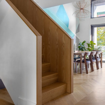
A new, ground-up attached house facing Cooper Park in Williamsburg Brooklyn. The site is in a row of small 1950s two-story, split-level brick townhouses, some of which have been modified and enlarged over the years and one of which was replaced by this building.
The exterior is intentionally subdued, reminiscent of the brick warehouse architecture that occupies much of the neighborhood. In contrast, the interior is bright, dynamic and highly-innovative. In a nod to the original house, nC2 opted to explore the idea of a new, urban version of the split-level home.
The house is organized around a stair oriented laterally at its center, which becomes a focal point for the free-flowing spaces that surround it. All of the main spaces of the house - entry hall, kitchen/dining area, living room, mezzanine and a tv room on the top floor - are open to each other and to the main stair. The split-level configuration serves to differentiate these spaces while maintaining the open quality of the house.
A four-story high mural by the artist Jerry Inscoe occupies one entire side of the building and creates a dialog with the architecture. Like the building itself, it can only be truly appreciated by moving through the spaces.
 Ward+Blake Architects
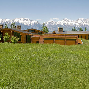
Located on a flat, open, grass-covered site amid wraparound views of the Teton and Gros Ventre ranges, the deliberately unobtrusive Tennican residence facilitates a clear dialogue between enclosed and natural space. Designed by Ward+Blake Architects in Jackson, Wyoming.
Photo Credit: Douglas Khan
 nC2 architecture llc
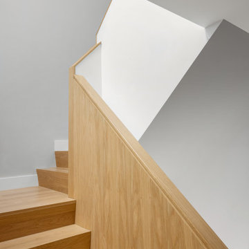
A new, ground-up attached house facing Cooper Park in Williamsburg Brooklyn. The site is in a row of small 1950s two-story, split-level brick townhouses, some of which have been modified and enlarged over the years and one of which was replaced by this building.
The exterior is intentionally subdued, reminiscent of the brick warehouse architecture that occupies much of the neighborhood. In contrast, the interior is bright, dynamic and highly-innovative. In a nod to the original house, nC2 opted to explore the idea of a new, urban version of the split-level home.
The house is organized around a stair oriented laterally at its center, which becomes a focal point for the free-flowing spaces that surround it. All of the main spaces of the house - entry hall, kitchen/dining area, living room, mezzanine and a tv room on the top floor - are open to each other and to the main stair. The split-level configuration serves to differentiate these spaces while maintaining the open quality of the house.
A four-story high mural by the artist Jerry Inscoe occupies one entire side of the building and creates a dialog with the architecture. Like the building itself, it can only be truly appreciated by moving through the spaces.
 By Darash - Kitchen Cabinets, Vanities & Closets
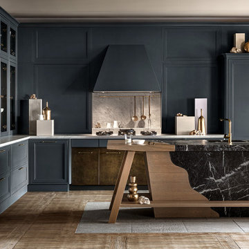
A meeting... Of materials: stainless steel, glass, white Carrara marble, wood, black Marquinia stone. Of styles, Farmhouse Shaker style contemporary and classic yet gives of the warm feeling of a rustic vibe interior design, creating a third, which transcends time. Match of finishes: hammering, antique brass finish, trowel, natural finish, matte, shiny reflective glass. An encounter between optimal functionality and pure aesthetics, which coexist in perfect balance. Blue avio, a color blue kitchen, played down by the large contemporary island and Shaker Style Cabinets, which aesthetically create a clever play of depth. The workhorse is undoubtedly his island, a dialogue of styles between classic and contemporary, a combination of materials in which honey-colored wood meets Nero Marquinia stone in a brushed finish and marble. The visual contrast alone, but also the Italian excellence of the material quality, make it a true work of art.
 Aranelli Design
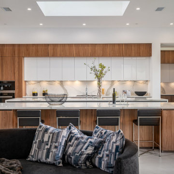
This exquisite kitchen is a symphony of contrasting elements that come together to create a space that's at once warm, contemporary, and inviting. Embracing a chic palette of rich walnut and pristine white gloss, the kitchen embodies modernity while paying homage to the traditional.
Stepping into the room, the eye is immediately drawn to the sumptuous walnut cabinetry. These units are notable for their stunning depth of color and unique, intricate grain patterns that lend a sense of natural charm to the room. The robust walnut undertones are the embodiment of sophistication and warmth, imbuing the space with a comforting, homely aura.
Complementing the wood's organic allure, the glossy white surfaces provide a sleek, modern counterpoint. The white gloss kitchen island and countertops are crafted with meticulous precision, their surfaces reflecting light to illuminate the room and enhance its spacious feel. The high gloss finish is incredibly smooth to the touch, adding a layer of tactile luxury to the overall aesthetic.
Where the walnut provides the soul, the white gloss provides the contemporary spirit. The cabinets, outfitted in glossy white, are not only visually striking but also serve as a practical design solution, resisting stains and spills while reflecting light to make the space appear larger and brighter.
The balance between the rich walnut and the crisp white gloss is expertly maintained throughout, creating a harmonious dialogue between the two. Brushed steel hardware provides a touch of industrial chic, while state-of-the-art appliances integrate seamlessly into the design.
Accent features such as a walnut-topped island or a white gloss splashback continue this dynamic interplay, providing not just functionality, but a visual spectacle. The result is a kitchen space that is as breathtaking to behold as it is to function within.
This walnut and white gloss kitchen effortlessly blends the traditional with the contemporary, the natural with the synthetic, the comforting with the clean. It is a testament to the power of design to create spaces that are both aesthetically pleasing and thoroughly practical, creating a kitchen that's not just a place for cooking, but a hub for home life.
54