
Search results for "Differentiation" in Home Design Ideas
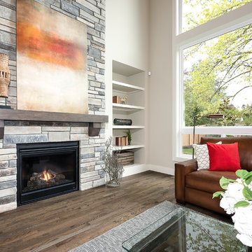
 Cultured Stone®
Home Design & Photo Credit: MurrayFranklyn.com
https://www.houzz.com/pro/murrayfranklyn/murray-franklyn
Stone: Country Ledgestone - Echo Ridge
https://www.culturedstone.com/products/country-ledgestone/cs-cl-echo-ridge
The extensive palette of installer-friendly Country Ledgestone stone veneer differentiates one ledgestone from another. It also provides a more subtle blend of color.
 Columbia Cabinets
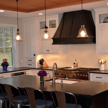
Project Details
Designer: Amy Van Wie
Cabinetry: Brookhaven II – Framed Inset Cabinetry
Wood: Perimeter and Island are Painted Maple; the Hutch is Distressed Pine
Finish: Alpine White, Black with espresso glaze and the Hutch is Vintage Putty and Hazel on Distressed Pine
Door: Lewisburg Recessed
Countertop: Soap Stone
Awards
2015 NKBA Design Award, Best New Kitchen 150SF+
This was such a fun project. Our clients were razor focused on all the details, which of course, as a designer, I loved! We decided to expand the finish palette from the traditional one or two to three: alpine white on the perimeter, black with espresso glaze for the island and vintage putty and hazel for the hutch area. We wanted to differentiate the hutch from the rest of the kitchen but still make it part of a unified whole. The third finish kept the area distinct and the matching door style kept it integrated.
The symmetrical balance gives the kitchen a sophistication which reflects the owners perfectly. The Kohler Whitehaven farm sink, backsplash and hardware introduce the rustic elements reflective of the rest of the home and its bucolic setting.
 STUDIO TASHIMA
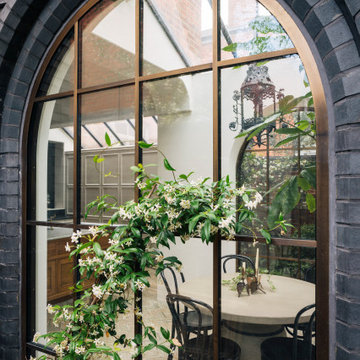
Keyes Road is a two-storey, semi-detached red brick house dating to around 1890-1910. The focus of our work was on the ground floor where we were asked to improve the layout and use of the main living areas of the house, for an active family of four. Important to the design was to maximise the quality and amount of light as well as connection to the garden and flow to the rest of the house.
Our proposal introduces three single storey extensions, comprising a central, large space that extends the main outrigger of the house. To each side are smaller volumes, affording a full width kitchen. While defining a series of discrete volumes, it was important for us to ensure that the kitchen, living, family and dining rooms that are interconnecting and continuous. The result is a big space punctuated by a series of differently sized arches, defining spaces to ensure their intimacy.
It was important for our client to have a sense of warmth and comfort - perhaps not dissimilar to the qualities of a hotel lobby. The colour scheme of the rooms are warm white painted plaster, natural wood flooring with black, bronze and brass accents. Indirect and carefully placed light fittings pulls together the atmosphere of the rooms - particularly in the evenings.
Externally, we felt it important to differentiate the extensions from the main house by using a dark, charcoal grey brick. This sets up a contrasting yet complimentary relationship to the rich red coloured brick house. The facets of the brick play with light and depth as do the graduated brick arches.
During the design process, we grappled with floor levels, the direction of sunlight, and care to not encroach on the neighbouring properties. As the house is in a conservation area, we worked closely with our trusted planning advisor. Throughout, we pursued a sensitive design strategy, using pitched roofs, matching materials and careful detailing. Internally, many of the original details are intact. This has enabled us to create an eclectic ensemble of elements, colours and materials varying in age and period.
Find the right local pro for your project
 Lori Pedersen Home
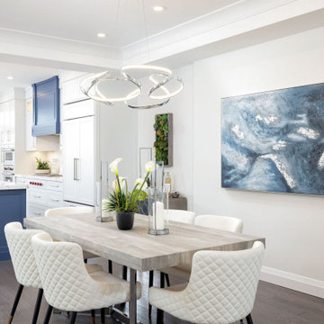
The custom builder went to great lengths to accent differentiate this home with quality finishings and attention to detail. We carefully selected each item in our design plan to highlight and showcase these features, so prospective buyers would be drawn to and impressed by the home.
 Arete Renovators Inc.
Amazing bathroom renovation and home remodel. A fresh start for the home began with the renovation of bedrooms and spaces to fill with personalized decor and memories. The bathroom remodel is a perfect place to rest and relax. The stunning stone tile differentiations from the wall to the shower to the floor allow for cohesive contrast and when a[ired with the stunning gold fixtures creates an oasis for the client.
 Crawford Builders
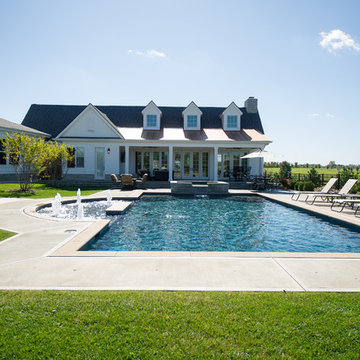
Example of a large transitional backyard concrete and rectangular pool house design in Other
 Granit Architects + Interiors
An expressive family home in Clapham.
The Brief
The brief was to create a new ground floor. It needed to be a flexible home capable of accommodating guests of all ages whilst maintaining purpose and separation between spaces.
The Solution
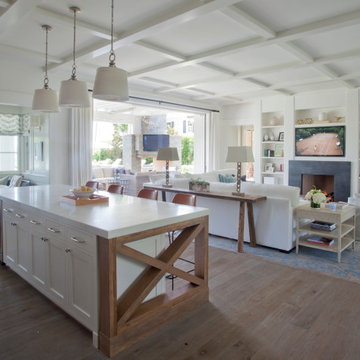
We proposed re-routing the hallway to become a central corridor through the ground floor plan. This would connect the rear and front halves of the property across a series of staggered level changes. We also wanted to create an enlarged rear space for entertainment that linked to the garden space.
The removal of an existing courtyard allowed for the insertion of a boot room and relocated WC central to the plan.
Separating the distinctly classical detailing of the front reception and dining room, which emphasises our clients’ favoured style and family backgrounds, from the sleek contemporary rear kitchen and entertainment space was successfully enhanced by the varied format of the timber flooring from Trunk.
Maintaining visual connectivity was achieved by way of two sizeable glazed pocket doors that enable the two halves of the plan to be differentiated from each other. At the same time, the use of internal glazing supports views through the property to the remodelled rear garden.
The bespoke designed kitchen from Eclectic Interiors introduces the user to the modernised rear extension, which features sharp detailing and a splash of colour from the feature media unit designed by our interiors team.
The symmetrical rear elevation carries through to the garden making for an interconnected, seamless transition through the property.
The Result
The combination of classical and contemporary elements marry together well to support flexible family living and entertaining. Our clients are delighted with the outcome and feel that it meets their brief and design aspirations.
 LJLdesigns Inc.
The 5,769 sq. ft. house overlooks Santa Monica from a timelessly bucolic Palisades neighborhood and sits on a 15,500 sq. ft. lot. The clients desire for open, spacious, indoor/ outdoor living is combined with the casual charm and ambiance of traditional beach-town cottage Architecture. Sensitive massing subtlety weaves the home into its street context, and creates a variety of spaces within for the young active family. The main living areas open to one another and the adjoining landscape in a progression of spaces that range from casually elegant to comfortably informal. The primary color used throughout the interior is sunlight. The house traverses the course of a day awash in daydreamy Southern California light, and is rich with subtle surprises: instances of used brick on walls and ceilings, built-in, hand crafted cabinetry, pennies used as flooring in the powder room; Creative uses of tile, fixtures and cabinet hardware differentiate each bathroom.
 Farinelli Construction, Inc.
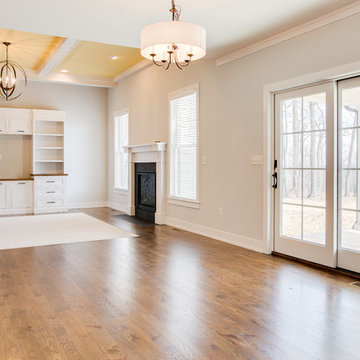
View from breakfast area into family room. We love open concept floor plans, varying your ceiling heights is a great way to stay open but differentiate rooms.
Photos by Rachel Gross
 STUDIO TASHIMA
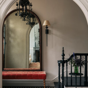
Keyes Road is a two-storey, semi-detached red brick house dating to around 1890-1910. The focus of our work was on the ground floor where we were asked to improve the layout and use of the main living areas of the house, for an active family of four. Important to the design was to maximise the quality and amount of light as well as connection to the garden and flow to the rest of the house.
Our proposal introduces three single storey extensions, comprising a central, large space that extends the main outrigger of the house. To each side are smaller volumes, affording a full width kitchen. While defining a series of discrete volumes, it was important for us to ensure that the kitchen, living, family and dining rooms that are interconnecting and continuous. The result is a big space punctuated by a series of differently sized arches, defining spaces to ensure their intimacy.
It was important for our client to have a sense of warmth and comfort - perhaps not dissimilar to the qualities of a hotel lobby. The colour scheme of the rooms are warm white painted plaster, natural wood flooring with black, bronze and brass accents. Indirect and carefully placed light fittings pulls together the atmosphere of the rooms - particularly in the evenings.
Externally, we felt it important to differentiate the extensions from the main house by using a dark, charcoal grey brick. This sets up a contrasting yet complimentary relationship to the rich red coloured brick house. The facets of the brick play with light and depth as do the graduated brick arches.
During the design process, we grappled with floor levels, the direction of sunlight, and care to not encroach on the neighbouring properties. As the house is in a conservation area, we worked closely with our trusted planning advisor. Throughout, we pursued a sensitive design strategy, using pitched roofs, matching materials and careful detailing. Internally, many of the original details are intact. This has enabled us to create an eclectic ensemble of elements, colours and materials varying in age and period.
 Thayer Hopkins Architects
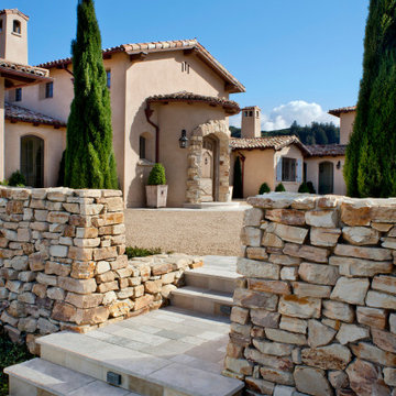
The Santa Lucia Estate is located on a private reserve in Upper Carmel Valley situated on a gentle grassland ridge with dramatic views of the surrounding valleys and coastal range. The house is not immediately visible and is approached from below by a winding drive and the initial view of the house is revealed through a masonry gateway surrounded by curvilinear walls made from local stone that enclose a protected forecourt.
The forms of the house are expressed in two materials, stucco and dry stack stone veneer to differentiate the elements, to reflect the vernacular of the Monterey regional style, and to give the house the appearance of having various elements that have been added over time.
The entry façade and the arched arcade of the entry court are symmetrical, and that formality gives way to asymmetrical enclosing wings. The building elements are placed to reflect both the Owner’s program and to fit in the topography of the site. A dominant gabled roof centers the composition of the front façade and creates space and light for the Entry Foyer and to the Dining and Living areas that open to the views on the opposite side. The Garage is located on the right of the forecourt, and the three arched openings reiterate the arches of the French doors in the main arcade. This wing contains a second story floor and traditional decorative timber balcony with views of the surrounding landscape. The main hallway that runs the length of the house is located at the entry court, forming and enfilade from which the formal living spaces and outdoor terraces are located on the opposite southeast side. The placement of these rooms allows a transition from indoor to outdoor terraces that takes advantage of protection from the prevailing wind, provides optimal solar exposure, and orients the living spaces toward the dramatic view corridor down the Potrero Valley.
Two roof towers at either end of the longitudinal ridge anchor the building and provide space, focal point and daylight to the interior. A stone Caretaker’s Cottage is located down slope from the main residence.
 Done Renovations
Isaac Brown
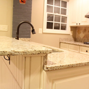
Small elegant galley enclosed kitchen photo in DC Metro with a single-bowl sink, raised-panel cabinets, white cabinets, granite countertops, beige backsplash, ceramic backsplash, stainless steel appliances and a peninsula
Small elegant galley enclosed kitchen photo in DC Metro with a single-bowl sink, raised-panel cabinets, white cabinets, granite countertops, beige backsplash, ceramic backsplash, stainless steel appliances and a peninsula
 nC2 architecture llc
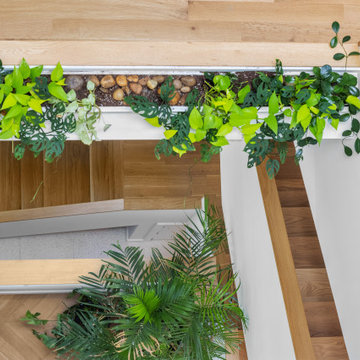
A new, ground-up attached house facing Cooper Park in Williamsburg Brooklyn. The site is in a row of small 1950s two-story, split-level brick townhouses, some of which have been modified and enlarged over the years and one of which was replaced by this building.
The exterior is intentionally subdued, reminiscent of the brick warehouse architecture that occupies much of the neighborhood. In contrast, the interior is bright, dynamic and highly-innovative. In a nod to the original house, nC2 opted to explore the idea of a new, urban version of the split-level home.
The house is organized around a stair oriented laterally at its center, which becomes a focal point for the free-flowing spaces that surround it. All of the main spaces of the house - entry hall, kitchen/dining area, living room, mezzanine and a tv room on the top floor - are open to each other and to the main stair. The split-level configuration serves to differentiate these spaces while maintaining the open quality of the house.
A four-story high mural by the artist Jerry Inscoe occupies one entire side of the building and creates a dialog with the architecture. Like the building itself, it can only be truly appreciated by moving through the spaces.
 Angie Amato Wieland Architecture LLC
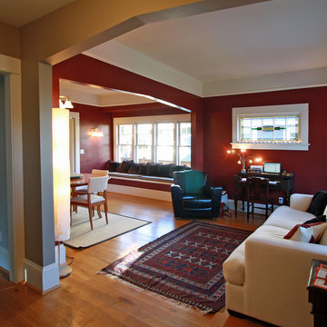
Example of a small arts and crafts medium tone wood floor living room design in Portland with red walls
 Lori Pedersen Home
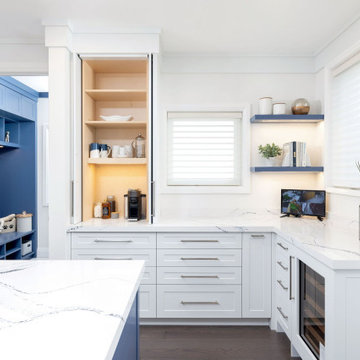
The custom builder went to great lengths to accent differentiate this home with quality finishings and attention to detail. We carefully selected each item in our design plan to highlight and showcase these features, so prospective buyers would be drawn to and impressed by the home.
 nC2 architecture llc
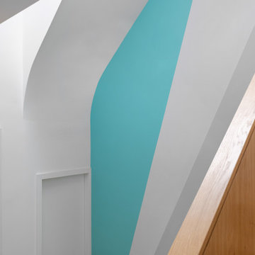
A new, ground-up attached house facing Cooper Park in Williamsburg Brooklyn. The site is in a row of small 1950s two-story, split-level brick townhouses, some of which have been modified and enlarged over the years and one of which was replaced by this building.
The exterior is intentionally subdued, reminiscent of the brick warehouse architecture that occupies much of the neighborhood. In contrast, the interior is bright, dynamic and highly-innovative. In a nod to the original house, nC2 opted to explore the idea of a new, urban version of the split-level home.
The house is organized around a stair oriented laterally at its center, which becomes a focal point for the free-flowing spaces that surround it. All of the main spaces of the house - entry hall, kitchen/dining area, living room, mezzanine and a tv room on the top floor - are open to each other and to the main stair. The split-level configuration serves to differentiate these spaces while maintaining the open quality of the house.
A four-story high mural by the artist Jerry Inscoe occupies one entire side of the building and creates a dialog with the architecture. Like the building itself, it can only be truly appreciated by moving through the spaces.
 Jorge Ulibarri Custom Homes
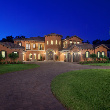
This 6,300 square foot custom home by Orlando Custom Home Builder Jorge Ulibarri is located in the country club community of Heathrow, just north of Orlando, Florida. Curb appeal comes from its two-story tower entry, a signature of Jorge Ulibarri custom homes. The front door features solid distressed wood for an Old World character with wrought iron embellished windows. Specialty glass windows with wrought iron detailing crown the tower and cast a beautiful light grid on the interior entryway . The home’s exterior color of terra cotta purposely makes a statement differentiating itself from the ubiquitous beige exterior colored homes in the neighborhood. The home’s metal garage door mimics the look of wood with faux trim that ties together the corbels. The metal garage doors with wood grain finish are framed in precast and together these materials are much more durable in Florida’s heat and humidity than real wood garage doors. Photo credit: Harvey Smith
 Dawson & Clinton
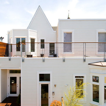
This Divisadero Street remodel project brought new life to a classic San Francisco home, revealing an elegant Victorian façade and a polished, contemporary interior. Working to blend the two styles, a simple yet elegant design was employed with specific accents to add life and a modern sensibility to the home.
Making the most of the home’s backyard was of great concern for the owner. The decking was designed to maximize the space for entertaining, and complement beauty of the landscaping.
Traditional ornamental millwork was used throughout to match the existing wainscoting and crown molding. Rendered as a monochromatic white without any color differentiation from the interior walls, the effect is contemporary, as if it were a blank canvas with detailed articulations on its surface. Furthermore, the contrast of its dark wood floors to the home's largely white color scheme gives it a modern aesthetic.
 nC2 architecture llc
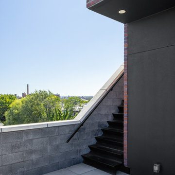
A new, ground-up attached house facing Cooper Park in Williamsburg Brooklyn. The site is in a row of small 1950s two-story, split-level brick townhouses, some of which have been modified and enlarged over the years and one of which was replaced by this building.
The exterior is intentionally subdued, reminiscent of the brick warehouse architecture that occupies much of the neighborhood. In contrast, the interior is bright, dynamic and highly-innovative. In a nod to the original house, nC2 opted to explore the idea of a new, urban version of the split-level home.
The house is organized around a stair oriented laterally at its center, which becomes a focal point for the free-flowing spaces that surround it. All of the main spaces of the house - entry hall, kitchen/dining area, living room, mezzanine and a tv room on the top floor - are open to each other and to the main stair. The split-level configuration serves to differentiate these spaces while maintaining the open quality of the house.
A four-story high mural by the artist Jerry Inscoe occupies one entire side of the building and creates a dialog with the architecture. Like the building itself, it can only be truly appreciated by moving through the spaces.
 Rachel Perls
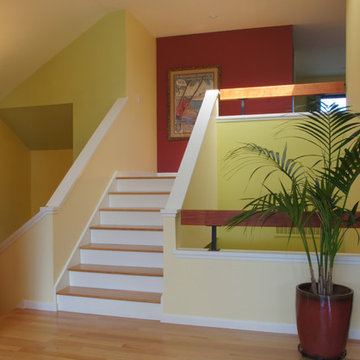
The owners of this airy, bright condo were perplexed by how to define each living area when they all flowed, one into another. With such a complicated layout, was there a way to differentiate from area to area, while incorporating bright colors? Yes!
33