
Search results for "Difficult concepts" in Home Design Ideas

 Truitt and White Window and Door Showroom
This hillside home in Piedmont, CA was remodeled to change the style from a 1940's rancher with eight foot ceilings and dark interiors, into a modern geometric composition with vast white interiors for casual living and generous daylighting for displaying the artist-owner's works.
In a city known for rigorous and difficult design review, an addition, two variances, and a full stylistic change were unanimously approved on the first round. All sloped roofs and attics were eliminated and replaced by a series of stacked and overlapping flat roofs. This made the house taller on the inside and shorter on the outside, which helped earn design review cooperation in the community. Windows were concentrated toward the rear yard views or moved up high on the side walls for daylight and privacy, benefitting the owners as well as the neighbors.
At the start, the owner husband was so enthusiastic and engaged in transforming his house into something modern that he presented the architect with a scaled foamcore model, rather than the usual magazine clippings and wish list. He participated in the design decisions throughout the process. The owner wife is the artist who did all the artwork in the house. She had been craving a display space with large walls and good natural light. Both of them loved the location and great views.
The project was an opportunity to transform the style of an older traditional home into a modern one, while solving numerous problems. By rebuilding the 1800 ft2 top of the 3-story home it was possible to change the style of the whole building, since the lower floors were a neutral base, and also to change the lifestyle of the owners, who wanted to move their master suite upstairs and live primarily on the top floor as empty nesters.
Going into the project, the architect knew there were multiple encroachments into the setbacks and potential privacy issues with close by neighbors. He approached this as a complex puzzle made up of architectural and political pieces which all had to fit together elegantly. It took many careful moves, small and large, to arrive at a serene and cohesive result that tied old and new together seamlessly.
The design-build contractor worked closely with the owners and handled all of the construction phase documents and design adjustments, adding ideas of their own to make the project really sing.
The project was a collaboration in three acts. The owner had a strong design concept from the start. The architect developed it into a realistic project and garnered the design approvals. Then the contractor executed brilliantly
 Living with Lolo
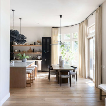
Dining Room in Alyssa Lane | Key Feature: A complete kitchen + living room transformation designed for a young, growing family who loved their home, but needed it to work harder and reflect their personality. The updated kitchen became the heart of the home, featuring a hidden smoothie station to keep daily essentials out of sight, plus a dedicated cocktail bar setup for entertaining. In the living room, the fireplace wall was fully reimagined by centering the previously cornered fireplace and creating a multifunctional media wall with custom furnishings and a statement chandelier. To top it off, the former formal dining room was transformed into a bar lounge with custom brass shelving, a black grasscloth backdrop, and a bold, elevated vibe perfect for hosting friends and family.
Challenge: This home belonged to a young couple with two small kids and a growing business, and while they loved the house itself, the spaces didn’t support the way they actually lived. The kitchen lacked function and storage, everyday routines (like smoothie-making) created visual clutter, and cocktail entertaining essentials were being shoved into the pantry with no dedicated space. The living room also felt awkward and unfinished due to the cornered fireplace, which made it difficult to create a centered, functional media wall. On top of that, the formal dining room wasn’t being used, leaving valuable square footage underutilized and disconnected from their lifestyle and personality.
Solution: We redesigned the home around how the family truly uses it day-to-day, focusing on function, personality, and elevated livability. In the kitchen, we created a modern, highly organized layout complete with a hidden smoothie station so daily supplies stay accessible but out of sight. For entertaining, we designed a dedicated bar area for Ryan, giving him a more inspired space to make cocktails without relying on pantry storage. In the living room, we centered the fireplace and fully revamped the feature wall into a multifunctional entertainment/media wall, then layered in custom furniture pieces and a statement chandelier to bring warmth and style. Finally, we converted the unused formal dining room into a bar lounge with custom brass shelving, a striking black grasscloth wall, and a sophisticated hangout space perfect for entertaining family and friends.
Budget: $100k-$150k |
Timeline: 4 months

 Studio Saxe
Overview:
Wing-like roofline houses a dramatic white villa in Costa Rica jungle.
Studio Saxe was commissioned to design a villa on the hilltops of Santiago in Santa Teresa, Costa Rica. The primary objective was not only to provide dwellers with a connection with its jungle surroundings but also to generate an intimate relationship with an amazing view of the shoreline which brings its dwellers back to a more profound appreciation of the natural world.
Concept
Studio Saxe decided to create a large roof that would house within a series of bedrooms and living spaces that would all be turned sideways in order to face the prominent views. Interstitial spaces within the living volumes create gaps that enhance a deeper connection to the natural surroundings whilst moving about the dwelling.
Design
Every space in the home has been angled to view the ocean, and this twist creates a geometric relationship between the roofline and the spaces that became the primary element of design that both addresses the need for large overhangs (for climate control and comfort) but also generates a literal connection between the view and every space.
This white house in the jungle acts as a canvas so that morning and sunset light reflect on its surfaces creating an array of colors that vary throughout the day. The angled surfaces also allow for the reflection of shadows and the textures of nature to play within the interstitial spaces that exist between the living spaces.
Construction
Due to the remoteness of the location and difficult access, Studio Saxe decided to create a light steel frame that could be prefabricated off-site, brought, and assembled in a fast and effective way. This not only ensured the quality of the construction in a very remote location, but it also allowed the process of construction to be very light touch and the intervention on the site to be very minimal while creating the sensation of large open spaces that bring the view in and at the same time are protected by a large roof held by steel “I” beams.
Sustainability
At Studio Saxe we believe that proper design with nature should be the first focus of sustainability and thus, this villa has been oriented properly to take advantage of predominant winds for cooling. Also, long overhangs protect from the sun and the rain in the most critical parts of the day creating comfort without the use of energy. A light touch construction method meant that the impact on the site was minimal during the implementation of the villa and the extended roofline also serves as a means to collect water and energy generation.
Find the right local pro for your project
 Living with Lolo
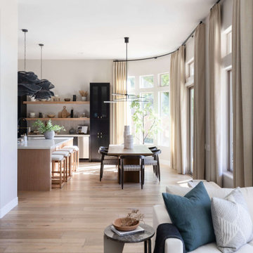
Kitchen in Alyssa Lane | Key Feature: A complete kitchen + living room transformation designed for a young, growing family who loved their home, but needed it to work harder and reflect their personality. The updated kitchen became the heart of the home, featuring a hidden smoothie station to keep daily essentials out of sight, plus a dedicated cocktail bar setup for entertaining. In the living room, the fireplace wall was fully reimagined by centering the previously cornered fireplace and creating a multifunctional media wall with custom furnishings and a statement chandelier. To top it off, the former formal dining room was transformed into a bar lounge with custom brass shelving, a black grasscloth backdrop, and a bold, elevated vibe perfect for hosting friends and family.
Challenge: This home belonged to a young couple with two small kids and a growing business, and while they loved the house itself, the spaces didn’t support the way they actually lived. The kitchen lacked function and storage, everyday routines (like smoothie-making) created visual clutter, and cocktail entertaining essentials were being shoved into the pantry with no dedicated space. The living room also felt awkward and unfinished due to the cornered fireplace, which made it difficult to create a centered, functional media wall. On top of that, the formal dining room wasn’t being used, leaving valuable square footage underutilized and disconnected from their lifestyle and personality.
Solution: We redesigned the home around how the family truly uses it day-to-day, focusing on function, personality, and elevated livability. In the kitchen, we created a modern, highly organized layout complete with a hidden smoothie station so daily supplies stay accessible but out of sight. For entertaining, we designed a dedicated bar area for Ryan, giving him a more inspired space to make cocktails without relying on pantry storage. In the living room, we centered the fireplace and fully revamped the feature wall into a multifunctional entertainment/media wall, then layered in custom furniture pieces and a statement chandelier to bring warmth and style. Finally, we converted the unused formal dining room into a bar lounge with custom brass shelving, a striking black grasscloth wall, and a sophisticated hangout space perfect for entertaining family and friends.
Budget: $100k-$150k |
Timeline: 4 months
 Studio Saxe
Overview:
Wing-like roofline houses a dramatic white villa in Costa Rica jungle.
Studio Saxe was commissioned to design a villa on the hilltops of Santiago in Santa Teresa, Costa Rica. The primary objective was not only to provide dwellers with a connection with its jungle surroundings but also to generate an intimate relationship with an amazing view of the shoreline which brings its dwellers back to a more profound appreciation of the natural world.
Concept
Studio Saxe decided to create a large roof that would house within a series of bedrooms and living spaces that would all be turned sideways in order to face the prominent views. Interstitial spaces within the living volumes create gaps that enhance a deeper connection to the natural surroundings whilst moving about the dwelling.
Design
Every space in the home has been angled to view the ocean, and this twist creates a geometric relationship between the roofline and the spaces that became the primary element of design that both addresses the need for large overhangs (for climate control and comfort) but also generates a literal connection between the view and every space.
This white house in the jungle acts as a canvas so that morning and sunset light reflect on its surfaces creating an array of colors that vary throughout the day. The angled surfaces also allow for the reflection of shadows and the textures of nature to play within the interstitial spaces that exist between the living spaces.
Construction
Due to the remoteness of the location and difficult access, Studio Saxe decided to create a light steel frame that could be prefabricated off-site, brought, and assembled in a fast and effective way. This not only ensured the quality of the construction in a very remote location, but it also allowed the process of construction to be very light touch and the intervention on the site to be very minimal while creating the sensation of large open spaces that bring the view in and at the same time are protected by a large roof held by steel “I” beams.
Sustainability
At Studio Saxe we believe that proper design with nature should be the first focus of sustainability and thus, this villa has been oriented properly to take advantage of predominant winds for cooling. Also, long overhangs protect from the sun and the rain in the most critical parts of the day creating comfort without the use of energy. A light touch construction method meant that the impact on the site was minimal during the implementation of the villa and the extended roofline also serves as a means to collect water and energy generation.
 Studio Saxe
Overview:
Wing-like roofline houses a dramatic white villa in Costa Rica jungle.
Studio Saxe was commissioned to design a villa on the hilltops of Santiago in Santa Teresa, Costa Rica. The primary objective was not only to provide dwellers with a connection with its jungle surroundings but also to generate an intimate relationship with an amazing view of the shoreline which brings its dwellers back to a more profound appreciation of the natural world.
Concept
Studio Saxe decided to create a large roof that would house within a series of bedrooms and living spaces that would all be turned sideways in order to face the prominent views. Interstitial spaces within the living volumes create gaps that enhance a deeper connection to the natural surroundings whilst moving about the dwelling.
Design
Every space in the home has been angled to view the ocean, and this twist creates a geometric relationship between the roofline and the spaces that became the primary element of design that both addresses the need for large overhangs (for climate control and comfort) but also generates a literal connection between the view and every space.
This white house in the jungle acts as a canvas so that morning and sunset light reflect on its surfaces creating an array of colors that vary throughout the day. The angled surfaces also allow for the reflection of shadows and the textures of nature to play within the interstitial spaces that exist between the living spaces.
Construction
Due to the remoteness of the location and difficult access, Studio Saxe decided to create a light steel frame that could be prefabricated off-site, brought, and assembled in a fast and effective way. This not only ensured the quality of the construction in a very remote location, but it also allowed the process of construction to be very light touch and the intervention on the site to be very minimal while creating the sensation of large open spaces that bring the view in and at the same time are protected by a large roof held by steel “I” beams.
Sustainability
At Studio Saxe we believe that proper design with nature should be the first focus of sustainability and thus, this villa has been oriented properly to take advantage of predominant winds for cooling. Also, long overhangs protect from the sun and the rain in the most critical parts of the day creating comfort without the use of energy. A light touch construction method meant that the impact on the site was minimal during the implementation of the villa and the extended roofline also serves as a means to collect water and energy generation.


Sponsored
Plain City, OH

The Creative Kitchen Company
Columbus Area Kitchen Remodeling and Refacing Professional

 Judy Dinkle - JD Designs
L.Herrada-Rios
Example of a small beach style 3/4 white tile, glass tile and beige tile travertine floor and beige floor tub/shower combo design in San Francisco with shaker cabinets, medium tone wood cabinets, a one-piece toilet, blue walls, an undermount sink and quartz countertops
Example of a small beach style 3/4 white tile, glass tile and beige tile travertine floor and beige floor tub/shower combo design in San Francisco with shaker cabinets, medium tone wood cabinets, a one-piece toilet, blue walls, an undermount sink and quartz countertops
 Almesedoors
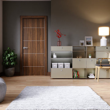
THE DOOR NAME ORIGIN - "ALLUMINIO ELIVIA VERTICAL WOOD GRAIN 4HS"
Of all the interior door models in the Elivia collection, this one is perhaps the most unapologetically elegant. Why? Hmm … That which is self-evident can be the most difficult to explain.
Is it because it is built using the latest breakthroughs in interior door making technology? Look at the finish: the process of applying it utilizes something called “stretching” by professionals, which is to say that instead of simply slapping the finish on top of the interior door’s surface, our company fuses (for lack of a better word) the materials (on molecular level, no less), the result being that the finished product is more warp-resistant, scratch-resistant, and fade-proof than any interior door put together in the past. This is especially important in climates known for their high humidity levels. Yes, but this has more to do with engineering than aesthetics, right?
Okay, so, is this interior door super-elegant because it features all the wonderful state-of-the-art hardware, specifically, the 3D adjustable, self-lubricating concealed hinges (made in Italy, by the way – a country which is, arguably, the birthplace of elegance as a concept)? Self-lubricating means your interior door will never creak. 3D-adjustable means that the installation is quick and precise (far more so than what you’d expect from ordinary hinges). Concealed means, of course, that the pin will not be visible from either side of the interior door when it’s closed. Actually, there is no pin. Neat, isn’t it? Would that be it?
Perhaps. Elegance in interior doors is a tricky concept. It combines (well, at least in the case of this particular interior door model it does) the “wow!” effect with the long-term agreeability. How so, you might ask. Well. It gets your favorable attention the first time you set eyes on it (the “wow” part); after which, you’ll never get tired of looking at it. For as long as you own it, it’ll always be easy on the eyes.
That must be it.
Maybe. Maybe not. There’s more.
This interior door is almost certainly Italian in spirit. Italian culture is rooted in Greco-Roman (Italian designers are very proud of that fact). Look at the vertical latitudinal orientation (which is to say the direction) of the wood grain. Pointing upward means creating additional visual space, pushing the ceiling higher (because your ceilings can never be too high). This is a time-proven architectural trick which ancient Greeks, with their characteristic tongue-in-cheek humor, referred to as “optical correction.” (By the way, if you’d sooner increase, the visual horizontal space of your room, you should look into this interior door’s sister – with the appropriate direction of the wood grain).
And then there’s the 4HS part, which stands for four horizontal stripes – resembling the four strings on the violin: the ultimate elegant musical instrument if there ever was one.
In its present form, the violin appeared in early Sixteenth Century in (guess …) northern Italy. Of course. To be fair, it quickly gained popularity throughout Europe, and the rest of the world soon after.
It’s elegance (the appearance as well as the sound) agreed with both street musicians and the nobility. The French king Charles IX ordered an Italian master to construct twenty-four violins for him in the year 1560.
Was the violin the source of inspiration for our designers?
Let’s move on to the finish.

 McCullough's Flooring
Gorgeous master bath finished with Dal-Tile's Fabrique porcelain tile in the color Noir Linen polished. Tile size is 12"x24" installed in a brick joint pattern. The floor boasts underfloor heating on a timed thermostat.
 Gore Design Co., LLC
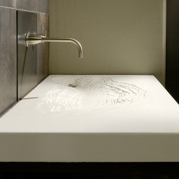
The Erosion Sink is a defining design for Gore Design Co. First created for a client in 2004 and shortly thereafter published in Dwell Magazine™, the Erosion Sink remains special to us.
Each one is unique, no two are the same. All aspects of this topographic sink can be customized, from color and size to the shape and layout of the erosion pattern. Brandon Gore personally creates each concrete Erosion Sink, spending more than 40 hours on the form and 200-300% more time hand-finishing the cast sink.
This original design is often imitated but never duplicated as the essence and nuance cannot be gained by impersonation. If you want to learn more, please visit our website at www.goredesignco.com
 Ferriss - Architectural Renderings
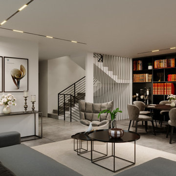
Top 10 house planning mistakes
Mistake # 1: placing wet areas away from communications.
Architects always foresee in advance the placement of wet areas in the immediate vicinity of communications, so you should not move the kitchen or bathrooms to more distant distances.
Mistake # 2: arrangement of living rooms and kitchens in rooms without natural light.
A person needs natural light when he is reading, studying or preparing food. Therefore, you should not plan living spaces, including the kitchen, in rooms without windows. Premises without natural light are mainly dressing rooms, storage rooms and bathrooms.
Mistake # 3: exit the bathroom to the living room or dining room.
Doors to bathrooms and utility rooms cannot open into public areas - living room or dining room. With such a planning decision, you will inconvenience guests and households, because no one will be able to enter or leave the premises unnoticed.
Mistake # 4: having one entrance to the house.
Plan 2-3 entrances to your home with each one serving a specific role. For example, through the front door you will meet guests, the entrance from the courtyard facade - to exit to the site in order to go around the house. The third entrance should lead from the street to the boiler room. Technicians enter through it and the equipment is replaced.
Mistake # 5: neglecting entrance hallways.
Do not plan grand halls and lounges when entering a house. Be sure to organize hallways with dressing rooms or spacious wardrobes.
Mistake # 6: placing a guest bathroom far from the entrance.
The concept of "guest bathroom" speaks for itself. To get into it, your friends do not need to go through all the rooms on the ground floor. Therefore, do not place it far from the front door.
Mistake # 7: Insufficient number of bathrooms on the floor.
One bathroom is not enough for a floor, especially if it is a bedroom. For the convenience of households and guests, each bedroom should be equipped with a separate bathroom.
Mistake #8: lack of an economic block.
In houses of any number of stores on the first or basement floor, a pantry with a sink should be provided for storing cleaning equipment, for storing vegetables or solid fuel. In this case, the exit from the storeroom to the floor must be isolated from the living rooms.
Mistake # 9: arrangement of walk-through living rooms.
Do not make the living room a walk-through, even if you plan to equip an office or living room in it. You and your guests will feel uncomfortable because the multiple doors leading to other rooms make the room look like a reception.
Mistake # 10: the wrong size of the corridors.
The width of the passage corridors should be at least 120 cm. First of all, the rule should be observed for the safety of residents and according to the rules of fire safety measures. An important role is played by ensuring sufficient ventilation of the premises: if the corridor is narrow and long, then there will be either a constant draft or stale air.
Also, in a narrow aisle, it will be extremely difficult to bring in and take out large-sized furniture or equipment. And the doors that open into the corridor should not block the passage, as a traumatic situation may arise.
If you have any polls that are not covered by this topic - write to us, we will be happy to advise you.
https://www.ferriss.co/

 RAJ Kitchen and Bath, LLC
“Full apartment design”.
IF you have not yet seen this apartment conversion before, we strongly urge you to go to the bottom left of this page and click on the short 2-minutes video. It would put a lot of things into perspective when you come back and continue reading this.
It is true we were literally handed the keys and told a list of things that they wanted to have happen and we were to go into the apartment, look at the space and come up with a design that would satisfy all of that need. UNTIL we showed up! The unit had really seen some better days but we knew we had to look past that and come up with a concept that would work for them.
The immediate challenges were centered around 3 big ideas:
1. Adding a second bedroom to the already small footprint
2. Figuring out a way to make the kitchen bigger, better and brighter
3. Creating a master room walk in closet
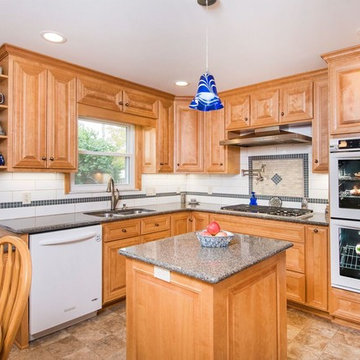
It’s always difficult to add new rooms into existing footprint without expanding out or up and not incurring any opportunity cost. In this case, that was exactly what we had to do. Item one and two above had to be tackled as one. We went ahead and switched out the location of the dining room and eliminating an area where there was a “nook” type eat-in area. By doing so, we were able to cut right into that footprint and change the layout of the kitchen.
That one move allowed us to dig into the kitchen design because it was now the main focal point in the apartment. It was no longer an option to keep it in that tiny hole where it was, so we had to ensure that this design was functional and aesthetically pleasing at the same time. By adding the table into the space where an Island typically would go, we were able to both cut cost and still provide a dining experience. The Table serves as an Island as well when cooking.
We then proceeded to block in the existing doorway to the dining room. By doing this, we were able to create a full room which allowed us to put a door on the other side and called that room Bedroom #2. This was easier to do because all of the mechanicals were already in that space (light, heater and windows). By shifting things around, we also achieved a huge wall to wall closet from inside. PERFECT!
Then we moved into the Single bedroom. We thought it was a big room with a small closet, so by creatively adding an L shaped wall and steal some footprint into the bedroom side, we were able to put a door on that new room and design it for the walk-in closet. Even after this, the bedroom still holds a queen size bed with 2 night stands, a TV on the wall, a sitting chair and plenty of room to walk around. This was done by rethinking the location for the bed and night stands.
The bathroom was gutted to make sure there was no leaks and rebuild from the ground up. We kept all of the plumbing where it was, added a new vanity, medicine cabinet, tiles and lighting and it was done.
From there, the rest of the unit had new flooring all throughout, paint, and lighting. After completion and walk through, this project was handed over back to the clients.
Execution and collaboration between all the trades were: Reggie and his team from Premier Interiors and Rohan from RD Mechanical Services.
p.s. Please see our website to see the video.

 Cutuli Homes
After a devastating fire destroyed this Woodinville, Washington home, the homeowners faced the unimaginable task of rebuilding their lives and their house from the ground up. Thankfully, no one was hurt, but the home itself could not be saved.
Cutuli Homes had the privilege of walking alongside the homeowners through the rebuilding process—helping transform a heartbreaking loss into an opportunity to create a completely new home designed for the way they wanted to live today.
Rather than simply recreate the dated house that had been lost, the homeowners chose to move forward. Working closely together, we created a home that feels modern, elegant, warm and distinctly Pacific Northwest—a place that acknowledges what came before while giving the family something beautiful to come home to again.
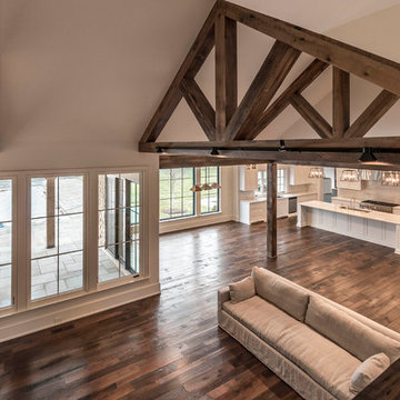
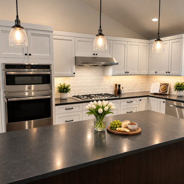
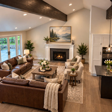
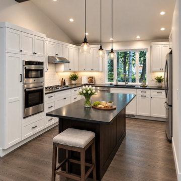
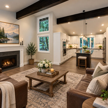
The new open-concept kitchen and family room became the heart of the rebuilt home. A dramatic vaulted ceiling with dark-stained wood beams brings warmth and architectural definition to the light-filled space. The kitchen combines crisp white custom cabinetry, black accents, stainless-steel appliances, dark countertops, a generous contrasting island and contemporary pendant lighting. Large windows bring the surrounding Woodinville landscape into the home and fill the kitchen with natural light.
The adjoining family room continues the home's understated Northwest aesthetic. A beautifully detailed fireplace creates a natural focal point, while the vaulted ceiling and exposed beams give the room a sense of scale without sacrificing warmth. The open relationship between the kitchen and living spaces was designed for everyday family life as well as entertaining.
The bathrooms were given the same careful attention to craftsmanship and materials. Custom shaker-style cabinetry, stone countertops, patterned tile, soft gray finishes, oversized mirrors, black hardware and beautifully tiled tub and shower surrounds create spaces that feel sophisticated yet comfortable. Clean lines and a restrained palette give the bathrooms a quiet, spa-like quality that complements the rest of the home.
Throughout the rebuilding process, our goal went far beyond constructing a new house. Losing a home to fire is deeply personal, and rebuilding requires countless decisions at a time when homeowners are already navigating an extraordinarily difficult experience. Cutuli Homes worked closely with the family throughout the process, helping guide the construction and turn their ideas for a fresh beginning into a home that could once again feel like theirs.
The finished residence is not simply a replacement for what was lost. It represents a new chapter: a dated home transformed into a thoughtfully designed custom residence filled with light, craftsmanship and warmth.
From ashes came an opportunity to create something beautiful—and, we hope, a little joy after tragedy.
For more than 30 years, Cutuli Homes has built and remodeled custom homes throughout Woodinville, Seattle, the Eastside, King County, Snohomish County and the greater Puget Sound region, specializing in highly personalized residential construction, major renovations and custom craftsmanship.
 Cutuli Homes
After a devastating fire destroyed this Woodinville, Washington home, the homeowners faced the unimaginable task of rebuilding their lives and their house from the ground up. Thankfully, no one was hurt, but the home itself could not be saved.
Cutuli Homes had the privilege of walking alongside the homeowners through the rebuilding process—helping transform a heartbreaking loss into an opportunity to create a completely new home designed for the way they wanted to live today.
Rather than simply recreate the dated house that had been lost, the homeowners chose to move forward. Working closely together, we created a home that feels modern, elegant, warm and distinctly Pacific Northwest—a place that acknowledges what came before while giving the family something beautiful to come home to again.
The new open-concept kitchen and family room became the heart of the rebuilt home. A dramatic vaulted ceiling with dark-stained wood beams brings warmth and architectural definition to the light-filled space. The kitchen combines crisp white custom cabinetry, black accents, stainless-steel appliances, dark countertops, a generous contrasting island and contemporary pendant lighting. Large windows bring the surrounding Woodinville landscape into the home and fill the kitchen with natural light.
The adjoining family room continues the home's understated Northwest aesthetic. A beautifully detailed fireplace creates a natural focal point, while the vaulted ceiling and exposed beams give the room a sense of scale without sacrificing warmth. The open relationship between the kitchen and living spaces was designed for everyday family life as well as entertaining.
The bathrooms were given the same careful attention to craftsmanship and materials. Custom shaker-style cabinetry, stone countertops, patterned tile, soft gray finishes, oversized mirrors, black hardware and beautifully tiled tub and shower surrounds create spaces that feel sophisticated yet comfortable. Clean lines and a restrained palette give the bathrooms a quiet, spa-like quality that complements the rest of the home.
Throughout the rebuilding process, our goal went far beyond constructing a new house. Losing a home to fire is deeply personal, and rebuilding requires countless decisions at a time when homeowners are already navigating an extraordinarily difficult experience. Cutuli Homes worked closely with the family throughout the process, helping guide the construction and turn their ideas for a fresh beginning into a home that could once again feel like theirs.
The finished residence is not simply a replacement for what was lost. It represents a new chapter: a dated home transformed into a thoughtfully designed custom residence filled with light, craftsmanship and warmth.
From ashes came an opportunity to create something beautiful—and, we hope, a little joy after tragedy.
For more than 30 years, Cutuli Homes has built and remodeled custom homes throughout Woodinville, Seattle, the Eastside, King County, Snohomish County and the greater Puget Sound region, specializing in highly personalized residential construction, major renovations and custom craftsmanship.
 Cutuli Homes
After a devastating fire destroyed this Woodinville, Washington home, the homeowners faced the unimaginable task of rebuilding their lives and their house from the ground up. Thankfully, no one was hurt, but the home itself could not be saved.
Cutuli Homes had the privilege of walking alongside the homeowners through the rebuilding process—helping transform a heartbreaking loss into an opportunity to create a completely new home designed for the way they wanted to live today.
Rather than simply recreate the dated house that had been lost, the homeowners chose to move forward. Working closely together, we created a home that feels modern, elegant, warm and distinctly Pacific Northwest—a place that acknowledges what came before while giving the family something beautiful to come home to again.
The new open-concept kitchen and family room became the heart of the rebuilt home. A dramatic vaulted ceiling with dark-stained wood beams brings warmth and architectural definition to the light-filled space. The kitchen combines crisp white custom cabinetry, black accents, stainless-steel appliances, dark countertops, a generous contrasting island and contemporary pendant lighting. Large windows bring the surrounding Woodinville landscape into the home and fill the kitchen with natural light.
The adjoining family room continues the home's understated Northwest aesthetic. A beautifully detailed fireplace creates a natural focal point, while the vaulted ceiling and exposed beams give the room a sense of scale without sacrificing warmth. The open relationship between the kitchen and living spaces was designed for everyday family life as well as entertaining.
The bathrooms were given the same careful attention to craftsmanship and materials. Custom shaker-style cabinetry, stone countertops, patterned tile, soft gray finishes, oversized mirrors, black hardware and beautifully tiled tub and shower surrounds create spaces that feel sophisticated yet comfortable. Clean lines and a restrained palette give the bathrooms a quiet, spa-like quality that complements the rest of the home.
Throughout the rebuilding process, our goal went far beyond constructing a new house. Losing a home to fire is deeply personal, and rebuilding requires countless decisions at a time when homeowners are already navigating an extraordinarily difficult experience. Cutuli Homes worked closely with the family throughout the process, helping guide the construction and turn their ideas for a fresh beginning into a home that could once again feel like theirs.
The finished residence is not simply a replacement for what was lost. It represents a new chapter: a dated home transformed into a thoughtfully designed custom residence filled with light, craftsmanship and warmth.
From ashes came an opportunity to create something beautiful—and, we hope, a little joy after tragedy.
For more than 30 years, Cutuli Homes has built and remodeled custom homes throughout Woodinville, Seattle, the Eastside, King County, Snohomish County and the greater Puget Sound region, specializing in highly personalized residential construction, major renovations and custom craftsmanship.
 Cutuli Homes
After a devastating fire destroyed this Woodinville, Washington home, the homeowners faced the unimaginable task of rebuilding their lives and their house from the ground up. Thankfully, no one was hurt, but the home itself could not be saved.
Cutuli Homes had the privilege of walking alongside the homeowners through the rebuilding process—helping transform a heartbreaking loss into an opportunity to create a completely new home designed for the way they wanted to live today.
Rather than simply recreate the dated house that had been lost, the homeowners chose to move forward. Working closely together, we created a home that feels modern, elegant, warm and distinctly Pacific Northwest—a place that acknowledges what came before while giving the family something beautiful to come home to again.
The new open-concept kitchen and family room became the heart of the rebuilt home. A dramatic vaulted ceiling with dark-stained wood beams brings warmth and architectural definition to the light-filled space. The kitchen combines crisp white custom cabinetry, black accents, stainless-steel appliances, dark countertops, a generous contrasting island and contemporary pendant lighting. Large windows bring the surrounding Woodinville landscape into the home and fill the kitchen with natural light.
The adjoining family room continues the home's understated Northwest aesthetic. A beautifully detailed fireplace creates a natural focal point, while the vaulted ceiling and exposed beams give the room a sense of scale without sacrificing warmth. The open relationship between the kitchen and living spaces was designed for everyday family life as well as entertaining.
The bathrooms were given the same careful attention to craftsmanship and materials. Custom shaker-style cabinetry, stone countertops, patterned tile, soft gray finishes, oversized mirrors, black hardware and beautifully tiled tub and shower surrounds create spaces that feel sophisticated yet comfortable. Clean lines and a restrained palette give the bathrooms a quiet, spa-like quality that complements the rest of the home.
Throughout the rebuilding process, our goal went far beyond constructing a new house. Losing a home to fire is deeply personal, and rebuilding requires countless decisions at a time when homeowners are already navigating an extraordinarily difficult experience. Cutuli Homes worked closely with the family throughout the process, helping guide the construction and turn their ideas for a fresh beginning into a home that could once again feel like theirs.
The finished residence is not simply a replacement for what was lost. It represents a new chapter: a dated home transformed into a thoughtfully designed custom residence filled with light, craftsmanship and warmth.
From ashes came an opportunity to create something beautiful—and, we hope, a little joy after tragedy.
For more than 30 years, Cutuli Homes has built and remodeled custom homes throughout Woodinville, Seattle, the Eastside, King County, Snohomish County and the greater Puget Sound region, specializing in highly personalized residential construction, major renovations and custom craftsmanship.

 RAJ Kitchen and Bath, LLC
“Full apartment design”.
IF you have not yet seen this apartment conversion before, we strongly urge you to go to the bottom left of this page and click on the short 2-minutes video. It would put a lot of things into perspective when you come back and continue reading this.
It is true we were literally handed the keys and told a list of things that they wanted to have happen and we were to go into the apartment, look at the space and come up with a design that would satisfy all of that need. UNTIL we showed up! The unit had really seen some better days but we knew we had to look past that and come up with a concept that would work for them.
The immediate challenges were centered around 3 big ideas:
1. Adding a second bedroom to the already small footprint
2. Figuring out a way to make the kitchen bigger, better and brighter
3. Creating a master room walk in closet
It’s always difficult to add new rooms into existing footprint without expanding out or up and not incurring any opportunity cost. In this case, that was exactly what we had to do. Item one and two above had to be tackled as one. We went ahead and switched out the location of the dining room and eliminating an area where there was a “nook” type eat-in area. By doing so, we were able to cut right into that footprint and change the layout of the kitchen.
That one move allowed us to dig into the kitchen design because it was now the main focal point in the apartment. It was no longer an option to keep it in that tiny hole where it was, so we had to ensure that this design was functional and aesthetically pleasing at the same time. By adding the table into the space where an Island typically would go, we were able to both cut cost and still provide a dining experience. The Table serves as an Island as well when cooking.
We then proceeded to block in the existing doorway to the dining room. By doing this, we were able to create a full room which allowed us to put a door on the other side and called that room Bedroom #2. This was easier to do because all of the mechanicals were already in that space (light, heater and windows). By shifting things around, we also achieved a huge wall to wall closet from inside. PERFECT!
Then we moved into the Single bedroom. We thought it was a big room with a small closet, so by creatively adding an L shaped wall and steal some footprint into the bedroom side, we were able to put a door on that new room and design it for the walk-in closet. Even after this, the bedroom still holds a queen size bed with 2 night stands, a TV on the wall, a sitting chair and plenty of room to walk around. This was done by rethinking the location for the bed and night stands.
The bathroom was gutted to make sure there was no leaks and rebuild from the ground up. We kept all of the plumbing where it was, added a new vanity, medicine cabinet, tiles and lighting and it was done.
From there, the rest of the unit had new flooring all throughout, paint, and lighting. After completion and walk through, this project was handed over back to the clients.
Execution and collaboration between all the trades were: Reggie and his team from Premier Interiors and Rohan from RD Mechanical Services.
p.s. Please see our website to see the video.
 RAJ Kitchen and Bath, LLC
“Full apartment design”.
IF you have not yet seen this apartment conversion before, we strongly urge you to go to the bottom left of this page and click on the short 2-minutes video. It would put a lot of things into perspective when you come back and continue reading this.
It is true we were literally handed the keys and told a list of things that they wanted to have happen and we were to go into the apartment, look at the space and come up with a design that would satisfy all of that need. UNTIL we showed up! The unit had really seen some better days but we knew we had to look past that and come up with a concept that would work for them.
The immediate challenges were centered around 3 big ideas:
1. Adding a second bedroom to the already small footprint
2. Figuring out a way to make the kitchen bigger, better and brighter
3. Creating a master room walk in closet
It’s always difficult to add new rooms into existing footprint without expanding out or up and not incurring any opportunity cost. In this case, that was exactly what we had to do. Item one and two above had to be tackled as one. We went ahead and switched out the location of the dining room and eliminating an area where there was a “nook” type eat-in area. By doing so, we were able to cut right into that footprint and change the layout of the kitchen.
That one move allowed us to dig into the kitchen design because it was now the main focal point in the apartment. It was no longer an option to keep it in that tiny hole where it was, so we had to ensure that this design was functional and aesthetically pleasing at the same time. By adding the table into the space where an Island typically would go, we were able to both cut cost and still provide a dining experience. The Table serves as an Island as well when cooking.
We then proceeded to block in the existing doorway to the dining room. By doing this, we were able to create a full room which allowed us to put a door on the other side and called that room Bedroom #2. This was easier to do because all of the mechanicals were already in that space (light, heater and windows). By shifting things around, we also achieved a huge wall to wall closet from inside. PERFECT!
Then we moved into the Single bedroom. We thought it was a big room with a small closet, so by creatively adding an L shaped wall and steal some footprint into the bedroom side, we were able to put a door on that new room and design it for the walk-in closet. Even after this, the bedroom still holds a queen size bed with 2 night stands, a TV on the wall, a sitting chair and plenty of room to walk around. This was done by rethinking the location for the bed and night stands.
The bathroom was gutted to make sure there was no leaks and rebuild from the ground up. We kept all of the plumbing where it was, added a new vanity, medicine cabinet, tiles and lighting and it was done.
From there, the rest of the unit had new flooring all throughout, paint, and lighting. After completion and walk through, this project was handed over back to the clients.
Execution and collaboration between all the trades were: Reggie and his team from Premier Interiors and Rohan from RD Mechanical Services.
p.s. Please see our website to see the video.
 RAJ Kitchen and Bath, LLC
“Full apartment design”.
IF you have not yet seen this apartment conversion before, we strongly urge you to go to the bottom left of this page and click on the short 2-minutes video. It would put a lot of things into perspective when you come back and continue reading this.
It is true we were literally handed the keys and told a list of things that they wanted to have happen and we were to go into the apartment, look at the space and come up with a design that would satisfy all of that need. UNTIL we showed up! The unit had really seen some better days but we knew we had to look past that and come up with a concept that would work for them.
The immediate challenges were centered around 3 big ideas:
1. Adding a second bedroom to the already small footprint
2. Figuring out a way to make the kitchen bigger, better and brighter
3. Creating a master room walk in closet
It’s always difficult to add new rooms into existing footprint without expanding out or up and not incurring any opportunity cost. In this case, that was exactly what we had to do. Item one and two above had to be tackled as one. We went ahead and switched out the location of the dining room and eliminating an area where there was a “nook” type eat-in area. By doing so, we were able to cut right into that footprint and change the layout of the kitchen.
That one move allowed us to dig into the kitchen design because it was now the main focal point in the apartment. It was no longer an option to keep it in that tiny hole where it was, so we had to ensure that this design was functional and aesthetically pleasing at the same time. By adding the table into the space where an Island typically would go, we were able to both cut cost and still provide a dining experience. The Table serves as an Island as well when cooking.
We then proceeded to block in the existing doorway to the dining room. By doing this, we were able to create a full room which allowed us to put a door on the other side and called that room Bedroom #2. This was easier to do because all of the mechanicals were already in that space (light, heater and windows). By shifting things around, we also achieved a huge wall to wall closet from inside. PERFECT!
Then we moved into the Single bedroom. We thought it was a big room with a small closet, so by creatively adding an L shaped wall and steal some footprint into the bedroom side, we were able to put a door on that new room and design it for the walk-in closet. Even after this, the bedroom still holds a queen size bed with 2 night stands, a TV on the wall, a sitting chair and plenty of room to walk around. This was done by rethinking the location for the bed and night stands.
The bathroom was gutted to make sure there was no leaks and rebuild from the ground up. We kept all of the plumbing where it was, added a new vanity, medicine cabinet, tiles and lighting and it was done.
From there, the rest of the unit had new flooring all throughout, paint, and lighting. After completion and walk through, this project was handed over back to the clients.
Execution and collaboration between all the trades were: Reggie and his team from Premier Interiors and Rohan from RD Mechanical Services.
p.s. Please see our website to see the video.
23