
Search results for "Difficult list">difficult" in Home Design Ideas
 RAJ Kitchen and Bath, LLC
**Check out the video of this transformation on our website**
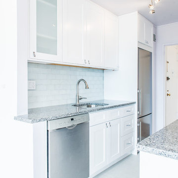
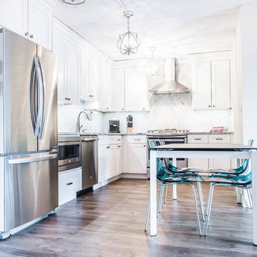
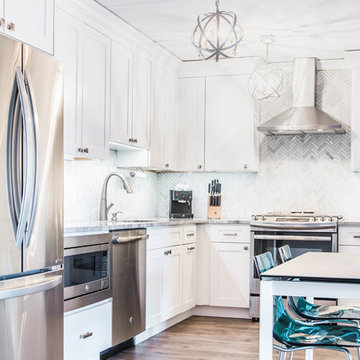
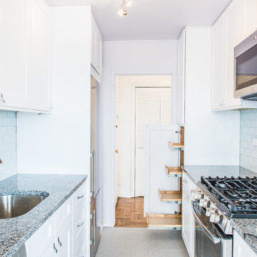
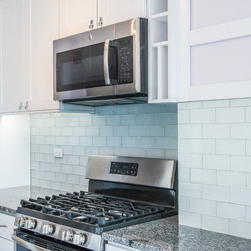
This small kitchen was way too small for this 2 bedrooms, 2 bathrooms apartment. Not only was it a very small kitchen, but the physical location of it made it very difficult to make it any bigger. There wasn't much that could have been done without incurring astronomical cost, which would get little or no return on the investment. The client wanted a kitchen that can be optimized in its current location to add a ton of value for resale.
This was difficult to do, because there was no moving of any mechanical around in the kitchen and even if we wanted to, the management of the building would not allow. For those of you who live in condos, co-ops or apartment building, you know how difficult it is to rework these foot prints. When we showed up, we saw the problems, but we also saw a huge opportunity where we can achieve those goals in the small space. This was accomplished by making some key changes and to incorporate some new things that was not possible when this kitchen was built years ago.
The crucial part of the design that would drive the entire new layout, was selecting the only appliance; that was the Refrigerator. Once we nailed down that refrigerator, we then proceeded to design the kitchen around it. We moved it to the other side of the wall where the sink was so that we can tap into the water line from the sink plumbing. It was crucial that it stays exactly 24" deep, not an inch more because we had to keep the entry as open as possible. Also, it was going to be directly in front of another big storage unit - The pantry. It is not ideal in most cases, but we needed the rest of the space to ramp up the design and open feel towards the side where all of the activities would take place, which happend to be the dining room and the view.
Once all that was figured out, we re-positioned the sink, dishwasher and the range and proceeded to wrap the cabinets around the columns to integrate them into the space. Thirty- six inches cabinets height was used so that they can be installed higher towards the ceiling height to give more room rather than the standard 18" required height between the counter tops. This was done to make the room feel a lot bigger than it really was. Not to mention, we also didn't want the faucet to be buried under the cabinets so that was also a necessary design detail for the space.
We then lowered both knee walls so that the counter top can sit on top of them, by removing that stop point that would have otherwise defined the kitchen area. This allowed us to pick up that extra footprint into the room for added prep space and enabled us to create the illusion of a kitchen that is looking longer than it really is. Every inch mattered when designing this kitchen and we made a conscious decision to use every one of that inch.
White cabinets were selected to do just what white cabinets are design to do; make a small or dark room appear bigger, brighter and more open. In this kitchen, this was amplified the more because of the kitchen location. It was perfect! We knew we did justice to the space because while we were there taking some photos, a few potential buyers walked in and went straight for the kitchen! They said its design just to fit the apartment.
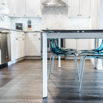
Pantry roll out shelving, Double recycle bin, fancy handles, LED lighting, Quartz counter top, beautiful backslash tiles and grey linen floors finished off the kitchen which looked over a beautiful view of the George Washington Bridge from the top of this lovely 4th floor apartment.
Credit to Masterpiece Tile and Marble (Annmarie on the selection of Tiles and countertop and Val on the Construction to complete this project).
Davor Kokic Photography
 Pennsylvania Landscape & Nursery Association
Keeping It Green http://keepingitgreenoutdoors.com
2014 PLNA Awards for Landscape Excellence Winner
Category: Residential $0-$15,000
Award Level: Honorable Mention
Project Description:
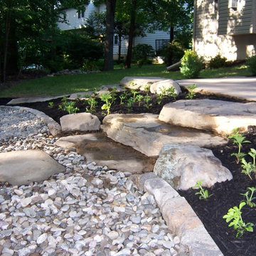
The objective of this project was to match the surrounding natural woodland setting with the new landscaping and outdoor area. The homeowners enjoy being outside and wanted an extension of their house that they could enjoy with family and friends. After returning from vacations in their cabin, they wanted to re-create the same feeling at their home. To complete their new cabin feel they wanted somewhere to have a camp fire with good company. I wanted to create flow from each area, and maximize space in a very limited area. The overall look of the project needed to blend with the natural environment and appear as though is has been there for years. The clients were very open minded and great to work with through the design process and we were able to achieve everything we needed while working with budgets and preferences.
The area was shaded with very poor drainage, which created a unusable space full of mud. The wet area made an already tight area with difficult access more challenging. It was also important to place the fire-pit at a safe distance from the house, and the tree canopy. The area was regarded to allow for better drainage and the downspouts were buried. A decorative river stone was selected to aide with drainage.
All plant material needed to be shade tolerant and provide color. As a result, I chose plants with terrific foliage color, and texture; Aucuba, Heuchera, Athyrium and Hosta. The construction materials to build the steps, walls and fire-pit needed to be a stone that would match the existing stone and environment. For this I chose PA flagstone and fieldstone of varying sizes for interest and to create a more natural look.
This project is special because of the limited space that needed to have its potential discovered and created. With the strong wooded environment the new outdoor area had to blend into that while working with the house and existing concrete patio. We exceeded our clients expectations by creating a new area that looked like it had been there forever.
Plant List:
5 Astilbe chinensis ‘Vision in Pink’
6 Heuchera x villosa ‘Citronella’
6 Hosta x ‘Sum and Substance’
2 Hydrangea macrophylla ‘Endless Summer
5 Buxus x ‘Green Velvet’
1 Leucothoe fontsiana ‘Rainbow’
4 Rhododendron ‘PJM’
2 Chamaecyparis obtusa ‘Aurea Nana’
1 Aucuba japonica ‘Variegata’
3 Athyrium filix-femina
24 Pachysandra terminalis
16 Torenia fournieri
Photo Credit:
Keeping It Green
 Truitt and White Window and Door Showroom
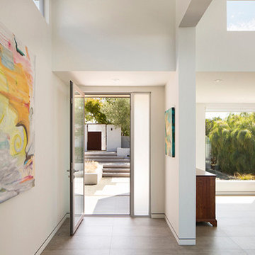
This hillside home in Piedmont, CA was remodeled to change the style from a 1940's rancher with eight foot ceilings and dark interiors, into a modern geometric composition with vast white interiors for casual living and generous daylighting for displaying the artist-owner's works.
In a city known for rigorous and difficult design review, an addition, two variances, and a full stylistic change were unanimously approved on the first round. All sloped roofs and attics were eliminated and replaced by a series of stacked and overlapping flat roofs. This made the house taller on the inside and shorter on the outside, which helped earn design review cooperation in the community. Windows were concentrated toward the rear yard views or moved up high on the side walls for daylight and privacy, benefitting the owners as well as the neighbors.
At the start, the owner husband was so enthusiastic and engaged in transforming his house into something modern that he presented the architect with a scaled foamcore model, rather than the usual magazine clippings and wish list. He participated in the design decisions throughout the process. The owner wife is the artist who did all the artwork in the house. She had been craving a display space with large walls and good natural light. Both of them loved the location and great views.
The project was an opportunity to transform the style of an older traditional home into a modern one, while solving numerous problems. By rebuilding the 1800 ft2 top of the 3-story home it was possible to change the style of the whole building, since the lower floors were a neutral base, and also to change the lifestyle of the owners, who wanted to move their master suite upstairs and live primarily on the top floor as empty nesters.
Going into the project, the architect knew there were multiple encroachments into the setbacks and potential privacy issues with close by neighbors. He approached this as a complex puzzle made up of architectural and political pieces which all had to fit together elegantly. It took many careful moves, small and large, to arrive at a serene and cohesive result that tied old and new together seamlessly.
The design-build contractor worked closely with the owners and handled all of the construction phase documents and design adjustments, adding ideas of their own to make the project really sing.
The project was a collaboration in three acts. The owner had a strong design concept from the start. The architect developed it into a realistic project and garnered the design approvals. Then the contractor executed brilliantly
Find the right local pro for your project
 RAJ Kitchen and Bath, LLC
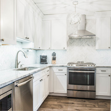
 “Full apartment design”.
IF you have not yet seen this apartment conversion before, we strongly urge you to go to the bottom left of this page and click on the short 2-minutes video. It would put a lot of things into perspective when you come back and continue reading this.
It is true we were literally handed the keys and told a list of things that they wanted to have happen and we were to go into the apartment, look at the space and come up with a design that would satisfy all of that need. UNTIL we showed up! The unit had really seen some better days but we knew we had to look past that and come up with a concept that would work for them.
The immediate challenges were centered around 3 big ideas:
1. Adding a second bedroom to the already small footprint
2. Figuring out a way to make the kitchen bigger, better and brighter
3. Creating a master room walk in closet
It’s always difficult to add new rooms into existing footprint without expanding out or up and not incurring any opportunity cost. In this case, that was exactly what we had to do. Item one and two above had to be tackled as one. We went ahead and switched out the location of the dining room and eliminating an area where there was a “nook” type eat-in area. By doing so, we were able to cut right into that footprint and change the layout of the kitchen.
That one move allowed us to dig into the kitchen design because it was now the main focal point in the apartment. It was no longer an option to keep it in that tiny hole where it was, so we had to ensure that this design was functional and aesthetically pleasing at the same time. By adding the table into the space where an Island typically would go, we were able to both cut cost and still provide a dining experience. The Table serves as an Island as well when cooking.
We then proceeded to block in the existing doorway to the dining room. By doing this, we were able to create a full room which allowed us to put a door on the other side and called that room Bedroom #2. This was easier to do because all of the mechanicals were already in that space (light, heater and windows). By shifting things around, we also achieved a huge wall to wall closet from inside. PERFECT!
Then we moved into the Single bedroom. We thought it was a big room with a small closet, so by creatively adding an L shaped wall and steal some footprint into the bedroom side, we were able to put a door on that new room and design it for the walk-in closet. Even after this, the bedroom still holds a queen size bed with 2 night stands, a TV on the wall, a sitting chair and plenty of room to walk around. This was done by rethinking the location for the bed and night stands.
The bathroom was gutted to make sure there was no leaks and rebuild from the ground up. We kept all of the plumbing where it was, added a new vanity, medicine cabinet, tiles and lighting and it was done.
From there, the rest of the unit had new flooring all throughout, paint, and lighting. After completion and walk through, this project was handed over back to the clients.
Execution and collaboration between all the trades were: Reggie and his team from Premier Interiors and Rohan from RD Mechanical Services.
p.s. Please see our website to see the video.
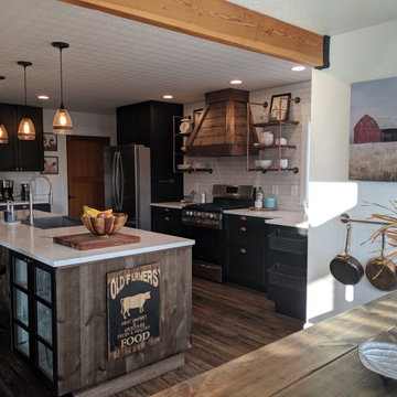
 INSPIRED KITCHEN DESIGN
While Teresa did countless hours of research on design Web sites such as Pinterest, she also wanted to get the kitchen done quickly.
That meant taking some risks, she says.
“I wanted to renovate the kitchen immediately after moving into the new house. This required me to take measurements, pictures and video all in one visit. So, my measurements were a little off,” she explains. Luckily IKD’s design team provided her with a detailed inventory list [as part of its design process and helped out with specific custom looks, she notes.
“With IKD’s design guidance I actually over ordered versus under ordered and simply had to return a few cabinets and pieces [rather than make a return trip to IKEA],” she concludes.
With her project now complete, Teresa says she is ready to move onto greener pastures.
But first, there are some specific tips she wanted to share for any future IKEA kitchen remodeler.
“I would say to do your research, and remember that no detail is too small. Also, be sure to visit an IKEA no matter where you live at least once to be able to see the kitchens in person. And, definitely use IKD but be sure to have a clear kitchen idea to convey!” she says.
With that said, Teresa was able to complete her IKEA kitchen in a timely manner and in a budget friendly way as well.
“I would say our budget was mid-level [for this project]. Since we did most of the work ourselves we saved a ton of money. We really have a glowing pride in accomplishing this project and it turned out to be not as difficult as we thought!” she concludes.
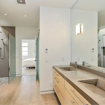 Truitt and White Window and Door Showroom
This hillside home in Piedmont, CA was remodeled to change the style from a 1940's rancher with eight foot ceilings and dark interiors, into a modern geometric composition with vast white interiors for casual living and generous daylighting for displaying the artist-owner's works.
In a city known for rigorous and difficult design review, an addition, two variances, and a full stylistic change were unanimously approved on the first round. All sloped roofs and attics were eliminated and replaced by a series of stacked and overlapping flat roofs. This made the house taller on the inside and shorter on the outside, which helped earn design review cooperation in the community. Windows were concentrated toward the rear yard views or moved up high on the side walls for daylight and privacy, benefitting the owners as well as the neighbors.
At the start, the owner husband was so enthusiastic and engaged in transforming his house into something modern that he presented the architect with a scaled foamcore model, rather than the usual magazine clippings and wish list. He participated in the design decisions throughout the process. The owner wife is the artist who did all the artwork in the house. She had been craving a display space with large walls and good natural light. Both of them loved the location and great views.
The project was an opportunity to transform the style of an older traditional home into a modern one, while solving numerous problems. By rebuilding the 1800 ft2 top of the 3-story home it was possible to change the style of the whole building, since the lower floors were a neutral base, and also to change the lifestyle of the owners, who wanted to move their master suite upstairs and live primarily on the top floor as empty nesters.
Going into the project, the architect knew there were multiple encroachments into the setbacks and potential privacy issues with close by neighbors. He approached this as a complex puzzle made up of architectural and political pieces which all had to fit together elegantly. It took many careful moves, small and large, to arrive at a serene and cohesive result that tied old and new together seamlessly.
The design-build contractor worked closely with the owners and handled all of the construction phase documents and design adjustments, adding ideas of their own to make the project really sing.
The project was a collaboration in three acts. The owner had a strong design concept from the start. The architect developed it into a realistic project and garnered the design approvals. Then the contractor executed brilliantly
 Showhomes Jacksonville
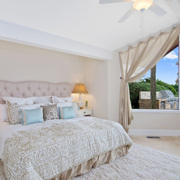
This Beachfront home is one of our most prized staging jobs. The home itself was an older Atlantic Beach home that had some very difficult flow patterns and room definitions. We Brought it to life and loved the outcome! What a change it makes when you choose the right stager and designer to come in and get your listing ready for its next buyers. Call or visit our website today!
Office: 904-273-7890
Mobile: 904-874-9944 (Jared Biby)
www.showhomesjacksonville.com
Instagram @Showhomes_JAX_Staging_Design


 Showhomes Jacksonville
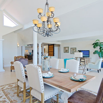
This Beachfront home is one of our most prized staging jobs. The home itself was an older Atlantic Beach home that had some very difficult flow patterns and room definitions. We Brought it to life and loved the outcome! What a change it makes when you choose the right stager and designer to come in and get your listing ready for its next buyers. Call or visit our website today!
Office: 904-273-7890
Mobile: 904-874-9944 (Jared Biby)
www.showhomesjacksonville.com
Instagram @Showhomes_JAX_Staging_Design
 RAJ Kitchen and Bath, LLC
 “Full apartment design”.
IF you have not yet seen this apartment conversion before, we strongly urge you to go to the bottom left of this page and click on the short 2-minutes video. It would put a lot of things into perspective when you come back and continue reading this.
It is true we were literally handed the keys and told a list of things that they wanted to have happen and we were to go into the apartment, look at the space and come up with a design that would satisfy all of that need. UNTIL we showed up! The unit had really seen some better days but we knew we had to look past that and come up with a concept that would work for them.
The immediate challenges were centered around 3 big ideas:
1. Adding a second bedroom to the already small footprint
2. Figuring out a way to make the kitchen bigger, better and brighter
3. Creating a master room walk in closet
It’s always difficult to add new rooms into existing footprint without expanding out or up and not incurring any opportunity cost. In this case, that was exactly what we had to do. Item one and two above had to be tackled as one. We went ahead and switched out the location of the dining room and eliminating an area where there was a “nook” type eat-in area. By doing so, we were able to cut right into that footprint and change the layout of the kitchen.
That one move allowed us to dig into the kitchen design because it was now the main focal point in the apartment. It was no longer an option to keep it in that tiny hole where it was, so we had to ensure that this design was functional and aesthetically pleasing at the same time. By adding the table into the space where an Island typically would go, we were able to both cut cost and still provide a dining experience. The Table serves as an Island as well when cooking.
We then proceeded to block in the existing doorway to the dining room. By doing this, we were able to create a full room which allowed us to put a door on the other side and called that room Bedroom #2. This was easier to do because all of the mechanicals were already in that space (light, heater and windows). By shifting things around, we also achieved a huge wall to wall closet from inside. PERFECT!
Then we moved into the Single bedroom. We thought it was a big room with a small closet, so by creatively adding an L shaped wall and steal some footprint into the bedroom side, we were able to put a door on that new room and design it for the walk-in closet. Even after this, the bedroom still holds a queen size bed with 2 night stands, a TV on the wall, a sitting chair and plenty of room to walk around. This was done by rethinking the location for the bed and night stands.
The bathroom was gutted to make sure there was no leaks and rebuild from the ground up. We kept all of the plumbing where it was, added a new vanity, medicine cabinet, tiles and lighting and it was done.
From there, the rest of the unit had new flooring all throughout, paint, and lighting. After completion and walk through, this project was handed over back to the clients.
Execution and collaboration between all the trades were: Reggie and his team from Premier Interiors and Rohan from RD Mechanical Services.
p.s. Please see our website to see the video.
 RAJ Kitchen and Bath, LLC
 “Full apartment design”.
IF you have not yet seen this apartment conversion before, we strongly urge you to go to the bottom left of this page and click on the short 2-minutes video. It would put a lot of things into perspective when you come back and continue reading this.
It is true we were literally handed the keys and told a list of things that they wanted to have happen and we were to go into the apartment, look at the space and come up with a design that would satisfy all of that need. UNTIL we showed up! The unit had really seen some better days but we knew we had to look past that and come up with a concept that would work for them.
The immediate challenges were centered around 3 big ideas:
1. Adding a second bedroom to the already small footprint
2. Figuring out a way to make the kitchen bigger, better and brighter
3. Creating a master room walk in closet
It’s always difficult to add new rooms into existing footprint without expanding out or up and not incurring any opportunity cost. In this case, that was exactly what we had to do. Item one and two above had to be tackled as one. We went ahead and switched out the location of the dining room and eliminating an area where there was a “nook” type eat-in area. By doing so, we were able to cut right into that footprint and change the layout of the kitchen.
That one move allowed us to dig into the kitchen design because it was now the main focal point in the apartment. It was no longer an option to keep it in that tiny hole where it was, so we had to ensure that this design was functional and aesthetically pleasing at the same time. By adding the table into the space where an Island typically would go, we were able to both cut cost and still provide a dining experience. The Table serves as an Island as well when cooking.
We then proceeded to block in the existing doorway to the dining room. By doing this, we were able to create a full room which allowed us to put a door on the other side and called that room Bedroom #2. This was easier to do because all of the mechanicals were already in that space (light, heater and windows). By shifting things around, we also achieved a huge wall to wall closet from inside. PERFECT!
Then we moved into the Single bedroom. We thought it was a big room with a small closet, so by creatively adding an L shaped wall and steal some footprint into the bedroom side, we were able to put a door on that new room and design it for the walk-in closet. Even after this, the bedroom still holds a queen size bed with 2 night stands, a TV on the wall, a sitting chair and plenty of room to walk around. This was done by rethinking the location for the bed and night stands.
The bathroom was gutted to make sure there was no leaks and rebuild from the ground up. We kept all of the plumbing where it was, added a new vanity, medicine cabinet, tiles and lighting and it was done.
From there, the rest of the unit had new flooring all throughout, paint, and lighting. After completion and walk through, this project was handed over back to the clients.
Execution and collaboration between all the trades were: Reggie and his team from Premier Interiors and Rohan from RD Mechanical Services.
p.s. Please see our website to see the video.
 Stearns Design Build
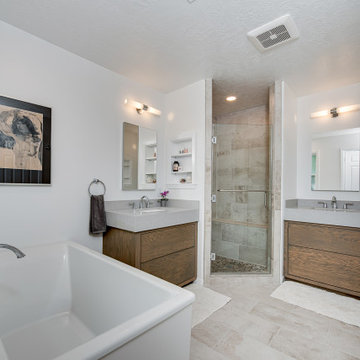
Before the remodel, this bathroom was not functional at all! It was a large space that felt very crowded, so our intention was to increase the size and maximize the space. Everything in this bathroom was cramped together and let’s not forget the awful phonebooth shower. (fingers crossed phonebooth showers stay in the past!) Collectively, we set out to re-envision a bathroom that is functional and relaxing.
In most cases, it’s difficult to accomplish everything on your wish list. By splitting up the double sinks and putting the shower in between the two, it made maneuvering around this bathroom much easier. Before this bathroom had a ton of wasted space and while it was a challenge; we were thrilled with the final design and outcome.
 European Home
Everywhere we look, we’re surrounded by structures and designs that captivate and draw us in, allowing us to truly appreciate the art of modern architecture.
I was very excited to receive a couple of beautiful installation images of our H Series vent-free gas fireplace from Matt Brazeau of Stove King, which operates in Putnam, CT, and Medford, MA. The images show a stunning living room that features large sliding doors and an open layout to the kitchen. What caught my eye was the detailed woodwork and the choice of wall color – I know “dark and moody” is trending but seeing it in a Boston multi-family and done so well, I was captivated and wanted to learn more.
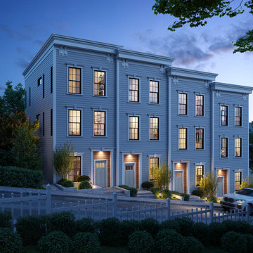
Developer Marc Savatsky, owner of Choose Boston, LLC, a multi-function development and real estate company, was behind this project. Marc’s company works throughout Boston and surrounding suburbs to redevelop and market multi-unit properties. Situated in Dorchester’s Neponset section, the property comprises four townhomes styled in a classic federalist design, paying homage to the rich history of the area. Remarkably, all units were spoken for during construction, which reflects a perfect alignment with what buyers are looking for, which is not common at all.
Collaborating with Architects and Partners
Working with architect Peter Vanko of Vanko Studio and Marc’s spouse and partner, Jessie Franco, the group designed this inviting and sought after living space. Warm and welcoming, with an open and inviting feel, unique building materials, lots of natural light and outdoor living spaces were on the list for what they felt would provide the right character for this property. Elements such as fluted wood were chosen to add visual interest, while the darker palette around the fireplace contributed to the overall aesthetic appeal.
The project faced significant challenges with the sloping terrain because Marc had not expected the need for so many retaining walls. But, once they were designed and put in, the challenge turned to charm and provided the landscaping with additional character.
Overcoming Development Challenges
Addressing the Sloping Land
Besides the sloping terrain, another major challenge was adding gas fireplaces into each unit. Due to building constraints preventing traditional venting, the fireplaces were as tricky as the retaining walls. It was important to Marc and Jessie to include fireplaces in these units. They felt that fireplaces provide a beautiful focal point and with the cold months Boston experiences, they would make the units so much more welcoming.
After consulting with Matt Brazeau, the choice became clear: the European Home H Series Vent-Free Natural Gas Fireplace. Vent free gas fireplaces are safe alternatives to direct vent fireplaces. They solve the challenge of where to run the venting and provide the living space with a real flame, heat efficiency (99%) and with the H Series, a very clean, European design. The H Series installs similarly to a gas stove – connected to gas and built with an outer body to insulate it from combustibles. It is an easy choice when gas is the preferred type of fuel and venting is difficult or the budget does not allow for the additional space, time, and cost of venting. Vent-free gas fireplaces have been allowed in Massachusetts for 20 years (since 2004) due to their safety, efficiency and practicality.
Marc Savatsky: The Developer’s Background
From New Jersey to Boston: A Passion for Building
Marc grew up in New Jersey and received a construction management degree from Purdue. As the chair of the housing committee on Mayor Walsh’s young advisory council, his love for Boston and building came together. Immersed in the dynamic environment of Boston, he discovered his passion for the city and appreciation of the architectural legacy. Suffolk Construction provided Marc with his formative, early years in the construction business. Over time he honed his skill and knowledge of the construction industry.
Having Marc as a developer who values the essence of local history and architecture adds a distinctive touch to his endeavors. It reflects not only a commitment to excellence in construction but also a dedication to harmonizing modern development with the rich tapestry of Boston’s past.
 RAJ Kitchen and Bath, LLC
 “Full apartment design”.
IF you have not yet seen this apartment conversion before, we strongly urge you to go to the bottom left of this page and click on the short 2-minutes video. It would put a lot of things into perspective when you come back and continue reading this.
It is true we were literally handed the keys and told a list of things that they wanted to have happen and we were to go into the apartment, look at the space and come up with a design that would satisfy all of that need. UNTIL we showed up! The unit had really seen some better days but we knew we had to look past that and come up with a concept that would work for them.
The immediate challenges were centered around 3 big ideas:
1. Adding a second bedroom to the already small footprint
2. Figuring out a way to make the kitchen bigger, better and brighter
3. Creating a master room walk in closet
It’s always difficult to add new rooms into existing footprint without expanding out or up and not incurring any opportunity cost. In this case, that was exactly what we had to do. Item one and two above had to be tackled as one. We went ahead and switched out the location of the dining room and eliminating an area where there was a “nook” type eat-in area. By doing so, we were able to cut right into that footprint and change the layout of the kitchen.
That one move allowed us to dig into the kitchen design because it was now the main focal point in the apartment. It was no longer an option to keep it in that tiny hole where it was, so we had to ensure that this design was functional and aesthetically pleasing at the same time. By adding the table into the space where an Island typically would go, we were able to both cut cost and still provide a dining experience. The Table serves as an Island as well when cooking.
We then proceeded to block in the existing doorway to the dining room. By doing this, we were able to create a full room which allowed us to put a door on the other side and called that room Bedroom #2. This was easier to do because all of the mechanicals were already in that space (light, heater and windows). By shifting things around, we also achieved a huge wall to wall closet from inside. PERFECT!
Then we moved into the Single bedroom. We thought it was a big room with a small closet, so by creatively adding an L shaped wall and steal some footprint into the bedroom side, we were able to put a door on that new room and design it for the walk-in closet. Even after this, the bedroom still holds a queen size bed with 2 night stands, a TV on the wall, a sitting chair and plenty of room to walk around. This was done by rethinking the location for the bed and night stands.
The bathroom was gutted to make sure there was no leaks and rebuild from the ground up. We kept all of the plumbing where it was, added a new vanity, medicine cabinet, tiles and lighting and it was done.
From there, the rest of the unit had new flooring all throughout, paint, and lighting. After completion and walk through, this project was handed over back to the clients.
Execution and collaboration between all the trades were: Reggie and his team from Premier Interiors and Rohan from RD Mechanical Services.
p.s. Please see our website to see the video.
 RAJ Kitchen and Bath, LLC
**Check out the video of this transformation on our website**
This small kitchen was way too small for this 2 bedrooms, 2 bathrooms apartment. Not only was it a very small kitchen, but the physical location of it made it very difficult to make it any bigger. There wasn't much that could have been done without incurring astronomical cost, which would get little or no return on the investment. The client wanted a kitchen that can be optimized in its current location to add a ton of value for resale.
This was difficult to do, because there was no moving of any mechanical around in the kitchen and even if we wanted to, the management of the building would not allow. For those of you who live in condos, co-ops or apartment building, you know how difficult it is to rework these foot prints. When we showed up, we saw the problems, but we also saw a huge opportunity where we can achieve those goals in the small space. This was accomplished by making some key changes and to incorporate some new things that was not possible when this kitchen was built years ago.
The crucial part of the design that would drive the entire new layout, was selecting the only appliance; that was the Refrigerator. Once we nailed down that refrigerator, we then proceeded to design the kitchen around it. We moved it to the other side of the wall where the sink was so that we can tap into the water line from the sink plumbing. It was crucial that it stays exactly 24" deep, not an inch more because we had to keep the entry as open as possible. Also, it was going to be directly in front of another big storage unit - The pantry. It is not ideal in most cases, but we needed the rest of the space to ramp up the design and open feel towards the side where all of the activities would take place, which happend to be the dining room and the view.
Once all that was figured out, we re-positioned the sink, dishwasher and the range and proceeded to wrap the cabinets around the columns to integrate them into the space. Thirty- six inches cabinets height was used so that they can be installed higher towards the ceiling height to give more room rather than the standard 18" required height between the counter tops. This was done to make the room feel a lot bigger than it really was. Not to mention, we also didn't want the faucet to be buried under the cabinets so that was also a necessary design detail for the space.
We then lowered both knee walls so that the counter top can sit on top of them, by removing that stop point that would have otherwise defined the kitchen area. This allowed us to pick up that extra footprint into the room for added prep space and enabled us to create the illusion of a kitchen that is looking longer than it really is. Every inch mattered when designing this kitchen and we made a conscious decision to use every one of that inch.
White cabinets were selected to do just what white cabinets are design to do; make a small or dark room appear bigger, brighter and more open. In this kitchen, this was amplified the more because of the kitchen location. It was perfect! We knew we did justice to the space because while we were there taking some photos, a few potential buyers walked in and went straight for the kitchen! They said its design just to fit the apartment.
Pantry roll out shelving, Double recycle bin, fancy handles, LED lighting, Quartz counter top, beautiful backslash tiles and grey linen floors finished off the kitchen which looked over a beautiful view of the George Washington Bridge from the top of this lovely 4th floor apartment.
Credit to Masterpiece Tile and Marble (Annmarie on the selection of Tiles and countertop and Val on the Construction to complete this project).
Davor Kokic Photography
 Wildwood Homes llc
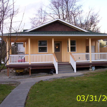
Nearing the finish line! down to the punch list, some landscaping and a concrete parking spot. I had a difficult time remembering the little two room shack I had purchased a few years previous.
 Michael Nash Design, Build & Homes
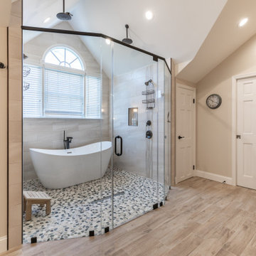
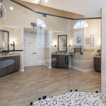
This prominent single-family home in Great Falls, serving as the home of baby boomers for a long time, needed an upgrade. First on the list was the master suite, especially the master bathroom.
The outdated master bathroom included lots of angles, rooflines, and wasted space.
Getting in the hot tub was difficult. The shower and tub were adjacent to two closets, for which we recommended taking some space to add more space to a new shower and tub area.
The prior shower area was small and dysfunctional, so we gutted out the entire shower and tub area, taking some space from adjacent closets to add area to the bathroom to enlarge this space to for a new wet shower and free-standing tub area. The floor was rebuilt for a curb less transition to the wet area. A heated floor was added along with large scale porcelain and pebble river rock.
A new makeup area for her, his and her vanity areas in contrasting grey cabinetry covered a gorgeous stone was also added.
Various new lighting elements brighten up this new master bathroom.
The upgraded amenities for this project include a heated floor, heated towel warmer, multi-rain shower, large walk-in wet space, and matching wood mirror frames.
 Michael Nash Design, Build & Homes
This prominent single-family home in Great Falls, serving as the home of baby boomers for a long time, needed an upgrade. First on the list was the master suite, especially the master bathroom.
The outdated master bathroom included lots of angles, rooflines, and wasted space.
Getting in the hot tub was difficult. The shower and tub were adjacent to two closets, for which we recommended taking some space to add more space to a new shower and tub area.
The prior shower area was small and dysfunctional, so we gutted out the entire shower and tub area, taking some space from adjacent closets to add area to the bathroom to enlarge this space to for a new wet shower and free-standing tub area. The floor was rebuilt for a curb less transition to the wet area. A heated floor was added along with large scale porcelain and pebble river rock.
A new makeup area for her, his and her vanity areas in contrasting grey cabinetry covered a gorgeous stone was also added.
Various new lighting elements brighten up this new master bathroom.
The upgraded amenities for this project include a heated floor, heated towel warmer, multi-rain shower, large walk-in wet space, and matching wood mirror frames.
 Truitt and White Window and Door Showroom
This hillside home in Piedmont, CA was remodeled to change the style from a 1940's rancher with eight foot ceilings and dark interiors, into a modern geometric composition with vast white interiors for casual living and generous daylighting for displaying the artist-owner's works.
In a city known for rigorous and difficult design review, an addition, two variances, and a full stylistic change were unanimously approved on the first round. All sloped roofs and attics were eliminated and replaced by a series of stacked and overlapping flat roofs. This made the house taller on the inside and shorter on the outside, which helped earn design review cooperation in the community. Windows were concentrated toward the rear yard views or moved up high on the side walls for daylight and privacy, benefitting the owners as well as the neighbors.
At the start, the owner husband was so enthusiastic and engaged in transforming his house into something modern that he presented the architect with a scaled foamcore model, rather than the usual magazine clippings and wish list. He participated in the design decisions throughout the process. The owner wife is the artist who did all the artwork in the house. She had been craving a display space with large walls and good natural light. Both of them loved the location and great views.
The project was an opportunity to transform the style of an older traditional home into a modern one, while solving numerous problems. By rebuilding the 1800 ft2 top of the 3-story home it was possible to change the style of the whole building, since the lower floors were a neutral base, and also to change the lifestyle of the owners, who wanted to move their master suite upstairs and live primarily on the top floor as empty nesters.
Going into the project, the architect knew there were multiple encroachments into the setbacks and potential privacy issues with close by neighbors. He approached this as a complex puzzle made up of architectural and political pieces which all had to fit together elegantly. It took many careful moves, small and large, to arrive at a serene and cohesive result that tied old and new together seamlessly.
The design-build contractor worked closely with the owners and handled all of the construction phase documents and design adjustments, adding ideas of their own to make the project really sing.
The project was a collaboration in three acts. The owner had a strong design concept from the start. The architect developed it into a realistic project and garnered the design approvals. Then the contractor executed brilliantly
 RAJ Kitchen and Bath, LLC
**Check out the video of this transformation on our website**
This small kitchen was way too small for this 2 bedrooms, 2 bathrooms apartment. Not only was it a very small kitchen, but the physical location of it made it very difficult to make it any bigger. There wasn't much that could have been done without incurring astronomical cost, which would get little or no return on the investment. The client wanted a kitchen that can be optimized in its current location to add a ton of value for resale.
This was difficult to do, because there was no moving of any mechanical around in the kitchen and even if we wanted to, the management of the building would not allow. For those of you who live in condos, co-ops or apartment building, you know how difficult it is to rework these foot prints. When we showed up, we saw the problems, but we also saw a huge opportunity where we can achieve those goals in the small space. This was accomplished by making some key changes and to incorporate some new things that was not possible when this kitchen was built years ago.
The crucial part of the design that would drive the entire new layout, was selecting the only appliance; that was the Refrigerator. Once we nailed down that refrigerator, we then proceeded to design the kitchen around it. We moved it to the other side of the wall where the sink was so that we can tap into the water line from the sink plumbing. It was crucial that it stays exactly 24" deep, not an inch more because we had to keep the entry as open as possible. Also, it was going to be directly in front of another big storage unit - The pantry. It is not ideal in most cases, but we needed the rest of the space to ramp up the design and open feel towards the side where all of the activities would take place, which happend to be the dining room and the view.
Once all that was figured out, we re-positioned the sink, dishwasher and the range and proceeded to wrap the cabinets around the columns to integrate them into the space. Thirty- six inches cabinets height was used so that they can be installed higher towards the ceiling height to give more room rather than the standard 18" required height between the counter tops. This was done to make the room feel a lot bigger than it really was. Not to mention, we also didn't want the faucet to be buried under the cabinets so that was also a necessary design detail for the space.
We then lowered both knee walls so that the counter top can sit on top of them, by removing that stop point that would have otherwise defined the kitchen area. This allowed us to pick up that extra footprint into the room for added prep space and enabled us to create the illusion of a kitchen that is looking longer than it really is. Every inch mattered when designing this kitchen and we made a conscious decision to use every one of that inch.
White cabinets were selected to do just what white cabinets are design to do; make a small or dark room appear bigger, brighter and more open. In this kitchen, this was amplified the more because of the kitchen location. It was perfect! We knew we did justice to the space because while we were there taking some photos, a few potential buyers walked in and went straight for the kitchen! They said its design just to fit the apartment.
Pantry roll out shelving, Double recycle bin, fancy handles, LED lighting, Quartz counter top, beautiful backslash tiles and grey linen floors finished off the kitchen which looked over a beautiful view of the George Washington Bridge from the top of this lovely 4th floor apartment.
Credit to Masterpiece Tile and Marble (Annmarie on the selection of Tiles and countertop and Val on the Construction to complete this project).
Davor Kokic Photography
 CSP International Staging Training Academy
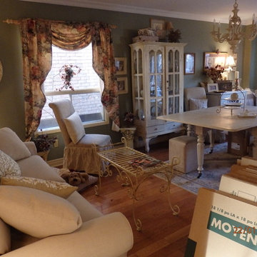
Christine Rae too the photos; Seller challenge in this space is there wasn't space, also no clearly defined function, flow was blocked and so many items in the room made it difficult for anyone to actually understand function and size of space. Zero budget although seller was left with a long list of recommended repairs, upgrades and renovations to boost salability
10