Search results for "Difficult list">difficult" in Home Design Ideas
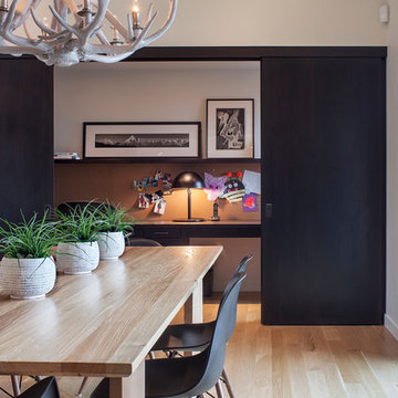
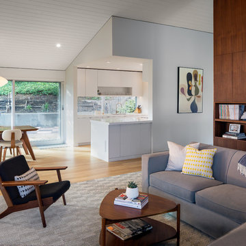
This hillside home in Piedmont, CA was remodeled to change the style from a 1940's rancher with eight foot ceilings and dark interiors, into a modern geometric composition with vast white interiors for casual living and generous daylighting for displaying the artist-owner's works.
In a city known for rigorous and difficult design review, an addition, two variances, and a full stylistic change were unanimously approved on the first round. All sloped roofs and attics were eliminated and replaced by a series of stacked and overlapping flat roofs. This made the house taller on the inside and shorter on the outside, which helped earn design review cooperation in the community. Windows were concentrated toward the rear yard views or moved up high on the side walls for daylight and privacy, benefitting the owners as well as the neighbors.
At the start, the owner husband was so enthusiastic and engaged in transforming his house into something modern that he presented the architect with a scaled foamcore model, rather than the usual magazine clippings and wish list. He participated in the design decisions throughout the process. The owner wife is the artist who did all the artwork in the house. She had been craving a display space with large walls and good natural light. Both of them loved the location and great views.
The project was an opportunity to transform the style of an older traditional home into a modern one, while solving numerous problems. By rebuilding the 1800 ft2 top of the 3-story home it was possible to change the style of the whole building, since the lower floors were a neutral base, and also to change the lifestyle of the owners, who wanted to move their master suite upstairs and live primarily on the top floor as empty nesters.
Going into the project, the architect knew there were multiple encroachments into the setbacks and potential privacy issues with close by neighbors. He approached this as a complex puzzle made up of architectural and political pieces which all had to fit together elegantly. It took many careful moves, small and large, to arrive at a serene and cohesive result that tied old and new together seamlessly.
The design-build contractor worked closely with the owners and handled all of the construction phase documents and design adjustments, adding ideas of their own to make the project really sing.
The project was a collaboration in three acts. The owner had a strong design concept from the start. The architect developed it into a realistic project and garnered the design approvals. Then the contractor executed brilliantly

This Beachfront home is one of our most prized staging jobs. The home itself was an older Atlantic Beach home that had some very difficult flow patterns and room definitions. We Brought it to life and loved the outcome! What a change it makes when you choose the right stager and designer to come in and get your listing ready for its next buyers. Call or visit our website today!
Office: 904-273-7890
Mobile: 904-874-9944 (Jared Biby)
www.showhomesjacksonville.com
Instagram @Showhomes_JAX_Staging_Design

"We took bids from seven or eight companies to remodel our kitchen and bathroom. We had a whole list of improvements we wanted, from 'must-haves' to 'might be nice someday'. We selected TaylorPro Home Services for several reasons, but foremost among those reasons was that the owner, Kerry Taylor, provided us with a detailed breakout of labor/material costs for every option. Nearly every other contractor bundled up the costs of our optional tasks into a single number, which made it quite difficult to select the best options based on our priorities and budget. Kerry's highly detailed proposal wasn't the least expensive we received, but it was organized, thorough, and competitive.
The second reason we selected TaylorPro was the demeanor and experience of Kerry himself. It was refreshing to talk to someone who actually gets his hands dirty rather than yet another designer with his head in a computer. (God bless the designers, though -- we had helpful conversations with many!) Kerry has a good design aesthetic, make no mistake, but it was clear that when problems inevitably popped up, Kerry would know how to address them. He is calm, personable, and competent. In other words, he is just the sort of person you want to work with.
We can't forget to mention the TaylorPro crew. The first thing you notice is how youthful they are. Not a single gray hair among them. Yet after watching them work awhile, you begin to notice how extraordinarily skilful they are. It doesn't matter what is on the day's agenda -- electrical, paint, plumbing, drywall -- these guys tackle it all and do it exceedingly well. They aren't just putting in their time and collecting a check. They take terrific pride in the work they do, a quality that seems more and more difficult to find these days. They are pleasant to be around and I never heard a cross word among them. They took pains to keep the noise and dust to a minimum. They cleaned up at the end of every day, even those days when they put in extra hours and were obviously very tired. This is easily the best work crew we've ever had at our house.
We should also mention that the subcontractors that TaylorPro uses are top-notch. The folks who laid down our new tile floor (Jeff) had every bit as much expertise and integrity as TaylorPro. They did an excellent job on both the flooring and the tile backsplash. These two elements receive compliments from everyone who visits our remodeled kitchen. (We wish Jeff would put his company on Angie's List so that we could give him the recognition he deserves!) In addition, the fellows who fabricated our Caesarstone countertop were also great craftsmen. They did a beautiful job. When we noticed a small blemish a few days after the countertop was installed, they came out immediately and corrected the problem. Nice!
In summary, TaylorPro has lived up to all the glowing recommendations here on Angie's List. Our experience with TaylorPro is right in line with the others. They stayed on task, they communicated well, they stayed on budget, and they gave us more than we had any right to expect. We don't know a better compliment to give Kerry and company than this: when it comes time to remodel the upstairs bathrooms, we won't need to solicit seven or eight bids. We'll just call TaylorPro. "
~ Lysa & Mark W, Clients
Photos by: Kerry W. Taylor
Find the right local pro for your project

Modern Pacific Northwest residence designed for a steep hillside property with elevated water and territorial views. The project required careful integration of engineered foundation systems, retaining walls, and multi-level living spaces to maximize the challenging site conditions while preserving functional outdoor areas and view corridors.
The exterior combines contemporary architectural forms, expansive glazing, and warm evening lighting to create a dramatic modern presence that responds directly to the terrain, orientation, and surrounding Pacific Northwest landscape.

Request Free Quote
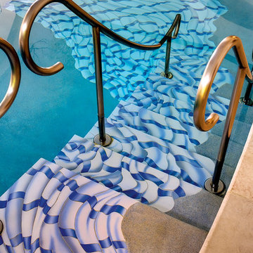
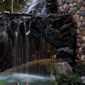
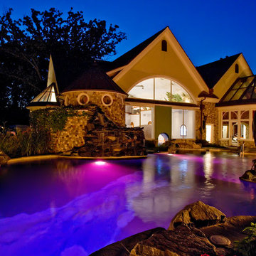
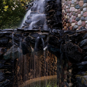
This amazing estate project has so many features it is quite difficult to list all of them. Set on 150 Acres, this sprawling project features an Indoor Oval Pool that connects to an outdoor swimming pool with a 65'0" lap lane. The pools are connected by a moveable swimming pool door that actuates with the turn of a key. The indoor pool house also features an indoor spa and baby pool, and is crowned at one end by a custom Oyster Shell. The Indoor sauna is connected to both main pool sections, and is accessible from the outdoor pool underneath the swim-up grotto and waterfall. The 25'0" vanishind edge is complemented by the hand-made ceramic tiles and fire features on the outdoor pools. Outdoor baby pool and spa complete the vessel count. Photos by Outvision Photography
This hillside home in Piedmont, CA was remodeled to change the style from a 1940's rancher with eight foot ceilings and dark interiors, into a modern geometric composition with vast white interiors for casual living and generous daylighting for displaying the artist-owner's works.
In a city known for rigorous and difficult design review, an addition, two variances, and a full stylistic change were unanimously approved on the first round. All sloped roofs and attics were eliminated and replaced by a series of stacked and overlapping flat roofs. This made the house taller on the inside and shorter on the outside, which helped earn design review cooperation in the community. Windows were concentrated toward the rear yard views or moved up high on the side walls for daylight and privacy, benefitting the owners as well as the neighbors.
At the start, the owner husband was so enthusiastic and engaged in transforming his house into something modern that he presented the architect with a scaled foamcore model, rather than the usual magazine clippings and wish list. He participated in the design decisions throughout the process. The owner wife is the artist who did all the artwork in the house. She had been craving a display space with large walls and good natural light. Both of them loved the location and great views.
The project was an opportunity to transform the style of an older traditional home into a modern one, while solving numerous problems. By rebuilding the 1800 ft2 top of the 3-story home it was possible to change the style of the whole building, since the lower floors were a neutral base, and also to change the lifestyle of the owners, who wanted to move their master suite upstairs and live primarily on the top floor as empty nesters.
Going into the project, the architect knew there were multiple encroachments into the setbacks and potential privacy issues with close by neighbors. He approached this as a complex puzzle made up of architectural and political pieces which all had to fit together elegantly. It took many careful moves, small and large, to arrive at a serene and cohesive result that tied old and new together seamlessly.
The design-build contractor worked closely with the owners and handled all of the construction phase documents and design adjustments, adding ideas of their own to make the project really sing.
The project was a collaboration in three acts. The owner had a strong design concept from the start. The architect developed it into a realistic project and garnered the design approvals. Then the contractor executed brilliantly.

“Full apartment design”.
IF you have not yet seen this apartment conversion before, we strongly urge you to go to the bottom left of this page and click on the short 2-minutes video. It would put a lot of things into perspective when you come back and continue reading this.
It is true we were literally handed the keys and told a list of things that they wanted to have happen and we were to go into the apartment, look at the space and come up with a design that would satisfy all of that need. UNTIL we showed up! The unit had really seen some better days but we knew we had to look past that and come up with a concept that would work for them.
The immediate challenges were centered around 3 big ideas:
1. Adding a second bedroom to the already small footprint
2. Figuring out a way to make the kitchen bigger, better and brighter
3. Creating a master room walk in closet
It’s always difficult to add new rooms into existing footprint without expanding out or up and not incurring any opportunity cost. In this case, that was exactly what we had to do. Item one and two above had to be tackled as one. We went ahead and switched out the location of the dining room and eliminating an area where there was a “nook” type eat-in area. By doing so, we were able to cut right into that footprint and change the layout of the kitchen.
That one move allowed us to dig into the kitchen design because it was now the main focal point in the apartment. It was no longer an option to keep it in that tiny hole where it was, so we had to ensure that this design was functional and aesthetically pleasing at the same time. By adding the table into the space where an Island typically would go, we were able to both cut cost and still provide a dining experience. The Table serves as an Island as well when cooking.
We then proceeded to block in the existing doorway to the dining room. By doing this, we were able to create a full room which allowed us to put a door on the other side and called that room Bedroom #2. This was easier to do because all of the mechanicals were already in that space (light, heater and windows). By shifting things around, we also achieved a huge wall to wall closet from inside. PERFECT!
Then we moved into the Single bedroom. We thought it was a big room with a small closet, so by creatively adding an L shaped wall and steal some footprint into the bedroom side, we were able to put a door on that new room and design it for the walk-in closet. Even after this, the bedroom still holds a queen size bed with 2 night stands, a TV on the wall, a sitting chair and plenty of room to walk around. This was done by rethinking the location for the bed and night stands.
The bathroom was gutted to make sure there was no leaks and rebuild from the ground up. We kept all of the plumbing where it was, added a new vanity, medicine cabinet, tiles and lighting and it was done.
From there, the rest of the unit had new flooring all throughout, paint, and lighting. After completion and walk through, this project was handed over back to the clients.
Execution and collaboration between all the trades were: Reggie and his team from Premier Interiors and Rohan from RD Mechanical Services.
p.s. Please see our website to see the video.

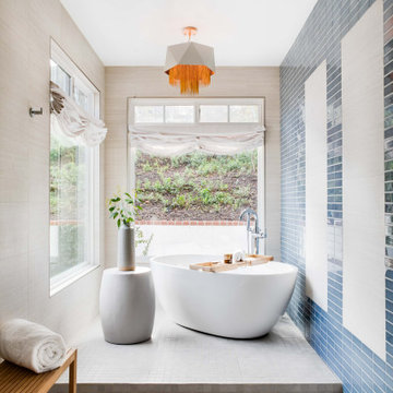
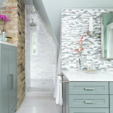
This prominent single-family home in Great Falls, serving as the home of baby boomers for a long time, needed an upgrade. First on the list was the master suite, especially the master bathroom.
The outdated master bathroom included lots of angles, rooflines, and wasted space.
Getting in the hot tub was difficult. The shower and tub were adjacent to two closets, for which we recommended taking some space to add more space to a new shower and tub area.
The prior shower area was small and dysfunctional, so we gutted out the entire shower and tub area, taking some space from adjacent closets to add area to the bathroom to enlarge this space to for a new wet shower and free-standing tub area. The floor was rebuilt for a curb less transition to the wet area. A heated floor was added along with large scale porcelain and pebble river rock.
A new makeup area for her, his and her vanity areas in contrasting grey cabinetry covered a gorgeous stone was also added.
Various new lighting elements brighten up this new master bathroom.
The upgraded amenities for this project include a heated floor, heated towel warmer, multi-rain shower, large walk-in wet space, and matching wood mirror frames.

**Check out the video of this transformation on our website**
This small kitchen was way too small for this 2 bedrooms, 2 bathrooms apartment. Not only was it a very small kitchen, but the physical location of it made it very difficult to make it any bigger. There wasn't much that could have been done without incurring astronomical cost, which would get little or no return on the investment. The client wanted a kitchen that can be optimized in its current location to add a ton of value for resale.
This was difficult to do, because there was no moving of any mechanical around in the kitchen and even if we wanted to, the management of the building would not allow. For those of you who live in condos, co-ops or apartment building, you know how difficult it is to rework these foot prints. When we showed up, we saw the problems, but we also saw a huge opportunity where we can achieve those goals in the small space. This was accomplished by making some key changes and to incorporate some new things that was not possible when this kitchen was built years ago.
The crucial part of the design that would drive the entire new layout, was selecting the only appliance; that was the Refrigerator. Once we nailed down that refrigerator, we then proceeded to design the kitchen around it. We moved it to the other side of the wall where the sink was so that we can tap into the water line from the sink plumbing. It was crucial that it stays exactly 24" deep, not an inch more because we had to keep the entry as open as possible. Also, it was going to be directly in front of another big storage unit - The pantry. It is not ideal in most cases, but we needed the rest of the space to ramp up the design and open feel towards the side where all of the activities would take place, which happend to be the dining room and the view.
Once all that was figured out, we re-positioned the sink, dishwasher and the range and proceeded to wrap the cabinets around the columns to integrate them into the space. Thirty- six inches cabinets height was used so that they can be installed higher towards the ceiling height to give more room rather than the standard 18" required height between the counter tops. This was done to make the room feel a lot bigger than it really was. Not to mention, we also didn't want the faucet to be buried under the cabinets so that was also a necessary design detail for the space.
We then lowered both knee walls so that the counter top can sit on top of them, by removing that stop point that would have otherwise defined the kitchen area. This allowed us to pick up that extra footprint into the room for added prep space and enabled us to create the illusion of a kitchen that is looking longer than it really is. Every inch mattered when designing this kitchen and we made a conscious decision to use every one of that inch.
White cabinets were selected to do just what white cabinets are design to do; make a small or dark room appear bigger, brighter and more open. In this kitchen, this was amplified the more because of the kitchen location. It was perfect! We knew we did justice to the space because while we were there taking some photos, a few potential buyers walked in and went straight for the kitchen! They said its design just to fit the apartment.
Pantry roll out shelving, Double recycle bin, fancy handles, LED lighting, Quartz counter top, beautiful backslash tiles and grey linen floors finished off the kitchen which looked over a beautiful view of the George Washington Bridge from the top of this lovely 4th floor apartment.
Credit to Masterpiece Tile and Marble (Annmarie on the selection of Tiles and countertop and Val on the Construction to complete this project).
Davor Kokic Photography

This Beachfront home is one of our most prized staging jobs. The home itself was an older Atlantic Beach home that had some very difficult flow patterns and room definitions. We Brought it to life and loved the outcome! What a change it makes when you choose the right stager and designer to come in and get your listing ready for its next buyers. Call or visit our website today!
Office: 904-273-7890
Mobile: 904-874-9944 (Jared Biby)
www.showhomesjacksonville.com
Instagram @Showhomes_JAX_Staging_Design

Request Free Quote
This amazing estate project has so many features it is quite difficult to list all of them. Set on 150 Acres, this sprawling project features an Indoor Oval Pool that connects to an outdoor swimming pool with a 65'0" lap lane. The pools are connected by a moveable swimming pool door that actuates with the turn of a key. The indoor pool house also features an indoor spa and baby pool, and is crowned at one end by a custom Oyster Shell. The Indoor sauna is connected to both main pool sections, and is accessible from the outdoor pool underneath the swim-up grotto and waterfall. The 25'0" vanishind edge is complemented by the hand-made ceramic tiles and fire features on the outdoor pools. Outdoor baby pool and spa complete the vessel count. Photos by Outvision Photography
Wallcovering Installation By Michelle
~ A Professional And Conscientious Craftsman For Over 30 Years ~
www.APaperhangersBlog.com
Inspiration for a contemporary home design remodel in Houston

This Powder bath was 9' tall and 3' wide. There was a cabinet to get over on one end and a pedistal sink on the other end to paper around. All difficult situations. I could not reach areas on my shorter ladder, but my 6' ladder did not fully open. Walls were stripped, primed and hung with a gorgeous, silver vinyl wallcovering by Brewster. The color is not showing up as the pretty silver that it was.

Wallcovering Installation By Michelle
~ A Professional And Conscientious Craftsman For Over 30 Years ~
www.APaperhangersBlog.com
Home design - small contemporary home design idea in Houston

**Check out the video of this transformation on our website**
This small kitchen was way too small for this 2 bedrooms, 2 bathrooms apartment. Not only was it a very small kitchen, but the physical location of it made it very difficult to make it any bigger. There wasn't much that could have been done without incurring astronomical cost, which would get little or no return on the investment. The client wanted a kitchen that can be optimized in its current location to add a ton of value for resale.
This was difficult to do, because there was no moving of any mechanical around in the kitchen and even if we wanted to, the management of the building would not allow. For those of you who live in condos, co-ops or apartment building, you know how difficult it is to rework these foot prints. When we showed up, we saw the problems, but we also saw a huge opportunity where we can achieve those goals in the small space. This was accomplished by making some key changes and to incorporate some new things that was not possible when this kitchen was built years ago.
The crucial part of the design that would drive the entire new layout, was selecting the only appliance; that was the Refrigerator. Once we nailed down that refrigerator, we then proceeded to design the kitchen around it. We moved it to the other side of the wall where the sink was so that we can tap into the water line from the sink plumbing. It was crucial that it stays exactly 24" deep, not an inch more because we had to keep the entry as open as possible. Also, it was going to be directly in front of another big storage unit - The pantry. It is not ideal in most cases, but we needed the rest of the space to ramp up the design and open feel towards the side where all of the activities would take place, which happend to be the dining room and the view.
Once all that was figured out, we re-positioned the sink, dishwasher and the range and proceeded to wrap the cabinets around the columns to integrate them into the space. Thirty- six inches cabinets height was used so that they can be installed higher towards the ceiling height to give more room rather than the standard 18" required height between the counter tops. This was done to make the room feel a lot bigger than it really was. Not to mention, we also didn't want the faucet to be buried under the cabinets so that was also a necessary design detail for the space.
We then lowered both knee walls so that the counter top can sit on top of them, by removing that stop point that would have otherwise defined the kitchen area. This allowed us to pick up that extra footprint into the room for added prep space and enabled us to create the illusion of a kitchen that is looking longer than it really is. Every inch mattered when designing this kitchen and we made a conscious decision to use every one of that inch.
White cabinets were selected to do just what white cabinets are design to do; make a small or dark room appear bigger, brighter and more open. In this kitchen, this was amplified the more because of the kitchen location. It was perfect! We knew we did justice to the space because while we were there taking some photos, a few potential buyers walked in and went straight for the kitchen! They said its design just to fit the apartment.
Pantry roll out shelving, Double recycle bin, fancy handles, LED lighting, Quartz counter top, beautiful backslash tiles and grey linen floors finished off the kitchen which looked over a beautiful view of the George Washington Bridge from the top of this lovely 4th floor apartment.
Credit to Masterpiece Tile and Marble (Annmarie on the selection of Tiles and countertop and Val on the Construction to complete this project).
Davor Kokic Photography

Photo by Jim Raycroft
When these homeowners first came to us in 2011, they had a list of major projects to adapt their Victorian home to the needs of their growing family. The first phase of work was a basement renovation to provide informal hang out space. The second was a garage. Finally they turned their attention to the master bedroom and bathroom.
FROM BALCONY TO BATHROOM
At one end of the suite was a cramped and outdated bathroom. At the other end was an underutilized, high-maintenance, exterior balcony. A leaky door to the balcony, as well as inadequate insulation and air-sealing and a poorly designed heating system, made the bedroom difficult to keep comfortable in the winter.
We chose to capture the old balcony as indoor space and relocate the bathroom to that end of the master suite. This strategy not only gave us the opportunity to install much better insulation and good, tight windows, it created enough new floor area that we were able to include a large walk-in shower, separate vanities, a toilet room, and a make-up counter in the new master bathroom.
ADAPTING AND UPDATING
The project allowed us to find a prominent place for an old leaded glass window sash that the homeowners had been hanging onto for several years in anticipation of this project.
The flow and layout of the master suite are now much better suited to a 21st century lifestyle. But best of all (to us, anyway), the homeowners report that the bathroom—where the old balcony had been—is now the most comfortable room in the house.

This hillside home in Piedmont, CA was remodeled to change the style from a 1940's rancher with eight foot ceilings and dark interiors, into a modern geometric composition with vast white interiors for casual living and generous daylighting for displaying the artist-owner's works.
In a city known for rigorous and difficult design review, an addition, two variances, and a full stylistic change were unanimously approved on the first round. All sloped roofs and attics were eliminated and replaced by a series of stacked and overlapping flat roofs. This made the house taller on the inside and shorter on the outside, which helped earn design review cooperation in the community. Windows were concentrated toward the rear yard views or moved up high on the side walls for daylight and privacy, benefitting the owners as well as the neighbors.
At the start, the owner husband was so enthusiastic and engaged in transforming his house into something modern that he presented the architect with a scaled foamcore model, rather than the usual magazine clippings and wish list. He participated in the design decisions throughout the process. The owner wife is the artist who did all the artwork in the house. She had been craving a display space with large walls and good natural light. Both of them loved the location and great views.
The project was an opportunity to transform the style of an older traditional home into a modern one, while solving numerous problems. By rebuilding the 1800 ft2 top of the 3-story home it was possible to change the style of the whole building, since the lower floors were a neutral base, and also to change the lifestyle of the owners, who wanted to move their master suite upstairs and live primarily on the top floor as empty nesters.
Going into the project, the architect knew there were multiple encroachments into the setbacks and potential privacy issues with close by neighbors. He approached this as a complex puzzle made up of architectural and political pieces which all had to fit together elegantly. It took many careful moves, small and large, to arrive at a serene and cohesive result that tied old and new together seamlessly.
The design-build contractor worked closely with the owners and handled all of the construction phase documents and design adjustments, adding ideas of their own to make the project really sing.
The project was a collaboration in three acts. The owner had a strong design concept from the start. The architect developed it into a realistic project and garnered the design approvals. Then the contractor executed brilliantly.

This prominent single-family home in Great Falls, serving as the home of baby boomers for a long time, needed an upgrade. First on the list was the master suite, especially the master bathroom.
The outdated master bathroom included lots of angles, rooflines, and wasted space.
Getting in the hot tub was difficult. The shower and tub were adjacent to two closets, for which we recommended taking some space to add more space to a new shower and tub area.
The prior shower area was small and dysfunctional, so we gutted out the entire shower and tub area, taking some space from adjacent closets to add area to the bathroom to enlarge this space to for a new wet shower and free-standing tub area. The floor was rebuilt for a curb less transition to the wet area. A heated floor was added along with large scale porcelain and pebble river rock.
A new makeup area for her, his and her vanity areas in contrasting grey cabinetry covered a gorgeous stone was also added.
Various new lighting elements brighten up this new master bathroom.
The upgraded amenities for this project include a heated floor, heated towel warmer, multi-rain shower, large walk-in wet space, and matching wood mirror frames.

“Full apartment design”.
IF you have not yet seen this apartment conversion before, we strongly urge you to go to the bottom left of this page and click on the short 2-minutes video. It would put a lot of things into perspective when you come back and continue reading this.
It is true we were literally handed the keys and told a list of things that they wanted to have happen and we were to go into the apartment, look at the space and come up with a design that would satisfy all of that need. UNTIL we showed up! The unit had really seen some better days but we knew we had to look past that and come up with a concept that would work for them.
The immediate challenges were centered around 3 big ideas:
1. Adding a second bedroom to the already small footprint
2. Figuring out a way to make the kitchen bigger, better and brighter
3. Creating a master room walk in closet
It’s always difficult to add new rooms into existing footprint without expanding out or up and not incurring any opportunity cost. In this case, that was exactly what we had to do. Item one and two above had to be tackled as one. We went ahead and switched out the location of the dining room and eliminating an area where there was a “nook” type eat-in area. By doing so, we were able to cut right into that footprint and change the layout of the kitchen.
That one move allowed us to dig into the kitchen design because it was now the main focal point in the apartment. It was no longer an option to keep it in that tiny hole where it was, so we had to ensure that this design was functional and aesthetically pleasing at the same time. By adding the table into the space where an Island typically would go, we were able to both cut cost and still provide a dining experience. The Table serves as an Island as well when cooking.
We then proceeded to block in the existing doorway to the dining room. By doing this, we were able to create a full room which allowed us to put a door on the other side and called that room Bedroom #2. This was easier to do because all of the mechanicals were already in that space (light, heater and windows). By shifting things around, we also achieved a huge wall to wall closet from inside. PERFECT!
Then we moved into the Single bedroom. We thought it was a big room with a small closet, so by creatively adding an L shaped wall and steal some footprint into the bedroom side, we were able to put a door on that new room and design it for the walk-in closet. Even after this, the bedroom still holds a queen size bed with 2 night stands, a TV on the wall, a sitting chair and plenty of room to walk around. This was done by rethinking the location for the bed and night stands.
The bathroom was gutted to make sure there was no leaks and rebuild from the ground up. We kept all of the plumbing where it was, added a new vanity, medicine cabinet, tiles and lighting and it was done.
From there, the rest of the unit had new flooring all throughout, paint, and lighting. After completion and walk through, this project was handed over back to the clients.
Execution and collaboration between all the trades were: Reggie and his team from Premier Interiors and Rohan from RD Mechanical Services.
p.s. Please see our website to see the video.

Request Free Quote
This amazing estate project has so many features it is quite difficult to list all of them. Set on 150 Acres, this sprawling project features an Indoor Oval Pool that connects to an outdoor swimming pool with a 65'0" lap lane. The pools are connected by a moveable swimming pool door that actuates with the turn of a key. The indoor pool house also features an indoor spa and baby pool, and is crowned at one end by a custom Oyster Shell. The Indoor sauna is connected to both main pool sections, and is accessible from the outdoor pool underneath the swim-up grotto and waterfall. The 25'0" vanishind edge is complemented by the hand-made ceramic tiles and fire features on the outdoor pools. Outdoor baby pool and spa complete the vessel count. Photos by Outvision Photography
8