
Search results for "Difficulties" in Home Design Ideas
 G. Christianson Construction, Inc.
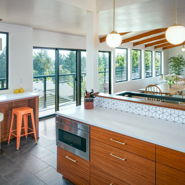
These clients fell in love with this home immediately when they saw it on the market, and quickly made the offer. From the unique lighting, retro architectural details, and view of the cascades, this home was full of potential to be remodeled to fit the lifestyle and personality of it’s new owners. Through the design process, we identified the aspects of the home that these owners loved, such as the Living Room soffit, grasscloth wallpaper, floating staircase and outdoor-feel basement. We then pinpointed the difficulties that the floor plan and materials presented for their lifestyle, such as the closed-off/compartmentalized floor plan, shag carpet in the living room, outdated finishes, lack of wood, and a newer kitchen that was an outlier within the style of the house. The finished product is a magazine-worthy transformation that thoughtfully unifies the owner’s personal style and the home’s retro roots.

 MaxMinDesign Inc.
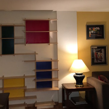
Wider-angle view to show setting. The arrangement of art on the wall to the right was one of the starting points for the design. A second was the difficulty of filling the alcove with full-width shelves without creating a dark corner of solid books and wood. Worth noting that the installation has almost 40 linear feet of shelving, so even with the white space it can hold a lot of books!
Find the right local pro for your project

 Frankel Design Build
This project, sitting on a little more than 3.5 acres on Rivercrest was completed in 3 years with a total square footage of more than 26,000 square feet.
Typically modern homes are smaller. At a certain size, usually around 4,000 square feet, the difficulty with modern or contemporary architecture becomes scale, and the minimalist idea gets lost. Whenever you get to this scale of house at over 26,000 square feet, this problem adds a layer of complexity.
Connie Anderson Photography
 Envision Concrete
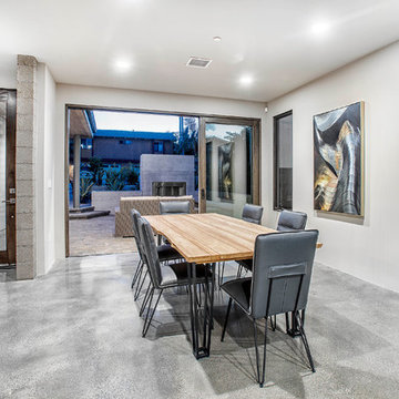
Inspiration for a mid-sized modern concrete floor great room remodel in San Diego with white walls
 Tile Doctor Ltd
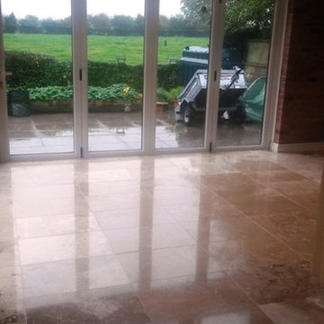
This customer had some real difficulty in getting their fantastic Travertine tiled kitchen area looking as good as it should. The cleaning methods they had previously employed were unable to prevent the tiles from appearing dull, and the customer was also unable to deal with the displeasing marks and small cracks damaging the stone.
Keen to get the floor back to looking its best, the customer called me down to their property, which overlooks the beautiful countryside area of Ashbourne, to see what could be done to restore the tiles.
Upon my arrival at the property, I assessed the situation and resolved that the best way to restore the polish and general appearance of the floor was to use a process known as burnishing. The burnishing process, which involves the application of four diamond encrusted polishing pads of varying grit, works to grind away ingrained dirt while smoothing and polishing rough surfaces. Most commonly we use burnishing to restore the shine to Limestone and Marble tiles, but it can be used on most types of natural stone floor where a deep polish is required.
To start the process, I applied the Coarse 400 grit burnishing pad to the floor using a small amount of water as lubrication in order to break down and remove any old sealer from the stone. Once this had been done across the entirety of the floor, I removed any soiled water with a wet-vac machine; this removal of soiled residue was repeated after each use of a burnishing pad.
Next, I moved on to the Medium 800 grit pad which is less coarse than the 400 grit, but still rough enough still to break down layers of ingrained dirt. I followed this up with the application of a Fine 1500 grit pad, which started to smooth down the rough areas of the surface to prepare the floor for a final polish with an even finer burnishing pad later on. Before moving straight on to the final of the four pads, I took the time to carefully fill in the all of the small cracks and holes in the stone, before leaving the floor to dry until the next day.
The next morning, I returned to the property to finish off the floor restoration. As soon as I arrived I used a damp tester to make sure the floor was completely dry. Noticing a number of small damp spots, I opted to use my heat gun to speed up the drying process.
Once the floor was completely dry, I used the Very Fine 3000 burnishing pad – the last of the four – without any lubricant to finally achieve a high quality polished finish. For polished floors it is recommended to use an impregnating sealer that penetrates into the pores of the stone rather than sitting on the surface of the floor, as this ensures the quality of the polish isn’t damaged.
As such I opted to use Tile Doctor Colour Grow to seal the tiles. This is a colour intensifying sealer that provides durable surface protection and allows the surface to breathe whilst enhancing the natural colours in the stone. It’s important that any sealer that doesn’t penetrate into the stone is removed by polishing it off with a cloth.
After completing the seal, I went over the floor for a final time with the 3000 grit diamond burnishing pad to leave a smooth and shiny polished finish. Needless to say that the customer was very happy with result as they had never before been able to get the floor looking this good!
Tony Olmet
Derbyshire Tile Doctor
 RAJ Kitchen and Bath, LLC
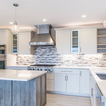
There were a few difficulties in making this kitchen any better than how it was. There was a separate staircase that had access to the second floor which was located in the kitchen. This left just enough room to push the dining room to one side. Then, there was the porch. A really nice panoramic view of the back, but was somehow under-used by the family during the summer months. Then, it was the size of the kitchen. It simply was way too small for a growing family, and while it had a peninsular in place, the flow just didn’t work. I remember watching them one day demonstrating how awkward it was using the kitchen. We got it! We had our marching orders to go and figure out how to make this kitchen work for this family.
Everything in the room was fair play. The design was done to make the kitchen very open. For a few ideas, we incorporated the porch in the kitchen by using the nana wall idea but it ended up being too cost prohibitive to do so. We then decided to do a permanent fix by using a commercial glass wall application. Once we figured that out, we moved back inside and removed the staircase. This gave us two added benefits. One allowed us to really reconfigure the kitchen and the other opened up the second floor for a huge built in closet system.
We relocated the windows, added a fire place with a built In TV above. From there, it was onto the kitchen itself which contained a huge Island with seating, large kitchen sink and built in appliances which was set up in a way to take advantage of the new layout. We re-positioned the kitchen facing the beautiful views outside rather than looking towards a wall. Now, when you enter the house up the entry stairs, the kitchen now draws you into the magnificent new open space. This is now setup for entertaining, relaxation, hanging out and most of all, preparing meals in a room where you only have to leave if you want to.
This one was all about the design. Design was what made this space. Setting this space up for success was crucial, and this kitchen is a great example of how design can cover a multitude of sins in Kitchen designs.
… Just close your eyes for a second and imagine waking up one winter morning and having a cup of coffee and watching the snow fall through those huge windows, leaning up against those 3D feature walls while watching the kids sitting around the table enjoying those warm radiant heated floors in this spacious kitchen…..
 The Nelson Team
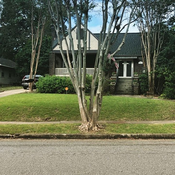
Before picture to demonstrate difficulty of slope to maintain
This is an example of a traditional partial sun retaining wall landscape in Birmingham.
This is an example of a traditional partial sun retaining wall landscape in Birmingham.
 G. Christianson Construction, Inc.
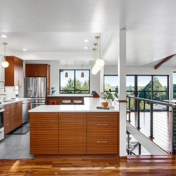
These clients fell in love with this home immediately when they saw it on the market, and quickly made the offer. From the unique lighting, retro architectural details, and view of the cascades, this home was full of potential to be remodeled to fit the lifestyle and personality of it’s new owners. Through the design process, we identified the aspects of the home that these owners loved, such as the Living Room soffit, grasscloth wallpaper, floating staircase and outdoor-feel basement. We then pinpointed the difficulties that the floor plan and materials presented for their lifestyle, such as the closed-off/compartmentalized floor plan, shag carpet in the living room, outdated finishes, lack of wood, and a newer kitchen that was an outlier within the style of the house. The finished product is a magazine-worthy transformation that thoughtfully unifies the owner’s personal style and the home’s retro roots.
 Stearns Design Build
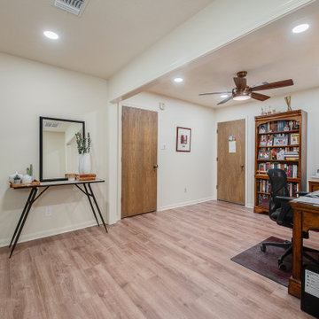
This project was done for a professional couple who had two children and a grandchild move back home due to the Pandemic. We helped the family add over 600 SF to their living space that they desperately needed.
The home is a brick home built in the 1980s. The area we had to work with was an atrium (We don’t see many of those these days!) and a garage that would be closed in.
They needed an additional room & storage space including a mechanical room for the AC that would service this area and expanded office space.
The primary difficulties were making the project not look like a closed garage and reframing the roof that had a valley that terminated at the atrium.
We were able to raise + level the floor of the garage so that it was equal to the rest of the home. We also matched windows put into the garage to other windows on the front of the house creating design continuity.
Often when we do garage conversions, we uncouple the drive way from the house to avoid the closed in garage appearance. Unfortunately, on this project that was not possible because of the need for maximum parking. But with the design consistency, the conversion appears seamless with the house.
The roof framing turned out to be more problematic than we had anticipated because the garage roof had been created with trusses whereas the rest of the roof had been traditionally framed. That combined with the open atrium falling in the roof valley made the infill framing a challenge. Ultimately, we were able to fill in the roof over the atrium so that it looks like it was always there.
Where there had once been a garage door, there was now a bedroom wall with two large windows. In addition to the two large windows, light-colored paint and flooring also contributed to the brightness of the new space. The bedroom has a walk-in closet with built-in shelving.
On the other side, we created a large storage space for the family to use since they no longer have their garage for storage.
 Masters of Design
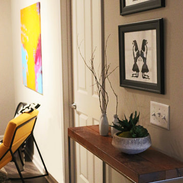
Inspiration for a small contemporary medium tone wood floor foyer remodel in Atlanta
 Urban Homes - Innovative Design for Kitchen & Bath
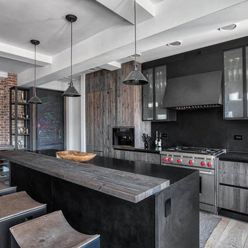
Reclaimed wood kitchen by Aster Cucine & designed by Urban Homes
Mid-sized urban home design photo in New York
Mid-sized urban home design photo in New York

 Donald Lococo Architects
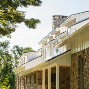
Located on farmland in McLean, Virginia, the American Farmhouse balances the expected comforts of a new home with the bucolic beauty of an old farmhouse. The final site plan still has evidence showing parallel courses of the barn’s destiny. The house mass is broken and lowered so that the home can remain secondary to the monolithic barn structure. Earthy and elemental materials are selected for the home that reference the barn without directly mimicking it. Wooden members found inside the barn and from other barns bridge ceilings and are used in floors along with rustic slate adding to a sense of simplicity to the farmhouse design.
The age and patina of the barn is reflected in the house’s textural use of board and batten and field stone layered similar to stone foundations. The original development plan was to demolish the existing barn and construct three suburban homes. Part of an endangered breed, as one of the few remaining barns in the area, it was originally viewed as a challenge in a luxury home construction with several difficulties posed to the impending project: it would be expensive to renovate, vulnerable to demolition, and threatened by urban sprawl. However, instead of trying to alter or destroy the barn, the structure was fully embraced into the traditional architecture project as a centerpiece and was used as the inspiration for the home. The new house was sited parallel to the barn so that views to the barn gable were accessible.
 Lennox Masonry
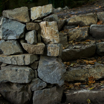
This project entailed the draining of a 200,000 cubic foot pond which was originally constructed in the early 1900s in order to install a water feature. I had previously dammed the lower pond, which was roughly equivalent in size to the upper pond, with stonework to match the existing stone walkways. The lower pond will be utilized as a catch-basin in an effort to keep the upper pond’s water level at a sufficient height through a pump system.
After the removal of over a 100 years worth of sediment, I began constructing several terraces, stone steps, stone walkways, and several stone retaining walls — all stone features were built without the use of mortar so as to allow plant growth, such as vines and flowering plants to grow through the stonework.
The difficulty I faced, oddly enough, was trying to be as random as possible with the placement of the stones, so as to make the stonework appear as though it had been built alongside some of the pre-existing 100-year-old stone walls scattered across other areas of the property. In essence, I forced myself to leave larger gaps in between stones where I typically wouldn’t, as well as leave some stones protruding from the wall, and allowing the wall to slightly fluctuate in height. All of which required me to become a perfectionist of randomness, which was quite trying of me.
The top 2 feet of the 2,000-foot upper pond was then faced and retained with stone.
 Beahm & Son, Ltd.
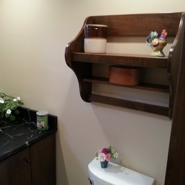
We were lucky enough to have the opportunity to help an older couple in our local community. They approached us with a project that they thought would be impossible. Turn a 6x6 first floor pantry into a fully functioning bathroom. Normally this space limitation would not be a problem but the plumbing presented a difficulty that already scared away 2 other contractors. We were able to overcome this obstacle with the help of our experienced staff who keep up to date on the newest devices and products in the remodeling industry.
We had a very enjoyable experience designing and remodeling this room. Even with the small space limitations we believe we came up with a very unique and rustic feel for their 1890's farm house. I must end on all the custom wood work that our employees made for this project. From the custom, two-sided, door to the little, wooden, wall shelf we made all of the wooden pieces you see in this project and most of them were unique creations specifically for this job.
 Frankel Design Build
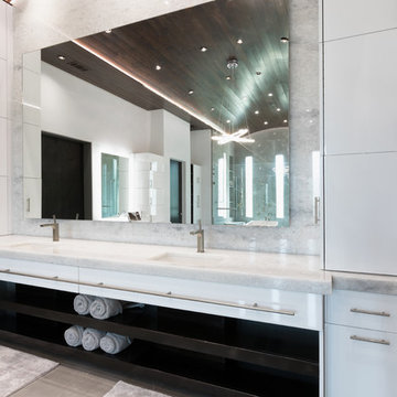
This project, sitting on a little more than 3.5 acres on Rivercrest was completed in 3 years with a total square footage of more than 26,000 square feet.
Typically modern homes are smaller. At a certain size, usually around 4,000 square feet, the difficulty with modern or contemporary architecture becomes scale, and the minimalist idea gets lost. Whenever you get to this scale of house at over 26,000 square feet, this problem adds a layer of complexity.
Connie Anderson Photography

 Wesley-Wayne Interiors, LLC
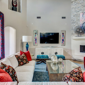
What an awesome, fun space for this young family. Comfort and functionality were key in the design, so we placed a large sectional and red swivel chairs to give plenty of space for everyone to lounge about. There is always difficulty when you have two focal points in a room, which in this case were the TV and fireplace. But, our team did a great job of blending the artwork and accessories to make it feel like one wall instead of two. We always love to have a complete surround of seating options, so adding the benches in front of the TV did the trick.
Design: Wesley-Wayne Interiors
Photo: Lance Selgo
 Studio 68/32
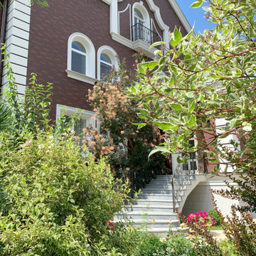
Designing an object was accompanied by certain difficulties. The owners bought a plot on which there was already a house. Its quality and appearance did not suit customers in any way. Moreover, the construction of a house from scratch was not even discussed, so the architects Vitaly Dorokhov and Tatyana Dmitrenko had to take the existing skeleton as a basis. During the reconstruction, the protruding glass volume was demolished, some structural elements of the facade were simplified. The number of storeys was increased and the height of the roof was increased. As a result, the building took the form of a real English home, as customers wanted.
The planning decision was dictated by the terms of reference. And the number of people living in the house. Therefore, in terms of the house acquired 400 m \ 2 extra.
The entire engineering structure and heating system were completely redone. Heating of the house comes from wells and the Ecokolt system.
The climate system of the house itself is integrated into the relay control system that constantly maintains the climate and humidity in the house.
35