
Search results for "Difficulty" in Home Design Ideas
 Granit Architects + Interiors
The brief:
Our clients own an apartment in a mansion block overlooking Clapham Common. They wanted to modernise and bring the apartment up to date and had a few goals:
To change the existing small cellular spaces in the apartment to create a new open-plan room
To extend into the loft and create a new master bedroom suite
To create a roof terrace for some much-needed private outdoor space
The key to the brief was to ensure a good connection between the different levels of the apartment and ensure natural light could flood into all spaces. The apartment is in a conservation area, which was an important consideration.
The solution:
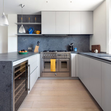
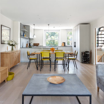
We changed the primary room space to run from the front to the back of the building. This change created the large kitchen dining living space our clients wanted, an area with good natural light throughout and at all times of the day.
We created a master bedroom suite in the loft space, with generous room size and lots of natural light.
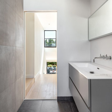
The limitations of the building’s form meant that a critical aspect to creating these larger living spaces was carefully considered smaller areas, including the bathrooms and a pocket utility room. The circulation space was carefully considered, too, with the landings used for storage in the form of new joinery.
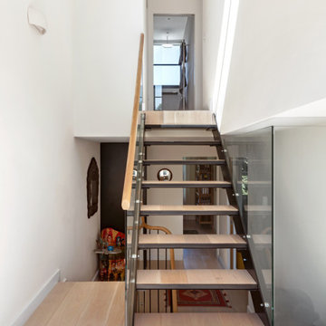
The stairs were vital in the design. Creating an in-between/half level meant we made the most of the flat roof extension for a bedroom suite and terrace. It also helped natural light get into the centre of the apartment, creating a clear connection between the different floors.
The stairs also help to mark the difference between the existing and the new. We shifted the design from a minimalist take on traditional metal balustraded stairs to open tread steel stairs with a glazed balustrade.
Externally, we kept the design quite simple and in keeping with the context. By adding dormers to the front and back, we created a sculptural and fun loft space.
The result:
A spacious, light and luxurious apartment for our clients Gareth and Mary in a Clapham Common Conservation area.
We asked about their experience with Granit, and we are pleased with their response:
Our experience overall is very good, even with the unexpected difficulties created by Covid.
If you are thinking of appointing an architect and interior design firm, Granit should be seriously considered.
 Granit Architects + Interiors
The brief:
Our clients own an apartment in a mansion block overlooking Clapham Common. They wanted to modernise and bring the apartment up to date and had a few goals:
To change the existing small cellular spaces in the apartment to create a new open-plan room
To extend into the loft and create a new master bedroom suite
To create a roof terrace for some much-needed private outdoor space
The key to the brief was to ensure a good connection between the different levels of the apartment and ensure natural light could flood into all spaces. The apartment is in a conservation area, which was an important consideration.
The solution:
We changed the primary room space to run from the front to the back of the building. This change created the large kitchen dining living space our clients wanted, an area with good natural light throughout and at all times of the day.
We created a master bedroom suite in the loft space, with generous room size and lots of natural light.
The limitations of the building’s form meant that a critical aspect to creating these larger living spaces was carefully considered smaller areas, including the bathrooms and a pocket utility room. The circulation space was carefully considered, too, with the landings used for storage in the form of new joinery.
The stairs were vital in the design. Creating an in-between/half level meant we made the most of the flat roof extension for a bedroom suite and terrace. It also helped natural light get into the centre of the apartment, creating a clear connection between the different floors.
The stairs also help to mark the difference between the existing and the new. We shifted the design from a minimalist take on traditional metal balustraded stairs to open tread steel stairs with a glazed balustrade.
Externally, we kept the design quite simple and in keeping with the context. By adding dormers to the front and back, we created a sculptural and fun loft space.
The result:
A spacious, light and luxurious apartment for our clients Gareth and Mary in a Clapham Common Conservation area.
We asked about their experience with Granit, and we are pleased with their response:
Our experience overall is very good, even with the unexpected difficulties created by Covid.
If you are thinking of appointing an architect and interior design firm, Granit should be seriously considered.
 Designs By Mark, Inc.
Design Statement:
My design challenge was to create and build a new ultra modern kitchen with a futuristic flare. This state of the art kitchen was to be equipped with an ample amount of usable storage and a better view of the outside while balancing design and function.
Some of the project goals were to include the following; a multi-level island with seating for four people, dramatic use of lighting, state of the art appliances, a generous view of the outside and last but not least, to create a kitchen space that looks like no other...”The WOW Factor”.
This challenging project was a completely new design and full renovation. The existing kitchen was outdated and in desperate need help. My new design required me to remove existing walls, cabinetry, flooring, plumbing, electric…a complete demolition. My job functions were to be the interior designer, GC, electrician and a laborer.
Construction and Design
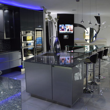
The existing kitchen had one small window in it like many kitchens. The main difficulty was…how to create more windows while gaining more cabinet storage. As a designer, our clients require us to think out of the box and give them something that they may have never dreamed of. I did just that. I created two 8’ glass backsplashes (with no visible supports) on the corner of the house. This was not easy task, engineering of massive blind headers and lam beams were used to support the load of the new floating walls. A generous amount of 48” high wall cabinets flank the new walls and appear floating in air seamlessly above the glass backsplash.
Technology and Design
The dramatic use of the latest in LED lighting was used. From color changing accent lights, high powered multi-directional spot lights, decorative soffit lights, under cabinet and above cabinet LED tape lights…all to be controlled from wall panels or mobile devises. A built-in ipad also controls not only the lighting, but a climate controlled thermostat, house wide music streaming with individually controlled zones, alarm system, video surveillance system and door bell.
Materials and design
Large amounts of glass and gloss; glass backsplash, iridescent glass tiles, raised glass island counter top, Quartz counter top with iridescent glass chips infused in it. 24” x 24” high polished porcelain tile flooring to give the appearance of water or glass. The custom cabinets are high gloss lacquer with a metallic fleck. All doors and drawers are Blum soft-close. The result is an ultra sleek and highly sophisticated design.
Appliances and design
All appliances were chosen for the ultimate in sleekness. These appliances include: a 48” built-in custom paneled subzero refrigerator/freezer, a built-in Miele dishwasher that is so quiet that it shoots a red led light on the floor to let you know that its on., a 36” Miele induction cook top and a built-in 200 bottle wine cooler. Some other cool features are the led kitchen faucet that changes color based on the water temperature. A stainless and glass wall hood with led lights. All duct work was built into the stainless steel toe kicks and grooves were cut into it to release airflow.
Photography by Mark Oser
Find the right local pro for your project
 RAJ Kitchen and Bath, LLC
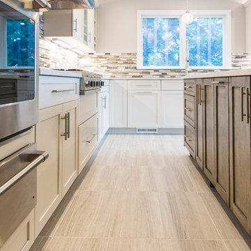
There were a few difficulties in making this kitchen any better than how it was. There was a separate staircase that had access to the second floor which was located in the kitchen. This left just enough room to push the dining room to one side. Then, there was the porch. A really nice panoramic view of the back, but was somehow under-used by the family during the summer months. Then, it was the size of the kitchen. It simply was way too small for a growing family, and while it had a peninsular in place, the flow just didn’t work. I remember watching them one day demonstrating how awkward it was using the kitchen. We got it! We had our marching orders to go and figure out how to make this kitchen work for this family.
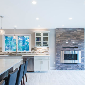
Everything in the room was fair play. The design was done to make the kitchen very open. For a few ideas, we incorporated the porch in the kitchen by using the nana wall idea but it ended up being too cost prohibitive to do so. We then decided to do a permanent fix by using a commercial glass wall application. Once we figured that out, we moved back inside and removed the staircase. This gave us two added benefits. One allowed us to really reconfigure the kitchen and the other opened up the second floor for a huge built in closet system.
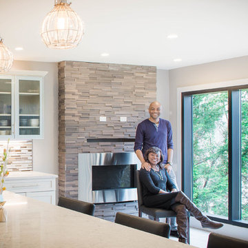
We relocated the windows, added a fire place with a built In TV above. From there, it was onto the kitchen itself which contained a huge Island with seating, large kitchen sink and built in appliances which was set up in a way to take advantage of the new layout. We re-positioned the kitchen facing the beautiful views outside rather than looking towards a wall. Now, when you enter the house up the entry stairs, the kitchen now draws you into the magnificent new open space. This is now setup for entertaining, relaxation, hanging out and most of all, preparing meals in a room where you only have to leave if you want to.
This one was all about the design. Design was what made this space. Setting this space up for success was crucial, and this kitchen is a great example of how design can cover a multitude of sins in Kitchen designs.
… Just close your eyes for a second and imagine waking up one winter morning and having a cup of coffee and watching the snow fall through those huge windows, leaning up against those 3D feature walls while watching the kids sitting around the table enjoying those warm radiant heated floors in this spacious kitchen…..
 RAJ Kitchen and Bath, LLC
There were a few difficulties in making this kitchen any better than how it was. There was a separate staircase that had access to the second floor which was located in the kitchen. This left just enough room to push the dining room to one side. Then, there was the porch. A really nice panoramic view of the back, but was somehow under-used by the family during the summer months. Then, it was the size of the kitchen. It simply was way too small for a growing family, and while it had a peninsular in place, the flow just didn’t work. I remember watching them one day demonstrating how awkward it was using the kitchen. We got it! We had our marching orders to go and figure out how to make this kitchen work for this family.
Everything in the room was fair play. The design was done to make the kitchen very open. For a few ideas, we incorporated the porch in the kitchen by using the nana wall idea but it ended up being too cost prohibitive to do so. We then decided to do a permanent fix by using a commercial glass wall application. Once we figured that out, we moved back inside and removed the staircase. This gave us two added benefits. One allowed us to really reconfigure the kitchen and the other opened up the second floor for a huge built in closet system.
We relocated the windows, added a fire place with a built In TV above. From there, it was onto the kitchen itself which contained a huge Island with seating, large kitchen sink and built in appliances which was set up in a way to take advantage of the new layout. We re-positioned the kitchen facing the beautiful views outside rather than looking towards a wall. Now, when you enter the house up the entry stairs, the kitchen now draws you into the magnificent new open space. This is now setup for entertaining, relaxation, hanging out and most of all, preparing meals in a room where you only have to leave if you want to.
This one was all about the design. Design was what made this space. Setting this space up for success was crucial, and this kitchen is a great example of how design can cover a multitude of sins in Kitchen designs.
… Just close your eyes for a second and imagine waking up one winter morning and having a cup of coffee and watching the snow fall through those huge windows, leaning up against those 3D feature walls while watching the kids sitting around the table enjoying those warm radiant heated floors in this spacious kitchen…..
 RAJ Kitchen and Bath, LLC
There were a few difficulties in making this kitchen any better than how it was. There was a separate staircase that had access to the second floor which was located in the kitchen. This left just enough room to push the dining room to one side. Then, there was the porch. A really nice panoramic view of the back, but was somehow under-used by the family during the summer months. Then, it was the size of the kitchen. It simply was way too small for a growing family, and while it had a peninsular in place, the flow just didn’t work. I remember watching them one day demonstrating how awkward it was using the kitchen. We got it! We had our marching orders to go and figure out how to make this kitchen work for this family.
Everything in the room was fair play. The design was done to make the kitchen very open. For a few ideas, we incorporated the porch in the kitchen by using the nana wall idea but it ended up being too cost prohibitive to do so. We then decided to do a permanent fix by using a commercial glass wall application. Once we figured that out, we moved back inside and removed the staircase. This gave us two added benefits. One allowed us to really reconfigure the kitchen and the other opened up the second floor for a huge built in closet system.
We relocated the windows, added a fire place with a built In TV above. From there, it was onto the kitchen itself which contained a huge Island with seating, large kitchen sink and built in appliances which was set up in a way to take advantage of the new layout. We re-positioned the kitchen facing the beautiful views outside rather than looking towards a wall. Now, when you enter the house up the entry stairs, the kitchen now draws you into the magnificent new open space. This is now setup for entertaining, relaxation, hanging out and most of all, preparing meals in a room where you only have to leave if you want to.
This one was all about the design. Design was what made this space. Setting this space up for success was crucial, and this kitchen is a great example of how design can cover a multitude of sins in Kitchen designs.
… Just close your eyes for a second and imagine waking up one winter morning and having a cup of coffee and watching the snow fall through those huge windows, leaning up against those 3D feature walls while watching the kids sitting around the table enjoying those warm radiant heated floors in this spacious kitchen…..
 Granit Architects + Interiors
The brief:
Our clients own an apartment in a mansion block overlooking Clapham Common. They wanted to modernise and bring the apartment up to date and had a few goals:
To change the existing small cellular spaces in the apartment to create a new open-plan room
To extend into the loft and create a new master bedroom suite
To create a roof terrace for some much-needed private outdoor space
The key to the brief was to ensure a good connection between the different levels of the apartment and ensure natural light could flood into all spaces. The apartment is in a conservation area, which was an important consideration.
The solution:
We changed the primary room space to run from the front to the back of the building. This change created the large kitchen dining living space our clients wanted, an area with good natural light throughout and at all times of the day.
We created a master bedroom suite in the loft space, with generous room size and lots of natural light.
The limitations of the building’s form meant that a critical aspect to creating these larger living spaces was carefully considered smaller areas, including the bathrooms and a pocket utility room. The circulation space was carefully considered, too, with the landings used for storage in the form of new joinery.
The stairs were vital in the design. Creating an in-between/half level meant we made the most of the flat roof extension for a bedroom suite and terrace. It also helped natural light get into the centre of the apartment, creating a clear connection between the different floors.
The stairs also help to mark the difference between the existing and the new. We shifted the design from a minimalist take on traditional metal balustraded stairs to open tread steel stairs with a glazed balustrade.
Externally, we kept the design quite simple and in keeping with the context. By adding dormers to the front and back, we created a sculptural and fun loft space.
The result:
A spacious, light and luxurious apartment for our clients Gareth and Mary in a Clapham Common Conservation area.
We asked about their experience with Granit, and we are pleased with their response:
Our experience overall is very good, even with the unexpected difficulties created by Covid.
If you are thinking of appointing an architect and interior design firm, Granit should be seriously considered.
 Granit Architects + Interiors
The brief:
Our clients own an apartment in a mansion block overlooking Clapham Common. They wanted to modernise and bring the apartment up to date and had a few goals:
To change the existing small cellular spaces in the apartment to create a new open-plan room
To extend into the loft and create a new master bedroom suite
To create a roof terrace for some much-needed private outdoor space
The key to the brief was to ensure a good connection between the different levels of the apartment and ensure natural light could flood into all spaces. The apartment is in a conservation area, which was an important consideration.
The solution:
We changed the primary room space to run from the front to the back of the building. This change created the large kitchen dining living space our clients wanted, an area with good natural light throughout and at all times of the day.
We created a master bedroom suite in the loft space, with generous room size and lots of natural light.
The limitations of the building’s form meant that a critical aspect to creating these larger living spaces was carefully considered smaller areas, including the bathrooms and a pocket utility room. The circulation space was carefully considered, too, with the landings used for storage in the form of new joinery.
The stairs were vital in the design. Creating an in-between/half level meant we made the most of the flat roof extension for a bedroom suite and terrace. It also helped natural light get into the centre of the apartment, creating a clear connection between the different floors.
The stairs also help to mark the difference between the existing and the new. We shifted the design from a minimalist take on traditional metal balustraded stairs to open tread steel stairs with a glazed balustrade.
Externally, we kept the design quite simple and in keeping with the context. By adding dormers to the front and back, we created a sculptural and fun loft space.
The result:
A spacious, light and luxurious apartment for our clients Gareth and Mary in a Clapham Common Conservation area.
We asked about their experience with Granit, and we are pleased with their response:
Our experience overall is very good, even with the unexpected difficulties created by Covid.
If you are thinking of appointing an architect and interior design firm, Granit should be seriously considered.
 RAJ Kitchen and Bath, LLC
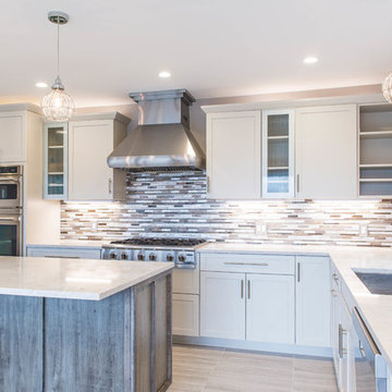
There were a few difficulties in making this kitchen any better than how it was. There was a separate staircase that had access to the second floor which was located in the kitchen. This left just enough room to push the dining room to one side. Then, there was the porch. A really nice panoramic view of the back, but was somehow under-used by the family during the summer months. Then, it was the size of the kitchen. It simply was way too small for a growing family, and while it had a peninsular in place, the flow just didn’t work. I remember watching them one day demonstrating how awkward it was using the kitchen. We got it! We had our marching orders to go and figure out how to make this kitchen work for this family.
Everything in the room was fair play. The design was done to make the kitchen very open. For a few ideas, we incorporated the porch in the kitchen by using the nana wall idea but it ended up being too cost prohibitive to do so. We then decided to do a permanent fix by using a commercial glass wall application. Once we figured that out, we moved back inside and removed the staircase. This gave us two added benefits. One allowed us to really reconfigure the kitchen and the other opened up the second floor for a huge built in closet system.
We relocated the windows, added a fire place with a built In TV above. From there, it was onto the kitchen itself which contained a huge Island with seating, large kitchen sink and built in appliances which was set up in a way to take advantage of the new layout. We re-positioned the kitchen facing the beautiful views outside rather than looking towards a wall. Now, when you enter the house up the entry stairs, the kitchen now draws you into the magnificent new open space. This is now setup for entertaining, relaxation, hanging out and most of all, preparing meals in a room where you only have to leave if you want to.
This one was all about the design. Design was what made this space. Setting this space up for success was crucial, and this kitchen is a great example of how design can cover a multitude of sins in Kitchen designs.
… Just close your eyes for a second and imagine waking up one winter morning and having a cup of coffee and watching the snow fall through those huge windows, leaning up against those 3D feature walls while watching the kids sitting around the table enjoying those warm radiant heated floors in this spacious kitchen…..
 Granit Architects + Interiors
The brief:
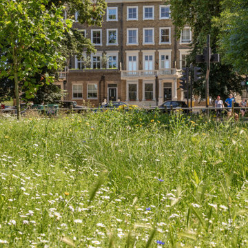
Our clients own an apartment in a mansion block overlooking Clapham Common. They wanted to modernise and bring the apartment up to date and had a few goals:
To change the existing small cellular spaces in the apartment to create a new open-plan room
To extend into the loft and create a new master bedroom suite
To create a roof terrace for some much-needed private outdoor space
The key to the brief was to ensure a good connection between the different levels of the apartment and ensure natural light could flood into all spaces. The apartment is in a conservation area, which was an important consideration.
The solution:
We changed the primary room space to run from the front to the back of the building. This change created the large kitchen dining living space our clients wanted, an area with good natural light throughout and at all times of the day.
We created a master bedroom suite in the loft space, with generous room size and lots of natural light.
The limitations of the building’s form meant that a critical aspect to creating these larger living spaces was carefully considered smaller areas, including the bathrooms and a pocket utility room. The circulation space was carefully considered, too, with the landings used for storage in the form of new joinery.
The stairs were vital in the design. Creating an in-between/half level meant we made the most of the flat roof extension for a bedroom suite and terrace. It also helped natural light get into the centre of the apartment, creating a clear connection between the different floors.
The stairs also help to mark the difference between the existing and the new. We shifted the design from a minimalist take on traditional metal balustraded stairs to open tread steel stairs with a glazed balustrade.
Externally, we kept the design quite simple and in keeping with the context. By adding dormers to the front and back, we created a sculptural and fun loft space.
The result:
A spacious, light and luxurious apartment for our clients Gareth and Mary in a Clapham Common Conservation area.
We asked about their experience with Granit, and we are pleased with their response:
Our experience overall is very good, even with the unexpected difficulties created by Covid.
If you are thinking of appointing an architect and interior design firm, Granit should be seriously considered.
 Kari P
When I bought my house in May 2014, there was one thing I really didn’t like about it – the 1950s bathroom complete with pink tile and mismatched gaudy fixtures was absolutely hideous. I knew redoing the bathroom would be a big, expensive project, so I vowed to just live with it while I fixed up parts of the house that were easier to update, such as putting a fresh coat of paint on the walls and updating the curtains (which I still haven’t done, by the way). Well my first winter in the new house turned out to be a bad one, and in February 2015, I noticed water stains on the walls and ceiling of the second bedroom that only got worse and worse each day. The water damage quickly spread to other rooms, and when contractors came to the house to access and fix the damage, they discovered moisture behind the pink tiled walls of my bathroom. And so started the bathroom remodel.
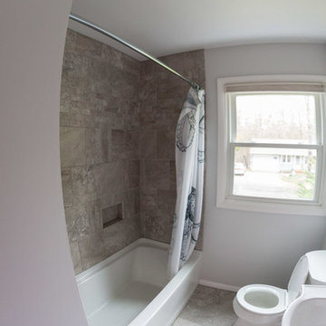
Start to finish, this project took close to six months, due to going back and forth with insurance and difficulty finding a contractor I liked. I lived without a shower for at least four of those months, showering at the gym where I worked or in a pop-up tent in my backyard once it was warm enough out. My friend Eric and I demoed the bathroom and for the remodel, I picked out all of the design components and had a local contractor, Fred Haas do the work. I kept the original layout – as my bathroom was small to begin with and it was both impractical and expensive to start moving things around – but just about everything else about the bathroom is new, except for maybe the window and door. New tub, sink, and toilet, new tile floor and shower surround, new walls and ceiling, fresh paint, new fixtures and mirror, updated lighting, and a better ventilation system were all added.
Tub – Sterling Vikrell
Toilet – Kohler Wellworth® two-piece round-front dual-flush toilet
Sink – Kohler Veer™ 21" pedestal bathroom sink
Fixtures – Kohler Alteo® line
Tile floor and shower surround – American Olean Laurel Heights ceramic tile in Summit Gray
Lighting – I don't remember... will have to see if I can find it
Ventilation system – NuTone
Mirror – Ikea
Paint – Behr
Here are photos of my project from start to finish. As you can see, I probably still need a thing or two (a toilet paper holder, mini storage shelf, and some art wouldn’t hurt, nor would replacing the door or painting it white), but overall I’m really happy with how my new bathroom came out. I LOVE it, which is the exact opposite of how I felt about the original bathroom.
Photos © Kari Post
 Eaton Custom Homes
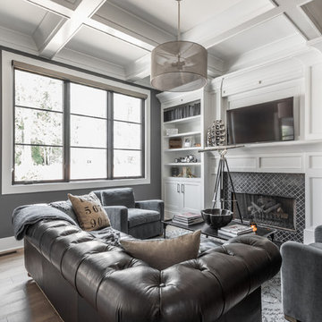
The goal in building this home was to create an exterior esthetic that elicits memories of a Tuscan Villa on a hillside and also incorporates a modern feel to the interior.
Modern aspects were achieved using an open staircase along with a 25' wide rear folding door. The addition of the folding door allows us to achieve a seamless feel between the interior and exterior of the house. Such creates a versatile entertaining area that increases the capacity to comfortably entertain guests.
The outdoor living space with covered porch is another unique feature of the house. The porch has a fireplace plus heaters in the ceiling which allow one to entertain guests regardless of the temperature. The zero edge pool provides an absolutely beautiful backdrop—currently, it is the only one made in Indiana. Lastly, the master bathroom shower has a 2' x 3' shower head for the ultimate waterfall effect. This house is unique both outside and in.
 Granit Architects + Interiors
The brief:
Our clients own an apartment in a mansion block overlooking Clapham Common. They wanted to modernise and bring the apartment up to date and had a few goals:
To change the existing small cellular spaces in the apartment to create a new open-plan room
To extend into the loft and create a new master bedroom suite
To create a roof terrace for some much-needed private outdoor space
The key to the brief was to ensure a good connection between the different levels of the apartment and ensure natural light could flood into all spaces. The apartment is in a conservation area, which was an important consideration.
The solution:
We changed the primary room space to run from the front to the back of the building. This change created the large kitchen dining living space our clients wanted, an area with good natural light throughout and at all times of the day.
We created a master bedroom suite in the loft space, with generous room size and lots of natural light.
The limitations of the building’s form meant that a critical aspect to creating these larger living spaces was carefully considered smaller areas, including the bathrooms and a pocket utility room. The circulation space was carefully considered, too, with the landings used for storage in the form of new joinery.
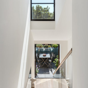
The stairs were vital in the design. Creating an in-between/half level meant we made the most of the flat roof extension for a bedroom suite and terrace. It also helped natural light get into the centre of the apartment, creating a clear connection between the different floors.
The stairs also help to mark the difference between the existing and the new. We shifted the design from a minimalist take on traditional metal balustraded stairs to open tread steel stairs with a glazed balustrade.
Externally, we kept the design quite simple and in keeping with the context. By adding dormers to the front and back, we created a sculptural and fun loft space.
The result:
A spacious, light and luxurious apartment for our clients Gareth and Mary in a Clapham Common Conservation area.
We asked about their experience with Granit, and we are pleased with their response:
Our experience overall is very good, even with the unexpected difficulties created by Covid.
If you are thinking of appointing an architect and interior design firm, Granit should be seriously considered.
 RAJ Kitchen and Bath, LLC
There were a few difficulties in making this kitchen any better than how it was. There was a separate staircase that had access to the second floor which was located in the kitchen. This left just enough room to push the dining room to one side. Then, there was the porch. A really nice panoramic view of the back, but was somehow under-used by the family during the summer months. Then, it was the size of the kitchen. It simply was way too small for a growing family, and while it had a peninsular in place, the flow just didn’t work. I remember watching them one day demonstrating how awkward it was using the kitchen. We got it! We had our marching orders to go and figure out how to make this kitchen work for this family.
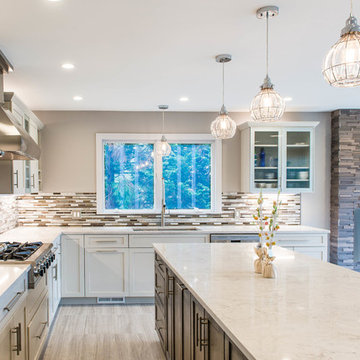
Everything in the room was fair play. The design was done to make the kitchen very open. For a few ideas, we incorporated the porch in the kitchen by using the nana wall idea but it ended up being too cost prohibitive to do so. We then decided to do a permanent fix by using a commercial glass wall application. Once we figured that out, we moved back inside and removed the staircase. This gave us two added benefits. One allowed us to really reconfigure the kitchen and the other opened up the second floor for a huge built in closet system.
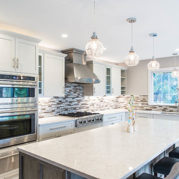
We relocated the windows, added a fire place with a built In TV above. From there, it was onto the kitchen itself which contained a huge Island with seating, large kitchen sink and built in appliances which was set up in a way to take advantage of the new layout. We re-positioned the kitchen facing the beautiful views outside rather than looking towards a wall. Now, when you enter the house up the entry stairs, the kitchen now draws you into the magnificent new open space. This is now setup for entertaining, relaxation, hanging out and most of all, preparing meals in a room where you only have to leave if you want to.
This one was all about the design. Design was what made this space. Setting this space up for success was crucial, and this kitchen is a great example of how design can cover a multitude of sins in Kitchen designs.
… Just close your eyes for a second and imagine waking up one winter morning and having a cup of coffee and watching the snow fall through those huge windows, leaning up against those 3D feature walls while watching the kids sitting around the table enjoying those warm radiant heated floors in this spacious kitchen…..
 RAJ Kitchen and Bath, LLC
There were a few difficulties in making this kitchen any better than how it was. There was a separate staircase that had access to the second floor which was located in the kitchen. This left just enough room to push the dining room to one side. Then, there was the porch. A really nice panoramic view of the back, but was somehow under-used by the family during the summer months. Then, it was the size of the kitchen. It simply was way too small for a growing family, and while it had a peninsular in place, the flow just didn’t work. I remember watching them one day demonstrating how awkward it was using the kitchen. We got it! We had our marching orders to go and figure out how to make this kitchen work for this family.
Everything in the room was fair play. The design was done to make the kitchen very open. For a few ideas, we incorporated the porch in the kitchen by using the nana wall idea but it ended up being too cost prohibitive to do so. We then decided to do a permanent fix by using a commercial glass wall application. Once we figured that out, we moved back inside and removed the staircase. This gave us two added benefits. One allowed us to really reconfigure the kitchen and the other opened up the second floor for a huge built in closet system.
We relocated the windows, added a fire place with a built In TV above. From there, it was onto the kitchen itself which contained a huge Island with seating, large kitchen sink and built in appliances which was set up in a way to take advantage of the new layout. We re-positioned the kitchen facing the beautiful views outside rather than looking towards a wall. Now, when you enter the house up the entry stairs, the kitchen now draws you into the magnificent new open space. This is now setup for entertaining, relaxation, hanging out and most of all, preparing meals in a room where you only have to leave if you want to.
This one was all about the design. Design was what made this space. Setting this space up for success was crucial, and this kitchen is a great example of how design can cover a multitude of sins in Kitchen designs.
… Just close your eyes for a second and imagine waking up one winter morning and having a cup of coffee and watching the snow fall through those huge windows, leaning up against those 3D feature walls while watching the kids sitting around the table enjoying those warm radiant heated floors in this spacious kitchen…..
 Affordable Chic
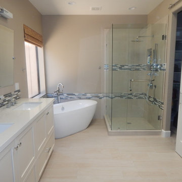
Mid-sized trendy master multicolored tile and porcelain tile porcelain tile alcove bathtub photo in Minneapolis with shaker cabinets, white cabinets, a two-piece toilet, beige walls, an undermount sink and quartz countertops
 RAJ Kitchen and Bath, LLC
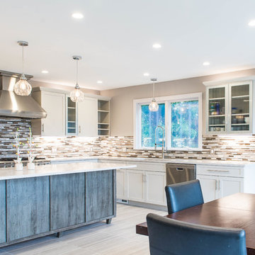
There were a few difficulties in making this kitchen any better than how it was. There was a separate staircase that had access to the second floor which was located in the kitchen. This left just enough room to push the dining room to one side. Then, there was the porch. A really nice panoramic view of the back, but was somehow under-used by the family during the summer months. Then, it was the size of the kitchen. It simply was way too small for a growing family, and while it had a peninsular in place, the flow just didn’t work. I remember watching them one day demonstrating how awkward it was using the kitchen. We got it! We had our marching orders to go and figure out how to make this kitchen work for this family.
Everything in the room was fair play. The design was done to make the kitchen very open. For a few ideas, we incorporated the porch in the kitchen by using the nana wall idea but it ended up being too cost prohibitive to do so. We then decided to do a permanent fix by using a commercial glass wall application. Once we figured that out, we moved back inside and removed the staircase. This gave us two added benefits. One allowed us to really reconfigure the kitchen and the other opened up the second floor for a huge built in closet system.
We relocated the windows, added a fire place with a built In TV above. From there, it was onto the kitchen itself which contained a huge Island with seating, large kitchen sink and built in appliances which was set up in a way to take advantage of the new layout. We re-positioned the kitchen facing the beautiful views outside rather than looking towards a wall. Now, when you enter the house up the entry stairs, the kitchen now draws you into the magnificent new open space. This is now setup for entertaining, relaxation, hanging out and most of all, preparing meals in a room where you only have to leave if you want to.
This one was all about the design. Design was what made this space. Setting this space up for success was crucial, and this kitchen is a great example of how design can cover a multitude of sins in Kitchen designs.
… Just close your eyes for a second and imagine waking up one winter morning and having a cup of coffee and watching the snow fall through those huge windows, leaning up against those 3D feature walls while watching the kids sitting around the table enjoying those warm radiant heated floors in this spacious kitchen…..
 Granit Architects + Interiors
The brief:
Our clients own an apartment in a mansion block overlooking Clapham Common. They wanted to modernise and bring the apartment up to date and had a few goals:
To change the existing small cellular spaces in the apartment to create a new open-plan room
To extend into the loft and create a new master bedroom suite
To create a roof terrace for some much-needed private outdoor space
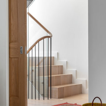
The key to the brief was to ensure a good connection between the different levels of the apartment and ensure natural light could flood into all spaces. The apartment is in a conservation area, which was an important consideration.
The solution:
We changed the primary room space to run from the front to the back of the building. This change created the large kitchen dining living space our clients wanted, an area with good natural light throughout and at all times of the day.
We created a master bedroom suite in the loft space, with generous room size and lots of natural light.
The limitations of the building’s form meant that a critical aspect to creating these larger living spaces was carefully considered smaller areas, including the bathrooms and a pocket utility room. The circulation space was carefully considered, too, with the landings used for storage in the form of new joinery.
The stairs were vital in the design. Creating an in-between/half level meant we made the most of the flat roof extension for a bedroom suite and terrace. It also helped natural light get into the centre of the apartment, creating a clear connection between the different floors.
The stairs also help to mark the difference between the existing and the new. We shifted the design from a minimalist take on traditional metal balustraded stairs to open tread steel stairs with a glazed balustrade.
Externally, we kept the design quite simple and in keeping with the context. By adding dormers to the front and back, we created a sculptural and fun loft space.
The result:
A spacious, light and luxurious apartment for our clients Gareth and Mary in a Clapham Common Conservation area.
We asked about their experience with Granit, and we are pleased with their response:
Our experience overall is very good, even with the unexpected difficulties created by Covid.
If you are thinking of appointing an architect and interior design firm, Granit should be seriously considered.
 RAJ Kitchen and Bath, LLC
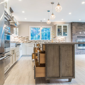
There were a few difficulties in making this kitchen any better than how it was. There was a separate staircase that had access to the second floor which was located in the kitchen. This left just enough room to push the dining room to one side. Then, there was the porch. A really nice panoramic view of the back, but was somehow under-used by the family during the summer months. Then, it was the size of the kitchen. It simply was way too small for a growing family, and while it had a peninsular in place, the flow just didn’t work. I remember watching them one day demonstrating how awkward it was using the kitchen. We got it! We had our marching orders to go and figure out how to make this kitchen work for this family.
Everything in the room was fair play. The design was done to make the kitchen very open. For a few ideas, we incorporated the porch in the kitchen by using the nana wall idea but it ended up being too cost prohibitive to do so. We then decided to do a permanent fix by using a commercial glass wall application. Once we figured that out, we moved back inside and removed the staircase. This gave us two added benefits. One allowed us to really reconfigure the kitchen and the other opened up the second floor for a huge built in closet system.
We relocated the windows, added a fire place with a built In TV above. From there, it was onto the kitchen itself which contained a huge Island with seating, large kitchen sink and built in appliances which was set up in a way to take advantage of the new layout. We re-positioned the kitchen facing the beautiful views outside rather than looking towards a wall. Now, when you enter the house up the entry stairs, the kitchen now draws you into the magnificent new open space. This is now setup for entertaining, relaxation, hanging out and most of all, preparing meals in a room where you only have to leave if you want to.
This one was all about the design. Design was what made this space. Setting this space up for success was crucial, and this kitchen is a great example of how design can cover a multitude of sins in Kitchen designs.
… Just close your eyes for a second and imagine waking up one winter morning and having a cup of coffee and watching the snow fall through those huge windows, leaning up against those 3D feature walls while watching the kids sitting around the table enjoying those warm radiant heated floors in this spacious kitchen…..
 Granit Architects + Interiors
The brief:
Our clients own an apartment in a mansion block overlooking Clapham Common. They wanted to modernise and bring the apartment up to date and had a few goals:
To change the existing small cellular spaces in the apartment to create a new open-plan room
To extend into the loft and create a new master bedroom suite
To create a roof terrace for some much-needed private outdoor space
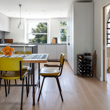
The key to the brief was to ensure a good connection between the different levels of the apartment and ensure natural light could flood into all spaces. The apartment is in a conservation area, which was an important consideration.
The solution:
We changed the primary room space to run from the front to the back of the building. This change created the large kitchen dining living space our clients wanted, an area with good natural light throughout and at all times of the day.
We created a master bedroom suite in the loft space, with generous room size and lots of natural light.
The limitations of the building’s form meant that a critical aspect to creating these larger living spaces was carefully considered smaller areas, including the bathrooms and a pocket utility room. The circulation space was carefully considered, too, with the landings used for storage in the form of new joinery.
The stairs were vital in the design. Creating an in-between/half level meant we made the most of the flat roof extension for a bedroom suite and terrace. It also helped natural light get into the centre of the apartment, creating a clear connection between the different floors.
The stairs also help to mark the difference between the existing and the new. We shifted the design from a minimalist take on traditional metal balustraded stairs to open tread steel stairs with a glazed balustrade.
Externally, we kept the design quite simple and in keeping with the context. By adding dormers to the front and back, we created a sculptural and fun loft space.
The result:
A spacious, light and luxurious apartment for our clients Gareth and Mary in a Clapham Common Conservation area.
We asked about their experience with Granit, and we are pleased with their response:
Our experience overall is very good, even with the unexpected difficulties created by Covid.
If you are thinking of appointing an architect and interior design firm, Granit should be seriously considered.
24