
Search results for "Direct result" in Home Design Ideas
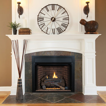
 Superior Fireplaces
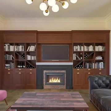
The VRT4000 radiant vent-free fireplace presents a fresh yet traditional tall and flush to the floor masonry fireplace design. Standard features include, a radiant clean face design with a 24" tall opening, hidden screen pockets, factory installed j-box and the industry's finest textured refractory panels and floor.
Features
VRT4000 Series offers 32”, 36” and 42” models
Expansive viewing area with a flush to the floor opening
Interior refractory panels available in Red and White in both stacked or herringbone pattern
Textured powder-coat paint
Full length nailing flanges for easier installation
Gas knockouts located on both sides for easier installation
Mesh draw screens for a more realistic appearance
Compatible with any listed ANSI Z21.11.2 vent-free log set. Choose a beautiful and reliable Superior vent-free log set for best results.
20 year limited warranty

 Michael Nash Design, Build & Homes
This growing family of six was struggling with a dysfunctional kitchen design. The center island had been installed at an odd angle that limited accessibility and traffic flow. Additionally, storage space was limited by poor cabinet design. Finally, doorways in and out of the kitchen were narrow and poorly located, especially for children dashing in and out.
Other design challenges included how to better use a 10’ x 12’ room for children’s jackets and toys and how to add a professional-quality gas range in a neighborhood were natural gas wasn’t available. The new design would address all of these issues.
DESIGN SOLUTIONS
The new kitchen design revolves around a more proportional island. Carefully placed in the center of the new space with seating for four, it includes a prep sink, a second dishwasher and a beverage center.
The distressed ebony-stained island and hutch provides a brilliant contrast between the white color cabinetry. White Carrera marble countertops and backsplash top both island and perimeter cabinets.
Tall, double stacked cabinetry lines two walls to maximize storage space. Across the room there was an unused wall that now contains a 36” tower fridge and freezer, both covered with matching panels, and a tall cabinet that contains a microwave, steam unit and warming drawer.
A propane tank was buried in the back yard to provide gas to a new 60” professional range and cooktop. A custom-made wood mantel hood blends perfectly with the cabinet style.
The old laundry room was reconfigured to have lots of locker space for all kids and added cabinetry for storage. A double entry door separated the new mudroom from the rest of the back hall. In the back hall the back windows were replaced with a set of French door and added decking to create a direct access to deck and backyard.
The end result is an open floor plan, high-end appliances, great traffic flow and pleasing colors. The homeowner calls it the “kitchen of her dreams.”
 Wesley-Wayne Interiors, LLC
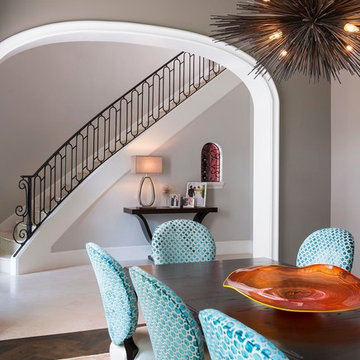
This dining room is a great space for large gatherings. The soft colors make the room feel serene, but the pops of orange in the centerpiece and jewel colors in the artwork create some interest that tie things together. For this young couple, the lighting really needed to be unique that's not seen in every new construction project. Cut velvet fabric on the back of dining chairs adds a cool texture and pattern to the space, while the leather seats make for maintenance friendly dining.
Design: Wesley-Wayne Interiors
Photo: Dan Piassick
Find the right local pro for your project
 MainStreet Design Build
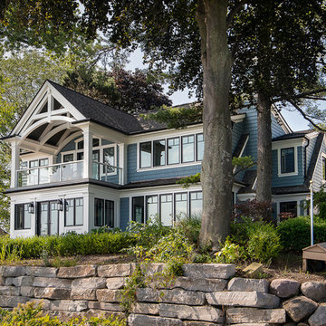
Originally built in the early twentieth century, this Orchard Lake cottage was purchased almost 10 years ago by a wonderful couple—empty nesters with an appreciation for stunning views, modern amenities and quality craftsmanship. They hired MainStreet Design Build to design and remodel their home to fit their needs exactly.
Upon initial inspection, it was apparent that the original home had been modified over the years, sustaining multiple room additions. Consequently, this mid-size cottage home had little character or cohesiveness. Even more concerning, after conducting a thorough inspection, it became apparent that the structure was inadequate to sustain major modifications. As a result, a plan was formulated to take the existing structure down to its original floor deck.
The clients’ needs that fueled the design plan included:
-Preserving and capitalizing on the lake view
-A large, welcoming entry from the street
-A warm, inviting space for entertaining guests and family
-A large, open kitchen with room for multiple cooks
-Built-ins for the homeowner’s book collection
-An in-law suite for the couple’s aging parents
The space was redesigned with the clients needs in mind. Building a completely new structure gave us the opportunity to create a large, welcoming main entrance. The dining and kitchen areas are now open and spacious for large family gatherings. A custom Grabill kitchen was designed with professional grade Wolf and Thermador appliances for an enjoyable cooking and dining experience. The homeowners loved the Grabill cabinetry so much that they decided to use it throughout the home in the powder room, (2) guest suite bathrooms and the laundry room, complete with dog wash. Most breathtaking; however, might be the luxury master bathroom which included extensive use of marble, a 2-person Maax whirlpool tub, an oversized walk-in-shower with steam and bench seating for two, and gorgeous custom-built inset cherry cabinetry.
The new wide plank oak flooring continues throughout the entire first and second floors with a lovely open staircase lit by a chandelier, skylights and flush in-wall step lighting. Plenty of custom built-ins were added on walls and seating areas to accommodate the client’s sizeable book collection. Fitting right in to the gorgeous lakefront lot, the home’s exterior is reminiscent of East Coast “beachy” shingle-style that includes an attached, oversized garage with Mahogany carriage style garage doors that leads directly into a mud room and first floor laundry.
These Orchard Lake property homeowners love their new home, with a combined first and second floor living space totaling 4,429 sq. ft. To further add to the amenities of this home, MainStreet Design Build is currently under design contract for another major lower-level / basement renovation in the fall of 2017.
Kate Benjamin Photography
 Laura Garner
Photo: Laura Garner Design & Realty © 2016 Houzz
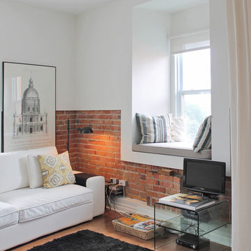
Example of a trendy living room design in Montreal
Example of a trendy living room design in Montreal
 Gardner/Fox Associates, Inc
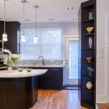
The existing narrow kitchen was renovated and expanded into the adjacent dining room area. The removal of a wall that separated the two spaces resulted in an open kitchen and dining area designed to be more suitable to modern living. The new kitchen acts as both a gathering place for the family and a functional work space.
The renovation features custom wood cabinetry, stone countertops, stainless steel appliances, a large center island with seating, hardwood flooring, and a combination of recessed top-hat and pendant lighting. The homeowners saved money by re-using the existing appliances.
 Thomas Roszak Architecture, LLC
Photo credit: Scott McDonald @ Hedrich Blessing
7RR-Ecohome:
The design objective was to build a house for a couple recently married who both had kids from previous marriages. How to bridge two families together?
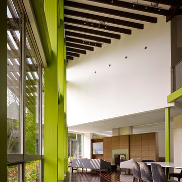
The design looks forward in terms of how people live today. The home is an experiment in transparency and solid form; removing borders and edges from outside to inside the house, and to really depict “flowing and endless space”. The house floor plan is derived by pushing and pulling the house’s form to maximize the backyard and minimize the public front yard while welcoming the sun in key rooms by rotating the house 45-degrees to true north. The angular form of the house is a result of the family’s program, the zoning rules, the lot’s attributes, and the sun’s path. We wanted to construct a house that is smart and efficient in terms of construction and energy, both in terms of the building and the user. We could tell a story of how the house is built in terms of the constructability, structure and enclosure, with a nod to Japanese wood construction in the method in which the siding is installed and the exposed interior beams are placed in the double height space. We engineered the house to be smart which not only looks modern but acts modern; every aspect of user control is simplified to a digital touch button, whether lights, shades, blinds, HVAC, communication, audio, video, or security. We developed a planning module based on a 6-foot square room size and a 6-foot wide connector called an interstitial space for hallways, bathrooms, stairs and mechanical, which keeps the rooms pure and uncluttered. The house is 6,200 SF of livable space, plus garage and basement gallery for a total of 9,200 SF. A large formal foyer celebrates the entry and opens up to the living, dining, kitchen and family rooms all focused on the rear garden. The east side of the second floor is the Master wing and a center bridge connects it to the kid’s wing on the west. Second floor terraces and sunscreens provide views and shade in this suburban setting. The playful mathematical grid of the house in the x, y and z axis also extends into the layout of the trees and hard-scapes, all centered on a suburban one-acre lot.
Many green attributes were designed into the home; Ipe wood sunscreens and window shades block out unwanted solar gain in summer, but allow winter sun in. Patio door and operable windows provide ample opportunity for natural ventilation throughout the open floor plan. Minimal windows on east and west sides to reduce heat loss in winter and unwanted gains in summer. Open floor plan and large window expanse reduces lighting demands and maximizes available daylight. Skylights provide natural light to the basement rooms. Durable, low-maintenance exterior materials include stone, ipe wood siding and decking, and concrete roof pavers. Design is based on a 2' planning grid to minimize construction waste. Basement foundation walls and slab are highly insulated. FSC-certified walnut wood flooring was used. Light colored concrete roof pavers to reduce cooling loads by as much as 15%. 2x6 framing allows for more insulation and energy savings. Super efficient windows have low-E argon gas filled units, and thermally insulated aluminum frames. Permeable brick and stone pavers reduce the site’s storm-water runoff. Countertops use recycled composite materials. Energy-Star rated furnaces and smart thermostats are located throughout the house to minimize duct runs and avoid energy loss. Energy-Star rated boiler that heats up both radiant floors and domestic hot water. Low-flow toilets and plumbing fixtures are used to conserve water usage. No VOC finish options and direct venting fireplaces maintain a high interior air quality. Smart home system controls lighting, HVAC, and shades to better manage energy use. Plumbing runs through interior walls reducing possibilities of heat loss and freezing problems. A large food pantry was placed next to kitchen to reduce trips to the grocery store. Home office reduces need for automobile transit and associated CO2 footprint. Plan allows for aging in place, with guest suite than can become the master suite, with no need to move as family members mature.


 Décor Aid
Having an eye for great interior design yet no clue on where to start or how to narrow down their aesthetic vision, a young family turned to Décor Aid to bring their drab pre-war Upper West Side apartment to life. With two young daughters in tow, our clients were looking for high style décor grounded in practicality and function – namely for their foyer, living room, dining room, and den.
Armed with a variety of inspiration from traditional to ultra-modern, they knew that they wanted their apartment’s interior design to look put together and thought through, but were short on a concise design direction.
In comes Décor Aid interior designer Gabrielle G. to revive their stark home with inspired design. After their initial in-home consultation, Gabrielle honed in on key decorative touchstones the couple had interest in and compiled a list of must-haves as an aesthetic foundation for the home.
Starting with fresh coats of pure white paint to liven up and brighten each room, Gabrielle took advantage of the apartments closed floor plan and gave each room it’s own design signature rather than having to ensure that everything flowed together – in turn, giving her more freedom.
Save for a china cabinet and formal dining table, Gabrielle was tasked with sourcing furnishings and accessories and went for clean simplicity as the couple also expressed that they’d like to have pieces that can move with them as their family grows while also being conducive for family life.
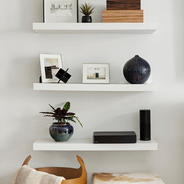
As you can see, the space is grounded with soothing neutrals so Gabrielle brought in pops of color and texture through accessories and abstract art for a sophisticated yet casual vibe.
The end result boasts concise design and pulled together everyday glamor for this modern family home that our clients adore, and so do we.
 Blue Heron Signature Homes
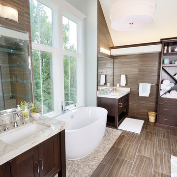
Designed and built by Terramor Homes in Raleigh, NC. In continuing the retreat feel, the goal in the master bath was to achieve a spa like feel. Inspired to incorporate the spa together with the tone of the rest of the home, the main focal element was a gorgeous free standing oval tub centered in the room under the vault of the ceiling and an 8 foot tall and 5 foot wide casement window that overlooks the river and greenway area behind the home. Directly across, the 6 foot by 6 foot full glass and glass tile was located- sharing the view out of the large windows. Flanking the tub are the adult height cabinets with large square legs and a shelf underneath, similar to the spa look that is expected. A full height cabinet pantry was added to encourage storage or rolled towels, bathing accessories and additional storage as well. The entire room was finished with a chocolate brown, 18” x 12” tile, laid in a brick pattern and continued up the walls for the consistent and clean look. Centered in the vault, a large, linen drum pendant with chrome trim drops- bringing elegance to the space. Small shelves were built at the bottom of each side of the vaulted ceiling to house the LED lighting that shines up the vaults of the ceiling, again replicating natural day light at any time of day. The final result of this master bath was exactly as we had set out to achieve- a peaceful and relaxing retreat right inside our home.
Photography: M. Eric Honeycutt
 ArtCraft Homes LLC
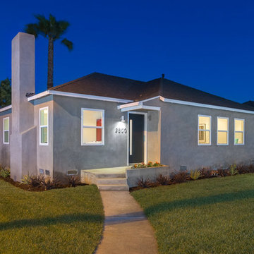
From neglected hoarder house to showplace! This post-war traditional ranch was remodeled into a sophisticated contemporary home by Tim Braseth of ArtCraft Homes, completed in 2013. Located in the Crenshaw Manor neighborhood of central Los Angeles with direct access to neighboring Culver City and downtown L.A. via the new Expo line. Space reconfiguration resulted in 3 spacious bedrooms and 2 full bathrooms. Features include all-new custom kitchen with stainless steel appliances, glass tile bathrooms, and solid oak floors throughout. The private master retreat features its own glass-tiled en suite bathroom with dual vanities, generously-sized walk-in closet, vaulted ceiling and French doors to the expansive patio with a direct view to the distant Hollywood sign. Remodel by ArtCraft Homes. Staging by Leslie Whitlock. "After" photography by Marc Angeles of Unlimited Style.
 Pittam Associates, Inc.
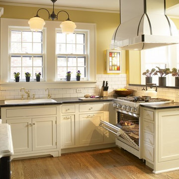
The small "old fashioned" 1920's kitchen was outdated by today's standards for the client who loved this look, but not the inconveniences that went with it.
The original breakfast room and butler’s pantry (after much discussion concerning honoring the original floor plan!) was incorporated into the new space by removal of the wall that separated them from the kitchen. The final result is tasteful and functional and in keeping with the classic 1920's look.
Photo credit: White Good & Company
 Klopf Architecture
Malibu Glass Box House by Klopf Architecture
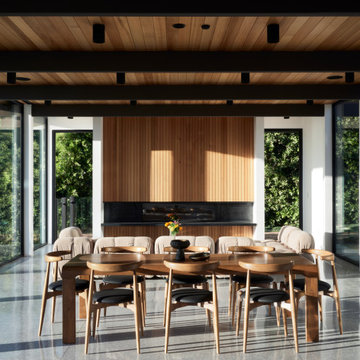
Following the devastating Woolsey Fire of 2018, the site in Malibu offered a unique opportunity to rebuild not just a home, but a new architectural composition that highlighted the property’s potential while navigating strict fire-rebuild codes in the area. Designed by Klopf Architecture, this project embraced a set of limitations and translated them into an architectural asset.
The city’s fire-rebuild process required the new structure to remain close to the original footprint, size and bulk, a constraint that ultimately clarified the architectural direction. Perched near the front of a long, narrow lot, the new home frames and overlooks a private, park-like rear expanse, an uncommon luxury especially in this part of Malibu .
Without a fixed program, the design process allowed for a different kind of creative focus allowing Klopf Architecture the opportunity to explore how a modernist home could best respond to this site. The team approached the project not with a list of requirements, but with a question: How might a modernist live here? What spatial qualities would inspire calm, connection, and a sense of wonder in this setting? The process became less about problem-solving and more about architectural storytelling—letting the site, the light, and the principles of modern design guide the form and flow of the home.
The response emerged in the form of a glass-box pavilion, an open, Mid-Century Modern inspired living, dining, and kitchen space that floats at the edge of the property’s natural descent. Connected to the more enclosed, private areas of the home by a glass-walled hallway, the living pavilion becomes a distinct centerpiece of the design. It opens on all four sides to the landscape with decks and patios on the flanks, an internal garden and water feature to the north, and a dramatic unguarded view of the expansive backyard and ocean horizon to the south.
Because of the mandated footprint, careful planning was required to ensure every space could still engage with light, landscape, or both. Strategic voids in the form of atriums and courtyards allow daylight to filter deep into the home’s core, while offering moments of surprise and retreat. These design gestures allow natural light to filter deep into the interior, creating a sense of brightness and openness throughout the day. At the same time, they expand the perceptual boundaries between inside and out, making the home feel more expansive while anchoring its connection to the surrounding landscape.
The siting of the house is what gives it its unique character. Rather than receding into the backyard like the neighboring homes, the house holds a slight prominence. From the central living pavilion, stepping down into the landscape feels more like entering a secluded park where a separate existing accessory structure, trail, and recreational areas await. The home’s modest street presence gives way to this unfolding drama of space, view, and nature.
Fire-resilient materials and assemblies are integrated seamlessly throughout including triple-pane glazing, under-slab and roof insulation, and locally sourced fire-rated cladding ensure the house not only meets Calfornia’s rigorous wildland-urban interface (WUI) standards, but feels effortlessly aligned with them. While technical decisions like fire-hardening and mechanical systems presented some construction challenges, particularly around the cantilevered glass box, the team found a functional compromise that preserved the integrity of the design.
Inside, a restrained palette and exposed post and beam design celebrate the ethos of mid-century modernism. A central circulation spine extends from the entry to the rear glass wall, offering a continuous visual link from street to ocean. Spaces such as the library and office, though more intimate in scale, are never cut off from nature as each opens to its own unique courtyard or garden view.
Though born out of a strict regulatory framework and developed without a specific client, the rebuild design unfolded with remarkable clarity. Grounded in site logic, refined by limitations and an emphasis on timeless spatial relationships – light, proportion, and a strong connection to nature, the resulting design feels both effortless and uplifting. The home lives lightly on the land, opens generously to its surroundings, and strikes a careful balance between privacy, openness, and calm. For Klopf Architecture, it stands as a compelling case study in how site, code, and circumstantial constraints can inspire enduring, modernist architecture. With years of experience reimagining mid-century modern design for how people live today, the firm took the project’s limitations as an opportunity. The result is a home shaped by open, flowing spaces, strong indoor-outdoor connections, and a calm, clear sense of structure. It’s a good reminder that even with strict constraints, there’s still room for architecture to breathe—and for modernism to keep moving forward.
Klopf Architecture project team: Geoff Campen, John Klopf, AIA, and Sherry Tan
Structural Engineer: ZFA
Contractor: Maison D’Artiste
Photography: ©2025 Mariko Reed
Year Completed: 2023
 StoneUnlimited Kitchen and Bath Remodeling
This expansive elegant marble master bathroom is classic and rates highly on our list of favorite projects. Marble is always a good choice as it is a timeless look and adds to the value of your home. Marble can be one of the higher priced materials and also requires regular maintenance however marble bathrooms are gorgeous and allow flexibility and a vast amount of possibilities for application. This marble inspired bathroom was achieved by mixing real marble with porcelain tile that mimics the look of marble. The result is breath taking, low maintenance and a fraction of the cost!
This master bath was expansive with over 300 square feet of usable space and a beautiful high ceiling. Sherry balanced out the room by creating a large double vanity designed with Waypoint cabinetry in painted linen. The higher elevation of the large tower between the vanities make it appear like a customized piece of furniture and the 4 sconces directly mounted to the mirrors are a nice detail that elevate the piece. The Ranier quartz countertops and Mayfair Volakas Giorgio Porcelain tile provide the subtle contrast of grey veining throughout the room.
A 66” Draque tub with floor mounted waterfall faucet is beautifully surrounded with the same Volakes Giorgio tile. It is the perfect spot for our client to relax and take a load off while being showered by the light of the unique Alexandria Abstract Chandelier hanging above the tub.
When designing the shower enclosure, Sherry blended different types of tile and tile sizes to create interest and movement. Cornice Perla Marble pieces create a beautiful transition between the glossy subway and the marble patterned tile. A bench for sitting is topped off with the same Ranier quartz used for the countertops and was added for the comfort of our client while using the Kohler handshower with extended hose. Bianco Perla basketweave marble are located in the niche and floor which add a different design component for interest.
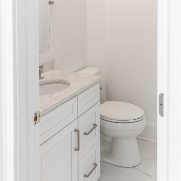
Our client opted to have her half bath remodeled as well. Many of the same components that we used in the master bathroom were used to make this other wise small space appear larger.
Overall, we can’t say enough about how happy we were with the end result of this project. We were even happier to know that our client was over the moon about her dream master bathroom.
Are you dreaming about your master bathroom and what possibilities we could accomplish in a marble look for you? We would love to hear from you, the options are amazing! .

 Gabriela Postole
The BG winery was the subject of a renovation in order to improve for the needs of its visitors.
The famous and delicious wine presentations and tastings are the main attractions at this fabulous place. Therefore, we placed the bar in front of the entrance to be directly seen when entering. As a decorative element it is featuring displays of soils.
Because the groups of visitor vary in size, but also because the space is used as an exquisite breakfast area for the guests of the nearby inn, we came up with a new idea: The division of the space by a glass wall. Consequently, this results in an event space or a private dining room. The convertible approach adds flexibility and dynamic to the whole place.
Furthermore, we enabled the large hallway of the winery going towards the restrooms to be used as a wardrobe for larger gatherings. Meanwhile, the additional room serves as a VIP lounge for only the finest guests.
The design team took everything into consideration while preparing layouts, developing individual objects and finetuning details: clients’ needs, the nice location and the usage of the attractive space. We designed in detail all furniture elements, while using reclaimed wood from old wine barrels for table tops and accent walls. In this regard the winery as a location of joy and community feels and breathes authentic. The whole interior design is rustic with fine touches of modern, resulting in a suiting atmosphere.
As for the color scheme, we proposed a pastel blue as a contrast to the reclaimed wood. Touches of color in the Patchwork tiles around the bar area and a mixture of hand-made lamps mix to roud up the rustic vibe.
Share your ideas for your location with us in a brief introductory call, free of charge.
 Klopf Architecture
Malibu Glass Box House by Klopf Architecture
Following the devastating Woolsey Fire of 2018, the site in Malibu offered a unique opportunity to rebuild not just a home, but a new architectural composition that highlighted the property’s potential while navigating strict fire-rebuild codes in the area. Designed by Klopf Architecture, this project embraced a set of limitations and translated them into an architectural asset.
The city’s fire-rebuild process required the new structure to remain close to the original footprint, size and bulk, a constraint that ultimately clarified the architectural direction. Perched near the front of a long, narrow lot, the new home frames and overlooks a private, park-like rear expanse, an uncommon luxury especially in this part of Malibu .
Without a fixed program, the design process allowed for a different kind of creative focus allowing Klopf Architecture the opportunity to explore how a modernist home could best respond to this site. The team approached the project not with a list of requirements, but with a question: How might a modernist live here? What spatial qualities would inspire calm, connection, and a sense of wonder in this setting? The process became less about problem-solving and more about architectural storytelling—letting the site, the light, and the principles of modern design guide the form and flow of the home.
The response emerged in the form of a glass-box pavilion, an open, Mid-Century Modern inspired living, dining, and kitchen space that floats at the edge of the property’s natural descent. Connected to the more enclosed, private areas of the home by a glass-walled hallway, the living pavilion becomes a distinct centerpiece of the design. It opens on all four sides to the landscape with decks and patios on the flanks, an internal garden and water feature to the north, and a dramatic unguarded view of the expansive backyard and ocean horizon to the south.
Because of the mandated footprint, careful planning was required to ensure every space could still engage with light, landscape, or both. Strategic voids in the form of atriums and courtyards allow daylight to filter deep into the home’s core, while offering moments of surprise and retreat. These design gestures allow natural light to filter deep into the interior, creating a sense of brightness and openness throughout the day. At the same time, they expand the perceptual boundaries between inside and out, making the home feel more expansive while anchoring its connection to the surrounding landscape.
The siting of the house is what gives it its unique character. Rather than receding into the backyard like the neighboring homes, the house holds a slight prominence. From the central living pavilion, stepping down into the landscape feels more like entering a secluded park where a separate existing accessory structure, trail, and recreational areas await. The home’s modest street presence gives way to this unfolding drama of space, view, and nature.
Fire-resilient materials and assemblies are integrated seamlessly throughout including triple-pane glazing, under-slab and roof insulation, and locally sourced fire-rated cladding ensure the house not only meets Calfornia’s rigorous wildland-urban interface (WUI) standards, but feels effortlessly aligned with them. While technical decisions like fire-hardening and mechanical systems presented some construction challenges, particularly around the cantilevered glass box, the team found a functional compromise that preserved the integrity of the design.
Inside, a restrained palette and exposed post and beam design celebrate the ethos of mid-century modernism. A central circulation spine extends from the entry to the rear glass wall, offering a continuous visual link from street to ocean. Spaces such as the library and office, though more intimate in scale, are never cut off from nature as each opens to its own unique courtyard or garden view.
Though born out of a strict regulatory framework and developed without a specific client, the rebuild design unfolded with remarkable clarity. Grounded in site logic, refined by limitations and an emphasis on timeless spatial relationships – light, proportion, and a strong connection to nature, the resulting design feels both effortless and uplifting. The home lives lightly on the land, opens generously to its surroundings, and strikes a careful balance between privacy, openness, and calm. For Klopf Architecture, it stands as a compelling case study in how site, code, and circumstantial constraints can inspire enduring, modernist architecture. With years of experience reimagining mid-century modern design for how people live today, the firm took the project’s limitations as an opportunity. The result is a home shaped by open, flowing spaces, strong indoor-outdoor connections, and a calm, clear sense of structure. It’s a good reminder that even with strict constraints, there’s still room for architecture to breathe—and for modernism to keep moving forward.
Klopf Architecture project team: Geoff Campen, John Klopf, AIA, and Sherry Tan
Structural Engineer: ZFA
Contractor: Maison D’Artiste
Photography: ©2025 Mariko Reed
Year Completed: 2023
 B Designs Interior's
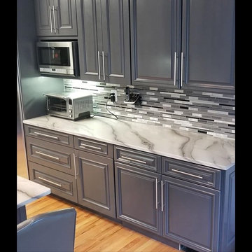
BEFORE & AFTER! We started this journey a couple months ago. Angela came up with the idea of using the existing cabinets since they were of excellent quality. So we were left with paint colors, back splash and counter top. Since it didn't have much natural light, I suggested gloss to bounce the light around. The end result is stunning, but not recommended for families with young kids, AKA "messy" fingerprints. Crystal and her husband did an incredible job and I'd recommend them to anyone considering such an endeavor. Next up, Albany Marble, to choose back splash and counter-top, material. Angela fell in love with this gorgeous, natural Quartz and the glass backsplash is super fun. I always use Albany Marble, for all my solid surface and tile needs. Albany Marble is a direct importer, so truly one cannot beat the prices and the welcoming customer service is stellar! The original kitchen didn't have enough cabinets, so we extended the Refrigerator wall, by adding 4 more uppers and lowers. We also had to cut off the Bar counter to even out and enlarge the counter space. As you can see, the end result is over the top! They say it takes a village and here we proved that it indeed takes a solid team! #Anotherbdesigns #allinthedetails #shabbybrownrestore #albanymarbleinc #blackkitchens #kitchenremodel #kitchenfacelift #quartzcountertops #naturalquartz #Glasstile #Shineon #ange
 StoneUnlimited Kitchen and Bath Remodeling
This expansive elegant marble master bathroom is classic and rates highly on our list of favorite projects. Marble is always a good choice as it is a timeless look and adds to the value of your home. Marble can be one of the higher priced materials and also requires regular maintenance however marble bathrooms are gorgeous and allow flexibility and a vast amount of possibilities for application. This marble inspired bathroom was achieved by mixing real marble with porcelain tile that mimics the look of marble. The result is breath taking, low maintenance and a fraction of the cost!
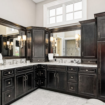
This master bath was expansive with over 300 square feet of usable space and a beautiful high ceiling. Sherry balanced out the room by creating a large double vanity designed with Waypoint cabinetry in painted linen. The higher elevation of the large tower between the vanities make it appear like a customized piece of furniture and the 4 sconces directly mounted to the mirrors are a nice detail that elevate the piece. The Ranier quartz countertops and Mayfair Volakas Giorgio Porcelain tile provide the subtle contrast of grey veining throughout the room.
A 66” Draque tub with floor mounted waterfall faucet is beautifully surrounded with the same Volakes Giorgio tile. It is the perfect spot for our client to relax and take a load off while being showered by the light of the unique Alexandria Abstract Chandelier hanging above the tub.
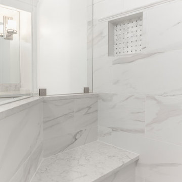
When designing the shower enclosure, Sherry blended different types of tile and tile sizes to create interest and movement. Cornice Perla Marble pieces create a beautiful transition between the glossy subway and the marble patterned tile. A bench for sitting is topped off with the same Ranier quartz used for the countertops and was added for the comfort of our client while using the Kohler handshower with extended hose. Bianco Perla basketweave marble are located in the niche and floor which add a different design component for interest.
Our client opted to have her half bath remodeled as well. Many of the same components that we used in the master bathroom were used to make this other wise small space appear larger.
Overall, we can’t say enough about how happy we were with the end result of this project. We were even happier to know that our client was over the moon about her dream master bathroom.
Are you dreaming about your master bathroom and what possibilities we could accomplish in a marble look for you? We would love to hear from you, the options are amazing! .
Sponsored
Sunbury, OH

J.Holderby - Renovations
Franklin County's Leading General Contractors - 2X Best of Houzz!
 OakWood Designers & Builders
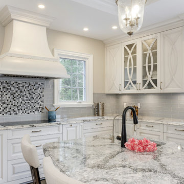
When local business owners with four kids and an extended family decided to build their custom home with OakWood, they knew what they wanted – a luxurious yet functional space.
This kitchen was designed with the intention of considering the fast-paced lives the family members while also looking to provide a space where everyone can interact and spend time together. Not only was this spacious kitchen inspired by a love of cooking, it was configured to easily facilitate informal dining for the whole large family. A large window behind the main sink brings natural light into the space but also provides a nice view into the backyard so mom can be in the kitchen and see the kids in the backyard.
The kitchen was also designed with a variety of entry points; clients can access the kitchen from their sunroom, mudroom, formal dining area and more. As a result, the space is a central space for the family. Directly adjacent to this space is the informal dining area and a desk with a computer which allows the clients to work while still being present for the comings and goings of everyone in this family space.
Although two colours and textures are used for the cabinetry, there is harmony created between them as a result of the raised panel being used. The cloudy glass backsplash not only breaks up the light toned cabinetry but also adds a glossy finish that contrasts with the smooth wood finishes. Seagrove quartz is present on both the counter and island. This highly detailed quartz adds a great deal of texture and also helps to guide the viewer’s eye around the space. Pendant lights placed above the island help to draw attention toward the center of the space while also mimicking the glass seen in the cabinetry.
This project was a finalist for the GOHBA Awards in the category Traditional Custom Kitchen and was also featured in the Fall issue of LUXE Magazine Ottawa. You can read the full story here: https://console.virtualpaper.com/luxe/luxe-fall-2020/#42/
 Gabriela Postole
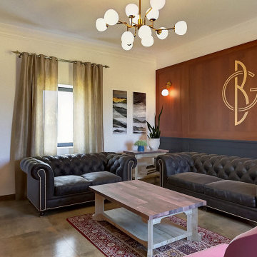
The BG winery was the subject of a renovation in order to improve for the needs of its visitors.
The famous and delicious wine presentations and tastings are the main attractions at this fabulous place. Therefore, we placed the bar in front of the entrance to be directly seen when entering. As a decorative element it is featuring displays of soils.
Because the groups of visitor vary in size, but also because the space is used as an exquisite breakfast area for the guests of the nearby inn, we came up with a new idea: The division of the space by a glass wall. Consequently, this results in an event space or a private dining room. The convertible approach adds flexibility and dynamic to the whole place.
Furthermore, we enabled the large hallway of the winery going towards the restrooms to be used as a wardrobe for larger gatherings. Meanwhile, the additional room serves as a VIP lounge for only the finest guests.
The design team took everything into consideration while preparing layouts, developing individual objects and finetuning details: clients’ needs, the nice location and the usage of the attractive space. We designed in detail all furniture elements, while using reclaimed wood from old wine barrels for table tops and accent walls. In this regard the winery as a location of joy and community feels and breathes authentic. The whole interior design is rustic with fine touches of modern, resulting in a suiting atmosphere.
As for the color scheme, we proposed a pastel blue as a contrast to the reclaimed wood. Touches of color in the Patchwork tiles around the bar area and a mixture of hand-made lamps mix to roud up the rustic vibe.
Share your ideas for your location with us in a brief introductory call, free of charge.
 ArtCraft Homes LLC
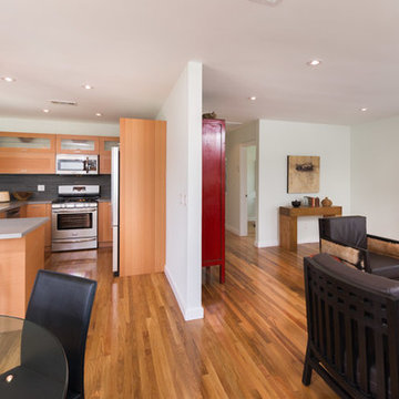
From neglected hoarder house to showplace! This post-war traditional ranch was remodeled into a sophisticated contemporary home by Tim Braseth of ArtCraft Homes, completed in 2013. Located in the Crenshaw Manor neighborhood of central Los Angeles with direct access to neighboring Culver City and downtown L.A. via the new Expo line. Space reconfiguration resulted in 3 spacious bedrooms and 2 full bathrooms. Features include all-new custom kitchen with stainless steel appliances, glass tile bathrooms, and solid oak floors throughout. The private master retreat features its own glass-tiled en suite bathroom with dual vanities, generously-sized walk-in closet, vaulted ceiling and French doors to the expansive patio with a direct view to the distant Hollywood sign. Remodel by ArtCraft Homes. Staging by Leslie Whitlock. "After" photography by Marc Angeles of Unlimited Style.
37