
Search results for "Direct result" in Home Design Ideas
 StoneUnlimited Kitchen and Bath Remodeling
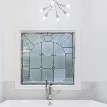
This expansive elegant marble master bathroom is classic and rates highly on our list of favorite projects. Marble is always a good choice as it is a timeless look and adds to the value of your home. Marble can be one of the higher priced materials and also requires regular maintenance however marble bathrooms are gorgeous and allow flexibility and a vast amount of possibilities for application. This marble inspired bathroom was achieved by mixing real marble with porcelain tile that mimics the look of marble. The result is breath taking, low maintenance and a fraction of the cost!
This master bath was expansive with over 300 square feet of usable space and a beautiful high ceiling. Sherry balanced out the room by creating a large double vanity designed with Waypoint cabinetry in painted linen. The higher elevation of the large tower between the vanities make it appear like a customized piece of furniture and the 4 sconces directly mounted to the mirrors are a nice detail that elevate the piece. The Ranier quartz countertops and Mayfair Volakas Giorgio Porcelain tile provide the subtle contrast of grey veining throughout the room.
A 66” Draque tub with floor mounted waterfall faucet is beautifully surrounded with the same Volakes Giorgio tile. It is the perfect spot for our client to relax and take a load off while being showered by the light of the unique Alexandria Abstract Chandelier hanging above the tub.
When designing the shower enclosure, Sherry blended different types of tile and tile sizes to create interest and movement. Cornice Perla Marble pieces create a beautiful transition between the glossy subway and the marble patterned tile. A bench for sitting is topped off with the same Ranier quartz used for the countertops and was added for the comfort of our client while using the Kohler handshower with extended hose. Bianco Perla basketweave marble are located in the niche and floor which add a different design component for interest.
Our client opted to have her half bath remodeled as well. Many of the same components that we used in the master bathroom were used to make this other wise small space appear larger.
Overall, we can’t say enough about how happy we were with the end result of this project. We were even happier to know that our client was over the moon about her dream master bathroom.
Are you dreaming about your master bathroom and what possibilities we could accomplish in a marble look for you? We would love to hear from you, the options are amazing! .
 Provost Companies, Inc.
This project is a great example of how the different divisions under Provost Companies can come together to create exceptional results for this construction project in Wellesley, MA.
This project consists of the initial site work including, excavating and re-grading the property to improve drainage and access.
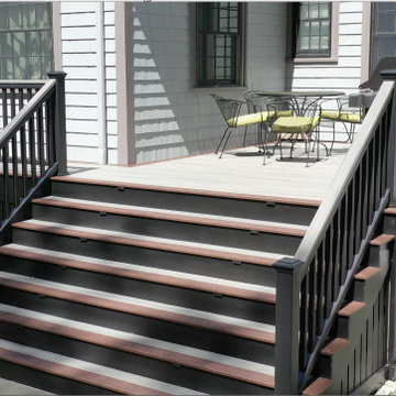
Our construction division was tasked with replacing some of the exterior siding and installing a new deck on the home. To provide more value to the client we installed waterproof taping on the top of all our joists to help prevent moisture from entering. We leave the bottom and side open so it can breathe. This prevents moisture from falling directly into the inevitable splits (specifically at the top of the joist where it will take direct rain and water infiltration) that occur in PT lumber. This wasn’t our idea, and we aren’t taking credit for it, it’s just a best practice we follow to provide more value to the client. Yes, using steel joists is a superior solution but steel is often outside of the budget.
Our landscape construction team was tasked with re-grading the yard, installing a bluestone patio and fieldstone retention wall.
 Klopf Architecture
Malibu Glass Box House by Klopf Architecture
Following the devastating Woolsey Fire of 2018, the site in Malibu offered a unique opportunity to rebuild not just a home, but a new architectural composition that highlighted the property’s potential while navigating strict fire-rebuild codes in the area. Designed by Klopf Architecture, this project embraced a set of limitations and translated them into an architectural asset.
The city’s fire-rebuild process required the new structure to remain close to the original footprint, size and bulk, a constraint that ultimately clarified the architectural direction. Perched near the front of a long, narrow lot, the new home frames and overlooks a private, park-like rear expanse, an uncommon luxury especially in this part of Malibu .
Without a fixed program, the design process allowed for a different kind of creative focus allowing Klopf Architecture the opportunity to explore how a modernist home could best respond to this site. The team approached the project not with a list of requirements, but with a question: How might a modernist live here? What spatial qualities would inspire calm, connection, and a sense of wonder in this setting? The process became less about problem-solving and more about architectural storytelling—letting the site, the light, and the principles of modern design guide the form and flow of the home.
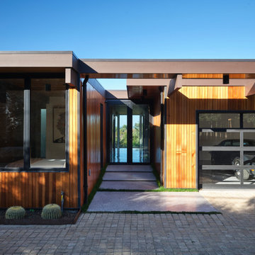
The response emerged in the form of a glass-box pavilion, an open, Mid-Century Modern inspired living, dining, and kitchen space that floats at the edge of the property’s natural descent. Connected to the more enclosed, private areas of the home by a glass-walled hallway, the living pavilion becomes a distinct centerpiece of the design. It opens on all four sides to the landscape with decks and patios on the flanks, an internal garden and water feature to the north, and a dramatic unguarded view of the expansive backyard and ocean horizon to the south.
Because of the mandated footprint, careful planning was required to ensure every space could still engage with light, landscape, or both. Strategic voids in the form of atriums and courtyards allow daylight to filter deep into the home’s core, while offering moments of surprise and retreat. These design gestures allow natural light to filter deep into the interior, creating a sense of brightness and openness throughout the day. At the same time, they expand the perceptual boundaries between inside and out, making the home feel more expansive while anchoring its connection to the surrounding landscape.
The siting of the house is what gives it its unique character. Rather than receding into the backyard like the neighboring homes, the house holds a slight prominence. From the central living pavilion, stepping down into the landscape feels more like entering a secluded park where a separate existing accessory structure, trail, and recreational areas await. The home’s modest street presence gives way to this unfolding drama of space, view, and nature.
Fire-resilient materials and assemblies are integrated seamlessly throughout including triple-pane glazing, under-slab and roof insulation, and locally sourced fire-rated cladding ensure the house not only meets Calfornia’s rigorous wildland-urban interface (WUI) standards, but feels effortlessly aligned with them. While technical decisions like fire-hardening and mechanical systems presented some construction challenges, particularly around the cantilevered glass box, the team found a functional compromise that preserved the integrity of the design.
Inside, a restrained palette and exposed post and beam design celebrate the ethos of mid-century modernism. A central circulation spine extends from the entry to the rear glass wall, offering a continuous visual link from street to ocean. Spaces such as the library and office, though more intimate in scale, are never cut off from nature as each opens to its own unique courtyard or garden view.
Though born out of a strict regulatory framework and developed without a specific client, the rebuild design unfolded with remarkable clarity. Grounded in site logic, refined by limitations and an emphasis on timeless spatial relationships – light, proportion, and a strong connection to nature, the resulting design feels both effortless and uplifting. The home lives lightly on the land, opens generously to its surroundings, and strikes a careful balance between privacy, openness, and calm. For Klopf Architecture, it stands as a compelling case study in how site, code, and circumstantial constraints can inspire enduring, modernist architecture. With years of experience reimagining mid-century modern design for how people live today, the firm took the project’s limitations as an opportunity. The result is a home shaped by open, flowing spaces, strong indoor-outdoor connections, and a calm, clear sense of structure. It’s a good reminder that even with strict constraints, there’s still room for architecture to breathe—and for modernism to keep moving forward.
Klopf Architecture project team: Geoff Campen, John Klopf, AIA, and Sherry Tan
Structural Engineer: ZFA
Contractor: Maison D’Artiste
Photography: ©2025 Mariko Reed
Year Completed: 2023
Find the right local pro for your project
 Gabriela Postole
The BG winery was the subject of a renovation in order to improve for the needs of its visitors.
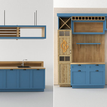
The famous and delicious wine presentations and tastings are the main attractions at this fabulous place. Therefore, we placed the bar in front of the entrance to be directly seen when entering. As a decorative element it is featuring displays of soils.
Because the groups of visitor vary in size, but also because the space is used as an exquisite breakfast area for the guests of the nearby inn, we came up with a new idea: The division of the space by a glass wall. Consequently, this results in an event space or a private dining room. The convertible approach adds flexibility and dynamic to the whole place.
Furthermore, we enabled the large hallway of the winery going towards the restrooms to be used as a wardrobe for larger gatherings. Meanwhile, the additional room serves as a VIP lounge for only the finest guests.
The design team took everything into consideration while preparing layouts, developing individual objects and finetuning details: clients’ needs, the nice location and the usage of the attractive space. We designed in detail all furniture elements, while using reclaimed wood from old wine barrels for table tops and accent walls. In this regard the winery as a location of joy and community feels and breathes authentic. The whole interior design is rustic with fine touches of modern, resulting in a suiting atmosphere.
As for the color scheme, we proposed a pastel blue as a contrast to the reclaimed wood. Touches of color in the Patchwork tiles around the bar area and a mixture of hand-made lamps mix to roud up the rustic vibe.
Share your ideas for your location with us in a brief introductory call, free of charge.
 Vetter Architects
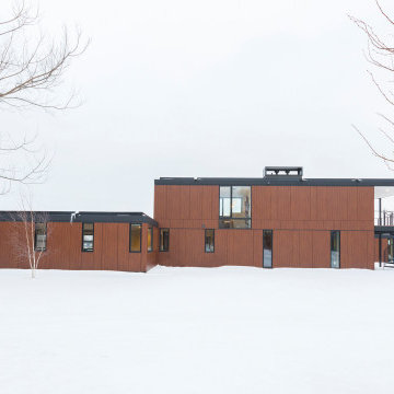
The mHouse is the brainchild of a magazine publisher intent on changing the way houses are constructed and how their owners relate to them. Named after one of the company’s website, the mHouse serves as a built manifesto of innovative panel materials such as rice hull composites and thermally fused laminate – becoming a case study house for over 30 international material suppliers.
The design challenge was quite clear – how to use a series of new materials unproven in the US building trades to create a beautiful house that meets the unique needs of today’s family. The result is a building that is highly rational in its construction systems, while encouraging social gathering.
The mHouse serves as a direct counterpoint to the typical suburban builder home – creating unique outdoor spaces in place of the typical open lawn, a variety of different views in contrast to one major view, and expressing a confidence in the future over nostalgia for the past.
Through a series of layers and nodes, the landscape grounds the house and heightens the views from inside, using indigenous plantings applied in non-traditional ways, the landscape mirrors the house in rethinking the suburban home.
The mHouse strikes a balance between proven methods and innovative solutions, resulting in one version of what is possible with these materials and setting the stage for future iterations and new possibilities.
Size
Total Finished Area: 3,405 sf
Completion Date
September 2015
Services
Architecture
Interior Design Consultant: Amy Carman Design
Landscape Consultant: Texten
 SM Design
Bridle Path Residence — Primary Bathroom Retreat
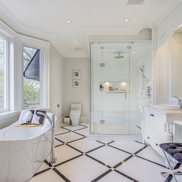
This Bridle Path Residence primary bathroom is conceived as a private spa-like retreat, combining classical architectural detailing with contemporary fixtures, expansive glazing, and a highly restrained material palette. The design prioritizes serenity and natural light while maintaining the level of craftsmanship and visual refinement established throughout the residence.
The room's strongest design feature is its relationship with the outdoors. A generous bay of windows brings the surrounding mature landscape directly into the bathroom, transforming the view into an important part of the experience. Daylight washes across the pale surfaces and enhances the sense of openness, making the space feel more like a private wellness suite than a conventional bathroom.
The freestanding sculptural tub is positioned directly beside the windows, creating a deliberate moment of relaxation and emphasizing the connection between bathing and the landscape. Its smooth, organic silhouette contrasts beautifully with the architectural geometry of the room, while the polished floor-mounted faucet introduces a refined contemporary detail.
The shower is treated as an architectural volume rather than simply a functional enclosure. Clear frameless glass preserves visual continuity across the room and allows the large-format wall surfaces and integrated shower niche to remain visible. The minimal hardware keeps the enclosure visually light and reinforces the clean, modern character.
A striking element is the geometric floor design, where dark linear insets intersect across the pale stone surface to create a sophisticated diamond-like pattern. This introduces a graphic layer beneath the otherwise quiet palette and provides a subtle connection to the more traditional detailing found elsewhere in the residence.
The custom vanity continues the home's tailored millwork language. White cabinetry, refined hardware, decorative supports, and integrated mirrors create a furniture-like composition rather than a generic bathroom installation. The large mirror amplifies the natural light and visually expands the room, while the sculptural upholstered stool adds softness and a touch of traditional glamour.
The material palette is intentionally restrained: luminous white surfaces, pale stone, crisp millwork, polished metal, and touches of dark detailing. This restraint allows architectural form, daylight, and the surrounding landscape to become the primary sources of visual interest.
Overall, the bathroom represents timeless luxury interpreted through a contemporary lens. Traditional millwork and geometric stone detailing provide character, while frameless glass, sculptural plumbing fixtures, and the freestanding tub introduce modern simplicity. The result is an elegant, highly personalized primary bathroom designed to feel restorative, spacious, and quietly luxurious.
 Tile Doctor Ltd
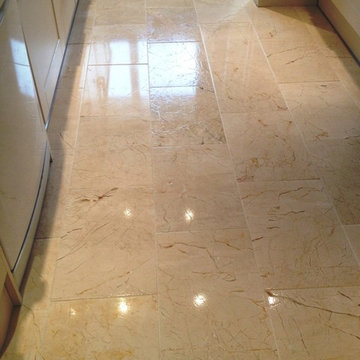
For this job I travelled to the town of Albrighton, which is actually the most easterly settlement in the whole of Shropshire. My client had an issue with their Marble tiled floor which was installed in the kitchen and hallway. They had dropped and broke a bottle of vinegar in the kitchen, and the substance unfortunately came in contact with the tiles. Since Marble is highly sensitive to acid, the vinegar (an acetic acid) had basically etched the surface of the tiles make it impossible clean chemically.
Although the tiles were a nice, expensive Marble, the person who had first installed them had done a poor job, leaving lippage of up to 5mm in some areas, which would make work trickier. Undeterred I could see it would be possible to restore the floor using a combination of burnishing for the tiles and cleaning with a high alkaline product for the grout lines. I demonstrated this to my client on one tile which went well and I was then given the go ahead to restore the entire floor.
My first task focused on cleaning the grout lines using a solution of Tile Doctor Pro-Clean worked in with a stiff grout brush. Pro-Clean is a high alkaline cleaner suitable for use on most types of natural stone floor. It helped to alleviate most of the grout staining caused by the vinegar, whilst also lifting out any ingrained dirt and muck, and this left the grout looking a lot cleaner.
After cleaning the grout lines I was able to move on to burnishing the tiles. As previously mentioned, no chemical product would be able to have an effect on the damaged tiles, so I resolved to burnish them using a system of four diamond encrusted burnishing pads fitted to a rotary machine. Working first with a coarse burnishing pad, and moving through to medium, fine and very fine pads, lubricated with a little water, I was able to significantly reduce the appearance of the acid stains, while also giving the tiles a nice polished finish.
Following the cleaning and burnishing processes I gave the tiles a good rinse to remove any remaining residue and then ensured the floor was completely dry before starting on the sealing.
To seal the floor and maximise the appearance I used Tile Doctor Colour Grow and Tile Doctor Shine powder. Colour Grow is an impregnating sealer that seeps into the pores of the stone intensifying and enhancing the natural shades and colours in the stone whilst also providing stain protection;
Shine Powder on the other hand is a crystallising powder that is ground directly into the tiles to provide a high shine finish and durable surface protection.
My client and her husband were really happy with the results and left the following message on the Tile Doctor Feedback system:
“Jozsef was a charming young man in every respect, who worked very hard and achieved an amazing result. The tiles look better than the day they were laid. We are absolutely delighted with the work he has done and will recommend him to all our acquaintances. Thank you, Jozsef!”
Jozsef Hoffmann
Shropshire Tile Doctor


 StoneUnlimited Kitchen and Bath Remodeling
This expansive elegant marble master bathroom is classic and rates highly on our list of favorite projects. Marble is always a good choice as it is a timeless look and adds to the value of your home. Marble can be one of the higher priced materials and also requires regular maintenance however marble bathrooms are gorgeous and allow flexibility and a vast amount of possibilities for application. This marble inspired bathroom was achieved by mixing real marble with porcelain tile that mimics the look of marble. The result is breath taking, low maintenance and a fraction of the cost!
This master bath was expansive with over 300 square feet of usable space and a beautiful high ceiling. Sherry balanced out the room by creating a large double vanity designed with Waypoint cabinetry in painted linen. The higher elevation of the large tower between the vanities make it appear like a customized piece of furniture and the 4 sconces directly mounted to the mirrors are a nice detail that elevate the piece. The Ranier quartz countertops and Mayfair Volakas Giorgio Porcelain tile provide the subtle contrast of grey veining throughout the room.
A 66” Draque tub with floor mounted waterfall faucet is beautifully surrounded with the same Volakes Giorgio tile. It is the perfect spot for our client to relax and take a load off while being showered by the light of the unique Alexandria Abstract Chandelier hanging above the tub.
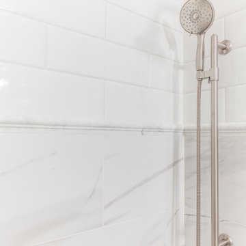
When designing the shower enclosure, Sherry blended different types of tile and tile sizes to create interest and movement. Cornice Perla Marble pieces create a beautiful transition between the glossy subway and the marble patterned tile. A bench for sitting is topped off with the same Ranier quartz used for the countertops and was added for the comfort of our client while using the Kohler handshower with extended hose. Bianco Perla basketweave marble are located in the niche and floor which add a different design component for interest.
Our client opted to have her half bath remodeled as well. Many of the same components that we used in the master bathroom were used to make this other wise small space appear larger.
Overall, we can’t say enough about how happy we were with the end result of this project. We were even happier to know that our client was over the moon about her dream master bathroom.
Are you dreaming about your master bathroom and what possibilities we could accomplish in a marble look for you? We would love to hear from you, the options are amazing! .
 Klopf Architecture
Malibu Glass Box House by Klopf Architecture
Following the devastating Woolsey Fire of 2018, the site in Malibu offered a unique opportunity to rebuild not just a home, but a new architectural composition that highlighted the property’s potential while navigating strict fire-rebuild codes in the area. Designed by Klopf Architecture, this project embraced a set of limitations and translated them into an architectural asset.
The city’s fire-rebuild process required the new structure to remain close to the original footprint, size and bulk, a constraint that ultimately clarified the architectural direction. Perched near the front of a long, narrow lot, the new home frames and overlooks a private, park-like rear expanse, an uncommon luxury especially in this part of Malibu .
Without a fixed program, the design process allowed for a different kind of creative focus allowing Klopf Architecture the opportunity to explore how a modernist home could best respond to this site. The team approached the project not with a list of requirements, but with a question: How might a modernist live here? What spatial qualities would inspire calm, connection, and a sense of wonder in this setting? The process became less about problem-solving and more about architectural storytelling—letting the site, the light, and the principles of modern design guide the form and flow of the home.
The response emerged in the form of a glass-box pavilion, an open, Mid-Century Modern inspired living, dining, and kitchen space that floats at the edge of the property’s natural descent. Connected to the more enclosed, private areas of the home by a glass-walled hallway, the living pavilion becomes a distinct centerpiece of the design. It opens on all four sides to the landscape with decks and patios on the flanks, an internal garden and water feature to the north, and a dramatic unguarded view of the expansive backyard and ocean horizon to the south.
Because of the mandated footprint, careful planning was required to ensure every space could still engage with light, landscape, or both. Strategic voids in the form of atriums and courtyards allow daylight to filter deep into the home’s core, while offering moments of surprise and retreat. These design gestures allow natural light to filter deep into the interior, creating a sense of brightness and openness throughout the day. At the same time, they expand the perceptual boundaries between inside and out, making the home feel more expansive while anchoring its connection to the surrounding landscape.
The siting of the house is what gives it its unique character. Rather than receding into the backyard like the neighboring homes, the house holds a slight prominence. From the central living pavilion, stepping down into the landscape feels more like entering a secluded park where a separate existing accessory structure, trail, and recreational areas await. The home’s modest street presence gives way to this unfolding drama of space, view, and nature.
Fire-resilient materials and assemblies are integrated seamlessly throughout including triple-pane glazing, under-slab and roof insulation, and locally sourced fire-rated cladding ensure the house not only meets Calfornia’s rigorous wildland-urban interface (WUI) standards, but feels effortlessly aligned with them. While technical decisions like fire-hardening and mechanical systems presented some construction challenges, particularly around the cantilevered glass box, the team found a functional compromise that preserved the integrity of the design.
Inside, a restrained palette and exposed post and beam design celebrate the ethos of mid-century modernism. A central circulation spine extends from the entry to the rear glass wall, offering a continuous visual link from street to ocean. Spaces such as the library and office, though more intimate in scale, are never cut off from nature as each opens to its own unique courtyard or garden view.
Though born out of a strict regulatory framework and developed without a specific client, the rebuild design unfolded with remarkable clarity. Grounded in site logic, refined by limitations and an emphasis on timeless spatial relationships – light, proportion, and a strong connection to nature, the resulting design feels both effortless and uplifting. The home lives lightly on the land, opens generously to its surroundings, and strikes a careful balance between privacy, openness, and calm. For Klopf Architecture, it stands as a compelling case study in how site, code, and circumstantial constraints can inspire enduring, modernist architecture. With years of experience reimagining mid-century modern design for how people live today, the firm took the project’s limitations as an opportunity. The result is a home shaped by open, flowing spaces, strong indoor-outdoor connections, and a calm, clear sense of structure. It’s a good reminder that even with strict constraints, there’s still room for architecture to breathe—and for modernism to keep moving forward.
Klopf Architecture project team: Geoff Campen, John Klopf, AIA, and Sherry Tan
Structural Engineer: ZFA
Contractor: Maison D’Artiste
Photography: ©2025 Mariko Reed
Year Completed: 2023
 StoneUnlimited Kitchen and Bath Remodeling
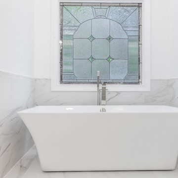
This expansive elegant marble master bathroom is classic and rates highly on our list of favorite projects. Marble is always a good choice as it is a timeless look and adds to the value of your home. Marble can be one of the higher priced materials and also requires regular maintenance however marble bathrooms are gorgeous and allow flexibility and a vast amount of possibilities for application. This marble inspired bathroom was achieved by mixing real marble with porcelain tile that mimics the look of marble. The result is breath taking, low maintenance and a fraction of the cost!
This master bath was expansive with over 300 square feet of usable space and a beautiful high ceiling. Sherry balanced out the room by creating a large double vanity designed with Waypoint cabinetry in painted linen. The higher elevation of the large tower between the vanities make it appear like a customized piece of furniture and the 4 sconces directly mounted to the mirrors are a nice detail that elevate the piece. The Ranier quartz countertops and Mayfair Volakas Giorgio Porcelain tile provide the subtle contrast of grey veining throughout the room.
A 66” Draque tub with floor mounted waterfall faucet is beautifully surrounded with the same Volakes Giorgio tile. It is the perfect spot for our client to relax and take a load off while being showered by the light of the unique Alexandria Abstract Chandelier hanging above the tub.
When designing the shower enclosure, Sherry blended different types of tile and tile sizes to create interest and movement. Cornice Perla Marble pieces create a beautiful transition between the glossy subway and the marble patterned tile. A bench for sitting is topped off with the same Ranier quartz used for the countertops and was added for the comfort of our client while using the Kohler handshower with extended hose. Bianco Perla basketweave marble are located in the niche and floor which add a different design component for interest.
Our client opted to have her half bath remodeled as well. Many of the same components that we used in the master bathroom were used to make this other wise small space appear larger.
Overall, we can’t say enough about how happy we were with the end result of this project. We were even happier to know that our client was over the moon about her dream master bathroom.
Are you dreaming about your master bathroom and what possibilities we could accomplish in a marble look for you? We would love to hear from you, the options are amazing! .
 Cavé Studio
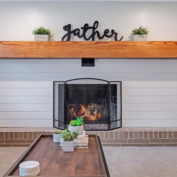
The dated built-in brick fireplace on the ground floor game room was redesigned. The new fireplace design would now directly tie in with the modern farmhouse style of the exterior, complete with the addition of a large wooden mantle.
DTSH Interiors formulated a plan for six rooms; the living room, dining room, master bedroom, two children's bedrooms and ground floor game room, with the inclusion of the complete fireplace re-design.
The interior also received major upgrades during the whole-house renovation. All of the walls and ceilings were resurfaced, the windows, doors and all interior trim was re-done.
The end result was a giant leap forward for this family; in design, style and functionality. The home felt completely new and refreshed, and once fully furnished, all elements of the renovation came together seamlessly and seemed to make all of the renovations shine.
During the "big reveal" moment, the day the family finally returned home for their summer away, it was difficult for me to decide who was more excited, the adults or the kids!
The home owners kept saying, with a look of delighted disbelief "I can't believe this is our house!"
As a designer, I absolutely loved this project, because it shows the potential of an average, older Pittsburgh area home, and how it can become a well designed and updated space.
It was rewarding to be part of a project which resulted in creating an elegant and serene living space the family loves coming home to everyday, while the exterior of the home became a standout gem in the neighborhood.
 Klopf Architecture
Malibu Glass Box House by Klopf Architecture
Following the devastating Woolsey Fire of 2018, the site in Malibu offered a unique opportunity to rebuild not just a home, but a new architectural composition that highlighted the property’s potential while navigating strict fire-rebuild codes in the area. Designed by Klopf Architecture, this project embraced a set of limitations and translated them into an architectural asset.
The city’s fire-rebuild process required the new structure to remain close to the original footprint, size and bulk, a constraint that ultimately clarified the architectural direction. Perched near the front of a long, narrow lot, the new home frames and overlooks a private, park-like rear expanse, an uncommon luxury especially in this part of Malibu .
Without a fixed program, the design process allowed for a different kind of creative focus allowing Klopf Architecture the opportunity to explore how a modernist home could best respond to this site. The team approached the project not with a list of requirements, but with a question: How might a modernist live here? What spatial qualities would inspire calm, connection, and a sense of wonder in this setting? The process became less about problem-solving and more about architectural storytelling—letting the site, the light, and the principles of modern design guide the form and flow of the home.
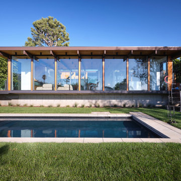
The response emerged in the form of a glass-box pavilion, an open, Mid-Century Modern inspired living, dining, and kitchen space that floats at the edge of the property’s natural descent. Connected to the more enclosed, private areas of the home by a glass-walled hallway, the living pavilion becomes a distinct centerpiece of the design. It opens on all four sides to the landscape with decks and patios on the flanks, an internal garden and water feature to the north, and a dramatic unguarded view of the expansive backyard and ocean horizon to the south.
Because of the mandated footprint, careful planning was required to ensure every space could still engage with light, landscape, or both. Strategic voids in the form of atriums and courtyards allow daylight to filter deep into the home’s core, while offering moments of surprise and retreat. These design gestures allow natural light to filter deep into the interior, creating a sense of brightness and openness throughout the day. At the same time, they expand the perceptual boundaries between inside and out, making the home feel more expansive while anchoring its connection to the surrounding landscape.
The siting of the house is what gives it its unique character. Rather than receding into the backyard like the neighboring homes, the house holds a slight prominence. From the central living pavilion, stepping down into the landscape feels more like entering a secluded park where a separate existing accessory structure, trail, and recreational areas await. The home’s modest street presence gives way to this unfolding drama of space, view, and nature.
Fire-resilient materials and assemblies are integrated seamlessly throughout including triple-pane glazing, under-slab and roof insulation, and locally sourced fire-rated cladding ensure the house not only meets Calfornia’s rigorous wildland-urban interface (WUI) standards, but feels effortlessly aligned with them. While technical decisions like fire-hardening and mechanical systems presented some construction challenges, particularly around the cantilevered glass box, the team found a functional compromise that preserved the integrity of the design.
Inside, a restrained palette and exposed post and beam design celebrate the ethos of mid-century modernism. A central circulation spine extends from the entry to the rear glass wall, offering a continuous visual link from street to ocean. Spaces such as the library and office, though more intimate in scale, are never cut off from nature as each opens to its own unique courtyard or garden view.
Though born out of a strict regulatory framework and developed without a specific client, the rebuild design unfolded with remarkable clarity. Grounded in site logic, refined by limitations and an emphasis on timeless spatial relationships – light, proportion, and a strong connection to nature, the resulting design feels both effortless and uplifting. The home lives lightly on the land, opens generously to its surroundings, and strikes a careful balance between privacy, openness, and calm. For Klopf Architecture, it stands as a compelling case study in how site, code, and circumstantial constraints can inspire enduring, modernist architecture. With years of experience reimagining mid-century modern design for how people live today, the firm took the project’s limitations as an opportunity. The result is a home shaped by open, flowing spaces, strong indoor-outdoor connections, and a calm, clear sense of structure. It’s a good reminder that even with strict constraints, there’s still room for architecture to breathe—and for modernism to keep moving forward.
Klopf Architecture project team: Geoff Campen, John Klopf, AIA, and Sherry Tan
Structural Engineer: ZFA
Contractor: Maison D’Artiste
Photography: ©2025 Mariko Reed
Year Completed: 2023
 ArtCraft Homes LLC
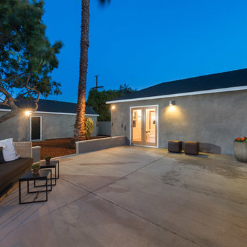
From neglected hoarder house to showplace! This post-war traditional ranch was remodeled into a sophisticated contemporary home by Tim Braseth of ArtCraft Homes, completed in 2013. Located in the Crenshaw Manor neighborhood of central Los Angeles with direct access to neighboring Culver City and downtown L.A. via the new Expo line. Space reconfiguration resulted in 3 spacious bedrooms and 2 full bathrooms. Features include all-new custom kitchen with stainless steel appliances, glass tile bathrooms, and solid oak floors throughout. The private master retreat features its own glass-tiled en suite bathroom with dual vanities, generously-sized walk-in closet, vaulted ceiling and French doors to the expansive patio with a direct view to the distant Hollywood sign. Remodel by ArtCraft Homes. Staging by Leslie Whitlock. "After" photography by Marc Angeles of Unlimited Style.


 Vetter Architects
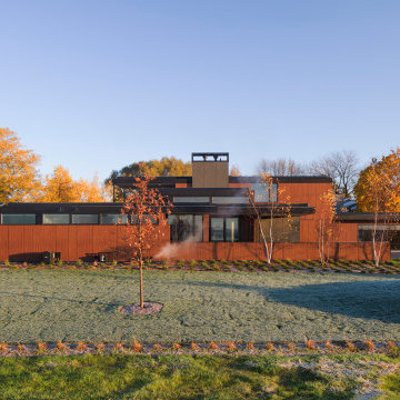
The mHouse is the brainchild of a magazine publisher intent on changing the way houses are constructed and how their owners relate to them. Named after one of the company’s website, the mHouse serves as a built manifesto of innovative panel materials such as rice hull composites and thermally fused laminate – becoming a case study house for over 30 international material suppliers.
The design challenge was quite clear – how to use a series of new materials unproven in the US building trades to create a beautiful house that meets the unique needs of today’s family. The result is a building that is highly rational in its construction systems, while encouraging social gathering.
The mHouse serves as a direct counterpoint to the typical suburban builder home – creating unique outdoor spaces in place of the typical open lawn, a variety of different views in contrast to one major view, and expressing a confidence in the future over nostalgia for the past.
Through a series of layers and nodes, the landscape grounds the house and heightens the views from inside, using indigenous plantings applied in non-traditional ways, the landscape mirrors the house in rethinking the suburban home.
The mHouse strikes a balance between proven methods and innovative solutions, resulting in one version of what is possible with these materials and setting the stage for future iterations and new possibilities.
Size
Total Finished Area: 3,405 sf
Completion Date
September 2015
Services
Architecture
Interior Design Consultant: Amy Carman Design
Landscape Consultant: Texten
 Klopf Architecture
Malibu Glass Box House by Klopf Architecture
Following the devastating Woolsey Fire of 2018, the site in Malibu offered a unique opportunity to rebuild not just a home, but a new architectural composition that highlighted the property’s potential while navigating strict fire-rebuild codes in the area. Designed by Klopf Architecture, this project embraced a set of limitations and translated them into an architectural asset.
The city’s fire-rebuild process required the new structure to remain close to the original footprint, size and bulk, a constraint that ultimately clarified the architectural direction. Perched near the front of a long, narrow lot, the new home frames and overlooks a private, park-like rear expanse, an uncommon luxury especially in this part of Malibu .
Without a fixed program, the design process allowed for a different kind of creative focus allowing Klopf Architecture the opportunity to explore how a modernist home could best respond to this site. The team approached the project not with a list of requirements, but with a question: How might a modernist live here? What spatial qualities would inspire calm, connection, and a sense of wonder in this setting? The process became less about problem-solving and more about architectural storytelling—letting the site, the light, and the principles of modern design guide the form and flow of the home.
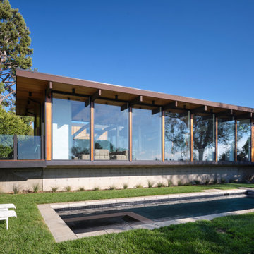
The response emerged in the form of a glass-box pavilion, an open, Mid-Century Modern inspired living, dining, and kitchen space that floats at the edge of the property’s natural descent. Connected to the more enclosed, private areas of the home by a glass-walled hallway, the living pavilion becomes a distinct centerpiece of the design. It opens on all four sides to the landscape with decks and patios on the flanks, an internal garden and water feature to the north, and a dramatic unguarded view of the expansive backyard and ocean horizon to the south.
Because of the mandated footprint, careful planning was required to ensure every space could still engage with light, landscape, or both. Strategic voids in the form of atriums and courtyards allow daylight to filter deep into the home’s core, while offering moments of surprise and retreat. These design gestures allow natural light to filter deep into the interior, creating a sense of brightness and openness throughout the day. At the same time, they expand the perceptual boundaries between inside and out, making the home feel more expansive while anchoring its connection to the surrounding landscape.
The siting of the house is what gives it its unique character. Rather than receding into the backyard like the neighboring homes, the house holds a slight prominence. From the central living pavilion, stepping down into the landscape feels more like entering a secluded park where a separate existing accessory structure, trail, and recreational areas await. The home’s modest street presence gives way to this unfolding drama of space, view, and nature.
Fire-resilient materials and assemblies are integrated seamlessly throughout including triple-pane glazing, under-slab and roof insulation, and locally sourced fire-rated cladding ensure the house not only meets Calfornia’s rigorous wildland-urban interface (WUI) standards, but feels effortlessly aligned with them. While technical decisions like fire-hardening and mechanical systems presented some construction challenges, particularly around the cantilevered glass box, the team found a functional compromise that preserved the integrity of the design.
Inside, a restrained palette and exposed post and beam design celebrate the ethos of mid-century modernism. A central circulation spine extends from the entry to the rear glass wall, offering a continuous visual link from street to ocean. Spaces such as the library and office, though more intimate in scale, are never cut off from nature as each opens to its own unique courtyard or garden view.
Though born out of a strict regulatory framework and developed without a specific client, the rebuild design unfolded with remarkable clarity. Grounded in site logic, refined by limitations and an emphasis on timeless spatial relationships – light, proportion, and a strong connection to nature, the resulting design feels both effortless and uplifting. The home lives lightly on the land, opens generously to its surroundings, and strikes a careful balance between privacy, openness, and calm. For Klopf Architecture, it stands as a compelling case study in how site, code, and circumstantial constraints can inspire enduring, modernist architecture. With years of experience reimagining mid-century modern design for how people live today, the firm took the project’s limitations as an opportunity. The result is a home shaped by open, flowing spaces, strong indoor-outdoor connections, and a calm, clear sense of structure. It’s a good reminder that even with strict constraints, there’s still room for architecture to breathe—and for modernism to keep moving forward.
Klopf Architecture project team: Geoff Campen, John Klopf, AIA, and Sherry Tan
Structural Engineer: ZFA
Contractor: Maison D’Artiste
Photography: ©2025 Mariko Reed
Year Completed: 2023
 Vetter Architects
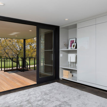
The mHouse is the brainchild of a magazine publisher intent on changing the way houses are constructed and how their owners relate to them. Named after one of the company’s website, the mHouse serves as a built manifesto of innovative panel materials such as rice hull composites and thermally fused laminate – becoming a case study house for over 30 international material suppliers.
The design challenge was quite clear – how to use a series of new materials unproven in the US building trades to create a beautiful house that meets the unique needs of today’s family. The result is a building that is highly rational in its construction systems, while encouraging social gathering.
The mHouse serves as a direct counterpoint to the typical suburban builder home – creating unique outdoor spaces in place of the typical open lawn, a variety of different views in contrast to one major view, and expressing a confidence in the future over nostalgia for the past.
Through a series of layers and nodes, the landscape grounds the house and heightens the views from inside, using indigenous plantings applied in non-traditional ways, the landscape mirrors the house in rethinking the suburban home.
The mHouse strikes a balance between proven methods and innovative solutions, resulting in one version of what is possible with these materials and setting the stage for future iterations and new possibilities.
Size
Total Finished Area: 3,405 sf
Completion Date
September 2015
Services
Architecture
Interior Design Consultant: Amy Carman Design
Landscape Consultant: Texten
 Advance Design Studio, Ltd.
After six years of living in their Huntley IL home, Chris and Meghan were tired of their dark, dingy, outdated kitchen and it was finally time for a long-anticipated change. “The kitchen is the place where we live, it’s where we do everything,” Meghan said. “It was important that it be a space where we wanted to be.” Meghan loves cooking and enjoys including their girls in healthy meal prepping, this led them to want a brighter, more enjoyable kitchen with increased functionality and improved storage.
For Chris especially, the laundry room was an entirely dysfunctional eyesore. “We had a washer and a dryer, but it was all kind-of cobbled together!” Chris said. “There were always laundry piles everywhere, we weren’t really sure what we wanted to do in there, but it was time for us to make a change.” The mess of the space was stressful every time they walked in the door from the garage each day. Kids’ backpacks and shoes piled up haphazardly in the makeshift boot-bench closet left the family feeling disorganized and stressed. They needed space for folding clothes and locker cubbies to help keep the family organized.
Having known Christine and Todd in the Huntley community for years, Chris and Meghan were familiar with their work. “We already trusted them personally and having seen their projects for years we knew they did top notch work. After we reviewed the initial round of designs, we knew that hiring them was definitely the right choice,” Meghan and Chris said. Although Chris had done a lot of work in their home himself, the kitchen and laundry room renovation was such a large undertaking that he didn’t want to steal time away from his family to spend what would surely be many long weekends doing the job himself. “That would not have been a wise choice for us,” Chris laughed.
“Our designer, Michelle was very, very, easy to work with; anything we wanted to see or weren’t sure about, she went above and beyond to make this easy for us. She was easy to get hold of and always quick to respond,” the couple said. Michelle pulled ideas that mirrored the couple’s taste and style and was adept at directing the couple to limited choices that didn’t overwhelm them and kept the process moving. “I have a hard time making decisions. Michelle made the decision-making process so easy. I loved how she listened to what I liked and then presented three great options for me to choose from,” Meghan said.
The main objectives for the kitchen were better storage solutions, they wanted the space to reflect their lifestyle and taste, and they wanted it to last for years with low maintenance. One of the first steps in creating a more functional kitchen was relocating the refrigerator, creating an improved workflow for the busy family.
“We didn’t know that we could even move the refrigerator to a new location where it is now, that was something that we never would have thought of,” Chris said. “The new refrigerator location makes the kitchen feel so much bigger. We didn’t add any space, but our whole kitchen with the new design just seems like it’s so much larger than before!” Meghan said.
The perimeter mist colored cabinets helped warm and brighten the entire room, while the graphite colored cabinets on the island added contrast. Using this fresh, clean color palette satisfied the couple’s desire for a bright space that was the exact opposite of what they had before. Organization accessories were also added to the cabinets such as a spice drawer tray and roll outs to create hidden convenience.
“I absolutely love the hidden spices – it makes cooking so much more enjoyable!” Chris said. “And all the pull outs, and the double trash bin, who would think you could get so excited about organization!” the couple said in unison.
One thing they hated in their original kitchen was how dark the space felt. Added lighting on the ceiling with the new light fixtures combined with the lighter cabinetry colors throughout solved this problem. “Our new kitchen has this warm, almost cozy feeling that our old kitchen never had, it’s just a space that I love spending my time in now,” Meghan said. The light airy feeling was accentuated with the use of floating white shelves on either side of the decorative range hood. “We have so much cabinetry space, the new design is amazing we actually have more storage space than we will ever need,” Meghan said.
The island was extended to create more work surface and added space for stool seating. “The new island changes how we live. Now the kids can be in the kitchen with us, doing homework, eating breakfast, and the three of us have special dinners there when Chris is working late,” Meghan said.
The Carrara Marmi Quartz countertops were chosen because they are, not only beautiful, but are made from hard-working material that doesn’t require maintenance. The white subway tile backsplash that wraps to the ceiling behind the focal point cooktop range/hood compliments the crisp white countertops perfectly, while brushed brass hardware and light fixtures keep the design fresh and new.
The couple had a few fears at the beginning of the project, as most homeowners do. Their biggest fear was being out of their kitchen and laundry room for an extended time. The crew made it very easy for the family to work in a limited space keeping the washer and dryer hooked up the majority of the time, and also getting appliances working with minimal downtime.
“They above and beyond accommodated us to get us through the process,” Meghan said. “They did a great job making sure we were as comfortable as possible throughout the process,” Chris added.
“Our project manager DJ did a great job. He was very good at updating us on schedule changes, getting guys in as quickly as possible. Everyone that stepped in the house was nice and did great work,” said Chris. They thought Advance’s carpenter was phenomenal and were impressed when he took a conceptual idea from a photograph and worked with designer Michelle to create a one of a kind range/hood that has become the topic of conversation with friends and family who visit the new kitchen. “He was in our house literally every day for several weeks. He was easy to work with and good at what he did,” Meghan and Chris said.
The focal point of the kitchen; a hand-crafted, custom-built ventilation hood was clad with handpicked reclaimed barnwood. Advance Design’s carpenter built the framework and the cladding to create a one-of-a-kind design element that the couple loves.
“I think it was especially fun for him to create something unique from scratch, showcasing his talent in this area,” Meghan said. “I love that my kitchen is not like everyone else’s. I got to pick out the wood on my hood and watch it being built and was able to choose what pieces of wood went where on it. It’s totally unique.”
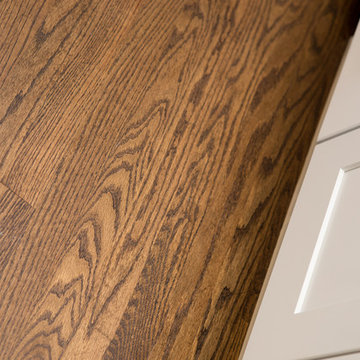
Red Oak flooring was toothed-in throughout the kitchen and the rest of the first floor anywhere changes were made. Then the whole floor was refinished to tone down the orange undertones in the existing floor stain, ultimately changing the color complexion of the entire first floor. The result is a completely new feeling to the entire home.
Renovating the laundry room was extremely important to Meghan and Chris, but they had trouble visualizing what the possibilities were for the seemingly small space. Michelle produced beautiful 3D illustrations that helped them envision the space in a whole new way.
“I must have told Michelle 100 times that I am a visual person, seeing the designs in 3D made it so easy to make decisions and see what we could really do with our space,” Meghan said.
A dividing wall and doorway were removed between the existing laundry room and hallway formerly containing a coat closet, providing space to design specialized graphite colored cabinetry matching the kitchen island to house custom storage cubbies for each family member. Adding the tall utility cabinetry in the new laundry area helped solve the storage issue, tucking away cleaning supplies, household items, and even the cat got its own cubby.
“I love how everything is now hidden in its own space. I can’t tell you how much I hated coming home and seeing everything sitting around on counters,” Chris said.
Electrical outlets were planned for the inside of utility cabinets, so devices could charge in hidden locations. Stacking the washer and dryer allowed for wider countertop space to provide a folding area and a special space for clothes to hang. “The way I do laundry has been completely transformed! I can actually fold clothes and hang them now right out of the washer and dryer,” Meghan said.
“The end result in the kitchen and the laundry/mud room was an updated light and bright space, with a smarter work flow that better meets the needs of this family,” Michelle said.
“I would totally recommend Advance Design,” Meghan said. “Sometimes I sit and just look at my kitchen and laundry room and think ‘Wow, I can’t believe I get to live here!’ It’s an understatement to say we love our new space.”

 Cantoni Irvine
Design by Blue Heron in Partnership with Cantoni. Photos By: Stephen Morgan
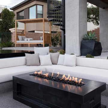
For many, Las Vegas is a destination that transports you away from reality. The same can be said of the thirty-nine modern homes built in The Bluffs Community by luxury design/build firm, Blue Heron. Perched on a hillside in Southern Highlands, The Bluffs is a private gated community overlooking the Las Vegas Valley with unparalleled views of the mountains and the Las Vegas Strip. Indoor-outdoor living concepts, sustainable designs and distinctive floorplans create a modern lifestyle that makes coming home feel like a getaway.
To give potential residents a sense for what their custom home could look like at The Bluffs, Blue Heron partnered with Cantoni to furnish a model home and create interiors that would complement the Vegas Modern™ architectural style. “We were really trying to introduce something that hadn’t been seen before in our area. Our homes are so innovative, so personal and unique that it takes truly spectacular furnishings to complete their stories as well as speak to the emotions of everyone who visits our homes,” shares Kathy May, director of interior design at Blue Heron. “Cantoni has been the perfect partner in this endeavor in that, like Blue Heron, Cantoni is innovative and pushes boundaries.”
Utilizing Cantoni’s extensive portfolio, the Blue Heron Interior Design team was able to customize nearly every piece in the home to create a thoughtful and curated look for each space. “Having access to so many high-quality and diverse furnishing lines enables us to think outside the box and create unique turnkey designs for our clients with confidence,” says Kathy May, adding that the quality and one-of-a-kind feel of the pieces are unmatched.
rom the perfectly situated sectional in the downstairs family room to the unique blue velvet dining chairs, the home breathes modern elegance. “I particularly love the master bed,” says Kathy. “We had created a concept design of what we wanted it to be and worked with one of Cantoni’s longtime partners, to bring it to life. It turned out amazing and really speaks to the character of the room.”
The combination of Cantoni’s soft contemporary touch and Blue Heron’s distinctive designs are what made this project a unified experience. “The partnership really showcases Cantoni’s capabilities to manage projects like this from presentation to execution,” shares Luca Mazzolani, vice president of sales at Cantoni. “We work directly with the client to produce custom pieces like you see in this home and ensure a seamless and successful result.”
And what a stunning result it is. There was no Las Vegas luck involved in this project, just a sureness of style and service that brought together Blue Heron and Cantoni to create one well-designed home.
To learn more about Blue Heron Design Build, visit www.blueheron.com.
 Klopf Architecture
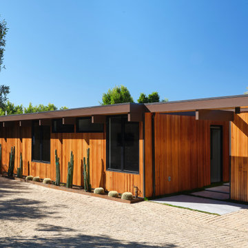
Set in a quiet neighborhood and framed by mature trees, this residence presented a unique opportunity: to thoughtfully evolve a custom mid-century modern home into a space that supports the everyday rhythms of a growing family. With a deep respect for the home’s original architecture, Klopf Architecture reimagined the house to better meet the needs of its owners—introducing functional improvements while preserving the spirit and character of its mid-century roots.
The clients approached Klopf Architecture with a clear vision: refresh their home while seamlessly integrating new programmatic elements. Key goals included clarifying and enhancing the entry sequence; connecting the detached garage to the main house with a practical yet architecturally intentional intervention; adding functional spaces such as a mudroom and laundry room; expanding and remodeling the primary suite’s bathroom and closet; and creating a more engaging outdoor space that capitalized on the site’s impressive views, featuring a fire pit and outdoor kitchen.
As a couple with distinct yet complementary perspectives—one focused on modern functionality and technology, and the other dedicated to preserving the home’s architectural integrity—their collaboration with Klopf Architecture resulted in a solution that harmonized both ideals. Their shared commitment to improving the livability of their home led to a design dialogue rooted in balance. This dynamic partnership shaped the direction of the renovation, ensuring that every decision honored the spirit of the original home while aligning with the practical needs of their growing family.
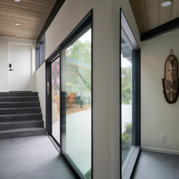
Designing within the constraints of the sloped site posed one of the project’s central challenges. The detached garage sat at a higher elevation than the main house, requiring a solution that ensured architectural and geometric compatibility between the two structures. Rather than create a purely utilitarian link, Klopf Architecture introduced an intentional connection that contributes to the overall architectural language. A notable pinch point in the plan—where differing geometries converged—was treated as a hinge point, turning a potentially awkward juncture into an architectural feature. This area now functions as both a transition and a moment of design interest that unifies the overall plan.
The design also addressed the underutilized outdoor area, which was located in a shadowed portion of the site with geometrical limitations. A new connection to the rear deck was created in this same area, making the outdoor space more useful and inviting. Klopf Architecture introduced carefully positioned openings and spatial improvements that forged a strong visual and functional connection between indoor and outdoor spaces. The outdoor area now reads as a deliberate extension of the home, embracing natural light and emphasizing the dramatic views.
Working through multiple design iterations, Klopf Architecture crafted a solution that preserved the architectural language of the original home while supporting the functional needs of modern life. The garage-to-house connection became more than a passage—it evolved into an architectural moment of transition. A new mudroom and laundry space enhanced convenience without compromising the clean lines of the design. The primary suite was expanded to create a private, serene retreat. The reimagined backyard, complete with fire pit and kitchen, now plays a vital role in the family’s daily routine and social life.
Outcomes and Lasting Impact
The result is a home that balances heritage with contemporary design, technical precision with design sensibility. The redesign not only met the clients’ initial goals but also exceeded expectations in its ability to seamlessly blend past and present, function and beauty, making the outdoor kitchen a favorite gathering place.
Beyond aesthetics, the renovation has significantly improved daily life for the family. The newly integrated garage connection has streamlined routines, providing a seamless transition between arriving home, storing belongings, and entering the main living spaces. The expanded primary suite offers a retreat-like atmosphere, creating a private space to unwind at the end of the day. The redesigned outdoor areas have also become an extension of their lifestyle—whether it's casual family dinners around the fire pit, entertaining friends in the outdoor kitchen, or simply enjoying the view from the reimagined backyard.
Through a thoughtful and strategic approach, the house has been successfully evolved into a home that remains true to its mid-century modern roots while enhancing livability, functionality, and the overall quality of life for the modern-day owners.
Klopf Architecture Team: Geoffrey Campen, Fernanda Bernardes
Architectural Interior Design: Klopf Architecture
Structural Engineer: Base Design Inc.
Contractor: Golden Snail Builders
Photography: Mariko Reed
Year Completed:2022
 Plantation Shutters of Florida Inc
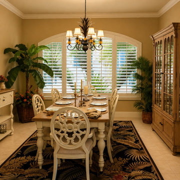
Experience the beauty of custom plantation shutters designed and installed by Plantation Shutters Florida. This luxury Florida home features premium plantation shutters throughout the living room and master bedroom, creating a timeless look while improving privacy, energy efficiency, and natural light control.
Every plantation shutter is custom-measured, handcrafted, and professionally installed to ensure a flawless fit. Our shutters are manufactured using premium hardwood and high-quality finishes that are built to withstand Florida's heat, humidity, and everyday living. The result is an elegant window treatment that enhances both traditional and contemporary interiors.
Whether you're updating a waterfront home, golf course estate, coastal residence, or custom-built luxury home, Plantation Shutters Florida delivers factory-direct craftsmanship with exceptional attention to detail.
Project Features
Custom plantation shutters for living rooms and master bedrooms
Premium hardwood plantation shutters
Furniture-quality finishes
Custom-fit for every window
Excellent light control and privacy
Energy-efficient window treatments
Built for Florida's climate
Professionally measured and installed
Factory-direct manufacturer in Florida
Plantation Shutters Florida specializes in custom plantation shutters, Ultra-Poly® shutters, specialty-shaped shutters, arched window shutters, sliding door shutters, French door shutters, motorized shades, and premium window treatments for luxury homes throughout Florida. Every project is designed to enhance your home's beauty, comfort, and value with craftsmanship that lasts for years.
Keywords: Plantation Shutters Florida, Custom Plantation Shutters, Living Room Plantation Shutters, Master Bedroom Plantation Shutters, Luxury Florida Homes, Interior Window Shutters, Hardwood Plantation Shutters, Custom Window Treatments, Florida Window Shutters, Made in Florida Plantation Shutters.
51