
Search results for "Discipline" in Home Design Ideas
 DesignARC
SANTA BARBARA, CA / DUPLEX RESIDENTIAL
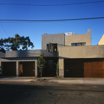
This urban infill, artist loft duplex was located in an overlooked, but well-located, light-commercial zone. It was also the first new residential construction built in the area for decades, the project is located within a 10-square-block area zoned for light-commercial and affectionately dubbed the “Funk Zone” by resident artists and city planners.
Only two blocks walking distance to the beach, and a similar distance to the downtown commercial district, this pedestrian-oriented project ideally suits the lifestyles of the owners. Although the two units share equal footprints, the southerly unit features a double-height, north-facing living space. The northerly unit supplants this volume with additional living space. The siting also allows for secure private courtyard entries, maximization of natural light and view-swept, rooftop living space.
The design incorporates a raised plinth required by flood zone restrictions to create a peaceful, intimate environment within the somewhat chaotic surrounding context. The disciplined and restrained approach towards the building’s image was intended to make reference to the much-loved Meridian Studios by George Washington Smith. Two roof-decks with outdoor fireplaces and shade trellises extend outdoor living space, contribute ocean and mountain views and provide both refuge and release.
Cost-effective materials were selected in order to adhere to the strict budget and to relate to the industrial surroundings. Over-sized pivot doors, “industrial” staircases and cabinetry were constructed on-site by the owners to conserve design integrity within the extremely limited budget.
2000 AIA Santa Barbara Chapter Honor Award
 Black Label Cabinetry and Design
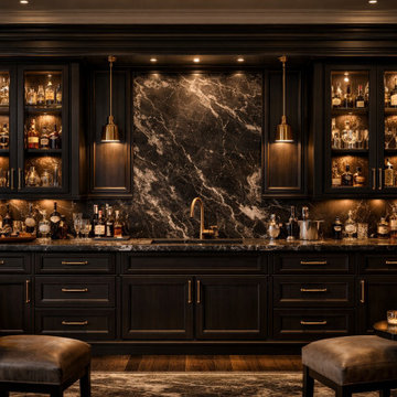
A moody, high-end entertaining bar designed to balance warmth, function, and visual impact. This space features rich dark cabinetry, symmetrical layout planning, and layered lighting to create a refined hospitality feel within the home.
The cabinetry was carefully composed to maintain clean alignment, consistent reveals, and balanced drawer and door proportions. The sink is intentionally centered within the base cabinet for proper function and visual symmetry, while surrounding storage supports both everyday use and entertaining.
Materials were selected to create contrast and depth, including a dramatic stone focal wall, warm metallic accents, and integrated lighting to highlight both display and work zones.
This project reflects Black Label’s approach: thoughtful design, disciplined execution, and a clear, guided process from concept through completion.
 All On Construction
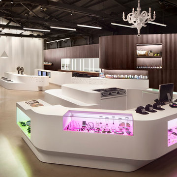
The well is a high end retail store in West Hollywood selling both emerging and established brands with a sophisticated and modern design to attract only Los Angeles's best.
Find the right local pro for your project
 Century Stair Company
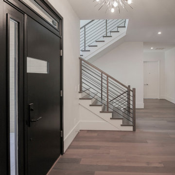
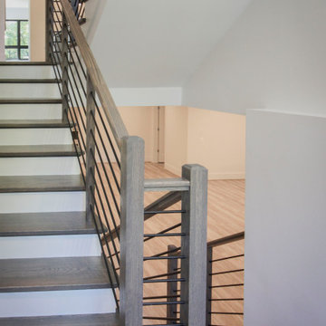
In this composition, restraint becomes the defining characteristic. The clean geometry of the horizontal black rod railing pairs effortlessly with warm wood elements, allowing the staircase to integrate with quiet confidence rather than overt display. The treads, newels, and handrail are finished in a refined taupe-brown stain that adds depth and softness, while crisp white risers introduce a subtle luminosity that enhances the surrounding architecture. The result is a staircase that feels effortless at first glance yet reveals itself as a carefully considered study in proportion, material balance, and disciplined design.
1976-2026 © Century Stair Company
 Century Stair Company
In this composition, restraint becomes the defining characteristic. The clean geometry of the horizontal black rod railing pairs effortlessly with warm wood elements, allowing the staircase to integrate with quiet confidence rather than overt display. The treads, newels, and handrail are finished in a refined taupe-brown stain that adds depth and softness, while crisp white risers introduce a subtle luminosity that enhances the surrounding architecture. The result is a staircase that feels effortless at first glance yet reveals itself as a carefully considered study in proportion, material balance, and disciplined design.
1976-2026 © Century Stair Company
 Arani Construction
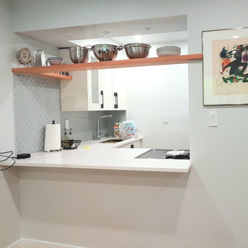
As part of this South Vancouver strata condo renovation, the kitchen was reconfigured to improve openness and connectivity to the adjacent living space. The existing wall separation was modified to create a functional pass-through opening, enhancing sightlines while maintaining structural integrity within the building envelope.
A custom suspended wood shelf was integrated into the opening, introducing warmth and practical display storage without overwhelming the compact footprint. The updated counter extension improves usability and creates a defined transition between kitchen and living areas. Decorative tile detailing and streamlined cabinetry complete the transformation.
Structural modifications in strata buildings require careful review, coordinated approvals, and disciplined execution. Arani Construction manages South Vancouver condo renovations with organized planning, compliance awareness, and precise installation standards.
 HIGOLD Outdoor Furniture
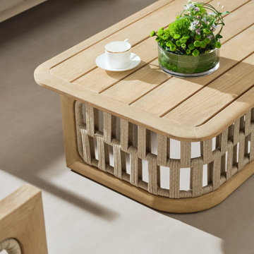
The RIVA collection - design by CLAUDIO BELLINI.
CLAUDIO BELLINI® is a Milan based multidisciplinary design studio founded by Claudio Bellini is built on an open-minded and innovative perspective, respectful to design heritage, specialized in product, furniture, and interior design since 1996. Integrating different disciplines gives the studio the privilege to provide long-term consultancy to clients by advising on graphic design, architecture, CMF, and brand identity.Studio’s capability of analyzing the complex dynamics of foreign markets has led CLAUDIO BELLINI® design studio to be recognized all around the world as one of the most influential European design practices.
Today, the studio continues evolving by enhancing the creativity with the support of a talented multinational team through their complementary skills.
In a game of solids and voids, of lights and shadows, the RIVA collection is born. It takes inspiration from the Moorish style of Andalusian architecture and it is characterised by its severe and essential lines. The empty spaces, created by the particular making of the yarn, bring to mind the arches of the Palace of Carlos V in Granada. A touch of Spain in your house.
 Divergent Custom Homes
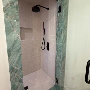
One suite bath within our ongoing work at a private estate in Denver's Polo Club, where Divergent serves as general contractor.
The existing room was original to the house — rojo alicante counters, a travertine shower, and basketweave mosaic that had aged past repair. Rather than refinish, we rebuilt the room around a several slabs of Emerald Quartzite.
Every stone surface in the room comes from those slabs, sequenced and mitered so the veining runs uninterrupted: the vanity deck, the full-height integral backsplash, both basins — carved and mitered rather than dropped in — and the shower jambs, which wrap the opening in a continuous 3" return. Nothing about it is off-the-shelf.
Around the stone: hand-troweled plaster walls, a limestone floor set on the diagonal with inlaid walnut banding, custom millwork tying the ceiling line to the mirrors, backlit mirrors integrated flush into the millwork, and painted inset cabinetry built to fit the room.
The coordination here — stone fabricator, plaster artisan, trim carpenter, and lighting all landing to a shared tolerance — is the same discipline we bring to full custom homes and estate renovations on the Front Range.
[Brayton Interiors] · [YK Stone] · [Underwood Concepts]
 Arani Construction
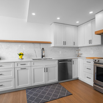
This kitchen renovation in Hollyburn, West Vancouver was designed to introduce clean geometry and durable finishes suited to everyday condo living. Custom shaker-style cabinetry was installed with precise alignment to maximize storage while maintaining consistent reveals and proportions throughout the layout.
A full-height slab backsplash with subtle veining creates visual continuity across the cooking wall, while open wood shelving introduces warmth and material contrast. The updated flooring complements the cabinetry tone, anchoring the space with a natural finish, and recessed ceiling lighting provides even illumination across work surfaces.
Arani Construction approaches West Vancouver condo kitchens with disciplined sequencing, detailed millwork installation, and careful material integration to ensure both functionality and long-term performance.
 CarsonSpeer Builders
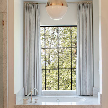
Inside, the home continues its disciplined aesthetic—open, airy, and rooted in natural texture. White oak floors, custom cabinetry, and stone countertops create a neutral foundation that highlights the home’s architectural lines. The open floor plan connects kitchen, dining, and living areas, while expansive window walls extend sightlines into the landscape.
Mechanical and structural systems are discreetly integrated for comfort and performance. High-efficiency insulation, HVAC zoning, and moisture control ensure long-term durability and efficiency. Outdoor living areas—terraces, porches, and patios—mirror the main structure’s material language, with continuous stone and wood elements that blur the boundary between interior and exterior.
Every joint, reveal, and finish at Summit Ridge exemplifies CarsonSpeer Builders’ dedication to authenticity, proportion, and craftsmanship. This modern Southern residence stands as a testament to timeless design—crafted to endure, inspire, and live beautifully within its mountain setting.
 Murphy Bros. Design | Build | Remodel
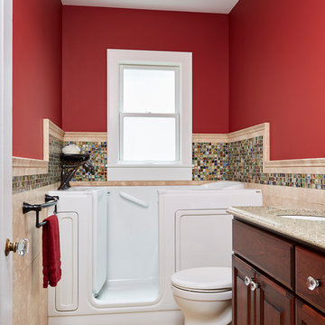
The need for Universal Design and/or Aging in Place Design is becoming more and more common and needed in our aging, society of increasing life expectancy. Murphy Bros. design/build CAPs certified expert Cherie Poissant explains some of the unique elements that went into this project which touch on both disciplines.
"In this particular case, my client, Dorothy, a widow, wanted to stay in the home she has lived in for decades. No surprise, most adults over 65 say they do too. But this 1920's home was not constructed with the principles of Universal or Aging-in-Place design concepts, which is true with most homes on the market these days. She also suffers from macular degeneration, which affects central vision. As is the case with senior clients dealing with vision issues, I needed to pay close attention to lighting and color that would give her peripheral vision cues. I chose a high contrast color scheme in the design to make navigating the room easier and safer," explains Poissant. "In addition, every wall and contact point, such as the the towel racks and TP dispenser also doubles as a grab bar to address fall prevention, which is a huge issue with the elderly."
Murphy Bros. Design/Build Consultant — Cherie Poissant
Alyssa Lee Photography
 Century Stair Company
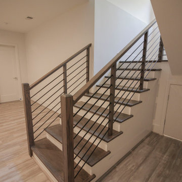
In this composition, restraint becomes the defining characteristic. The clean geometry of the horizontal black rod railing pairs effortlessly with warm wood elements, allowing the staircase to integrate with quiet confidence rather than overt display. The treads, newels, and handrail are finished in a refined taupe-brown stain that adds depth and softness, while crisp white risers introduce a subtle luminosity that enhances the surrounding architecture. The result is a staircase that feels effortless at first glance yet reveals itself as a carefully considered study in proportion, material balance, and disciplined design.
1976-2026 © Century Stair Company
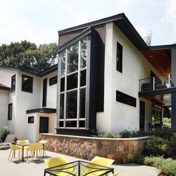
 Domus Constructors, LLC.
“Compelling.” That’s how one of our judges characterized this stair, which manages to embody both reassuring solidity and airy weightlessness. Architect Mahdad Saniee specified beefy maple treads—each laminated from two boards, to resist twisting and cupping—and supported them at the wall with hidden steel hangers. “We wanted to make them look like they are floating,” he says, “so they sit away from the wall by about half an inch.” The stainless steel rods that seem to pierce the treads’ opposite ends are, in fact, joined by threaded couplings hidden within the thickness of the wood. The result is an assembly whose stiffness underfoot defies expectation, Saniee says. “It feels very solid, much more solid than average stairs.” With the rods working in tension from above and compression below, “it’s very hard for those pieces of wood to move.”
The interplay of wood and steel makes abstract reference to a Steinway concert grand, Saniee notes. “It’s taking elements of a piano and playing with them.” A gently curved soffit in the ceiling reinforces the visual rhyme. The jury admired the effect but was equally impressed with the technical acumen required to achieve it. “The rhythm established by the vertical rods sets up a rigorous discipline that works with the intricacies of stair dimensions,” observed one judge. “That’s really hard to do.”
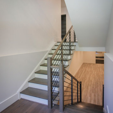 Century Stair Company
In this composition, restraint becomes the defining characteristic. The clean geometry of the horizontal black rod railing pairs effortlessly with warm wood elements, allowing the staircase to integrate with quiet confidence rather than overt display. The treads, newels, and handrail are finished in a refined taupe-brown stain that adds depth and softness, while crisp white risers introduce a subtle luminosity that enhances the surrounding architecture. The result is a staircase that feels effortless at first glance yet reveals itself as a carefully considered study in proportion, material balance, and disciplined design.
1976-2026 © Century Stair Company
 Attanasio Landscape Architecture
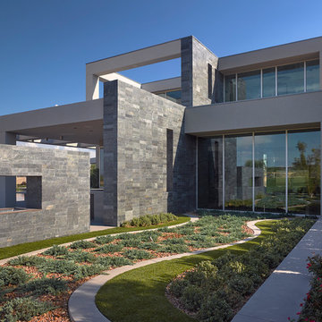
Attanasio Landscape Architecture, A Nevada Professional Corporation, (ALA) has a single goal on all projects: To collaborate with quality clients and other consultants contributing talent, skills and discipline directed into a cohesive project vision. ALA take's great pride in providing our clients with projects which create a sense of place, engage and enrich the experiences of the people who use them, and are responsive to the environment.
 Century Stair Company
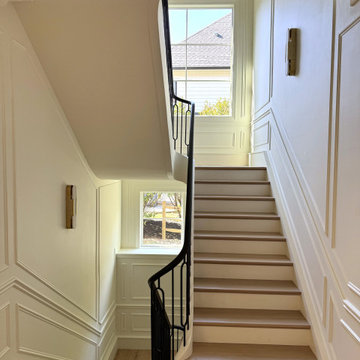
On first glance, this staircase reads as restrained. White oak treads rise with natural warmth, metal balusters hold their disciplined rhythm, and the painted black railing traces a clean, straight path upward. Then you notice the elliptical stringer wrap, and the whole composition shifts. Unlike a circular curve drawn with a compass, an ellipse requires mathematical calculation and a craftsman who knows how to make that complexity disappear. Here, it does exactly that.
Natural light finishes the story. Moving through the space across the day, it deepens the oak grain, catches the metal, and lets the black railing guide the eye along the handrail's elliptical path from start to finish. Restraint brought the design this far. One well-executed curve made it memorable.
1976-2026 © Century Stair Company
 Luula
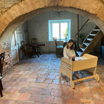
LuulaAttractive design from Italian designer Ezio Pescarori makes the set a special place for dreams and fantasy adventures!
The main advantage of the Wheel table and chair set is height adjustable. It meets the needs of children from the time the child is ready to sit up to a height of 150 cm (60 in). According to our latest product tester, Kurt, even people under the age of two are entitled to their individual space for creative activities. Comfortable, ergonomic, funny- place for create anything, whatever you want! According to Maria Montessori, the main goal is for the child to learn to learn with interest and joy. Self-motivation, self-discipline, self-discovery - children's ability to develop their potential, independence, systematic approach to problem solving, acquisition of knowledge and skills and at the same time increasing the joy of learning is not possible without an appropriate environment.
 HIGOLD Outdoor Furniture
CLAUDIO BELLINI® is a Milan based multidisciplinary design studio founded by Claudio Bellini is built on an open-minded and innovative perspective, respectful to design heritage, specialized in product, furniture, and interior design since 1996.
Integrating different disciplines gives the studio the privilege to provide long-term consultancy to clients by advising on graphic design, architecture, CMF, and brand identity.
Studio’s capability of analyzing the complex dynamics of foreign markets has led CLAUDIO BELLINI® design studio to be recognized all around the world as one of the most influential European design practices.
Today, the studio continues evolving by enhancing the creativity with the support of a talented multinational team through their complementary skills.
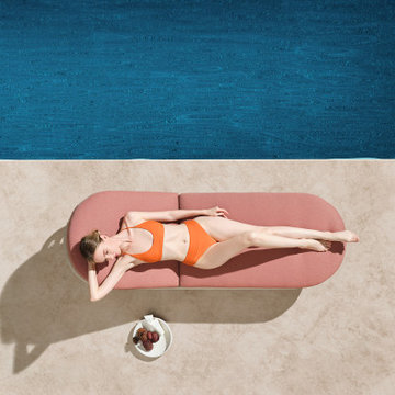
You will feel asleep cradled in the arms of VASCA collection. It takes inspiration from the long summer days, when you are so tired that the only thing you would do is to be rocked by the light of the moon.
The weavings of the furnitures' structure remind you of the cord of an hammock childhood. It leaves in your soul the sensation of light-heartedness, well-being and levity, perfect mix at the end of a demanding day. Its rounded shapes and soft cushions convey a harmony and sense of calm.
The wooden parts bring back a warm and gentle atmosphere.
 Attanasio Landscape Architecture
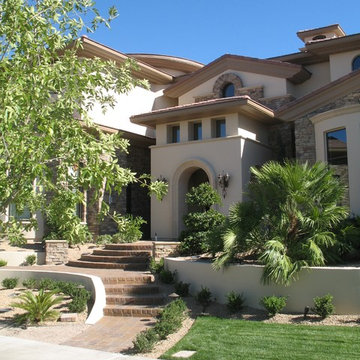
Attanasio Landscape Architecture, A Nevada Professional Corporation, (ALA) has a single goal on all projects: To collaborate with quality clients and other consultants contributing talent, skills and discipline directed into a cohesive project vision. ALA take's great pride in providing our clients with projects which create a sense of place, engage and enrich the experiences of the people who use them, and are responsive to the environment.
 Klopf Architecture
Set on a narrow hillside lot overlooking the San Francisco Bay in Point Richmond, California, Bay Heirloom is a Mid-Century Modern family home restored, modernized and adapted for contemporary living. Oriented south-southwest toward the Marin Headlands, with views of the Golden Gate Bridge, the residence captures shifting Bay light throughout the day, from fog-muted mornings to vivid, glowing sunsets.
The home was built by Karlyn Neel’s grandfather, the owner of the construction company Flo-Crete, one of the Bay Area’s early concrete pumping firms. Flo-Crete completed the foundation and structural concrete work, with family photographs documenting the original cinderblock walls and pours. The firm also contributed to major regional infrastructure projects, including the Transbay BART tube and Candlestick Park, situating the house within a broader legacy of Bay Area construction. Growing up, Neel spent considerable time in the home, developing an early appreciation for mid-century modern principles. Instead of parting with this family heirloom, she purchased the home from her grandfather’s estate.
While her grandfather continued to live in the Point Richmond house, Neel purchased a Mid-Century Modern residence in Palm Desert. In contrast to the Bay Area’s cool temperatures, salt air, and persistent winds, the desert home is shaped by heat and sun and requires a different material response. A substantial renovation she led there emphasized thermal performance, filtered light, and restrained detailing. The experience later informed the restoration of her Bay Area family home.
What began as a modest Mid-Century Modern update expanded when decades of exposure to marine conditions revealed leaks and significant structural and seismic deficiencies. Neel was determined to honor her grandfather’s perseverance and without hesitation pivoted to a much more intensive project. Addressing these challenges required close coordination between Neel, Klopf Architecture and Kasten Builders, with architectural restraint and construction precision guiding each intervention. Rather than alter the home’s defining features, the project focused on reinforcing the structure from within. Discreet beams were embedded along the rear facade and in an upstairs wall, strengthening the building while maximizing the wall of glass facing the Bay and opening the wall between the kitchen and the living space. These structural interventions allowed the space to open fully to the Bay without visual interruption, with the kitchen repositioned as the social and functional core of an open, continuous living space. The building envelope was updated using weather- and corrosion-resistant materials appropriate to the marine environment.
The house unfolds vertically from the street, beginning with a modest garage level and workshop, with the main living spaces located below. Original slate flooring at the entry was preserved, along with select furnishings and artwork collected by Neel’s grandfather, anchoring the restored interior in its past. A restrained palette of black accents and pale, natural finishes replaces darker wood tones, reinforcing openness and calm. A naturally illuminated stair connects to the lowest level, where a former basement was transformed into a guest suite and family room opening onto a deck. From there, steps lead directly to a small concrete boat ramp at the water’s edge.
Throughout the project, decisions were guided by continuity rather than transformation for its own sake. Lessons drawn from both desert and coastal climates informed a material strategy rooted in performance and restraint. Bay Heirloom stands as a measured evolution of a family house, structurally renewed and carefully modernized, grounded in the discipline and care that first shaped it.
Klopf Architecture Project Team: John Klopf, AIA, Angela Todorova and Fernanda Bernardes
Landscape Architect: Huettl Landscape Architecture
General Contractor: Kasten Builders
Photography: ©2025 Mariko Reed
Year Completed: 2022
Location: Point Richmond, CA
18