
Search results for "Double check" in Home Design Ideas
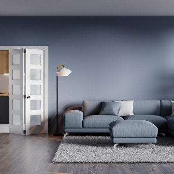
 Almesedoors
FINISH: PRIMED
The advantages of this approach – of this type of interior door finish – are fairly obvious. Pick a color, any color that suits your projects best. Mix and apply. Re- coat whenever you feel it is necessary to do so. Touch it up. It gives you, the proud owner of these interior doors, complete freedom of choice, and the significant savings, especially where it comes to bulk orders, can be a true source of joy.
As Kurt Vonnegut mentions in one of his novels (Bluebeard, unless I’m mistaken … check it out when you get a chance), the thrill of laying on colors is a large part of the artist’s professional satisfaction. In other words, a keen pleasure.
When back in the remote past visual arts became a field dominated by professionals rather than hobbyists, the main problem of “just laying on paint” became obvious: you can’t.
The medium of choice back then was egg tempera, a permanent, fast-drying substance consisting of colored pigments mixed with a water-soluble binder medium, usually glutinous material such as egg yolk. Portraits and ornaments were executed in this medium, and the wood panel was the surface of choice. One of tempera’s interesting features is that it is not as easily absorbed by wood as other mediums. Some sort of primer was necessary, of course, but pretty much any substance that dried evenly could be used.
The drawbacks of tempera, or pintura al temple, as the Spanish call it, only became obvious with the advent of the Renaissance, when the leading representatives of the trade turned to oil (and interior doors suddenly became a great deal less crude, but that’s a story for another day).
Oil painting is the process of “painting with pigments with a medium of drying oil as the binder.” Commonly used types include linseed (highly preferable in art, though not necessarily in interior doors, mind you), poppy seed, walnut, and safflower.
Today, five hundred years later, it is safe to say that oil is more versatile than pintura al temple – by orders of magnitude. Specifically, the contrasts achieved through the former are much greater, the darks are far deeper, and three- dimensional, highly realistic images are much easier to achieve. Next time you visit a museum, take a closer look at pintura al temple portraits. All of them, without exception, come off as a bit “flat” as opposed to their latter-day counterparts.
Also, where glazing is concerned …
Glazing: a painting technique in which a transparent layer, with just a touch of pigment, is laid over a previously painted surface, allowing light to travel through the glaze and be reflected back off of the opaque layer below. Gentle shadows, subtle changes of color, smooth transitions – all these can be achieved through glazing, which was used by all artists up until the middle of the Nineteenth Century, when artist tubes were invented, revolutionizing the field, and other techniques began to be explored.
Tempera enthusiasts (it takes all kinds to make a world) will assure you that glazing is not just possible in pintura al temple but is actually the basis of the whole enterprise. Well, what are you going to do? They’re enthusiasts.
Anyway, la peinture à l'huile, as the French call it, re-introduced the ancient problem of most surface’s propensity to absorb dipingere, as the Italians call the stuff. Wood or canvas, it is all the same: you’re not going to get very far without a good primer.
Experiments were conducted, and soon rabbit skin glue emerged as the least expensive and most effective solution. It was easy to apply. It dried evenly. It made the application of the l’huile stuff on top of it a walk in the park.
There were drawbacks. Today, rabbit skin glue is considered to be a major cause of cracking by most modern conservators. (Remember, when you visited the Metropolitan Museum of Art – and did you see those interior doors? … some of them are quite something … - most “old masters” pictures are completely covered with a cobweb of cracks? There you go). Because the glue is hygroscopic, it continually absorbs moisture from the atmosphere, causing the glue to swell and shrink as ambient humidity levels change. Over many humidity cycles, this repeated flexing causes the brittle oily layers to crack.
To combat this problem, modern primers are made of acrylic materials which are guaranteed not to cause any damage to the dipingere. No bubbling, no cracks. Your interior doors are safe.
 Wine Cellar Specialists
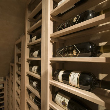
Not only are unfinished mahogany wine racks beautiful in their own rite, they provide a nice backdrop for the bottles.
Mahogany also boasts fantastic resistance to moisture, and the mold, mildew and decay that could otherwise come of it.
This makes it perfect for the cool and humid environment inherent in a custom wine cellar in Texas.
Specifically, horizontal display vine racks can be seen here. This bottle orientation allows for easy viewing of the wine labels.
See the full story at http://www.winecellarspec.com/custom-wine-cellars-chicago-illinois-under-staircase-project-white/ .
Wine Cellar Specialists
Chicago Design Office
858 W. Armitage Ave #385
Chicago, IL 60614
See our reviews: https://www.google.com/search?q=Wine+Cellar+Specialists&ludocid=8538802152238743744#lrd=0x0:0x767feb51238800c0,1
 Four Elements Construction
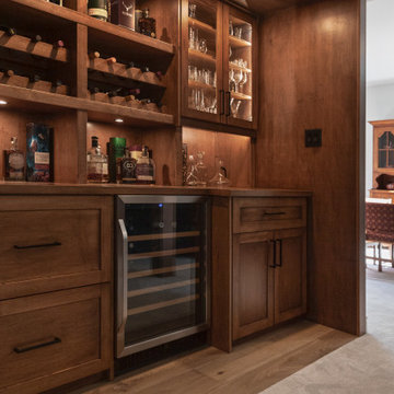
This is our very first Four Elements remodel show home! We started with a basic spec-level early 2000s walk-out bungalow, and transformed the interior into a beautiful modern farmhouse style living space with many custom features. The floor plan was also altered in a few key areas to improve livability and create more of an open-concept feel. Check out the shiplap ceilings with Douglas fir faux beams in the kitchen, dining room, and master bedroom. And a new coffered ceiling in the front entry contrasts beautifully with the custom wood shelving above the double-sided fireplace. Highlights in the lower level include a unique under-stairs custom wine & whiskey bar and a new home gym with a glass wall view into the main recreation area.
Find the right local pro for your project
 Four Elements Construction
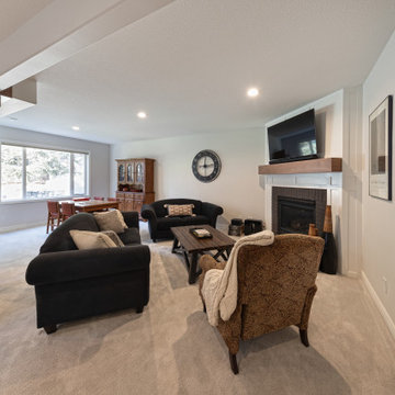
This is our very first Four Elements remodel show home! We started with a basic spec-level early 2000s walk-out bungalow, and transformed the interior into a beautiful modern farmhouse style living space with many custom features. The floor plan was also altered in a few key areas to improve livability and create more of an open-concept feel. Check out the shiplap ceilings with Douglas fir faux beams in the kitchen, dining room, and master bedroom. And a new coffered ceiling in the front entry contrasts beautifully with the custom wood shelving above the double-sided fireplace. Highlights in the lower level include a unique under-stairs custom wine & whiskey bar and a new home gym with a glass wall view into the main recreation area.
 Stacey Kocevar Designs, LLC
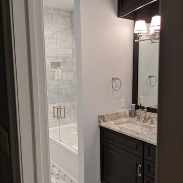
Mid-sized elegant marble tile marble floor and double-sink bathroom photo in Other with furniture-like cabinets, black cabinets, a two-piece toilet, gray walls, an undermount sink, marble countertops, a hinged shower door, a niche and a built-in vanity

 User
User
[Assembly]
No assembly is required. Our kennels come fully built, just ensure to check the dimensions of your entrance so there are no issues getting your kennel into your home.
[Shipping]
These are solid and heavy items that weigh anywhere from 150lbs to 350lbs. The shipping is driveway drop off but if someone is present to help the shipping personnel will help you get it into the door.
[Contact us]
Website: www.thefinerustic.com
IG&FB: @thefinerustic
Email: info@thefinerustic.com
Txt&Call: 866-422-7311
 House of Brazier
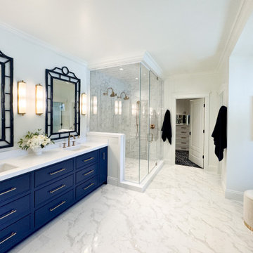
When my clients purchased their home, they knew it needed a major overhaul. And by major, I mean we may have left one wall while tearing down the entire home before building it back up. With requests for a modern, sophisticated southern charmer, we designed a timeless classic perfectly suited for their family’s functions and needs full of whimsy, color and pattern. Everything you see was designed and built from the ground up, including space planning, hard surface specifications from floor to ceiling, lighting, furniture, artwork, and accessories.
We reworked their floorplan to efficiently use the space and provide plenty of natural light, living and entertaining space, and storage throughout. Beautiful accents and thoughtful details are found throughout their home like the custom entry floor pattern, reeded wood detailing on the navy kitchen hutch, custom reeded great room cabinetry, the laundry room dog wash drawer/step or the pull-out drying rack, the double-sided fireplace in the master bedroom and master bath, or the paneled walls with inset wallpaper. There’s sophistication and beauty at every turn and I absolutely loved all of the color and pattern! Stay tuned for the before and after reveal because it’s major!
I’m also honored to say this was also awarded two ASID ANDYZ Awards for Best Residential Kitchen Design over 150sq.ft. and Best Multiple Residential Space over 3000 sq.ft. I’m grateful to work with such amazing clients and talented trades! Be sure to check out the full reveal with the before and after photos too!

 Four Elements Construction
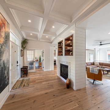
This is our very first Four Elements remodel show home! We started with a basic spec-level early 2000s walk-out bungalow, and transformed the interior into a beautiful modern farmhouse style living space with many custom features. The floor plan was also altered in a few key areas to improve livability and create more of an open-concept feel. Check out the shiplap ceilings with Douglas fir faux beams in the kitchen, dining room, and master bedroom. And a new coffered ceiling in the front entry contrasts beautifully with the custom wood shelving above the double-sided fireplace. Highlights in the lower level include a unique under-stairs custom wine & whiskey bar and a new home gym with a glass wall view into the main recreation area.
 RAJ Kitchen and Bath, LLC
**Check out the video of this transformation on our website**
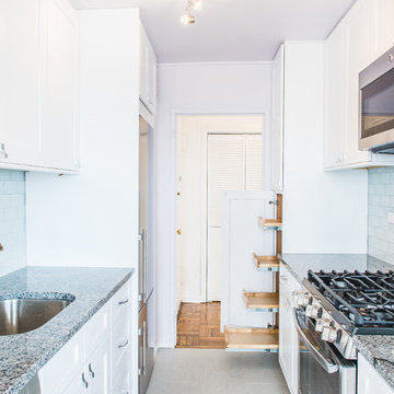
This small kitchen was way too small for this 2 bedrooms, 2 bathrooms apartment. Not only was it a very small kitchen, but the physical location of it made it very difficult to make it any bigger. There wasn't much that could have been done without incurring astronomical cost, which would get little or no return on the investment. The client wanted a kitchen that can be optimized in its current location to add a ton of value for resale.
This was difficult to do, because there was no moving of any mechanical around in the kitchen and even if we wanted to, the management of the building would not allow. For those of you who live in condos, co-ops or apartment building, you know how difficult it is to rework these foot prints. When we showed up, we saw the problems, but we also saw a huge opportunity where we can achieve those goals in the small space. This was accomplished by making some key changes and to incorporate some new things that was not possible when this kitchen was built years ago.
The crucial part of the design that would drive the entire new layout, was selecting the only appliance; that was the Refrigerator. Once we nailed down that refrigerator, we then proceeded to design the kitchen around it. We moved it to the other side of the wall where the sink was so that we can tap into the water line from the sink plumbing. It was crucial that it stays exactly 24" deep, not an inch more because we had to keep the entry as open as possible. Also, it was going to be directly in front of another big storage unit - The pantry. It is not ideal in most cases, but we needed the rest of the space to ramp up the design and open feel towards the side where all of the activities would take place, which happend to be the dining room and the view.
Once all that was figured out, we re-positioned the sink, dishwasher and the range and proceeded to wrap the cabinets around the columns to integrate them into the space. Thirty- six inches cabinets height was used so that they can be installed higher towards the ceiling height to give more room rather than the standard 18" required height between the counter tops. This was done to make the room feel a lot bigger than it really was. Not to mention, we also didn't want the faucet to be buried under the cabinets so that was also a necessary design detail for the space.
We then lowered both knee walls so that the counter top can sit on top of them, by removing that stop point that would have otherwise defined the kitchen area. This allowed us to pick up that extra footprint into the room for added prep space and enabled us to create the illusion of a kitchen that is looking longer than it really is. Every inch mattered when designing this kitchen and we made a conscious decision to use every one of that inch.
White cabinets were selected to do just what white cabinets are design to do; make a small or dark room appear bigger, brighter and more open. In this kitchen, this was amplified the more because of the kitchen location. It was perfect! We knew we did justice to the space because while we were there taking some photos, a few potential buyers walked in and went straight for the kitchen! They said its design just to fit the apartment.
Pantry roll out shelving, Double recycle bin, fancy handles, LED lighting, Quartz counter top, beautiful backslash tiles and grey linen floors finished off the kitchen which looked over a beautiful view of the George Washington Bridge from the top of this lovely 4th floor apartment.
Credit to Masterpiece Tile and Marble (Annmarie on the selection of Tiles and countertop and Val on the Construction to complete this project).
Davor Kokic Photography
 Cabinet Technologies LLC
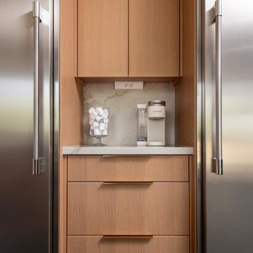
Check out this beautiful rift cut white oak kitchen! We put in a custom hood in Venetian plaster for a sleek look. the countertops are Mont Blanc Quartzite with full backsplash.
We added some great accessories like a double trash pullout, cabinet pullouts and power bars.
 User
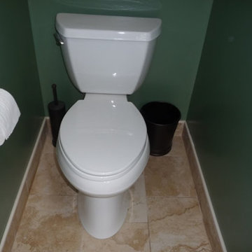
UserWorn and dreary to stunning and crisp - Check out this previous #Master #Bath #Transformation!
Powder room - mid-sized modern powder room idea in DC Metro
Powder room - mid-sized modern powder room idea in DC Metro
 Four Elements Construction
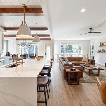
We have another amazing project to share this week, and this time it’s our very first Four Elements remodel show home! We started with a basic spec-level early 2000s walk-out bungalow, and transformed the interior into a beautiful modern farmhouse style living space with many custom features. The floor plan was also altered in a few key areas to improve liveability and create more of an open-concept feel. Check out the shiplap ceilings with douglas fir faux beams in the kitchen, dining room, and master bedroom. And a new coffered ceiling in the front entry contrasts beautifully with the custom wood shelving above the double-sided fireplace. Highlights in the lower level include a unique under-stairs custom wine & whiskey bar and a new home gym with a glass wall view into the main recreation area.
 Tracy Berman Interiors
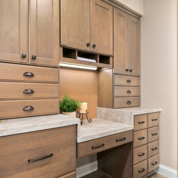
This kitchen was your typical builder basic design. Lot's of cabinets with no thought for function. An odd shaped island that took up space, but didn't provide much storage. We straightened out the island to create more storage and loads of function. It now has the sink, dishwasher, trash center, bookcase, mixer cabinet and microwave drawer plus more! We removed the wall double ovens and added a 48" range instead. This allowed us to flank either side of the fridge with roll out pantry cabinets. An appliance garage was added to the corner. The range has a custom hood over it that blends seamlessly with the cabinets. The client needed a space to sit and check the mail so we created an office space at the end of the wall. Behind the blinds is a new 10' slider for access to the patio. Luxury vinyl plank flooring went in throughout the house. Custom pendant lights were hung in clusters of three above the island. The kitchen was painted Accessible Beige by SW.
 Closets For Life
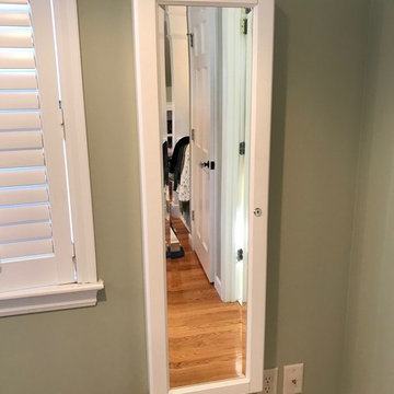
Jewelry collection outgrown its current storage spot? Check out this wall-mounted jewelry cabinet that does double duty as a mirror. Visit us at www.closetsforlife.com to about more creative storage options like this one!
 House of Brazier
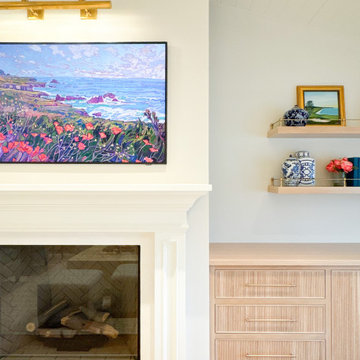
When my clients purchased their home, they knew it needed a major overhaul. And by major, I mean we may have left one wall while tearing down the entire home before building it back up. With requests for a modern, sophisticated southern charmer, we designed a timeless classic perfectly suited for their family’s functions and needs full of whimsy, color and pattern. Everything you see was designed and built from the ground up, including space planning, hard surface specifications from floor to ceiling, lighting, furniture, artwork, and accessories.
We reworked their floorplan to efficiently use the space and provide plenty of natural light, living and entertaining space, and storage throughout. Beautiful accents and thoughtful details are found throughout their home like the custom entry floor pattern, reeded wood detailing on the navy kitchen hutch, custom reeded great room cabinetry, the laundry room dog wash drawer/step or the pull-out drying rack, the double-sided fireplace in the master bedroom and master bath, or the paneled walls with inset wallpaper. There’s sophistication and beauty at every turn and I absolutely loved all of the color and pattern! Stay tuned for the before and after reveal because it’s major!
I’m also honored to say this was also awarded two ASID ANDYZ Awards for Best Residential Kitchen Design over 150sq.ft. and Best Multiple Residential Space over 3000 sq.f.t. I’m grateful to work with such amazing clients and talented trades! Be sure to check out the full reveal with the before and after photos too!
 Bathroom Remodeling Teacher
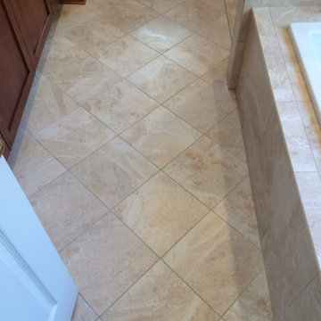
After: The client had gone to Best Tile in Wexford, PA and fell in love with one of their showroom displays. She ended up buying the exact tiles and wanted the same style from the display, making my job very easy. Design is one of the harder obstacles when redoing a bathroom yourself, and going to a tile store is helpful in narrowing down your options. My wife, Nikki, has design planning on the Bathroom Remodeling Teacher website to help you (www.bathroomremodelingteacher.com/plan).
These are the before and after pictures of a large master bathroom remodel that was done by Steve White (owner of Bathroom Remodeling Teacher and SRW Contracting, Inc.) Steve has been a bathroom remodeling contractor in the Pittsburgh area since 2008. Steve has created easy-to-follow courses that enable YOU to build your own bathroom. He has compiled all of his industry knowledge and tips & tricks into several courses he offers online to pass his knowledge on to you. He makes it possible for you to BUILD a bathroom just like this contemporary style master bathroom. Check out his courses by visiting the Bathroom Remodeling Teacher website at:
https://www.bathroomremodelingteacher.com/learn.
 Fratantoni Design / Residential Architects
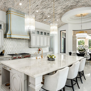
This incredible home is brought to you by the best architecture company in the nation -- Fratantoni Design. These experts know luxury home design and love to showcase their work! This stunning home features double sweeping staircases, custom ceilings, a chef's kitchen decked out in white Italian marble, ornate living quarters and incredible style throughout. Check out the Fratantoni Design portfolio of homes online and reach out to schedule a meeting today!
Sponsored
Fredericksburg, OH

High Point Cabinets
Columbus' Experienced Custom Cabinet Builder | 4x Best of Houzz Winner
 Four Elements Construction
This is our very first Four Elements remodel show home! We started with a basic spec-level early 2000s walk-out bungalow, and transformed the interior into a beautiful modern farmhouse style living space with many custom features. The floor plan was also altered in a few key areas to improve livability and create more of an open-concept feel. Check out the shiplap ceilings with Douglas fir faux beams in the kitchen, dining room, and master bedroom. And a new coffered ceiling in the front entry contrasts beautifully with the custom wood shelving above the double-sided fireplace. Highlights in the lower level include a unique under-stairs custom wine & whiskey bar and a new home gym with a glass wall view into the main recreation area.
 SRQ Woodworks Co.
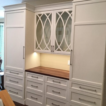
We love creating one-of-a-kind kitchens. Check out these handmade double arch mullion doors we completed in the shop! #ArtInWoodworking #OneInAMullion
 House of Brazier
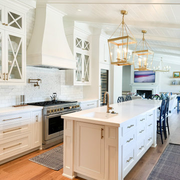
When my clients purchased their home, they knew it needed a major overhaul. And by major, I mean we may have left one wall while tearing down the entire home before building it back up. With requests for a modern, sophisticated southern charmer, we designed a timeless classic perfectly suited for their family’s functions and needs full of whimsy, color and pattern. Everything you see was designed and built from the ground up, including space planning, hard surface specifications from floor to ceiling, lighting, furniture, artwork, and accessories.
We reworked their floorplan to efficiently use the space and provide plenty of natural light, living and entertaining space, and storage throughout. Beautiful accents and thoughtful details are found throughout their home like the custom entry floor pattern, reeded wood detailing on the navy kitchen hutch, custom reeded great room cabinetry, the laundry room dog wash drawer/step or the pull-out drying rack, the double-sided fireplace in the master bedroom and master bath, or the paneled walls with inset wallpaper. There’s sophistication and beauty at every turn and I absolutely loved all of the color and pattern! Stay tuned for the before and after reveal because it’s major!
I’m also honored to say this was also awarded two ASID ANDYZ Awards for Best Residential Kitchen Design over 150sq.ft. and Best Multiple Residential Space over 3000 sq.ft. I’m grateful to work with such amazing clients and talented trades! Be sure to check out the full reveal with the before and after photos too!
55