
Search results for "Download hidden" in Home Design Ideas
 TKS Design Group
Download our free ebook, Creating the Ideal Kitchen. DOWNLOAD NOW
Lakefront property in the northwest suburbs of Chicago is hard to come by, so when we were hired by this young family with exactly that, we were immediately inspired by not just the unusually large footprint of this 1950’s colonial revival but also the lovely views of the manmade lake it was sited on. The large 5-bedroom home was solidly stuck in the 1980’s, but we saw tons of potential. We started out by updating the existing staircase with a fresh coat of paint and adding new herringbone slate to the entry hall.
The powder room off the entryway also got a refresh - new flooring, new cabinets and fixtures. We ran the new slate right through into this space for some consistency. A fun wallpaper and shiplap trim add a welcoming feel and set the tone for the home.
Next, we tackled the kitchen. Located away from the rest of the first floor, the kitchen felt a little isolated, so we immediately began planning for how to better connect it to the rest of the first floor. We landed on removing the wall between the kitchen and dining room and designed a modified galley style space with separate cooking and clean up zones. The cooking zone consists of the refrigerator, prep sink and cooktop, along with a nice long run of prep space at the island. The cleanup side of the kitchen consists of the main sink and dishwasher. Both areas are situated so that the user can view the lake during prep work and cleanup!
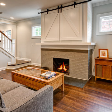
One of the home’s main puzzles was how to incorporate the mudroom and area in front of the patio doors at the back of the house. We already had a breakfast table area, so the space by the patio doors was a bit of a no man’s land. We decided to separate the kitchen proper from what became the new mudroom with a large set of barn doors. That way you can quickly hide any mudroom messes but have easy access to the light coming in through the patio doors as well as the outdoor grilling station. We also love the impact the barn doors add to the overall space.
The homeowners’ first words to us were “it’s time to ditch the brown,” so we did! We chose a lovely blue pallet that reflects the home’s location on the lake which is also vibrant yet easy on the eye. Countertops are white quartz, and the natural oak floor works well with the other honey accents. The breakfast table was given a refresh with new chairs, chandelier and window treatments that frame the gorgeous views of the lake out the back.
We coordinated the slate mudroom flooring with that used in the home’s main entrance for a consistent feel. The storage area consists of open and closed storage to allow for some clutter control as needed.
Next on our “to do” list was revamping the dated brown bar area in the neighboring dining room. We eliminated the clutter by adding some closed cabinets and did some easy updates to help the space feel more current. One snag we ran into here was the discovery of a beam above the existing open shelving that had to be modified with a smaller structural beam to allow for our new design to work. This was an unexpected surprise, but in the end we think it was well worth it!
We kept the colors here a bit more muted to blend with the homeowner’s existing furnishings. Open shelving and polished nickel hardware add some simple detail to the new entertainment zone which also looks out onto the lake!
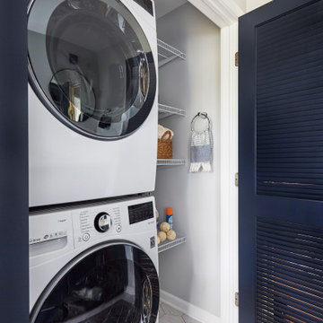
Next we tackled the upstairs starting with the homeowner’s son’s bath. The bath originally had both a tub shower and a separate shower, so we decided to swap out the shower for a new laundry area. This freed up some space downstairs in what used to be the mudroom/laundry room and is much more convenient for daily laundry needs.
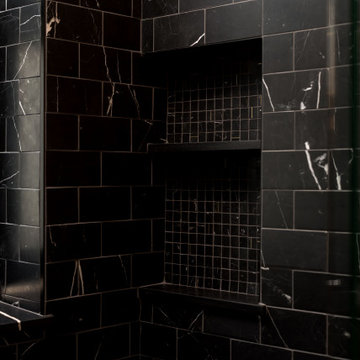
We continued the blue palette here with navy cabinetry and the navy tile in the shower. Porcelain floor tile and chrome fixtures keep maintenance to a minimum while matte black mirrors and lighting add some depth the design. A low maintenance runner adds some warmth underfoot and ties the whole space together.
We added a pocket door to the bathroom to minimize interference with the door swings. The left door of the laundry closet is on a 180 degree hinge to allow for easy full access to the machines. Next we tackled the master bath which is an en suite arrangement. The original was typical of the 1980’s with the vanity outside of the bathroom, situated near the master closet. And the brown theme continued here with multiple shades of brown.
Our first move was to segment off the bath and the closet from the master bedroom. We created a short hall from the bedroom to the bathroom with his and hers walk-in closets on the left and right as well as a separate toilet closet outside of the main bathroom for privacy and flexibility.
The original bathroom had a giant soaking tub with steps (dangerous!) as well as a small shower that did not work well for our homeowner who is 6’3”. With other bathtubs in the home, they decided to eliminate the tub and create an oversized shower which takes up the space where the old tub was located. The double vanity is on the opposite wall and a bench is located under the window for morning conversations and a place to set a couple of towels.
The pallet in here is light and airy with a mix of blond wood, creamy porcelain and marble tile, and brass accents. A simple roman shade adds some texture and it’s top-down mechanism allows for light and privacy.
This large whole house remodel gave our homeowners not only the ability to maximize the potential of their home but also created a lovely new frame from which to view their fabulous lake views.
Designed by: Susan Klimala, CKD, CBD
Photography by: Michael Kaskel
For more information on kitchen and bath design ideas go to: www.kitchenstudio-ge.com
 TKS Design Group
Free ebook, Creating the Ideal Kitchen. DOWNLOAD NOW
The homeowners of this mid-century Colonial and family of four were frustrated with the layout of their existing kitchen which was a small, narrow peninsula layout but that was adjoining a large space that they could not figure out how to use. Stealing part of the unused space seemed like an easy solution, except that there was an existing transition in floor height which made that a bit tricky. The solution of bringing the floor height up to meet the height of the existing kitchen allowed us to do just that.
This solution also offered some challenges. The exterior door had to be raised which resulted in some exterior rework, and the floor transition had to happen somewhere to get out to the garage, so we ended up “pushing” it towards what is now a new mudroom and powder room area. This solution allows for a small but functional and hidden mudroom area and more private powder room situation.
Another challenge of the design was the very narrow space. To minimize issues with this, we moved the location of the refrigerator into the newly found space which gave us an L-shaped layout allowing for an island and even some shallow pantry storage. The windows over the kitchen sink were expanded in size and relocated to allow more light into the room. A breakfast table fits perfectly in the area adjacent to the existing French doors and there was even room for a small bar area that helps transition from inside to outside for entertaining. The confusing unused space now makes sense and provides functionality on a daily basis.
To help bring some calm to this busy family, a pallet of soft neutrals was chosen -- gray glass tile with a simple metal accent strip, clear modern pendant lights and a neutral color scheme for cabinetry and countertops.
For more information on kitchen and bath design ideas go to: www.kitchenstudio-ge.com
 TKS Design Group
Free ebook, Creating the Ideal Kitchen. DOWNLOAD NOW
Starting out with a project that has good bones is always a bonus as was the case with the project. This young family has a great house on a great street in a great location. The kitchen was a large space with ample room and great view to the backyard. The dated cabinets and large peninsula layout however were not working for them, so they came in looking for a fresh start.
Goals for the project included adding a large island with seating for four and a bright, open and cheerful space for daily meals and entertaining. Our clients also wanted to keep the existing breakfast table, but the original space did not allow for an island and breakfast table. Our solution was to create banquette seating which gave us the extra inches necessary to accomplish both.
The larger awning window over the kitchen sink allows for ample light in the new space. The wall between the kitchen and family room was partially removed to provide the more open feeling our clients desired.
The work triangle is centered on the island which serves as a big open prep space conveniently located across from the large pro style range. The island also houses the microwave and a 2nd oven for larger gatherings. A new counter depth fridge and beverage center provide options for refrigeration.
A simple pallet of white cabinetry, Carrera marble countertops and polished nickel fixtures will be a timeless look and provide a lovely backdrop for entertaining and spending time with family.
Designed by: Susan Klimala, CKD, CBD
Photography by: Mike Kaskel
For more information on kitchen and bath design ideas go to: www.kitchenstudio-ge.com
Find the right local pro for your project
 TKS Design Group
Free ebook, Creating the Ideal Kitchen. DOWNLOAD NOW
A load-bearing wall was removed to make way for this large family kitchen boasting two islands and seating for five. White cabinetry, Cambria Torquay counter tops, and white tile provide a rich contrast for the dark cherry island, stained maple flooring, and walnut butcher block table. Crystal chandeliers and knobs, and custom turned legs along with a keyed arched hood provide elegant details for this family friendly space.
Designed by: Susan Klimala, CKD, CBD
Photography by: Carlos Vergara
For more information on kitchen and bath design ideas go to: www.kitchenstudio-ge.com
 TKS Design Group
Free ebook, Creating the Ideal Kitchen. DOWNLOAD NOW
The homeowners of this mid-century Colonial and family of four were frustrated with the layout of their existing kitchen which was a small, narrow peninsula layout but that was adjoining a large space that they could not figure out how to use. Stealing part of the unused space seemed like an easy solution, except that there was an existing transition in floor height which made that a bit tricky. The solution of bringing the floor height up to meet the height of the existing kitchen allowed us to do just that.
This solution also offered some challenges. The exterior door had to be raised which resulted in some exterior rework, and the floor transition had to happen somewhere to get out to the garage, so we ended up “pushing” it towards what is now a new mudroom and powder room area. This solution allows for a small but functional and hidden mudroom area and more private powder room situation.
Another challenge of the design was the very narrow space. To minimize issues with this, we moved the location of the refrigerator into the newly found space which gave us an L-shaped layout allowing for an island and even some shallow pantry storage. The windows over the kitchen sink were expanded in size and relocated to allow more light into the room. A breakfast table fits perfectly in the area adjacent to the existing French doors and there was even room for a small bar area that helps transition from inside to outside for entertaining. The confusing unused space now makes sense and provides functionality on a daily basis.
To help bring some calm to this busy family, a pallet of soft neutrals was chosen -- gray glass tile with a simple metal accent strip, clear modern pendant lights and a neutral color scheme for cabinetry and countertops.
For more information on kitchen and bath design ideas go to: www.kitchenstudio-ge.com

 Leicht Westchester-Greenwich
Example of a minimalist u-shaped concrete floor home design design in New York with an integrated sink, flat-panel cabinets, dark wood cabinets, quartzite countertops, stainless steel appliances and an island
 TKS Design Group
Free ebook, Creating the Ideal Kitchen. DOWNLOAD NOW
Designer, Julie Dunfee, of Julie Dunfee Designs, took on the task of redesigning an entire condominium unit for her clients. The unit which serves as the couple’s pied-a-terre, is located in downtown Chicago and is in near proximity to immediate family, offering the opportunity for both weekend getaways and family get togethers.
Julie brought The Kitchen Studio in to help with the kitchen design and cabinetry layout. Below is what the kitchen area looked like before. One of the primary objectives was to have a sleek contemporary feel, so an eco veneer was chosen in a dark stain for the cabinetry in a horizontal grain. Custom appliance panels at the fridge and dishwasher as well as panels along the back wall were added to continue the look of wood around the room. Custom doors cleverly hide the washer and dryer and provide a cohesive look to the space.
Other storage solutions include dual pull out pantries and a built-in trash bin. A small beverage station was added to a previously unused corner of the neighboring living room. Here, guests can easily help themselves to coffee or espresso from a built-in coffee unit or a cold beverage from the beverage center.
Designed by: Susan Klimala, CKBD
Interior Designer: Julie Dunfee Designs
Photography by: Michael Kaskel
For more information on kitchen and bath design ideas go to: www.kitchenstudio-ge.com
Sponsored
Columbus, OH

Hope Restoration & General Contracting
Columbus Design-Build, Kitchen & Bath Remodeling, Historic Renovations
 TKS Design Group
Free ebook, Creating the Ideal Kitchen. DOWNLOAD NOW
Designer, Julie Dunfee, of Julie Dunfee Designs, took on the task of redesigning an entire condominium unit for her clients. The unit which serves as the couple’s pied-a-terre, is located in downtown Chicago and is in near proximity to immediate family, offering the opportunity for both weekend getaways and family get togethers.
Julie brought The Kitchen Studio in to help with the kitchen design and cabinetry layout. Below is what the kitchen area looked like before. One of the primary objectives was to have a sleek contemporary feel, so an eco veneer was chosen in a dark stain for the cabinetry in a horizontal grain. Custom appliance panels at the fridge and dishwasher as well as panels along the back wall were added to continue the look of wood around the room. Custom doors cleverly hide the washer and dryer and provide a cohesive look to the space.
Other storage solutions include dual pull out pantries and a built-in trash bin. A small beverage station was added to a previously unused corner of the neighboring living room. Here, guests can easily help themselves to coffee or espresso from a built-in coffee unit or a cold beverage from the beverage center.
Designed by: Susan Klimala, CKBD
Interior Designer: Julie Dunfee Designs
Photography by: Michael Kaskel
For more information on kitchen and bath design ideas go to: www.kitchenstudio-ge.com
 TKS Design Group
Free ebook, Creating the Ideal Kitchen. DOWNLOAD NOW
This project started out as a kitchen remodel but ended up as so much more. As the original plan started to take shape, some water damage provided the impetus to remodel a small upstairs hall bath. Once this bath was complete, the homeowners enjoyed the result so much that they decided to set aside the kitchen and complete a large master bath remodel. Once that was completed, we started planning for the kitchen!
The original kitchen was just large enough to accommodate an island and a separate pantry but felt a little cramped, especially during the weekends when the couple likes to entertain. The primary goal was to maintain the functionality of the current space, but to add some breathing room as well as to provide a view to the homeowner’s side yard and substantial Hosta garden.
The solution was to bump out the space about 10 feet which provided ample room for large pro appliances, a large island for gathering and an upgraded pantry space. It was important to the homeowners to create a space that felt like it belonged in their historic 1866 home. Details such as matching new trim to the existing large custom profiles in the original home and re-purposing an existing door to be used for the new pantry, provided these touches. A large window at the main sink provides that view into the yard and a beautiful focal point for the room.
A mix of painted wood and stained cabinetry gives the new kitchen a sense of belonging in the older home, as do the Super White quartzite that has the look of marble, subway tile backsplash, polished nickel lanterns and glass and mirrored doors. The large pantry, filled with custom shelving built to the homeowner’s specifications, stainless steel appliances and the two Galley Workstations – sinks that do double duty as prep space – ensure that not only does the kitchen look great, but also functions in a personalized manner that works perfectly for the occupants.
Doing the bump out also allowed the opportunity for a small mudroom and powder room right off the kitchen as well as re-arranging some openings to allow for better traffic flow throughout the entire first floor. The result is a comfortable up-to-date home that feels both steeped in history yet allows for today’s style of living.
Designed by: Susan Klimala, CKD, CBD
Photography by: Michael Alan Kaskel
For more information on kitchen and bath design ideas go to: www.kitchenstudio-ge.com

 TKS Design Group
Free ebook, Creating the Ideal Kitchen. DOWNLOAD NOW
Our clients came in after thinking a long time about what to do with their kitchen – new cabinets or paint them, white kitchen or wood, custom or is semi-custom? All good questions to ask! They were committed to making this home for a while, they decided to do a full remodel. The kitchen was not living up to its potential both visually and functionally. The dark cabinets and countertop made the room feel dull. And the major drawback, a large corner pantry that was eating into the room, make it appear smaller than it was.
We started by ditching the corner pantry. It created a perfectly centered spot for the new professional range and made room for a much larger island that now houses a beverage center, microwave drawer, seating for three and tons of storage. The multi-generational family does a ton of cooking, so this kitchen gets used! We spent lots of time fine tuning the storage devices and planning where critical items would be stored. This included the new pantry area across from the refrigerator that houses small appliances and food staples.
Designed by: Susan Klimala, CKBD
Photography by: LOMA Studios
For more information on kitchen and bath design ideas go to: www.kitchenstudio-ge.com
 TKS Design Group
Free ebook, Creating the Ideal Kitchen. DOWNLOAD NOW
Designer, Julie Dunfee, of Julie Dunfee Designs, took on the task of redesigning an entire condominium unit for her clients. The unit which serves as the couple’s pied-a-terre, is located in downtown Chicago and is in near proximity to immediate family, offering the opportunity for both weekend getaways and family get togethers.
Julie brought The Kitchen Studio in to help with the kitchen design and cabinetry layout. Below is what the kitchen area looked like before. One of the primary objectives was to have a sleek contemporary feel, so an eco veneer was chosen in a dark stain for the cabinetry in a horizontal grain. Custom appliance panels at the fridge and dishwasher as well as panels along the back wall were added to continue the look of wood around the room. Custom doors cleverly hide the washer and dryer and provide a cohesive look to the space.
Other storage solutions include dual pull out pantries and a built-in trash bin. A small beverage station was added to a previously unused corner of the neighboring living room. Here, guests can easily help themselves to coffee or espresso from a built-in coffee unit or a cold beverage from the beverage center.
Designed by: Susan Klimala, CKBD
Interior Designer: Julie Dunfee Designs
Photography by: Michael Kaskel
For more information on kitchen and bath design ideas go to: www.kitchenstudio-ge.com

Sponsored
Plain City, OH

The Creative Kitchen Company
Columbus Area Kitchen Remodeling and Refacing Professional
 TKS Design Group
Free ebook, Creating the Ideal Kitchen. DOWNLOAD NOW
Designer, Julie Dunfee, of Julie Dunfee Designs, took on the task of redesigning an entire condominium unit for her clients. The unit which serves as the couple’s pied-a-terre, is located in downtown Chicago and is in near proximity to immediate family, offering the opportunity for both weekend getaways and family get togethers.
Julie brought The Kitchen Studio in to help with the kitchen design and cabinetry layout. Below is what the kitchen area looked like before. One of the primary objectives was to have a sleek contemporary feel, so an eco veneer was chosen in a dark stain for the cabinetry in a horizontal grain. Custom appliance panels at the fridge and dishwasher as well as panels along the back wall were added to continue the look of wood around the room. Custom doors cleverly hide the washer and dryer and provide a cohesive look to the space.
Other storage solutions include dual pull out pantries and a built-in trash bin. A small beverage station was added to a previously unused corner of the neighboring living room. Here, guests can easily help themselves to coffee or espresso from a built-in coffee unit or a cold beverage from the beverage center.
Designed by: Susan Klimala, CKBD
Interior Designer: Julie Dunfee Designs
Photography by: Michael Kaskel
For more information on kitchen and bath design ideas go to: www.kitchenstudio-ge.com


 TKS Design Group
Free ebook, Creating the Ideal Kitchen. DOWNLOAD NOW
Designer, Julie Dunfee, of Julie Dunfee Designs, took on the task of redesigning an entire condominium unit for her clients. The unit which serves as the couple’s pied-a-terre, is located in downtown Chicago and is in near proximity to immediate family, offering the opportunity for both weekend getaways and family get togethers.
Julie brought The Kitchen Studio in to help with the kitchen design and cabinetry layout. Below is what the kitchen area looked like before. One of the primary objectives was to have a sleek contemporary feel, so an eco veneer was chosen in a dark stain for the cabinetry in a horizontal grain. Custom appliance panels at the fridge and dishwasher as well as panels along the back wall were added to continue the look of wood around the room. Custom doors cleverly hide the washer and dryer and provide a cohesive look to the space.
Other storage solutions include dual pull out pantries and a built-in trash bin. A small beverage station was added to a previously unused corner of the neighboring living room. Here, guests can easily help themselves to coffee or espresso from a built-in coffee unit or a cold beverage from the beverage center.
Designed by: Susan Klimala, CKBD
Interior Designer: Julie Dunfee Designs
Photography by: Michael Kaskel
For more information on kitchen and bath design ideas go to: www.kitchenstudio-ge.com
 TKS Design Group
Free ebook, Creating the Ideal Kitchen. DOWNLOAD NOW
Designer, Julie Dunfee, of Julie Dunfee Designs, took on the task of redesigning an entire condominium unit for her clients. The unit which serves as the couple’s pied-a-terre, is located in downtown Chicago and is in near proximity to immediate family, offering the opportunity for both weekend getaways and family get togethers.
Julie brought The Kitchen Studio in to help with the kitchen design and cabinetry layout. Below is what the kitchen area looked like before. One of the primary objectives was to have a sleek contemporary feel, so an eco veneer was chosen in a dark stain for the cabinetry in a horizontal grain. Custom appliance panels at the fridge and dishwasher as well as panels along the back wall were added to continue the look of wood around the room. Custom doors cleverly hide the washer and dryer and provide a cohesive look to the space.
Other storage solutions include dual pull out pantries and a built-in trash bin. A small beverage station was added to a previously unused corner of the neighboring living room. Here, guests can easily help themselves to coffee or espresso from a built-in coffee unit or a cold beverage from the beverage center.
Designed by: Susan Klimala, CKBD
Interior Designer: Julie Dunfee Designs
Photography by: Michael Kaskel
For more information on kitchen and bath design ideas go to: www.kitchenstudio-ge.com
Sponsored
Plain City, OH
The Creative Kitchen Company
Columbus Area Kitchen Remodeling and Refacing Professional
 TKS Design Group
WATCH the time lapse video of this kitchen remodel: https://youtu.be/caemXXlauLU
Free ebook, Creating the Ideal Kitchen. DOWNLOAD NOW
This Glen Ellyn homeowner came to us, frustrated with the layout and size of their current kitchen, looking for help generating ideas for how to maximize functionality within the constraints of the space. After visiting with them and seeing the home’s layout, I realized that looking at the bigger picture of how they used the entire first floor might bring us some dramatic solutions. We ended up flipping the kitchen and family room and taking down the wall separating the two creating one big open floor plan for the family to enjoy. There is still a visual separation between the rooms because of their different lengths and the overall space now relates nicely to the dining room which was also opened up to both rooms.
The new kitchen is an L-shaped space that is no longer cramped and small and is truly a cook’s dream. The fridge is on one end, a large cooktop and sink are located along the main perimeter and double ovens located at the end of the “L” complete the layout. Ample work surface along the perimeter and on the large island makes entertaining a breeze. An existing door to the patio remains, floods the room with light and provides easy access to the existing outdoor deck for entertaining and grilling.
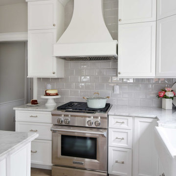
White cabinetry with quartz countertops, Carrera marble backsplash tile and a contrasting gray island give the space a clean and modern feel. The gray pendant lights and stainless appliances bring a slight industrial feel to the space letting you know that some serious cooking will take place here.
Once we had their Dream Kitchen design completed, the homeowners decided to tackle another project at the same time. We made plans to create a master suite upstairs by combining two existing bedrooms into a larger bedroom, bathroom and walk-in closet. The existing spaces were not overly large so getting everything on the wish list into the design was a challenge. In the end, we came up with a design that works. The two bedrooms were adjoined, one wall moved back slightly to make for a slightly larger bedroom, and the remaining space was allotted to the new bathroom and a walk in closet.
The bathroom consists of a double vanity and a large shower with a barn door shower door. A skylight brings light into the space and helps make it feel larger and more open. The new walk-in closet is accessible through the bathroom, and we even managed to fit in a small entry vestibule that houses some additional storage and makes a nice transition from the hallway. A white vanity, Carrera tops and gray floor tile make for a serene space that feels just right for this home.
Designed by: Susan Klimala, CKD, CBD
Photography by: Mike Kaskel
For more information on kitchen and bath design ideas go to: www.kitchenstudio-ge.com

 Rockwood Cabinetry
Remodel by Ostmo Construction
Design by Tyler Engle Architects PS
Photos by Dale Lang of NW Architectural Photography
Example of a huge minimalist u-shaped medium tone wood floor and brown floor kitchen pantry design in Portland with an undermount sink, flat-panel cabinets, gray cabinets, quartzite countertops, white backsplash, glass sheet backsplash, stainless steel appliances and an island
Example of a huge minimalist u-shaped medium tone wood floor and brown floor kitchen pantry design in Portland with an undermount sink, flat-panel cabinets, gray cabinets, quartzite countertops, white backsplash, glass sheet backsplash, stainless steel appliances and an island


3