
Search results for "Downloaded" in Home Design Ideas
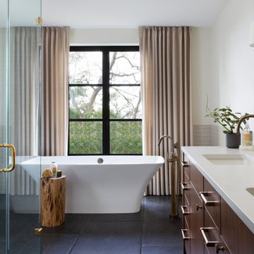
 Laura Roberts Design
Transitional gray tile and subway tile black floor freestanding bathtub photo in Austin with flat-panel cabinets, dark wood cabinets, white walls, an undermount sink and white countertops
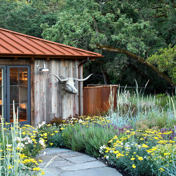

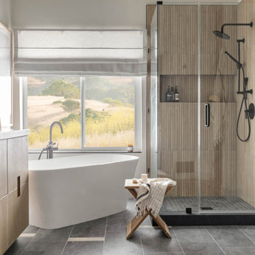
 Green Bay Remodeling Inc.
Featured in Rue Magazine's 2022 winter collection. Designed by Evgenia Merson, this house uses elements of contemporary, modern and minimalist style to create a unique space filled with tons of natural light, clean lines, distinctive furniture and a warm aesthetic feel.
Find the right local pro for your project
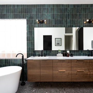
Danish green tile gray floor and double-sink freestanding bathtub photo in Phoenix with flat-panel cabinets, medium tone wood cabinets, white walls, an undermount sink, white countertops and a floating vanity
 ReVision Design + Build
© Deborah Scannell Photography
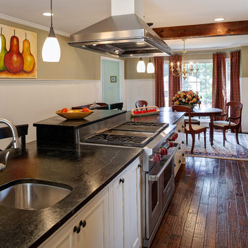
Inspiration for a small timeless galley dark wood floor eat-in kitchen remodel in Charlotte with soapstone countertops, a farmhouse sink, flat-panel cabinets, white cabinets, gray backsplash, stone tile backsplash, stainless steel appliances and an island
Inspiration for a small timeless galley dark wood floor eat-in kitchen remodel in Charlotte with soapstone countertops, a farmhouse sink, flat-panel cabinets, white cabinets, gray backsplash, stone tile backsplash, stainless steel appliances and an island
 Abbey Hall Interiors
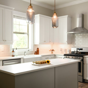
Kitchen with island and upper and lower cabinets
Eat-in kitchen - small transitional l-shaped medium tone wood floor and brown floor eat-in kitchen idea in Atlanta with a farmhouse sink, beaded inset cabinets, white cabinets, quartzite countertops, white backsplash, porcelain backsplash, stainless steel appliances, an island and white countertops
Eat-in kitchen - small transitional l-shaped medium tone wood floor and brown floor eat-in kitchen idea in Atlanta with a farmhouse sink, beaded inset cabinets, white cabinets, quartzite countertops, white backsplash, porcelain backsplash, stainless steel appliances, an island and white countertops
 TKS Design Group
Free ebook, Creating the Ideal Kitchen. DOWNLOAD NOW
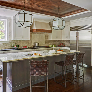
This young family of four came in right after closing on their house and with a new baby on the way. Our goal was to complete the project prior to baby’s arrival so this project went on the expedite track. The beautiful 1920’s era brick home sits on a hill in a very picturesque neighborhood, so we were eager to give it the kitchen it deserves. The clients’ dream kitchen included pro-style appliances, a large island with seating for five and a kitchen that feels appropriate to the home’s era but that also is fresh and modern. They explicitly stated they did not want a “cookie cutter” design, so we took that to heart.
The key challenge was to fit in all of the items on their wish given the room’s constraints. We eliminated an existing breakfast area and bay window and incorporated that area into the kitchen. The bay window was bricked in, and to compensate for the loss of seating, we widened the opening between the kitchen and formal dining room for more of an open concept plan.
The ceiling in the original kitchen is about a foot lower than the rest of the house, and once it was determined that it was to hide pipes and other mechanicals, we reframed a large tray over the island and left the rest of the ceiling as is. Clad in walnut planks, the tray provides an interesting feature and ties in with the custom walnut and plaster hood.
The space feels modern yet appropriate to its Tudor roots. The room boasts large family friendly appliances, including a beverage center and cooktop/double oven combination. Soft white inset cabinets paired with a slate gray island provide a gentle backdrop to the multi-toned island top, a color echoed in the backsplash tile. The handmade subway tile has a textured pattern at the cooktop, and large pendant lights add more than a bit of drama to the room.
Designed by: Susan Klimala, CKD, CBD
Photography by: Mike Kaskel
For more information on kitchen and bath design ideas go to: www.kitchenstudio-ge.com


 TKS Design Group
Download our free ebook, Creating the Ideal Kitchen. DOWNLOAD NOW
Designed by: Susan Klimala, CKD, CBD
Photography by: Michael Kaskel
For more information on kitchen, bath and interior design ideas go to: www.kitchenstudio-ge.com
 Mackenzie Collier Interiors
GoFitJo
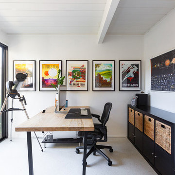
This client loves astronomy and all things outer space, and we wanted to reflect that in his office design. These imaginative NASA Jet Propulsion Laboratory travel posters are totally stellar—they're made to look like vintage National Park tourism posters, and they're free to download online.
Photo by Gilian Walsworth for Dwell Magazine
 Sarah Greenman
Photo: Sarah Greenman © 2014 Houzz
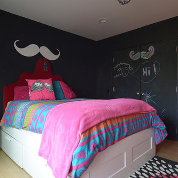
Kids' room - transitional girl light wood floor kids' room idea in Dallas with black walls
Kids' room - transitional girl light wood floor kids' room idea in Dallas with black walls
 TKS Design Group
Download our free ebook, Creating the Ideal Kitchen. DOWNLOAD NOW
Bathrooms come in all shapes and sizes and each project has its unique challenges. This master bath remodel was no different. The room had been remodeled about 20 years ago as part of a large addition and consists of three separate zones – 1) tub zone, 2) vanity/storage zone and 3) shower and water closet zone. The room layout and zones had to remain the same, but the goal was to make each area more functional. In addition, having comfortable access to the tub and seating in the tub area was also high on the list, as the tub serves as an important part of the daily routine for the homeowners and their special needs son.
We started out in the tub room and determined that an undermount tub and flush deck would be much more functional and comfortable for entering and exiting the tub than the existing drop in tub with its protruding lip. A redundant radiator was eliminated from this room allowing room for a large comfortable chair that can be used as part of the daily bathing routine.
In the vanity and storage zone, the existing vanities size neither optimized the space nor provided much real storage. A few tweaks netted a much better storage solution that now includes cabinets, drawers, pull outs and a large custom built-in hutch that houses towels and other bathroom necessities. A framed custom mirror opens the space and bounces light around the room from the large existing bank of windows.
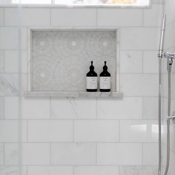
We transformed the shower and water closet room into a large walk in shower with a trench drain, making for both ease of access and a seamless look. Next, we added a niche for shampoo storage to the back wall, and updated shower fixtures to give the space new life.
The star of the bathroom is the custom marble mosaic floor tile. All the other materials take a simpler approach giving permission to the beautiful circular pattern of the mosaic to shine. White shaker cabinetry is topped with elegant Calacatta marble countertops, which also lines the shower walls. Polished nickel fixtures and sophisticated crystal lighting are simple yet sophisticated, allowing the beauty of the materials shines through.
Designed by: Susan Klimala, CKD, CBD
For more information on kitchen and bath design ideas go to: www.kitchenstudio-ge.com
 Jane Reece Interiors
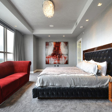
At the Four Seasons Residence in Austin, R Designs transformed this otherwise bland high-rise condo into a slick and bold space using multiple wall-coverings, ceiling coverings (leather, suede, fabric and paper), custom Italian furnishings and unique custom lighting.
 TKS Design Group
Download our free ebook, Creating the Ideal Kitchen. DOWNLOAD NOW
This client came to us in a bit of a panic when she realized that she really wanted her bathroom to be updated by March 1st due to having 2 daughters getting married in the spring and one graduating. We were only about 5 months out from that date, but decided we were up for the challenge.
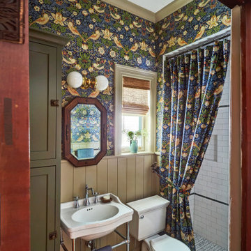
The beautiful historical home was built in 1896 by an ornithologist (bird expert), so we took our cues from that as a starting point. The flooring is a vintage basket weave of marble and limestone, the shower walls of the tub shower conversion are clad in subway tile with a vintage feel. The lighting, mirror and plumbing fixtures all have a vintage vibe that feels both fitting and up to date. To give a little of an eclectic feel, we chose a custom green paint color for the linen cabinet, mushroom paint for the ship lap paneling that clads the walls and selected a vintage mirror that ties in the color from the existing door trim. We utilized some antique trim from the home for the wainscot cap for more vintage flavor.
The drama in the bathroom comes from the wallpaper and custom shower curtain, both in William Morris’s iconic “Strawberry Thief” print that tells the story of thrushes stealing fruit, so fitting for the home’s history. There is a lot of this pattern in a very small space, so we were careful to make sure the pattern on the wallpaper and shower curtain aligned.
A sweet little bird tie back for the shower curtain completes the story...
Designed by: Susan Klimala, CKD, CBD
Photography by: Michael Kaskel
For more information on kitchen and bath design ideas go to: www.kitchenstudio-ge.com
 TKS Design Group
Download our free ebook, Creating the Ideal Kitchen. DOWNLOAD NOW
Lakefront property in the northwest suburbs of Chicago is hard to come by, so when we were hired by this young family with exactly that, we were immediately inspired by not just the unusually large footprint of this 1950’s colonial revival but also the lovely views of the manmade lake it was sited on. The large 5-bedroom home was solidly stuck in the 1980’s, but we saw tons of potential. We started out by updating the existing staircase with a fresh coat of paint and adding new herringbone slate to the entry hall.
The powder room off the entryway also got a refresh - new flooring, new cabinets and fixtures. We ran the new slate right through into this space for some consistency. A fun wallpaper and shiplap trim add a welcoming feel and set the tone for the home.
Next, we tackled the kitchen. Located away from the rest of the first floor, the kitchen felt a little isolated, so we immediately began planning for how to better connect it to the rest of the first floor. We landed on removing the wall between the kitchen and dining room and designed a modified galley style space with separate cooking and clean up zones. The cooking zone consists of the refrigerator, prep sink and cooktop, along with a nice long run of prep space at the island. The cleanup side of the kitchen consists of the main sink and dishwasher. Both areas are situated so that the user can view the lake during prep work and cleanup!
One of the home’s main puzzles was how to incorporate the mudroom and area in front of the patio doors at the back of the house. We already had a breakfast table area, so the space by the patio doors was a bit of a no man’s land. We decided to separate the kitchen proper from what became the new mudroom with a large set of barn doors. That way you can quickly hide any mudroom messes but have easy access to the light coming in through the patio doors as well as the outdoor grilling station. We also love the impact the barn doors add to the overall space.
The homeowners’ first words to us were “it’s time to ditch the brown,” so we did! We chose a lovely blue pallet that reflects the home’s location on the lake which is also vibrant yet easy on the eye. Countertops are white quartz, and the natural oak floor works well with the other honey accents. The breakfast table was given a refresh with new chairs, chandelier and window treatments that frame the gorgeous views of the lake out the back.
We coordinated the slate mudroom flooring with that used in the home’s main entrance for a consistent feel. The storage area consists of open and closed storage to allow for some clutter control as needed.
Next on our “to do” list was revamping the dated brown bar area in the neighboring dining room. We eliminated the clutter by adding some closed cabinets and did some easy updates to help the space feel more current. One snag we ran into here was the discovery of a beam above the existing open shelving that had to be modified with a smaller structural beam to allow for our new design to work. This was an unexpected surprise, but in the end we think it was well worth it!
We kept the colors here a bit more muted to blend with the homeowner’s existing furnishings. Open shelving and polished nickel hardware add some simple detail to the new entertainment zone which also looks out onto the lake!
Next we tackled the upstairs starting with the homeowner’s son’s bath. The bath originally had both a tub shower and a separate shower, so we decided to swap out the shower for a new laundry area. This freed up some space downstairs in what used to be the mudroom/laundry room and is much more convenient for daily laundry needs.
We continued the blue palette here with navy cabinetry and the navy tile in the shower. Porcelain floor tile and chrome fixtures keep maintenance to a minimum while matte black mirrors and lighting add some depth the design. A low maintenance runner adds some warmth underfoot and ties the whole space together.
We added a pocket door to the bathroom to minimize interference with the door swings. The left door of the laundry closet is on a 180 degree hinge to allow for easy full access to the machines. Next we tackled the master bath which is an en suite arrangement. The original was typical of the 1980’s with the vanity outside of the bathroom, situated near the master closet. And the brown theme continued here with multiple shades of brown.
Our first move was to segment off the bath and the closet from the master bedroom. We created a short hall from the bedroom to the bathroom with his and hers walk-in closets on the left and right as well as a separate toilet closet outside of the main bathroom for privacy and flexibility.
The original bathroom had a giant soaking tub with steps (dangerous!) as well as a small shower that did not work well for our homeowner who is 6’3”. With other bathtubs in the home, they decided to eliminate the tub and create an oversized shower which takes up the space where the old tub was located. The double vanity is on the opposite wall and a bench is located under the window for morning conversations and a place to set a couple of towels.
The pallet in here is light and airy with a mix of blond wood, creamy porcelain and marble tile, and brass accents. A simple roman shade adds some texture and it’s top-down mechanism allows for light and privacy.
This large whole house remodel gave our homeowners not only the ability to maximize the potential of their home but also created a lovely new frame from which to view their fabulous lake views.
Designed by: Susan Klimala, CKD, CBD
Photography by: Michael Kaskel
For more information on kitchen and bath design ideas go to: www.kitchenstudio-ge.com

 Lee Waters Design
Inspiration for a mid-sized transitional medium tone wood floor, brown floor and wainscoting enclosed dining room remodel in Richmond with green walls and no fireplace
 Wenz Home Furniture
Cathy Carter for Fotosold
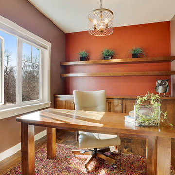
Inspiration for a transitional freestanding desk dark wood floor home office remodel in Other with multicolored walls
Inspiration for a transitional freestanding desk dark wood floor home office remodel in Other with multicolored walls
 Sharp and Grey Interiors
This home outside of Philadelphia was designed to be family friendly and comfortable space and is just the place to relax and spend family time as well as have enough seating for entertaining. The living room has a large sectional to cozy up with a movie or to entertain. The historic home is bright and open all while feeling collected, comfortable and cozy. The applied box molding on the living room wall adds a subtle pattern all while being a striking focal point for the room. The grand foyer is fresh and inviting and uncluttered and allows for ample space for guests to be welcomed to the home. The kitchen was refreshed to include a contrasting toned island, blue backsplash tile and bright brass fixtures and lighting
12