
Search results for "Downloaded" in Home Design Ideas
 TKS Design Group
Download our free ebook, Creating the Ideal Kitchen. DOWNLOAD NOW
I am still sometimes shocked myself at how much of a difference a kitchen remodel can make in a space, you think I would know by now! This was one of those jobs. The small U-shaped room was a bit cramped, a bit dark and a bit dated. A neighboring sunroom/breakfast room addition was awkwardly used, and most of the time the couple hung out together at the small peninsula.
The client wish list included a larger, lighter kitchen with an island that would seat 7 people. They have a large family and wanted to be able to gather and entertain in the space. Right outside is a lovely backyard and patio with a fireplace, so having easy access and flow to that area was also important.
Our first move was to eliminate the wall between kitchen and breakfast room, which we anticipated would need a large beam and some structural maneuvering since it was the old exterior wall. However, what we didn’t anticipate was that the stucco exterior of the original home was layered over hollow clay tiles which was impossible to shore up in the typical manner. After much back and forth with our structural team, we were able to develop a plan to shore the wall and install a large steal & wood structural beam with minimal disruption to the original floor plan. That was important because we had already ordered everything customized to fit the plan.
We all breathed a collective sigh of relief once that part was completed. Now we could move on to building the kitchen we had all been waiting for. Oh, and let’s not forget that this was all being done amidst COVID 2020.
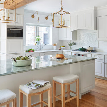
We covered the rough beam with cedar and stained it to coordinate with the floors. It’s actually one of my favorite elements in the space. The homeowners now have a big beautiful island that seats up to 7 people and has a wonderful flow to the outdoor space just like they wanted. The large island provides not only seating but also substantial prep area perfectly situated between the sink and cooktop. In addition to a built-in oven below the large gas cooktop, there is also a steam oven to the left of the sink. The steam oven is great for baking as well for heating daily meals without having to heat up the large oven.
The other side of the room houses a substantial pantry, the refrigerator, a small bar area as well as a TV.
The homeowner fell in love the with the Aqua quartzite that is on the island, so we married that with a custom mosaic in a similar tone behind the cooktop. Soft white cabinetry, Cambria quartz and Thassos marble subway tile complete the soft traditional look. Gold accents, wood wrapped beams and oak barstools add warmth the room. The little powder room was also included in the project. Some fun wallpaper, a vanity with a pop of color and pretty fixtures and accessories finish off this cute little space.
Designed by: Susan Klimala, CKD, CBD
Photography by: Michael Kaskel
For more information on kitchen and bath design ideas go to: www.kitchenstudio-ge.com
 TKS Design Group
Download our free ebook, Creating the Ideal Kitchen. DOWNLOAD NOW
For many, extra time at home during COVID left them wanting more from their homes. Whether you realized the shortcomings of your space or simply wanted to combat boredom, a well-designed and functional home was no longer a want, it became a need. Tina found herself wanting more from her Old Irving Park home and reached out to The Kitchen Studio about adding function to her kitchen to make the most of the available real estate.
At the end of the day, there is nothing better than returning home to a bright and happy space you love. And this kitchen wasn’t that for Tina. Dark and dated, with a palette from the past and features that didn’t make the most of the available square footage, this remodel required vision and a fresh approach to the space. Lead designer, Stephanie Cole’s main design goal was better flow, while adding greater functionality with organized storage, accessible open shelving, and an overall sense of cohesion with the adjoining family room.
The original kitchen featured a large pizza oven, which was rarely used, yet its footprint limited storage space. The nearby pantry had become a catch-all, lacking the organization needed in the home. The initial plan was to keep the pizza oven, but eventually Tina realized she preferred the design possibilities that came from removing this cumbersome feature, with the goal of adding function throughout the upgraded and elevated space. Eliminating the pantry added square footage and length to the kitchen for greater function and more storage. This redesigned space reflects how she lives and uses her home, as well as her love for entertaining.
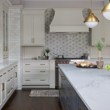
The kitchen features a classic, clean, and timeless palette. White cabinetry, with brass and bronze finishes, contrasts with rich wood flooring, and lets the large, deep blue island in Woodland’s custom color Harbor – a neutral, yet statement color – draw your eye.
The kitchen was the main priority. In addition to updating and elevating this space, Tina wanted to maximize what her home had to offer. From moving the location of the patio door and eliminating a window to removing an existing closet in the mudroom and the cluttered pantry, the kitchen footprint grew. Once the floorplan was set, it was time to bring cohesion to her home, creating connection between the kitchen and surrounding spaces.
The color palette carries into the mudroom, where we added beautiful new cabinetry, practical bench seating, and accessible hooks, perfect for guests and everyday living. The nearby bar continues the aesthetic, with stunning Carrara marble subway tile, hints of brass and bronze, and a design that further captures the vibe of the kitchen.
Every home has its unique design challenges. But with a fresh perspective and a bit of creativity, there is always a way to give the client exactly what they want [and need]. In this particular kitchen, the existing soffits and high slanted ceilings added a layer of complexity to the lighting layout and upper perimeter cabinets.
While a space needs to look good, it also needs to function well. This meant making the most of the height of the room and accounting for the varied ceiling features, while also giving Tina everything she wanted and more. Pendants and task lighting paired with an abundance of natural light amplify the bright aesthetic. The cabinetry layout and design compliments the soffits with subtle profile details that bring everything together. The tile selections add visual interest, drawing the eye to the focal area above the range. Glass-doored cabinets further customize the space and give the illusion of even more height within the room.
While her family may be grown and out of the house, Tina was focused on adding function without sacrificing a stunning aesthetic and dreamy finishes that make the kitchen the gathering place of any home. It was time to love her kitchen again, and if you’re wondering what she loves most, it’s the niche with glass door cabinetry and open shelving for display paired with the marble mosaic backsplash over the range and complimenting hood. Each of these features is a stunning point of interest within the kitchen – both brag-worthy additions to a perimeter layout that previously felt limited and lacking.
Whether your remodel is the result of special needs in your home or simply the excitement of focusing your energy on creating a fun new aesthetic, we are here for it. We love a good challenge because there is always a way to make a space better – adding function and beauty simultaneously.

Find the right local pro for your project
 TKS Design Group
Download our free ebook, Creating the Ideal Kitchen. DOWNLOAD NOW
This client came to us in a bit of a panic when she realized that she really wanted her bathroom to be updated by March 1st due to having 2 daughters getting married in the spring and one graduating. We were only about 5 months out from that date, but decided we were up for the challenge.
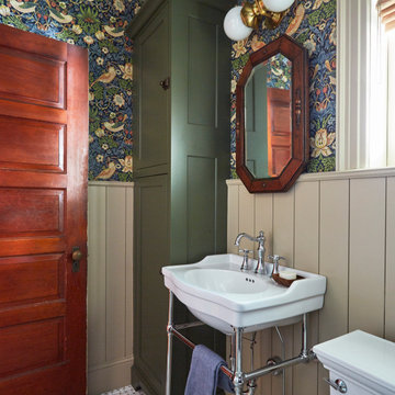
The beautiful historical home was built in 1896 by an ornithologist (bird expert), so we took our cues from that as a starting point. The flooring is a vintage basket weave of marble and limestone, the shower walls of the tub shower conversion are clad in subway tile with a vintage feel. The lighting, mirror and plumbing fixtures all have a vintage vibe that feels both fitting and up to date. To give a little of an eclectic feel, we chose a custom green paint color for the linen cabinet, mushroom paint for the ship lap paneling that clads the walls and selected a vintage mirror that ties in the color from the existing door trim. We utilized some antique trim from the home for the wainscot cap for more vintage flavor.
The drama in the bathroom comes from the wallpaper and custom shower curtain, both in William Morris’s iconic “Strawberry Thief” print that tells the story of thrushes stealing fruit, so fitting for the home’s history. There is a lot of this pattern in a very small space, so we were careful to make sure the pattern on the wallpaper and shower curtain aligned.
A sweet little bird tie back for the shower curtain completes the story...
Designed by: Susan Klimala, CKD, CBD
Photography by: Michael Kaskel
For more information on kitchen and bath design ideas go to: www.kitchenstudio-ge.com
 TKS Design Group
Download our free ebook, Creating the Ideal Kitchen. DOWNLOAD NOW
This family from Wheaton was ready to remodel their kitchen, dining room and powder room. The project didn’t call for any structural or space planning changes but the makeover still had a massive impact on their home. The homeowners wanted to change their dated 1990’s brown speckled granite and light maple kitchen. They liked the welcoming feeling they got from the wood and warm tones in their current kitchen, but this style clashed with their vision of a deVOL type kitchen, a London-based furniture company. Their inspiration came from the country homes of the UK that mix the warmth of traditional detail with clean lines and modern updates.
To create their vision, we started with all new framed cabinets with a modified overlay painted in beautiful, understated colors. Our clients were adamant about “no white cabinets.” Instead we used an oyster color for the perimeter and a custom color match to a specific shade of green chosen by the homeowner. The use of a simple color pallet reduces the visual noise and allows the space to feel open and welcoming. We also painted the trim above the cabinets the same color to make the cabinets look taller. The room trim was painted a bright clean white to match the ceiling.
In true English fashion our clients are not coffee drinkers, but they LOVE tea. We created a tea station for them where they can prepare and serve tea. We added plenty of glass to showcase their tea mugs and adapted the cabinetry below to accommodate storage for their tea items. Function is also key for the English kitchen and the homeowners. They requested a deep farmhouse sink and a cabinet devoted to their heavy mixer because they bake a lot. We then got rid of the stovetop on the island and wall oven and replaced both of them with a range located against the far wall. This gives them plenty of space on the island to roll out dough and prepare any number of baked goods. We then removed the bifold pantry doors and created custom built-ins with plenty of usable storage for all their cooking and baking needs.
The client wanted a big change to the dining room but still wanted to use their own furniture and rug. We installed a toile-like wallpaper on the top half of the room and supported it with white wainscot paneling. We also changed out the light fixture, showing us once again that small changes can have a big impact.
As the final touch, we also re-did the powder room to be in line with the rest of the first floor. We had the new vanity painted in the same oyster color as the kitchen cabinets and then covered the walls in a whimsical patterned wallpaper. Although the homeowners like subtle neutral colors they were willing to go a bit bold in the powder room for something unexpected. For more design inspiration go to: www.kitchenstudio-ge.com
 TKS Design Group
Download our free ebook, Creating the Ideal Kitchen. DOWNLOAD NOW
Designed by: Susan Klimala, CKD, CBD
Photography by: Michael Kaskel
For more information on kitchen, bath and interior design ideas go to: www.kitchenstudio-ge.com
 TKS Design Group
Download our free ebook, Creating the Ideal Kitchen. DOWNLOAD NOW
Lakefront property in the northwest suburbs of Chicago is hard to come by, so when we were hired by this young family with exactly that, we were immediately inspired by not just the unusually large footprint of this 1950’s colonial revival but also the lovely views of the manmade lake it was sited on. The large 5-bedroom home was solidly stuck in the 1980’s, but we saw tons of potential. We started out by updating the existing staircase with a fresh coat of paint and adding new herringbone slate to the entry hall.
The powder room off the entryway also got a refresh - new flooring, new cabinets and fixtures. We ran the new slate right through into this space for some consistency. A fun wallpaper and shiplap trim add a welcoming feel and set the tone for the home.
Next, we tackled the kitchen. Located away from the rest of the first floor, the kitchen felt a little isolated, so we immediately began planning for how to better connect it to the rest of the first floor. We landed on removing the wall between the kitchen and dining room and designed a modified galley style space with separate cooking and clean up zones. The cooking zone consists of the refrigerator, prep sink and cooktop, along with a nice long run of prep space at the island. The cleanup side of the kitchen consists of the main sink and dishwasher. Both areas are situated so that the user can view the lake during prep work and cleanup!
One of the home’s main puzzles was how to incorporate the mudroom and area in front of the patio doors at the back of the house. We already had a breakfast table area, so the space by the patio doors was a bit of a no man’s land. We decided to separate the kitchen proper from what became the new mudroom with a large set of barn doors. That way you can quickly hide any mudroom messes but have easy access to the light coming in through the patio doors as well as the outdoor grilling station. We also love the impact the barn doors add to the overall space.
The homeowners’ first words to us were “it’s time to ditch the brown,” so we did! We chose a lovely blue pallet that reflects the home’s location on the lake which is also vibrant yet easy on the eye. Countertops are white quartz, and the natural oak floor works well with the other honey accents. The breakfast table was given a refresh with new chairs, chandelier and window treatments that frame the gorgeous views of the lake out the back.
We coordinated the slate mudroom flooring with that used in the home’s main entrance for a consistent feel. The storage area consists of open and closed storage to allow for some clutter control as needed.
Next on our “to do” list was revamping the dated brown bar area in the neighboring dining room. We eliminated the clutter by adding some closed cabinets and did some easy updates to help the space feel more current. One snag we ran into here was the discovery of a beam above the existing open shelving that had to be modified with a smaller structural beam to allow for our new design to work. This was an unexpected surprise, but in the end we think it was well worth it!
We kept the colors here a bit more muted to blend with the homeowner’s existing furnishings. Open shelving and polished nickel hardware add some simple detail to the new entertainment zone which also looks out onto the lake!
Next we tackled the upstairs starting with the homeowner’s son’s bath. The bath originally had both a tub shower and a separate shower, so we decided to swap out the shower for a new laundry area. This freed up some space downstairs in what used to be the mudroom/laundry room and is much more convenient for daily laundry needs.
We continued the blue palette here with navy cabinetry and the navy tile in the shower. Porcelain floor tile and chrome fixtures keep maintenance to a minimum while matte black mirrors and lighting add some depth the design. A low maintenance runner adds some warmth underfoot and ties the whole space together.
We added a pocket door to the bathroom to minimize interference with the door swings. The left door of the laundry closet is on a 180 degree hinge to allow for easy full access to the machines. Next we tackled the master bath which is an en suite arrangement. The original was typical of the 1980’s with the vanity outside of the bathroom, situated near the master closet. And the brown theme continued here with multiple shades of brown.
Our first move was to segment off the bath and the closet from the master bedroom. We created a short hall from the bedroom to the bathroom with his and hers walk-in closets on the left and right as well as a separate toilet closet outside of the main bathroom for privacy and flexibility.
The original bathroom had a giant soaking tub with steps (dangerous!) as well as a small shower that did not work well for our homeowner who is 6’3”. With other bathtubs in the home, they decided to eliminate the tub and create an oversized shower which takes up the space where the old tub was located. The double vanity is on the opposite wall and a bench is located under the window for morning conversations and a place to set a couple of towels.
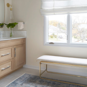
The pallet in here is light and airy with a mix of blond wood, creamy porcelain and marble tile, and brass accents. A simple roman shade adds some texture and it’s top-down mechanism allows for light and privacy.
This large whole house remodel gave our homeowners not only the ability to maximize the potential of their home but also created a lovely new frame from which to view their fabulous lake views.
Designed by: Susan Klimala, CKD, CBD
Photography by: Michael Kaskel
For more information on kitchen and bath design ideas go to: www.kitchenstudio-ge.com
 E Builders Homes
Zachary Molino
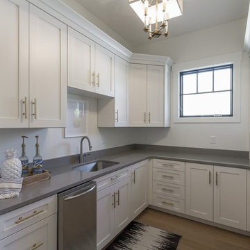
Large trendy light wood floor kitchen pantry photo in Salt Lake City with an undermount sink, recessed-panel cabinets, white cabinets, quartz countertops, stainless steel appliances and an island
Large trendy light wood floor kitchen pantry photo in Salt Lake City with an undermount sink, recessed-panel cabinets, white cabinets, quartz countertops, stainless steel appliances and an island
 TKS Design Group
Download our free ebook, Creating the Ideal Kitchen. DOWNLOAD NOW
A tired primary bathroom, with varying ceiling heights and a beige-on-beige color scheme, was screaming for love. Squaring the room and adding natural materials erased the memory of the lack luster space and converted it to a bright and welcoming spa oasis. The home was a new build in 2005 and it looked like all the builder’s material choices remained. The client was clear on their design direction but were challenged by the differing ceiling heights and were looking to hire a design-build firm that could resolve that issue.
This local Glen Ellyn couple found us on Instagram (@kitchenstudioge, follow us ?). They loved our designs and felt like we fit their style. They requested a full primary bath renovation to include a large shower, soaking tub, double vanity with storage options, and heated floors. The wife also really wanted a separate make-up vanity. The biggest challenge presented to us was to architecturally marry the various ceiling heights and deliver a streamlined design.
The existing layout worked well for the couple, so we kept everything in place, except we enlarged the shower and replaced the built-in tub with a lovely free-standing model. We also added a sitting make-up vanity. We were able to eliminate the awkward ceiling lines by extending all the walls to the highest level. Then, to accommodate the sprinklers and HVAC, lowered the ceiling height over the entrance and shower area which then opens to the 2-story vanity and tub area. Very dramatic!
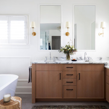
This high-end home deserved high-end fixtures. The homeowners also quickly realized they loved the look of natural marble and wanted to use as much of it as possible in their new bath. They chose a marble slab from the stone yard for the countertops and back splash, and we found complimentary marble tile for the shower. The homeowners also liked the idea of mixing metals in their new posh bathroom and loved the look of black, gold, and chrome.
Although our clients were very clear on their style, they were having a difficult time pulling it all together and envisioning the final product. As interior designers it is our job to translate and elevate our clients’ ideas into a deliverable design. We presented the homeowners with mood boards and 3D renderings of our modern, clean, white marble design. Since the color scheme was relatively neutral, at the homeowner’s request, we decided to add of interest with the patterns and shapes in the room.
We were first inspired by the shower floor tile with its circular/linear motif. We designed the cabinetry, floor and wall tiles, mirrors, cabinet pulls, and wainscoting to have a square or rectangular shape, and then to create interest we added perfectly placed circles to contrast with the rectangular shapes. The globe shaped chandelier against the square wall trim is a delightful yet subtle juxtaposition.
The clients were overjoyed with our interpretation of their vision and impressed with the level of detail we brought to the project. It’s one thing to know how you want a space to look, but it takes a special set of skills to create the design and see it thorough to implementation. Could hiring The Kitchen Studio be the first step to making your home dreams come to life?
 TKS Design Group
Download our free ebook, Creating the Ideal Kitchen. DOWNLOAD NOW
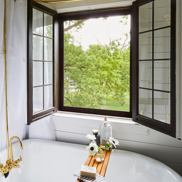
This charming little attic bath was an infrequently used guest bath located on the 3rd floor right above the master bath that we were also remodeling. The beautiful original leaded glass windows open to a view of the park and small lake across the street. A vintage claw foot tub sat directly below the window. This is where the charm ended though as everything was sorely in need of updating. From the pieced-together wall cladding to the exposed electrical wiring and old galvanized plumbing, it was in definite need of a gut job. Plus the hardwood flooring leaked into the bathroom below which was priority one to fix. Once we gutted the space, we got to rebuilding the room. We wanted to keep the cottage-y charm, so we started with simple white herringbone marble tile on the floor and clad all the walls with soft white shiplap paneling. A new clawfoot tub/shower under the original window was added. Next, to allow for a larger vanity with more storage, we moved the toilet over and eliminated a mish mash of storage pieces. We discovered that with separate hot/cold supplies that were the only thing available for a claw foot tub with a shower kit, building codes require a pressure balance valve to prevent scalding, so we had to install a remote valve. We learn something new on every job! There is a view to the park across the street through the home’s original custom shuttered windows. Can’t you just smell the fresh air? We found a vintage dresser and had it lacquered in high gloss black and converted it into a vanity. The clawfoot tub was also painted black. Brass lighting, plumbing and hardware details add warmth to the room, which feels right at home in the attic of this traditional home. We love how the combination of traditional and charming come together in this sweet attic guest bath. Truly a room with a view!
Designed by: Susan Klimala, CKD, CBD
Photography by: Michael Kaskel
For more information on kitchen and bath design ideas go to: www.kitchenstudio-ge.com
 TKS Design Group
Download our free ebook, Creating the Ideal Kitchen. DOWNLOAD NOW
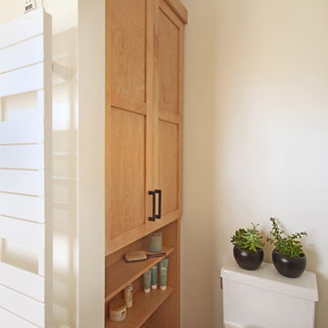
Storage was extremely important for this project because she wanted to go from keeping everything out in the open to have everything tucked away neatly, and who wouldn’t want this? So we went to work figuring out how to hide as much as possible but still keep things easy to access. The solution was two pullouts on either side of each vanity and a flush mount medicine cabinet above, so plenty of storage for each person.
We kept the layout pretty much the same, but just changed up the configuration of the cabinets. We added a storage cabinet by the toilet because there was plenty of room for that and converted the tub to a shower to make it easy to use the space long-term.
Modern day conveniences were also installed, including a heated towel bar, a lower threshold cast iron shower pan with sliding barn door shower door and a flip down shower seat. The house is a classic 1950’s midcentury ranch so we chose materials that fit that bill, and that had a bit of a Scandinavian vibe, including light maple Shaker door cabinets, black hardware and lighting, and simple subway tile in the shower. Our client fell in love with the white Macauba quartzite countertops in our showroom, and we agree they bring a perfect earthy energy into her space.
Designed by: Susan Klimala, CKD, CBD
Photography by: Dawn Jackman
For more information on kitchen and bath design ideas go to: www.kitchenstudio-ge.com
 TKS Design Group
Download our free ebook, Creating the Ideal Kitchen. DOWNLOAD NOW
This family from Wheaton was ready to remodel their kitchen, dining room and powder room. The project didn’t call for any structural or space planning changes but the makeover still had a massive impact on their home. The homeowners wanted to change their dated 1990’s brown speckled granite and light maple kitchen. They liked the welcoming feeling they got from the wood and warm tones in their current kitchen, but this style clashed with their vision of a deVOL type kitchen, a London-based furniture company. Their inspiration came from the country homes of the UK that mix the warmth of traditional detail with clean lines and modern updates.
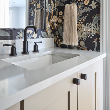
To create their vision, we started with all new framed cabinets with a modified overlay painted in beautiful, understated colors. Our clients were adamant about “no white cabinets.” Instead we used an oyster color for the perimeter and a custom color match to a specific shade of green chosen by the homeowner. The use of a simple color pallet reduces the visual noise and allows the space to feel open and welcoming. We also painted the trim above the cabinets the same color to make the cabinets look taller. The room trim was painted a bright clean white to match the ceiling.
In true English fashion our clients are not coffee drinkers, but they LOVE tea. We created a tea station for them where they can prepare and serve tea. We added plenty of glass to showcase their tea mugs and adapted the cabinetry below to accommodate storage for their tea items. Function is also key for the English kitchen and the homeowners. They requested a deep farmhouse sink and a cabinet devoted to their heavy mixer because they bake a lot. We then got rid of the stovetop on the island and wall oven and replaced both of them with a range located against the far wall. This gives them plenty of space on the island to roll out dough and prepare any number of baked goods. We then removed the bifold pantry doors and created custom built-ins with plenty of usable storage for all their cooking and baking needs.
The client wanted a big change to the dining room but still wanted to use their own furniture and rug. We installed a toile-like wallpaper on the top half of the room and supported it with white wainscot paneling. We also changed out the light fixture, showing us once again that small changes can have a big impact.
As the final touch, we also re-did the powder room to be in line with the rest of the first floor. We had the new vanity painted in the same oyster color as the kitchen cabinets and then covered the walls in a whimsical patterned wallpaper. Although the homeowners like subtle neutral colors they were willing to go a bit bold in the powder room for something unexpected. For more design inspiration go to: www.kitchenstudio-ge.com
 TKS Design Group
Download our free ebook, Creating the Ideal Kitchen. DOWNLOAD NOW
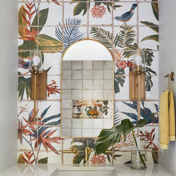
What’s the next best thing to a tropical vacation in the middle of a Chicago winter? Well, how about a tropical themed bath that works year round? The goal of this bath was just that, to bring some fun, whimsy and tropical vibes!
We started out by making some updates to the built in bookcase leading into the bath. It got an easy update by removing all the stained trim and creating a simple arched opening with a few floating shelves for a much cleaner and up-to-date look. We love the simplicity of this arch in the space.
Now, into the bathroom design. Our client fell in love with this beautiful handmade tile featuring tropical birds and flowers and featuring bright, vibrant colors. We played off the tile to come up with the pallet for the rest of the space. The cabinetry and trim is a custom teal-blue paint that perfectly picks up on the blue in the tile. The gold hardware, lighting and mirror also coordinate with the colors in the tile.
Because the house is a 1930’s tudor, we played homage to that by using a simple black and white hex pattern on the floor and retro style hardware that keep the whole space feeling vintage appropriate. We chose a wall mount unpolished brass hardware faucet which almost gives the feel of a tropical fountain. It just works. The arched mirror continues the arch theme from the bookcase.
For the shower, we chose a coordinating antique white tile with the same tropical tile featured in a shampoo niche where we carefully worked to get a little bird almost standing on the niche itself. We carried the gold fixtures into the shower, and instead of a shower door, the shower features a simple hinged glass panel that is easy to clean and allows for easy access to the shower controls.
Designed by: Susan Klimala, CKBD
Photography by: Michael Kaskel
For more design inspiration go to: www.kitchenstudio-ge.com
 TKS Design Group
Download our free ebook, Creating the Ideal Kitchen. DOWNLOAD NOW
This family from Wheaton was ready to remodel their kitchen, dining room and powder room. The project didn’t call for any structural or space planning changes but the makeover still had a massive impact on their home. The homeowners wanted to change their dated 1990’s brown speckled granite and light maple kitchen. They liked the welcoming feeling they got from the wood and warm tones in their current kitchen, but this style clashed with their vision of a deVOL type kitchen, a London-based furniture company. Their inspiration came from the country homes of the UK that mix the warmth of traditional detail with clean lines and modern updates.
To create their vision, we started with all new framed cabinets with a modified overlay painted in beautiful, understated colors. Our clients were adamant about “no white cabinets.” Instead we used an oyster color for the perimeter and a custom color match to a specific shade of green chosen by the homeowner. The use of a simple color pallet reduces the visual noise and allows the space to feel open and welcoming. We also painted the trim above the cabinets the same color to make the cabinets look taller. The room trim was painted a bright clean white to match the ceiling.
In true English fashion our clients are not coffee drinkers, but they LOVE tea. We created a tea station for them where they can prepare and serve tea. We added plenty of glass to showcase their tea mugs and adapted the cabinetry below to accommodate storage for their tea items. Function is also key for the English kitchen and the homeowners. They requested a deep farmhouse sink and a cabinet devoted to their heavy mixer because they bake a lot. We then got rid of the stovetop on the island and wall oven and replaced both of them with a range located against the far wall. This gives them plenty of space on the island to roll out dough and prepare any number of baked goods. We then removed the bifold pantry doors and created custom built-ins with plenty of usable storage for all their cooking and baking needs.
The client wanted a big change to the dining room but still wanted to use their own furniture and rug. We installed a toile-like wallpaper on the top half of the room and supported it with white wainscot paneling. We also changed out the light fixture, showing us once again that small changes can have a big impact.
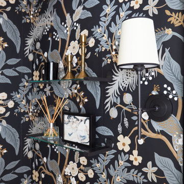
As the final touch, we also re-did the powder room to be in line with the rest of the first floor. We had the new vanity painted in the same oyster color as the kitchen cabinets and then covered the walls in a whimsical patterned wallpaper. Although the homeowners like subtle neutral colors they were willing to go a bit bold in the powder room for something unexpected. For more design inspiration go to: www.kitchenstudio-ge.com
 TKS Design Group
Download our free ebook, Creating the Ideal Kitchen. DOWNLOAD NOW
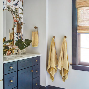
What’s the next best thing to a tropical vacation in the middle of a Chicago winter? Well, how about a tropical themed bath that works year round? The goal of this bath was just that, to bring some fun, whimsy and tropical vibes!
We started out by making some updates to the built in bookcase leading into the bath. It got an easy update by removing all the stained trim and creating a simple arched opening with a few floating shelves for a much cleaner and up-to-date look. We love the simplicity of this arch in the space.
Now, into the bathroom design. Our client fell in love with this beautiful handmade tile featuring tropical birds and flowers and featuring bright, vibrant colors. We played off the tile to come up with the pallet for the rest of the space. The cabinetry and trim is a custom teal-blue paint that perfectly picks up on the blue in the tile. The gold hardware, lighting and mirror also coordinate with the colors in the tile.
Because the house is a 1930’s tudor, we played homage to that by using a simple black and white hex pattern on the floor and retro style hardware that keep the whole space feeling vintage appropriate. We chose a wall mount unpolished brass hardware faucet which almost gives the feel of a tropical fountain. It just works. The arched mirror continues the arch theme from the bookcase.
For the shower, we chose a coordinating antique white tile with the same tropical tile featured in a shampoo niche where we carefully worked to get a little bird almost standing on the niche itself. We carried the gold fixtures into the shower, and instead of a shower door, the shower features a simple hinged glass panel that is easy to clean and allows for easy access to the shower controls.
Designed by: Susan Klimala, CKBD
Photography by: Michael Kaskel
For more design inspiration go to: www.kitchenstudio-ge.com
 TKS Design Group
Download our free ebook, Creating the Ideal Kitchen. DOWNLOAD NOW
As with most projects, it all started with the kitchen layout. The home owners came to us wanting to upgrade their kitchen and overall aesthetic in their suburban home, with a combination of fresh paint, updated finishes, and improved flow for more ease when doing everyday activities.
A monochromatic, earth-toned palette left the kitchen feeling uninspired. It lacked the brightness they wanted from their space. An eat-in table underutilized the available square footage. The butler’s pantry was out of the way and hard to access, and the dining room felt detached from the kitchen.
Lead Designer, Stephanie Cole, saw an improved layout for the spaces that were no longer working for this family. By eliminating an existing wall between the kitchen and dining room, and relocating the bar area to the dining room, we opened up the kitchen, providing all the space we needed to create a dreamy and functional layout. A new perimeter configuration promoted circulation while also making space for a large and functional island loaded with seating – a must for any family. Because an island that isn’t big enough for everyone (and a few more) is a recipe for disaster. The light white cabinetry is fresh and contrasts with the deeper tones in the wood flooring, creating a modern aesthetic that is elevated, yet approachable for everyday living.
With better flow as the overarching goal, we made some structural changes too. To remove a bottleneck in the entryway, we angled one of the dining room walls to create more natural separation between rooms and facilitate ease of movement throughout the large space.
At The Kitchen Studio, we believe a well-designed kitchen uses every square inch to the fullest. By starting from scratch, it was possible to rethink the entire kitchen layout and design the space according to how it is used, because the kitchen shouldn’t make it harder to feed the family. A new location for the existing range, flanked by a new column refrigerator and freezer on each side, worked to anchor the space. The very large and very spacious island (a dream island if we do say so ourselves) now houses the primary sink and provides ample space for food prep and family gathering.
The new kitchen table and coordinating banquette seating provide a cozy nook for quick breakfasts before school or work, and evening homework sessions. Elegant gold details catch the natural light, elevating the aesthetic.
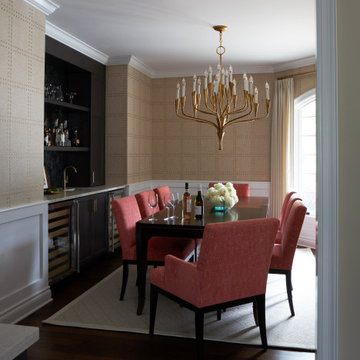
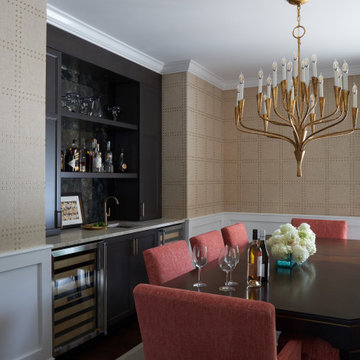
The dining room was transformed into one of this client’s favorite spaces and we couldn’t agree more. We saw an opportunity to give the dining room a more distinguished identity by closing off the entrance from the foyer. The relocated wet bar enhances the sophisticated vibe of this gathering space, complete with beautiful antique mirror tiles and open shelving encased by moody built-in cabinets.
Updated furnishings add warmth. A rich walnut table is paired with custom chairs in a muted coral fabric. The large, transitional chandelier grounds the room, pairing beautifully with the gold finishes prevalent in the faucet and cabinet hardware. Linen-inspired wallpaper and cream-toned window treatments add to the glamorous feel of this entertainment space.
There is no way around it. The laundry room was cramped. The large washer and dryer blocked access to the sink and left little room for the space to serve its other essential function – as a mudroom. Because we reworked the kitchen layout to create more space overall, we could rethink the mudroom too – an essential for any busy family. The first step was moving the washer and dryer to an existing area on the second floor, where most of the family’s laundry lives (no one wants to carry laundry up and down the stairs if they don’t have to anyway). This is a more functional solution and opened up the space for all the mudroom necessities – including the existing kitchen refrigerator, loads of built-in cubbies, and a bench.
It’s hard to not fall in love with every detail of a new space, especially when it serves your day-to-day life. But that doesn’t mean the clients didn’t have their favorite features they use on the daily. This remodel was focused largely on function with a new kitchen layout. And it’s the functional features that have the biggest impact. The large island provides much needed workspace in the kitchen and is a spot where everyone gathers together – it grounds the space and the family. And the custom counter stools are the icing on the cake. The nearby mudroom has everything their previous space was lacking – ample storage, space for everyone’s essentials, and the beloved cement floor tiles that are both durable and artistic.
 TKS Design Group
Download our free ebook, Creating the Ideal Kitchen. DOWNLOAD NOW
Like many families with older children, this local Glen Ellyn couple wanted to expand the size of their kitchen while also creating a more open, airy feel for their main level. The home had plenty of space that included a formal living room, formal dining room, family room with eat-in area and kitchen with butler’s pantry. What it didn’t have, was an effortless flow between the areas used daily for cooking, eating and gathering.
Additionally, the kitchen had become outdated, feeling dark and dismal, despite the abundance of natural light. Our clients wanted a bright, cheerful interior that would inspire the family to congregate in this part of the house. No easy feat with teenagers.
An open floor plan design solved the issues with functionality and circulation, removing the walls that restricted flow and opening up the entry to the dining room. We also eliminated the rarely used butler’s pantry allowing us to expand the kitchen and add a large island for food prep and gathering. To create a sense of symmetry and consistency in the space, a clerestory window was added below the header and framed to match the existing adjacent entry from the living room.
Inspired by the owner’s Scottish ancestry, the island cabinetry boasts a beautiful blue hue, paired with stools upholstered in a sprightly plaid. The built-in buffet area provides additional storage, topped with a beautiful wooden top stained to coordinate with the stunning tones of the flooring.
The owner’s opted for stainless steel appliances, inspiring the selection of brushed silver light fixtures and polished chrome hardware. Marble-look quartz offered a durable, lightly colored surface to reflect sunlight and enhance the cheer factor. According to this happy family, this uplifting space is now everyone’s favorite place to gather.
Designed by: Susan Klimala, CKBD
Photography by: Michael Kaskel
For more design inspiration go to: www.kitchenstudio-ge.com
 TKS Design Group
Download our free ebook, Creating the Ideal Kitchen. DOWNLOAD NOW
As with most projects, it all started with the kitchen layout. The home owners came to us wanting to upgrade their kitchen and overall aesthetic in their suburban home, with a combination of fresh paint, updated finishes, and improved flow for more ease when doing everyday activities.
A monochromatic, earth-toned palette left the kitchen feeling uninspired. It lacked the brightness they wanted from their space. An eat-in table underutilized the available square footage. The butler’s pantry was out of the way and hard to access, and the dining room felt detached from the kitchen.
Lead Designer, Stephanie Cole, saw an improved layout for the spaces that were no longer working for this family. By eliminating an existing wall between the kitchen and dining room, and relocating the bar area to the dining room, we opened up the kitchen, providing all the space we needed to create a dreamy and functional layout. A new perimeter configuration promoted circulation while also making space for a large and functional island loaded with seating – a must for any family. Because an island that isn’t big enough for everyone (and a few more) is a recipe for disaster. The light white cabinetry is fresh and contrasts with the deeper tones in the wood flooring, creating a modern aesthetic that is elevated, yet approachable for everyday living.
With better flow as the overarching goal, we made some structural changes too. To remove a bottleneck in the entryway, we angled one of the dining room walls to create more natural separation between rooms and facilitate ease of movement throughout the large space.
At The Kitchen Studio, we believe a well-designed kitchen uses every square inch to the fullest. By starting from scratch, it was possible to rethink the entire kitchen layout and design the space according to how it is used, because the kitchen shouldn’t make it harder to feed the family. A new location for the existing range, flanked by a new column refrigerator and freezer on each side, worked to anchor the space. The very large and very spacious island (a dream island if we do say so ourselves) now houses the primary sink and provides ample space for food prep and family gathering.
The new kitchen table and coordinating banquette seating provide a cozy nook for quick breakfasts before school or work, and evening homework sessions. Elegant gold details catch the natural light, elevating the aesthetic.
The dining room was transformed into one of this client’s favorite spaces and we couldn’t agree more. We saw an opportunity to give the dining room a more distinguished identity by closing off the entrance from the foyer. The relocated wet bar enhances the sophisticated vibe of this gathering space, complete with beautiful antique mirror tiles and open shelving encased by moody built-in cabinets.
Updated furnishings add warmth. A rich walnut table is paired with custom chairs in a muted coral fabric. The large, transitional chandelier grounds the room, pairing beautifully with the gold finishes prevalent in the faucet and cabinet hardware. Linen-inspired wallpaper and cream-toned window treatments add to the glamorous feel of this entertainment space.
There is no way around it. The laundry room was cramped. The large washer and dryer blocked access to the sink and left little room for the space to serve its other essential function – as a mudroom. Because we reworked the kitchen layout to create more space overall, we could rethink the mudroom too – an essential for any busy family. The first step was moving the washer and dryer to an existing area on the second floor, where most of the family’s laundry lives (no one wants to carry laundry up and down the stairs if they don’t have to anyway). This is a more functional solution and opened up the space for all the mudroom necessities – including the existing kitchen refrigerator, loads of built-in cubbies, and a bench.
It’s hard to not fall in love with every detail of a new space, especially when it serves your day-to-day life. But that doesn’t mean the clients didn’t have their favorite features they use on the daily. This remodel was focused largely on function with a new kitchen layout. And it’s the functional features that have the biggest impact. The large island provides much needed workspace in the kitchen and is a spot where everyone gathers together – it grounds the space and the family. And the custom counter stools are the icing on the cake. The nearby mudroom has everything their previous space was lacking – ample storage, space for everyone’s essentials, and the beloved cement floor tiles that are both durable and artistic.
 TKS Design Group
Download our free ebook, Creating the Ideal Kitchen. DOWNLOAD NOW
I am still sometimes shocked myself at how much of a difference a kitchen remodel can make in a space, you think I would know by now! This was one of those jobs. The small U-shaped room was a bit cramped, a bit dark and a bit dated. A neighboring sunroom/breakfast room addition was awkwardly used, and most of the time the couple hung out together at the small peninsula.
The client wish list included a larger, lighter kitchen with an island that would seat 7 people. They have a large family and wanted to be able to gather and entertain in the space. Right outside is a lovely backyard and patio with a fireplace, so having easy access and flow to that area was also important.
Our first move was to eliminate the wall between kitchen and breakfast room, which we anticipated would need a large beam and some structural maneuvering since it was the old exterior wall. However, what we didn’t anticipate was that the stucco exterior of the original home was layered over hollow clay tiles which was impossible to shore up in the typical manner. After much back and forth with our structural team, we were able to develop a plan to shore the wall and install a large steal & wood structural beam with minimal disruption to the original floor plan. That was important because we had already ordered everything customized to fit the plan.
We all breathed a collective sigh of relief once that part was completed. Now we could move on to building the kitchen we had all been waiting for. Oh, and let’s not forget that this was all being done amidst COVID 2020.
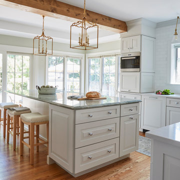
We covered the rough beam with cedar and stained it to coordinate with the floors. It’s actually one of my favorite elements in the space. The homeowners now have a big beautiful island that seats up to 7 people and has a wonderful flow to the outdoor space just like they wanted. The large island provides not only seating but also substantial prep area perfectly situated between the sink and cooktop. In addition to a built-in oven below the large gas cooktop, there is also a steam oven to the left of the sink. The steam oven is great for baking as well for heating daily meals without having to heat up the large oven.
The other side of the room houses a substantial pantry, the refrigerator, a small bar area as well as a TV.
The homeowner fell in love the with the Aqua quartzite that is on the island, so we married that with a custom mosaic in a similar tone behind the cooktop. Soft white cabinetry, Cambria quartz and Thassos marble subway tile complete the soft traditional look. Gold accents, wood wrapped beams and oak barstools add warmth the room. The little powder room was also included in the project. Some fun wallpaper, a vanity with a pop of color and pretty fixtures and accessories finish off this cute little space.
Designed by: Susan Klimala, CKD, CBD
Photography by: Michael Kaskel
For more information on kitchen and bath design ideas go to: www.kitchenstudio-ge.com
 TKS Design Group
Download our free ebook, Creating the Ideal Kitchen. DOWNLOAD NOW
It’s not uncommon to buy a new home and want to make it your own. But that doesn’t always mean starting from scratch – because when something works, it works. At TKS Design Group, we believe in intentional design, not change for the sake of change. Especially when it comes to quality kitchen cabinets. Lead designer, Jennifer, was able to make the most of what worked in this space, while elevating the aesthetic to make the kitchen feel brand new.
This kitchen is an example of just that. When the homeowners purchased the home in 2016, they made some initial updates. From painting to refinishing the floors, they began the process of making this house their own. When the time came to update the kitchen, they wanted to work with what they had to elevate the space, while also adding in the design details that were missing for them.
Not every space or kitchen requires starting from scratch to make new. Sometimes the layout is just right, and the cabinets are in great shape. Instead, you can prioritize the aesthetic you seek within the scope of what you already have. That is exactly what this kitchen called for.
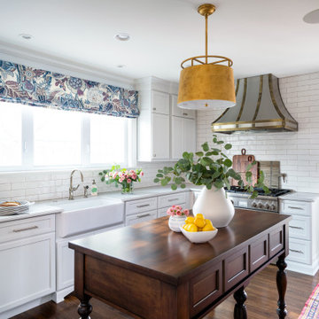
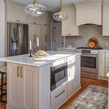
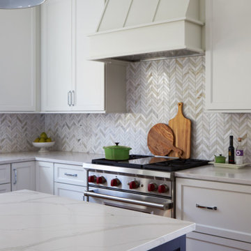
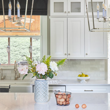
The new statement island in slate was added to make space for the microwave drawer which wasn’t a part of the original layout. The bold tone of the island adds contrast against light perimeter cabinetry painted in Benjamin Moore White Dove. A custom hood accommodates a new blower for an upgraded cooking experience. Quartz countertops paired with a marble backsplash pull everything together. Elevated plumbing fixtures in a polished nickel finish add a subtle sheen and loads of elegance.
This client cared a lot about the details of the design, but especially the light fixtures. When we understand what matters to our client, we can prioritize it as a part of our design and process.
16