
Search results for "Downloaded" in Home Design Ideas
 TKS Design Group
Download our free ebook, Creating the Ideal Kitchen. DOWNLOAD NOW
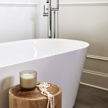
A tired primary bathroom, with varying ceiling heights and a beige-on-beige color scheme, was screaming for love. Squaring the room and adding natural materials erased the memory of the lack luster space and converted it to a bright and welcoming spa oasis. The home was a new build in 2005 and it looked like all the builder’s material choices remained. The client was clear on their design direction but were challenged by the differing ceiling heights and were looking to hire a design-build firm that could resolve that issue.
This local Glen Ellyn couple found us on Instagram (@kitchenstudioge, follow us ?). They loved our designs and felt like we fit their style. They requested a full primary bath renovation to include a large shower, soaking tub, double vanity with storage options, and heated floors. The wife also really wanted a separate make-up vanity. The biggest challenge presented to us was to architecturally marry the various ceiling heights and deliver a streamlined design.
The existing layout worked well for the couple, so we kept everything in place, except we enlarged the shower and replaced the built-in tub with a lovely free-standing model. We also added a sitting make-up vanity. We were able to eliminate the awkward ceiling lines by extending all the walls to the highest level. Then, to accommodate the sprinklers and HVAC, lowered the ceiling height over the entrance and shower area which then opens to the 2-story vanity and tub area. Very dramatic!
This high-end home deserved high-end fixtures. The homeowners also quickly realized they loved the look of natural marble and wanted to use as much of it as possible in their new bath. They chose a marble slab from the stone yard for the countertops and back splash, and we found complimentary marble tile for the shower. The homeowners also liked the idea of mixing metals in their new posh bathroom and loved the look of black, gold, and chrome.
Although our clients were very clear on their style, they were having a difficult time pulling it all together and envisioning the final product. As interior designers it is our job to translate and elevate our clients’ ideas into a deliverable design. We presented the homeowners with mood boards and 3D renderings of our modern, clean, white marble design. Since the color scheme was relatively neutral, at the homeowner’s request, we decided to add of interest with the patterns and shapes in the room.
We were first inspired by the shower floor tile with its circular/linear motif. We designed the cabinetry, floor and wall tiles, mirrors, cabinet pulls, and wainscoting to have a square or rectangular shape, and then to create interest we added perfectly placed circles to contrast with the rectangular shapes. The globe shaped chandelier against the square wall trim is a delightful yet subtle juxtaposition.
The clients were overjoyed with our interpretation of their vision and impressed with the level of detail we brought to the project. It’s one thing to know how you want a space to look, but it takes a special set of skills to create the design and see it thorough to implementation. Could hiring The Kitchen Studio be the first step to making your home dreams come to life?
 TKS Design Group
Free ebook, Creating the Ideal Kitchen. DOWNLOAD NOW
This condo in downtown Chicago has amazing views of the city, Soldier Field and the Shedd Aquarium. The client’s goal was to update the inside view to make it more compatible with those looking out.
Upper cabinets hanging over the peninsula of the existing kitchen blocked the magnificent view, so those had to go. The existing layout wasn’t bad but we felt with a few small changes it could be great.
We started by separating the ovens and the fridge so that there was more symmetry and functionality to the design. And we made a more dramatic feature wall along the back elevation to showcase the cooktop area.
An existing soffit was extended towards the side door to give it a more intentional look and to provide a more built-in appearance to the new pantry cabinets that were added to the left of the fridge.
Semi-custom cherry cabinetry, open shelving, waterfall quartz countertops and Carrera marble backsplash tile give the space a decidedly contemporary feel perfect for city living. Now the cook can easily interact with guests and simultaneously enjoy the incredible views that the space offers.
Designed by: Susan Klimala, CKD, CBD
Photography by: Mike Kaskel
For more information on kitchen and bath design ideas go to: www.kitchenstudio-ge.com
 TKS Design Group
Free ebook, Creating the Ideal Kitchen. DOWNLOAD NOW
This project was featured on an episode of TV show "House Hunters Renovation". Kitchen Studio Designer, Susan Klimala, was brought in to help homeowners design their dream kitchen. Lindsay's style was more vintage and Tyler's more streamlined, so the challenge was trying to get something that worked well for both of them. There were many construction challenges along the way, but the end result is beautiful!
Designed by: Susan Klimala, CKD, CBD
Photography by: Dawn Jackman
For more information on kitchen and bath design ideas go to: www.kitchenstudio-ge.com
Find the right local pro for your project
 TKS Design Group
Free ebook, Creating the Ideal Kitchen. DOWNLOAD NOW
Entertaining and hosting parties and events is high on the list for this socially inclined couple. Priorities for this kitchen included carefully thought out storage solutions, such as roll out storage, a “drop spot” and an area to display collectibles. Much attention was paid to each detail from the incorporation of unique leaded glass windows above the sink to the specialty hardware for the apothecary drawers. The light bright and airy space will be a welcome hang out for future events.
Designed by: Susan Klimala, CKD, CBD
For more information on kitchen and bath design ideas go to: www.kitchenstudio-ge.com
 TKS Design Group
Free ebook, Creating the Ideal Kitchen. DOWNLOAD NOW
This large kitchen had a lot going for it in terms of the large open space and work triangle, however the honey oak cabinets and laminate countertops left a lot to be desired.
The small range was replaced with a large pro-style cooktop. Space from an existing pantry was reworked to allow for the addition of double ovens, refrigerator and butler pantry type storage.
A new larger window was added and relocated to allow for better placement of the sink, and a bar area was redesigned into a more functional and visually pleasing area.
This young family wanted a unique design that was not a “cookie cutter” space. To accomplish this, Klimala designed a large custom hood flanked by large storage cabinets. The hood area is a steel gray repeating the color of the island giving each of those areas equal weight and a sense of balance.
The large island that houses storage and a microwave drawer is topped with a walnut butcher block. The walnut is repeated at the mantle hood and in some shallow shelving for spice storage near the cooktop.
Hardworking gray quartz countertops were chosen for the rest of the space and gray limestone brick adds some texture to the backsplash area. The unique circular glass mosaic tile at the cooktop provides a stunning focal point. Globe shaped pendants repeat the circle theme above the island.
Designed by: Susan Klimala, CKD, CBD
Photography by: Carlos Vergara
For more information on kitchen and bath design ideas go to: www.kitchenstudio-ge.com
 TKS Design Group
Download our free ebook, Creating the Ideal Kitchen. DOWNLOAD NOW
This homeowner’s daughter originally contacted us on behalf of her parents who were reluctant to begin the remodeling process in their home due to the inconvenience and dust. Once we met and they dipped their toes into the process, we were off to the races. The existing bathroom in this beautiful historical 1920’s home, had not been updated since the 70’/80’s as evidenced by the blue carpeting, mirrored walls and dropped ceilings. In addition, there was very little storage, and some health setbacks had made the bathroom difficult to maneuver with its tub shower.
Once we demoed, we discovered everything we expected to find in a home that had not been updated for many years. We got to work bringing all the electrical and plumbing up to code, and it was just as dusty and dirty as the homeowner’s anticipated! Once the space was demoed, we got to work building our new plan. We eliminated the existing tub and created a large walk-in curb-less shower.
An existing closet was eliminated and in its place, we planned a custom built in with spots for linens, jewelry and general storage. Because of the small space, we had to be very creative with the shower footprint, so we clipped one of the walls for more clearance behind the sink. The bathroom features a beautiful custom mosaic floor tile as well as tiled walls throughout the space. This required lots of coordination between the carpenter and tile setter to make sure that the framing and tile design were all properly aligned. We worked around an existing radiator and a unique original leaded window that was architecturally significant to the façade of the home. We had a lot of extra depth behind the original toilet location, so we built the wall out a bit, moved the toilet forward and then created some extra storage space behind the commode. We settled on mirrored mullioned doors to bounce lots of light around the smaller space.
We also went back and forth on deciding between a single and double vanity, and in the end decided the single vanity allowed for more counter space, more storage below and for the design to breath a bit in the smaller space. I’m so happy with this decision! To build on the luxurious feel of the space, we added a heated towel bar and heated flooring.
One of the concerns the homeowners had was having a comfortable floor to walk on. They realized that carpet was not a very practical solution but liked the comfort it had provided. Heated floors are the perfect solution. The room is decidedly traditional from its intricate mosaic marble floor to the calacutta marble clad walls. Elegant gold chandelier style fixtures, marble countertops and Morris & Co. beaded wallpaper provide an opulent feel to the space.
The gray monochromatic pallet keeps it feeling fresh and up-to-date. The beautiful leaded glass window is an important architectural feature at the front of the house. In the summertime, the homeowners love having the window open for fresh air and ventilation. We love it too!
The curb-less shower features a small fold down bench that can be used if needed and folded up when not. The shower also features a custom niche for storing shampoo and other hair products. The linear drain is built into the tilework and is barely visible. A frameless glass door that swings both in and out completes the luxurious feel.
Designed by: Susan Klimala, CKD, CBD
Photography by: Michael Kaskel
For more information on kitchen and bath design ideas go to: www.kitchenstudio-ge.com
 TKS Design Group
Free ebook, Creating the Ideal Kitchen. DOWNLOAD NOW
Klimala transitioned the large semi-functional kitchen by widening the opening between the kitchen and breakfast room and relocating an existing powder room. The resulting kitchen has not only a center island, but also a large peninsula for prep work and baking projects.
Room was made in the adjoining breakfast room for a large decorative hutch for storage of glassware and linens. A new upholstered banquette provides a spot for daily meals and homework spot for the family’s three kids.
The clients love of contemporary design was married with the 1920s era tudor home by keeping the details simple, choosing clean lines for decorative features such as hardware and lighting, but allowing for period appropriate touches such as shaker doors, subway tiles and a farm sink.
Designed by: Susan Klimala, CKD, CBD
Photography by: Carlos Vergara
For more information on kitchen and bath design ideas go to: www.kitchenstudio-ge.com
 TKS Design Group
Free ebook, Creating the Ideal Kitchen. DOWNLOAD NOW
Sometimes it take a few tries to get a space to work how you want it to and that’s exactly what happened with this Hinsdale client. Their desire for a family friendly, open floor plan had them reworking an opening between the kitchen and family room and relocating some pantry cabinets in an attempt to make their home’s flow more suitable to their lifestyle. After living with this small change for a few years, they decided that a full kitchen remodel was really what was needed to make their home function the way they desired.
They came in with the stereotypical “sketch on a napkin” done by an architect friend, and we proceeded to make that design come to life with a few tweaks along the way. The space was quite unique and also a bit challenging because of its multiple angled walls. While interesting, angles can be a challenge when trying make a space functional.
The new kitchen has a great lineup of large appliances, including a large built-in fridge, steam oven and Galley workstation, which is a large prep sink that utilizes several inserts such as strainers and cutting boards and acts as a very large prep space. The new induction cooktop is easy to keep clean and a microwave drawer in the island is located away from the main prep space for convenient access.
The main perimeter has tons of countertop space, with additional prep space available at the island and a slightly raised peninsula for casual meals and nice homework spot for the couple’s teenaged children. The kitchen also included a large shallow depth pantry and a large counter height desk area for keeping track of paperwork.
The weathered finish on the cabinets and custom metal hood are a nice juxtaposition to the more sleek glass mosaic backsplash and waterfall countertops. The pendants and cabinet hardware provide modern details that provide an overall casual yet sophisticated feel in this transitional design.
Designed by: Susan Klimala, CKD, CBD
Photography by: Mike Kaskel
For more information on kitchen and bath design ideas go to: www.kitchenstudio-ge.com

 Mouery's Flooring
Example of a mid-sized classic basement design with gray walls, a standard fireplace and a stone fireplace
 TKS Design Group
Download our free ebook, Creating the Ideal Kitchen. DOWNLOAD NOW
Lakefront property in the northwest suburbs of Chicago is hard to come by, so when we were hired by this young family with exactly that, we were immediately inspired by not just the unusually large footprint of this 1950’s colonial revival but also the lovely views of the manmade lake it was sited on. The large 5-bedroom home was solidly stuck in the 1980’s, but we saw tons of potential. We started out by updating the existing staircase with a fresh coat of paint and adding new herringbone slate to the entry hall.
The powder room off the entryway also got a refresh - new flooring, new cabinets and fixtures. We ran the new slate right through into this space for some consistency. A fun wallpaper and shiplap trim add a welcoming feel and set the tone for the home.
Next, we tackled the kitchen. Located away from the rest of the first floor, the kitchen felt a little isolated, so we immediately began planning for how to better connect it to the rest of the first floor. We landed on removing the wall between the kitchen and dining room and designed a modified galley style space with separate cooking and clean up zones. The cooking zone consists of the refrigerator, prep sink and cooktop, along with a nice long run of prep space at the island. The cleanup side of the kitchen consists of the main sink and dishwasher. Both areas are situated so that the user can view the lake during prep work and cleanup!
One of the home’s main puzzles was how to incorporate the mudroom and area in front of the patio doors at the back of the house. We already had a breakfast table area, so the space by the patio doors was a bit of a no man’s land. We decided to separate the kitchen proper from what became the new mudroom with a large set of barn doors. That way you can quickly hide any mudroom messes but have easy access to the light coming in through the patio doors as well as the outdoor grilling station. We also love the impact the barn doors add to the overall space.
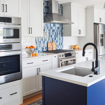
The homeowners’ first words to us were “it’s time to ditch the brown,” so we did! We chose a lovely blue pallet that reflects the home’s location on the lake which is also vibrant yet easy on the eye. Countertops are white quartz, and the natural oak floor works well with the other honey accents. The breakfast table was given a refresh with new chairs, chandelier and window treatments that frame the gorgeous views of the lake out the back.
We coordinated the slate mudroom flooring with that used in the home’s main entrance for a consistent feel. The storage area consists of open and closed storage to allow for some clutter control as needed.
Next on our “to do” list was revamping the dated brown bar area in the neighboring dining room. We eliminated the clutter by adding some closed cabinets and did some easy updates to help the space feel more current. One snag we ran into here was the discovery of a beam above the existing open shelving that had to be modified with a smaller structural beam to allow for our new design to work. This was an unexpected surprise, but in the end we think it was well worth it!
We kept the colors here a bit more muted to blend with the homeowner’s existing furnishings. Open shelving and polished nickel hardware add some simple detail to the new entertainment zone which also looks out onto the lake!
Next we tackled the upstairs starting with the homeowner’s son’s bath. The bath originally had both a tub shower and a separate shower, so we decided to swap out the shower for a new laundry area. This freed up some space downstairs in what used to be the mudroom/laundry room and is much more convenient for daily laundry needs.
We continued the blue palette here with navy cabinetry and the navy tile in the shower. Porcelain floor tile and chrome fixtures keep maintenance to a minimum while matte black mirrors and lighting add some depth the design. A low maintenance runner adds some warmth underfoot and ties the whole space together.
We added a pocket door to the bathroom to minimize interference with the door swings. The left door of the laundry closet is on a 180 degree hinge to allow for easy full access to the machines. Next we tackled the master bath which is an en suite arrangement. The original was typical of the 1980’s with the vanity outside of the bathroom, situated near the master closet. And the brown theme continued here with multiple shades of brown.
Our first move was to segment off the bath and the closet from the master bedroom. We created a short hall from the bedroom to the bathroom with his and hers walk-in closets on the left and right as well as a separate toilet closet outside of the main bathroom for privacy and flexibility.
The original bathroom had a giant soaking tub with steps (dangerous!) as well as a small shower that did not work well for our homeowner who is 6’3”. With other bathtubs in the home, they decided to eliminate the tub and create an oversized shower which takes up the space where the old tub was located. The double vanity is on the opposite wall and a bench is located under the window for morning conversations and a place to set a couple of towels.
The pallet in here is light and airy with a mix of blond wood, creamy porcelain and marble tile, and brass accents. A simple roman shade adds some texture and it’s top-down mechanism allows for light and privacy.
This large whole house remodel gave our homeowners not only the ability to maximize the potential of their home but also created a lovely new frame from which to view their fabulous lake views.
Designed by: Susan Klimala, CKD, CBD
Photography by: Michael Kaskel
For more information on kitchen and bath design ideas go to: www.kitchenstudio-ge.com
 TKS Design Group
Free ebook, Creating the Ideal Kitchen. DOWNLOAD NOW
Collaborations with builders on new construction is a favorite part of my job. I love seeing a house go up from the blueprints to the end of the build. It is always a journey filled with a thousand decisions, some creative on-the-spot thinking and yes, usually a few stressful moments. This Naperville project was a collaboration with a local builder and architect. The Kitchen Studio collaborated by completing the cabinetry design and final layout for the entire home.
The kitchen is spacious and opens into the neighboring family room. A 48” Thermador range is centered between two windows, and the sink has a view through a window into the mudroom which is a unique feature. A large island with seating and waterfall countertops creates a beautiful focal point for the room. A bank of refrigeration, including a full-size wine refrigerator completes the picture.
The area between the kitchen and dining room houses a second sink and a large walk in pantry. The kitchen features many unique storage elements important to the new homeowners including in-drawer charging stations, a cutlery divider, knife block, microwave drawer, pull out trash, multiple appliance garages, spice pull outs and tray dividers. There’s not much you can’t store in this room! Cabinetry is white shaker inset styling with a gray stain on the island. The back of the island features lap style siding that coordinates with the fireplace in the neighboring family room. Mid-century inspired lighting gives the room a modern vibe.
Designed by: Susan Klimala, CKBD
Builder: Hampton Homes
Photography by: Michael Alan Kaskel
For more information on kitchen and bath design ideas go to: www.kitchenstudio-ge.com
 TKS Design Group
Free ebook, Creating the Ideal Kitchen. DOWNLOAD NOW
This condo in downtown Chicago has amazing views of the city, Soldier Field and the Shedd Aquarium. The client’s goal was to update the inside view to make it more compatible with those looking out.
Upper cabinets hanging over the peninsula of the existing kitchen blocked the magnificent view, so those had to go. The existing layout wasn’t bad but we felt with a few small changes it could be great.
We started by separating the ovens and the fridge so that there was more symmetry and functionality to the design. And we made a more dramatic feature wall along the back elevation to showcase the cooktop area.
An existing soffit was extended towards the side door to give it a more intentional look and to provide a more built-in appearance to the new pantry cabinets that were added to the left of the fridge.
Semi-custom cherry cabinetry, open shelving, waterfall quartz countertops and Carrera marble backsplash tile give the space a decidedly contemporary feel perfect for city living. Now the cook can easily interact with guests and simultaneously enjoy the incredible views that the space offers.
Designed by: Susan Klimala, CKD, CBD
Photography by: Mike Kaskel
For more information on kitchen and bath design ideas go to: www.kitchenstudio-ge.com
 TKS Design Group
Free ebook, Creating the Ideal Kitchen. DOWNLOAD NOW
This was a fun and special project for me to work on – it’s my parent’s new (to them) townhome. Downsizing from their previous home, and I collaborated with my architect father on redesigning their kitchen and master bathroom.
Opening up the layout on the 1st floor was on the top of their list. They hoped to make it possible for whoever was cooking in the kitchen was still able to interact with people in family room and the dining room easily. An existing wall between the family room and the kitchen, made the kitchen feel cut off from the rest of the house.
By removing the wall, we were able to turn the kitchen layout from the standard "U" shape kitchen to a galley which allowed for more storage and countertop space. White Dove frameless cabinetry from Woodharbor was used to give the space a light and fresh feel, while maximizing space within for easy storage. A built in-hutch in the dining room was added for additional storage without encroaching in the room itself.
The master bathroom was completely remodeled as well from head-to-toe. The existing layout was not conducive to my parent’s daily lifestyle. It had one vanity, an awkward corner tub with a just as awkward corner shower which seemed more like a dungeon than a shower. We gutted the existing bathroom, relocated a wall to create a large walk-in closet, omitted the tub, and created a nice spa like shower. The new layout also allowed them to have a double vanity with a small make-up area in between.
Some features we added into the bathroom were heated floors, which are especially nice during the cold Chicago winters, custom marble tile as an accent in the shower, and a custom shower enclosure which really kept the room open.
Designed by: Keri Pryde
Photography by: Mike Kaskal
For more information on kitchen and bath design ideas go to: www.kitchenstudio-ge.com
 TKS Design Group
Download our free ebook, Creating the Ideal Kitchen. DOWNLOAD NOW
The homeowners built their traditional Colonial style home 17 years’ ago. It was in great shape but needed some updating. Over the years, their taste had drifted into a more contemporary realm, and they wanted our help to bridge the gap between traditional and modern.
We decided the layout of the kitchen worked well in the space and the cabinets were in good shape, so we opted to do a refresh with the kitchen. The original kitchen had blond maple cabinets and granite countertops. This was also a great opportunity to make some updates to the functionality that they were hoping to accomplish.
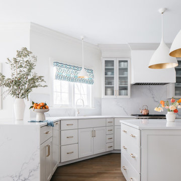
After re-finishing all the first floor wood floors with a gray stain, which helped to remove some of the red tones from the red oak, we painted the cabinetry Benjamin Moore “Repose Gray” a very soft light gray. The new countertops are hardworking quartz, and the waterfall countertop to the left of the sink gives a bit of the contemporary flavor.
We reworked the refrigerator wall to create more pantry storage and eliminated the double oven in favor of a single oven and a steam oven. The existing cooktop was replaced with a new range paired with a Venetian plaster hood above. The glossy finish from the hood is echoed in the pendant lights. A touch of gold in the lighting and hardware adds some contrast to the gray and white. A theme we repeated down to the smallest detail illustrated by the Jason Wu faucet by Brizo with its similar touches of white and gold (the arrival of which we eagerly awaited for months due to ripples in the supply chain – but worth it!).
The original breakfast room was pleasant enough with its windows looking into the backyard. Now with its colorful window treatments, new blue chairs and sculptural light fixture, this space flows seamlessly into the kitchen and gives more of a punch to the space.
The original butler’s pantry was functional but was also starting to show its age. The new space was inspired by a wallpaper selection that our client had set aside as a possibility for a future project. It worked perfectly with our pallet and gave a fun eclectic vibe to this functional space. We eliminated some upper cabinets in favor of open shelving and painted the cabinetry in a high gloss finish, added a beautiful quartzite countertop and some statement lighting. The new room is anything but cookie cutter.
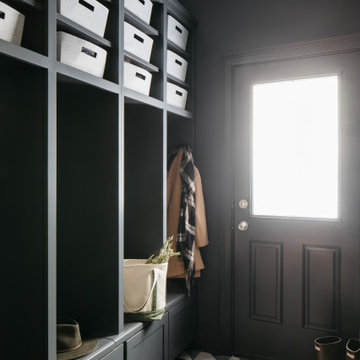
Next the mudroom. You can see a peek of the mudroom across the way from the butler’s pantry which got a facelift with new paint, tile floor, lighting and hardware. Simple updates but a dramatic change! The first floor powder room got the glam treatment with its own update of wainscoting, wallpaper, console sink, fixtures and artwork. A great little introduction to what’s to come in the rest of the home.
The whole first floor now flows together in a cohesive pallet of green and blue, reflects the homeowner’s desire for a more modern aesthetic, and feels like a thoughtful and intentional evolution. Our clients were wonderful to work with! Their style meshed perfectly with our brand aesthetic which created the opportunity for wonderful things to happen. We know they will enjoy their remodel for many years to come!
Photography by Margaret Rajic Photography
 TKS Design Group
Download our free ebook, Creating the Ideal Kitchen. DOWNLOAD NOW
The homeowners built their traditional Colonial style home 17 years’ ago. It was in great shape but needed some updating. Over the years, their taste had drifted into a more contemporary realm, and they wanted our help to bridge the gap between traditional and modern.
We decided the layout of the kitchen worked well in the space and the cabinets were in good shape, so we opted to do a refresh with the kitchen. The original kitchen had blond maple cabinets and granite countertops. This was also a great opportunity to make some updates to the functionality that they were hoping to accomplish.
After re-finishing all the first floor wood floors with a gray stain, which helped to remove some of the red tones from the red oak, we painted the cabinetry Benjamin Moore “Repose Gray” a very soft light gray. The new countertops are hardworking quartz, and the waterfall countertop to the left of the sink gives a bit of the contemporary flavor.
We reworked the refrigerator wall to create more pantry storage and eliminated the double oven in favor of a single oven and a steam oven. The existing cooktop was replaced with a new range paired with a Venetian plaster hood above. The glossy finish from the hood is echoed in the pendant lights. A touch of gold in the lighting and hardware adds some contrast to the gray and white. A theme we repeated down to the smallest detail illustrated by the Jason Wu faucet by Brizo with its similar touches of white and gold (the arrival of which we eagerly awaited for months due to ripples in the supply chain – but worth it!).
The original breakfast room was pleasant enough with its windows looking into the backyard. Now with its colorful window treatments, new blue chairs and sculptural light fixture, this space flows seamlessly into the kitchen and gives more of a punch to the space.
The original butler’s pantry was functional but was also starting to show its age. The new space was inspired by a wallpaper selection that our client had set aside as a possibility for a future project. It worked perfectly with our pallet and gave a fun eclectic vibe to this functional space. We eliminated some upper cabinets in favor of open shelving and painted the cabinetry in a high gloss finish, added a beautiful quartzite countertop and some statement lighting. The new room is anything but cookie cutter.
Next the mudroom. You can see a peek of the mudroom across the way from the butler’s pantry which got a facelift with new paint, tile floor, lighting and hardware. Simple updates but a dramatic change! The first floor powder room got the glam treatment with its own update of wainscoting, wallpaper, console sink, fixtures and artwork. A great little introduction to what’s to come in the rest of the home.
The whole first floor now flows together in a cohesive pallet of green and blue, reflects the homeowner’s desire for a more modern aesthetic, and feels like a thoughtful and intentional evolution. Our clients were wonderful to work with! Their style meshed perfectly with our brand aesthetic which created the opportunity for wonderful things to happen. We know they will enjoy their remodel for many years to come!
Photography by Margaret Rajic Photography
 TKS Design Group
Free ebook, Creating the Ideal Kitchen. DOWNLOAD NOW
Klimala transitioned the large semi-functional kitchen by widening the opening between the kitchen and breakfast room and relocating an existing powder room. The resulting kitchen has not only a center island, but also a large peninsula for prep work and baking projects.
Room was made in the adjoining breakfast room for a large decorative hutch for storage of glassware and linens. A new upholstered banquette provides a spot for daily meals and homework spot for the family’s three kids.
The clients love of contemporary design was married with the 1920s era tudor home by keeping the details simple, choosing clean lines for decorative features such as hardware and lighting, but allowing for period appropriate touches such as shaker doors, subway tiles and a farm sink.
Designed by: Susan Klimala, CKD, CBD
Photography by: Carlos Vergara
For more information on kitchen and bath design ideas go to: www.kitchenstudio-ge.com

 Realty Restoration, LLC
Christopher Davison, AIA
Inspiration for a large timeless u-shaped medium tone wood floor eat-in kitchen remodel in Austin with an undermount sink, raised-panel cabinets, beige cabinets, granite countertops, beige backsplash, stone tile backsplash, paneled appliances and an island
Inspiration for a large timeless u-shaped medium tone wood floor eat-in kitchen remodel in Austin with an undermount sink, raised-panel cabinets, beige cabinets, granite countertops, beige backsplash, stone tile backsplash, paneled appliances and an island
 TKS Design Group
Free ebook, Creating the Ideal Kitchen. DOWNLOAD NOW
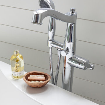
This client came to us wanting some help with updating the master bath in their home. Their primary goals were to increase the size of the shower, add a rain head, add a freestanding tub and overall freshen the feel of the space.
The existing layout of the bath worked well, so we left the basic footprint the same, but increased the size of the shower and added a freestanding tub on a bit of an angle which allowed for some additional storage.
One of the most important things on the wish list was adding a rainhead in the shower, but this was not an easy task with the angled ceiling. We came up with the solution of using an extra long wall-mounted shower arm that was reinforced with a meal bracket attached the ceiling. This did the trick, and no extra framing or insulation was required to make it work.
The materials selected for the space are classic and fresh. Large format white oriental marble is used throughout the bath, on the floor in a herrinbone pattern and in a staggered brick pattern on the walls. Alder cabinets with a gray stain contrast nicely with the white marble, while shiplap detail helps unify the space and gives it a casual and cozy vibe. Storage solutions include an area for towels and other necessities at the foot of the tub, roll out shelves and out storage in the vanities and a custom niche and shaving ledge in the shower. We love how just a few simple changes can make such a great impact!
Designed by: Susan Klimala, CKBD
Photography by: LOMA Studios
For more information on kitchen and bath design ideas go to: www.kitchenstudio-ge.com
 TKS Design Group
Download our free ebook, Creating the Ideal Kitchen. DOWNLOAD NOW
This homeowner’s daughter originally contacted us on behalf of her parents who were reluctant to begin the remodeling process in their home due to the inconvenience and dust. Once we met and they dipped their toes into the process, we were off to the races. The existing bathroom in this beautiful historical 1920’s home, had not been updated since the 70’/80’s as evidenced by the blue carpeting, mirrored walls and dropped ceilings. In addition, there was very little storage, and some health setbacks had made the bathroom difficult to maneuver with its tub shower.
Once we demoed, we discovered everything we expected to find in a home that had not been updated for many years. We got to work bringing all the electrical and plumbing up to code, and it was just as dusty and dirty as the homeowner’s anticipated! Once the space was demoed, we got to work building our new plan. We eliminated the existing tub and created a large walk-in curb-less shower.
An existing closet was eliminated and in its place, we planned a custom built in with spots for linens, jewelry and general storage. Because of the small space, we had to be very creative with the shower footprint, so we clipped one of the walls for more clearance behind the sink. The bathroom features a beautiful custom mosaic floor tile as well as tiled walls throughout the space. This required lots of coordination between the carpenter and tile setter to make sure that the framing and tile design were all properly aligned. We worked around an existing radiator and a unique original leaded window that was architecturally significant to the façade of the home. We had a lot of extra depth behind the original toilet location, so we built the wall out a bit, moved the toilet forward and then created some extra storage space behind the commode. We settled on mirrored mullioned doors to bounce lots of light around the smaller space.
We also went back and forth on deciding between a single and double vanity, and in the end decided the single vanity allowed for more counter space, more storage below and for the design to breath a bit in the smaller space. I’m so happy with this decision! To build on the luxurious feel of the space, we added a heated towel bar and heated flooring.
One of the concerns the homeowners had was having a comfortable floor to walk on. They realized that carpet was not a very practical solution but liked the comfort it had provided. Heated floors are the perfect solution. The room is decidedly traditional from its intricate mosaic marble floor to the calacutta marble clad walls. Elegant gold chandelier style fixtures, marble countertops and Morris & Co. beaded wallpaper provide an opulent feel to the space.
The gray monochromatic pallet keeps it feeling fresh and up-to-date. The beautiful leaded glass window is an important architectural feature at the front of the house. In the summertime, the homeowners love having the window open for fresh air and ventilation. We love it too!
The curb-less shower features a small fold down bench that can be used if needed and folded up when not. The shower also features a custom niche for storing shampoo and other hair products. The linear drain is built into the tilework and is barely visible. A frameless glass door that swings both in and out completes the luxurious feel.
Designed by: Susan Klimala, CKD, CBD
Photography by: Michael Kaskel
For more information on kitchen and bath design ideas go to: www.kitchenstudio-ge.com
 TKS Design Group
Download our free ebook, Creating the Ideal Kitchen. DOWNLOAD NOW
The homeowners built their traditional Colonial style home 17 years’ ago. It was in great shape but needed some updating. Over the years, their taste had drifted into a more contemporary realm, and they wanted our help to bridge the gap between traditional and modern.
We decided the layout of the kitchen worked well in the space and the cabinets were in good shape, so we opted to do a refresh with the kitchen. The original kitchen had blond maple cabinets and granite countertops. This was also a great opportunity to make some updates to the functionality that they were hoping to accomplish.
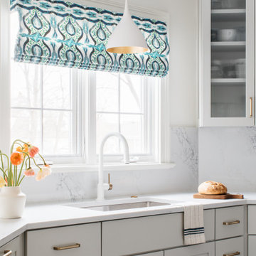
After re-finishing all the first floor wood floors with a gray stain, which helped to remove some of the red tones from the red oak, we painted the cabinetry Benjamin Moore “Repose Gray” a very soft light gray. The new countertops are hardworking quartz, and the waterfall countertop to the left of the sink gives a bit of the contemporary flavor.
We reworked the refrigerator wall to create more pantry storage and eliminated the double oven in favor of a single oven and a steam oven. The existing cooktop was replaced with a new range paired with a Venetian plaster hood above. The glossy finish from the hood is echoed in the pendant lights. A touch of gold in the lighting and hardware adds some contrast to the gray and white. A theme we repeated down to the smallest detail illustrated by the Jason Wu faucet by Brizo with its similar touches of white and gold (the arrival of which we eagerly awaited for months due to ripples in the supply chain – but worth it!).
The original breakfast room was pleasant enough with its windows looking into the backyard. Now with its colorful window treatments, new blue chairs and sculptural light fixture, this space flows seamlessly into the kitchen and gives more of a punch to the space.
The original butler’s pantry was functional but was also starting to show its age. The new space was inspired by a wallpaper selection that our client had set aside as a possibility for a future project. It worked perfectly with our pallet and gave a fun eclectic vibe to this functional space. We eliminated some upper cabinets in favor of open shelving and painted the cabinetry in a high gloss finish, added a beautiful quartzite countertop and some statement lighting. The new room is anything but cookie cutter.
Next the mudroom. You can see a peek of the mudroom across the way from the butler’s pantry which got a facelift with new paint, tile floor, lighting and hardware. Simple updates but a dramatic change! The first floor powder room got the glam treatment with its own update of wainscoting, wallpaper, console sink, fixtures and artwork. A great little introduction to what’s to come in the rest of the home.
The whole first floor now flows together in a cohesive pallet of green and blue, reflects the homeowner’s desire for a more modern aesthetic, and feels like a thoughtful and intentional evolution. Our clients were wonderful to work with! Their style meshed perfectly with our brand aesthetic which created the opportunity for wonderful things to happen. We know they will enjoy their remodel for many years to come!
Photography by Margaret Rajic Photography
50