
Search results for "Downloaded" in Home Design Ideas
 Realty Restoration, LLC
Christopher Davison, AIA
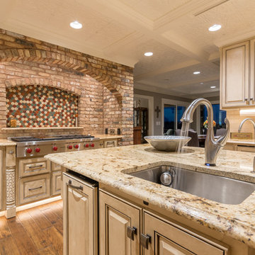
Eat-in kitchen - large traditional u-shaped medium tone wood floor eat-in kitchen idea in Austin with an undermount sink, raised-panel cabinets, beige cabinets, granite countertops, beige backsplash, stone tile backsplash, paneled appliances and an island
Eat-in kitchen - large traditional u-shaped medium tone wood floor eat-in kitchen idea in Austin with an undermount sink, raised-panel cabinets, beige cabinets, granite countertops, beige backsplash, stone tile backsplash, paneled appliances and an island
 C.H.I. Overhead Doors
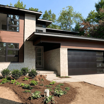
Incorporate self-expression into your garage door while complementing your home’s modern architecture. Having trouble deciding on the garage door style right for your home? We've got you covered - download our free Residential Product Guide today!
(via Midwest Door & Window)
 TKS Design Group
Free ebook, Creating the Ideal Kitchen. DOWNLOAD NOW
The Klimala’s and their three kids are no strangers to moving, this being their fifth house in the same town over the 20-year period they have lived there. “It must be the 7-year itch, because every seven years, we seem to find ourselves antsy for a new project or a new environment. I think part of it is being a designer, I see my own taste evolve and I want my environment to reflect that. Having easy access to wonderful tradesmen and a knowledge of the process makes it that much easier”.
This time, Klimala’s fell in love with a somewhat unlikely candidate. The 1950’s ranch turned cape cod was a bit of a mutt, but it’s location 5 minutes from their design studio and backing up to the high school where their kids can roll out of bed and walk to school, coupled with the charm of its location on a private road and lush landscaping made it an appealing choice for them.
“The bones of the house were really charming. It was typical 1,500 square foot ranch that at some point someone added a second floor to. Its sloped roofline and dormered bedrooms gave it some charm.” With the help of architect Maureen McHugh, Klimala’s gutted and reworked the layout to make the house work for them. An open concept kitchen and dining room allows for more frequent casual family dinners and dinner parties that linger. A dingy 3-season room off the back of the original house was insulated, given a vaulted ceiling with skylights and now opens up to the kitchen. This room now houses an 8’ raw edge white oak dining table and functions as an informal dining room. “One of the challenges with these mid-century homes is the 8’ ceilings. I had to have at least one room that had a higher ceiling so that’s how we did it” states Klimala.
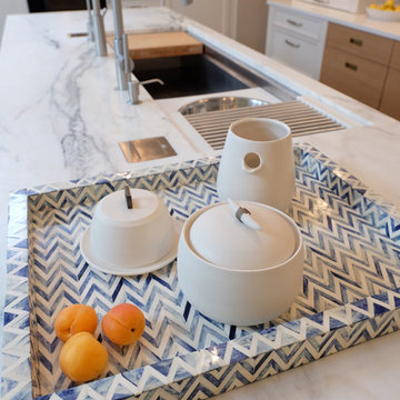
The kitchen features a 10’ island which houses a 5’0” Galley Sink. The Galley features two faucets, and double tiered rail system to which accessories such as cutting boards and stainless steel bowls can be added for ease of cooking. Across from the large sink is an induction cooktop. “My two teen daughters and I enjoy cooking, and the Galley and induction cooktop make it so easy.” A wall of tall cabinets features a full size refrigerator, freezer, double oven and built in coffeemaker. The area on the opposite end of the kitchen features a pantry with mirrored glass doors and a beverage center below.
The rest of the first floor features an entry way, a living room with views to the front yard’s lush landscaping, a family room where the family hangs out to watch TV, a back entry from the garage with a laundry room and mudroom area, one of the home’s four bedrooms and a full bath. There is a double sided fireplace between the family room and living room. The home features pops of color from the living room’s peach grass cloth to purple painted wall in the family room. “I’m definitely a traditionalist at heart but because of the home’s Midcentury roots, I wanted to incorporate some of those elements into the furniture, lighting and accessories which also ended up being really fun. We are not formal people so I wanted a house that my kids would enjoy, have their friends over and feel comfortable.”
The second floor houses the master bedroom suite, two of the kids’ bedrooms and a back room nicknamed “the library” because it has turned into a quiet get away area where the girls can study or take a break from the rest of the family. The area was originally unfinished attic, and because the home was short on closet space, this Jack and Jill area off the girls’ bedrooms houses two large walk-in closets and a small sitting area with a makeup vanity. “The girls really wanted to keep the exposed brick of the fireplace that runs up the through the space, so that’s what we did, and I think they feel like they are in their own little loft space in the city when they are up there” says Klimala.
Designed by: Susan Klimala, CKD, CBD
Photography by: Carlos Vergara
For more information on kitchen and bath design ideas go to: www.kitchenstudio-ge.com
Find the right local pro for your project
 PI Photography Wall Art & Fine Art
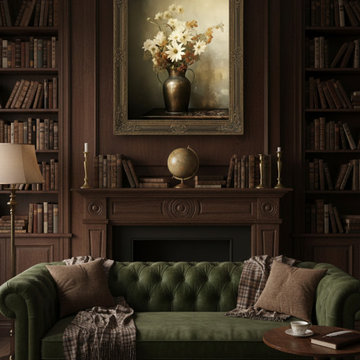
A Moment of Bloom Floral Bouquet Retro Subdued Photorealism DIY Downloadable and Printable Wall Art Print in Dark Academia Style Living Room. Explore print options:
https://pipafineart.com/pages/a-moment-of-bloom-flower-bouquet-retro-subdued-digital-artwork-prints-and-digital-backgrounds
 PI Photography Wall Art & Fine Art
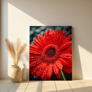
 https://pipafineart.com/pages/after-the-rain-gerbera-daisy-realism-painting-digital-artwork-prints-and-digital-backgrounds. This striking digitally created photorealistic artwork captures the vibrant essence of a red gerbera daisy, freshly kissed by rain. The central focus is undeniably the flower itself, presented in a captivating close-up that highlights its intricate details. Each vivid red petal is adorned with countless shimmering water droplets, catching the light in a way that suggests recent precipitation and infuses the image with a sense of vitality and freshness. The rich, almost fiery red of the petals is beautifully contrasted by the subtly textured, darker hues within the daisy's center, which hints at deeper purples and maroons, adding depth and visual interest. The background is thoughtfully rendered in a soft, dark blur, allowing the brilliant red of the daisy and the crystalline sparkle of the raindrops to truly pop and command attention. It creates a dreamlike, almost ethereal quality, ensuring the flower remains the undisputed star of this botanical tableau. The level of detail achieved here is truly remarkable, mimicking the realism of a high-resolution photograph while retaining the controlled artistry of a digital creation.
After the Rain Gerbera Daisy Photorealistic Floral Digital Artwork Downloadable Printable Art in Living Room Setting
This captivating artwork offers incredible versatility for various interior spaces and decorating styles. In a modern or contemporary living room, its bold color and crisp details would serve as a dynamic focal point against minimalist furniture and neutral palettes, injecting a vibrant burst of life. Imagine it above a sleek, low-profile sofa, bringing an unexpected organic element to a clean-lined aesthetic. For a transitional space, which blends traditional warmth with modern simplicity, this piece would seamlessly integrate, offering both classic floral appeal and a fresh, updated feel. It could perfectly complement a mix of comfortable seating and clean-lined accessories. In a maximalist design scheme, where layers of pattern and color are embraced, this artwork could contribute another rich layer, perhaps contrasting with an ornate wallpaper or complementing other botanical prints.
 Simply Home Decorating
The kitchen may be the heart of a home, but the dining room is where the family gathers to enjoy special occasions, create and pass on traditions, and savour each other’s company free from distractions. The family behind this particular dining room enjoys doing just that.
When they are not traveling the world, Matthew and Anna (names changed) love to cook meals at home with their teenage daughter, entertain family and friends, and live amongst their cherished travel souvenirs and heirlooms. Their dining room, however, was far from the perfect backdrop for these experiences.
Before: Dining Room:
When Matthew and Anna contacted us, they imagined a space that would comfortably seat 8 to 10 people and incorporate their beautiful inherited dining table and sideboard in a fresh, modern way. Above all, they wanted a dining room that they would feel proud to share.
They worked with us to design, lightly renovate, and furnish their dining room and adjacent living space. Now, the room is nothing short of inviting and elevated.
Classic Yet Contemporary Dining Room:
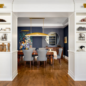
Viewed from the living area, the dining room is a hidden gem waiting to be discovered. Matthew and Anna wanted dark blue for the walls, and we couldn’t have been happier to find the perfect shade for them. By leaning darker, this rich blue creates the perception of depth, making the room feel enticing, comfortable and secluded.
The previous built-ins were underwhelming and lacked function, so we designed wider, taller, double sided cabinets that integrated the existing bulk-head, and then accessorized the shelves with the family’s travel finds, books, and decor. Topping these units with brass art lights not only blends contemporary and traditional styles, it also draws attention to the dining table’s modern show-stopping chandelier. You can’t miss it.
Inside the dining room, the effect is equally impressive: enveloping yet spacious, warm yet cool, classic yet contemporary. We incorporated their heirloom pieces seamlessly into the design thanks to the 1:2 ratio. For every traditional piece, we introduced two more modern or contemporary pieces — clean lines, subtle curves, and lustrous brass hardware. The result is a collected yet updated look.
In any room with dark walls, lighting is of the utmost importance. We placed a mirror adjacent to the window to reflect natural light throughout the room, and we kept the trim and ceiling white for brightness. To provide maximum versatility, we provided multiple light sources that can be adjusted to create different levels of light to suit any mood or occasion. These include: pot lights and a chandelier on dimmers, a sculptural trilight lamp on the sideboard, and art lights on the bookcases and above important art pieces.
The built-ins have another surprise waiting inside this special dining room:
Double-sided built-ins: dining room shelving and living room shelving.
Rather than keep them white like we did in the living room, we painted the back wall of the book cases the same dark blue as the walls in the rest of the room. This reduces the contrast with the surrounding walls and emphasizes the white outline of the cabinets. We also love the dark blue walls’ role as a beautiful backdrop for this family’s treasures. The brass accessories and hand-painted vases and bowls feel like part of the experience.
Of course, what is beauty without function? It may not look like it, but the base storage is only accessible from the dining room side. The units include deep cabinets for storing serving ware, as well as another delightful surprise: silverware drawers lined in luxurious navy velvet!
Lastly, we designed this beautiful nook for their heirloom sideboard. From afar, the wall looks as if it has texture and perhaps a touch of shine. Up close, you will notice that it is actually navy blue wallpaper with tiny golden dots. This unique touch accentuates the brass in the room touches throughout the space.. The room feels curated, contemporary, and full of character.
Words of Praise:
Anna and Matthew were thrilled with their new dining room and with the design process itself, which is always the highest compliment. They said:
“Working with Lori and her team at Simply Home Decorating was a great experience. The design they came up with was both beautiful and practical for our family. Renovations can be stressful but working with Simply Home made the process much more pleasant.
“Simply Home's project management and their longstanding relationships with reliable trades meant we could relax, knowing that everything was taken care of. If an issue arose, the entire Simply Home team was quick to address it. They were excellent at communicating with us—we never felt like we didn't know what was going on. We would highly recommend working with Simply Home Decorating.”
Thank you, Matthew and Anna! We are honoured to have been part of your journey and wish your family many happy memories in these new spaces.
Now, is it your turn? Are you ready to uncover the hidden potential in your home? If so, contact us here to start the conversation or download my guide Uncovering the Hidden Potential in Your Home below to learn more about what we can do for you.
 Jeanne Liem Architecture + Design
Photos downloaded from MLS are with permission by the owner.
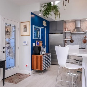
Example of a dining room design in San Diego
Example of a dining room design in San Diego
 TKS Design Group
Free ebook, Creating the Ideal Kitchen. DOWNLOAD NOW
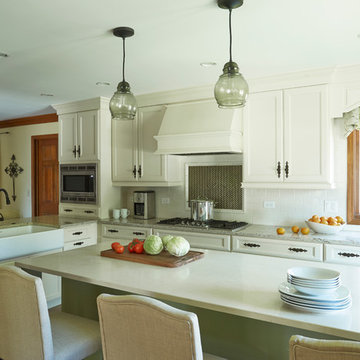
From dark and dated to bright and beautiful, who says you can't take your kitchen from the past into the future? Open almost any design magazine today and you will see tons of examples of contemporary and transitional design. Maybe those designs are appealing, but you’re are just not feeling it for your own space or traditional suburban home filled with traditional furniture. Do you still have the option to remodel your kitchen in a traditional style and not have it look instantly dated? The answer is yes! This kitchen is a perfect example of how to do that. Take traditional cabinetry and sprinkle in a few updated accents and voila!
In addition to the look of the space, this 1970’s neo-Tudor home also had a very traditional floorplan which was given new life for today’s living. We eliminated the wall between the kitchen and the (rarely used) dining room which opened up the whole first floor and created the open plan that the homeowners wanted. With the added space, a larger island was added with seating for casual dining. An existing room off the kitchen now works as the main dining area and even houses a fireplace! Hardworking quartz countertops were used to keep maintenance easy, and professional style appliances were added for this home cook to really get cooking in the kitchen. An apron sink, Ann Sacks bronze accent tile, green glass pendants lighting and new window treatments transition this kitchen into the current decade!
Designed by: Susan Klimala, CKD, CBD
Photography by: Mike Kaskel
For more information on kitchen and bath design ideas go to: www.kitchenstudio-ge.com
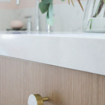 TKS Design Group
Free ebook, Creating the Ideal Kitchen. DOWNLOAD NOW
Designed by: Susan Klimala, CKD, CBD
Photography by: LOMA Studios
For more information on kitchen and bath design ideas go to: www.kitchenstudio-ge.com
 Hopkins & Porter
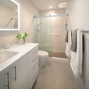
Inspiration for a mid-sized modern 3/4 beige tile and porcelain tile laminate floor and beige floor bathroom remodel in DC Metro with flat-panel cabinets, white cabinets, a one-piece toilet, beige walls, an undermount sink, quartzite countertops and white countertops
 PI Photography Wall Art & Fine Art
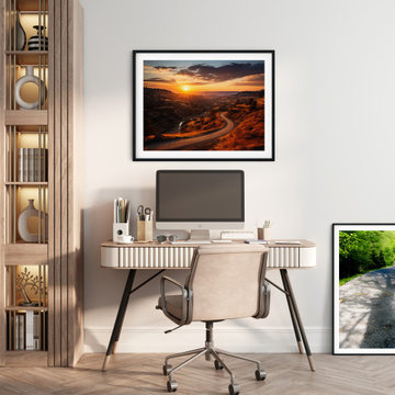
A Tranquil Trail Photorealistic Digital Rustic Artwork Downloadable Printable in Home Office Setting. Explore print options: https://pipafineart.com/pages/a-tranquil-trail-photorealistic-digital-art-rustic-landscape-art-prints-downloadable-artwork-and-backgrounds
 Jacobson Construction
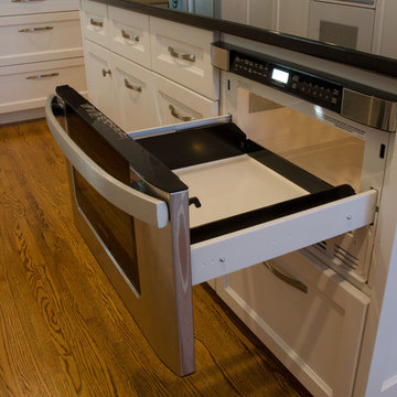
The island features two large recycling bins, a drawer microwave that opens and closes automatically with the push of a button, and seating for four.
Enclosed kitchen - large contemporary l-shaped medium tone wood floor and brown floor enclosed kitchen idea in Minneapolis with a drop-in sink, flat-panel cabinets, white cabinets, granite countertops, blue backsplash, ceramic backsplash, stainless steel appliances and an island
Enclosed kitchen - large contemporary l-shaped medium tone wood floor and brown floor enclosed kitchen idea in Minneapolis with a drop-in sink, flat-panel cabinets, white cabinets, granite countertops, blue backsplash, ceramic backsplash, stainless steel appliances and an island
 Simply Home Decorating
This penthouse condo in Raven Woods is home to an adventurous, nature-loving couple. With their children grown and starting families of their own, Jeremy and Cynthia (names changed) chose to downsize their livable space and “upsize” in quality and luxury.
The couple hired us to help them achieve several well-defined goals: feeling immersed and connected to nature, having warm and welcoming spaces to host their family and friends, and selecting pieces that would support local makers and artisans. (If you know me, you know that nature, connection, and community are some of my most important values, personally and professionally — the perfect fit!)
Using our comprehensive design process, we spent months designing, procuring, and installing their new, long-time home. The resulting spaces are breathtaking, creating a daily living experience that is full of serenity and bliss.
Welcoming & Bright Home with Forest Views:
Ahhh… can you imagine coming home to a space as bright and soothing as this one? To find inspiration for this home’s interiors, we needed to look no further than out the windows, where mountain views greet us to the north and the ocean beckons from the south.
Paying homage to their locale, we curated a colour palette of subtle blues and grays, warm-toned woods, and natural materials, all set against a crisp, white backdrop. These help us create a seamless visual transition between the interior and exterior. Let’s start our tour in the living area…
A Cozy Living Area with Warmth & Dimension:
In the living area, the fireplace was the starting point for the design, as it determined the size of the space and the scale of our furnishings. To keep this area feeling cozy but not crowded, we selected this soft ottoman to serve as a table surface with a tray or as additional seating when Jeremy and Cynthia host guests. (Multi-purpose items are one of the 5 elements of The Simple Home.)
Additional textures — the sofa, upholstered swivel chairs, pillows, and ceramic wall art reminiscent of sand dollars — offer further depth and dimension in this simple yet layered space. The result is a cozy living room area perfect for a relaxing read on an overcast day or a social evening by the fire.
While daunting at first, this home’s small and open footprint offered a special opportunity for us to design thoughtful “zones”. To create a defined living space, we used an area rug to establish a border and situated the larger seating (the sofa) on the right. Its visual weight serves as a grounding barrier that naturally separates the living and dining areas.
Overhead, the centrally located brass and glass chandelier serves as another focal point, making the entire living area feel like one unit. Last but not least…
Styled with tall decorative lamps, this light oak and rattan console sits just behind the sofa, creating an additional visual barrier between the living and dining areas. We styled it with accessories that complement the overall palette, and it has the added benefit of providing storage right where Jeremy and Cynthia need it, the dining area.
An Art-Infused Dining Area:
The dining area is warm, woodsy, and filled with locally sourced art that Jeremy and Cynthia love. Next to the console is a custom textile piece from Vancouver artist, With Strings Attached, that mimics the scenic, mountain backdrop. The blue hues of the piece work in harmony with the warm wood dining table, cool gray upholstered chairs, and neutral stools at the kitchen bar.
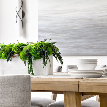
On the other side of the space, is Jeremy’s and Cynthia’s favourite piece, a commissioned work of art by local maker, Katie Napier. Carefully positioned in a central location and framed by two modern sconces, this piece captures the feel of gentle waters on a misty day and evokes calm.
Other curated pieces include this rectangular vessel centrepiece by sculptural artist, Martha Sturdy, bearing a stunning moss arrangement by Soul Roots Moss Art. As this couple can attest, a treasured memento or piece of art can transform your space and your mood, transporting you to a relaxed and peaceful state.
A Bedroom Full of Light & Texture:
This beautiful bedroom is another manifestation of Jeremy and Cynthia’s favourite experiences: hiking the rainforest trails and enjoying the spray of the sea. The blue-and-green branching pattern found in the window treatments and pillows ground the space, while bright turquoise lamps — akin to sea glass — infuse the room with a touch of coastal vibrance.
Similar to the living area, we added comfort through texture and warm tones, incorporating oak end tables, natural woven wall decor above the headboard, knitted ottomans at the foot of the bed, a textured duvet, and an extra plush area rug.
A Loft Inspired by Flora & Fauna:
For the loft space, we moved away from coastal elements and decided to ground the space in the more earthy elements of nature: flora and fauna. We selected an umber-hued sofa complemented by floral decorative pillows and walls adorned with botanical prints by Heather Johnston.
This multi-purpose space serves as a reprieve for our clients to read, practice yoga, and relax. Alternatively, a Frame TV intentionally meant to blend as art allows the space to function as a secondary entertainment space or a place for their granddaughter to play and sleep over.
Praise from Our Clients:
This home’s small footprint pushed us to be more resourceful in our furniture sourcing and more creative in our space planning. The result is a home as livable, beautiful, and intentional as any larger home would be. Most importantly, Jeremy and Cynthia love it!
“Lori listened to our love of nature and designed our condo reflecting that love. It is beautiful, serene, and welcoming. We couldn't be happier.”
If you’re ready to uncover the hidden potential in your home, that is what we do best. Contact us here or download our complimentary guide below to discover more.
 Sawhill Kitchens
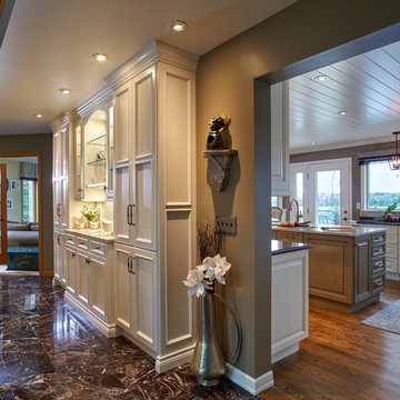
Kitchen remodel by Sawhill Custom Kitchens & Design in Minneapolis. Visit our website at www.sawhillkitchens.com to see more examples of our work and download our free Guide to Remodeling.
 Sawhill Kitchens
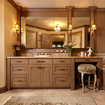
Bathroom design project by Sawhill Custom Kitchens & Design. Looking to remodel your home? Visit our website at www.sawhillkitchens.com to see more project photos and download our free remodeling guide
 Arlene Gold Design
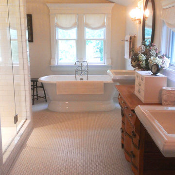
 1" porcelain hex floor tiles replaced brown shag carpet! Bath was reconfigured to accomodate two pedestal sinks, a walk-in shower and soaking tub. The back windows were added.

 Bill Fry Construction - Wm. H. Fry Const. Co.
Covid During Construction and Making Face Masks
Dear Houzz Folks,
We've started getting back to work and are educating everyone at our projects on how to be safe during COVID, posting signage, and we've been making masks for our employees, colleagues, friends, family etc... Here's some information on what I've learned so far in sewing the best fitting face mask for COVID.
1. Put in a wire at the nose bridge (about 3.5 inches) - it helps with fit and if you wear glasses, it keeps them from fogging up. I found that doorbell wire, available at the hardware store, seems to work well. It isn't too thin or too fat, bends easily and holds its shape. I attach it by using a zigzag stitch on the interior seam of the outside of the mask (so there's a bit more cushion on the inside).
2. For the shaped masks, I make a pocket in case my friends, family, colleagues, want to insert a filter - it also allows for three layers of fabric in the breathing area and less bulk where the ties go. For patterns that don't offer pockets, I just make my own pattern pocket. I also first baste the two inside pieces first and then sew the front on. This way, there's no worries about slipping. No pins are needed and no pins minimizes the number of extra air holes in the fabric.
3. So that the ties/loops can be replaced or modified, I make a channel for rather than sewing it in permanently. Many videos show using a safety pin to pull the elastic through. If you sew much, you might have a bodkin in your sewing box, but it might be a bit too wide. Instead, I use a long hairpin (you could probably make a long loop with a paper clip). I run the hairpin through the channel, loop the elastic through the end of the pin and pull through. That takes much less time than piercing it with a safety-pin.
4. For the inside of the masks, it is nice to have softer fabric inside, so high-thread-count sheets purchased on sale work great. Then you can easily tell what is inside as well.
5. For surgical-style masks, there's a pattern with a pocket on the inside and a wire. I like the ideas in this video but use 2 fabrics and make them bigger. About a 9x9 inch for the outside and 9x8 inch for the inside. 5/8 seam on the nose and 1/4 seam on the bottom.
6. For the fitted masks, there are two patterns that I like. For this one, https://moinliz.de/mundschutz-naehen-mit-schnittmuster it expects you to print on European-sized paper, so if you want to get the size right, print at 100%
I also really like this pattern and I added a pocket and lengthened the ends to make channels https://intermountainhealthcare.org/covid19-coronavirus/homemade-cloth-face-coverings/ (scroll down to a link to download the pdf) Lots of folks sew craftpassion, but I like the fit of these patterns better. There are still some other patterns I have left to try!
6. After breaking lots of needles, I realized that I really didn't need to topstich the fitted masks over the bridge, so I just started skipping the bridge.
7. If you're going to wear a face-covering for a really long time, you might want to skip the ear hangers and go for ties behind the head. Instead of two ties, I'll use one long one so that the bottom one is a loop and the top one ties. Bungee cord works nice.
Happy Sewing!
: ) Rhoda Fry, Bill Fry Construction
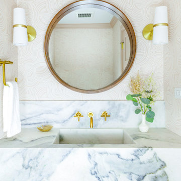 TKS Design Group
Free ebook, Creating the Ideal Kitchen. DOWNLOAD NOW
Designed by: Susan Klimala, CKD, CBD
Photography by: LOMA Studios
For more information on kitchen and bath design ideas go to: www.kitchenstudio-ge.com


 Jeanne Liem Architecture + Design
Photos downloaded from MLS are with permission from the owner.
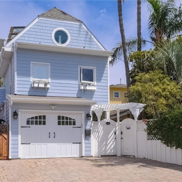
Inspiration for a coastal exterior home remodel in San Diego
Inspiration for a coastal exterior home remodel in San Diego
51