
Search results for "Drives opportunities" in Home Design Ideas
 Klopf Architecture
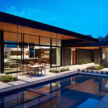
Klopf Architecture, Arterra Landscape Architects and Henry Calvert of Calvert Ventures Designed and built a new warm, modern, Eichler-inspired, open, indoor-outdoor home on a deeper-than-usual San Mateo Highlands property where an original Eichler house had burned to the ground.
The owners wanted multi-generational living and larger spaces than the original home offered, but all parties agreed that the house should respect the neighborhood and blend in stylistically with the other Eichlers. At first the Klopf team considered re-using what little was left of the original home and expanding on it. But after discussions with the owner and builder, all parties agreed that the last few remaining elements of the house were not practical to re-use, so Klopf Architecture designed a new home that pushes the Eichler approach in new directions.
One disadvantage of Eichler production homes is that the house designs were not optimized for each specific lot. A new custom home offered the team a chance to start over. In this case, a longer house that opens up sideways to the south fit the lot better than the original square-ish house that used to open to the rear (west). Accordingly, the Klopf team designed an L-shaped “bar” house with a large glass wall with large sliding glass doors that faces sideways instead of to the rear like a typical Eichler. This glass wall opens to a pool and landscaped yard designed by Arterra Landscape Architects.
Driving by the house, one might assume at first glance it is an Eichler because of the horizontality, the overhanging flat roof eaves, the dark gray vertical siding, and orange solid panel front door, but the house is designed for the 21st Century and is not meant to be a “Likeler.” You won't see any posts and beams in this home. Instead, the ceiling decking is a western red cedar that covers over all the beams. Like Eichlers, this cedar runs continuously from inside to out, enhancing the indoor / outdoor feeling of the house, but unlike Eichlers it conceals a cavity for lighting, wiring, and insulation. Ceilings are higher, rooms are larger and more open, the master bathroom is light-filled and more generous, with a separate tub and shower and a separate toilet compartment, and there is plenty of storage. The garage even easily fits two of today's vehicles with room to spare.
A massive 49-foot by 12-foot wall of glass and the continuity of materials from inside to outside enhance the inside-outside living concept, so the owners and their guests can flow freely from house to pool deck to BBQ to pool and back.
During construction in the rough framing stage, Klopf thought the front of the house appeared too tall even though the house had looked right in the design renderings (probably because the house is uphill from the street). So Klopf Architecture paid the framer to change the roofline from how we had designed it to be lower along the front, allowing the home to blend in better with the neighborhood. One project goal was for people driving up the street to pass the home without immediately noticing there is an "imposter" on this lot, and making that change was essential to achieve that goal.
This 2,606 square foot, 3 bedroom, 3 bathroom Eichler-inspired new house is located in San Mateo in the heart of the Silicon Valley.
Klopf Architecture Project Team: John Klopf, AIA, Klara Kevane
Landscape Architect: Arterra Landscape Architects
Contractor: Henry Calvert of Calvert Ventures
Photography ©2016 Mariko Reed
Location: San Mateo, CA
Year completed: 2016

 Shuler Architecture
Here's one of our most recent projects that was completed in 2011. This client had just finished a major remodel of their house in 2008 and were about to enjoy Christmas in their new home. At the time, Seattle was buried under several inches of snow (a rarity for us) and the entire region was paralyzed for a few days waiting for the thaw. Our client decided to take advantage of this opportunity and was in his driveway sledding when a neighbor rushed down the drive yelling that his house was on fire. Unfortunately, the house was already engulfed in flames. Equally unfortunate was the snowstorm and the delay it caused the fire department getting to the site. By the time they arrived, the house and contents were a total loss of more than $2.2 million.
Here's one of our most recent projects that was completed in 2011. This client had just finished a major remodel of their house in 2008 and were about to enjoy Christmas in their new home. At the time, Seattle was buried under several inches of snow (a rarity for us) and the entire region was paralyzed for a few days waiting for the thaw. Our client decided to take advantage of this opportunity and was in his driveway sledding when a neighbor rushed down the drive yelling that his house was on fire. Unfortunately, the house was already engulfed in flames. Equally unfortunate was the snowstorm and the delay it caused the fire department getting to the site. By the time they arrived, the house and contents were a total loss of more than $2.2 million.
Our role in the reconstruction of this home was two-fold. The first year of our involvement was spent working with a team of forensic contractors gutting the house, cleansing it of all particulate matter, and then helping our client negotiate his insurance settlement. Once we got over these hurdles, the design work and reconstruction started. Maintaining the existing shell, we reworked the interior room arrangement to create classic great room house with a contemporary twist. Both levels of the home were opened up to take advantage of the waterfront views and flood the interiors with natural light. On the lower level, rearrangement of the walls resulted in a tripling of the size of the family room while creating an additional sitting/game room. The upper level was arranged with living spaces bookended by the Master Bedroom at one end the kitchen at the other. The open Great Room and wrap around deck create a relaxed and sophisticated living and entertainment space that is accentuated by a high level of trim and tile detail on the interior and by custom metal railings and light fixtures on the exterior.
Find the right local pro for your project

 R.S. Walsh Landscaping, Inc.
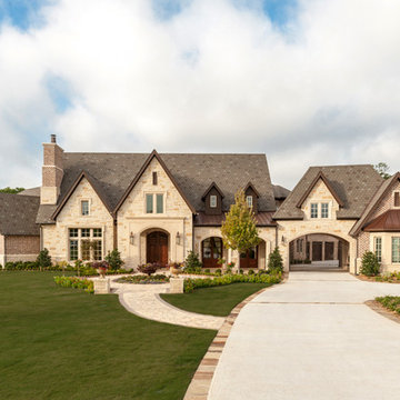
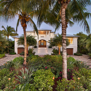
This newly completed contemporary island style Florida home overlooks the Roosevelt Channel, on the Bay side of Captiva Island, and is graced with the sunrise in the mornings.
Repeat clients remind us of the success of previous landscape designs and of lasting relationships built while offering new and challenging opportunities for creative design. This client expressed a desire for a colorful tropical garden with emphasis on tropical plants, creative color palette and privacy.
A grove of coconut palms with lush bamboo and a dense clusia hedge with a small tropical garden at the entry of the property screen views to the interior of the property plant a seed of intrigue for what lies around the corner beyond the decorative tabby stucco gate columns. Upon passing under the grove of coconuts and rounding the corner of the drive, the property opens to an expansive front yard with colorful tropical garden beds and channels views to the newly completed residence. Gardens containing colorful bromeliads, bougainvillea and tropical palms with a variety of leaf shape and texture and color draw upon influences of Brazilian garden design. Manicured swaths of Empire Zoysa separates the various gardens and allows for the user to stroll and explore the different gardens.
The winding drive terminates at the front entry in a large tear drop shape turn around with massive coconuts in the center island surrounded by seven Sylvester Date palms around the outside of the drive. The entire perimeter of the turn around is surrounded with tropical gardens and intimate tropical gardens flank each side of the main entrance stairs. The hardscape pattern and color was selected to compliment the coquina tabby shell stucco finish on the foundation walls. The completed hardscape design including retaining walls, driveway, golf cart paths and private walks, is the result of collaborating closely with the owner over multiple revisions.
The back of the residence overlooks an expansive resort-like pool and spa and a pool deck that terminates just feet from the seawall of the Roosevelt Channel. Tropical vegetation at each side of the property offers privacy to the pool area but is manicured to preserve views to the bay beyond. This truly is an island paradise.
 R.S. Walsh Landscaping, Inc.
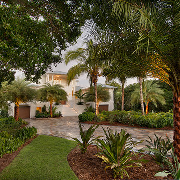
This newly completed contemporary island style Florida home overlooks the Roosevelt Channel, on the Bay side of Captiva Island, and is graced with the sunrise in the mornings.
Repeat clients remind us of the success of previous landscape designs and of lasting relationships built while offering new and challenging opportunities for creative design. This client expressed a desire for a colorful tropical garden with emphasis on tropical plants, creative color palette and privacy.
A grove of coconut palms with lush bamboo and a dense clusia hedge with a small tropical garden at the entry of the property screen views to the interior of the property plant a seed of intrigue for what lies around the corner beyond the decorative tabby stucco gate columns. Upon passing under the grove of coconuts and rounding the corner of the drive, the property opens to an expansive front yard with colorful tropical garden beds and channels views to the newly completed residence. Gardens containing colorful bromeliads, bougainvillea and tropical palms with a variety of leaf shape and texture and color draw upon influences of Brazilian garden design. Manicured swaths of Empire Zoysa separates the various gardens and allows for the user to stroll and explore the different gardens.
The winding drive terminates at the front entry in a large tear drop shape turn around with massive coconuts in the center island surrounded by seven Sylvester Date palms around the outside of the drive. The entire perimeter of the turn around is surrounded with tropical gardens and intimate tropical gardens flank each side of the main entrance stairs. The hardscape pattern and color was selected to compliment the coquina tabby shell stucco finish on the foundation walls. The completed hardscape design including retaining walls, driveway, golf cart paths and private walks, is the result of collaborating closely with the owner over multiple revisions.
The back of the residence overlooks an expansive resort-like pool and spa and a pool deck that terminates just feet from the seawall of the Roosevelt Channel. Tropical vegetation at each side of the property offers privacy to the pool area but is manicured to preserve views to the bay beyond. This truly is an island paradise.
 TVL Creative Ltd.
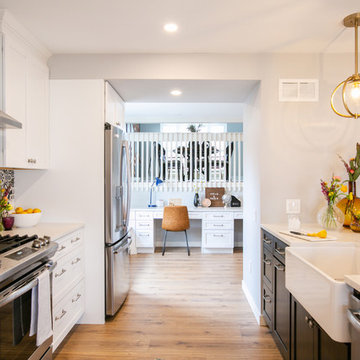
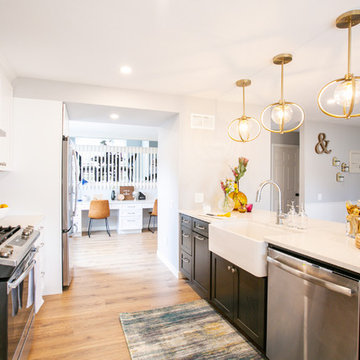
Cramped kitchen be gone! That was the project motto and top priority. The goal was to transform the current layout from multiple smaller spaces into a connected whole that would activate the main level for our clients, a young family of four.
The biggest obstacle was the wall dividing the kitchen and the dining room. Removing this wall was central to opening up and integrating the main living spaces, but the existing ductwork that ran right through the center of the wall posed a design challenge, er design opportunity. The resulting design solution features a central pantry that captures the ductwork and provides valuable storage- especially when compared to the original kitchen's 18" wide pantry cabinet. The pantry also anchors the kitchen island and serves as a visual separation of space between the kitchen and homework area.
Through our design development process, we learned the formal living room was of no service to their lifestyle and therefore space they rarely spent time in. With that in mind, we proposed to eliminate the unused living room and make it the new dining room. Relocating the dining room to this space inherently felt right given the soaring ceiling and ample room for holiday dinners and celebrations. The new dining room was spacious enough for us to incorporate a conversational seating area in the warm, south-facing window alcove.
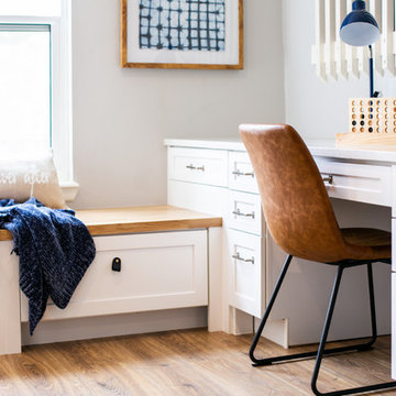
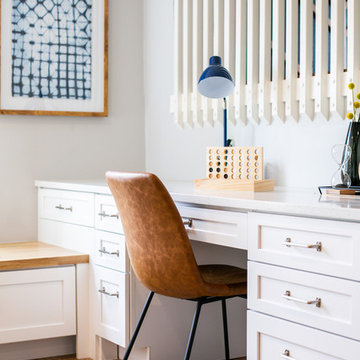
Now what to do with the old dining room?! To answer that question we took inspiration from our clients' shared profession in education and developed a craft area/homework station for both of their boys. The semi-custom cabinetry of the desk area carries over to the adjacent wall and forms window bench base with storage that we topped with butcher block for a touch of warmth. While the boys are young, the bench drawers are the perfect place for a stash of toys close to the kitchen.
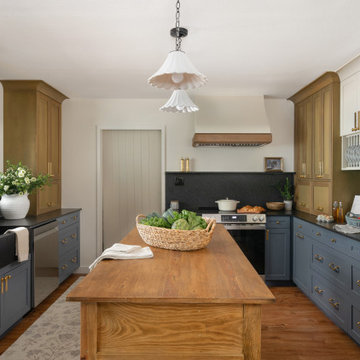
The kitchen begins just beyond the window seat with their refrigerator enclosure. Opposite the refrigerator is the new pantry with twenty linear feet of shelving and space for brooms and a stick vacuum. Extending from the backside of the pantry the kitchen island design incorporates counter seating on the family room side and a cabinetry configuration on the kitchen side with drawer storage, a trashcan center, farmhouse sink, and dishwasher.
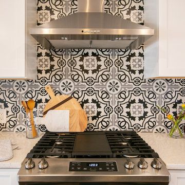
We took careful time in design and execution to align the range and sink because while it might seem like a small detail, it plays an important role in supporting the symmetrical configuration of the back wall of the kitchen. The rear wall design utilizes an appliance garage mirrors the visual impact of the refrigerator enclosure and helps keep the now open kitchen tidy. Between the appliance garage and refrigerator enclosure is the cooking zone with 30" of cabinetry and work surface on either side of the range, a chimney style vent hood, and a bold graphic tile backsplash.
The backsplash is just one of many personal touches we added to the space to reflect our client's modern eclectic style and love of color. Swooping lines of the mid-mod style barstools compliment the pendants and backsplash pattern. A pop of vibrant green on the frame of the pantry door adds a fresh wash of color to an otherwise neutral space. The big show stopper is the custom charcoal gray and copper chevron wall installation in the dining room. This was an idea our clients softly suggested, and we excitedly embraced the opportunity. It is also a kickass solution to the head-scratching design dilemma of how to fill a large and lofty wall.
We are so grateful to bring this design to life for our clients and now dear friends.
 User
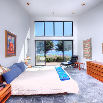
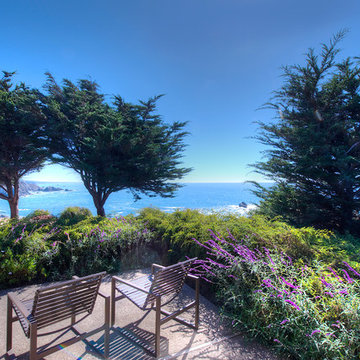
UserSea Arches is a stunning modern architectural masterpiece, perched atop an eleven-acre peninsular promontory rising 160 feet above the Pacific Ocean on northern California’s spectacular Mendocino coast. Surrounded by the ocean on 3 sides and presiding over unparalleled vistas of sea and surf, Sea Arches includes 2,000 feet of ocean frontage, as well as beaches that extend some 1,300 feet. This one-of-a-kind property also includes one of the famous Elk Sea Stacks, a grouping of remarkable ancient rock outcroppings that tower above the Pacific, and add a powerful and dramatic element to the coastal scenery. Integrated gracefully into its spectacular setting, Sea Arches is set back 500 feet from the Pacific Coast Hwy and is completely screened from public view by more than 400 Monterey cypress trees. Approached by a winding, tree-lined drive, the main house and guesthouse include over 4,200 square feet of modern living space with four bedrooms, two mezzanines, two mini-lofts, and five full bathrooms. All rooms are spacious and the hallways are extra-wide. A cantilevered, raised deck off the living-room mezzanine provides a stunningly close approach to the ocean. Walls of glass invite views of the enchanting scenery in every direction: north to the Elk Sea Stacks, south to Point Arena and its historic lighthouse, west beyond the property’s captive sea stack to the horizon, and east to lofty wooded mountains. All of these vistas are enjoyed from Sea Arches and from the property’s mile-long groomed trails that extend along the oceanfront bluff tops overlooking the beautiful beaches on the north and south side of the home. While completely private and secluded, Sea Arches is just a two-minute drive from the charming village of Elk offering quaint and cozy restaurants and inns. A scenic seventeen-mile coastal drive north will bring you to the picturesque and historic seaside village of Mendocino which attracts tourists from near and far. One can also find many world-class wineries in nearby Anderson Valley. All of this just a three-hour drive from San Francisco or if you choose to fly, Little River Airport, with its mile long runway, is only 16 miles north of Sea Arches. Truly a special and unique property, Sea Arches commands some of the most dramatic coastal views in the world, and offers superb design, construction, and high-end finishes throughout, along with unparalleled beauty, tranquility, and privacy. Property Highlights: • Idyllically situated on a one-of-a-kind eleven-acre oceanfront parcel • Dwelling is completely screened from public view by over 400 trees • Includes 2,000 feet of ocean frontage plus over 1,300 feet of beaches • Includes one of the famous Elk Sea Stacks connected to the property by an isthmus • Main house plus private guest house totaling over 4300 sq ft of superb living space • 4 bedrooms and 5 full bathrooms • Separate His and Hers master baths • Open floor plan featuring Single Level Living (with the exception of mezzanines and lofts) • Spacious common rooms with extra wide hallways • Ample opportunities throughout the home for displaying art • Radiant heated slate floors throughout • Soaring 18 foot high ceilings in main living room with walls of glass • Cantilevered viewing deck off the mezzanine for up close ocean views • Gourmet kitchen with top of the line stainless appliances, custom cabinetry and granite counter tops • Granite window sills throughout the home • Spacious guest house including a living room, wet bar, large bedroom, an office/second bedroom, two spacious baths, sleeping loft and two mini lofts • Spectacular ocean and sunset views from most every room in the house • Gracious winding driveway offering ample parking • Large 2 car-garage with workshop • Extensive low-maintenance landscaping offering a profusion of Spring and Summer blooms • Approx. 1 mile of groomed trails • Equipped with a generator • Copper roof • Anchored in bedrock by 42 reinforced concrete piers and framed with steel girders.
2 Fireplaces
Deck
Granite Countertops
Guest House
Patio
Security System
Storage
Gardens
 TVL Creative Ltd.
Cramped kitchen be gone! That was the project motto and top priority. The goal was to transform the current layout from multiple smaller spaces into a connected whole that would activate the main level for our clients, a young family of four.
The biggest obstacle was the wall dividing the kitchen and the dining room. Removing this wall was central to opening up and integrating the main living spaces, but the existing ductwork that ran right through the center of the wall posed a design challenge, er design opportunity. The resulting design solution features a central pantry that captures the ductwork and provides valuable storage- especially when compared to the original kitchen's 18" wide pantry cabinet. The pantry also anchors the kitchen island and serves as a visual separation of space between the kitchen and homework area.
Through our design development process, we learned the formal living room was of no service to their lifestyle and therefore space they rarely spent time in. With that in mind, we proposed to eliminate the unused living room and make it the new dining room. Relocating the dining room to this space inherently felt right given the soaring ceiling and ample room for holiday dinners and celebrations. The new dining room was spacious enough for us to incorporate a conversational seating area in the warm, south-facing window alcove.
Now what to do with the old dining room?! To answer that question we took inspiration from our clients' shared profession in education and developed a craft area/homework station for both of their boys. The semi-custom cabinetry of the desk area carries over to the adjacent wall and forms window bench base with storage that we topped with butcher block for a touch of warmth. While the boys are young, the bench drawers are the perfect place for a stash of toys close to the kitchen.
The kitchen begins just beyond the window seat with their refrigerator enclosure. Opposite the refrigerator is the new pantry with twenty linear feet of shelving and space for brooms and a stick vacuum. Extending from the backside of the pantry the kitchen island design incorporates counter seating on the family room side and a cabinetry configuration on the kitchen side with drawer storage, a trashcan center, farmhouse sink, and dishwasher.
We took careful time in design and execution to align the range and sink because while it might seem like a small detail, it plays an important role in supporting the symmetrical configuration of the back wall of the kitchen. The rear wall design utilizes an appliance garage mirrors the visual impact of the refrigerator enclosure and helps keep the now open kitchen tidy. Between the appliance garage and refrigerator enclosure is the cooking zone with 30" of cabinetry and work surface on either side of the range, a chimney style vent hood, and a bold graphic tile backsplash.
The backsplash is just one of many personal touches we added to the space to reflect our client's modern eclectic style and love of color. Swooping lines of the mid-mod style barstools compliment the pendants and backsplash pattern. A pop of vibrant green on the frame of the pantry door adds a fresh wash of color to an otherwise neutral space. The big show stopper is the custom charcoal gray and copper chevron wall installation in the dining room. This was an idea our clients softly suggested, and we excitedly embraced the opportunity. It is also a kickass solution to the head-scratching design dilemma of how to fill a large and lofty wall.
We are so grateful to bring this design to life for our clients and now dear friends.
 TVL Creative Ltd.
Cramped kitchen be gone! That was the project motto and top priority. The goal was to transform the current layout from multiple smaller spaces into a connected whole that would activate the main level for our clients, a young family of four.
The biggest obstacle was the wall dividing the kitchen and the dining room. Removing this wall was central to opening up and integrating the main living spaces, but the existing ductwork that ran right through the center of the wall posed a design challenge, er design opportunity. The resulting design solution features a central pantry that captures the ductwork and provides valuable storage- especially when compared to the original kitchen's 18" wide pantry cabinet. The pantry also anchors the kitchen island and serves as a visual separation of space between the kitchen and homework area.
Through our design development process, we learned the formal living room was of no service to their lifestyle and therefore space they rarely spent time in. With that in mind, we proposed to eliminate the unused living room and make it the new dining room. Relocating the dining room to this space inherently felt right given the soaring ceiling and ample room for holiday dinners and celebrations. The new dining room was spacious enough for us to incorporate a conversational seating area in the warm, south-facing window alcove.
Now what to do with the old dining room?! To answer that question we took inspiration from our clients' shared profession in education and developed a craft area/homework station for both of their boys. The semi-custom cabinetry of the desk area carries over to the adjacent wall and forms window bench base with storage that we topped with butcher block for a touch of warmth. While the boys are young, the bench drawers are the perfect place for a stash of toys close to the kitchen.
The kitchen begins just beyond the window seat with their refrigerator enclosure. Opposite the refrigerator is the new pantry with twenty linear feet of shelving and space for brooms and a stick vacuum. Extending from the backside of the pantry the kitchen island design incorporates counter seating on the family room side and a cabinetry configuration on the kitchen side with drawer storage, a trashcan center, farmhouse sink, and dishwasher.
We took careful time in design and execution to align the range and sink because while it might seem like a small detail, it plays an important role in supporting the symmetrical configuration of the back wall of the kitchen. The rear wall design utilizes an appliance garage mirrors the visual impact of the refrigerator enclosure and helps keep the now open kitchen tidy. Between the appliance garage and refrigerator enclosure is the cooking zone with 30" of cabinetry and work surface on either side of the range, a chimney style vent hood, and a bold graphic tile backsplash.
The backsplash is just one of many personal touches we added to the space to reflect our client's modern eclectic style and love of color. Swooping lines of the mid-mod style barstools compliment the pendants and backsplash pattern. A pop of vibrant green on the frame of the pantry door adds a fresh wash of color to an otherwise neutral space. The big show stopper is the custom charcoal gray and copper chevron wall installation in the dining room. This was an idea our clients softly suggested, and we excitedly embraced the opportunity. It is also a kickass solution to the head-scratching design dilemma of how to fill a large and lofty wall.
We are so grateful to bring this design to life for our clients and now dear friends.
 User
UserSea Arches is a stunning modern architectural masterpiece, perched atop an eleven-acre peninsular promontory rising 160 feet above the Pacific Ocean on northern California’s spectacular Mendocino coast. Surrounded by the ocean on 3 sides and presiding over unparalleled vistas of sea and surf, Sea Arches includes 2,000 feet of ocean frontage, as well as beaches that extend some 1,300 feet. This one-of-a-kind property also includes one of the famous Elk Sea Stacks, a grouping of remarkable ancient rock outcroppings that tower above the Pacific, and add a powerful and dramatic element to the coastal scenery. Integrated gracefully into its spectacular setting, Sea Arches is set back 500 feet from the Pacific Coast Hwy and is completely screened from public view by more than 400 Monterey cypress trees. Approached by a winding, tree-lined drive, the main house and guesthouse include over 4,200 square feet of modern living space with four bedrooms, two mezzanines, two mini-lofts, and five full bathrooms. All rooms are spacious and the hallways are extra-wide. A cantilevered, raised deck off the living-room mezzanine provides a stunningly close approach to the ocean. Walls of glass invite views of the enchanting scenery in every direction: north to the Elk Sea Stacks, south to Point Arena and its historic lighthouse, west beyond the property’s captive sea stack to the horizon, and east to lofty wooded mountains. All of these vistas are enjoyed from Sea Arches and from the property’s mile-long groomed trails that extend along the oceanfront bluff tops overlooking the beautiful beaches on the north and south side of the home. While completely private and secluded, Sea Arches is just a two-minute drive from the charming village of Elk offering quaint and cozy restaurants and inns. A scenic seventeen-mile coastal drive north will bring you to the picturesque and historic seaside village of Mendocino which attracts tourists from near and far. One can also find many world-class wineries in nearby Anderson Valley. All of this just a three-hour drive from San Francisco or if you choose to fly, Little River Airport, with its mile long runway, is only 16 miles north of Sea Arches. Truly a special and unique property, Sea Arches commands some of the most dramatic coastal views in the world, and offers superb design, construction, and high-end finishes throughout, along with unparalleled beauty, tranquility, and privacy. Property Highlights: • Idyllically situated on a one-of-a-kind eleven-acre oceanfront parcel • Dwelling is completely screened from public view by over 400 trees • Includes 2,000 feet of ocean frontage plus over 1,300 feet of beaches • Includes one of the famous Elk Sea Stacks connected to the property by an isthmus • Main house plus private guest house totaling over 4300 sq ft of superb living space • 4 bedrooms and 5 full bathrooms • Separate His and Hers master baths • Open floor plan featuring Single Level Living (with the exception of mezzanines and lofts) • Spacious common rooms with extra wide hallways • Ample opportunities throughout the home for displaying art • Radiant heated slate floors throughout • Soaring 18 foot high ceilings in main living room with walls of glass • Cantilevered viewing deck off the mezzanine for up close ocean views • Gourmet kitchen with top of the line stainless appliances, custom cabinetry and granite counter tops • Granite window sills throughout the home • Spacious guest house including a living room, wet bar, large bedroom, an office/second bedroom, two spacious baths, sleeping loft and two mini lofts • Spectacular ocean and sunset views from most every room in the house • Gracious winding driveway offering ample parking • Large 2 car-garage with workshop • Extensive low-maintenance landscaping offering a profusion of Spring and Summer blooms • Approx. 1 mile of groomed trails • Equipped with a generator • Copper roof • Anchored in bedrock by 42 reinforced concrete piers and framed with steel girders.
2 Fireplaces
Deck
Granite Countertops
Guest House
Patio
Security System
Storage
Gardens
 TVL Creative Ltd.
Cramped kitchen be gone! That was the project motto and top priority. The goal was to transform the current layout from multiple smaller spaces into a connected whole that would activate the main level for our clients, a young family of four.
The biggest obstacle was the wall dividing the kitchen and the dining room. Removing this wall was central to opening up and integrating the main living spaces, but the existing ductwork that ran right through the center of the wall posed a design challenge, er design opportunity. The resulting design solution features a central pantry that captures the ductwork and provides valuable storage- especially when compared to the original kitchen's 18" wide pantry cabinet. The pantry also anchors the kitchen island and serves as a visual separation of space between the kitchen and homework area.
Through our design development process, we learned the formal living room was of no service to their lifestyle and therefore space they rarely spent time in. With that in mind, we proposed to eliminate the unused living room and make it the new dining room. Relocating the dining room to this space inherently felt right given the soaring ceiling and ample room for holiday dinners and celebrations. The new dining room was spacious enough for us to incorporate a conversational seating area in the warm, south-facing window alcove.
Now what to do with the old dining room?! To answer that question we took inspiration from our clients' shared profession in education and developed a craft area/homework station for both of their boys. The semi-custom cabinetry of the desk area carries over to the adjacent wall and forms window bench base with storage that we topped with butcher block for a touch of warmth. While the boys are young, the bench drawers are the perfect place for a stash of toys close to the kitchen.
The kitchen begins just beyond the window seat with their refrigerator enclosure. Opposite the refrigerator is the new pantry with twenty linear feet of shelving and space for brooms and a stick vacuum. Extending from the backside of the pantry the kitchen island design incorporates counter seating on the family room side and a cabinetry configuration on the kitchen side with drawer storage, a trashcan center, farmhouse sink, and dishwasher.
We took careful time in design and execution to align the range and sink because while it might seem like a small detail, it plays an important role in supporting the symmetrical configuration of the back wall of the kitchen. The rear wall design utilizes an appliance garage mirrors the visual impact of the refrigerator enclosure and helps keep the now open kitchen tidy. Between the appliance garage and refrigerator enclosure is the cooking zone with 30" of cabinetry and work surface on either side of the range, a chimney style vent hood, and a bold graphic tile backsplash.
The backsplash is just one of many personal touches we added to the space to reflect our client's modern eclectic style and love of color. Swooping lines of the mid-mod style barstools compliment the pendants and backsplash pattern. A pop of vibrant green on the frame of the pantry door adds a fresh wash of color to an otherwise neutral space. The big show stopper is the custom charcoal gray and copper chevron wall installation in the dining room. This was an idea our clients softly suggested, and we excitedly embraced the opportunity. It is also a kickass solution to the head-scratching design dilemma of how to fill a large and lofty wall.
We are so grateful to bring this design to life for our clients and now dear friends.
 Shuler Architecture
Here's one of our most recent projects that was completed in 2011. This client had just finished a major remodel of their house in 2008 and were about to enjoy Christmas in their new home. At the time, Seattle was buried under several inches of snow (a rarity for us) and the entire region was paralyzed for a few days waiting for the thaw. Our client decided to take advantage of this opportunity and was in his driveway sledding when a neighbor rushed down the drive yelling that his house was on fire. Unfortunately, the house was already engulfed in flames. Equally unfortunate was the snowstorm and the delay it caused the fire department getting to the site. By the time they arrived, the house and contents were a total loss of more than $2.2 million.
Here's one of our most recent projects that was completed in 2011. This client had just finished a major remodel of their house in 2008 and were about to enjoy Christmas in their new home. At the time, Seattle was buried under several inches of snow (a rarity for us) and the entire region was paralyzed for a few days waiting for the thaw. Our client decided to take advantage of this opportunity and was in his driveway sledding when a neighbor rushed down the drive yelling that his house was on fire. Unfortunately, the house was already engulfed in flames. Equally unfortunate was the snowstorm and the delay it caused the fire department getting to the site. By the time they arrived, the house and contents were a total loss of more than $2.2 million.
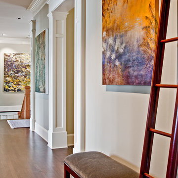
Our role in the reconstruction of this home was two-fold. The first year of our involvement was spent working with a team of forensic contractors gutting the house, cleansing it of all particulate matter, and then helping our client negotiate his insurance settlement. Once we got over these hurdles, the design work and reconstruction started. Maintaining the existing shell, we reworked the interior room arrangement to create classic great room house with a contemporary twist. Both levels of the home were opened up to take advantage of the waterfront views and flood the interiors with natural light. On the lower level, rearrangement of the walls resulted in a tripling of the size of the family room while creating an additional sitting/game room. The upper level was arranged with living spaces bookended by the Master Bedroom at one end the kitchen at the other. The open Great Room and wrap around deck create a relaxed and sophisticated living and entertainment space that is accentuated by a high level of trim and tile detail on the interior and by custom metal railings and light fixtures on the exterior.
 TVL Creative Ltd.
Cramped kitchen be gone! That was the project motto and top priority. The goal was to transform the current layout from multiple smaller spaces into a connected whole that would activate the main level for our clients, a young family of four.
The biggest obstacle was the wall dividing the kitchen and the dining room. Removing this wall was central to opening up and integrating the main living spaces, but the existing ductwork that ran right through the center of the wall posed a design challenge, er design opportunity. The resulting design solution features a central pantry that captures the ductwork and provides valuable storage- especially when compared to the original kitchen's 18" wide pantry cabinet. The pantry also anchors the kitchen island and serves as a visual separation of space between the kitchen and homework area.
Through our design development process, we learned the formal living room was of no service to their lifestyle and therefore space they rarely spent time in. With that in mind, we proposed to eliminate the unused living room and make it the new dining room. Relocating the dining room to this space inherently felt right given the soaring ceiling and ample room for holiday dinners and celebrations. The new dining room was spacious enough for us to incorporate a conversational seating area in the warm, south-facing window alcove.
Now what to do with the old dining room?! To answer that question we took inspiration from our clients' shared profession in education and developed a craft area/homework station for both of their boys. The semi-custom cabinetry of the desk area carries over to the adjacent wall and forms window bench base with storage that we topped with butcher block for a touch of warmth. While the boys are young, the bench drawers are the perfect place for a stash of toys close to the kitchen.
The kitchen begins just beyond the window seat with their refrigerator enclosure. Opposite the refrigerator is the new pantry with twenty linear feet of shelving and space for brooms and a stick vacuum. Extending from the backside of the pantry the kitchen island design incorporates counter seating on the family room side and a cabinetry configuration on the kitchen side with drawer storage, a trashcan center, farmhouse sink, and dishwasher.
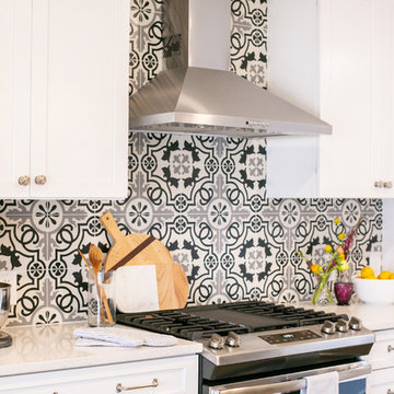
We took careful time in design and execution to align the range and sink because while it might seem like a small detail, it plays an important role in supporting the symmetrical configuration of the back wall of the kitchen. The rear wall design utilizes an appliance garage mirrors the visual impact of the refrigerator enclosure and helps keep the now open kitchen tidy. Between the appliance garage and refrigerator enclosure is the cooking zone with 30" of cabinetry and work surface on either side of the range, a chimney style vent hood, and a bold graphic tile backsplash.
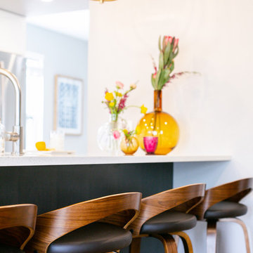
The backsplash is just one of many personal touches we added to the space to reflect our client's modern eclectic style and love of color. Swooping lines of the mid-mod style barstools compliment the pendants and backsplash pattern. A pop of vibrant green on the frame of the pantry door adds a fresh wash of color to an otherwise neutral space. The big show stopper is the custom charcoal gray and copper chevron wall installation in the dining room. This was an idea our clients softly suggested, and we excitedly embraced the opportunity. It is also a kickass solution to the head-scratching design dilemma of how to fill a large and lofty wall.
We are so grateful to bring this design to life for our clients and now dear friends.
 TVL Creative Ltd.
Cramped kitchen be gone! That was the project motto and top priority. The goal was to transform the current layout from multiple smaller spaces into a connected whole that would activate the main level for our clients, a young family of four.
The biggest obstacle was the wall dividing the kitchen and the dining room. Removing this wall was central to opening up and integrating the main living spaces, but the existing ductwork that ran right through the center of the wall posed a design challenge, er design opportunity. The resulting design solution features a central pantry that captures the ductwork and provides valuable storage- especially when compared to the original kitchen's 18" wide pantry cabinet. The pantry also anchors the kitchen island and serves as a visual separation of space between the kitchen and homework area.
Through our design development process, we learned the formal living room was of no service to their lifestyle and therefore space they rarely spent time in. With that in mind, we proposed to eliminate the unused living room and make it the new dining room. Relocating the dining room to this space inherently felt right given the soaring ceiling and ample room for holiday dinners and celebrations. The new dining room was spacious enough for us to incorporate a conversational seating area in the warm, south-facing window alcove.
Now what to do with the old dining room?! To answer that question we took inspiration from our clients' shared profession in education and developed a craft area/homework station for both of their boys. The semi-custom cabinetry of the desk area carries over to the adjacent wall and forms window bench base with storage that we topped with butcher block for a touch of warmth. While the boys are young, the bench drawers are the perfect place for a stash of toys close to the kitchen.
The kitchen begins just beyond the window seat with their refrigerator enclosure. Opposite the refrigerator is the new pantry with twenty linear feet of shelving and space for brooms and a stick vacuum. Extending from the backside of the pantry the kitchen island design incorporates counter seating on the family room side and a cabinetry configuration on the kitchen side with drawer storage, a trashcan center, farmhouse sink, and dishwasher.
We took careful time in design and execution to align the range and sink because while it might seem like a small detail, it plays an important role in supporting the symmetrical configuration of the back wall of the kitchen. The rear wall design utilizes an appliance garage mirrors the visual impact of the refrigerator enclosure and helps keep the now open kitchen tidy. Between the appliance garage and refrigerator enclosure is the cooking zone with 30" of cabinetry and work surface on either side of the range, a chimney style vent hood, and a bold graphic tile backsplash.
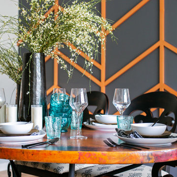
The backsplash is just one of many personal touches we added to the space to reflect our client's modern eclectic style and love of color. Swooping lines of the mid-mod style barstools compliment the pendants and backsplash pattern. A pop of vibrant green on the frame of the pantry door adds a fresh wash of color to an otherwise neutral space. The big show stopper is the custom charcoal gray and copper chevron wall installation in the dining room. This was an idea our clients softly suggested, and we excitedly embraced the opportunity. It is also a kickass solution to the head-scratching design dilemma of how to fill a large and lofty wall.
We are so grateful to bring this design to life for our clients and now dear friends.
 TVL Creative Ltd.
Cramped kitchen be gone! That was the project motto and top priority. The goal was to transform the current layout from multiple smaller spaces into a connected whole that would activate the main level for our clients, a young family of four.
The biggest obstacle was the wall dividing the kitchen and the dining room. Removing this wall was central to opening up and integrating the main living spaces, but the existing ductwork that ran right through the center of the wall posed a design challenge, er design opportunity. The resulting design solution features a central pantry that captures the ductwork and provides valuable storage- especially when compared to the original kitchen's 18" wide pantry cabinet. The pantry also anchors the kitchen island and serves as a visual separation of space between the kitchen and homework area.
Through our design development process, we learned the formal living room was of no service to their lifestyle and therefore space they rarely spent time in. With that in mind, we proposed to eliminate the unused living room and make it the new dining room. Relocating the dining room to this space inherently felt right given the soaring ceiling and ample room for holiday dinners and celebrations. The new dining room was spacious enough for us to incorporate a conversational seating area in the warm, south-facing window alcove.
Now what to do with the old dining room?! To answer that question we took inspiration from our clients' shared profession in education and developed a craft area/homework station for both of their boys. The semi-custom cabinetry of the desk area carries over to the adjacent wall and forms window bench base with storage that we topped with butcher block for a touch of warmth. While the boys are young, the bench drawers are the perfect place for a stash of toys close to the kitchen.
The kitchen begins just beyond the window seat with their refrigerator enclosure. Opposite the refrigerator is the new pantry with twenty linear feet of shelving and space for brooms and a stick vacuum. Extending from the backside of the pantry the kitchen island design incorporates counter seating on the family room side and a cabinetry configuration on the kitchen side with drawer storage, a trashcan center, farmhouse sink, and dishwasher.
We took careful time in design and execution to align the range and sink because while it might seem like a small detail, it plays an important role in supporting the symmetrical configuration of the back wall of the kitchen. The rear wall design utilizes an appliance garage mirrors the visual impact of the refrigerator enclosure and helps keep the now open kitchen tidy. Between the appliance garage and refrigerator enclosure is the cooking zone with 30" of cabinetry and work surface on either side of the range, a chimney style vent hood, and a bold graphic tile backsplash.
The backsplash is just one of many personal touches we added to the space to reflect our client's modern eclectic style and love of color. Swooping lines of the mid-mod style barstools compliment the pendants and backsplash pattern. A pop of vibrant green on the frame of the pantry door adds a fresh wash of color to an otherwise neutral space. The big show stopper is the custom charcoal gray and copper chevron wall installation in the dining room. This was an idea our clients softly suggested, and we excitedly embraced the opportunity. It is also a kickass solution to the head-scratching design dilemma of how to fill a large and lofty wall.
We are so grateful to bring this design to life for our clients and now dear friends.
 TVL Creative Ltd.
Cramped kitchen be gone! That was the project motto and top priority. The goal was to transform the current layout from multiple smaller spaces into a connected whole that would activate the main level for our clients, a young family of four.
The biggest obstacle was the wall dividing the kitchen and the dining room. Removing this wall was central to opening up and integrating the main living spaces, but the existing ductwork that ran right through the center of the wall posed a design challenge, er design opportunity. The resulting design solution features a central pantry that captures the ductwork and provides valuable storage- especially when compared to the original kitchen's 18" wide pantry cabinet. The pantry also anchors the kitchen island and serves as a visual separation of space between the kitchen and homework area.
Through our design development process, we learned the formal living room was of no service to their lifestyle and therefore space they rarely spent time in. With that in mind, we proposed to eliminate the unused living room and make it the new dining room. Relocating the dining room to this space inherently felt right given the soaring ceiling and ample room for holiday dinners and celebrations. The new dining room was spacious enough for us to incorporate a conversational seating area in the warm, south-facing window alcove.
Now what to do with the old dining room?! To answer that question we took inspiration from our clients' shared profession in education and developed a craft area/homework station for both of their boys. The semi-custom cabinetry of the desk area carries over to the adjacent wall and forms window bench base with storage that we topped with butcher block for a touch of warmth. While the boys are young, the bench drawers are the perfect place for a stash of toys close to the kitchen.
The kitchen begins just beyond the window seat with their refrigerator enclosure. Opposite the refrigerator is the new pantry with twenty linear feet of shelving and space for brooms and a stick vacuum. Extending from the backside of the pantry the kitchen island design incorporates counter seating on the family room side and a cabinetry configuration on the kitchen side with drawer storage, a trashcan center, farmhouse sink, and dishwasher.
We took careful time in design and execution to align the range and sink because while it might seem like a small detail, it plays an important role in supporting the symmetrical configuration of the back wall of the kitchen. The rear wall design utilizes an appliance garage mirrors the visual impact of the refrigerator enclosure and helps keep the now open kitchen tidy. Between the appliance garage and refrigerator enclosure is the cooking zone with 30" of cabinetry and work surface on either side of the range, a chimney style vent hood, and a bold graphic tile backsplash.
The backsplash is just one of many personal touches we added to the space to reflect our client's modern eclectic style and love of color. Swooping lines of the mid-mod style barstools compliment the pendants and backsplash pattern. A pop of vibrant green on the frame of the pantry door adds a fresh wash of color to an otherwise neutral space. The big show stopper is the custom charcoal gray and copper chevron wall installation in the dining room. This was an idea our clients softly suggested, and we excitedly embraced the opportunity. It is also a kickass solution to the head-scratching design dilemma of how to fill a large and lofty wall.
We are so grateful to bring this design to life for our clients and now dear friends.
 Mangum Design-Build, Inc.
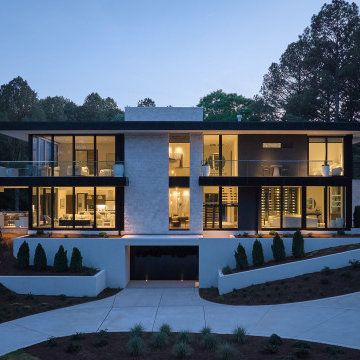
The Glenhill house settles gracefully into a mature pine forest, its form composed as a quiet
study of light, proportion, and crafted detail. A two-story residence lifted above a drive-through
garage, it is designed as a sequence of framed views — each room capturing the vertical
rhythm of pines, shifting daylight, and the subtle movement of the landscape. Boundaries
dissolve as floor-to-ceiling glass opens living spaces to broad terraces and cantilevered
balconies, allowing the forest to inhabit the interior as much as the residents inhabit the site.
A finely tuned steel frame enables deep overhangs and slender structural lines, giving the
house its floating clarity. These long spans soften the transition between indoors and out,
casting calibrated shadows across stone floors and hand-finished wood surfaces. Every
junction, from the precision-cut steel connections to the custom millwork, reflects an elevated
commitment to craft. Materials are chosen not only for their beauty but for the way they register
light—the warmth of timber, the quiet solidity of stone, the reflective sheen of metal.
The owner’s collection of art integrates seamlessly into the architectural language. Display walls
and open sightlines turn circulation paths into gallery promenades, while the garage level
becomes both threshold and exhibition space for the automobile collection. At dusk, the home
glows lantern-like within the pines, revealing a composition where structure, material, and
nature are held in delicate balance. It is a dwelling shaped less as an object in the woods and
more as a crafted extension of the forest itself.
The project began with an unexpected challenge: the original lot, once selected for its beauty,
became untenable when neighboring homeowners objected to the presence of a modern house.
Rather than compromise the vision, the team embraced a new site, one even more deeply
woven into the pine forest, and treated the change as an opportunity to refine the project’s
relationship to nature and craft.
Working within a densely wooded parcel required choreography as much as construction.
Limited access routes, the need to preserve mature trees, and the precision demands of steel
erection shaped a carefully phased process. Contractors navigated the site with restraint,
placing each piece of steel like a line of poetry between trunks. The resulting frame, powerful
yet minimal, was later infilled with lumber to create a hybrid system — efficient, warm, and
capable of carrying cantilevers far beyond what wood alone could achieve. These extended
overhangs became the project’s quiet gesture of shelter and shadow. Collaboration with the interior designer was integral to the home’s harmony. Together, the team
refined material transitions so stone, wood, and metal could pass from exterior to interior with a
single visual glance. Craftsmanship elevated everyday moments: concealed hardware, sculpted
millwork, and the sourcing of a solid limestone soaking tub, carved from a single block, all
contribute to the home’s sense of intentional calm.
What emerged is a house shaped by constraint, strengthened by collaboration, and refined
through an unwavering commitment to detail — an architectural refuge where complexity was
transformed into clarity, and obstacles into opportunities for deeper expression.
Material selection became an essential extension of the home’s design philosophy, reinforcing
the crafted clarity of each space. Hand-selected stone slabs were book-matched for the
fireplace and bath walls, creating veined compositions that read like natural murals. Custom-
built windows, engineered with specialty-coated glazing and rigorously pressure-tested, provide
both protection and extraordinary visual transparency. Above, concealed truss framing houses
recessed air diffusers and hidden shades, allowing ceilings to remain quiet and uninterrupted.
The horizontal planes of the flat roof are achieved with a commercial-grade membrane system,
delivering the crisp, modern silhouette the design demands. At the exterior, natural stone
grounds the home to its site, stitching the architecture to the forest floor and rooting the dwelling
in the land from which its materials are drawn.
 Klopf Architecture
Klopf Architecture, Arterra Landscape Architects and Henry Calvert of Calvert Ventures Designed and built a new warm, modern, Eichler-inspired, open, indoor-outdoor home on a deeper-than-usual San Mateo Highlands property where an original Eichler house had burned to the ground.
The owners wanted multi-generational living and larger spaces than the original home offered, but all parties agreed that the house should respect the neighborhood and blend in stylistically with the other Eichlers. At first the Klopf team considered re-using what little was left of the original home and expanding on it. But after discussions with the owner and builder, all parties agreed that the last few remaining elements of the house were not practical to re-use, so Klopf Architecture designed a new home that pushes the Eichler approach in new directions.
One disadvantage of Eichler production homes is that the house designs were not optimized for each specific lot. A new custom home offered the team a chance to start over. In this case, a longer house that opens up sideways to the south fit the lot better than the original square-ish house that used to open to the rear (west). Accordingly, the Klopf team designed an L-shaped “bar” house with a large glass wall with large sliding glass doors that faces sideways instead of to the rear like a typical Eichler. This glass wall opens to a pool and landscaped yard designed by Arterra Landscape Architects.
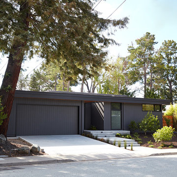
Driving by the house, one might assume at first glance it is an Eichler because of the horizontality, the overhanging flat roof eaves, the dark gray vertical siding, and orange solid panel front door, but the house is designed for the 21st Century and is not meant to be a “Likeler.” You won't see any posts and beams in this home. Instead, the ceiling decking is a western red cedar that covers over all the beams. Like Eichlers, this cedar runs continuously from inside to out, enhancing the indoor / outdoor feeling of the house, but unlike Eichlers it conceals a cavity for lighting, wiring, and insulation. Ceilings are higher, rooms are larger and more open, the master bathroom is light-filled and more generous, with a separate tub and shower and a separate toilet compartment, and there is plenty of storage. The garage even easily fits two of today's vehicles with room to spare.
A massive 49-foot by 12-foot wall of glass and the continuity of materials from inside to outside enhance the inside-outside living concept, so the owners and their guests can flow freely from house to pool deck to BBQ to pool and back.
During construction in the rough framing stage, Klopf thought the front of the house appeared too tall even though the house had looked right in the design renderings (probably because the house is uphill from the street). So Klopf Architecture paid the framer to change the roofline from how we had designed it to be lower along the front, allowing the home to blend in better with the neighborhood. One project goal was for people driving up the street to pass the home without immediately noticing there is an "imposter" on this lot, and making that change was essential to achieve that goal.
This 2,606 square foot, 3 bedroom, 3 bathroom Eichler-inspired new house is located in San Mateo in the heart of the Silicon Valley.
Klopf Architecture Project Team: John Klopf, AIA, Klara Kevane
Landscape Architect: Arterra Landscape Architects
Contractor: Henry Calvert of Calvert Ventures
Photography ©2016 Mariko Reed
Location: San Mateo, CA
Year completed: 2016
 TVL Creative Ltd.
Cramped kitchen be gone! That was the project motto and top priority. The goal was to transform the current layout from multiple smaller spaces into a connected whole that would activate the main level for our clients, a young family of four.
The biggest obstacle was the wall dividing the kitchen and the dining room. Removing this wall was central to opening up and integrating the main living spaces, but the existing ductwork that ran right through the center of the wall posed a design challenge, er design opportunity. The resulting design solution features a central pantry that captures the ductwork and provides valuable storage- especially when compared to the original kitchen's 18" wide pantry cabinet. The pantry also anchors the kitchen island and serves as a visual separation of space between the kitchen and homework area.
Through our design development process, we learned the formal living room was of no service to their lifestyle and therefore space they rarely spent time in. With that in mind, we proposed to eliminate the unused living room and make it the new dining room. Relocating the dining room to this space inherently felt right given the soaring ceiling and ample room for holiday dinners and celebrations. The new dining room was spacious enough for us to incorporate a conversational seating area in the warm, south-facing window alcove.
Now what to do with the old dining room?! To answer that question we took inspiration from our clients' shared profession in education and developed a craft area/homework station for both of their boys. The semi-custom cabinetry of the desk area carries over to the adjacent wall and forms window bench base with storage that we topped with butcher block for a touch of warmth. While the boys are young, the bench drawers are the perfect place for a stash of toys close to the kitchen.
The kitchen begins just beyond the window seat with their refrigerator enclosure. Opposite the refrigerator is the new pantry with twenty linear feet of shelving and space for brooms and a stick vacuum. Extending from the backside of the pantry the kitchen island design incorporates counter seating on the family room side and a cabinetry configuration on the kitchen side with drawer storage, a trashcan center, farmhouse sink, and dishwasher.
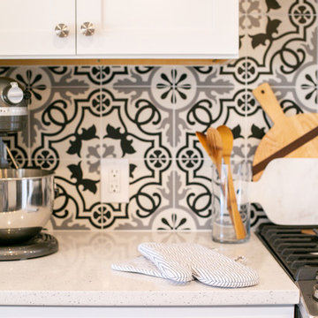
We took careful time in design and execution to align the range and sink because while it might seem like a small detail, it plays an important role in supporting the symmetrical configuration of the back wall of the kitchen. The rear wall design utilizes an appliance garage mirrors the visual impact of the refrigerator enclosure and helps keep the now open kitchen tidy. Between the appliance garage and refrigerator enclosure is the cooking zone with 30" of cabinetry and work surface on either side of the range, a chimney style vent hood, and a bold graphic tile backsplash.
The backsplash is just one of many personal touches we added to the space to reflect our client's modern eclectic style and love of color. Swooping lines of the mid-mod style barstools compliment the pendants and backsplash pattern. A pop of vibrant green on the frame of the pantry door adds a fresh wash of color to an otherwise neutral space. The big show stopper is the custom charcoal gray and copper chevron wall installation in the dining room. This was an idea our clients softly suggested, and we excitedly embraced the opportunity. It is also a kickass solution to the head-scratching design dilemma of how to fill a large and lofty wall.
We are so grateful to bring this design to life for our clients and now dear friends.
3