
Search results for "Durchgehende schiene" in Home Design Ideas

 Preservation Station
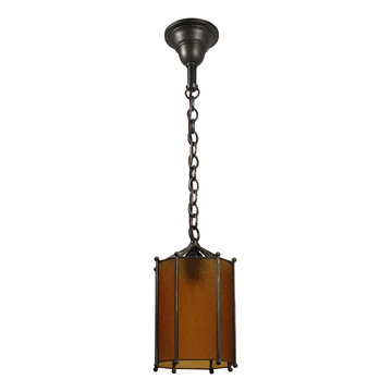
This is a wonderful antique one-light pendant, dating from the 1920s, and found in a home in Charlotte, NC. This octagonal lantern-style chandelier begins with an understated canopy, coming down in a chain to a simple loop finial. The angular body below features eight panels of gorgeous amber granite glass. This light fixture is in excellent condition, and the glass is also in excellent condition with no cracks or breaks. The simplicity of this fixture lends it to work with a variety of styles. The chandelier has been professionally rewired and comes with all the necessary attachments for modern installation. The chandelier body measures 7” wide and 12-1/2” tall, and the fixture is 29” long overall.
NC1979
 Patrice Rios Design
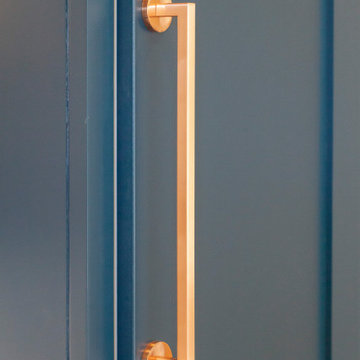
Modern kitchen with blue cabinets, copper accents and white tile. Floating wood kitchen shelves with lighting underneath. Black and copper range hood with black pot filler above stainless steel range. Stained concrete flooring. White quartz countertops. Black pendant lighting, Integrated refrigerator with freezer drawers. Tiled wet bar with copper countertop. Kitchen island with seating. Home staging done by Troo Home Staging in Austin, TX.
Find the right local pro for your project



 InterDesign Studio
Brushed Nickel HansGrohe single lever faucet.
Photo: Jamie Snavley
Bathroom - bathroom idea in San Francisco
Bathroom - bathroom idea in San Francisco
 Kelly Martin Interiors
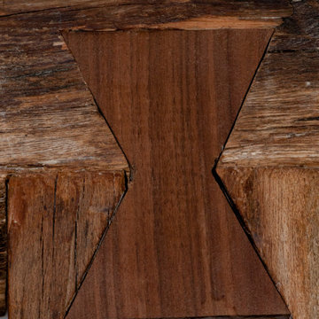
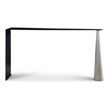
ATELIERxKM is a bespoke furniture collection designed & created by interior designer, Kelly Martin. Her goal is to create high end fashion pieces for your home. She has mixed the beauty of natural walnuts & oaks with blackened steel accents to create a dark juxtaposition of soft & hard edges. Made in California.

 Northern Roof Tiles
Project near Boston MA
Installed by longtime customer LifeTime Tilers of Westfield MA
Onda is a tile that brings the second oldest European style profile (what we in North America know as ‘Spanish S’), into the 21st Century. By combining the classic beauty of the S profile with high tech double side and head locks they can provide a tile that will withstand whatever Mother Nature wants to throw at it.
Once tile makers had mastered the technology of extruding clay to form the shape of the tile, as opposed to shaping a pad of clay round a pre-formed mold, an inventive tile maker decided to combine the existing two piece pan and cover tile into one tile and the ‘S’ profile was born.
The makers of our Onda tile have been able to retain the overall appearance and timeless beauty of the good old Spanish S tile which up to now have simply relied upon overlapping each other to keep out most of the weather.
Available in a range of colors and complete with all the necessary fittings and accessories Onda, like all those offered by our company, are perfectly suitable for installation in the Northern US and Canada.





 User
Multi-level wood-look Zuri cellular PVC decking with curved steps to lower level round deck.
Inspiration for a mid-sized contemporary backyard deck remodel in Providence
Inspiration for a mid-sized contemporary backyard deck remodel in Providence

 Greener House Cleaning
The discoloration on this fridge from other house cleaners/products would not come off with a standard cleaning, so I had to restore the finish which was a longer process.
(C) Jennifer Everett / Greener House Cleaning of Phoenix, AZ
 KURV Architecture DPC (Alex Hughes Architects)
Located in the heart of Manhattan’s Lower East Side, the building was erected on a shallow commercial lot between two 120 year old masonry buildings and a new residential rental building. 330 Grand Street is a mix of 725 SF 1BRs and 1050 SF 2BR apartments. It also contains a 1100 SF two story duplex as well as private and public rooftop space, large private balconies for most units and two large private terraces for the ground floor units.
330 Grand Street was originally designed and approved at the NYC DOB as a prefabricated modular building. During the pandemic, as shipping costs skyrocketed putting the project at risk, we suggested redesigning the building as a reinforced cast-in-place concrete structure. Concrete was readily available and prices had not been affected by the demand increase that many other materials suffered in the pandemic. We took this opportunity to raise floor to ceiling heights, enlarge high performance windows and redistribute the buildings MEPFS and Structural Systems to create very open floor plans.
The challenge was to create a luxurious sensorial living experience with very limited means. In a city with very high construction costs, low cost residential buildings in the area are usually devoid of good quality, design and character. Our approach was to aim high for the end user, prioritizing natural light, open space with long visual perspectives, high ceilings and as always, rejecting the use of predefined building templates.
Our biggest challenge was to ensure that the small spaces feel as clean cut, large and bright as possible. Several unique design decisions were made to ensure low cost and high quality;
Floor plans were laid out so that spaces were wide open and free of clutter from mechanical or structural interruptions. Therefore all infrastructure was placed in lateral demising walls, which in turn act as the unit’s storage and kitchen. The apartments feel wide open, are super quiet and have more storage space than any other comparable apartment in the city.
To solve the problem of the site’s shallow commercial lot which is typically prone to dark interior spaces we focused our attention on the building’s envelope. Instead of the usual small punched window openings, oversized high performance windows were designed to ensure that light penetrated as far as possible into the units. In the smaller 1BR units, the full 50’ depth of the lot is perceived by partitioning spaces with sliding pocket doors that can be retracted to allow deep visual perspectives, making the sight lines in the space feel longer, larger, more ample than normal. In addition to the full height glazing, each unit above the 2nd floor receives a 7 foot covered balcony, adding 120 to 240 sf to each apartment, something unusual in New York City buildings. The space is large enough for a full size dining table, when the weather permits being outside.
We also worked hard to ensure modularity. For example, all kitchen units are all identical throughout the building. The idea of modularity and the economy of the repetitive unit is exercised to the maximum through the building.
Hardware, appliances, flooring, wall coverings and material finishes are all carefully selected to feel bespoke, high quality and unique.
It was important to KURV that the result of this work manifest into something that would deeply connect with the end user and sustain relationships with the consumers of this space.
All images by KURV Architecture ©





44