
Search results for "Eat difficult" in Home Design Ideas
 Cavé Studio
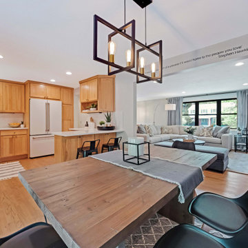
This is a view from the dining room to the kitchen and living room.
DTSH Interiors brought in furniture for the eat in kitchen, dining, and living room as well as added Belgian Linen window treatments.
The exterior of the home received a major facelift and transformation, including new light fixtures, updated roof and facia, updated wood beams, wood door, wood ceiling and stone added to the entrance and more. This took the home from a dated look to an updated and fresh "modern farmhouse" aesthetic.
The kitchen layout remained intact, while appliances, fixtures, hardware, countertops and backsplashes were upgraded . All three bathrooms in the house were also renovated, original hardwood floors were refinished and carpet and tile flooring throughout replaced. Additionally, the dated built-in brick fireplace on the ground floor game room was redesigned. The new fireplace design would now directly tie in with the modern farmhouse style of the exterior, complete with the addition of a large wooden mantle.
DTSH Interiors formulated a plan for six rooms; the living room, dining room, master bedroom, two children's bedrooms and ground floor game room, with the inclusion of the complete fireplace re-design.
The interior also received major upgrades during the whole-house renovation. All of the walls and ceilings were resurfaced, the windows, doors and all interior trim was re-done.
The end result was a giant leap forward for this family; in design, style and functionality. The home felt completely new and refreshed, and once fully furnished, all elements of the renovation came together seamlessly and seemed to make all of the renovations shine.
During the "big reveal" moment, the day the family finally returned home for their summer away, it was difficult for me to decide who was more excited, the adults or the kids!
The home owners kept saying, with a look of delighted disbelief "I can't believe this is our house!"
As a designer, I absolutely loved this project, because it shows the potential of an average, older Pittsburgh area home, and how it can become a well designed and updated space.
It was rewarding to be part of a project which resulted in creating an elegant and serene living space the family loves coming home to everyday, while the exterior of the home became a standout gem in the neighborhood.
 Sharon Flatley Design
Daniel S Flatley
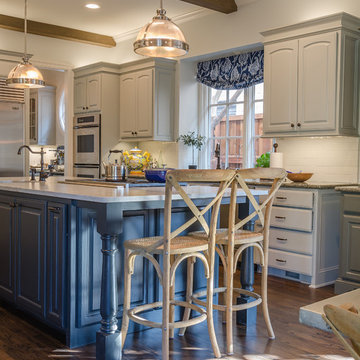
Example of a classic l-shaped dark wood floor open concept kitchen design in Dallas with raised-panel cabinets, beige cabinets, granite countertops, white backsplash, subway tile backsplash, stainless steel appliances and an island
Example of a classic l-shaped dark wood floor open concept kitchen design in Dallas with raised-panel cabinets, beige cabinets, granite countertops, white backsplash, subway tile backsplash, stainless steel appliances and an island
 RAJ Kitchen and Bath, LLC
 “Full apartment design”.
IF you have not yet seen this apartment conversion before, we strongly urge you to go to the bottom left of this page and click on the short 2-minutes video. It would put a lot of things into perspective when you come back and continue reading this.
It is true we were literally handed the keys and told a list of things that they wanted to have happen and we were to go into the apartment, look at the space and come up with a design that would satisfy all of that need. UNTIL we showed up! The unit had really seen some better days but we knew we had to look past that and come up with a concept that would work for them.
The immediate challenges were centered around 3 big ideas:
1. Adding a second bedroom to the already small footprint
2. Figuring out a way to make the kitchen bigger, better and brighter
3. Creating a master room walk in closet
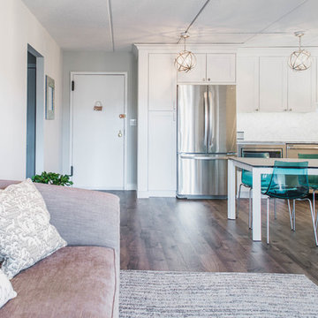
It’s always difficult to add new rooms into existing footprint without expanding out or up and not incurring any opportunity cost. In this case, that was exactly what we had to do. Item one and two above had to be tackled as one. We went ahead and switched out the location of the dining room and eliminating an area where there was a “nook” type eat-in area. By doing so, we were able to cut right into that footprint and change the layout of the kitchen.
That one move allowed us to dig into the kitchen design because it was now the main focal point in the apartment. It was no longer an option to keep it in that tiny hole where it was, so we had to ensure that this design was functional and aesthetically pleasing at the same time. By adding the table into the space where an Island typically would go, we were able to both cut cost and still provide a dining experience. The Table serves as an Island as well when cooking.
We then proceeded to block in the existing doorway to the dining room. By doing this, we were able to create a full room which allowed us to put a door on the other side and called that room Bedroom #2. This was easier to do because all of the mechanicals were already in that space (light, heater and windows). By shifting things around, we also achieved a huge wall to wall closet from inside. PERFECT!
Then we moved into the Single bedroom. We thought it was a big room with a small closet, so by creatively adding an L shaped wall and steal some footprint into the bedroom side, we were able to put a door on that new room and design it for the walk-in closet. Even after this, the bedroom still holds a queen size bed with 2 night stands, a TV on the wall, a sitting chair and plenty of room to walk around. This was done by rethinking the location for the bed and night stands.
The bathroom was gutted to make sure there was no leaks and rebuild from the ground up. We kept all of the plumbing where it was, added a new vanity, medicine cabinet, tiles and lighting and it was done.
From there, the rest of the unit had new flooring all throughout, paint, and lighting. After completion and walk through, this project was handed over back to the clients.
Execution and collaboration between all the trades were: Reggie and his team from Premier Interiors and Rohan from RD Mechanical Services.
p.s. Please see our website to see the video.
Find the right local pro for your project
 RAJ Kitchen and Bath, LLC
 “Full apartment design”.
IF you have not yet seen this apartment conversion before, we strongly urge you to go to the bottom left of this page and click on the short 2-minutes video. It would put a lot of things into perspective when you come back and continue reading this.
It is true we were literally handed the keys and told a list of things that they wanted to have happen and we were to go into the apartment, look at the space and come up with a design that would satisfy all of that need. UNTIL we showed up! The unit had really seen some better days but we knew we had to look past that and come up with a concept that would work for them.
The immediate challenges were centered around 3 big ideas:
1. Adding a second bedroom to the already small footprint
2. Figuring out a way to make the kitchen bigger, better and brighter
3. Creating a master room walk in closet
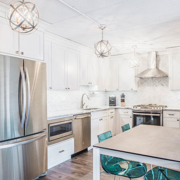
It’s always difficult to add new rooms into existing footprint without expanding out or up and not incurring any opportunity cost. In this case, that was exactly what we had to do. Item one and two above had to be tackled as one. We went ahead and switched out the location of the dining room and eliminating an area where there was a “nook” type eat-in area. By doing so, we were able to cut right into that footprint and change the layout of the kitchen.
That one move allowed us to dig into the kitchen design because it was now the main focal point in the apartment. It was no longer an option to keep it in that tiny hole where it was, so we had to ensure that this design was functional and aesthetically pleasing at the same time. By adding the table into the space where an Island typically would go, we were able to both cut cost and still provide a dining experience. The Table serves as an Island as well when cooking.
We then proceeded to block in the existing doorway to the dining room. By doing this, we were able to create a full room which allowed us to put a door on the other side and called that room Bedroom #2. This was easier to do because all of the mechanicals were already in that space (light, heater and windows). By shifting things around, we also achieved a huge wall to wall closet from inside. PERFECT!
Then we moved into the Single bedroom. We thought it was a big room with a small closet, so by creatively adding an L shaped wall and steal some footprint into the bedroom side, we were able to put a door on that new room and design it for the walk-in closet. Even after this, the bedroom still holds a queen size bed with 2 night stands, a TV on the wall, a sitting chair and plenty of room to walk around. This was done by rethinking the location for the bed and night stands.
The bathroom was gutted to make sure there was no leaks and rebuild from the ground up. We kept all of the plumbing where it was, added a new vanity, medicine cabinet, tiles and lighting and it was done.
From there, the rest of the unit had new flooring all throughout, paint, and lighting. After completion and walk through, this project was handed over back to the clients.
Execution and collaboration between all the trades were: Reggie and his team from Premier Interiors and Rohan from RD Mechanical Services.
p.s. Please see our website to see the video.
 Betsy Bassett Interiors
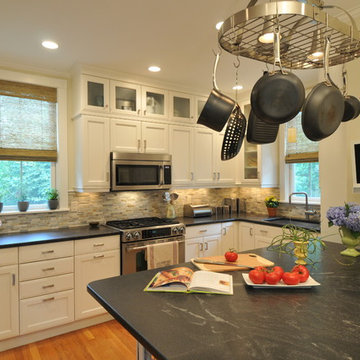
New cabinets were added on top of existing cabinets for additional storage. A custom designed "Dog Den" base cabinet is new home for Maxie and Scout and creates a new L-Shaped kitchen floor plan.
Photo Credit: Betsy Bassett
 RAJ Kitchen and Bath, LLC
 “Full apartment design”.
IF you have not yet seen this apartment conversion before, we strongly urge you to go to the bottom left of this page and click on the short 2-minutes video. It would put a lot of things into perspective when you come back and continue reading this.
It is true we were literally handed the keys and told a list of things that they wanted to have happen and we were to go into the apartment, look at the space and come up with a design that would satisfy all of that need. UNTIL we showed up! The unit had really seen some better days but we knew we had to look past that and come up with a concept that would work for them.
The immediate challenges were centered around 3 big ideas:
1. Adding a second bedroom to the already small footprint
2. Figuring out a way to make the kitchen bigger, better and brighter
3. Creating a master room walk in closet
It’s always difficult to add new rooms into existing footprint without expanding out or up and not incurring any opportunity cost. In this case, that was exactly what we had to do. Item one and two above had to be tackled as one. We went ahead and switched out the location of the dining room and eliminating an area where there was a “nook” type eat-in area. By doing so, we were able to cut right into that footprint and change the layout of the kitchen.
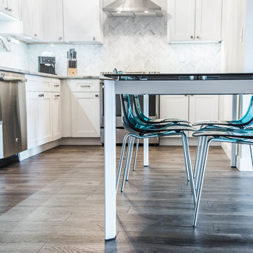
That one move allowed us to dig into the kitchen design because it was now the main focal point in the apartment. It was no longer an option to keep it in that tiny hole where it was, so we had to ensure that this design was functional and aesthetically pleasing at the same time. By adding the table into the space where an Island typically would go, we were able to both cut cost and still provide a dining experience. The Table serves as an Island as well when cooking.
We then proceeded to block in the existing doorway to the dining room. By doing this, we were able to create a full room which allowed us to put a door on the other side and called that room Bedroom #2. This was easier to do because all of the mechanicals were already in that space (light, heater and windows). By shifting things around, we also achieved a huge wall to wall closet from inside. PERFECT!
Then we moved into the Single bedroom. We thought it was a big room with a small closet, so by creatively adding an L shaped wall and steal some footprint into the bedroom side, we were able to put a door on that new room and design it for the walk-in closet. Even after this, the bedroom still holds a queen size bed with 2 night stands, a TV on the wall, a sitting chair and plenty of room to walk around. This was done by rethinking the location for the bed and night stands.
The bathroom was gutted to make sure there was no leaks and rebuild from the ground up. We kept all of the plumbing where it was, added a new vanity, medicine cabinet, tiles and lighting and it was done.
From there, the rest of the unit had new flooring all throughout, paint, and lighting. After completion and walk through, this project was handed over back to the clients.
Execution and collaboration between all the trades were: Reggie and his team from Premier Interiors and Rohan from RD Mechanical Services.
p.s. Please see our website to see the video.
 Castle Building & Remodeling
This beautiful St. Anthony mid-century home needed some major updates to the kitchen and main bathroom. The original 1972 kitchen and bathroom were extremely dark and quirky – an old bidet in the bathroom and cooktop shoved into the corner of the kitchen made it difficult for the homeowners to cook and clean efficiently in both spaces.
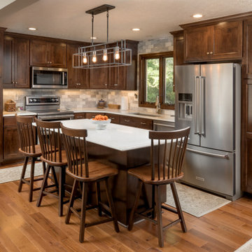
The remodel gave them the opportunity to create a new layout in each of the rooms – the kitchen was opened to the eat-in area, the cooktop was relocated for a better work triangle, and more counter space was added through a small island. Custom bench seats were added to the eat-in area for added storage and character to the kitchen.
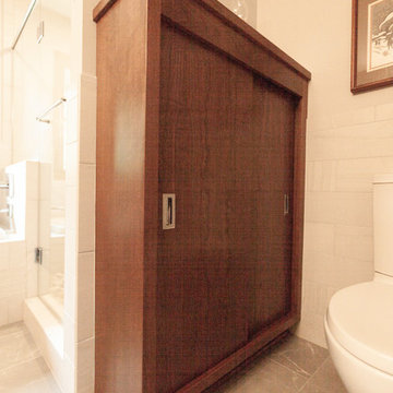
The bathroom was reconfigured to eliminate the old 70’s bidet, and a useless storage cabinet, which allowed us to add a large, walk in shower with bench and a separate soaking tub. The same cabinetry and earthy color palette was used in the bathroom to create cohesion and to emphasize the mid-century character of the home.
What was created is much brighter, more functional and is a timeless yet new space for the homeowners to enjoy as they age in the home.
Sponsored
Plain City, OH

Kuhns Contracting, Inc.
Central Ohio's Trusted Home Remodeler Specializing in Kitchens & Baths
 Hamilton-Gray Design, Inc.
Preview First
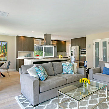
Example of a mid-sized trendy open concept light wood floor family room design in San Diego with beige walls
Example of a mid-sized trendy open concept light wood floor family room design in San Diego with beige walls
 RAJ Kitchen and Bath, LLC
 “Full apartment design”.
IF you have not yet seen this apartment conversion before, we strongly urge you to go to the bottom left of this page and click on the short 2-minutes video. It would put a lot of things into perspective when you come back and continue reading this.
It is true we were literally handed the keys and told a list of things that they wanted to have happen and we were to go into the apartment, look at the space and come up with a design that would satisfy all of that need. UNTIL we showed up! The unit had really seen some better days but we knew we had to look past that and come up with a concept that would work for them.
The immediate challenges were centered around 3 big ideas:
1. Adding a second bedroom to the already small footprint
2. Figuring out a way to make the kitchen bigger, better and brighter
3. Creating a master room walk in closet
It’s always difficult to add new rooms into existing footprint without expanding out or up and not incurring any opportunity cost. In this case, that was exactly what we had to do. Item one and two above had to be tackled as one. We went ahead and switched out the location of the dining room and eliminating an area where there was a “nook” type eat-in area. By doing so, we were able to cut right into that footprint and change the layout of the kitchen.
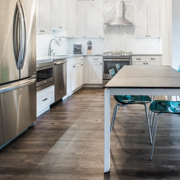
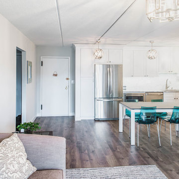
That one move allowed us to dig into the kitchen design because it was now the main focal point in the apartment. It was no longer an option to keep it in that tiny hole where it was, so we had to ensure that this design was functional and aesthetically pleasing at the same time. By adding the table into the space where an Island typically would go, we were able to both cut cost and still provide a dining experience. The Table serves as an Island as well when cooking.
We then proceeded to block in the existing doorway to the dining room. By doing this, we were able to create a full room which allowed us to put a door on the other side and called that room Bedroom #2. This was easier to do because all of the mechanicals were already in that space (light, heater and windows). By shifting things around, we also achieved a huge wall to wall closet from inside. PERFECT!
Then we moved into the Single bedroom. We thought it was a big room with a small closet, so by creatively adding an L shaped wall and steal some footprint into the bedroom side, we were able to put a door on that new room and design it for the walk-in closet. Even after this, the bedroom still holds a queen size bed with 2 night stands, a TV on the wall, a sitting chair and plenty of room to walk around. This was done by rethinking the location for the bed and night stands.
The bathroom was gutted to make sure there was no leaks and rebuild from the ground up. We kept all of the plumbing where it was, added a new vanity, medicine cabinet, tiles and lighting and it was done.
From there, the rest of the unit had new flooring all throughout, paint, and lighting. After completion and walk through, this project was handed over back to the clients.
Execution and collaboration between all the trades were: Reggie and his team from Premier Interiors and Rohan from RD Mechanical Services.
p.s. Please see our website to see the video.
 RAJ Kitchen and Bath, LLC
 “Full apartment design”.
IF you have not yet seen this apartment conversion before, we strongly urge you to go to the bottom left of this page and click on the short 2-minutes video. It would put a lot of things into perspective when you come back and continue reading this.
It is true we were literally handed the keys and told a list of things that they wanted to have happen and we were to go into the apartment, look at the space and come up with a design that would satisfy all of that need. UNTIL we showed up! The unit had really seen some better days but we knew we had to look past that and come up with a concept that would work for them.
The immediate challenges were centered around 3 big ideas:
1. Adding a second bedroom to the already small footprint
2. Figuring out a way to make the kitchen bigger, better and brighter
3. Creating a master room walk in closet
It’s always difficult to add new rooms into existing footprint without expanding out or up and not incurring any opportunity cost. In this case, that was exactly what we had to do. Item one and two above had to be tackled as one. We went ahead and switched out the location of the dining room and eliminating an area where there was a “nook” type eat-in area. By doing so, we were able to cut right into that footprint and change the layout of the kitchen.
That one move allowed us to dig into the kitchen design because it was now the main focal point in the apartment. It was no longer an option to keep it in that tiny hole where it was, so we had to ensure that this design was functional and aesthetically pleasing at the same time. By adding the table into the space where an Island typically would go, we were able to both cut cost and still provide a dining experience. The Table serves as an Island as well when cooking.
We then proceeded to block in the existing doorway to the dining room. By doing this, we were able to create a full room which allowed us to put a door on the other side and called that room Bedroom #2. This was easier to do because all of the mechanicals were already in that space (light, heater and windows). By shifting things around, we also achieved a huge wall to wall closet from inside. PERFECT!
Then we moved into the Single bedroom. We thought it was a big room with a small closet, so by creatively adding an L shaped wall and steal some footprint into the bedroom side, we were able to put a door on that new room and design it for the walk-in closet. Even after this, the bedroom still holds a queen size bed with 2 night stands, a TV on the wall, a sitting chair and plenty of room to walk around. This was done by rethinking the location for the bed and night stands.
The bathroom was gutted to make sure there was no leaks and rebuild from the ground up. We kept all of the plumbing where it was, added a new vanity, medicine cabinet, tiles and lighting and it was done.
From there, the rest of the unit had new flooring all throughout, paint, and lighting. After completion and walk through, this project was handed over back to the clients.
Execution and collaboration between all the trades were: Reggie and his team from Premier Interiors and Rohan from RD Mechanical Services.
p.s. Please see our website to see the video.
 INSPIRED KITCHEN DESIGN
Although Chelsea had a clear kitchen design idea, achieving these results required professional assistance.
“I went into the project having a good sense of the colors and materials I wanted. However, the layout of our kitchen was a struggle. Our kitchen has some difficult design features due to the age of the home. These challenges, coupled with us wanting to save costs on not moving water lines, stumped us. That’s when we decided to work with IKD,” she explains. “With IKD’s great layout and already having many materials selected, we got to the ordering stage quite fast.”
And she quickly adds, the decision paid off.
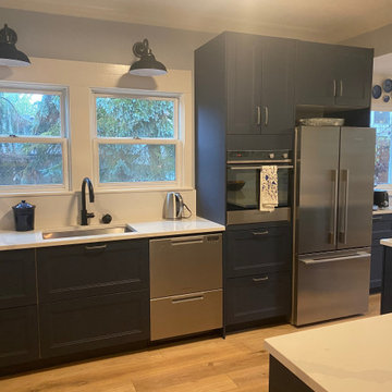
“The designing phase went smoothly. Our designer Florence at IKD suggested moving the fridge next to the oven and this was a tremendous idea. It allowed us to move the stovetop to a new location too, which gave us more counter space in the center of the kitchen and made the eat-in bar a reality. These layout changes have made a world of difference for the flow of the space,” she says.
 Castle Building & Remodeling
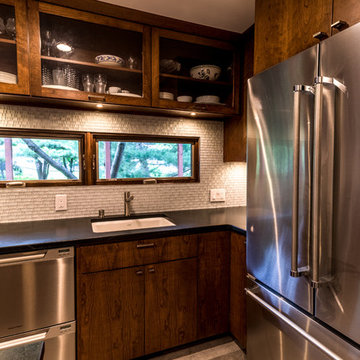
This beautiful St. Anthony mid-century home needed some major updates to the kitchen and main bathroom. The original 1972 kitchen and bathroom were extremely dark and quirky – an old bidet in the bathroom and cooktop shoved into the corner of the kitchen made it difficult for the homeowners to cook and clean efficiently in both spaces.
The remodel gave them the opportunity to create a new layout in each of the rooms – the kitchen was opened to the eat-in area, the cooktop was relocated for a better work triangle, and more counter space was added through a small island. Custom bench seats were added to the eat-in area for added storage and character to the kitchen.
The bathroom was reconfigured to eliminate the old 70’s bidet, and a useless storage cabinet, which allowed us to add a large, walk in shower with bench and a separate soaking tub. The same cabinetry and earthy color palette was used in the bathroom to create cohesion and to emphasize the mid-century character of the home.
What was created is much brighter, more functional and is a timeless yet new space for the homeowners to enjoy as they age in the home.
 Castle Building & Remodeling
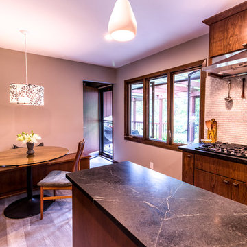
This beautiful St. Anthony, MN mid-century home needed some major updates to the kitchen and main bathroom. The original 1972 kitchen and bathroom were extremely dark and quirky – an old bidet in the bathroom and cooktop shoved into the corner of the kitchen made it difficult for the homeowners to cook and clean efficiently in both spaces. The remodel gave them the opportunity to create a new layout in each of the rooms – the kitchen was opened to the eat-in area, the cooktop was relocated for a better work triangle, and more counter space was added through a small island. Custom bench seats were added to the eat-in area for added storage and character to the kitchen. The bathroom was reconfigured to eliminate the old 70’s bidet, and a useless storage cabinet, which allowed us to add a large, walk in shower with bench and a separate soaking tub. The same cabinetry and earthy color palette was used in the bathroom to create cohesion and to emphasize the mid-century character of the home. What was created is much brighter, more functional and is a timeless yet new space for the homeowners to enjoy as they age in the home.

Sponsored
Columbus, OH

Hope Restoration & General Contracting
Columbus Design-Build, Kitchen & Bath Remodeling, Historic Renovations
 Masters Countertops
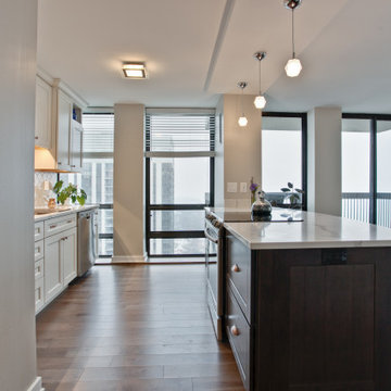
A young professional purchased a 40th floor condo with a stunning view of the lake shore. The tiny galley kitchen was dated and poorly designed. Limited counter space and few cabinets, made this a difficult and uncomfortable place to cook and entertain.
The age and the construction of the building made redesign very challenging. With patience and determination, we overcame each obstacle and created the perfect space for this client’s needs and lifestyle.
The new kitchen is open to the living space and shares its spectacular views. A large island dramatically expanded the cooking area, houses several appliances, adds lots of storage, and serves as the main eating area. The newly designed kitchen is the center piece of this lovely condo.
 Castle Building & Remodeling
This beautiful St. Anthony, MN mid-century home needed some major updates to the kitchen and main bathroom. The original 1972 kitchen and bathroom were extremely dark and quirky – an old bidet in the bathroom and cooktop shoved into the corner of the kitchen made it difficult for the homeowners to cook and clean efficiently in both spaces. The remodel gave them the opportunity to create a new layout in each of the rooms – the kitchen was opened to the eat-in area, the cooktop was relocated for a better work triangle, and more counter space was added through a small island. Custom bench seats were added to the eat-in area for added storage and character to the kitchen. The bathroom was reconfigured to eliminate the old 70’s bidet, and a useless storage cabinet, which allowed us to add a large, walk in shower with bench and a separate soaking tub. The same cabinetry and earthy color palette was used in the bathroom to create cohesion and to emphasize the mid-century character of the home. What was created is much brighter, more functional and is a timeless yet new space for the homeowners to enjoy as they age in the home.
 Lisa Stewart Design
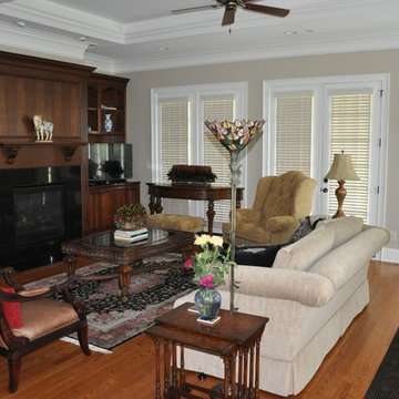
Moving into a new home? Where do your furnishings look and fit the best? Where and what should you purchase new? Downsizing can be even more difficult. How do you get all your cherished belongings to fit? What do you keep and what to you pass onto a new home? I'm here to help. This home was smaller and the homeowners asked me to help make it feel like home and make everything work. Mission accomplished!
 Bon Brise Design, Inc.
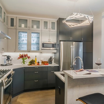
The exceptional functionality of this home is the cornerstone of the kitchen. Behind the modern aesthetic of gray cabinets, contemporary lighting, and sleek fixtures, this kitchen features custom designed drawers and pullouts, a full-height pantry, and a built-in upper cabinet microwave. We encountered an awkwardly-placedwindow on one of the walls, which we transformed into a backlit crystal cabinet. We moved the sink from its original, difficult corner location to the island, where we also installed a trash pullout, a dishwasher, and a wine fridge—all of which were small enough to fit in the limited space. The island also provides space for a small eat-in area with low profile barstools.

 Castle Building & Remodeling
This beautiful St. Anthony mid-century home needed some major updates to the kitchen and main bathroom. The original 1972 kitchen and bathroom were extremely dark and quirky – an old bidet in the bathroom and cooktop shoved into the corner of the kitchen made it difficult for the homeowners to cook and clean efficiently in both spaces.
The remodel gave them the opportunity to create a new layout in each of the rooms – the kitchen was opened to the eat-in area, the cooktop was relocated for a better work triangle, and more counter space was added through a small island. Custom bench seats were added to the eat-in area for added storage and character to the kitchen.
The bathroom was reconfigured to eliminate the old 70’s bidet, and a useless storage cabinet, which allowed us to add a large, walk in shower with bench and a separate soaking tub. The same cabinetry and earthy color palette was used in the bathroom to create cohesion and to emphasize the mid-century character of the home.
What was created is much brighter, more functional and is a timeless yet new space for the homeowners to enjoy as they age in the home.
 Castle Building & Remodeling
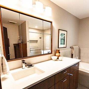
This beautiful St. Anthony mid-century home needed some major updates to the kitchen and main bathroom. The original 1972 kitchen and bathroom were extremely dark and quirky – an old bidet in the bathroom and cooktop shoved into the corner of the kitchen made it difficult for the homeowners to cook and clean efficiently in both spaces.
The remodel gave them the opportunity to create a new layout in each of the rooms – the kitchen was opened to the eat-in area, the cooktop was relocated for a better work triangle, and more counter space was added through a small island. Custom bench seats were added to the eat-in area for added storage and character to the kitchen.
The bathroom was reconfigured to eliminate the old 70’s bidet, and a useless storage cabinet, which allowed us to add a large, walk in shower with bench and a separate soaking tub. The same cabinetry and earthy color palette was used in the bathroom to create cohesion and to emphasize the mid-century character of the home.
What was created is much brighter, more functional and is a timeless yet new space for the homeowners to enjoy as they age in the home.
 Masters Countertops
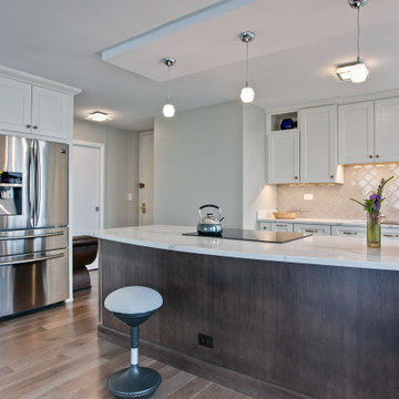
A young professional purchased a 40th floor condo with a stunning view of the lake shore. The tiny galley kitchen was dated and poorly designed. Limited counter space and few cabinets, made this a difficult and uncomfortable place to cook and entertain.
The age and the construction of the building made redesign very challenging. With patience and determination, we overcame each obstacle and created the perfect space for this client’s needs and lifestyle.
The new kitchen is open to the living space and shares its spectacular views. A large island dramatically expanded the cooking area, houses several appliances, adds lots of storage, and serves as the main eating area. The newly designed kitchen is the center piece of this lovely condo.
5