
Search results for "Eat difficult" in Home Design Ideas

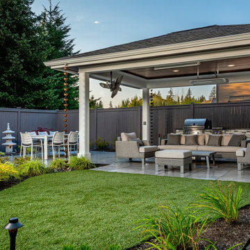
 Alderwood Landscape Architecture and Construction
These clients' small yard had severe drainage issues, making it difficult for their large family to spend time outdoors. After discussing it with Alderwood architects, the family decided synthetic lawn was the best, low maintenance grass-alternative option. The outdoor structure is large enough for year-round entertainment but small enough to provide sky-high access for the rest of the yard.
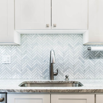
 RAJ Kitchen and Bath, LLC
 “Full apartment design”.
IF you have not yet seen this apartment conversion before, we strongly urge you to go to the bottom left of this page and click on the short 2-minutes video. It would put a lot of things into perspective when you come back and continue reading this.
It is true we were literally handed the keys and told a list of things that they wanted to have happen and we were to go into the apartment, look at the space and come up with a design that would satisfy all of that need. UNTIL we showed up! The unit had really seen some better days but we knew we had to look past that and come up with a concept that would work for them.
The immediate challenges were centered around 3 big ideas:
1. Adding a second bedroom to the already small footprint
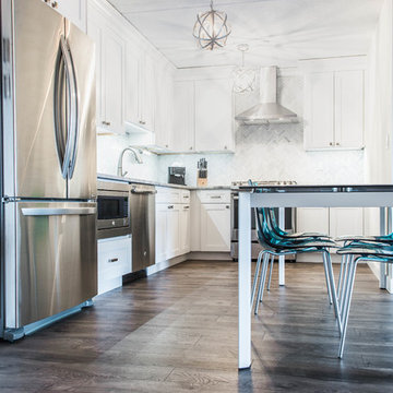
2. Figuring out a way to make the kitchen bigger, better and brighter
3. Creating a master room walk in closet
It’s always difficult to add new rooms into existing footprint without expanding out or up and not incurring any opportunity cost. In this case, that was exactly what we had to do. Item one and two above had to be tackled as one. We went ahead and switched out the location of the dining room and eliminating an area where there was a “nook” type eat-in area. By doing so, we were able to cut right into that footprint and change the layout of the kitchen.
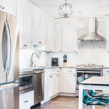
That one move allowed us to dig into the kitchen design because it was now the main focal point in the apartment. It was no longer an option to keep it in that tiny hole where it was, so we had to ensure that this design was functional and aesthetically pleasing at the same time. By adding the table into the space where an Island typically would go, we were able to both cut cost and still provide a dining experience. The Table serves as an Island as well when cooking.
We then proceeded to block in the existing doorway to the dining room. By doing this, we were able to create a full room which allowed us to put a door on the other side and called that room Bedroom #2. This was easier to do because all of the mechanicals were already in that space (light, heater and windows). By shifting things around, we also achieved a huge wall to wall closet from inside. PERFECT!
Then we moved into the Single bedroom. We thought it was a big room with a small closet, so by creatively adding an L shaped wall and steal some footprint into the bedroom side, we were able to put a door on that new room and design it for the walk-in closet. Even after this, the bedroom still holds a queen size bed with 2 night stands, a TV on the wall, a sitting chair and plenty of room to walk around. This was done by rethinking the location for the bed and night stands.
The bathroom was gutted to make sure there was no leaks and rebuild from the ground up. We kept all of the plumbing where it was, added a new vanity, medicine cabinet, tiles and lighting and it was done.
From there, the rest of the unit had new flooring all throughout, paint, and lighting. After completion and walk through, this project was handed over back to the clients.
Execution and collaboration between all the trades were: Reggie and his team from Premier Interiors and Rohan from RD Mechanical Services.
p.s. Please see our website to see the video.
Find the right local pro for your project
 RAJ Kitchen and Bath, LLC
 “Full apartment design”.
IF you have not yet seen this apartment conversion before, we strongly urge you to go to the bottom left of this page and click on the short 2-minutes video. It would put a lot of things into perspective when you come back and continue reading this.
It is true we were literally handed the keys and told a list of things that they wanted to have happen and we were to go into the apartment, look at the space and come up with a design that would satisfy all of that need. UNTIL we showed up! The unit had really seen some better days but we knew we had to look past that and come up with a concept that would work for them.
The immediate challenges were centered around 3 big ideas:
1. Adding a second bedroom to the already small footprint
2. Figuring out a way to make the kitchen bigger, better and brighter
3. Creating a master room walk in closet
It’s always difficult to add new rooms into existing footprint without expanding out or up and not incurring any opportunity cost. In this case, that was exactly what we had to do. Item one and two above had to be tackled as one. We went ahead and switched out the location of the dining room and eliminating an area where there was a “nook” type eat-in area. By doing so, we were able to cut right into that footprint and change the layout of the kitchen.
That one move allowed us to dig into the kitchen design because it was now the main focal point in the apartment. It was no longer an option to keep it in that tiny hole where it was, so we had to ensure that this design was functional and aesthetically pleasing at the same time. By adding the table into the space where an Island typically would go, we were able to both cut cost and still provide a dining experience. The Table serves as an Island as well when cooking.
We then proceeded to block in the existing doorway to the dining room. By doing this, we were able to create a full room which allowed us to put a door on the other side and called that room Bedroom #2. This was easier to do because all of the mechanicals were already in that space (light, heater and windows). By shifting things around, we also achieved a huge wall to wall closet from inside. PERFECT!
Then we moved into the Single bedroom. We thought it was a big room with a small closet, so by creatively adding an L shaped wall and steal some footprint into the bedroom side, we were able to put a door on that new room and design it for the walk-in closet. Even after this, the bedroom still holds a queen size bed with 2 night stands, a TV on the wall, a sitting chair and plenty of room to walk around. This was done by rethinking the location for the bed and night stands.
The bathroom was gutted to make sure there was no leaks and rebuild from the ground up. We kept all of the plumbing where it was, added a new vanity, medicine cabinet, tiles and lighting and it was done.
From there, the rest of the unit had new flooring all throughout, paint, and lighting. After completion and walk through, this project was handed over back to the clients.
Execution and collaboration between all the trades were: Reggie and his team from Premier Interiors and Rohan from RD Mechanical Services.
p.s. Please see our website to see the video.
 Castle Building & Remodeling
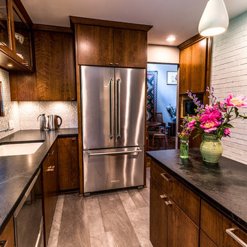
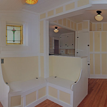
This beautiful St. Anthony, MN mid-century home needed some major updates to the kitchen and main bathroom. The original 1972 kitchen and bathroom were extremely dark and quirky – an old bidet in the bathroom and cooktop shoved into the corner of the kitchen made it difficult for the homeowners to cook and clean efficiently in both spaces. The remodel gave them the opportunity to create a new layout in each of the rooms – the kitchen was opened to the eat-in area, the cooktop was relocated for a better work triangle, and more counter space was added through a small island. Custom bench seats were added to the eat-in area for added storage and character to the kitchen. The bathroom was reconfigured to eliminate the old 70’s bidet, and a useless storage cabinet, which allowed us to add a large, walk in shower with bench and a separate soaking tub. The same cabinetry and earthy color palette was used in the bathroom to create cohesion and to emphasize the mid-century character of the home. What was created is much brighter, more functional and is a timeless yet new space for the homeowners to enjoy as they age in the home.
 US Kitchens & Baths
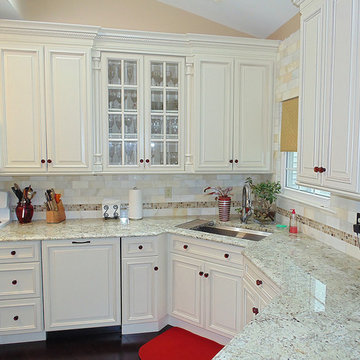
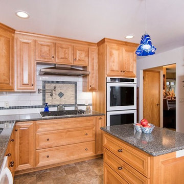
The corner sink base was turned on a 45 degree angle and recessed 3" to better utilize a small, difficult space and allow for extra counter space; glass tile backsplash and trim, raised panel cabinets and mullion beveled glass doors.
 Masters Countertops
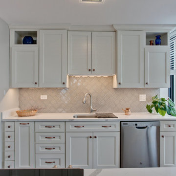
A young professional purchased a 40th floor condo with a stunning view of the lake shore. The tiny galley kitchen was dated and poorly designed. Limited counter space and few cabinets, made this a difficult and uncomfortable place to cook and entertain.
The age and the construction of the building made redesign very challenging. With patience and determination, we overcame each obstacle and created the perfect space for this client’s needs and lifestyle.
The new kitchen is open to the living space and shares its spectacular views. A large island dramatically expanded the cooking area, houses several appliances, adds lots of storage, and serves as the main eating area. The newly designed kitchen is the center piece of this lovely condo.

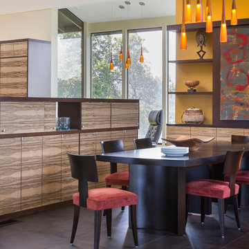
 Lindy Small Architecture
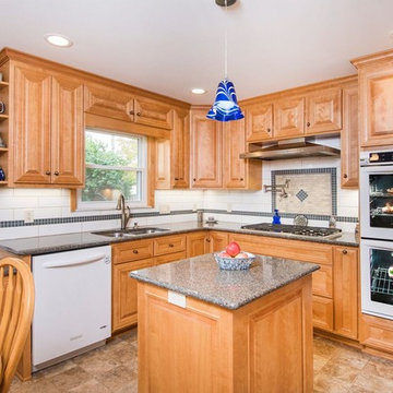
Kitchens are seductive when photographed and published, as colors are coordinated, fruit and flowers arranged, clutter removed, lighting just so. What is difficult to tell from glossy images is how well a kitchen really works.
The East Bay Kitchen for a Cook is an excellent example of a kitchen that really works. It is a kitchen for an accomplished cook. It is also a kitchen that is independent yet connected to a formal dining room, a kitchen with an informal ‘cafe nook’, and a kitchen ideal for a couple as well as a crowd. It is a true working kitchen for all occasions.
There are many things to take into account when designing a kitchen - surfaces, materials, storage, circulation, spatial relationships, natural light. These are all important considerations in designing a kitchen.
What is equally important in designing a kitchen is how a person works in a kitchen, and generally, what their kitchen is all about. Is it a kitchen for one or more cooks? Is there a ‘mess factor’ that the client wants to hide? Does the kitchen function purely as a kitchen or as a social center, or both? What is the relationship of the kitchen to adjacent rooms, and if there is a separate dining room, how does the circulation work between the two? For a kitchen to really work well, each one of these items need to be addressed and resolved. There are no generalized correct answers to any of these questions, only a correct answer for each individual cook.
The original Kitchen for a Cook was small, dark, and cramped, with no connection to the dining room, which was the main eating area. A discourse began between the architect and the client, centered on how the client works in her kitchen and the desired relationship between the kitchen and dining room, which would remain the primary eating area in the renovated kitchen. Other important considerations were how to incorporate an informal ‘café nook’ in the kitchen, and how to have an easy circulation between kitchen and dining area, for both people and food.
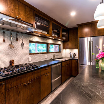 Castle Building & Remodeling
This beautiful St. Anthony, MN mid-century home needed some major updates to the kitchen and main bathroom. The original 1972 kitchen and bathroom were extremely dark and quirky – an old bidet in the bathroom and cooktop shoved into the corner of the kitchen made it difficult for the homeowners to cook and clean efficiently in both spaces. The remodel gave them the opportunity to create a new layout in each of the rooms – the kitchen was opened to the eat-in area, the cooktop was relocated for a better work triangle, and more counter space was added through a small island. Custom bench seats were added to the eat-in area for added storage and character to the kitchen. The bathroom was reconfigured to eliminate the old 70’s bidet, and a useless storage cabinet, which allowed us to add a large, walk in shower with bench and a separate soaking tub. The same cabinetry and earthy color palette was used in the bathroom to create cohesion and to emphasize the mid-century character of the home. What was created is much brighter, more functional and is a timeless yet new space for the homeowners to enjoy as they age in the home.
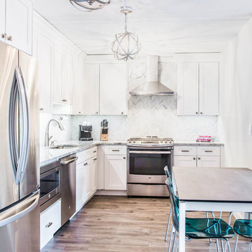 RAJ Kitchen and Bath, LLC
 “Full apartment design”.
IF you have not yet seen this apartment conversion before, we strongly urge you to go to the bottom left of this page and click on the short 2-minutes video. It would put a lot of things into perspective when you come back and continue reading this.
It is true we were literally handed the keys and told a list of things that they wanted to have happen and we were to go into the apartment, look at the space and come up with a design that would satisfy all of that need. UNTIL we showed up! The unit had really seen some better days but we knew we had to look past that and come up with a concept that would work for them.
The immediate challenges were centered around 3 big ideas:
1. Adding a second bedroom to the already small footprint
2. Figuring out a way to make the kitchen bigger, better and brighter
3. Creating a master room walk in closet
It’s always difficult to add new rooms into existing footprint without expanding out or up and not incurring any opportunity cost. In this case, that was exactly what we had to do. Item one and two above had to be tackled as one. We went ahead and switched out the location of the dining room and eliminating an area where there was a “nook” type eat-in area. By doing so, we were able to cut right into that footprint and change the layout of the kitchen.
That one move allowed us to dig into the kitchen design because it was now the main focal point in the apartment. It was no longer an option to keep it in that tiny hole where it was, so we had to ensure that this design was functional and aesthetically pleasing at the same time. By adding the table into the space where an Island typically would go, we were able to both cut cost and still provide a dining experience. The Table serves as an Island as well when cooking.
We then proceeded to block in the existing doorway to the dining room. By doing this, we were able to create a full room which allowed us to put a door on the other side and called that room Bedroom #2. This was easier to do because all of the mechanicals were already in that space (light, heater and windows). By shifting things around, we also achieved a huge wall to wall closet from inside. PERFECT!
Then we moved into the Single bedroom. We thought it was a big room with a small closet, so by creatively adding an L shaped wall and steal some footprint into the bedroom side, we were able to put a door on that new room and design it for the walk-in closet. Even after this, the bedroom still holds a queen size bed with 2 night stands, a TV on the wall, a sitting chair and plenty of room to walk around. This was done by rethinking the location for the bed and night stands.
The bathroom was gutted to make sure there was no leaks and rebuild from the ground up. We kept all of the plumbing where it was, added a new vanity, medicine cabinet, tiles and lighting and it was done.
From there, the rest of the unit had new flooring all throughout, paint, and lighting. After completion and walk through, this project was handed over back to the clients.
Execution and collaboration between all the trades were: Reggie and his team from Premier Interiors and Rohan from RD Mechanical Services.
p.s. Please see our website to see the video.
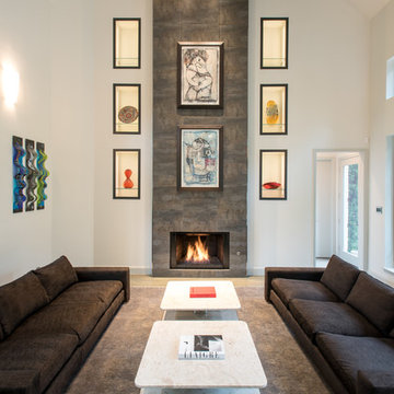
 Kasper Custom Home Remodeling
This shot of the formal living room provides a more intimate view of the seating area and adjacent art. All this room needs is a fine wine, a charcuterie board, and a few friends to make it feel complete.
Designer: Debra Owens
Photographer: Michael Hunter
 Thompson Remodeling
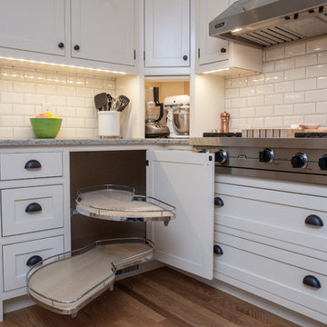
The kitchen in this 1950’s home needed a complete overhaul. It was dark, outdated and inefficient.
The homeowners wanted to give the space a modern feel without losing the 50’s vibe that is consistent throughout the rest of the home.
The homeowner’s needs included:
- Working within a fixed space, though reconfiguring or moving walls was okay
- Incorporating work space for two chefs
- Creating a mudroom
- Maintaining the existing laundry chute
- A concealed trash receptacle
The new kitchen makes use of every inch of space. To maximize counter and cabinet space, we closed in a second exit door and removed a wall between the kitchen and family room. This allowed us to create two L shaped workspaces and an eat-in bar space. A new mudroom entrance was gained by capturing space from an existing closet next to the main exit door.
The industrial lighting fixtures and wrought iron hardware bring a modern touch to this retro space. Inset doors on cabinets and beadboard details replicate details found throughout the rest of this 50’s era house.

 RAJ Kitchen and Bath, LLC
 “Full apartment design”.
IF you have not yet seen this apartment conversion before, we strongly urge you to go to the bottom left of this page and click on the short 2-minutes video. It would put a lot of things into perspective when you come back and continue reading this.
It is true we were literally handed the keys and told a list of things that they wanted to have happen and we were to go into the apartment, look at the space and come up with a design that would satisfy all of that need. UNTIL we showed up! The unit had really seen some better days but we knew we had to look past that and come up with a concept that would work for them.
The immediate challenges were centered around 3 big ideas:
1. Adding a second bedroom to the already small footprint
2. Figuring out a way to make the kitchen bigger, better and brighter
3. Creating a master room walk in closet
It’s always difficult to add new rooms into existing footprint without expanding out or up and not incurring any opportunity cost. In this case, that was exactly what we had to do. Item one and two above had to be tackled as one. We went ahead and switched out the location of the dining room and eliminating an area where there was a “nook” type eat-in area. By doing so, we were able to cut right into that footprint and change the layout of the kitchen.
That one move allowed us to dig into the kitchen design because it was now the main focal point in the apartment. It was no longer an option to keep it in that tiny hole where it was, so we had to ensure that this design was functional and aesthetically pleasing at the same time. By adding the table into the space where an Island typically would go, we were able to both cut cost and still provide a dining experience. The Table serves as an Island as well when cooking.
We then proceeded to block in the existing doorway to the dining room. By doing this, we were able to create a full room which allowed us to put a door on the other side and called that room Bedroom #2. This was easier to do because all of the mechanicals were already in that space (light, heater and windows). By shifting things around, we also achieved a huge wall to wall closet from inside. PERFECT!
Then we moved into the Single bedroom. We thought it was a big room with a small closet, so by creatively adding an L shaped wall and steal some footprint into the bedroom side, we were able to put a door on that new room and design it for the walk-in closet. Even after this, the bedroom still holds a queen size bed with 2 night stands, a TV on the wall, a sitting chair and plenty of room to walk around. This was done by rethinking the location for the bed and night stands.
The bathroom was gutted to make sure there was no leaks and rebuild from the ground up. We kept all of the plumbing where it was, added a new vanity, medicine cabinet, tiles and lighting and it was done.
From there, the rest of the unit had new flooring all throughout, paint, and lighting. After completion and walk through, this project was handed over back to the clients.
Execution and collaboration between all the trades were: Reggie and his team from Premier Interiors and Rohan from RD Mechanical Services.
p.s. Please see our website to see the video.
 Castle Building & Remodeling
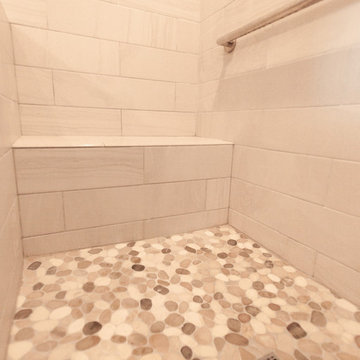
This beautiful St. Anthony mid-century home needed some major updates to the kitchen and main bathroom. The original 1972 kitchen and bathroom were extremely dark and quirky – an old bidet in the bathroom and cooktop shoved into the corner of the kitchen made it difficult for the homeowners to cook and clean efficiently in both spaces.
The remodel gave them the opportunity to create a new layout in each of the rooms – the kitchen was opened to the eat-in area, the cooktop was relocated for a better work triangle, and more counter space was added through a small island. Custom bench seats were added to the eat-in area for added storage and character to the kitchen.
The bathroom was reconfigured to eliminate the old 70’s bidet, and a useless storage cabinet, which allowed us to add a large, walk in shower with bench and a separate soaking tub. The same cabinetry and earthy color palette was used in the bathroom to create cohesion and to emphasize the mid-century character of the home.
What was created is much brighter, more functional and is a timeless yet new space for the homeowners to enjoy as they age in the home.
 J.S. Brown & Co.
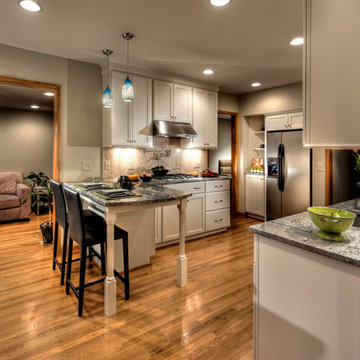
Remodel by J.S. Brown & Co.
Designed by Monica Lewis, CMKBD, MCR, UDCP
Photography by Michael Houghton
Countertop: 3cm Scottish Meadows granite
Cabinetry: Soft White Painted Maple by Shiloh
Sink: Blanco Metallic Grey undermount sink
Faucet: Kohler Forte, Vibrant Stainless Steel
Backsplash Tile: 12"x12" Walker Zanger Gascogne tile with Hydroment Misty Grey grout
 RAJ Kitchen and Bath, LLC
 “Full apartment design”.
IF you have not yet seen this apartment conversion before, we strongly urge you to go to the bottom left of this page and click on the short 2-minutes video. It would put a lot of things into perspective when you come back and continue reading this.
It is true we were literally handed the keys and told a list of things that they wanted to have happen and we were to go into the apartment, look at the space and come up with a design that would satisfy all of that need. UNTIL we showed up! The unit had really seen some better days but we knew we had to look past that and come up with a concept that would work for them.
The immediate challenges were centered around 3 big ideas:
1. Adding a second bedroom to the already small footprint
2. Figuring out a way to make the kitchen bigger, better and brighter
3. Creating a master room walk in closet
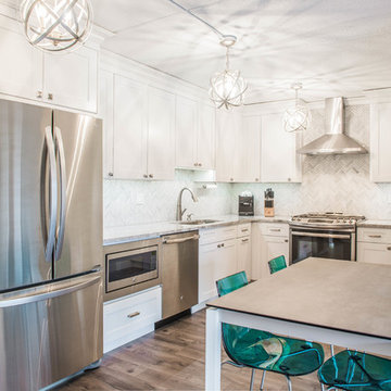
It’s always difficult to add new rooms into existing footprint without expanding out or up and not incurring any opportunity cost. In this case, that was exactly what we had to do. Item one and two above had to be tackled as one. We went ahead and switched out the location of the dining room and eliminating an area where there was a “nook” type eat-in area. By doing so, we were able to cut right into that footprint and change the layout of the kitchen.
That one move allowed us to dig into the kitchen design because it was now the main focal point in the apartment. It was no longer an option to keep it in that tiny hole where it was, so we had to ensure that this design was functional and aesthetically pleasing at the same time. By adding the table into the space where an Island typically would go, we were able to both cut cost and still provide a dining experience. The Table serves as an Island as well when cooking.
We then proceeded to block in the existing doorway to the dining room. By doing this, we were able to create a full room which allowed us to put a door on the other side and called that room Bedroom #2. This was easier to do because all of the mechanicals were already in that space (light, heater and windows). By shifting things around, we also achieved a huge wall to wall closet from inside. PERFECT!
Then we moved into the Single bedroom. We thought it was a big room with a small closet, so by creatively adding an L shaped wall and steal some footprint into the bedroom side, we were able to put a door on that new room and design it for the walk-in closet. Even after this, the bedroom still holds a queen size bed with 2 night stands, a TV on the wall, a sitting chair and plenty of room to walk around. This was done by rethinking the location for the bed and night stands.
The bathroom was gutted to make sure there was no leaks and rebuild from the ground up. We kept all of the plumbing where it was, added a new vanity, medicine cabinet, tiles and lighting and it was done.
From there, the rest of the unit had new flooring all throughout, paint, and lighting. After completion and walk through, this project was handed over back to the clients.
Execution and collaboration between all the trades were: Reggie and his team from Premier Interiors and Rohan from RD Mechanical Services.
p.s. Please see our website to see the video.

 Castle Building & Remodeling
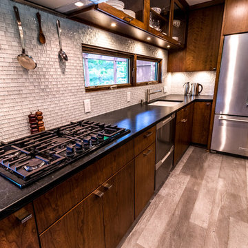
This beautiful St. Anthony, MN mid-century home needed some major updates to the kitchen and main bathroom. The original 1972 kitchen and bathroom were extremely dark and quirky – an old bidet in the bathroom and cooktop shoved into the corner of the kitchen made it difficult for the homeowners to cook and clean efficiently in both spaces. The remodel gave them the opportunity to create a new layout in each of the rooms – the kitchen was opened to the eat-in area, the cooktop was relocated for a better work triangle, and more counter space was added through a small island. Custom bench seats were added to the eat-in area for added storage and character to the kitchen. The bathroom was reconfigured to eliminate the old 70’s bidet, and a useless storage cabinet, which allowed us to add a large, walk in shower with bench and a separate soaking tub. The same cabinetry and earthy color palette was used in the bathroom to create cohesion and to emphasize the mid-century character of the home. What was created is much brighter, more functional and is a timeless yet new space for the homeowners to enjoy as they age in the home.
 INSPIRED KITCHEN DESIGN
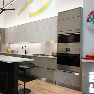
After initially attempting to go it alone, Charmaine hired IKD to lay out her IKEA kitchen. “It was difficult for me to envision how our kitchen would look using the IKEA Kitchen Planner. It just looked like boxes to me. I wanted to have a full kitchen rendering and that was why we chose IKD. We wanted to see how our kitchen would look and [see] other ways we can configure our cabinet sizes,” she says. She continues: “The price was so affordable and IKD really moved quickly with our design to meet the kitchen sales deadline.
 RAJ Kitchen and Bath, LLC
 “Full apartment design”.
IF you have not yet seen this apartment conversion before, we strongly urge you to go to the bottom left of this page and click on the short 2-minutes video. It would put a lot of things into perspective when you come back and continue reading this.
It is true we were literally handed the keys and told a list of things that they wanted to have happen and we were to go into the apartment, look at the space and come up with a design that would satisfy all of that need. UNTIL we showed up! The unit had really seen some better days but we knew we had to look past that and come up with a concept that would work for them.
The immediate challenges were centered around 3 big ideas:
1. Adding a second bedroom to the already small footprint
2. Figuring out a way to make the kitchen bigger, better and brighter
3. Creating a master room walk in closet
It’s always difficult to add new rooms into existing footprint without expanding out or up and not incurring any opportunity cost. In this case, that was exactly what we had to do. Item one and two above had to be tackled as one. We went ahead and switched out the location of the dining room and eliminating an area where there was a “nook” type eat-in area. By doing so, we were able to cut right into that footprint and change the layout of the kitchen.
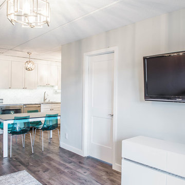
That one move allowed us to dig into the kitchen design because it was now the main focal point in the apartment. It was no longer an option to keep it in that tiny hole where it was, so we had to ensure that this design was functional and aesthetically pleasing at the same time. By adding the table into the space where an Island typically would go, we were able to both cut cost and still provide a dining experience. The Table serves as an Island as well when cooking.
We then proceeded to block in the existing doorway to the dining room. By doing this, we were able to create a full room which allowed us to put a door on the other side and called that room Bedroom #2. This was easier to do because all of the mechanicals were already in that space (light, heater and windows). By shifting things around, we also achieved a huge wall to wall closet from inside. PERFECT!
Then we moved into the Single bedroom. We thought it was a big room with a small closet, so by creatively adding an L shaped wall and steal some footprint into the bedroom side, we were able to put a door on that new room and design it for the walk-in closet. Even after this, the bedroom still holds a queen size bed with 2 night stands, a TV on the wall, a sitting chair and plenty of room to walk around. This was done by rethinking the location for the bed and night stands.
The bathroom was gutted to make sure there was no leaks and rebuild from the ground up. We kept all of the plumbing where it was, added a new vanity, medicine cabinet, tiles and lighting and it was done.
From there, the rest of the unit had new flooring all throughout, paint, and lighting. After completion and walk through, this project was handed over back to the clients.
Execution and collaboration between all the trades were: Reggie and his team from Premier Interiors and Rohan from RD Mechanical Services.
p.s. Please see our website to see the video.
4