
Search results for "Edition many times" in Home Design Ideas
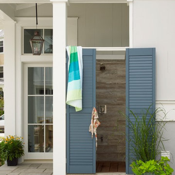
 Our Town Plans
Courtesy Coastal Living, a division of the Time Inc. Lifestyle Group, photography by Tria Giovan. Coastal Living is a registered trademark of Time Inc. and is used with permission.
 Adrienne DeRosa
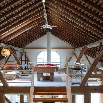
From the doorway of the master bedroom, the entertainment loft appears to hover over the living space below.
Franklin took advantage of the existing hay track in the peak of the ceiling, using it to conceal wiring needed to run the fan and lights. In order to preserve the quality of the ceiling, the architect covered the original slats with 6" insulated panels (SIP's).
While his children were younger, Franklin recognized the need to child-proof the space. "I installed Plexiglas on all the railings so the kids couldn’t climb over them when they were very small," he explains. While some of the sheeting was removed over time, Franklin laughs, " The Plexiglas on the railings by the pool table will always stay since we are so bad at pool! Too many balls fly off the table and could injure someone in the gathering room below."
Adrienne DeRosa Photography
 Susan Yeley Homes
Nearly two decades ago now, Susan and her husband put a letter in the mailbox of this eastside home: "If you have any interest in selling, please reach out." But really, who would give up a Flansburgh House?
Fast forward to 2020, when the house went on the market! By then it was clear that three children and a busy home design studio couldn't be crammed into this efficient footprint. But what's second best to moving into your dream home? Being asked to redesign the functional core for the family that was.
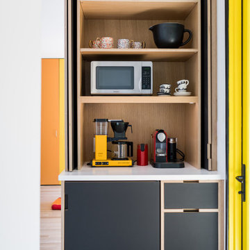
In this classic Flansburgh layout, all the rooms align tidily in a square around a central hall and open air atrium. As such, all the spaces are both connected to one another and also private; and all allow for visual access to the outdoors in two directions—toward the atrium and toward the exterior. All except, in this case, the utilitarian galley kitchen. That space, oft-relegated to second class in midcentury architecture, got the shaft, with narrow doorways on two ends and no good visual access to the atrium or the outside. Who spends time in the kitchen anyway?
As is often the case with even the very best midcentury architecture, the kitchen at the Flansburgh House needed to be modernized; appliances and cabinetry have come a long way since 1970, but our culture has evolved too, becoming more casual and open in ways we at SYH believe are here to stay. People (gasp!) do spend time—lots of time!—in their kitchens! Nonetheless, our goal was to make this kitchen look as if it had been designed this way by Earl Flansburgh himself.
The house came to us full of bold, bright color. We edited out some of it (along with the walls it was on) but kept and built upon the stunning red, orange and yellow closet doors in the family room adjacent to the kitchen. That pop was balanced by a few colorful midcentury pieces that our clients already owned, and the stunning light and verdant green coming in from both the atrium and the perimeter of the house, not to mention the many skylights. Thus, the rest of the space just needed to quiet down and be a beautiful, if neutral, foil. White terrazzo tile grounds custom plywood and black cabinetry, offset by a half wall that offers both camouflage for the cooking mess and also storage below, hidden behind seamless oak tambour.
Contractor: Rusty Peterson
Cabinetry: Stoll's Woodworking
Photographer: Sarah Shields
Find the right local pro for your project
 Klopf Architecture
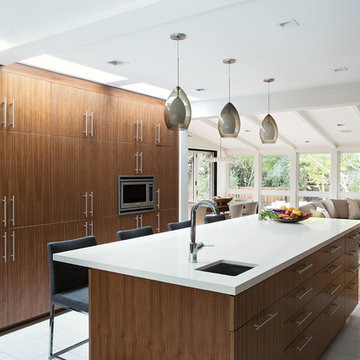
The owners of this property had been away from the Bay Area for many years, and looked forward to returning to an elegant mid-century modern house. The one they bought was anything but that. Faced with a “remuddled” kitchen from one decade, a haphazard bedroom / family room addition from another, and an otherwise disjointed and generally run-down mid-century modern house, the owners asked Klopf Architecture and Envision Landscape Studio to re-imagine this house and property as a unified, flowing, sophisticated, warm, modern indoor / outdoor living space for a family of five.
Opening up the spaces internally and from inside to out was the first order of business. The formerly disjointed eat-in kitchen with 7 foot high ceilings were opened up to the living room, re-oriented, and replaced with a spacious cook's kitchen complete with a row of skylights bringing light into the space. Adjacent the living room wall was completely opened up with La Cantina folding door system, connecting the interior living space to a new wood deck that acts as a continuation of the wood floor. People can flow from kitchen to the living / dining room and the deck seamlessly, making the main entertainment space feel at once unified and complete, and at the same time open and limitless.
Klopf opened up the bedroom with a large sliding panel, and turned what was once a large walk-in closet into an office area, again with a large sliding panel. The master bathroom has high windows all along one wall to bring in light, and a large wet room area for the shower and tub. The dark, solid roof structure over the patio was replaced with an open trellis that allows plenty of light, brightening the new deck area as well as the interior of the house.
All the materials of the house were replaced, apart from the framing and the ceiling boards. This allowed Klopf to unify the materials from space to space, running the same wood flooring throughout, using the same paint colors, and generally creating a consistent look from room to room. Located in Lafayette, CA this remodeled single-family house is 3,363 square foot, 4 bedroom, and 3.5 bathroom.
Klopf Architecture Project Team: John Klopf, AIA, Jackie Detamore, and Jeffrey Prose
Landscape Design: Envision Landscape Studio
Structural Engineer: Brian Dotson Consulting Engineers
Contractor: Kasten Builders
Photography ©2015 Mariko Reed
Staging: The Design Shop
Location: Lafayette, CA
Year completed: 2014
 Advance Design Studio, Ltd.
Jennifer and Dan have lived in their Deer Park Illinois home for 15 years, slowly making minor fixes like painting and decorating; but they had a new plan for their kitchen the entire time. An awkwardly placed garage door, and an island cooktop with a terrible downdraft made a full-scale kitchen remodel an absolute must. Jennifer had many ideas in mind and wanted to work with a company that could provide high-end work, while partnering with a designer that would tailor the kitchen to her ideas.
She was intrigued by the phrase “Common Sense Remodeling” in Advance Design’s feature she discovered while perusing an issue of the community’s Quintessential Barrington Magazine. Doing further research on the company’s website, as she looked through project profiles and read about Advance Design’s “Common Sense Remodeling” philosophy, she promptly scheduled an appointment to see if the people and ideas she read about were truly who they said they were. The more she read, the more she knew that the “Common Sense” approach to remodeling they described was exactly the type of company she was looking for.
The partnership was sealed after an initial consultation with Owner Todd Jurs and Project Designer Michelle Lecinski. They displayed a combination of friendliness, professionalism and respect that was unmatched by any of the other companies Jennifer talked to. She knew that with Advance Design, she would be able to retain the vision that she had in mind with high-quality craftsmanship.
“I reached out to Advance Design because of the ‘Common Sense Remodeling’ tagline,” Jennifer said. “That’s what lingered for me”. “Advance Design was the most respectful- of the house and of my design ideas, and the most professional of the handful of companies that looked at my project”.
Soon after the meeting Jennifer began working with Michelle on the project design. They quickly developed chemistry. Jennifer loved how Michelle researched and located every detail that Jennifer wanted for the kitchen. Between the two of them, every concept and idea was worked through and perfected. “Jennifer had definite ideas about what she wanted the new kitchen to look like, she just didn’t know how to bring it all together. We worked together really well to make her ideas into the practical reality necessary for a well-functioning kitchen, with the look and feel that she had envisioned”, says Michelle.
“Michelle was wonderful in using the CAD system she would show me new drawings every time we changed the layout while working through the design,” Jennifer said. “She was a really wonderful partner in execution, she made sure everything happened quickly and easily.”
The finished design drew out elements of Jennifer’s style and personality. The pair call the look “sophisticated farmhouse” to describe the kitchen renovation to family and friends. The result was a beautifully crafted, authentic-feeling space that satisfied Jennifer’s dreams 15 years in the making. The whole project consisted of a kitchen remodel, mudroom upgrade with powder room, and garage entry relocation. “The projects I personally like the best, are the ones that put the client’s dreams on display,” Project Designer Michelle said. “And this is one of those projects.”
The main focal point of the kitchen is custom zinc and brass ventilation hood with a vintage sheen, which was hand made to order by a small company in Indiana named Vogler Metalworking. “It’s like sculpture, a true work of art”, says Jennifer. Your eye is immediately drawn towards this elegant yet practical hood that eliminated the home’s downdraft problem and added a striking conversation piece at the same time. The carpenters had to use special gloves when transporting and installing it, so they didn’t smudge it with fingerprints. The beautiful hood centers proudly over the stunning black enamel and brass LaCornue Range. “I had a friend who had a LaCornue range and after learning how easy it was to cook perfect meals, I was convinced I wanted to have one”, says Jennifer. This unique, breathtaking combination anchors the entire kitchen and is apparent immediately as you walk into the great room the surrounds the space.
DuraSupreme Crestwood cabinets with a Kendall Panel add function and sophistication. A custom gray paint color paired with a storm blue was developed so that the new kitchen looked like it belonged to the existing space. Unlacquered brass faucets and hardware were important to Jennifer because she wanted the living finishes to age over time. Remarkable brass diamond mesh cabinet door inserts imported from the UK continue to add this one-of-a-kind kitchen renovation; giving it a “you won’t see this everywhere” quality. The use of old railcar flooring for the coffee bar countertop and reclaimed oak for the open shelving gives an authenticity to the space uncommon in kitchens today.
Jennifer and Michelle fell in love with the Limestone Grey Stone while they were investigating unique island countertop ideas. They liked the fact that the limestone as a living finish will age and change over time. Calcutta Miel Quartz countertops made for an excellent pairing around the perimeter, as it’s durable and perfect for cooking preparations. A textured white subway tile backsplash that runs to the ceiling keeps your eye moving towards the open shelving, and to the main focal point of the stunning range hood combination.
“The kitchen functions beautifully, and it’s gorgeous,” beams Jennifer as she gestures with both hands while smiling ear to ear. “The most important thing was I wanted a kitchen that had a wonderful flow, cooked beautiful meals and was a great gathering place for family and friends, and this space does that perfectly! Beauty wise, it turned out exactly how I had envisioned. I felt the function part was the hardest part, and that was nailed”!
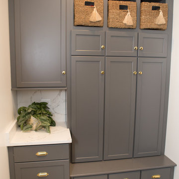
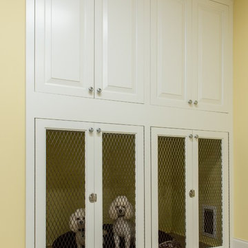
Relocating the garage entry to the new mudroom was a huge priority and has finally separated the family’s arriving home functions from their kitchen. Now coats and shoes and bags have their own area for dropping once members arrive home. Matching gray DuraSupreme cabinetry helped create gorgeous, purposeful lockers for the family. A reclaimed vintage sink and custom wall paper were added to the tiny powder room to beautify the once previously only functional space. Advance Design was even able to create a custom space for their dog to sleep while the family is away.
“It was unbelievable that a project of this size was completed in such a short time, and I think that’s because of the large amount of planning and preparation that went into it,” Jennifer marveled, “When we started, we were ready, and everything was prepared”.
When it came to execution, Project Manager Justin Davis and his crew were quick, accessible, and organized. Projects like this kitchen are typically completed in as little as 8-10 weeks. Jennifer’s kitchen however despite the relocation of some challenging HVAC in a soffit and moving of an exterior door was completed remarkably fast in part because the team was working with an existing tile floor that ran throughout the first floor that the client really loved.
“You get to know these people really well because they’re living in your house while you’re living in your house. They were so fast and really good, it didn’t take as long as even planned” reported Jennifer. “I would text Justin and he always responded almost immediately. I got to know all the guys who were working in our house and they were all wonderful people”.
Details in a customized kitchen like this one require skill and care from the people who install it. “All the guys on the job were skilled at what the did. I wanted small details like little feet to look like furniture, that is where their carpentry skill came in to make these all perfect”, said Jennifer. “The tile guys were wonderful. They even let me determine how I wanted the texture with the grout to appear for a salt and pepper look; now that is a very skilled trade person making it custom”.
In Jennifer’s interview, she continued to reference Advance Design’s “Common Sense Remodeling”, so I took a minute to ask her exactly what that phrase meant to her and how it played out in her experience with her project and the Advance Design team. Here is what she said: “I was intrigued about Common Sense Remodeling and in my head that there would be clear costs and prices, great communication between the design team, the execution team and me”, said Jennifer. They did deliver on that, it was so clear about the cost breakdown, what I could expect from everyone who came to my house, and everything that we had ordered. That to me is the Common Sense”!
It’s great to see a client take literally our assertion that a well-planned remodeling project is simply “Common Sense”! She anticipated each step of the way would be clear, concise, and predictable, all the while protecting the outcome due to the careful upfront planning. “Advance Design delivered on their ‘Common Sense Remodeling’ promise,” Jennifer said. “From the design team, to the execution team - everything was straight forward like I imagined. The project turned out exactly how I envisioned, I enjoyed this process and absolutely would recommend Advance Design Studio to anyone.”
 Chapman Design Group, Inc.
Mark Hoyle
Originally, this 3700 SF two level eclectic farmhouse from the mid 1980’s underwent design changes to reflect a more colonial style. Now, after being completely renovated with additional 2800 SF living space, it’s combined total of 6500 SF boasts an Energy Star certification of 5 stars.
Approaching this completed home, you will meander along a new driveway through the dense buffer of trees until you reach the clearing, and then circle a tiered fountain on axis with the front entry accentuating the symmetrical main structure. Many of the exterior changes included enclosing the front porch and rear screened porch, replacing windows, replacing all the vinyl siding with and fiber cement siding, creating a new front stoop with winding brick stairs and wrought iron railings as will as other additions to the left and rear of the home.
The existing interior was completely fro the studs and included modifying uses of many of the existing rooms such as converting the original dining room into an oval shaped theater with reclining theater seats, fiber-optic starlight ceiling and an 80” television with built-in surround sound. The laundry room increased in size by taking in the porch and received all new cabinets and finishes. The screened porch across the back of the house was enclosed to create a new dining room, enlarged the kitchen, all of which allows for a commanding view of the beautifully landscaped pool. The upper master suite begins by entering a private office then leads to a newly vaulted bedroom, a new master bathroom with natural light and an enlarged closet.
The major portion of the addition space was added to the left side as a part time home for the owner’s brother. This new addition boasts an open plan living, dining and kitchen, a master suite with a luxurious bathroom and walk–in closet, a guest suite, a garage and its own private gated brick courtyard entry and direct access to the well appointed pool patio.
And finally the last part of the project is the sunroom and new lagoon style pool. Tucked tightly against the rear of the home. This room was created to feel like a gazebo including a metal roof and stained wood ceiling, the foundation of this room was constructed with the pool to insure the look as if it is floating on the water. The pool’s negative edge opposite side allows open views of the trees beyond. There is a natural stone waterfall on one side of the pool and a shallow area on the opposite side for lounge chairs to be placed in it along with a hot tub that spills into the pool. The coping completes the pool’s natural shape and continues to the patio utilizing the same stone but separated by Zoysia grass keeping the natural theme. The finishing touches to this backyard oasis is completed utilizing large boulders, Tempest Torches, architectural lighting and abundant variety of landscaping complete the oasis for all to enjoy.
 Advance Design Studio, Ltd.
After six years of living in their Huntley IL home, Chris and Meghan were tired of their dark, dingy, outdated kitchen and it was finally time for a long-anticipated change. “The kitchen is the place where we live, it’s where we do everything,” Meghan said. “It was important that it be a space where we wanted to be.” Meghan loves cooking and enjoys including their girls in healthy meal prepping, this led them to want a brighter, more enjoyable kitchen with increased functionality and improved storage.
For Chris especially, the laundry room was an entirely dysfunctional eyesore. “We had a washer and a dryer, but it was all kind-of cobbled together!” Chris said. “There were always laundry piles everywhere, we weren’t really sure what we wanted to do in there, but it was time for us to make a change.” The mess of the space was stressful every time they walked in the door from the garage each day. Kids’ backpacks and shoes piled up haphazardly in the makeshift boot-bench closet left the family feeling disorganized and stressed. They needed space for folding clothes and locker cubbies to help keep the family organized.
Having known Christine and Todd in the Huntley community for years, Chris and Meghan were familiar with their work. “We already trusted them personally and having seen their projects for years we knew they did top notch work. After we reviewed the initial round of designs, we knew that hiring them was definitely the right choice,” Meghan and Chris said. Although Chris had done a lot of work in their home himself, the kitchen and laundry room renovation was such a large undertaking that he didn’t want to steal time away from his family to spend what would surely be many long weekends doing the job himself. “That would not have been a wise choice for us,” Chris laughed.
“Our designer, Michelle was very, very, easy to work with; anything we wanted to see or weren’t sure about, she went above and beyond to make this easy for us. She was easy to get hold of and always quick to respond,” the couple said. Michelle pulled ideas that mirrored the couple’s taste and style and was adept at directing the couple to limited choices that didn’t overwhelm them and kept the process moving. “I have a hard time making decisions. Michelle made the decision-making process so easy. I loved how she listened to what I liked and then presented three great options for me to choose from,” Meghan said.
The main objectives for the kitchen were better storage solutions, they wanted the space to reflect their lifestyle and taste, and they wanted it to last for years with low maintenance. One of the first steps in creating a more functional kitchen was relocating the refrigerator, creating an improved workflow for the busy family.
“We didn’t know that we could even move the refrigerator to a new location where it is now, that was something that we never would have thought of,” Chris said. “The new refrigerator location makes the kitchen feel so much bigger. We didn’t add any space, but our whole kitchen with the new design just seems like it’s so much larger than before!” Meghan said.
The perimeter mist colored cabinets helped warm and brighten the entire room, while the graphite colored cabinets on the island added contrast. Using this fresh, clean color palette satisfied the couple’s desire for a bright space that was the exact opposite of what they had before. Organization accessories were also added to the cabinets such as a spice drawer tray and roll outs to create hidden convenience.
“I absolutely love the hidden spices – it makes cooking so much more enjoyable!” Chris said. “And all the pull outs, and the double trash bin, who would think you could get so excited about organization!” the couple said in unison.
One thing they hated in their original kitchen was how dark the space felt. Added lighting on the ceiling with the new light fixtures combined with the lighter cabinetry colors throughout solved this problem. “Our new kitchen has this warm, almost cozy feeling that our old kitchen never had, it’s just a space that I love spending my time in now,” Meghan said. The light airy feeling was accentuated with the use of floating white shelves on either side of the decorative range hood. “We have so much cabinetry space, the new design is amazing we actually have more storage space than we will ever need,” Meghan said.
The island was extended to create more work surface and added space for stool seating. “The new island changes how we live. Now the kids can be in the kitchen with us, doing homework, eating breakfast, and the three of us have special dinners there when Chris is working late,” Meghan said.
The Carrara Marmi Quartz countertops were chosen because they are, not only beautiful, but are made from hard-working material that doesn’t require maintenance. The white subway tile backsplash that wraps to the ceiling behind the focal point cooktop range/hood compliments the crisp white countertops perfectly, while brushed brass hardware and light fixtures keep the design fresh and new.
The couple had a few fears at the beginning of the project, as most homeowners do. Their biggest fear was being out of their kitchen and laundry room for an extended time. The crew made it very easy for the family to work in a limited space keeping the washer and dryer hooked up the majority of the time, and also getting appliances working with minimal downtime.
“They above and beyond accommodated us to get us through the process,” Meghan said. “They did a great job making sure we were as comfortable as possible throughout the process,” Chris added.
“Our project manager DJ did a great job. He was very good at updating us on schedule changes, getting guys in as quickly as possible. Everyone that stepped in the house was nice and did great work,” said Chris. They thought Advance’s carpenter was phenomenal and were impressed when he took a conceptual idea from a photograph and worked with designer Michelle to create a one of a kind range/hood that has become the topic of conversation with friends and family who visit the new kitchen. “He was in our house literally every day for several weeks. He was easy to work with and good at what he did,” Meghan and Chris said.
The focal point of the kitchen; a hand-crafted, custom-built ventilation hood was clad with handpicked reclaimed barnwood. Advance Design’s carpenter built the framework and the cladding to create a one-of-a-kind design element that the couple loves.
“I think it was especially fun for him to create something unique from scratch, showcasing his talent in this area,” Meghan said. “I love that my kitchen is not like everyone else’s. I got to pick out the wood on my hood and watch it being built and was able to choose what pieces of wood went where on it. It’s totally unique.”
Red Oak flooring was toothed-in throughout the kitchen and the rest of the first floor anywhere changes were made. Then the whole floor was refinished to tone down the orange undertones in the existing floor stain, ultimately changing the color complexion of the entire first floor. The result is a completely new feeling to the entire home.
Renovating the laundry room was extremely important to Meghan and Chris, but they had trouble visualizing what the possibilities were for the seemingly small space. Michelle produced beautiful 3D illustrations that helped them envision the space in a whole new way.
“I must have told Michelle 100 times that I am a visual person, seeing the designs in 3D made it so easy to make decisions and see what we could really do with our space,” Meghan said.
A dividing wall and doorway were removed between the existing laundry room and hallway formerly containing a coat closet, providing space to design specialized graphite colored cabinetry matching the kitchen island to house custom storage cubbies for each family member. Adding the tall utility cabinetry in the new laundry area helped solve the storage issue, tucking away cleaning supplies, household items, and even the cat got its own cubby.
“I love how everything is now hidden in its own space. I can’t tell you how much I hated coming home and seeing everything sitting around on counters,” Chris said.
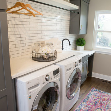
Electrical outlets were planned for the inside of utility cabinets, so devices could charge in hidden locations. Stacking the washer and dryer allowed for wider countertop space to provide a folding area and a special space for clothes to hang. “The way I do laundry has been completely transformed! I can actually fold clothes and hang them now right out of the washer and dryer,” Meghan said.
“The end result in the kitchen and the laundry/mud room was an updated light and bright space, with a smarter work flow that better meets the needs of this family,” Michelle said.
“I would totally recommend Advance Design,” Meghan said. “Sometimes I sit and just look at my kitchen and laundry room and think ‘Wow, I can’t believe I get to live here!’ It’s an understatement to say we love our new space.”

Sponsored
Delaware, OH

Buckeye Basements, Inc.
Central Ohio's Basement Finishing ExpertsBest Of Houzz '13-'21
 J Design Group - Interior Designers Miami - Modern
Modern Family Room, Miami Beach.
Ocean front, Luxury home in Miami Beach - Living Room.
Projects by J Design Group, Your friendly Interior designers firm in Miami, FL. at your service.
AVENTURA MAGAZINE selected our client’s luxury 5000 Sf ocean front apartment in Miami Beach, to publish it in their issue and they Said:
Story by Linda Marx, Photography by Daniel Newcomb
Light & Bright
New York snowbirds redesigned their Miami Beach apartment to take advantage of the tropical lifestyle.
New York snowbirds redesigned their Miami Beach apartment to take advantage of the tropical lifestyle.
WHEN INTERIOR DESIGNER JENNIFER CORREDOR was asked to recreate a four-bedroom, six-bath condominium at The Bath Club in Miami Beach, she seized the opportunity to open the rooms and better utilize the vast ocean views.
In five months last year, the designer transformed a dark and closed 5,000-square-foot unit located on a high floor into a series of sweeping waterfront spaces and updated the well located apartment into a light and airy retreat for a sports-loving family of five.
“They come down from New York every other weekend and wanted to make their waterfront home a series of grand open spaces,” says Jennifer Corrredor, of the J. Design Group in Miami, a firm specializing in modern and contemporary interiors. “Since many of the rooms face the ocean, it made sense to open and lighten up the home, taking advantage of the awesome views of the sea and the bay.”
The designer used 40 x 40 all white tile throughout the apartment as a clean base. This way, her sophisticated use of color would stand out and bring the outdoors in.
The close-knit family members—two parents and three boys in college—like to do things together. But there were situations to overcome in the process of modernizing and opening the space. When Jennifer Corredor was briefed on their desires, nothing seemed too daunting. The confident designer was ready to delve in. For example, she fixed an area at the front door
that was curved. “The wood was concave so I straightened it out,” she explains of a request from the clients. “It was an obstacle that I overcame as part of what I do in a redesign. I don’t consider it a difficult challenge. Improving what I see is part of the process.”
She also tackled the kitchen with gusto by demolishing a wall. The kitchen had formerly been enclosed, which was a waste of space and poor use of available waterfront ambience. To create a grand space linking the kitchen to the living room and dining room area, something had to go. Once the wall was yesterday’s news, she relocated the refrigerator and freezer (two separate appliances) to the other side of the room. This change was a natural functionality in the new open space. “By tearing out the wall, the family has a better view of the kitchen from the living and dining rooms,” says Jennifer Corredor, who also made it easier to walk in and out of one area and into the other. “The views of the larger public space and the surrounding water are breathtaking.
Opening it up changed everything.”
They clients can now see the kitchen from the living and dining areas, and at the same time, dwell in an airy and open space instead of feeling stuck in a dark enclosed series of rooms. In fact, the high-top bar stools that Jennifer Corredor selected for the kitchen can be twirled around to use for watching TV in the living room.
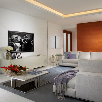
In keeping with the theme of moving seamlessly from one room to the other, Corredor designed a subtle wall of glass in the living room along with lots of comfortable seating. This way, all family members feel at ease while relaxing, talking, or watching sporting events on the large flat screen television. “For this room, I wanted more open space, light and a supreme airy feeling,” she says. “With the glass design making a statement, it quickly became the star of the show.”…….
….. To add texture and depth, Jennifer Corredor custom created wood doors here, and in other areas of the home. They provide a nice contrast to the open Florida tropical feel. “I added character to the openness by using exotic cherry wood,” she says. “I repeated this throughout the home and it works well.”
Known for capturing the client’s vision while adding her own innovative twists, Jennifer Corredor lightened the family room, giving it a contemporary and modern edge with colorful art and matching throw pillows on the sofas. She added a large beige leather ottoman as the center coffee table in the room. This round piece was punctuated with a bold-toned flowering plant atop. It effortlessly matches the pillows and colors of the contemporary canvas.
Jennifer Corredor also gutted all of the bathrooms, resulting in a major redesign of the master. She jettisoned the whirlpool and created the dazzling illusion of a floating tub. From an area where there were two toilets, she eliminated one to make a grand rectangular shower, which became an overall showpiece. The master bath went from being just a functional water closet to a sophisticated spa-like space. “The client said I was ‘delicious’ after seeing the change,” laughed Jennifer Corredor, who emphasized that her clients love their part-time life in South Florida more each time they come down. Even when the husband has to work from their Miami Beach digs, he is surrounded by tropical beauty. For instance, there are times when the master bedroom must double as the husband’s home office.
The room had to be large enough to accommodate a working space for this purpose. So Jennifer Corredor placed an appropriate table near the window and across from the king-size bed. “No blocking of the amazing water view was necessary,” she says. “I kept an open space with a lot of white so It functions well and the work space fits right in.” She repeated the bold modern art in the room as well as in the guest bedroom, which also has a workspace for the sons when they are home from school and need to study.
The designer is still happy and glowing with the results of her toil in this apartment. She gets a “spiritual feeling” when she walks inside. “It is so peaceful and serene, with subtle hints of explosive statements,” she says. “The entire space is open, yet anchored by the warmth of the exotic woods.” The client wrote Jennifer Corredor a letter at the end of the project congratulating her on a
job well done. She revealed that owning a Miami Beach home was her husband’s dream 30 years ago. “Now we have a quality perfect yet practical home,” she wrote to the designer. “You solved the challenges, and the end
result far exceeds our expectations. We love it.”
Thanks for your interest in our Contemporary Interior Design projects and if you have any question please do not hesitate to ask us.
http://www.JDesignGroup.com
305.444.4611
Modern Interior designer Miami. Contemporary
Miami
Miami Interior Designers
Miami Interior Designer
Interior Designers Miami
Interior Designer Miami
Modern Interior Designers
Modern Interior Designer
Modern interior decorators
Modern interior decorator
Contemporary Interior Designers
Contemporary Interior Designer
Interior design decorators
Interior design decorator
Interior Decoration and Design
Black Interior Designers
Black Interior Designer
Interior designer
Interior designers
Interior design decorators
Interior design decorator
Home interior designers
Home interior designer
Interior design companies
Interior decorators
Interior decorator
Decorators
Decorator
Miami Decorators
Miami Decorator
Decorators Miami
Decorator Miami
Interior Design Firm
Interior Design Firms
Interior Designer Firm
Interior Designer Firms
Interior design
Interior designs
home decorators
Interior decorating Miami
Best Interior Designers.
225 Malaga Ave.
Coral Gable, FL 33134
http://www.JDesignGroup.com
305.444.4611
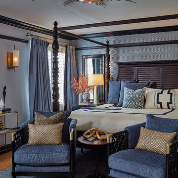
 Tiffany Brooks, HGTV Host & Interior Designer
Inquire About Our Design Services
When we first started talking in the spring of 2015, I was impressed. She was witty, realistic, and understood that as much as she loves my shows on HGTV, design does not does not happen in 43 minutes! She told me about her space, and how she felt that her bedroom seemed “blah” to her. She had no retreat. Molly desperately longed for a place that she could spend time in, read in, play in and above all, relax in.
What we did:
Many people are terrified of hiring a designer. Rightfully so, they are investing a pretty penny in their homes. They want to make sure that everything, down to the last floral arrangement, is to their liking, because they will have to live it (and pay for it). Unfortunately, a client can unintentionally stifle a designer’s creativity through micro-management. This can produce lackluster results and ultimately cause more time (and money) to be spent on a project than is really necessary.
With Molly, that was never an issue. Before she even showed me the room in question, she said that I could have full creative license to do what I needed to do to her bedroom. SAY WHAAH!?
With Molly giving me complete creative freedom, I planned everything out and got down to business. The result: Bite-your-bottom-lip sexy. I don’t get jealous of too many of my clients’ spaces, but this one still takes my breath away every time I look at the pics!
The craziest part was that by adding more furniture, it actually made the space feel larger.
Molly and her husband Patrick loved the finished space, and promised me I will be back to finish the rest of the house!
Here’s the highlights of the rest of the project:
I came up with a space plan with three options.
Next, we reviewed mood boards and fabric schemes that would work for both Molly and her hubby Patrick.
We started with the bed. My goal was to add edge to its otherwise traditional style.
We decided to spice things up by painting the trim work in the room black.
We built in layers of lighting with dimmers. In a bedroom everything should be on dimmers, right? Right.
We designed and customized bedding, chairs and window treatments.
Together with Molly, we selected the most perfect wallpaper. This geometric “grasscloth” adds so much depth and dimension that was just missing before.
What I love:
That light fixture. I mean it is really, really amazing in person.
The porcupine mirror. This thing came packaged like it was the hope diamond, and everyone was terrified to handle it. But it really became a highlight of the room.
 TimeLine Renovations Inc.
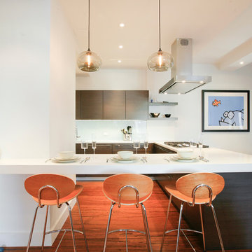
Going house hunting to find the dream home is difficult in every aspect, especially in NYC. The first apartment may have a feature that the other has but very rarely will one place have all. Most important is making sure the location and size works and everything else can be incorporated later. As the apartment our clients selected was "move in" condition its surely was not for what they work looking for in creating their dream home. We first started by creating a "wish list" of all of the essentials, which included; open kitchen, walk in closet, office space , larger master bathroom with stand up shower and soaking tub. With creating many different floor plan options, the only way we would achieve this was by sacrificing the 3rd bedroom. At this stage the 3rd bedroom was very easy for them to sacrifice as it gave them all of the wish list for now. In the future ,they could easily take the square footage from the new oversized living room and add that 3rd bedroom if it were necessary. Our first goal in the demolition stage was to remove all existing interior partition walls and start with a fresh new slate. By removing the existing kitchen walls the New Kitchen layout now combines it with the living room. The cabinetry is 2 tone color, flat slab doors for the modern look. State of the art appliances were installed; Integrated panels were installed on the fridge, wall oven, microwave, cook top. The sink is the ultimate chefs prep station sliding butcher block with bowls that slide over the sink. A garage cabinet was installed to conceal smaller appliances. The cantilever counter top adds the additional seating space for guests while keeping the bottom portion open for the view. The existing walk in closet was relocated to achieve the New Master Bathroom, Combining the spaces now gave us the option to add all the features. Floating vanity with double sinks, soaking tub, stand up shower. The glossy rectified tiles used are 12x36 and when installed make the grout line disappear and make it look like a solid wall. The chocolate floor tiles are randomly staggered then wrap up the tub platform and continue up one wall to create an accent. No tile edge was used but all tiles that meet on a 90 degree outside corner are mitered; tub platform, walls and shower niches. Heated floors were installed to keep the feet warm on the cold winter days. In the Master Bedroom we built a bed frame accent wall. Serves for multiple functions; eliminates night stands by using the niches for alarm clock / phone charger station, lights were added inside the niches for accent lights and raised wall paper was used to finish this beautiful feature. Each his and hers niche has an outlet, 4 way switch for the accent lights and 4 way switch for the recessed lights above when they are done reading in bed. Custom steps were built for easy up and down off the bed for the little puppies that could not possibly make the jump up. Other features throughout the apartment include; New bamboo floors throughout. Since the concrete ceiling slab cannot be chopped , soffits and drop ceilings were built throughout the apartment to accommodate recessed lights. Low voltage recessed lights were used with multiple zone dimmers for energy efficiency. Remote operated shades were installed The overall design was for the apartment was modern, simple lines and true elegance. The newly renovated apartment will be enjoyed by them, friends and family for many years to come...
edit
 Marvin
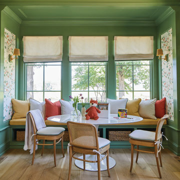
The 2021 Southern Living Idea House is inspiring on multiple levels—from the stunning location in Louisville, Kentucky overlooking the Ohio river, to the design-driven home that marries European countryside vibes with a timeless aesthetic. Dubbed the “forever home,” the concept was to design for all stages of life, with thoughtful spaces that meet the ever-evolving needs of families today.
The 5,545-square-foot, Colonial Greek Revival Cottage-style home is located in The Breakers at Prospect community and is the collective effort of many. While it may have formerly been a trend to embrace open layout living spaces, following the pandemic families are seeking spaces in the home that feel separated, to allow for privacy. Rooms with clear intentions allow more options for areas in which to spend time, depending on your mood, and this home perfectly balances livable and lively ideas.
Marvin products were chosen for this project to maximize the use of natural light, allow airflow from outdoors to indoors, and provide expansive views that overlook the Ohio River.
MARVIN PRODUCTS USED:
Marvin Awaken Skylight
Marvin Ultimate Casement Window
Marvin Ultimate Double Hung G2 Window
Marvin Ultimate Picture Window
Marvin Ultimate Direct Glaze Round Top Window
Marvin Ultimate Swinging French Door G2
BUILDER: Jason Black and Jimmy King of Artisan Signature Homes
ARCHITECT: Brandon Ingram of C. Brandon Ingram Design
INTERIOR DESIGNER: Sarah Bartholomew, Sarah Bartholomew Design
LANDSCAPE ARCHITECT: Josh Myers of Myers & Co. Landscape Architecture
PHOTOGRAPHY: Laurey W. Glenn, Marta Xochilt Perez, and Kriech-Higdon Photography for Southern Living
 Milgard Windows & Doors
The Kiguchi family moved into their Austin, Texas home in 1994. Built in the 1980’s as part of a neighborhood development, they happily raised their family here but longed for something more contemporary. Once they became empty nesters, they decided it was time for a major remodel. After spending many years visiting Austin AIA Home Tours that highlight contemporary residential architecture, they had a lot of ideas and in 2013 were ready to interview architects and get their renovation underway.
The project turned into a major remodel due to an unstable foundation. Architects Ben Arbib and Ed Hughey, of Arbib Hughey Design were hired to solve the structural issue and look for inspiration in the bones of the house, which sat on top of a hillside and was surrounded by great views.
Unfortunately, with the old floor plan, the beautiful views were hidden by small windows that were poorly placed. In order to bring more natural light into the house the window sizes and configurations had to be addressed, all while keeping in mind the homeowners desire for a modern look and feel.
To achieve a more contemporary and sophisticated front of house, a new entry was designed that included removing a two-story bay window and porch. The entrance of the home also became more integrated with the landscape creating a template for new foliage to be planted. Older exterior materials were updated to incorporate a more muted palette of colors with a metal roof, dark grey siding in the back and white stucco in the front. Deep eaves were added over many of the new large windows for clean lines and sun protection.
“Inside it was about opening up the floor plan, expanding the views throughout the house, and updating the material palette to get a modern look that was also warm and inviting,” said Ben from Arbib Hughey Design. “Prior to the remodel, the house had the typical separation of rooms. We removed the walls between them and changed all of the windows to Milgard Thermally Improved Aluminum to connect the inside with the outside. No matter where you are you get nice views and natural light.”
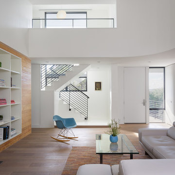
The architects wanted to create some drama, which they accomplished with the window placement and opening up the interior floor plan to an open concept approach. Cabinetry was used to help delineate intimate spaces. To add warmth to an all-white living room, white-washed oak wood floors were installed and pine planks were used around the fireplace. The large windows served as artwork bringing the color of nature into the space.
An octagon shaped, elevated dining room, (named “the turret”), had a big impact on the design of the house. They architects rounded the corners and added larger window openings overlooking a new sunken garden. The great room was also softened by rounding out the corners and that circular theme continued throughout the house, being picked up in skylight wells and kitchen cabinetry. A staircase leading to a catwalk was added and the result was a two-story window wall that flooded the home with natural light.
When asked why Milgard® Thermally Improved Aluminum windows were selected, the architectural team listed many reasons:
1) Aesthetics: “We liked the slim profiles and narrow sightlines. The window frames never get in the way of the view and that was important to us. They also have a very contemporary look that went well with our design.”
2) Options: “We liked that we could get large sliding doors that matched the windows, giving us a very cohesive look and feel throughout the project.”
3) Cost Effective: “Milgard windows are affordable. You get a good product at a good price.”
4) Custom Sizes: “Milgard windows are customizable, which allowed us to get the right window for each location.”
Ready to take on your own traditional to modern home remodeling project? Arbib Hughey Design advises, “Work with a good architect. That means picking a team that is creative, communicative, listens well and is responsive. We think it’s important for an architect to listen to their clients and give them something they want, not something the architect thinks they should have. At the same time you want an architect who is willing and able to think outside the box and offer up design options that you may not have considered. Design is about a lot of back and forth, trying out ideas, getting feedback and trying again.”
The home was completely transformed into a unique, contemporary house perfectly integrated with its site. Internally the home has a natural flow for the occupants and externally it is integrated with the surroundings taking advantage of great natural light. As a side note, it was highly praised as part of the Austin AIA homes tour.
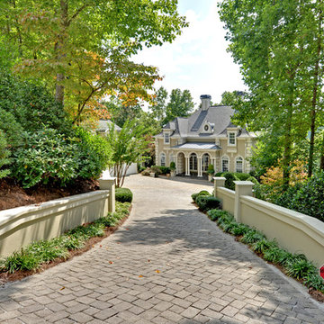
 Envision Web
Stuart Wade, Envision Virtual Tours, Inc.
Envision Virtual Tours and High Resolution Photography is your best choice to find just what you are looking for in the Lake Burton Area . Knowing the areas and resources of Lake Burton is our specialty
Lake Burton is a 2,775 acre man-made lake with 62 miles of shoreline located in the northeastern corner of Georgia in Rabun County. It is the first lake in a five-lake series called the Tallulah River Watershed that follows the original course of the Tallulah River. The series of lakes starts with Lake Burton as the northernmost lake followed by Lake Seed, Lake Rabun, Lake Tallulah Falls and the eastern arm of Lake Tugalo (the western arm is formed by the Chattooga River. The lakes are owned and operated by the Georgia Power Company to generate hydroelectric energy for Georgia's largest city, Atlanta. At one time these lakes were the largest producers of electricity in the state of Georgia. Now, they only provide peak power supply.
The lake was built in a deep valley located along a 10 mile section of the Tallulah River. The Lake Burton Dam was closed on December 22, 1919 and the lake started to fill. The dam is a gravity concrete dam, with a height of 128 feet and a span of 1,100 feet. The spillway is equipped with eight gates 22 feet wide by 6.6 feet high. The total capacity at an elevation of 1,866.6 feet is 108,000 acre-ft, of which 106,000 acre-ft is usable storage. The generating capacity of the dam is 6,120 kilowatts (two units).Lake Burton is the highest Georgia Power lake in Georgia.
Lake Burton gets its named from the town of Burton, which was the second largest town in Rabun County with a population of approximately 200 but now lies below the lake's surface. The town (and the lake) was named after local prominent citizen Jeremiah Burton and was situated along the road from Clayton, Georgia to the Nacoochee Valley. Andrew Jackson Ritchie served as the postmaster for the area for several years. Gold was first discovered in Rabun County where Dicks Creek and the Tallulah River come together and was the reason for the town's founding in the early 1800s.
The Lake Burton Fish Hatchery and Moccasin Creek State Park are located on the western side of the lake. Lake Burton is home to several species of fish, including Spotted Bass, Largemouth Bass, White Bass, Black Crappie, Bluegill, Redear Sunfish, White Catfish, Walleye, Brown Trout, Rainbow Trout, and Yellow Perch.
The residents of Lake Burton are a mix of permanent residents and seasonal vacationers who together make-up the Lake Burton Civic Association, a local organization who goal is to maintain the lake through volunteer clean-ups and other such events. Let a Lake Burton resident and expert show you the way
The Lake Burton Civic Association is an active homeowners association for residents of the Lake Burton area and sponsors many events throughout the year such as:
burton, custom, envision, georgia, lake, mountain, nc, north, photography, web, western, Lake Burton, Lake Rabun, Seed Lake,Virtual Tours.
Sponsored
Fredericksburg, OH

High Point Cabinets
Columbus' Experienced Custom Cabinet Builder | 4x Best of Houzz Winner
 Advance Design Studio, Ltd.
After six years of living in their Huntley IL home, Chris and Meghan were tired of their dark, dingy, outdated kitchen and it was finally time for a long-anticipated change. “The kitchen is the place where we live, it’s where we do everything,” Meghan said. “It was important that it be a space where we wanted to be.” Meghan loves cooking and enjoys including their girls in healthy meal prepping, this led them to want a brighter, more enjoyable kitchen with increased functionality and improved storage.
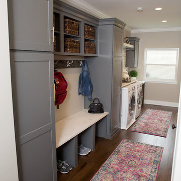
For Chris especially, the laundry room was an entirely dysfunctional eyesore. “We had a washer and a dryer, but it was all kind-of cobbled together!” Chris said. “There were always laundry piles everywhere, we weren’t really sure what we wanted to do in there, but it was time for us to make a change.” The mess of the space was stressful every time they walked in the door from the garage each day. Kids’ backpacks and shoes piled up haphazardly in the makeshift boot-bench closet left the family feeling disorganized and stressed. They needed space for folding clothes and locker cubbies to help keep the family organized.
Having known Christine and Todd in the Huntley community for years, Chris and Meghan were familiar with their work. “We already trusted them personally and having seen their projects for years we knew they did top notch work. After we reviewed the initial round of designs, we knew that hiring them was definitely the right choice,” Meghan and Chris said. Although Chris had done a lot of work in their home himself, the kitchen and laundry room renovation was such a large undertaking that he didn’t want to steal time away from his family to spend what would surely be many long weekends doing the job himself. “That would not have been a wise choice for us,” Chris laughed.
“Our designer, Michelle was very, very, easy to work with; anything we wanted to see or weren’t sure about, she went above and beyond to make this easy for us. She was easy to get hold of and always quick to respond,” the couple said. Michelle pulled ideas that mirrored the couple’s taste and style and was adept at directing the couple to limited choices that didn’t overwhelm them and kept the process moving. “I have a hard time making decisions. Michelle made the decision-making process so easy. I loved how she listened to what I liked and then presented three great options for me to choose from,” Meghan said.
The main objectives for the kitchen were better storage solutions, they wanted the space to reflect their lifestyle and taste, and they wanted it to last for years with low maintenance. One of the first steps in creating a more functional kitchen was relocating the refrigerator, creating an improved workflow for the busy family.
“We didn’t know that we could even move the refrigerator to a new location where it is now, that was something that we never would have thought of,” Chris said. “The new refrigerator location makes the kitchen feel so much bigger. We didn’t add any space, but our whole kitchen with the new design just seems like it’s so much larger than before!” Meghan said.
The perimeter mist colored cabinets helped warm and brighten the entire room, while the graphite colored cabinets on the island added contrast. Using this fresh, clean color palette satisfied the couple’s desire for a bright space that was the exact opposite of what they had before. Organization accessories were also added to the cabinets such as a spice drawer tray and roll outs to create hidden convenience.
“I absolutely love the hidden spices – it makes cooking so much more enjoyable!” Chris said. “And all the pull outs, and the double trash bin, who would think you could get so excited about organization!” the couple said in unison.
One thing they hated in their original kitchen was how dark the space felt. Added lighting on the ceiling with the new light fixtures combined with the lighter cabinetry colors throughout solved this problem. “Our new kitchen has this warm, almost cozy feeling that our old kitchen never had, it’s just a space that I love spending my time in now,” Meghan said. The light airy feeling was accentuated with the use of floating white shelves on either side of the decorative range hood. “We have so much cabinetry space, the new design is amazing we actually have more storage space than we will ever need,” Meghan said.
The island was extended to create more work surface and added space for stool seating. “The new island changes how we live. Now the kids can be in the kitchen with us, doing homework, eating breakfast, and the three of us have special dinners there when Chris is working late,” Meghan said.
The Carrara Marmi Quartz countertops were chosen because they are, not only beautiful, but are made from hard-working material that doesn’t require maintenance. The white subway tile backsplash that wraps to the ceiling behind the focal point cooktop range/hood compliments the crisp white countertops perfectly, while brushed brass hardware and light fixtures keep the design fresh and new.
The couple had a few fears at the beginning of the project, as most homeowners do. Their biggest fear was being out of their kitchen and laundry room for an extended time. The crew made it very easy for the family to work in a limited space keeping the washer and dryer hooked up the majority of the time, and also getting appliances working with minimal downtime.
“They above and beyond accommodated us to get us through the process,” Meghan said. “They did a great job making sure we were as comfortable as possible throughout the process,” Chris added.
“Our project manager DJ did a great job. He was very good at updating us on schedule changes, getting guys in as quickly as possible. Everyone that stepped in the house was nice and did great work,” said Chris. They thought Advance’s carpenter was phenomenal and were impressed when he took a conceptual idea from a photograph and worked with designer Michelle to create a one of a kind range/hood that has become the topic of conversation with friends and family who visit the new kitchen. “He was in our house literally every day for several weeks. He was easy to work with and good at what he did,” Meghan and Chris said.
The focal point of the kitchen; a hand-crafted, custom-built ventilation hood was clad with handpicked reclaimed barnwood. Advance Design’s carpenter built the framework and the cladding to create a one-of-a-kind design element that the couple loves.
“I think it was especially fun for him to create something unique from scratch, showcasing his talent in this area,” Meghan said. “I love that my kitchen is not like everyone else’s. I got to pick out the wood on my hood and watch it being built and was able to choose what pieces of wood went where on it. It’s totally unique.”
Red Oak flooring was toothed-in throughout the kitchen and the rest of the first floor anywhere changes were made. Then the whole floor was refinished to tone down the orange undertones in the existing floor stain, ultimately changing the color complexion of the entire first floor. The result is a completely new feeling to the entire home.
Renovating the laundry room was extremely important to Meghan and Chris, but they had trouble visualizing what the possibilities were for the seemingly small space. Michelle produced beautiful 3D illustrations that helped them envision the space in a whole new way.
“I must have told Michelle 100 times that I am a visual person, seeing the designs in 3D made it so easy to make decisions and see what we could really do with our space,” Meghan said.
A dividing wall and doorway were removed between the existing laundry room and hallway formerly containing a coat closet, providing space to design specialized graphite colored cabinetry matching the kitchen island to house custom storage cubbies for each family member. Adding the tall utility cabinetry in the new laundry area helped solve the storage issue, tucking away cleaning supplies, household items, and even the cat got its own cubby.
“I love how everything is now hidden in its own space. I can’t tell you how much I hated coming home and seeing everything sitting around on counters,” Chris said.
Electrical outlets were planned for the inside of utility cabinets, so devices could charge in hidden locations. Stacking the washer and dryer allowed for wider countertop space to provide a folding area and a special space for clothes to hang. “The way I do laundry has been completely transformed! I can actually fold clothes and hang them now right out of the washer and dryer,” Meghan said.
“The end result in the kitchen and the laundry/mud room was an updated light and bright space, with a smarter work flow that better meets the needs of this family,” Michelle said.
“I would totally recommend Advance Design,” Meghan said. “Sometimes I sit and just look at my kitchen and laundry room and think ‘Wow, I can’t believe I get to live here!’ It’s an understatement to say we love our new space.”
 Design Studio West
Committing to a kosher kitchen is quite a daunting undertaking and when you are also taking on a complete remodel, it can be overwhelming. It does not, however, have to be insurmountable. There are many resources to help guide you through the experience. Check out the internet and magazines to guide you. Once you have done the initial research, contact your Rabi with questions and for clarification on a kosher kitchen. Kosher requirements can vary differently between Orthodox, Conservatism, Ultra Orthodox and Reform Judaism. Your Rabi most likely will have a list of rules and guidelines. Also, hire a professional kitchen designer. They will not only be able to design the needs of a kosher kitchen but also make it personal to your needs and beautiful too.
If the space and the budget allow, two distinct kitchens within one space is a possibility. A kosher kitchen requires stringent separation of meat and dairy items. Depending on the sect of Judaism you practice ------
Storage:
The Storage areas need space for two sets of dishes, pots and pans, flatware, cups and utensils. You can combine the storage areas as long as there is a separation and that you do not mix service ware. A good recommendation is to color code your plates, flatware, table linen, pots. For example, red plates, gold-colored flatware, copper pots for meat items while dairy items have white plates, stainless flatware, stainless pots. You may want to label each area so when you have your new sister-in-law help in the kitchen; everything stays in the correct place.
Appliances:
When selecting appliances look for the STAR-K logo. This will help you determine to what extent an appliance is Kosher. Some ovens will have Sabbath modes where they will turn on automatically at a predetermined time. Once the oven is open, the oven turns off. Some refrigerators also have Sabbath modes where the ice maker turns off on the Sabbath and back on the following day. One refrigerator is usually sufficient provided all foods stay on the proper container in the proper section of the refrigerator. Having an immaculately clean refrigerator is a must if this is the case. You do not want spills from one food source contaminating food from the other. If you decide on two refrigerators, one can be full size while the other is smaller. A good kitchen designer can help assess your family’s needs to determine which is best for you.
Dishwashers cannot be Kosher in most cases. You either need two dishwashers, separate compartment dishwashers as in dishwasher drawers or wash by hand. Look at Fisher Pikel or Kitchen Aid for dishwasher drawers. Each drawer is on separate controls. You can dedicate the top drawer for dairy while the bottom drawer is for meat service ware.
If you have space and decide to have two dishwashers, you can get two 24” wide dishwashers. Another option is to have one full size dishwasher and supplement it with a small 18” wide dishwasher. Miele makes an 18” wide dishwasher that is super quiet and cleans dishes very well. You may also opt for a single dishwasher drawer in addition to a full sized dishwasher.
A single Microwave oven can be used for milk and meat provided that a complete cover is used around the food. You will also need separate plastic plate’s places on the bottom or glass turn table. Keeping the unit clean is very important.
Counter tops:
Counter tops may or may not be able to be koshered depending on your sect. Simply having sets of trivets for dairy, meat and pareve (not meat or dairy) will provide adequate separation of foods.
Sinks:
If you can’t have two separate sinks, include three separate tubs to be places in the sink. Color code the tubs for meat, dairy and pareve. If you have one sink or a single divided sink, you will need to be cautious about splashing, to keep the meat and dairy particulates apart. You will also need space for separate dish cloths or sponges and dish towels. Again, color coding is extremely helpful and highly suggested.
Must Haves:
~Storage space for two sets of dishes, flatware, pans bowls
~Color Code and label where appropriate
~Separate burners dedicate for either meat or dairy
~Separate clean up areas
~Clean environment to avoid contamination between meat and dairy
~A space that functions for how you cook
~A space that reflects you
Design and remodel by Design Studio West
Brady Architectural Photography
 Interiors by Maite Granda
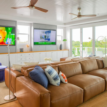
The client was referred to us by the builder to build a vacation home where the family mobile home used to be. Together, we visited Key Largo and once there we understood that the most important thing was to incorporate nature and the sea inside the house. A meeting with the architect took place after and we made a few suggestions that it was taking into consideration as to change the fixed balcony doors by accordion doors or better known as NANA Walls, this detail would bring the ocean inside from the very first moment you walk into the house as if you were traveling in a cruise.
A client's request from the very first day was to have two televisions in the main room, at first I did hesitate about it but then I understood perfectly the purpose and we were fascinated with the final results, it is really impressive!!! and he does not miss any football games, while their children can choose their favorite programs or games. An easy solution to modern times for families to share various interest and time together.
Our purpose from the very first day was to design a more sophisticate style Florida Keys home with a happy vibe for the entire family to enjoy vacationing at a place that had so many good memories for our client and the future generation.
Architecture Photographer : Mattia Bettinelli
 Ecostruct LLC
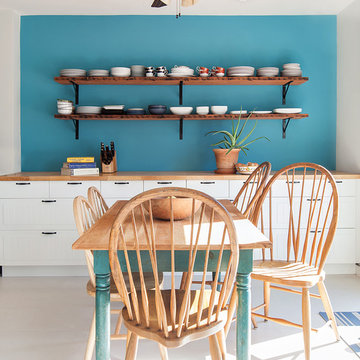
By mimicking the kitchen cabinet/West Elm shelving dynamic in the dining area, we were really able to tie the two spaces together. The clients had an existing antique pine dining table that had been poorly refinished one too many times. We stripped the peeling layers of polyurethane off and refinished with wax to give a very natural look without losing the age lines and character of the table.
Regan Wood Photography
 AIBD - American Institute of Building Design
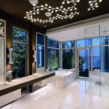
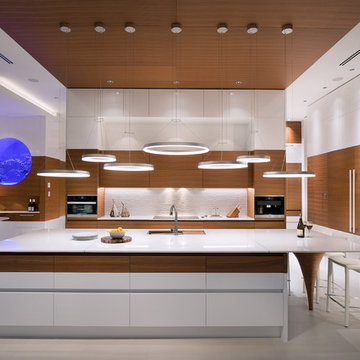
This home was designed with a clean, modern aesthetic that imposes a commanding view of its expansive riverside lot. The wide-span, open wing design provides a feeling of open movement and flow throughout the home. Interior design elements are tightly edited to their most elemental form. Simple yet daring lines simultaneously convey a sense of energy and tranquility. Super-matte, zero sheen finishes are punctuated by brightly polished stainless steel and are further contrasted by thoughtful use of natural textures and materials. The judges said “this home would be like living in a sculpture. It’s sleek and luxurious at the same time.”
The award for Best In Show goes to
RG Designs Inc. and K2 Design Group
Designers: Richard Guzman with Jenny Provost
From: Bonita Springs, Florida
 Interiors by Maite Granda
The client was referred to us by the builder to build a vacation home where the family mobile home used to be. Together, we visited Key Largo and once there we understood that the most important thing was to incorporate nature and the sea inside the house. A meeting with the architect took place after and we made a few suggestions that it was taking into consideration as to change the fixed balcony doors by accordion doors or better known as NANA Walls, this detail would bring the ocean inside from the very first moment you walk into the house as if you were traveling in a cruise.
A client's request from the very first day was to have two televisions in the main room, at first I did hesitate about it but then I understood perfectly the purpose and we were fascinated with the final results, it is really impressive!!! and he does not miss any football games, while their children can choose their favorite programs or games. An easy solution to modern times for families to share various interest and time together.
Our purpose from the very first day was to design a more sophisticate style Florida Keys home with a happy vibe for the entire family to enjoy vacationing at a place that had so many good memories for our client and the future generation.
Architecture Photographer : Mattia Bettinelli
 AIBD - American Institute of Building Design
This home was designed with a clean, modern aesthetic that imposes a commanding view of its expansive riverside lot. The wide-span, open wing design provides a feeling of open movement and flow throughout the home. Interior design elements are tightly edited to their most elemental form. Simple yet daring lines simultaneously convey a sense of energy and tranquility. Super-matte, zero sheen finishes are punctuated by brightly polished stainless steel and are further contrasted by thoughtful use of natural textures and materials. The judges said “this home would be like living in a sculpture. It’s sleek and luxurious at the same time.”
The award for Best In Show goes to
RG Designs Inc. and K2 Design Group
Designers: Richard Guzman with Jenny Provost
From: Bonita Springs, Florida
8