
Search results for "Effective solution" in Home Design Ideas

 Progressive Design Build
Challenge:
When our clients decided to do a major renovation on their home, they were looking for a more modern, transitional design with additional cabinetry for storage, new appliances and hardwood flooring. They also wanted to create an open, more cohesive kitchen/dining/living area.
The existing kitchen had dated finishes, a non-functional layout and was closed off from the living area by a large partition wall.
Solution:
To ensure a smooth renovation process, a lot of time and effort went into the planning phase.
The existing hardwood floors throughout the home were removed in certain areas and laced in with new material. Once installed, all floors were sanded and multi-coated with tint and sealer to achieve a weathered look. All rooms were also repainted to complement the newly remodeled kitchen/dining/living area and the refinished wood floors.
The kitchen was modernized and opened up to give the family a more functional living space. It was designed with white Dura Supreme cabinetry and Weathered Oak finished floors, creating a sophisticated contrast and an open, airy feel. By adding a large center kitchen island we created a comfortable sitting area for people to gather while the family entertained or cooked. The refrigerator was disguised using custom cabinet appliance panels, effectively integrating it with the cabinetry wall for a unified look.
In the master bathroom, Progressive Design Build added a curbless, walk-in shower with a half-inch clear glass partition, separating it from the new undermount tub and Quartz tub deck. White Dura Supreme cabinetry was paired with Quartz countertops, and two towers were added for additional storage. A honed marble accent band was used throughout the room to tie it all together.
Results:
The clients were very pleased with the new layout of the kitchen/dining/living area and the master bathroom, particularly all of the final finishes that completed the look and feel they were looking for.

 Abbas Rachaman, Designer, Board&Vellum
This is major kitchen remodel done on a tight budget!
1st thing I noticed in the original kitchen (please refer to before pictures) was that the ceiling height was lower than both the adjacent rooms, and of course the soffit cabinets made everything lower so I suggested we take the ceiling height up the match the other rooms. Through process of elimination I found the best place for the sink was in the corner because she would now have 2 windows for views of the neighborhood and a place to put the plants that once sat on the floor in the “breakfast nook”. Moving the gas cook top the exterior wall allowed for ease of installation and venting out also this was the best place to put it given the amount of windows. It is very important to me to design every kitchen with surface space on either side of the cook top so that you have enough room for baking racks, cookie sheets, etc.. to spread out. The solution to the double oven request was to put 2 of them under the counter instead of stacking them which would have taken up surface space. During the design meeting I asked how often to you close that door to the dining room? To which they replied “never, we always leave it open”. I knew then that door was a waste of space so I decided to toss that to make a bigger opening to make the kitchen more inviting as you enter from the dining room. Another thing I always talk about during kitchen designs is “landing zone”. You must have a surface to place things on once you enter the kitchen, be it groceries, keys, phone, wallet, etc.. But I find it functional and it keeps you from walking into a room with large things on either side of you. Again relating back to making sure the kitchen felt inviting. Definitely wanted make sure we had as much pullout kitchen accessories and deep drawers for ease of use because we did not have room for a lot of upper cabinets. I decided to take full advantage of those large open windows buy taking the tile to the ceiling and picture framing them with tile liners. The effect is that you see more light coming in because of the contrast of the darker tile. My solution to the clients request to get as much light in from the adjacent family room was to take out that kitchen desk and frame in a large opening. I needed to make sure that opening made a statement so instead of doing a standard door casing I added architectural details of molding around the doorway and highlighted by insetting the molding into the wall and painting the inset a different color. Once I was able to achieve bringing in the most light, I decided I could bring in a little drama by going with a dark wall color! It is okay to use dark wall colors as long as you have enough light so it still feels inviting. My solution to the radiator was to move it over to give us just enough room to squeeze in another cabinet for capturing as much storage as I could. I needed to make sure I had that “landing zone” so I wanted to place a counter top over the radiator, but how? I used a decorative post to give the kitchen a little something extra and to tie back in with the cabinets. Then I added a counter top above the wine refrigerator but both had to be the same height because they were across from each other. So what a great challenge this turned out be. Because of me needing to make the wine refrigerator counter top higher to match the other counter top, I was able to fit in a little drawer for wine accessories above the wine refrigerator. More storage! Yes!! Painting the radiator white to give it a fresh new look added a lot and was relatively simple in the grand scheme of things. Solution to pantry was to make it a cabinet pantry so that we didn’t have to work around the thickness of walls and a door. Island size was determined by NKBA standards of having enough room for traffic flow around the kitchen which allowed us 3 chairs. And if someone ever wanted to, they could use the counter above the radiator as a surface to work on. Of course we updated all the lighting, made sure we had under counter lighting, and they are all LED. Lastly porcelain floor tiles , ceramic backsplash and quartz counter tops were the material of choice for ease of maintenance and budget.

 Advance Design Studio, Ltd.
After living in this home for a decade, Crystal Lake residents Ken & Bonnie needed an update to their tired original kitchen to meet the needs of their busy family. Together with the expertise of designer Scott Christensen at Advance Design Studio they planned to completely reconfigure the entire space. They began by removing the restrictive peninsula and replaced it with a generous island designed to house an expansive farmhouse sink, convenient pull out trash receptacles, and a hidden dishwasher. Now there was ample room to add island seating to accommodate family gatherings, or for just “hanging out” with teenagers.
A dramatic new focal point was created with the design of an elegant range area featuring a beautiful custom wood mantle hood detailed with crushed glass handmade tile. Hidden storage houses every spice imaginable right at the cook’s fingertips. Double-stacked glass cabinetry emphasizes the impressive height of the room that was a wonderful architectural element that previously went unnoticed in the original kitchen.
The entire kitchen and breakfast nook was opened up to the 2 story family room by integrating enlarged arched openings. An outdated desk area was transformed into a beautiful breakfront bar with beverage refrigeration, glass display cabinets and plenty of new storage for entertainment pieces. An espresso nook was tucked neatly between tall cabinetry, and an old fashioned closet with shelves was converted into an efficient chef’s dream of organized custom pull out pantries.
“I am the leader of the Scott Christensen fan club,” says Bonnie. “With my busy family and a full time career, Scott made the process of designing this space so easy for me. He didn’t overwhelm me, but carefully determined what I liked and offered me two thoughtful solutions for just about everything - complete with his expert opinion that I really respected.”
Bright white Jay Rambo custom made maple cabinets are accented by Cambria quartz counter tops and simple subway tiles. Original hardwood floors were refinished and stained a darker shade, and stair risers and balusters were painted white to coordinate with the smart wainscot details throughout the first floor. The end effect is a cohesive first floor that flows together with grace and a level of elegance perfectly suitable for this stately Crystal Lake home.
Designer: Scott Christensen
Photographer: Joe Nowak
Find the right local pro for your project
 Tomlinson Kitchen and Bath
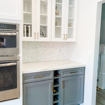
Welcome home to a stunning modern two tone kitchen, at least thats what are clients are thinking. This beautiful new open layout kitchen went from a small closed off space to a large contemporary showstopper. Walking into this kitchen the airiness from the glass cabinets and floating shelves add an open concept to the overall design. This multifunctional space has everything you would hope for in a kitchen, from large modern appliances, great unique storage, built in bar area, peninsula seating, and a small home office space. The Waypoint Living Space cabinetry used in this design is the new 570 door style in Painted Linen and Painted Boulder, accomplishing a desired two tone effect. The addition of the light oak floating shelves and desk top compliment the gray and white cabinets, as well as the warm engineered hardwood floor that runs throughout. The mixing of metals was key in adding a touch of glam to this kitchen by complimenting the stainless steel appliances with Champagne Bronze tones in the Delta Trinsic Kitchen Faucet and the Honey Bronze Riverside Top Knobs hardware. The large, modern and square apron front sink from Nantucket Sinks below the kitchen window flows nicely with the Vadara Calacatta Blanco Quartz. Smart drawer storage was a must on the cook top wall along with hidden appliance storage in order to give the clients the open look they desired. The Marble Greecian White Herringbone pattern was a nice addition to make a thoughtful statement to the overall design. From built in bar and wine storage, to a messenger center at the desk space, tall pantry storage, corner solutions and open clean counter tops this kitchen is loved by the homeowners and hopefully loved by you and sparks some inspiration for your kitchen remodel.
 Mihaly Slocombe
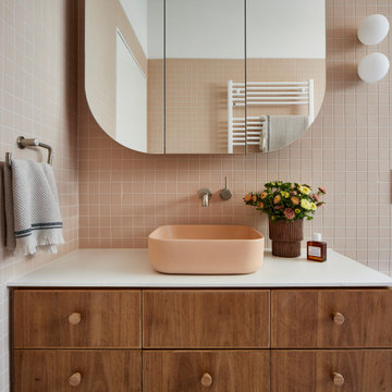
Brunswick Parlour transforms a Victorian cottage into a hard-working, personalised home for a family of four.
Our clients loved the character of their Brunswick terrace home, but not its inefficient floor plan and poor year-round thermal control. They didn't need more space, they just needed their space to work harder.
The front bedrooms remain largely untouched, retaining their Victorian features and only introducing new cabinetry. Meanwhile, the main bedroom’s previously pokey en suite and wardrobe have been expanded, adorned with custom cabinetry and illuminated via a generous skylight.
At the rear of the house, we reimagined the floor plan to establish shared spaces suited to the family’s lifestyle. Flanked by the dining and living rooms, the kitchen has been reoriented into a more efficient layout and features custom cabinetry that uses every available inch. In the dining room, the Swiss Army Knife of utility cabinets unfolds to reveal a laundry, more custom cabinetry, and a craft station with a retractable desk. Beautiful materiality throughout infuses the home with warmth and personality, featuring Blackbutt timber flooring and cabinetry, and selective pops of green and pink tones.
The house now works hard in a thermal sense too. Insulation and glazing were updated to best practice standard, and we’ve introduced several temperature control tools. Hydronic heating installed throughout the house is complemented by an evaporative cooling system and operable skylight.
The result is a lush, tactile home that increases the effectiveness of every existing inch to enhance daily life for our clients, proving that good design doesn’t need to add space to add value.
 StoneUnlimited Kitchen and Bath Remodeling
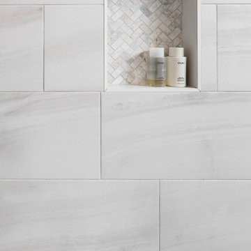
This aesthetically pleasing master bathroom is the perfect place for our clients to start and end each day. Fully customized shower fixtures and a deep soaking tub will provide the perfect solutions to destress and unwind. Our client's love for plants translates beautifully into this space with a sage green double vanity that brings life and serenity into their master bath retreat. Opting to utilize softer patterned tile throughout the space, makes it more visually expansive while gold accessories, natural wood elements, and strategically placed rugs throughout the room, make it warm and inviting.
Committing to a color scheme in a space can be overwhelming at times when considering the number of options that are available. This master bath is a perfect example of how to incorporate color into a room tastefully, while still having a cohesive design.
Items used in this space include:
Waypoint Living Spaces Cabinetry in Sage Green
Calacatta Italia Manufactured Quartz Vanity Tops
Elegant Stone Onice Bianco Tile
Natural Marble Herringbone Tile
Delta Cassidy Collection Fixtures
Want to see more samples of our work or before and after photographs of this project?
Visit the Stoneunlimited Kitchen and Bath website:
www.stoneunlimited.net
Stoneunlimited Kitchen and Bath is a full scope, full service, turnkey business. We do it all so that you don’t have to. You get to do the fun part of approving the design, picking your materials and making selections with our guidance and we take care of everything else. We provide you with 3D and 4D conceptual designs so that you can see your project come to life. Materials such as tile, fixtures, sinks, shower enclosures, flooring, cabinetry and countertops are ordered through us, inspected by us and installed by us. We are also a fabricator, so we fabricate all the countertops. We assign and manage the schedule and the workers that will be in your home taking care of the installation. We provide painting, electrical, plumbing as well as cabinetry services for your project from start to finish. So, when I say we do it, we truly do it all!
 SHELLEY RODNER DESIGN / DDI
DESIGN CHALLENGES ADDRESSED:
To anyone who may be reading this project overview, I do hope you'll have the opportunity to
have a look at the 'before' photo of this space. It's quite a transformation!
Our homeowners purchased their condo at the beach several years ago. As shown in the 'before'
photo, at the time, their family room was a dark and dated space with unsightly paneled walls,
heavy faux ceiling beams and odds and ends for furniture. Everything felt cramped and cluttered
throughout the condo, especially their family room. The client's vision was for an airy and
relaxed coastal vibe for their 'place at the beach'.
DESIGN SOLUTIONS PROVIDED:
The entire condo was taken down to stud. The faux beams were edited out and the ceiling raised.
The heavy out-dated paneling was removed and replaced with fresh clean walls that were painted
in a calming creamy sand tone throughout the entire condo.
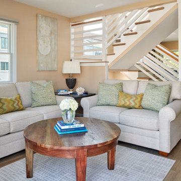
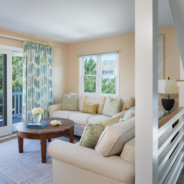
The existing dark and gloomy furniture was replaced with stylish updated pieces. Great thought
was given to the size, scale and textiles used. The sofa and loveseat, done in a softly textured
herring boned pattern, was the perfect choice. It's cremey toned easy care fabric created a 'pet
friendly' environment for the clients. The homeowners have two dogs and a cat who love a visit
to the beach as much as their 'humans'.
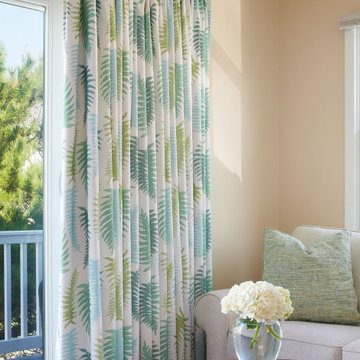
Worn out window treatments were replaced with fresh custom draperies in a playful botanical
print featuring tones of kiwi, leaf green and cerulean blue. A special 'solar friendly' lining was
used to tame the harmful rays of direct sun.
A variety of special curated accents were added to the room. The richly textured rug, round
coffee table with an organic feel, comfy pillows and a few special art pieces all helped to
complete this space.
The overall effect of the renovation was quite dramatic and the clients were thrilled with the
results. This family room went from being dark and dated to light and airy and is now a space
that is inviting and relaxing which perfectly suits the homeowner's coastal lifestyle.
RETAIL PROJECT PRICE: $ 9,000.00
Retail price is defined as the total sale you submitted on your sales repor

 SHELLEY RODNER DESIGN / DDI
DESIGN CHALLENGES ADDRESSED:
To anyone who may be reading this project overview, I do hope you'll have the opportunity to
have a look at the 'before' photo of this space. It's quite a transformation!
Our homeowners purchased their condo at the beach several years ago. As shown in the 'before'
photo, at the time, their family room was a dark and dated space with unsightly paneled walls,
heavy faux ceiling beams and odds and ends for furniture. Everything felt cramped and cluttered
throughout the condo, especially their family room. The client's vision was for an airy and
relaxed coastal vibe for their 'place at the beach'.
DESIGN SOLUTIONS PROVIDED:
The entire condo was taken down to stud. The faux beams were edited out and the ceiling raised.
The heavy out-dated paneling was removed and replaced with fresh clean walls that were painted
in a calming creamy sand tone throughout the entire condo.
The existing dark and gloomy furniture was replaced with stylish updated pieces. Great thought
was given to the size, scale and textiles used. The sofa and loveseat, done in a softly textured
herring boned pattern, was the perfect choice. It's cremey toned easy care fabric created a 'pet
friendly' environment for the clients. The homeowners have two dogs and a cat who love a visit
to the beach as much as their 'humans'.
Worn out window treatments were replaced with fresh custom draperies in a playful botanical
print featuring tones of kiwi, leaf green and cerulean blue. A special 'solar friendly' lining was
used to tame the harmful rays of direct sun.
A variety of special curated accents were added to the room. The richly textured rug, round
coffee table with an organic feel, comfy pillows and a few special art pieces all helped to
complete this space.
The overall effect of the renovation was quite dramatic and the clients were thrilled with the
results. This family room went from being dark and dated to light and airy and is now a space
that is inviting and relaxing which perfectly suits the homeowner's coastal lifestyle.
RETAIL PROJECT PRICE: $ 9,000.00
Retail price is defined as the total sale you submitted on your sales repor
 Inox Steel india
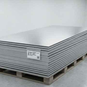
Inox Steel India has established itself as a trusted Aluminium Sheets Manufacturer in Pune, delivering premium-quality aluminium sheets that meet the requirements of modern industries. Our products are engineered for superior strength, outstanding corrosion resistance, excellent durability, and lightweight performance, making them ideal for construction, automotive, marine, engineering, fabrication, and industrial applications. As a leading Aluminium Sheet Supplier in India, we offer an extensive range of aluminium sheets in various grades, thicknesses, and dimensions to suit projects of every scale. Every sheet is manufactured with precision to ensure a smooth surface finish, accurate dimensions, and dependable long-term performance.
As a preferred Aluminium Sheets Supplier in Pune, we supply high-quality aluminium sheets for structural fabrication, transportation, roofing systems, industrial equipment, and commercial projects. Our advanced manufacturing processes and stringent quality standards ensure consistent product quality and reliable performance in demanding environments. Being a recognized Aluminium Sheet Manufacturer in India, we also provide a detailed Aluminium Sheets Weight Chart, helping customers select the right material specifications for improved efficiency, cost-effectiveness, and engineering accuracy.
In addition to standard aluminium sheets, we are a reliable 5083 Aluminium Sheets Manufacturer and 5754 Aluminium Sheets Manufacturer, offering high-performance aluminium alloys known for exceptional corrosion resistance, superior weldability, and remarkable mechanical strength. These grades are widely preferred in the marine, automotive, transportation, and heavy engineering sectors due to their excellent performance under challenging conditions. Furthermore, we are a trusted Aluminium Plates Manufacturer in India, supplying premium aluminium plates manufactured to international quality standards. Our commitment to quality, timely delivery, and customer satisfaction has made Inox Steel India the preferred choice for businesses seeking durable and high-performance aluminium solutions across India.
 SHELLEY RODNER DESIGN / DDI
DESIGN CHALLENGES ADDRESSED:
To anyone who may be reading this project overview, I do hope you'll have the opportunity to
have a look at the 'before' photo of this space. It's quite a transformation!
Our homeowners purchased their condo at the beach several years ago. As shown in the 'before'
photo, at the time, their family room was a dark and dated space with unsightly paneled walls,
heavy faux ceiling beams and odds and ends for furniture. Everything felt cramped and cluttered
throughout the condo, especially their family room. The client's vision was for an airy and
relaxed coastal vibe for their 'place at the beach'.
DESIGN SOLUTIONS PROVIDED:
The entire condo was taken down to stud. The faux beams were edited out and the ceiling raised.
The heavy out-dated paneling was removed and replaced with fresh clean walls that were painted
in a calming creamy sand tone throughout the entire condo.
The existing dark and gloomy furniture was replaced with stylish updated pieces. Great thought
was given to the size, scale and textiles used. The sofa and loveseat, done in a softly textured
herring boned pattern, was the perfect choice. It's cremey toned easy care fabric created a 'pet
friendly' environment for the clients. The homeowners have two dogs and a cat who love a visit
to the beach as much as their 'humans'.
Worn out window treatments were replaced with fresh custom draperies in a playful botanical
print featuring tones of kiwi, leaf green and cerulean blue. A special 'solar friendly' lining was
used to tame the harmful rays of direct sun.
A variety of special curated accents were added to the room. The richly textured rug, round
coffee table with an organic feel, comfy pillows and a few special art pieces all helped to
complete this space.
The overall effect of the renovation was quite dramatic and the clients were thrilled with the
results. This family room went from being dark and dated to light and airy and is now a space
that is inviting and relaxing which perfectly suits the homeowner's coastal lifestyle.
RETAIL PROJECT PRICE: $ 9,000.00
Retail price is defined as the total sale you submitted on your sales repor
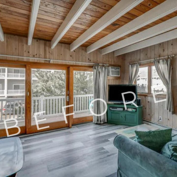 SHELLEY RODNER DESIGN / DDI
DESIGN CHALLENGES ADDRESSED:
To anyone who may be reading this project overview, I do hope you'll have the opportunity to
have a look at the 'before' photo of this space. It's quite a transformation!
Our homeowners purchased their condo at the beach several years ago. As shown in the 'before'
photo, at the time, their family room was a dark and dated space with unsightly paneled walls,
heavy faux ceiling beams and odds and ends for furniture. Everything felt cramped and cluttered
throughout the condo, especially their family room. The client's vision was for an airy and
relaxed coastal vibe for their 'place at the beach'.
DESIGN SOLUTIONS PROVIDED:
The entire condo was taken down to stud. The faux beams were edited out and the ceiling raised.
The heavy out-dated paneling was removed and replaced with fresh clean walls that were painted
in a calming creamy sand tone throughout the entire condo.
The existing dark and gloomy furniture was replaced with stylish updated pieces. Great thought
was given to the size, scale and textiles used. The sofa and loveseat, done in a softly textured
herring boned pattern, was the perfect choice. It's cremey toned easy care fabric created a 'pet
friendly' environment for the clients. The homeowners have two dogs and a cat who love a visit
to the beach as much as their 'humans'.
Worn out window treatments were replaced with fresh custom draperies in a playful botanical
print featuring tones of kiwi, leaf green and cerulean blue. A special 'solar friendly' lining was
used to tame the harmful rays of direct sun.
A variety of special curated accents were added to the room. The richly textured rug, round
coffee table with an organic feel, comfy pillows and a few special art pieces all helped to
complete this space.
The overall effect of the renovation was quite dramatic and the clients were thrilled with the
results. This family room went from being dark and dated to light and airy and is now a space
that is inviting and relaxing which perfectly suits the homeowner's coastal lifestyle.
RETAIL PROJECT PRICE: $ 9,000.00
Retail price is defined as the total sale you submitted on your sales repor
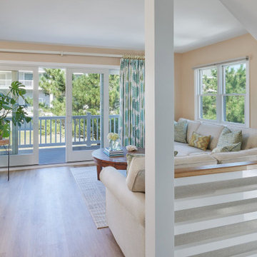 SHELLEY RODNER DESIGN / DDI
DESIGN CHALLENGES ADDRESSED:
To anyone who may be reading this project overview, I do hope you'll have the opportunity to
have a look at the 'before' photo of this space. It's quite a transformation!
Our homeowners purchased their condo at the beach several years ago. As shown in the 'before'
photo, at the time, their family room was a dark and dated space with unsightly paneled walls,
heavy faux ceiling beams and odds and ends for furniture. Everything felt cramped and cluttered
throughout the condo, especially their family room. The client's vision was for an airy and
relaxed coastal vibe for their 'place at the beach'.
DESIGN SOLUTIONS PROVIDED:
The entire condo was taken down to stud. The faux beams were edited out and the ceiling raised.
The heavy out-dated paneling was removed and replaced with fresh clean walls that were painted
in a calming creamy sand tone throughout the entire condo.
The existing dark and gloomy furniture was replaced with stylish updated pieces. Great thought
was given to the size, scale and textiles used. The sofa and loveseat, done in a softly textured
herring boned pattern, was the perfect choice. It's cremey toned easy care fabric created a 'pet
friendly' environment for the clients. The homeowners have two dogs and a cat who love a visit
to the beach as much as their 'humans'.
Worn out window treatments were replaced with fresh custom draperies in a playful botanical
print featuring tones of kiwi, leaf green and cerulean blue. A special 'solar friendly' lining was
used to tame the harmful rays of direct sun.
A variety of special curated accents were added to the room. The richly textured rug, round
coffee table with an organic feel, comfy pillows and a few special art pieces all helped to
complete this space.
The overall effect of the renovation was quite dramatic and the clients were thrilled with the
results. This family room went from being dark and dated to light and airy and is now a space
that is inviting and relaxing which perfectly suits the homeowner's coastal lifestyle.
RETAIL PROJECT PRICE: $ 9,000.00
Retail price is defined as the total sale you submitted on your sales repor
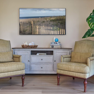 SHELLEY RODNER DESIGN / DDI
DESIGN CHALLENGES ADDRESSED:
To anyone who may be reading this project overview, I do hope you'll have the opportunity to
have a look at the 'before' photo of this space. It's quite a transformation!
Our homeowners purchased their condo at the beach several years ago. As shown in the 'before'
photo, at the time, their family room was a dark and dated space with unsightly paneled walls,
heavy faux ceiling beams and odds and ends for furniture. Everything felt cramped and cluttered
throughout the condo, especially their family room. The client's vision was for an airy and
relaxed coastal vibe for their 'place at the beach'.
DESIGN SOLUTIONS PROVIDED:
The entire condo was taken down to stud. The faux beams were edited out and the ceiling raised.
The heavy out-dated paneling was removed and replaced with fresh clean walls that were painted
in a calming creamy sand tone throughout the entire condo.
The existing dark and gloomy furniture was replaced with stylish updated pieces. Great thought
was given to the size, scale and textiles used. The sofa and loveseat, done in a softly textured
herring boned pattern, was the perfect choice. It's cremey toned easy care fabric created a 'pet
friendly' environment for the clients. The homeowners have two dogs and a cat who love a visit
to the beach as much as their 'humans'.
Worn out window treatments were replaced with fresh custom draperies in a playful botanical
print featuring tones of kiwi, leaf green and cerulean blue. A special 'solar friendly' lining was
used to tame the harmful rays of direct sun.
A variety of special curated accents were added to the room. The richly textured rug, round
coffee table with an organic feel, comfy pillows and a few special art pieces all helped to
complete this space.
The overall effect of the renovation was quite dramatic and the clients were thrilled with the
results. This family room went from being dark and dated to light and airy and is now a space
that is inviting and relaxing which perfectly suits the homeowner's coastal lifestyle.
RETAIL PROJECT PRICE: $ 9,000.00
Retail price is defined as the total sale you submitted on your sales repor

Sponsored
Sunbury, OH

J.Holderby - Renovations
Franklin County's Leading General Contractors - 2X Best of Houzz!
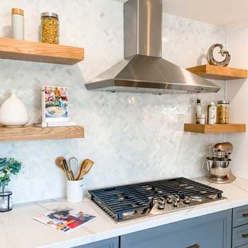 Tomlinson Kitchen and Bath
Welcome home to a stunning modern two tone kitchen, at least thats what are clients are thinking. This beautiful new open layout kitchen went from a small closed off space to a large contemporary showstopper. Walking into this kitchen the airiness from the glass cabinets and floating shelves add an open concept to the overall design. This multifunctional space has everything you would hope for in a kitchen, from large modern appliances, great unique storage, built in bar area, peninsula seating, and a small home office space. The Waypoint Living Space cabinetry used in this design is the new 570 door style in Painted Linen and Painted Boulder, accomplishing a desired two tone effect. The addition of the light oak floating shelves and desk top compliment the gray and white cabinets, as well as the warm engineered hardwood floor that runs throughout. The mixing of metals was key in adding a touch of glam to this kitchen by complimenting the stainless steel appliances with Champagne Bronze tones in the Delta Trinsic Kitchen Faucet and the Honey Bronze Riverside Top Knobs hardware. The large, modern and square apron front sink from Nantucket Sinks below the kitchen window flows nicely with the Vadara Calacatta Blanco Quartz. Smart drawer storage was a must on the cook top wall along with hidden appliance storage in order to give the clients the open look they desired. The Marble Greecian White Herringbone pattern was a nice addition to make a thoughtful statement to the overall design. From built in bar and wine storage, to a messenger center at the desk space, tall pantry storage, corner solutions and open clean counter tops this kitchen is loved by the homeowners and hopefully loved by you and sparks some inspiration for your kitchen remodel.

 Laqfoil Ltd.
The issues that annoyed the family in this condo are common to new condo units: Low ceilings covered with a popcorn finish, small rooms, low light in the bedrooms and living room, and no ceiling light fixtures. Concrete ceilings are not only difficult to drill into to install fixtures, installing wiring behind them for such fixtures is impossible. There are often conduits for building services embedded in the concrete along with structural steel reinforcements, so drilling without x-raying first is dangerous.
Laqfoil stretch ceiling provided a solution to all of these issues for this condo unit. A high gloss finish was chosen, as the reflections visually double the height of the space. Installing a stretch ceiling also naturally conceals the popcorn ceiling behind it, but in this case, was also used to conceal the wiring necessary to add ceiling lights in every room. The wiring was simply attached to the existing popcorn ceiling. Laqfoil stretch ceiling is supported around the perimeter only, by tracks, or profiles which are only about 0.75" thick. The ceiling membrane itself is less than one millimetre thick.
We also added a small vector graphic, printed in each corner of the living room ceiling, for a unique aesthetic effect.
We constructed a suspended bulkhead above the island and covered it with red high gloss membrane, to visually separate the kitchen and living room while keeping the design's open concept. This also provided a supporting structure for 3 mini chandelier pendant lights.
A red rose depicted on a black and white textured ground was chosen for the kitchen ceiling and applied using digital wide format printing technology, to tie the red, black and white colour scheme with the kitchen cabinets' texture.
 Advance Design Studio, Ltd.
After living in this home for a decade, Crystal Lake residents Ken & Bonnie needed an update to their tired original kitchen to meet the needs of their busy family. Together with the expertise of designer Scott Christensen at Advance Design Studio they planned to completely reconfigure the entire space. They began by removing the restrictive peninsula and replaced it with a generous island designed to house an expansive farmhouse sink, convenient pull out trash receptacles, and a hidden dishwasher. Now there was ample room to add island seating to accommodate family gatherings, or for just “hanging out” with teenagers.
A dramatic new focal point was created with the design of an elegant range area featuring a beautiful custom wood mantle hood detailed with crushed glass handmade tile. Hidden storage houses every spice imaginable right at the cook’s fingertips. Double-stacked glass cabinetry emphasizes the impressive height of the room that was a wonderful architectural element that previously went unnoticed in the original kitchen.
The entire kitchen and breakfast nook was opened up to the 2 story family room by integrating enlarged arched openings. An outdated desk area was transformed into a beautiful breakfront bar with beverage refrigeration, glass display cabinets and plenty of new storage for entertainment pieces. An espresso nook was tucked neatly between tall cabinetry, and an old fashioned closet with shelves was converted into an efficient chef’s dream of organized custom pull out pantries.
“I am the leader of the Scott Christensen fan club,” says Bonnie. “With my busy family and a full time career, Scott made the process of designing this space so easy for me. He didn’t overwhelm me, but carefully determined what I liked and offered me two thoughtful solutions for just about everything - complete with his expert opinion that I really respected.”
Bright white Jay Rambo custom made maple cabinets are accented by Cambria quartz counter tops and simple subway tiles. Original hardwood floors were refinished and stained a darker shade, and stair risers and balusters were painted white to coordinate with the smart wainscot details throughout the first floor. The end effect is a cohesive first floor that flows together with grace and a level of elegance perfectly suitable for this stately Crystal Lake home.
Designer: Scott Christensen
Photographer: Joe Nowak

 Kitchen Magic
Some remodeling customers are uncertain about the best way to change the look of their space, and turn to us at Kitchen Magic for guidance; other homeowners already have a clear idea of what they want, and ask us to make their vision a reality. The latter was very much the case in a recent remodeling project we completed in Milford, New Jersey.
The home had been designed by the homeowner, who was clearly accustomed to creating and implementing an artistic vision for their living space. By the time Kitchen Magic arrived on the scene, the homeowner already had clear ideas about the colors and materials that would go into creating the look of their new kitchen. Cabinet refacing was the perfect solution for staying within budget, yet still having the kitchen they had always dreamed of.
Building on the Existing Decor is Key
The sleek, black appliances already in place demanded a bold complement, and the rich, deep hue of Cordovan on Cherry stain fit the bill perfectly. The arched cabinet doors add a classic touch of elegance, but one that blends seamlessly with the modern feel of the other design elements. The clean lines and chrome finish of the cabinet hardware serve to unite the vivid cherry cabinetry with the gray toned counters and backsplash.
That backsplash, a custom design envisioned by the homeowner, brings both unity and contrast to the entire space. The splashes of lighter values brighten the deep red tones of the cabinets, keeping the room from feeling too dark. The use of texture and varied tonal values create a unique piece that adds dimension to the kitchen's personality and reflects the creative energy of the homeowners.
The luxury of the deep cherry-red cabinets and the sleekly modern lines of the furnishings create a timeless and bold back drop for the counters, and only one stone perfectly fits that bill: granite! The black Uba Tuba granite countertops chosen by the homeowners have the visual weight and richness to pair with the Cordovan on Cherry, and the marbling of lighter and darker values echo of the custom-designed backsplash over the range, completing the new design.
Taken together, the effect of the homeowners' choices create a striking, elegant, and almost decadent feel without any heavy or dark characters. The sleek lines and organic look created by the arched cabinet doors give the room a sense of grace and motion that is entirely appropriate to the homeowners' aesthetic, given their fondness for the adventure of hot-air ballooning and active life style.
David Glasofer
Sponsored
Sunbury, OH
J.Holderby - Renovations
Franklin County's Leading General Contractors - 2X Best of Houzz!
 CHRISTOPHER STROM ARCHITECTS
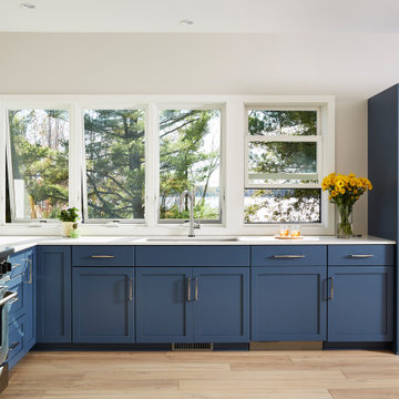
Sommerhus is a private retreat for two empty-nesters. The clients purchased the previous cabin after falling in love with its location on a private, lakefront peninsula. However, this beautiful site was a challenging site to build on, due to its position sandwiched between the lake and protected wet land. The clients disliked the old cabin because it could only be used in the summer months, due to its lack of both insulation and heat. In addition, it was too small for their needs. They wanted to build a new, larger retreat, but were met with yet another constraint: the new cabin would be limited to the previous cabin’s small footprint. Thus, they decided to approach an architect to design their dream cabin.
As the clients described, “We visited Denmark for a family wedding in 2015, and while biking near Gilleleje, a fishing village on the Baltic Sea, we fell in love with the aesthetic of ‘Sommerhus’: dark exteriors, clean, simple lines, and lots of windows.” We set out to design a cabin that fit this aesthetic while also meeting the site’s constraints.
The clients were committed to keeping all existing trees on their site. In addition, zoning codes required the new retreat to stay within the previous cabin's small footprint. Thus, to maximize the square footage of the cabin without removing trees or expanding the footprint, the new structure had to grow vertically. At the same time, the clients wanted to be good neighbors. To them, this meant that their cabin should disappear into the woods, especially when viewed from the lake. To accomplish both these requests, the architect selected a dark exterior metal façade that would visually retreat into the trees. The metal siding is a modern, low-maintenance, and cost-effective solution, especially when compared to traditional wood siding. Warm wood on the soffits of the large roof overhang contrast with the metal siding. Sommerhus's resulting exterior is just as the clients’ requested: boldly modern yet respectful of the serene surroundings.
The homeowners desired a beach-house-inspired interior, full of light and warmth, in contrast to the dark exterior. As the homeowner explained, “I wanted it to feel like a porch inside.” To achieve this, the living room has two walls of sliding glass doors that connect to the wrap-around porch. This creates a beautiful, indoor-outdoor living space. The crisp and bright kitchen also connects to the porch with the window that opens to an outdoor counter - perfect for passing food and drinks to those lounging on the porch. The kitchen is open to the rest of the first-floor entertaining space, and brings a playful, beach-house feel to the cabin.
After the completion of the project, the homeowners remarked, “Working with Christopher and Eric [of CSA] was a wonderful experience. We absolutely love our home, and each season on the lake is more special than the last.”

 Shuler Architecture
About a year after purchasing this structure, these clients engaged us to to start the process of designing and engineering a expansion of this little cottage into a larger home where they could put down roots and start a family. Our clients looked long and hard for the perfect outdoor setting and after months of searching, they found a little post-war cottage on a lake just east of Redmond, Washington. Our solution is a classic upper level addition that takes in the views of its alpine lake setting. The existing basement level was repurposed as the recreation hub of the house with a game area, media center, guest suite and storage for a large inventory of outdoor & boating gear. The main level was redesigned in a more family friendly format with a powder room, bedroom, vaulted great room, pantry and gourmet kitchen. The upper level is the private domain of the Master Suite and high tech hub. Because our clients work in the tech industry, a large home office that allows them to work remotely was an important component of their home's program. The master suite includes a large walk-in closet, small laundry, sleeping area and 5-piece master bath. The exterior of the house includes a covered porch that wraps around this level and leads to an expansive deck on the water side of the house. This deck functions as an extension of the main level and effectively adds several hundred square feet of additional living space. We then enveloped this building shell in a shingled craftsman style that is a hallmark of Seattle residential architecture.
 Tile Doctor Ltd
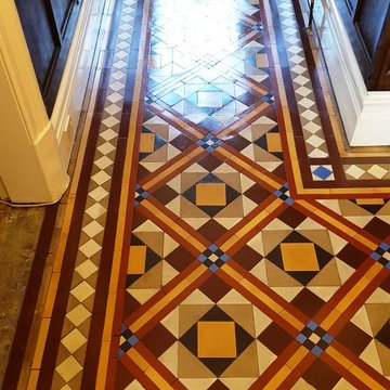
The colourful and diverse geometric patterns of a Victorian tiled floor can give a property a regal, elegant and timeless feel, making it a popular choice even in the 21st century. However, as time passes without regular care and maintenance, Victorian tiles can quickly lose their colour and appear deadened by the buildup of dirt and dust over several months (and sometimes years).
This property owner in Hebden a very small village in North Yorkshire of less than 300 people, had this common problem. Her Victorian tiled hallway had not been adequately maintained and was now more difficult to keep clean than ever. To add to the problem, most of the tiles along the edges were either broken, cracked, or filled with holes, probably I suspect from the installation of carpet grippers at some point in the past.
At this point, the property owner turned to Tile Doctor to see what could be done.
Before beginning a deep clean of the entire length of the hallway, it was first necessary to source and install replacement tiles for those that had been broken and damaged. I also relaid any that were loose.
When finished, I left the tiles to set and returned the next day to start the clean. My choice of cleaner in this situation was Tile Doctor Pro Clean, which was scrubbed into the floor with a special pad fitted to a rotary machine to break down ingrained dirt and stains. Pro Clean does this very effectively on all types of tile, including natural stone and of course Victorian tiles.
The floor was then rinsed with water and the soiled cleaning solution extracted from the floor using a vet vacuum. Stubborn areas were re-treated with more Pro Clean, and when I was satisfied with the condition of the tiles the floor was given a final but thorough rinse to remove any trace of cleaning product.
The floor was then left to dry completely overnight to ensure all excess moisture had disappeared, leaving it fresh to be sealed. I returned in the morning for a third day of work to seal the Victorian tiles with four coats of Tile Doctor Seal and Go, a topical sealer which provides a rich satin finish to really add depth to the colours in the tile while protecting it against dirt and stains.
The customer was delighted with the restoration and couldn’t quite believe the huge improvement in the appearance of the tiles, especially in regards to the enhancement in the different colours. Another satisfied customer!
Nigel Stoker
North West Yorkshire Tile Doctor
119