
Search results for "Effectively address" in Home Design Ideas
 User
UserThe client purchased a mature, small, NAPA Valley vineyard to be their home and for personal enjoyment.
Once they began converting their new "hobby" grapes into wine, they soon realized they needed a place to "age" their labors and a place to then enjoy them. They decided to design such a place within the confines of their home where they could entertain family and friends.
The structure was modified to allow storage of more than 200 individual bottles, cases, and magnum size bottles. A cask room was added as was a well-appointed tasting room. The storage area is separated from the tasting and social area by a tempered glass doors and windows. The space to be converted was a challenge. No surface was plumb or level, therefore, the remodel involved interior walls, new floors and ceilings.
Until these issues were addressed, the beautiful cabinet work, and a complete temperature and humidity control system to store, maintain, and enjoy the wine could not be started. The floors had to be floated out and chases with faux finishes provided for HVAC and electrical. Lighting in the tasting room is provided by a series of recessed and puck lights.
The bar/counter area is highlighted by a custom, Tiffany style chandelier. Enough space was left in front of the bar to accommodate two serving tables for food and snacks, with plenty of room to move about the space. Discreetly hidden behind the bar is a large capacity cooler that can chill several bottles at once.
The bar is capped with eight lineal feet of Calcutta Gold Marble and sports a brass foot rail. The bar has grape panels between Acanthus Corbels and the bottle storage cabinet areas are a unique blend of Acanthus overlays under precisely cut and mitered grape design crown molding over and around a cleverly designed bottle storage system.
Traffic flow is achieved through the multiple points of entry through any of three pairs of 6' custom double doors which, when weather permitting, can remain open while entertaining. The host and hostess can attend food and beverage service from behind and around the bar through a separate doorway.
The temperature controlled cask storage area is large enough for the clients' current needs, and can accommodate a larger number of casks should the need arise.
The floor and walls of the cask room are designed for easy maintenance.. Both rooms are delightfully decorated with earthen tone faux finishes on walls, ceilings and floors reminiscent of a nonspecific European wine making region.
This effect is extended to the soffits in the tasting room. A unique wine racking system is easily stored, providing even greater ability to maintain and move about the storage area.
 CRC Builders Inc.
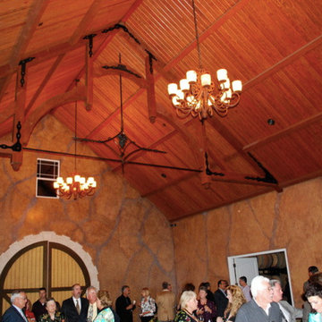
The client purchased a mature, small, NAPA Valley vineyard to be their home and for personal enjoyment.
Once they began converting their new "hobby" grapes into wine, they soon realized they needed a place to "age" their labors and a place to then enjoy them. They decided to design such a place within the confines of their home where they could entertain family and friends.
The structure was modified to allow storage of more than 200 individual bottles, cases, and magnum size bottles. A cask room was added as was a well-appointed tasting room. The storage area is separated from the tasting and social area by a tempered glass doors and windows. The space to be converted was a challenge. No surface was plumb or level, therefore, the remodel involved interior walls, new floors and ceilings.
Until these issues were addressed, the beautiful cabinet work, and a complete temperature and humidity control system to store, maintain, and enjoy the wine could not be started. The floors had to be floated out and chases with faux finishes provided for HVAC and electrical. Lighting in the tasting room is provided by a series of recessed and puck lights.
The bar/counter area is highlighted by a custom, Tiffany style chandelier. Enough space was left in front of the bar to accommodate two serving tables for food and snacks, with plenty of room to move about the space. Discreetly hidden behind the bar is a large capacity cooler that can chill several bottles at once.
The bar is capped with eight lineal feet of Calcutta Gold Marble and sports a brass foot rail. The bar has grape panels between Acanthus Corbels and the bottle storage cabinet areas are a unique blend of Acanthus overlays under precisely cut and mitered grape design crown molding over and around a cleverly designed bottle storage system.
Traffic flow is achieved through the multiple points of entry through any of three pairs of 6' custom double doors which, when weather permitting, can remain open while entertaining. The host and hostess can attend food and beverage service from behind and around the bar through a separate doorway.
The temperature controlled cask storage area is large enough for the clients' current needs, and can accommodate a larger number of casks should the need arise.
The floor and walls of the cask room are designed for easy maintenance.. Both rooms are delightfully decorated with earthen tone faux finishes on walls, ceilings and floors reminiscent of a nonspecific European wine making region.
This effect is extended to the soffits in the tasting room. A unique wine racking system is easily stored, providing even greater ability to maintain and move about the storage area.
 SHELLEY RODNER DESIGN / DDI
DESIGN CHALLENGES ADDRESSED:
To anyone who may be reading this project overview, I do hope you'll have the opportunity to
have a look at the 'before' photo of this space. It's quite a transformation!
Our homeowners purchased their condo at the beach several years ago. As shown in the 'before'
photo, at the time, their family room was a dark and dated space with unsightly paneled walls,
heavy faux ceiling beams and odds and ends for furniture. Everything felt cramped and cluttered
throughout the condo, especially their family room. The client's vision was for an airy and
relaxed coastal vibe for their 'place at the beach'.
DESIGN SOLUTIONS PROVIDED:
The entire condo was taken down to stud. The faux beams were edited out and the ceiling raised.
The heavy out-dated paneling was removed and replaced with fresh clean walls that were painted
in a calming creamy sand tone throughout the entire condo.
The existing dark and gloomy furniture was replaced with stylish updated pieces. Great thought
was given to the size, scale and textiles used. The sofa and loveseat, done in a softly textured
herring boned pattern, was the perfect choice. It's cremey toned easy care fabric created a 'pet
friendly' environment for the clients. The homeowners have two dogs and a cat who love a visit
to the beach as much as their 'humans'.
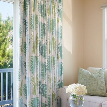
Worn out window treatments were replaced with fresh custom draperies in a playful botanical
print featuring tones of kiwi, leaf green and cerulean blue. A special 'solar friendly' lining was
used to tame the harmful rays of direct sun.
A variety of special curated accents were added to the room. The richly textured rug, round
coffee table with an organic feel, comfy pillows and a few special art pieces all helped to
complete this space.
The overall effect of the renovation was quite dramatic and the clients were thrilled with the
results. This family room went from being dark and dated to light and airy and is now a space
that is inviting and relaxing which perfectly suits the homeowner's coastal lifestyle.
RETAIL PROJECT PRICE: $ 9,000.00
Retail price is defined as the total sale you submitted on your sales repor
Find the right local pro for your project
 Building Designers Association of Australia
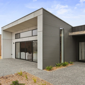
Named after a local crustacean, the Periwinkle Project design by Beaumont Concepts promotes harmony with the natural coastal surrounds and addresses sustainability from construction to consumption of resources over the life cycle of the home. The compact, cost effective home is successful in responding to constraints of the site. The home sits comfortably within the site and actively benefits from it with passive solar principals and energy efficiency and environmentally conscious provision of thermal mass.
 Amazing Spaces
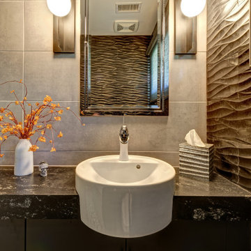
Combining an everyday hallway bathroom with the main guest bath/powder room is not an easy task. The hallway bath needs to have a lot of utility with durable materials and functional storage. It also wants to be a bit “dressy” to make house guests feel special. This bathroom needed to do both.
We first addressed its utility with bathroom necessities including the tub/shower. The recessed medicine cabinet in combination with an elongated vanity tackles all the storage needs including a concealed waste bin. Thoughtfully placed towel hooks are mostly out of sight behind the door while the half-wall hides the paper holder and a niche for other toilet necessities.
It’s the materials that elevate this bathroom to powder room status. The tri-color marble penny tile sets the scene for the color palette. Carved black marble wall tile adds the necessary drama flowing along two walls. The remaining two walls of tile keep the room durable while softening the effects of the black walls and vanity.
Rounded elements such as the light fixtures and the apron sink punctuate and carry the theme of the floor tile throughout the bathroom. Polished chrome fixtures along with the beefy frameless glass shower enclosure add just enough sparkle and contrast.
 Skill Construction & Design, LLC
Last week we featured an incredible new kitchen with an open floor plan and unique architectural interest. I alluded to a change in the staircase and here it is. Part of designing a new kitchen or bath is looking at surrounding spaces and how the remodel will affect them. Will the current master bedroom seem dated as an entrance to the new bath? Is the dining room that adjoins the kitchen badly in need of flooring and lighting? Some projects might have to wait. But if the immediate area has an adverse affect on the newly remodeled kitchen it might be just as important to address these areas within your remodel.
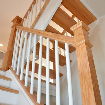
Although the staircase was in harmony with the homes existing era and colors, it simply didn’t work with the new kitchen. Despite its open risers, the existing balusters and railings with their colonial turnings and dark stain, were the opposite of the finished kitchen. With the carpeting gone from the floors, it looked dated and out-of-place on the stairs.
We carried our kitchen theme to the staircase. We used the natural oak of our flooring for the treads, handrails and posts, but kept the balusters and trim crisp white. The effect perfectly reflects the feel of the kitchen, light and airy.
Before, the dark wood details drew the eye up, ultimately to the textured ceiling in the dining room. The darker tone created a dramatic ending as it traveled up to die into the wall.
Now, as the eye travels up, the staircase seems to soar. The textured ceiling was replaced with a smooth white one and the wall color is a soft warm contrast. The handrail still ends at the wall, but with white balusters and the light oak handrail, the ending is softer.
It isn’t a lighting change, the staircase simply lets the light shine through. The treads are slim and sleek, while the white walls, trim and balusters reflect the light for an overall brighter feel.
The newel posts were a great choice. The larger size and square craftsman like features add substance and architecture without seeming heavy or bulky.
The final touch completes the look. From front door to back, up and down, this remodel is finished. This home now bursts with sunshine the minute you enter and stays bright and sunny no matter where you turn. From the architectural details that are the center of attention, to the modern stainless steel appliance, this space is perfect for entertaining, or any day.
http://www.designsbyskill.com/
http://www.rjkconstructioninc.com/
 Velero Deck Designs
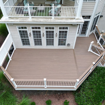
This project was all about resurfacing an existing deck, which provides a significant amount of benefits, including:
- Enhanced Aesthetics: A deck resurfacing project can transform the appearance of the deck, giving it a fresh and modern look that can significantly improve the curb appeal of the entire home.
- Cost Savings: Resurfacing is often more cost-effective than completely rebuilding a deck. It allows homeowners to achieve a like-new appearance without the expense of a full replacement.
- Increased Durability: New materials used in resurfacing are designed to be more resistant to wear, fading, and the elements, resulting in a longer lifespan for the deck.
- Improved Safety: Addressing structural issues during the resurfacing process ensures the deck's safety and stability, reducing the risk of accidents.
- Less Disruption: Compared to a full deck replacement, resurfacing typically involves less disruption to the homeowner's daily routine, as it's a faster and less invasive process.
- Customization: Homeowners can choose from a wide range of materials, colors, and finishes to match their design preferences and complement their home's style.
- Environmentally Friendly: Resurfacing reduces the amount of old material that needs to be disposed of, making it a more environmentally conscious option.
By undertaking a deck resurfacing project, homeowners can rejuvenate their outdoor space, enjoy a beautiful and functional deck for years to come and increase the overall value of their property.

Sponsored
Sunbury, OH

J.Holderby - Renovations
Franklin County's Leading General Contractors - 2X Best of Houzz!
 Alair Homes Arlington
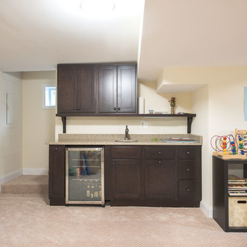
Addition off the side of a typical mid-century post-WWII colonial, including master suite with master bath expansion, first floor family room addition, a complete basement remodel with the addition of new bedroom suite for an AuPair. The clients realized it was more cost effective to do an addition over paying for outside child care for their growing family. Additionally, we helped the clients address some serious drainage issues that were causing settling issues in the home.
 Building Designers Association of Australia
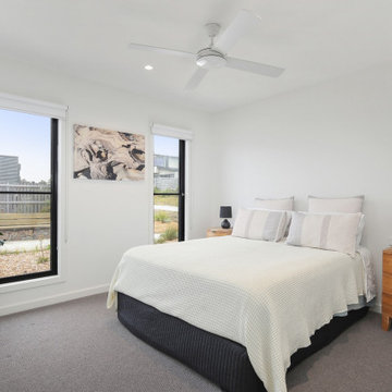
Named after a local crustacean, the Periwinkle Project design by Beaumont Concepts promotes harmony with the natural coastal surrounds and addresses sustainability from construction to consumption of resources over the life cycle of the home. The compact, cost effective home is successful in responding to constraints of the site. The home sits comfortably within the site and actively benefits from it with passive solar principals and energy efficiency and environmentally conscious provision of thermal mass.
 Skill Construction & Design, LLC
Last week we featured an incredible new kitchen with an open floor plan and unique architectural interest. I alluded to a change in the staircase and here it is. Part of designing a new kitchen or bath is looking at surrounding spaces and how the remodel will affect them. Will the current master bedroom seem dated as an entrance to the new bath? Is the dining room that adjoins the kitchen badly in need of flooring and lighting? Some projects might have to wait. But if the immediate area has an adverse affect on the newly remodeled kitchen it might be just as important to address these areas within your remodel.
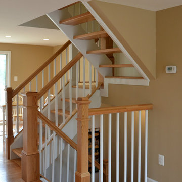
Although the staircase was in harmony with the homes existing era and colors, it simply didn’t work with the new kitchen. Despite its open risers, the existing balusters and railings with their colonial turnings and dark stain, were the opposite of the finished kitchen. With the carpeting gone from the floors, it looked dated and out-of-place on the stairs.
We carried our kitchen theme to the staircase. We used the natural oak of our flooring for the treads, handrails and posts, but kept the balusters and trim crisp white. The effect perfectly reflects the feel of the kitchen, light and airy.
Before, the dark wood details drew the eye up, ultimately to the textured ceiling in the dining room. The darker tone created a dramatic ending as it traveled up to die into the wall.
Now, as the eye travels up, the staircase seems to soar. The textured ceiling was replaced with a smooth white one and the wall color is a soft warm contrast. The handrail still ends at the wall, but with white balusters and the light oak handrail, the ending is softer.
It isn’t a lighting change, the staircase simply lets the light shine through. The treads are slim and sleek, while the white walls, trim and balusters reflect the light for an overall brighter feel.
The newel posts were a great choice. The larger size and square craftsman like features add substance and architecture without seeming heavy or bulky.
The final touch completes the look. From front door to back, up and down, this remodel is finished. This home now bursts with sunshine the minute you enter and stays bright and sunny no matter where you turn. From the architectural details that are the center of attention, to the modern stainless steel appliance, this space is perfect for entertaining, or any day.
http://www.designsbyskill.com/
http://www.rjkconstructioninc.com/
 User
UserThe client purchased a mature, small, NAPA Valley vineyard to be their home and for personal enjoyment.
Once they began converting their new "hobby" grapes into wine, they soon realized they needed a place to "age" their labors and a place to then enjoy them. They decided to design such a place within the confines of their home where they could entertain family and friends.
The structure was modified to allow storage of more than 200 individual bottles, cases, and magnum size bottles. A cask room was added as was a well-appointed tasting room. The storage area is separated from the tasting and social area by a tempered glass doors and windows. The space to be converted was a challenge. No surface was plumb or level, therefore, the remodel involved interior walls, new floors and ceilings.
Until these issues were addressed, the beautiful cabinet work, and a complete temperature and humidity control system to store, maintain, and enjoy the wine could not be started. The floors had to be floated out and chases with faux finishes provided for HVAC and electrical. Lighting in the tasting room is provided by a series of recessed and puck lights.
The bar/counter area is highlighted by a custom, Tiffany style chandelier. Enough space was left in front of the bar to accommodate two serving tables for food and snacks, with plenty of room to move about the space. Discreetly hidden behind the bar is a large capacity cooler that can chill several bottles at once.
The bar is capped with eight lineal feet of Calcutta Gold Marble and sports a brass foot rail. The bar has grape panels between Acanthus Corbels and the bottle storage cabinet areas are a unique blend of Acanthus overlays under precisely cut and mitered grape design crown molding over and around a cleverly designed bottle storage system.
Traffic flow is achieved through the multiple points of entry through any of three pairs of 6' custom double doors which, when weather permitting, can remain open while entertaining. The host and hostess can attend food and beverage service from behind and around the bar through a separate doorway.
The temperature controlled cask storage area is large enough for the clients' current needs, and can accommodate a larger number of casks should the need arise.
The floor and walls of the cask room are designed for easy maintenance.. Both rooms are delightfully decorated with earthen tone faux finishes on walls, ceilings and floors reminiscent of a nonspecific European wine making region.
This effect is extended to the soffits in the tasting room. A unique wine racking system is easily stored, providing even greater ability to maintain and move about the storage area.
 Schedio Spaces
Starting its life as a dark, walled in space with inadequate cabinetry and multiple awkward components, I knew the only way forward with this penthouse kitchen, was for it to undergo a complete rebuild.
The clients were hoping to welcome a child in the years following this renovation, however they love to entertain so also wanted a modern and sophisticated kitchen. Therefore, the task became marrying functional
indestructibility with clean, elevated design, resulting in a timeless, architecturally forward kitchen with sensible storage and innovated finishes.
The first and most important task when addressing the modernization of this kitchen, was to remove the existing walls that closed off the space. Accomplishing this allowed for a more free-flowing feel and opened the sightline to the rest of the unit. This also invited the opportunity for a new, more welcoming floor plan including the addition of a large island with
ample counter space and optional eat-in functionality.
In order to maximize functional efficiency and overall aesthetic value, I knew the plumbing required substantial relocation. However, with concrete ceilings and floors, combined with a strata unwilling to allow trenching of
the slab, moving the plumbing to the most effective location was no easy feat.
Ultimately, I was able to accomplish this by creating a hidden channel inside the cabinetry that allowed the plumbing to be redirected to the ideal location without visible detection.
Creatively, I was inspired by the idea of injecting dimension, by way of juxtaposing materials that wouldn’t necessarily be found together in nature,
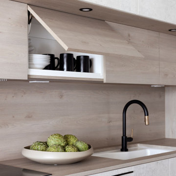
yet worked harmonious when combined. You’ll notice the cabinet fronts are all made of solid Dekton – a manmade stone that while costly, is nearly indestructible. This created the base in which we inset the countertop,
backsplash and surround, all made in a wood-like material. As if a huge ice-cream scoop glided into a slab of solid stone, uncovering beautiful layered depths of wood. I worked with a local company to custom
manufacture this is a high impact, one-of-a-kind laminate specifically for this project. It’s nonporous, fingerprint resistant and antimicrobial. It offers a matte finish which has a beautiful hand-feel resembling real wood but because it’s manmade, it’s not subjected to the same expansion and contraction of natural wood, making it an exceptional choice for this application.
Final details also include a touchless kitchen faucet, integrated appliances, hidden storage, Italian lighting, delicate Australian hardware and smart switches and plugs.
 Simply Home Decorating
The kitchen may be the heart of a home, but the dining room is where the family gathers to enjoy special occasions, create and pass on traditions, and savour each other’s company free from distractions. The family behind this particular dining room enjoys doing just that.
When they are not traveling the world, Matthew and Anna (names changed) love to cook meals at home with their teenage daughter, entertain family and friends, and live amongst their cherished travel souvenirs and heirlooms. Their dining room, however, was far from the perfect backdrop for these experiences.
Before: Dining Room:
When Matthew and Anna contacted us, they imagined a space that would comfortably seat 8 to 10 people and incorporate their beautiful inherited dining table and sideboard in a fresh, modern way. Above all, they wanted a dining room that they would feel proud to share.
They worked with us to design, lightly renovate, and furnish their dining room and adjacent living space. Now, the room is nothing short of inviting and elevated.
Classic Yet Contemporary Dining Room:
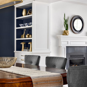
Viewed from the living area, the dining room is a hidden gem waiting to be discovered. Matthew and Anna wanted dark blue for the walls, and we couldn’t have been happier to find the perfect shade for them. By leaning darker, this rich blue creates the perception of depth, making the room feel enticing, comfortable and secluded.
The previous built-ins were underwhelming and lacked function, so we designed wider, taller, double sided cabinets that integrated the existing bulk-head, and then accessorized the shelves with the family’s travel finds, books, and decor. Topping these units with brass art lights not only blends contemporary and traditional styles, it also draws attention to the dining table’s modern show-stopping chandelier. You can’t miss it.
Inside the dining room, the effect is equally impressive: enveloping yet spacious, warm yet cool, classic yet contemporary. We incorporated their heirloom pieces seamlessly into the design thanks to the 1:2 ratio. For every traditional piece, we introduced two more modern or contemporary pieces — clean lines, subtle curves, and lustrous brass hardware. The result is a collected yet updated look.
In any room with dark walls, lighting is of the utmost importance. We placed a mirror adjacent to the window to reflect natural light throughout the room, and we kept the trim and ceiling white for brightness. To provide maximum versatility, we provided multiple light sources that can be adjusted to create different levels of light to suit any mood or occasion. These include: pot lights and a chandelier on dimmers, a sculptural trilight lamp on the sideboard, and art lights on the bookcases and above important art pieces.
The built-ins have another surprise waiting inside this special dining room:
Double-sided built-ins: dining room shelving and living room shelving.
Rather than keep them white like we did in the living room, we painted the back wall of the book cases the same dark blue as the walls in the rest of the room. This reduces the contrast with the surrounding walls and emphasizes the white outline of the cabinets. We also love the dark blue walls’ role as a beautiful backdrop for this family’s treasures. The brass accessories and hand-painted vases and bowls feel like part of the experience.
Of course, what is beauty without function? It may not look like it, but the base storage is only accessible from the dining room side. The units include deep cabinets for storing serving ware, as well as another delightful surprise: silverware drawers lined in luxurious navy velvet!
Lastly, we designed this beautiful nook for their heirloom sideboard. From afar, the wall looks as if it has texture and perhaps a touch of shine. Up close, you will notice that it is actually navy blue wallpaper with tiny golden dots. This unique touch accentuates the brass in the room touches throughout the space.. The room feels curated, contemporary, and full of character.
Words of Praise:
Anna and Matthew were thrilled with their new dining room and with the design process itself, which is always the highest compliment. They said:
“Working with Lori and her team at Simply Home Decorating was a great experience. The design they came up with was both beautiful and practical for our family. Renovations can be stressful but working with Simply Home made the process much more pleasant.
“Simply Home's project management and their longstanding relationships with reliable trades meant we could relax, knowing that everything was taken care of. If an issue arose, the entire Simply Home team was quick to address it. They were excellent at communicating with us—we never felt like we didn't know what was going on. We would highly recommend working with Simply Home Decorating.”
Thank you, Matthew and Anna! We are honoured to have been part of your journey and wish your family many happy memories in these new spaces.
Now, is it your turn? Are you ready to uncover the hidden potential in your home? If so, contact us here to start the conversation or download my guide Uncovering the Hidden Potential in Your Home below to learn more about what we can do for you.


 DesignARC
LOS ANGELES, CA / SINGLE FAMILY RESIDENTIAL
The commission for this 4,300-square-foot residence came with significant challenges for the architects – a house had once existed on the lot but had burned down and the attempt to replace the house had stalled, leading to an abatement order and a lapse of permits.
Our first challenge was to revive the lapsed construction permit by proposing to “modify” the existing structure. The practical effect this had was to fix the footprint of the new home to the existing structure’s plan outline. Having thereby inherited the large, dense block of the original house, the new strategy became one of substituting selective areas of indoor space for outdoor courtyard.
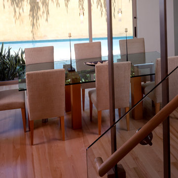
This strategy of trading indoor space for outdoor courtyard allowed an erosion of the formerly monolithic structure into a series of distinct volumetric elements, and further suggested that the architectural pieces could cohere as a “village.” The main level is further eroded by large, glazed planes, merging indoor with outdoor, and virtually stretching the landscape across interior space. Moving the detached garage from the rear yard to beneath the new living space allowed for a 75-meter lap pool and a shaded olive garden.
The gardens include built-in seating, extensive use of ornamental grasses and Zen-like interior courtyards. A material palette of fossilized stone, bonderized-galvanized metal, and natural Douglas fir allows for the warmth desired by the wife, while providing the modernity required by the husband. Programmatically, her music room borrows from the calm and protected olive court in the rear, while his office becomes a pavilion set in the landscape, which both addresses the street and acts as a sheltering monument for the terraced entry garden.
 Skill Construction & Design, LLC
Last week we featured an incredible new kitchen with an open floor plan and unique architectural interest. I alluded to a change in the staircase and here it is. Part of designing a new kitchen or bath is looking at surrounding spaces and how the remodel will affect them. Will the current master bedroom seem dated as an entrance to the new bath? Is the dining room that adjoins the kitchen badly in need of flooring and lighting? Some projects might have to wait. But if the immediate area has an adverse affect on the newly remodeled kitchen it might be just as important to address these areas within your remodel.
Although the staircase was in harmony with the homes existing era and colors, it simply didn’t work with the new kitchen. Despite its open risers, the existing balusters and railings with their colonial turnings and dark stain, were the opposite of the finished kitchen. With the carpeting gone from the floors, it looked dated and out-of-place on the stairs.
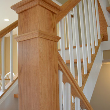
We carried our kitchen theme to the staircase. We used the natural oak of our flooring for the treads, handrails and posts, but kept the balusters and trim crisp white. The effect perfectly reflects the feel of the kitchen, light and airy.
Before, the dark wood details drew the eye up, ultimately to the textured ceiling in the dining room. The darker tone created a dramatic ending as it traveled up to die into the wall.
Now, as the eye travels up, the staircase seems to soar. The textured ceiling was replaced with a smooth white one and the wall color is a soft warm contrast. The handrail still ends at the wall, but with white balusters and the light oak handrail, the ending is softer.
It isn’t a lighting change, the staircase simply lets the light shine through. The treads are slim and sleek, while the white walls, trim and balusters reflect the light for an overall brighter feel.
The newel posts were a great choice. The larger size and square craftsman like features add substance and architecture without seeming heavy or bulky.
The final touch completes the look. From front door to back, up and down, this remodel is finished. This home now bursts with sunshine the minute you enter and stays bright and sunny no matter where you turn. From the architectural details that are the center of attention, to the modern stainless steel appliance, this space is perfect for entertaining, or any day.
http://www.designsbyskill.com/
http://www.rjkconstructioninc.com/
 Alair Homes Arlington
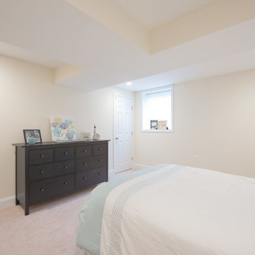
Addition off the side of a typical mid-century post-WWII colonial, including master suite with master bath expansion, first floor family room addition, a complete basement remodel with the addition of new bedroom suite for an AuPair. The clients realized it was more cost effective to do an addition over paying for outside child care for their growing family. Additionally, we helped the clients address some serious drainage issues that were causing settling issues in the home.
 Amazing Spaces
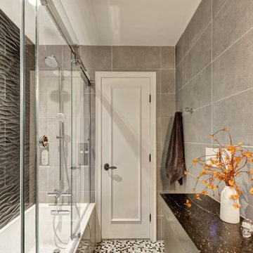
Combining an everyday hallway bathroom with the main guest bath/powder room is not an easy task. The hallway bath needs to have a lot of utility with durable materials and functional storage. It also wants to be a bit “dressy” to make house guests feel special. This bathroom needed to do both.
We first addressed its utility with bathroom necessities including the tub/shower. The recessed medicine cabinet in combination with an elongated vanity tackles all the storage needs including a concealed waste bin. Thoughtfully placed towel hooks are mostly out of sight behind the door while the half-wall hides the paper holder and a niche for other toilet necessities.
It’s the materials that elevate this bathroom to powder room status. The tri-color marble penny tile sets the scene for the color palette. Carved black marble wall tile adds the necessary drama flowing along two walls. The remaining two walls of tile keep the room durable while softening the effects of the black walls and vanity.
Rounded elements such as the light fixtures and the apron sink punctuate and carry the theme of the floor tile throughout the bathroom. Polished chrome fixtures along with the beefy frameless glass shower enclosure add just enough sparkle and contrast.
Sponsored
Sunbury, OH
J.Holderby - Renovations
Franklin County's Leading General Contractors - 2X Best of Houzz!
 team3
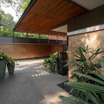
team3The A18 Residence is a townhouse renovation project located in the southern part of New Delhi. team3 was tasked with transforming the facade while minimising modifications to create a visually appealing and functional space that provides residents with a sense of peace and tranquillity.
Blurring the Boundaries Between Indoors and Outdoors
The driving force behind the project was to seamlessly infuse green elements into the building’s living spaces. This was achieved through a transparent living space that harmoniously bridges the divide between the interiors and the natural surroundings. Floor-to-ceiling windows and sliding doors allow for maximum natural light and ventilation, creating a sense of openness and connection to the outdoors. These windows are double-paned to help reduce noise pollution.
A defining feature of the project is its fully planted facade. A pragmatic approach was adopted to ensure the vitality of the greens. Plants are placed to be accessed via the staircase with landings to the balconies, avoiding the need to cross through the rooms for maintenance and sharing the responsibility of upkeep.
Effective Zoning to Enhance Functionality
The property's strategic location presented a dual-faced scenario, overlooking a small park at the rear and fronting a busy main road. To address the latter, a green strip and a service road were introduced as buffers to minimise noise intrusion. The green strip was designed to be unobtrusive, using low-maintenance materials and native plants that require minimal watering. The planted facade also adds a level of protection shielding the indoor environment from the noise and pollution of the adjoining road.
Sustainable Design with Shared Amenities and Accessible Maintenance
The A18 Residence is a single-family home designed for a family of four. The design process was collaborative, with the clients deeply engaged due to their keen interest in architectural aesthetics and sustainability. This collaboration led to the introduction of shared, energy-efficient amenities and resources, fostering efficiency. A terrace garden maintained with harvested rainwater also acts as a communal area for the family.
The balconies have been thoughtfully designed with an external staircase for convenient access and maintenance without compromising residents' privacy. The project unfolded organically across its various levels. On the ground floor, residents enjoy greenery from both front and rear gardens, offering a dynamic connection with nature. The first floor features a continuous living space that seamlessly merges with the lush surroundings. On the third floor, a strategically positioned courtyard artfully links to the rooftop terrace garden, extending the green narrative and providing panoramic views and a tangible connection to nature.
Solar panels on the roof provide electricity for common areas, while a rainwater harvesting system collects rainwater for irrigation. These features help to reduce the project's environmental impact and create a more sustainable urban lifestyle for its residents.
Blending Simplicity, Functionality, and Natural Light
The interiors of the A18 Residence are designed to complement the overall aesthetic of the project, with a focus on simplicity and functionality. The open-plan living space is flooded with natural light, thanks to the floor-to-ceiling windows. Spacious, well-lit bedrooms feature private balconies that offer stunning views of the surrounding greenery. The landscape is an integral part of the design, providing residents with a tranquil oasis in the city.
The A18 Residence stands as an example of how innovative design and a collaborative approach can transform an existing building into a thriving urban oasis. Its focus on sustainability, functionality, and connection to nature makes it a model for sustainable living in the city.
 Phoenix Home Remodeling
Martin's master bathroom was a decently functional space with elements that had seen better days. The key elements included an old tub/shower combo, which, while practical, lacked the aesthetic and space optimization he desired.
The bathroom overall felt dated, with worn-out fixtures and a lack of efficient storage solutions. The lighting was dim, making the space feel smaller and less inviting.
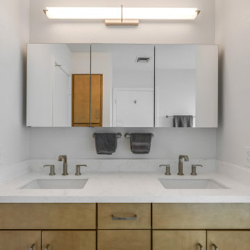
Martin selected new Waypoint Cabinetry in the Maple Rye finish, offering a contemporary, yet warm and inviting, look that was the first step of transforming the room's ambiance. The LG Forte Quartz countertops added a clean and sleek look, enhancing the bathroom's overall modern vibe.
He chose to optimize his wall space by selecting a surface mount storage mirror, which provided ample storage space and better organization.
To address the previously dim lighting and cave-like feel at his vanity, Martin selected a Kichler Zel Linear LED Bath Light. This significantly brightened the space, creating an illusion of a larger room and highlighting his new and modern bathroom design.
The highlight of this renovation was the custom-built shower. Replacing the outdated tub/shower combo. The combination of Pearl and Ocean Blue over-sized tiles for the walls and the niche, creates a visually striking effect. The White Hexagon floor tiles added a fun and stunning touch to the shower area. His shower was completed with the Delta Tetra Shower Trim Package, which ensures functionality while maintaining the contemporary luxury.
 EK ARCHITECTURE, PLLC
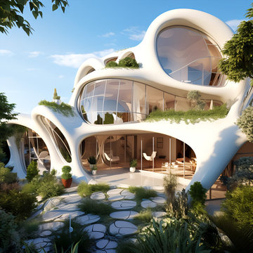
Introducing "LA Biomoph," a groundbreaking and eco-sustainable architectural vision that reimagines the luxury homes of Los Angeles. Meticulously crafted to align with the region's climate, LA Biomoph embraces nature-inspired solutions, delivering a harmonious living experience while addressing environmental challenges.
At the core of LA Biomoph is a profound dedication to energy efficiency. Smartly utilizing natural elements, the architecture optimizes energy consumption with advanced insulation, reflective roofing, and passive cooling strategies like cross-ventilation and natural shading.
Renewable energy integration is key, utilizing solar coatings on cladding and glazing to harness the abundant Californian sunshine and significantly reduce the development's carbon footprint. Water conservation takes center stage with rainwater harvesting systems and low-flow fixtures, responsibly managing the region's scarce water resources.
LA Biomoph's impact extends beyond the buildings themselves, as native and drought-resistant plantings support local ecosystems and reduce water demand for landscaping. With a focus on sustainable construction practices, the use of recycled and locally sourced materials minimizes environmental impact.
Committed to sustainability, LA Biomoph emphasizes waste reduction and recycling during construction. Natural ventilation through operable windows complements the design, providing fresh air and mild weather cooling, thereby reducing the need for artificial cooling.
With cool roofing materials that reflect sunlight, LA Biomoph ensures indoor comfort while mitigating the urban heat island effect. The architecture maximizes natural daylight, enhancing energy efficiency and reducing reliance on artificial lighting.
LA Biomoph's adaptive design ensures longevity, accommodating evolving needs and future sustainable technologies.
16