
Search results for "Effectively address" in Home Design Ideas
 Schulte Design Build
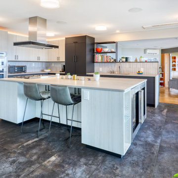
Our clients recently purchased a beautiful hillside home in Broadview. What started as a simple kitchen refresh turned into a full-scale renovation to address structural issues and achieve a modern aesthetic.
The top priorities for the client’s kitchen were a space for entertaining and to enjoy the sweeping Sound views. The existing late-90s kitchen was outdated and the walls separated the kitchen from the rest of the home. To achieve this, we removed both sides of internal walls and reconfigured plumbing and structural support.
The clients, who are artists and photographers, highly valued aesthetics. Collaborating with their designer, known for using industrial materials in commercial spaces, we aimed to bring these elements into the kitchen. We created a design that maximized the views and integrated industrial and mid-century styles, featuring steel shelving and quartz countertops that resembled concrete.
Instead of using traditional concrete flooring, we opted for concrete tiles. Believe it or not, those tiles are 2x4 feet long! It took two of our team to set each one. Recommended by their designer, large tiles like these are often used in commercial buildings, but the designer knew they were a cost effective (and beautiful) solution for this home.
The renovation also included: A much larger island for cooking and entertaining, custom-made faucets with hot and cold taps, a built-in refrigerator, and a double beverage fridge at the end of the island. We put in two laminated cabinets in two contrasting colors: Wilsonart White Cypress and Wilsonart Black Velvet Traceless. Lastly, we installed hydronic floor heating and AC, ensuring comfort year-round.
The result is a beautifully modern kitchen that is both functional and aesthetically pleasing. This project exceeded the clients' initial expectations, transforming their kitchen into the heart of their home.
 Schulte Design Build
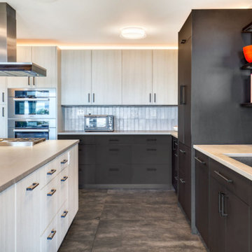
Our clients recently purchased a beautiful hillside home in Broadview. What started as a simple kitchen refresh turned into a full-scale renovation to address structural issues and achieve a modern aesthetic.
The top priorities for the client’s kitchen were a space for entertaining and to enjoy the sweeping Sound views. The existing late-90s kitchen was outdated and the walls separated the kitchen from the rest of the home. To achieve this, we removed both sides of internal walls and reconfigured plumbing and structural support.
The clients, who are artists and photographers, highly valued aesthetics. Collaborating with their designer, known for using industrial materials in commercial spaces, we aimed to bring these elements into the kitchen. We created a design that maximized the views and integrated industrial and mid-century styles, featuring steel shelving and quartz countertops that resembled concrete.
Instead of using traditional concrete flooring, we opted for concrete tiles. Believe it or not, those tiles are 2x4 feet long! It took two of our team to set each one. Recommended by their designer, large tiles like these are often used in commercial buildings, but the designer knew they were a cost effective (and beautiful) solution for this home.
The renovation also included: A much larger island for cooking and entertaining, custom-made faucets with hot and cold taps, a built-in refrigerator, and a double beverage fridge at the end of the island. We put in two laminated cabinets in two contrasting colors: Wilsonart White Cypress and Wilsonart Black Velvet Traceless. Lastly, we installed hydronic floor heating and AC, ensuring comfort year-round.
The result is a beautifully modern kitchen that is both functional and aesthetically pleasing. This project exceeded the clients' initial expectations, transforming their kitchen into the heart of their home.
 D. A. Dunlevy
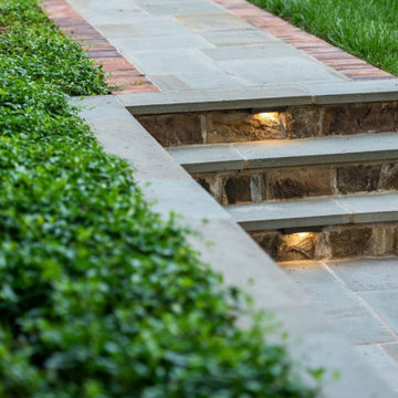
Elevated curb appeal with family-friendly function.
Varying elevations and an unexpected structural challenge required a strategic plan for this charming Bethesda home. The clients wanted an outdoor space for family and friends that had room for play, lounging, and grilling—all while keeping a high curb appeal. Once all structural needs were addressed, our team installed an exposed aggregate driveway with a brick border and banding. The stunning outdoor kitchen was custom-built for the grill and smoker station, topped with a granite counter. A custom lattice planted with climbing hydrangea serves as a beautiful privacy screen for the kitchen windows. A lush, serene feel was created using low-maintenance plantings like crepe myrtle trees, creeping Jenny, heavenly bamboo, roses, and ferns. Stepping stones dotted with mazus plants meander through, and the entire effect is one of a woodland paradise that’s always been there. It’s the perfect place to relax with friends and family, and the home has been made even lovelier with these additions.
Find the right local pro for your project
 User
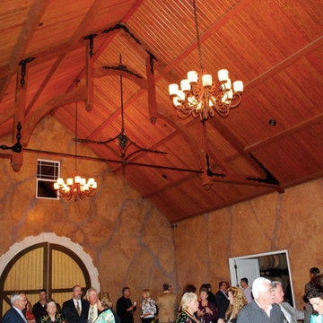
UserThe client purchased a mature, small, NAPA Valley vineyard to be their home and for personal enjoyment.
Once they began converting their new "hobby" grapes into wine, they soon realized they needed a place to "age" their labors and a place to then enjoy them. They decided to design such a place within the confines of their home where they could entertain family and friends.
The structure was modified to allow storage of more than 200 individual bottles, cases, and magnum size bottles. A cask room was added as was a well-appointed tasting room. The storage area is separated from the tasting and social area by a tempered glass doors and windows. The space to be converted was a challenge. No surface was plumb or level, therefore, the remodel involved interior walls, new floors and ceilings.
Until these issues were addressed, the beautiful cabinet work, and a complete temperature and humidity control system to store, maintain, and enjoy the wine could not be started. The floors had to be floated out and chases with faux finishes provided for HVAC and electrical. Lighting in the tasting room is provided by a series of recessed and puck lights.
The bar/counter area is highlighted by a custom, Tiffany style chandelier. Enough space was left in front of the bar to accommodate two serving tables for food and snacks, with plenty of room to move about the space. Discreetly hidden behind the bar is a large capacity cooler that can chill several bottles at once.
The bar is capped with eight lineal feet of Calcutta Gold Marble and sports a brass foot rail. The bar has grape panels between Acanthus Corbels and the bottle storage cabinet areas are a unique blend of Acanthus overlays under precisely cut and mitered grape design crown molding over and around a cleverly designed bottle storage system.
Traffic flow is achieved through the multiple points of entry through any of three pairs of 6' custom double doors which, when weather permitting, can remain open while entertaining. The host and hostess can attend food and beverage service from behind and around the bar through a separate doorway.
The temperature controlled cask storage area is large enough for the clients' current needs, and can accommodate a larger number of casks should the need arise.
The floor and walls of the cask room are designed for easy maintenance.. Both rooms are delightfully decorated with earthen tone faux finishes on walls, ceilings and floors reminiscent of a nonspecific European wine making region.
This effect is extended to the soffits in the tasting room. A unique wine racking system is easily stored, providing even greater ability to maintain and move about the storage area.
 Simply Home Decorating
The kitchen may be the heart of a home, but the dining room is where the family gathers to enjoy special occasions, create and pass on traditions, and savour each other’s company free from distractions. The family behind this particular dining room enjoys doing just that.
When they are not traveling the world, Matthew and Anna (names changed) love to cook meals at home with their teenage daughter, entertain family and friends, and live amongst their cherished travel souvenirs and heirlooms. Their dining room, however, was far from the perfect backdrop for these experiences.
Before: Dining Room:
When Matthew and Anna contacted us, they imagined a space that would comfortably seat 8 to 10 people and incorporate their beautiful inherited dining table and sideboard in a fresh, modern way. Above all, they wanted a dining room that they would feel proud to share.
They worked with us to design, lightly renovate, and furnish their dining room and adjacent living space. Now, the room is nothing short of inviting and elevated.
Classic Yet Contemporary Dining Room:
Viewed from the living area, the dining room is a hidden gem waiting to be discovered. Matthew and Anna wanted dark blue for the walls, and we couldn’t have been happier to find the perfect shade for them. By leaning darker, this rich blue creates the perception of depth, making the room feel enticing, comfortable and secluded.
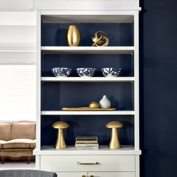
The previous built-ins were underwhelming and lacked function, so we designed wider, taller, double sided cabinets that integrated the existing bulk-head, and then accessorized the shelves with the family’s travel finds, books, and decor. Topping these units with brass art lights not only blends contemporary and traditional styles, it also draws attention to the dining table’s modern show-stopping chandelier. You can’t miss it.
Inside the dining room, the effect is equally impressive: enveloping yet spacious, warm yet cool, classic yet contemporary. We incorporated their heirloom pieces seamlessly into the design thanks to the 1:2 ratio. For every traditional piece, we introduced two more modern or contemporary pieces — clean lines, subtle curves, and lustrous brass hardware. The result is a collected yet updated look.
In any room with dark walls, lighting is of the utmost importance. We placed a mirror adjacent to the window to reflect natural light throughout the room, and we kept the trim and ceiling white for brightness. To provide maximum versatility, we provided multiple light sources that can be adjusted to create different levels of light to suit any mood or occasion. These include: pot lights and a chandelier on dimmers, a sculptural trilight lamp on the sideboard, and art lights on the bookcases and above important art pieces.
The built-ins have another surprise waiting inside this special dining room:
Double-sided built-ins: dining room shelving and living room shelving.
Rather than keep them white like we did in the living room, we painted the back wall of the book cases the same dark blue as the walls in the rest of the room. This reduces the contrast with the surrounding walls and emphasizes the white outline of the cabinets. We also love the dark blue walls’ role as a beautiful backdrop for this family’s treasures. The brass accessories and hand-painted vases and bowls feel like part of the experience.
Of course, what is beauty without function? It may not look like it, but the base storage is only accessible from the dining room side. The units include deep cabinets for storing serving ware, as well as another delightful surprise: silverware drawers lined in luxurious navy velvet!
Lastly, we designed this beautiful nook for their heirloom sideboard. From afar, the wall looks as if it has texture and perhaps a touch of shine. Up close, you will notice that it is actually navy blue wallpaper with tiny golden dots. This unique touch accentuates the brass in the room touches throughout the space.. The room feels curated, contemporary, and full of character.
Words of Praise:
Anna and Matthew were thrilled with their new dining room and with the design process itself, which is always the highest compliment. They said:
“Working with Lori and her team at Simply Home Decorating was a great experience. The design they came up with was both beautiful and practical for our family. Renovations can be stressful but working with Simply Home made the process much more pleasant.
“Simply Home's project management and their longstanding relationships with reliable trades meant we could relax, knowing that everything was taken care of. If an issue arose, the entire Simply Home team was quick to address it. They were excellent at communicating with us—we never felt like we didn't know what was going on. We would highly recommend working with Simply Home Decorating.”
Thank you, Matthew and Anna! We are honoured to have been part of your journey and wish your family many happy memories in these new spaces.
Now, is it your turn? Are you ready to uncover the hidden potential in your home? If so, contact us here to start the conversation or download my guide Uncovering the Hidden Potential in Your Home below to learn more about what we can do for you.

 FiveSTAR Landscape
This Houston, TX property, nestled in the Timbergrove neighborhood, rests on a floodplain. To address this, the owners constructed a custom farmhouse porch raised above a substantial crawlspace beneath the home. Concealing this crawlspace was pivotal, requiring a foliage that will mature to effectively mask and blend it.
The property's sloped and sun-soaked terrain posed another layer of complexity, both of which our landscape architect seamlessly integrated into the design process.
Guided by these factors, we devised a plan that features three distinctive gardens, each leading gracefully to the house. The front garden boasts a xeriscape design with succulents and Blackstar gravel. The middle garden showcases the rugged beauty of West Texas native plants, accentuated by moss rock boulders and Texas sage. As you approach the house, the final garden combines a medley of the owners' favorite ornamental plants such as hollyleaf fern, wood fern, salvia, yucca plants, frog root, and blue flag iris.
We employed chop block raised beds crafted from rectangular limestone cuts, aligning with the farmhouse's aesthetic. Strategic placement of Brody juniper trees ensures they will mature in harmony with the home.
 Homeowner Services of Michigan LLC
Residential Transformation by Homeowner Services of Michigan
At Homeowner Services of Michigan, we bring the same level of expertise and dedication to our residential projects as we do for commercial restorations. Our recent project highlights our commitment to quality, precision, and customer satisfaction. Here's what we accomplished for a delighted homeowner:
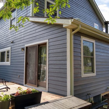
We began by removing and replacing three windows and one door, ensuring enhanced energy efficiency and aesthetic appeal. Next, we installed new gutters to provide effective water management and protect the home’s exterior.
Our team meticulously trimmed all windows and repaired or replaced any failed trim boards, ensuring a seamless and polished look. At the rear of the house, we replaced approximately 700 square feet of siding and addressed areas of failed siding totaling about 100 linear feet, restoring the home's structural integrity and appearance.
To complete the transformation, we prepared and painted the entire exterior of the home, including the trim. Using a two-color scheme, we created a fresh, vibrant look that stands out in the neighborhood.
Every aspect of the project was executed with care and precision, reflecting our dedication to delivering exceptional results. Homeowner Services of Michigan is proud to enhance the beauty, functionality, and value of our clients' homes. Contact us today to transform your living space with our expert renovation services.

Sponsored
Sunbury, OH

J.Holderby - Renovations
Franklin County's Leading General Contractors - 2X Best of Houzz!
 Alair Homes Arlington
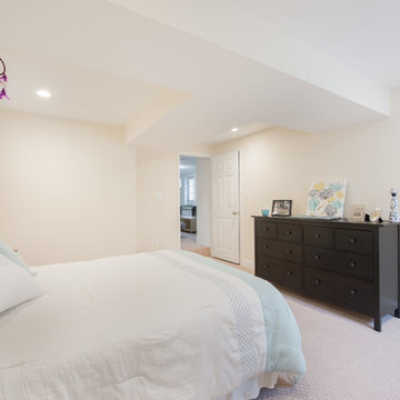
Addition off the side of a typical mid-century post-WWII colonial, including master suite with master bath expansion, first floor family room addition, a complete basement remodel with the addition of new bedroom suite for an AuPair. The clients realized it was more cost effective to do an addition over paying for outside child care for their growing family. Additionally, we helped the clients address some serious drainage issues that were causing settling issues in the home.
 Envision Design with CDA Interiors
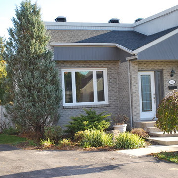
To home stage this property, we painted the fence, and changed out the door, address sign, mailbox, and light, as well we cut back the shrubbery, we did not change out the whole door jam, just the door. It updated the property, tied into the fairly recent updated windows. This property was built in the 1980's, but with some simple cost effective changes, we were able to update it, for a quick resale.
 RAJ Kitchen and Bath, LLC
This family throws some mean parties where large crowds usually sit at the poolside. There’s an entire section of this walk out second level that is dedicated to entertaining which also gives access to the pool in the backyard. This place comes alive at night with built in surround sounds and LED lights. There was just one issue. The kitchen.
The kitchen did not fit in. It was old, outdated, out-styled and nonfunctional. They knew the kitchen had to be address eventually but they just didn’t want to redo the kitchen. They wanted to revamp the kitchen, so they asked us to come in and look at the space to see how we can design this second floor kitchen in their New Rochelle home.
It was a small kitchen, strategically located where it could be the hub that the family wanted it to be. It held its own amongst everything that was in the open space like the big screen TV, fireplace and pool table. That is exactly what we did in the design and here is how we did it.
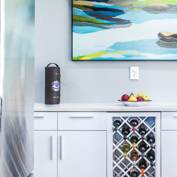
First, we got rid of the kitchen table and by doing so we created a peninsular. This eventually sets up the space for a couple of really cool pendant lights, some unique counter chairs and a wine cooler that was purchased before but never really had a home. We then turned our attention to the range and hood. This was not the main kitchen, so wall storage wasn’t the main goal here. We wanted to create a more open feel interaction while in the kitchen, hence we designed the free standing chimney hood alone to the left of the window.
We then looked at how we can make it more entertaining. We did that by adding a Wine rack on a buffet style type area. This wall was free and would have remained empty had we not find a way to add some more glitz.
Finally came the counter-top. Every detail was crucial because the view of the kitchen can be seen from when you enter the front door even if it was on the second floor walk out. The use of the space called for a waterfall edge counter-top and more importantly, the stone selection to further accentuate the effect. It was crucial that there was movement in the stone which connects to the 45 degree waterfall edge so it would be very dramatic.
Nothing was overlooked in this space. It had to be done this way if it was going to have a fighting chance to take command of its territory.
Have a look at some before and after photos on the left and see a brief video transformation of this lovely small kitchen.
See more photos and vidoe of this transformation on our website @ http://www.rajkitchenandbath.com/portfolio-items/kitchen-remodel-new-rochelle-ny-10801/
 SHELLEY RODNER DESIGN / DDI
DESIGN CHALLENGES ADDRESSED:
To anyone who may be reading this project overview, I do hope you'll have the opportunity to
have a look at the 'before' photo of this space. It's quite a transformation!
Our homeowners purchased their condo at the beach several years ago. As shown in the 'before'
photo, the casual dining area was a dark and dated space with unsightly paneled walls, heavy
faux ceiling beams and odds and ends for furniture. It was cut off from the kitchen and did not
lend itself for entertaining. Everything felt cramped and cluttered throughout the condo,
especially this space. The client's vision was for a relaxed and welcoming dining space that
would allow them to comfortably host friends and family.
DESIGN SOLUTIONS PROVIDED:
The entire condo was taken down to the stud. The faux beams were edited out and the ceiling
raised. The heavy out-dated paneling was replaced with fresh clean walls that were painted in a
calming creamy sand tone throughout the entire condo. The wall that once separated the kitchen
and dining area was completely removed. This space now felt far more spacious and open.
The existing heavy and out dated furniture was replaced with stylish functional pieces. Great
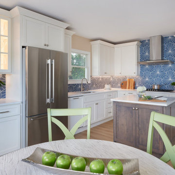
thought was given to the size, scale and textiles used. A round table with a wonderful archectural
base in a richly textured weathered driftwood finish was selected. With the option of adding an
extension leaf (which converted the table into a generous rectangle) the homeowners now had
the desired space to host a sizable group of guests without feeling crowded as before. Dining
chairs with a 'x' back wood frame in a playful shade of kiwi and crisp striped cushions completed
the look.
Clean line sconces in a rich linen textile were added on either of the window for soft ambient
lighting.
The overall effect of the renovation was quite dramatic and the clients were thrilled with the
results. This casual dining area went from being dark and dated to light and airy and is now a
wonderful space that is both inviting and relaxing along with being a great place to entertain.
RETAIL PROJECT PRICE: $ 5,000.00
Retail price is defined as the total sale you submitted on your sales repor
 Homeowner Services of Michigan LLC
Residential Transformation by Homeowner Services of Michigan
At Homeowner Services of Michigan, we bring the same level of expertise and dedication to our residential projects as we do for commercial restorations. Our recent project highlights our commitment to quality, precision, and customer satisfaction. Here's what we accomplished for a delighted homeowner:
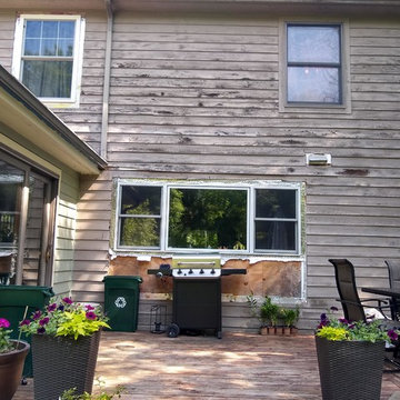
We began by removing and replacing three windows and one door, ensuring enhanced energy efficiency and aesthetic appeal. Next, we installed new gutters to provide effective water management and protect the home’s exterior.
Our team meticulously trimmed all windows and repaired or replaced any failed trim boards, ensuring a seamless and polished look. At the rear of the house, we replaced approximately 700 square feet of siding and addressed areas of failed siding totaling about 100 linear feet, restoring the home's structural integrity and appearance.
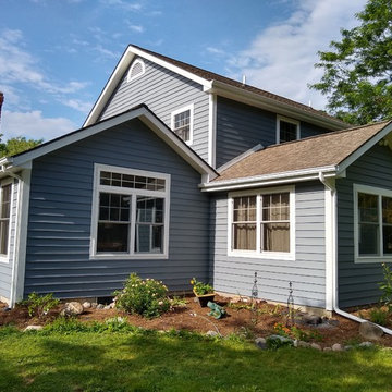
To complete the transformation, we prepared and painted the entire exterior of the home, including the trim. Using a two-color scheme, we created a fresh, vibrant look that stands out in the neighborhood.
Every aspect of the project was executed with care and precision, reflecting our dedication to delivering exceptional results. Homeowner Services of Michigan is proud to enhance the beauty, functionality, and value of our clients' homes. Contact us today to transform your living space with our expert renovation services.
 Homeowner Services of Michigan LLC
Residential Transformation by Homeowner Services of Michigan
At Homeowner Services of Michigan, we bring the same level of expertise and dedication to our residential projects as we do for commercial restorations. Our recent project highlights our commitment to quality, precision, and customer satisfaction. Here's what we accomplished for a delighted homeowner:
We began by removing and replacing three windows and one door, ensuring enhanced energy efficiency and aesthetic appeal. Next, we installed new gutters to provide effective water management and protect the home’s exterior.
Our team meticulously trimmed all windows and repaired or replaced any failed trim boards, ensuring a seamless and polished look. At the rear of the house, we replaced approximately 700 square feet of siding and addressed areas of failed siding totaling about 100 linear feet, restoring the home's structural integrity and appearance.
To complete the transformation, we prepared and painted the entire exterior of the home, including the trim. Using a two-color scheme, we created a fresh, vibrant look that stands out in the neighborhood.
Every aspect of the project was executed with care and precision, reflecting our dedication to delivering exceptional results. Homeowner Services of Michigan is proud to enhance the beauty, functionality, and value of our clients' homes. Contact us today to transform your living space with our expert renovation services.


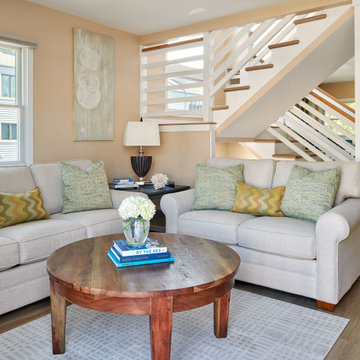 SHELLEY RODNER DESIGN / DDI
DESIGN CHALLENGES ADDRESSED:
To anyone who may be reading this project overview, I do hope you'll have the opportunity to
have a look at the 'before' photo of this space. It's quite a transformation!
Our homeowners purchased their condo at the beach several years ago. As shown in the 'before'
photo, at the time, their family room was a dark and dated space with unsightly paneled walls,
heavy faux ceiling beams and odds and ends for furniture. Everything felt cramped and cluttered
throughout the condo, especially their family room. The client's vision was for an airy and
relaxed coastal vibe for their 'place at the beach'.
DESIGN SOLUTIONS PROVIDED:
The entire condo was taken down to stud. The faux beams were edited out and the ceiling raised.
The heavy out-dated paneling was removed and replaced with fresh clean walls that were painted
in a calming creamy sand tone throughout the entire condo.
The existing dark and gloomy furniture was replaced with stylish updated pieces. Great thought
was given to the size, scale and textiles used. The sofa and loveseat, done in a softly textured
herring boned pattern, was the perfect choice. It's cremey toned easy care fabric created a 'pet
friendly' environment for the clients. The homeowners have two dogs and a cat who love a visit
to the beach as much as their 'humans'.
Worn out window treatments were replaced with fresh custom draperies in a playful botanical
print featuring tones of kiwi, leaf green and cerulean blue. A special 'solar friendly' lining was
used to tame the harmful rays of direct sun.
A variety of special curated accents were added to the room. The richly textured rug, round
coffee table with an organic feel, comfy pillows and a few special art pieces all helped to
complete this space.
The overall effect of the renovation was quite dramatic and the clients were thrilled with the
results. This family room went from being dark and dated to light and airy and is now a space
that is inviting and relaxing which perfectly suits the homeowner's coastal lifestyle.
RETAIL PROJECT PRICE: $ 9,000.00
Retail price is defined as the total sale you submitted on your sales repor
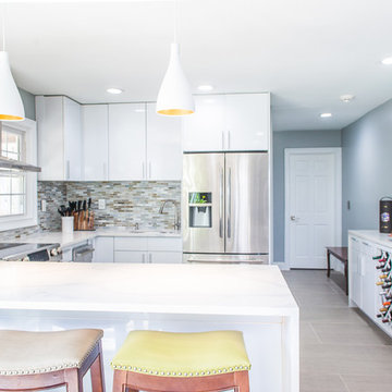 RAJ Kitchen and Bath, LLC
This family throws some mean parties where large crowds usually sit at the poolside. There’s an entire section of this walk out second level that is dedicated to entertaining which also gives access to the pool in the backyard. This place comes alive at night with built in surround sounds and LED lights. There was just one issue. The kitchen.
The kitchen did not fit in. It was old, outdated, out-styled and nonfunctional. They knew the kitchen had to be address eventually but they just didn’t want to redo the kitchen. They wanted to revamp the kitchen, so they asked us to come in and look at the space to see how we can design this second floor kitchen in their New Rochelle home.
It was a small kitchen, strategically located where it could be the hub that the family wanted it to be. It held its own amongst everything that was in the open space like the big screen TV, fireplace and pool table. That is exactly what we did in the design and here is how we did it.
First, we got rid of the kitchen table and by doing so we created a peninsular. This eventually sets up the space for a couple of really cool pendant lights, some unique counter chairs and a wine cooler that was purchased before but never really had a home. We then turned our attention to the range and hood. This was not the main kitchen, so wall storage wasn’t the main goal here. We wanted to create a more open feel interaction while in the kitchen, hence we designed the free standing chimney hood alone to the left of the window.
We then looked at how we can make it more entertaining. We did that by adding a Wine rack on a buffet style type area. This wall was free and would have remained empty had we not find a way to add some more glitz.
Finally came the counter-top. Every detail was crucial because the view of the kitchen can be seen from when you enter the front door even if it was on the second floor walk out. The use of the space called for a waterfall edge counter-top and more importantly, the stone selection to further accentuate the effect. It was crucial that there was movement in the stone which connects to the 45 degree waterfall edge so it would be very dramatic.
Nothing was overlooked in this space. It had to be done this way if it was going to have a fighting chance to take command of its territory.
Have a look at some before and after photos on the left and see a brief video transformation of this lovely small kitchen.
See more photos and vidoe of this transformation on our website @ http://www.rajkitchenandbath.com/portfolio-items/kitchen-remodel-new-rochelle-ny-10801/

 EK ARCHITECTURE, PLLC
Introducing "LA Biomoph," a groundbreaking and eco-sustainable architectural vision that reimagines the luxury homes of Los Angeles. Meticulously crafted to align with the region's climate, LA Biomoph embraces nature-inspired solutions, delivering a harmonious living experience while addressing environmental challenges.
At the core of LA Biomoph is a profound dedication to energy efficiency. Smartly utilizing natural elements, the architecture optimizes energy consumption with advanced insulation, reflective roofing, and passive cooling strategies like cross-ventilation and natural shading.
Renewable energy integration is key, utilizing solar coatings on cladding and glazing to harness the abundant Californian sunshine and significantly reduce the development's carbon footprint. Water conservation takes center stage with rainwater harvesting systems and low-flow fixtures, responsibly managing the region's scarce water resources.
LA Biomoph's impact extends beyond the buildings themselves, as native and drought-resistant plantings support local ecosystems and reduce water demand for landscaping. With a focus on sustainable construction practices, the use of recycled and locally sourced materials minimizes environmental impact.
Committed to sustainability, LA Biomoph emphasizes waste reduction and recycling during construction. Natural ventilation through operable windows complements the design, providing fresh air and mild weather cooling, thereby reducing the need for artificial cooling.
With cool roofing materials that reflect sunlight, LA Biomoph ensures indoor comfort while mitigating the urban heat island effect. The architecture maximizes natural daylight, enhancing energy efficiency and reducing reliance on artificial lighting.
LA Biomoph's adaptive design ensures longevity, accommodating evolving needs and future sustainable technologies.
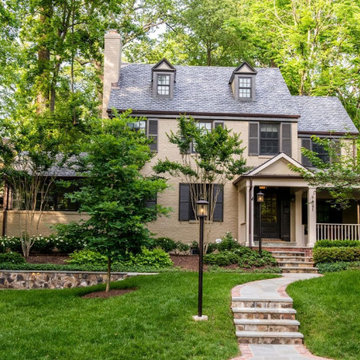 D. A. Dunlevy
Elevated curb appeal with family-friendly function.
Varying elevations and an unexpected structural challenge required a strategic plan for this charming Bethesda home. The clients wanted an outdoor space for family and friends that had room for play, lounging, and grilling—all while keeping a high curb appeal. Once all structural needs were addressed, our team installed an exposed aggregate driveway with a brick border and banding. The stunning outdoor kitchen was custom-built for the grill and smoker station, topped with a granite counter. A custom lattice planted with climbing hydrangea serves as a beautiful privacy screen for the kitchen windows. A lush, serene feel was created using low-maintenance plantings like crepe myrtle trees, creeping Jenny, heavenly bamboo, roses, and ferns. Stepping stones dotted with mazus plants meander through, and the entire effect is one of a woodland paradise that’s always been there. It’s the perfect place to relax with friends and family, and the home has been made even lovelier with these additions.
Sponsored
Sunbury, OH
J.Holderby - Renovations
Franklin County's Leading General Contractors - 2X Best of Houzz!
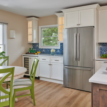 SHELLEY RODNER DESIGN / DDI
DESIGN CHALLENGES ADDRESSED:
To anyone who may be reading this project overview, I do hope you'll have the opportunity to
have a look at the 'before' photo of this space. It's quite a transformation!
Our homeowners purchased their condo at the beach several years ago. As shown in the 'before'
photo, the casual dining area was a dark and dated space with unsightly paneled walls, heavy
faux ceiling beams and odds and ends for furniture. It was cut off from the kitchen and did not
lend itself for entertaining. Everything felt cramped and cluttered throughout the condo,
especially this space. The client's vision was for a relaxed and welcoming dining space that
would allow them to comfortably host friends and family.
DESIGN SOLUTIONS PROVIDED:
The entire condo was taken down to the stud. The faux beams were edited out and the ceiling
raised. The heavy out-dated paneling was replaced with fresh clean walls that were painted in a
calming creamy sand tone throughout the entire condo. The wall that once separated the kitchen
and dining area was completely removed. This space now felt far more spacious and open.
The existing heavy and out dated furniture was replaced with stylish functional pieces. Great
thought was given to the size, scale and textiles used. A round table with a wonderful archectural
base in a richly textured weathered driftwood finish was selected. With the option of adding an
extension leaf (which converted the table into a generous rectangle) the homeowners now had
the desired space to host a sizable group of guests without feeling crowded as before. Dining
chairs with a 'x' back wood frame in a playful shade of kiwi and crisp striped cushions completed
the look.
Clean line sconces in a rich linen textile were added on either of the window for soft ambient
lighting.
The overall effect of the renovation was quite dramatic and the clients were thrilled with the
results. This casual dining area went from being dark and dated to light and airy and is now a
wonderful space that is both inviting and relaxing along with being a great place to entertain.
RETAIL PROJECT PRICE: $ 5,000.00
Retail price is defined as the total sale you submitted on your sales repor
 Milgard Windows & Doors
The Kiguchi family moved into their Austin, Texas home in 1994. Built in the 1980’s as part of a neighborhood development, they happily raised their family here but longed for something more contemporary. Once they became empty nesters, they decided it was time for a major remodel. After spending many years visiting Austin AIA Home Tours that highlight contemporary residential architecture, they had a lot of ideas and in 2013 were ready to interview architects and get their renovation underway.
The project turned into a major remodel due to an unstable foundation. Architects Ben Arbib and Ed Hughey, of Arbib Hughey Design were hired to solve the structural issue and look for inspiration in the bones of the house, which sat on top of a hillside and was surrounded by great views.
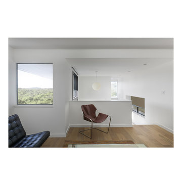
Unfortunately, with the old floor plan, the beautiful views were hidden by small windows that were poorly placed. In order to bring more natural light into the house the window sizes and configurations had to be addressed, all while keeping in mind the homeowners desire for a modern look and feel.
To achieve a more contemporary and sophisticated front of house, a new entry was designed that included removing a two-story bay window and porch. The entrance of the home also became more integrated with the landscape creating a template for new foliage to be planted. Older exterior materials were updated to incorporate a more muted palette of colors with a metal roof, dark grey siding in the back and white stucco in the front. Deep eaves were added over many of the new large windows for clean lines and sun protection.
“Inside it was about opening up the floor plan, expanding the views throughout the house, and updating the material palette to get a modern look that was also warm and inviting,” said Ben from Arbib Hughey Design. “Prior to the remodel, the house had the typical separation of rooms. We removed the walls between them and changed all of the windows to Milgard Thermally Improved Aluminum to connect the inside with the outside. No matter where you are you get nice views and natural light.”
The architects wanted to create some drama, which they accomplished with the window placement and opening up the interior floor plan to an open concept approach. Cabinetry was used to help delineate intimate spaces. To add warmth to an all-white living room, white-washed oak wood floors were installed and pine planks were used around the fireplace. The large windows served as artwork bringing the color of nature into the space.
An octagon shaped, elevated dining room, (named “the turret”), had a big impact on the design of the house. They architects rounded the corners and added larger window openings overlooking a new sunken garden. The great room was also softened by rounding out the corners and that circular theme continued throughout the house, being picked up in skylight wells and kitchen cabinetry. A staircase leading to a catwalk was added and the result was a two-story window wall that flooded the home with natural light.
When asked why Milgard® Thermally Improved Aluminum windows were selected, the architectural team listed many reasons:
1) Aesthetics: “We liked the slim profiles and narrow sightlines. The window frames never get in the way of the view and that was important to us. They also have a very contemporary look that went well with our design.”
2) Options: “We liked that we could get large sliding doors that matched the windows, giving us a very cohesive look and feel throughout the project.”
3) Cost Effective: “Milgard windows are affordable. You get a good product at a good price.”
4) Custom Sizes: “Milgard windows are customizable, which allowed us to get the right window for each location.”
Ready to take on your own traditional to modern home remodeling project? Arbib Hughey Design advises, “Work with a good architect. That means picking a team that is creative, communicative, listens well and is responsive. We think it’s important for an architect to listen to their clients and give them something they want, not something the architect thinks they should have. At the same time you want an architect who is willing and able to think outside the box and offer up design options that you may not have considered. Design is about a lot of back and forth, trying out ideas, getting feedback and trying again.”
The home was completely transformed into a unique, contemporary house perfectly integrated with its site. Internally the home has a natural flow for the occupants and externally it is integrated with the surroundings taking advantage of great natural light. As a side note, it was highly praised as part of the Austin AIA homes tour.

 U.S. Wildlife Removal Service
As a 23 year professional in wildlife control, I see hundreds of situations every month with nuisance animals going into places that they don't belong. Some of those places are more common than others. I recently addressed a skunk infestation for a residence in Glen Ellyn, IL. The challenge involved a family of skunks that had taken residence under the front concrete stoop. Concrete and skunks are never a good mix because concrete is porous, when a skunk sprays the odors penetrate and will permeate for months and months as the weather gets warm or humidity rises.
My approach was methodical and focused on humane Glen Ellyn skunk removal.
The process began with the strategic placement of live traps near the stoop, ensuring minimal distress to the animals. These traps are industry standard, designed to safely contain the skunks without harm. Regular monitoring of these traps was a critical part of the process, ensuring the skunks were not confined for an extended period.
Upon successful capture, the skunks were removed and the animal proofing work was next on the list.
Skunk exclusion work, is a critical component in preventing future infestations of skunks, raccoons or opossums. This involved a thorough inspection and sealing of potential entry points with steel mesh buried underground at a specific depth and angle. Skunk-proofing is a vital step in ensuring long-term resolution to wildlife intrusions.
Once the skunks were gone and the area was sealed, we performed an ozone treatment to the basement with a special filter to sub the air, destroying the skunk spray's odor molecules from the air. Typically the reason people discover skunks under the stoop to begin with is because the odor from spraying.
For residents in and around Glen Ellyn experiencing similar issues, we offer humane, effective, and affordable wildlife control solutions. Expertise in skunk removal and exclusion is just a call away!
20