
Search results for "Efforts" in Home Design Ideas
 Redl World Class Kitchens
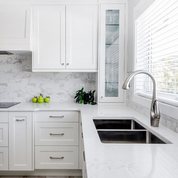
Inspiration for a mid-sized transitional u-shaped porcelain tile and beige floor eat-in kitchen remodel in Edmonton with a double-bowl sink, shaker cabinets, white cabinets, quartz countertops, multicolored backsplash, subway tile backsplash, stainless steel appliances, an island and white countertops

Find the right local pro for your project

 User
UserPhotography: www.katelesueur.com
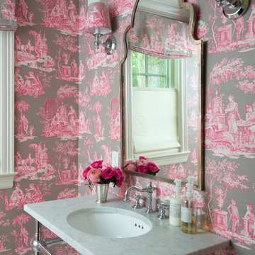
Elegant mosaic tile floor bathroom photo in Houston with an undermount sink and multicolored walls
Elegant mosaic tile floor bathroom photo in Houston with an undermount sink and multicolored walls
 Thyme & Place Design LLC
When my client had to move from her company office to work at home, she set up in the dining room. Despite her best efforts, this was not the long-term solution she was looking for. My client realized she needed a dedicated space not on the main floor of the home. On one hand, having your office space right next to the kitchen is handy. On the other hand, it made separating work and home life was not that easy.
The house was a ranch. In essence, the basement would run entire length of the home. As we came down the steps, we entered a time capsule. The house was built in the 1950’s. The walls were covered with original knotty pine paneling. There was a wood burning fireplace and considering this was a basement, high ceilings. In addition, there was everything her family could not store at their own homes. As we wound though the space, I though “wow this has potential”, Eventually, after walking through the laundry room we came to a small nicely lit room. This would be the office.
My client looked at me and asked what I thought. Undoubtedly, I said, this can be a great workspace, but do you really want to walk through this basement and laundry to get here? Without reservation, my client said where do we start?
Once the design was in place, we started the renovation. The knotty pine paneling had to go. Specifically, to add some insulation and control the dampness and humidity. The laundry room wall was relocated to create a hallway to the office.
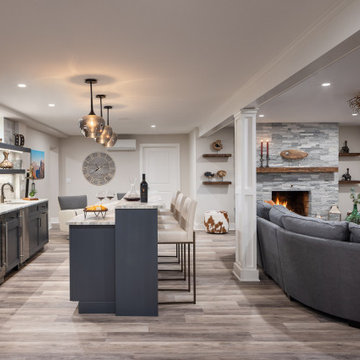
At the far end of the room, we designated a workout zone. Weights, mats, exercise bike and television are at the ready for morning or afternoon workouts. The space can be concealed by a folding screen for party time. Doors to an old closet under the stairs were relocated to the workout area for hidden storage. Now we had nice wall for a beautiful console and mirror for storage and serving during parties.
In order to add architectural details, we covered the old ugly support columns with simple recessed millwork panels. This detail created a visual division between the bar area and the seating area in front of the fireplace. The old red brick on the fireplace surround was replaced with stack stone. A mantle was made from reclaimed wood. Additional reclaimed wood floating shelves left and right of the fireplace provides decorative display while maintaining a rustic element balancing the copper end table and leather swivel rocker.
We found an amazing rug which tied all of the colors together further defining the gathering space. Russet and burnt orange became the accent color unifying each space. With a bit of whimsy, a rather unusual light fixture which looks like roots from a tree growing through the ceiling is a conversation piece.
The office space is quite and removed from the main part of the basement. There is a desk large enough for multiple screens, a small bookcase holding office supplies and a comfortable chair for conference calls. Because working from home requires many online meetings, we added a shiplap wall painted in Hale Navy to contrast with the orange fabric on the chair. We finished the décor with a painting from my client’s father. This is the background online visitors will see.
The last and best part of the renovation is the beautiful bar. My client is an avid collector of wine. She already had the EuroCave refrigerator, so I incorporated it into the design. The cabinets are painted Temptation Grey from Benjamin Moore. The counter tops are my favorite hard working quartzite Brown Fantasy. The backsplash is a combination of rustic wood and old tin ceiling like porcelain tiles. Together with the textures of the reclaimed wood and hide poofs balanced against the smooth finish of the cabinets, we created a comfortable luxury for relaxing.
There is ample storage for bottles, cans, glasses, and anything else you can think of for a great party. In addition to the wine storage, we incorporated a beverage refrigerator, an ice maker, and a sink. Floating shelves with integrated lighting illuminate the back bar. The raised height of the front bar provides the perfect wine tasting and paring spot. I especially love the pendant lights which look like wine glasses.
Finally, I selected carpet for the stairs and office. It is perfect for noise reduction. Meanwhile for the overall flooring, I specifically selected a high-performance vinyl plank floor. We often use this product as it is perfect to install on a concrete floor. It is soft to walk on, easy to clean and does not reduce the overall height of the space.
 ODS Architecture
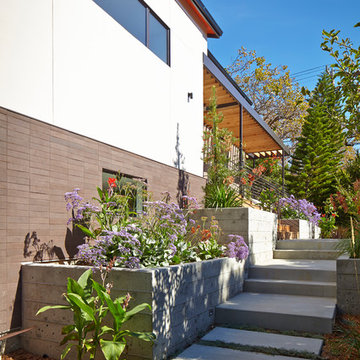
Originally a nearly three-story tall 1920’s European-styled home was turned into a modern villa for work and home. A series of low concrete retaining wall planters and steps gradually takes you up to the second level entry, grounding or anchoring the house into the site, as does a new wrap around veranda and trellis. Large eave overhangs on the upper roof were designed to give the home presence and were accented with a Mid-century orange color. The new master bedroom addition white box creates a better sense of entry and opens to the wrap around veranda at the opposite side. Inside the owners live on the lower floor and work on the upper floor with the garage basement for storage, archives and a ceramics studio. New windows and open spaces were created for the graphic designer owners; displaying their mid-century modern furnishings collection.
A lot of effort went into attempting to lower the house visually by bringing the ground plane higher with the concrete retaining wall planters, steps, wrap around veranda and trellis, and the prominent roof with exaggerated overhangs. That the eaves were painted orange is a cool reflection of the owner’s Dutch heritage. Budget was a driver for the project and it was determined that the footprint of the home should have minimal extensions and that the new windows remain in the same relative locations as the old ones. Wall removal was utilized versus moving and building new walls where possible.
Photo Credit: John Sutton Photography.
 NR Interiors
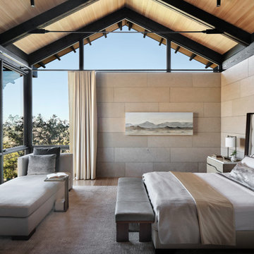
Designing the Master Suite custom furnishings, bedding, window coverings and artwork to compliment the modern architecture while offering an elegant, serene environment for peaceful reflection were the chief objectives. The color scheme remains a warm neutral, like the limestone walls, along with soft accents of subdued greens, sage and silvered blues to bring the colors of the magnificent, long Hill country views into the space. Special effort was spent designing custom window coverings that wouldn't compete with the architecture, but appear integrated and operate easily to open wide the prized view fully and provide privacy when needed. To achieve an understated elegance, the textures are rich and refined with a glazed linen headboard fabric, plush wool and viscose rug, soft leather bench, velvet pillow, satin accents to custom bedding and an ultra fine linen for the drapery with accents of natural wood mixed with warm bronze and aged brass metal finishes. The original oil painting curated for this room sets a calming and serene tone for the space with an ever important focus on the beauty of nature.
The original fine art landscape painting for this room was created by Christa Brothers, of Brothers Fine Art Marfa.
 Fred Parker Company, Inc.
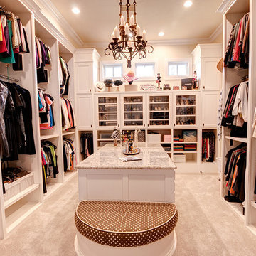
The clients worked with the collaborative efforts of builders Ron and Fred Parker, architect Don Wheaton, and interior designer Robin Froesche to create this incredible home.

 Laurie Ghielmetti
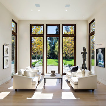
Inspiration for a mid-sized contemporary formal and open concept light wood floor and beige floor living room remodel in San Francisco with beige walls, no fireplace and no tv
 Last Detail Interior Design
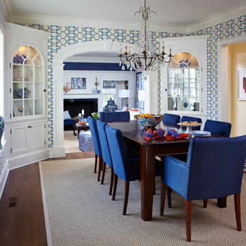
We made every effort to visually meld the dining room with the living rooms without applying the same wall covering. This bold blue and white geometric gives a modern twist to a room with traditional corner cabinets. The overall color scheme of blue and white can be accessorized with different contrasting colors as desired for completely different looks.
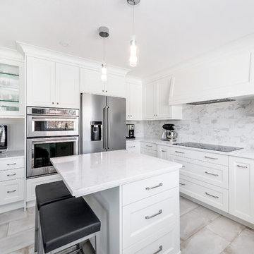 Redl World Class Kitchens
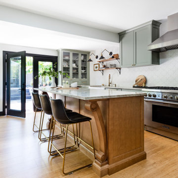
Eat-in kitchen - mid-sized transitional u-shaped porcelain tile and beige floor eat-in kitchen idea in Edmonton with a double-bowl sink, shaker cabinets, white cabinets, quartz countertops, multicolored backsplash, subway tile backsplash, stainless steel appliances, an island and white countertops
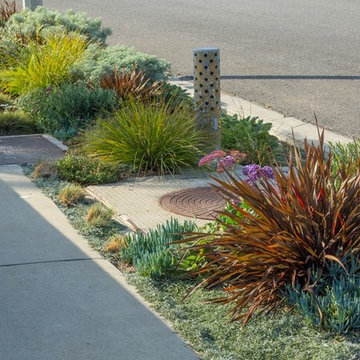

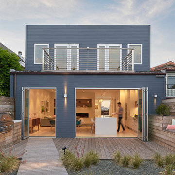

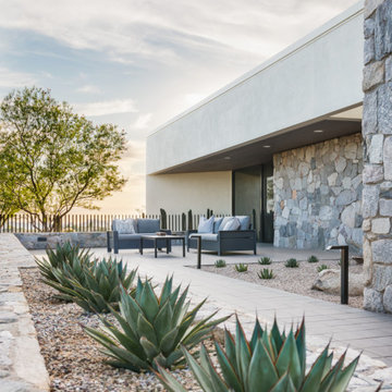
 Prideaux Design
Photo of a mid-sized modern drought-tolerant, desert and full sun backyard concrete paver landscaping.
 HUDSON DESIGN Architecture & Construction Mgmt
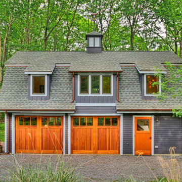
The conversion of this iconic American barn into a Writer’s Studio was conceived of as a tranquil retreat with natural light and lush views to stimulate inspiration for both husband and wife. Originally used as a garage with two horse stalls, the existing stick framed structure provided a loft with ideal space and orientation for a secluded studio. Signature barn features were maintained and enhanced such as horizontal siding, trim, large barn doors, cupola, roof overhangs, and framing. New features added to compliment the contextual significance and sustainability aspect of the project were reclaimed lumber from a razed barn used as flooring, driftwood retrieved from the shores of the Hudson River used for trim, and distressing / wearing new wood finishes creating an aged look. Along with the efforts for maintaining the historic character of the barn, modern elements were also incorporated into the design to provide a more current ensemble based on its new use. Elements such a light fixtures, window configurations, plumbing fixtures and appliances were all modernized to appropriately represent the present way of life.
 Ford & Associates
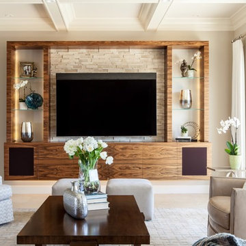
This dramatic entertainment unit was a work of love. We needed a custom unit that would not be boring, but also not weigh down the room that is so light and comfortable. By floating the unit and lighting it from below and inside, it gave it a lighter look that we needed. The grain goes across and continuous which matches the clients posts and details in the home. The stone detail in the back adds texture and interest to the piece. A team effort between the homeowners, the contractor and the designer that was a win win.
 McKinney York Architects
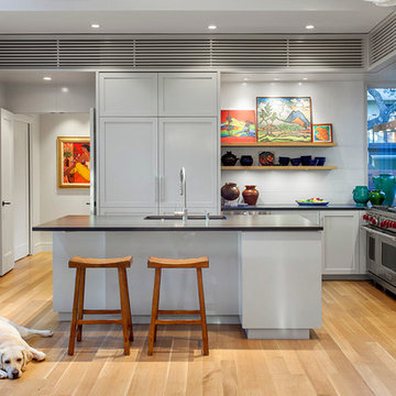
This property came with a house which proved ill-matched to our clients’ needs but which nestled neatly amid beautiful live oaks. In choosing to commission a new home, they asked that it also tuck under the limbs of the oaks and maintain a subdued presence to the street. Extraordinary efforts such as cantilevered floors and even bridging over critical root zones allow the design to be truly fitted to the site and to co-exist with the trees, the grandest of which is the focal point of the entry courtyard.
Of equal importance to the trees and view was to provide, conversely, for walls to display 35 paintings and numerous books. From form to smallest detail, the house is quiet and subtle.
 Studio Dearborn
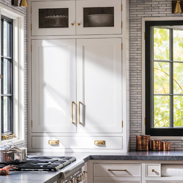
INTERNATIONAL AWARD WINNER. 2018 NKBA Design Competition Best Overall Kitchen. 2018 TIDA International USA Kitchen of the Year. 2018 Best Traditional Kitchen - Westchester Home Magazine design awards. The designer's own kitchen was gutted and renovated in 2017, with a focus on classic materials and thoughtful storage. The 1920s craftsman home has been in the family since 1940, and every effort was made to keep finishes and details true to the original construction. For sources, please see the website at www.studiodearborn.com. Photography, Adam Kane Macchia
10