
Search results for "Enhances problem solving" in Home Design Ideas
 Kristen Elizabeth Design
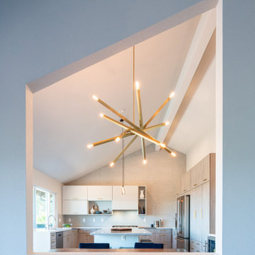
This home remodel was all about creating a modern oasis for easy entertaining and family life while accentuating the existing architecture of the home. It was critical to harmonize the kitchen with the remainder of the home and we achieved that by bringing a fresh and clean palette throughout the entry, living and kitchen areas. Every aspect of this design was thoughtfully curated in the best interest of the structure of the home and the desires of our clients.
We highlighted the negative wall space by adding a textured three dimensional tile to the entire back wall. To balance, we added an asymmetric lower bank of storage with open pockets for easy access. We blended a fine linen veneer that provides a soft contrast to the back wall cabinets and the island. For additional visual interest we added a grey wood veneer to complete the remainder of the space.
To continue the theme of harmony we needed to open up the divider wall between the living and kitchen, without removing it- as it was a critical structural shear wall. To problem solve, we mirrored the vaulted architecture of the kitchen in the opening to add consistency throughout the space.
The result: A crisp and contemporary aesthetic guests are sure to be WOW’d by.
 ATA Architects Inc
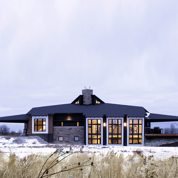
Function meets form in the Delta House, which incorporates innovative building solutions for our challenging rural Canadian climate. Perhaps more akin to aeronautics than architecture, biomimetic processes drove the problem-solving approach while seeking multiple functions for each component. A typical Canadian home grows up and out of the site, exposing more of the facade to the elements. Instead of building up, the focus here was to make better use of the lower level. A section of the house was dug out on the south side, making room for three main glazed boxes. The spaces and bedrooms of a typical second floor were transferred to the more protected basement, thus lowering the volume of conditioned air within the dwelling.
To minimize energy losses through the glazing, ATA centralized the windows on the south side of the building, while minimizing the glazing on other facades. The centralized windows became the “three sisters” allowing the winter sun into the main floor and lower level of the house. The aerodynamic delta shape of the building was tested in a wind tunnel and was designed to minimize energy loss due to contact with the turbulent winter wind. The sisters are tilted 10 degrees towards the sun, leveraging the properties of glass as a reflector, when the sun is at a high angle of incidence in the summer.
The house also contains an innovative thermal mass battery in the basement slab and a connected radiative masonry fireplace. Excess heat, gathered at the top of the tent-like roof is directed down and reheated through the chimney before being drawn into the basement slab for storage. Openings in the floor areas ensure the energy is equally distributed throughout the dwelling.
Read an article in the Globe and Mail about ATA’s Delta project here.
 Unpatterned
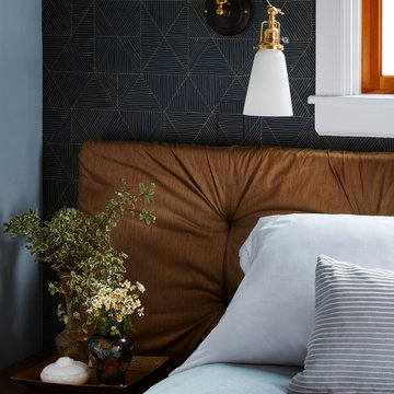
First we helped this family make their traditional first floor their own by adding a custom painted entry design, designer wallpaper, fresh paint on the fireplace and bookshelves, and a dining accent wall. We even helped procure furniture, including the custom designed record cabinet and commissioned painting and completed the look with hands-on styling. Less than a year later we were back for a master suite overhaul, including a new floor plan, an expanded master bath, his/hers closets, a fresh look for the hall bath, some bedroom, nursery and office decor and new floors throughout. From space planning problem solving, to project management during construction, and down to styling the details, Unpatterned was involved every step of the way.
FUN FACT The master bathroom used to just have a pedestal sink and no door!
Photography 2nd Floor: Dustin Halleck/1st Floor: Michael Kaskel
Find the right local pro for your project
 Smart Playrooms
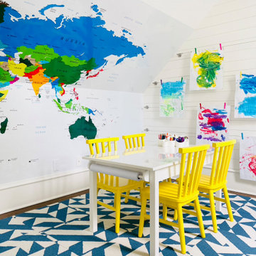
HOMESCHOOL ANYONE? This educational #homeschool and #playspace naturally encourages kids to think, problem solve, question and be independent. The large map is dry erase which invites kids to purposefully write and draw. The art display celebrates each child and the table gives a sturdy and comfortable place to draw, write, do puzzles and homework.

 Unpatterned
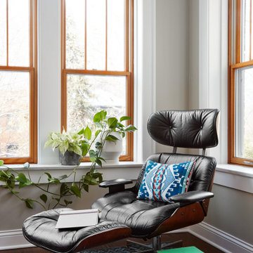
First we helped this family make their traditional first floor their own by adding a custom painted entry design, designer wallpaper, fresh paint on the fireplace and bookshelves, and a dining accent wall. We even helped procure furniture, including the custom designed record cabinet and commissioned painting and completed the look with hands-on styling. Less than a year later we were back for a master suite overhaul, including a new floor plan, an expanded master bath, his/hers closets, a fresh look for the hall bath, some bedroom, nursery and office decor and new floors throughout. From space planning problem solving, to project management during construction, and down to styling the details, Unpatterned was involved every step of the way.
FUN FACT The master bathroom used to just have a pedestal sink and no door!
Photography 2nd Floor: Dustin Halleck/1st Floor: Michael Kaskel
 Rhodes Architecture + Light
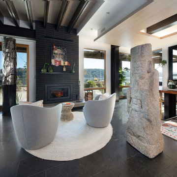
The renovation of an extensive linear residence and site facing Port Orchard waterway embraces water, greenspace and forested hillside. The home, completed this fall, serves as an artist’s studio, galleries, family space, game room, outdoor living areas and peaceful retreat.
New interiors and exterior spaces and finishes, cabinetry, lighting, paving, landscape and courtyards become settings for the owner’s art + collections, three-generations of family and the wonderful colors and textures of the land + water.
Inside, a monumental central stair and tapered two-story tall red cedar and steel column was designed as the residence’s entry focal point and internal landmarks, guiding the visitor’s eye to the main atrium…. and upward. Heavy wide-flange steel moment frames support the house and enable whole walls of glass. Rough, mill-finished steel contrasts refined cabinetry, stone, wood structure and defining dropped ceilings, reflecting the opener’s love of the tension between highly polished and detailed + rough, found art.
Outside, A new southern “dining room” was designed for warm summer evening gatherings under a heavy-timber trellis. The focus, opposite water and island views, is a metal perforated screen. The final screen is composed of the lyrics from a Joe Cocker song of great meaning to the owners, cut from ½” marine bronze, set into dark-fired brick. “Oh My Darling, Be Home Soon….”
Natural daylight and high-efficiency lighting are central players as in any gallery. From a high clerestory and extensive southern and eastern window-walls to carefully selected up-lighting, pendants, and accent fixtures, Rhodes Architecture + Light worked closely with the owner to ensure that their dark existing house would become one filled with light…. night and day.
The owners, Ken and Jane, allowed us to interview them about their experience working with Rhodes Architecture + Light, and how they are feeling about living with the architecture today.
What was your experience like, working with Rhodes Architecture + Light?
“They worked with us because it was a remodel, an existing thing, and we had to try to make it work for all of our interests and how our family operated. They listened, and we listened, and it was a great communication back and forth.”–Jane
How has the renovation changed the way you live and enjoy your home?
“I remember saying to them that I want the whole floor heated because it gets so chilly down here. And we had the wood burning stove, but it was over there and now we just turn the floor heat on and we can come down. It’s cozy and nice. So we’re looking forward to winter now.”–Ken
“We have 5 kids together and now a bunch of grandchildren. I wanted a marble countertop, but there’s just no way. I didn’t want it to be a place where I had to say, ‘No, no, no. Wipe up your drink, do this, do that.’ I wanted it to be a place where everybody can come with all the kids, and we make a big mess, and I can clean it up. And we can enjoy ourselves here, because that room upstairs, we almost never went in. And now we’re in there eating pizza and watching the game.” –Jane
As an artist, Jane enjoyed the collaborative process.
“I can’t believe it was as positive as it was. I went into it thinking it would be a great, creative, fun, collaborative thing, and I have to say, with our architects, it was. I like that creative process. I always say when I am doing a painting, it’s a series of problem solving so it wasn’t unusual for me. I am completely blown away by them and had fun with that part of it.” –Jane
Architect: Tim James Rhodes RA AIA, Rhodes Architecture + Light
Builder: Fairbank Construction Company
Structural: Swensen Say Faget

 Klopf Architecture
Malibu Glass Box House by Klopf Architecture
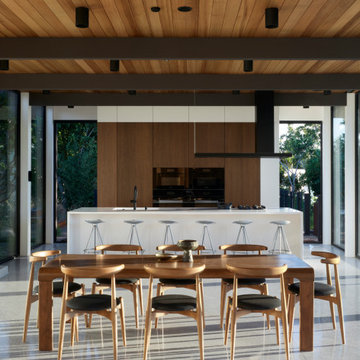
Following the devastating Woolsey Fire of 2018, the site in Malibu offered a unique opportunity to rebuild not just a home, but a new architectural composition that highlighted the property’s potential while navigating strict fire-rebuild codes in the area. Designed by Klopf Architecture, this project embraced a set of limitations and translated them into an architectural asset.
The city’s fire-rebuild process required the new structure to remain close to the original footprint, size and bulk, a constraint that ultimately clarified the architectural direction. Perched near the front of a long, narrow lot, the new home frames and overlooks a private, park-like rear expanse, an uncommon luxury especially in this part of Malibu .
Without a fixed program, the design process allowed for a different kind of creative focus allowing Klopf Architecture the opportunity to explore how a modernist home could best respond to this site. The team approached the project not with a list of requirements, but with a question: How might a modernist live here? What spatial qualities would inspire calm, connection, and a sense of wonder in this setting? The process became less about problem-solving and more about architectural storytelling—letting the site, the light, and the principles of modern design guide the form and flow of the home.
The response emerged in the form of a glass-box pavilion, an open, Mid-Century Modern inspired living, dining, and kitchen space that floats at the edge of the property’s natural descent. Connected to the more enclosed, private areas of the home by a glass-walled hallway, the living pavilion becomes a distinct centerpiece of the design. It opens on all four sides to the landscape with decks and patios on the flanks, an internal garden and water feature to the north, and a dramatic unguarded view of the expansive backyard and ocean horizon to the south.
Because of the mandated footprint, careful planning was required to ensure every space could still engage with light, landscape, or both. Strategic voids in the form of atriums and courtyards allow daylight to filter deep into the home’s core, while offering moments of surprise and retreat. These design gestures allow natural light to filter deep into the interior, creating a sense of brightness and openness throughout the day. At the same time, they expand the perceptual boundaries between inside and out, making the home feel more expansive while anchoring its connection to the surrounding landscape.
The siting of the house is what gives it its unique character. Rather than receding into the backyard like the neighboring homes, the house holds a slight prominence. From the central living pavilion, stepping down into the landscape feels more like entering a secluded park where a separate existing accessory structure, trail, and recreational areas await. The home’s modest street presence gives way to this unfolding drama of space, view, and nature.
Fire-resilient materials and assemblies are integrated seamlessly throughout including triple-pane glazing, under-slab and roof insulation, and locally sourced fire-rated cladding ensure the house not only meets Calfornia’s rigorous wildland-urban interface (WUI) standards, but feels effortlessly aligned with them. While technical decisions like fire-hardening and mechanical systems presented some construction challenges, particularly around the cantilevered glass box, the team found a functional compromise that preserved the integrity of the design.
Inside, a restrained palette and exposed post and beam design celebrate the ethos of mid-century modernism. A central circulation spine extends from the entry to the rear glass wall, offering a continuous visual link from street to ocean. Spaces such as the library and office, though more intimate in scale, are never cut off from nature as each opens to its own unique courtyard or garden view.
Though born out of a strict regulatory framework and developed without a specific client, the rebuild design unfolded with remarkable clarity. Grounded in site logic, refined by limitations and an emphasis on timeless spatial relationships – light, proportion, and a strong connection to nature, the resulting design feels both effortless and uplifting. The home lives lightly on the land, opens generously to its surroundings, and strikes a careful balance between privacy, openness, and calm. For Klopf Architecture, it stands as a compelling case study in how site, code, and circumstantial constraints can inspire enduring, modernist architecture. With years of experience reimagining mid-century modern design for how people live today, the firm took the project’s limitations as an opportunity. The result is a home shaped by open, flowing spaces, strong indoor-outdoor connections, and a calm, clear sense of structure. It’s a good reminder that even with strict constraints, there’s still room for architecture to breathe—and for modernism to keep moving forward.
Klopf Architecture project team: Geoff Campen, John Klopf, AIA, and Sherry Tan
Structural Engineer: ZFA
Contractor: Maison D’Artiste
Photography: ©2025 Mariko Reed
Year Completed: 2023
 Rhodes Architecture + Light
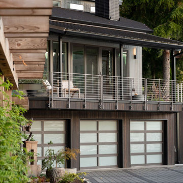
The renovation of an extensive linear residence and site facing Port Orchard waterway embraces water, greenspace and forested hillside. The home, completed this fall, serves as an artist’s studio, galleries, family space, game room, outdoor living areas and peaceful retreat.
New interiors and exterior spaces and finishes, cabinetry, lighting, paving, landscape and courtyards become settings for the owner’s art + collections, three-generations of family and the wonderful colors and textures of the land + water.
Inside, a monumental central stair and tapered two-story tall red cedar and steel column was designed as the residence’s entry focal point and internal landmarks, guiding the visitor’s eye to the main atrium…. and upward. Heavy wide-flange steel moment frames support the house and enable whole walls of glass. Rough, mill-finished steel contrasts refined cabinetry, stone, wood structure and defining dropped ceilings, reflecting the opener’s love of the tension between highly polished and detailed + rough, found art.
Outside, A new southern “dining room” was designed for warm summer evening gatherings under a heavy-timber trellis. The focus, opposite water and island views, is a metal perforated screen. The final screen is composed of the lyrics from a Joe Cocker song of great meaning to the owners, cut from ½” marine bronze, set into dark-fired brick. “Oh My Darling, Be Home Soon….”
Natural daylight and high-efficiency lighting are central players as in any gallery. From a high clerestory and extensive southern and eastern window-walls to carefully selected up-lighting, pendants, and accent fixtures, Rhodes Architecture + Light worked closely with the owner to ensure that their dark existing house would become one filled with light…. night and day.
The owners, Ken and Jane, allowed us to interview them about their experience working with Rhodes Architecture + Light, and how they are feeling about living with the architecture today.
What was your experience like, working with Rhodes Architecture + Light?
“They worked with us because it was a remodel, an existing thing, and we had to try to make it work for all of our interests and how our family operated. They listened, and we listened, and it was a great communication back and forth.”–Jane
How has the renovation changed the way you live and enjoy your home?
“I remember saying to them that I want the whole floor heated because it gets so chilly down here. And we had the wood burning stove, but it was over there and now we just turn the floor heat on and we can come down. It’s cozy and nice. So we’re looking forward to winter now.”–Ken
“We have 5 kids together and now a bunch of grandchildren. I wanted a marble countertop, but there’s just no way. I didn’t want it to be a place where I had to say, ‘No, no, no. Wipe up your drink, do this, do that.’ I wanted it to be a place where everybody can come with all the kids, and we make a big mess, and I can clean it up. And we can enjoy ourselves here, because that room upstairs, we almost never went in. And now we’re in there eating pizza and watching the game.” –Jane
As an artist, Jane enjoyed the collaborative process.
“I can’t believe it was as positive as it was. I went into it thinking it would be a great, creative, fun, collaborative thing, and I have to say, with our architects, it was. I like that creative process. I always say when I am doing a painting, it’s a series of problem solving so it wasn’t unusual for me. I am completely blown away by them and had fun with that part of it.” –Jane
Architect: Tim James Rhodes RA AIA, Rhodes Architecture + Light
Builder: Fairbank Construction Company
Structural: Swensen Say Faget
 Grade A Millwork & Renovations
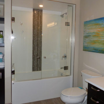
Here's what our client had to say about this project which is taken from our review page:
We have hired Grade A Millwork to renovate our family room, ensuite and main bathrooms. In setting up the original contract, our needs were listened to and a realistic work schedule was established. In each of our 3 projects, the workmanship was excellent, with attention to detail and delivered in a timely manner. The level of knowledge of all of the team members was especially evident when challenged to problem solve unforeseen issues in the renovations. All of our questions were also answered in a timely and professional manner. All three project were completed within the budget. We highly recommend Grade A Millwork.
 User
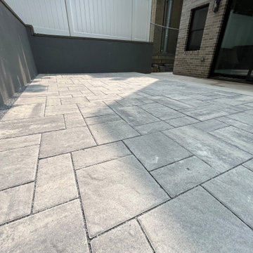
UserOpen Graded crushed stone base with proper drainage grid was installed to effectively address water accumulation. Quality Permeable Concrete Paver Patio was installed to successfully absorb any rain water AND re-route raising ground water to the new drainage system. Another water problem solved, and Owners gained a beautiful hard surface patio to enjoy.
 Abigail Shea Interiors
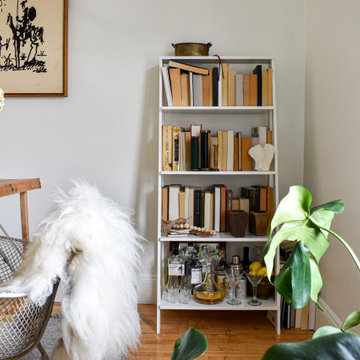
I had a blast working on this personal project. My partner, Alex, is working from home and I needed a space where I could be creative but also put in the hard work. We had 100sf, a budget of "as-cheap-as-possible," and tons of rental restrictions--but good design always starts with a little problem solving, right?
I infused the space with lots of neutral colors and tons of texture to keep it warm. I threw in my favorite vintage pieces, a big oversized paper lantern, and a bookshelf bar for some soul. & just like that, it's our favorite spot in town.
 Bullseye Wood Specialties, L.L.C
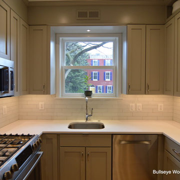
This compact DC kitchen was in dire need of space saving tricks and we used several. The kitchen features two tip-on toe kick drawers, sink tilt out, lazy susan, blind corner cabinet and custom vertical wood dividers over the frig. The original kitchen layout was L shaped because space did not allow for full depth base cabinets on the right wall. Problem solved -- we simply built cabinets that were 18" deep which still provide loads of storage as well as much needed counter top space.
 User
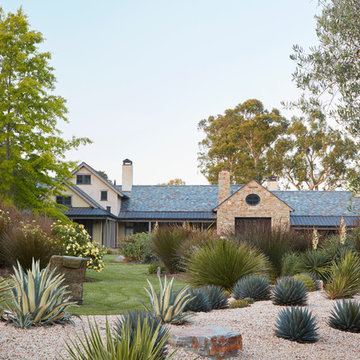
UserWe installed this garden a few years after the major installation. There were small pieces of the evil plant Equisetum in the soil mix, that over time became a pest. We shut off the water and put in a desert garden instead. Problem solved. photos by Caitlin Atkinson
 Kristen Elizabeth Design
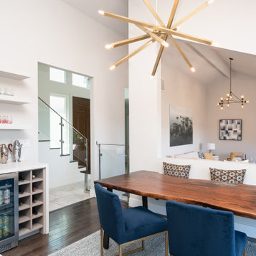
This home remodel was all about creating a modern oasis for easy entertaining and family life while accentuating the existing architecture of the home. It was critical to harmonize the kitchen with the remainder of the home and we achieved that by bringing a fresh and clean palette throughout the entry, living and kitchen areas. Every aspect of this design was thoughtfully curated in the best interest of the structure of the home and the desires of our clients.
We highlighted the negative wall space by adding a textured three dimensional tile to the entire back wall. To balance, we added an asymmetric lower bank of storage with open pockets for easy access. We blended a fine linen veneer that provides a soft contrast to the back wall cabinets and the island. For additional visual interest we added a grey wood veneer to complete the remainder of the space.
To continue the theme of harmony we needed to open up the divider wall between the living and kitchen, without removing it- as it was a critical structural shear wall. To problem solve, we mirrored the vaulted architecture of the kitchen in the opening to add consistency throughout the space.
The result: A crisp and contemporary aesthetic guests are sure to be WOW’d by.
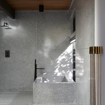 Klopf Architecture
Malibu Glass Box House by Klopf Architecture
Following the devastating Woolsey Fire of 2018, the site in Malibu offered a unique opportunity to rebuild not just a home, but a new architectural composition that highlighted the property’s potential while navigating strict fire-rebuild codes in the area. Designed by Klopf Architecture, this project embraced a set of limitations and translated them into an architectural asset.
The city’s fire-rebuild process required the new structure to remain close to the original footprint, size and bulk, a constraint that ultimately clarified the architectural direction. Perched near the front of a long, narrow lot, the new home frames and overlooks a private, park-like rear expanse, an uncommon luxury especially in this part of Malibu .
Without a fixed program, the design process allowed for a different kind of creative focus allowing Klopf Architecture the opportunity to explore how a modernist home could best respond to this site. The team approached the project not with a list of requirements, but with a question: How might a modernist live here? What spatial qualities would inspire calm, connection, and a sense of wonder in this setting? The process became less about problem-solving and more about architectural storytelling—letting the site, the light, and the principles of modern design guide the form and flow of the home.
The response emerged in the form of a glass-box pavilion, an open, Mid-Century Modern inspired living, dining, and kitchen space that floats at the edge of the property’s natural descent. Connected to the more enclosed, private areas of the home by a glass-walled hallway, the living pavilion becomes a distinct centerpiece of the design. It opens on all four sides to the landscape with decks and patios on the flanks, an internal garden and water feature to the north, and a dramatic unguarded view of the expansive backyard and ocean horizon to the south.
Because of the mandated footprint, careful planning was required to ensure every space could still engage with light, landscape, or both. Strategic voids in the form of atriums and courtyards allow daylight to filter deep into the home’s core, while offering moments of surprise and retreat. These design gestures allow natural light to filter deep into the interior, creating a sense of brightness and openness throughout the day. At the same time, they expand the perceptual boundaries between inside and out, making the home feel more expansive while anchoring its connection to the surrounding landscape.
The siting of the house is what gives it its unique character. Rather than receding into the backyard like the neighboring homes, the house holds a slight prominence. From the central living pavilion, stepping down into the landscape feels more like entering a secluded park where a separate existing accessory structure, trail, and recreational areas await. The home’s modest street presence gives way to this unfolding drama of space, view, and nature.
Fire-resilient materials and assemblies are integrated seamlessly throughout including triple-pane glazing, under-slab and roof insulation, and locally sourced fire-rated cladding ensure the house not only meets Calfornia’s rigorous wildland-urban interface (WUI) standards, but feels effortlessly aligned with them. While technical decisions like fire-hardening and mechanical systems presented some construction challenges, particularly around the cantilevered glass box, the team found a functional compromise that preserved the integrity of the design.
Inside, a restrained palette and exposed post and beam design celebrate the ethos of mid-century modernism. A central circulation spine extends from the entry to the rear glass wall, offering a continuous visual link from street to ocean. Spaces such as the library and office, though more intimate in scale, are never cut off from nature as each opens to its own unique courtyard or garden view.
Though born out of a strict regulatory framework and developed without a specific client, the rebuild design unfolded with remarkable clarity. Grounded in site logic, refined by limitations and an emphasis on timeless spatial relationships – light, proportion, and a strong connection to nature, the resulting design feels both effortless and uplifting. The home lives lightly on the land, opens generously to its surroundings, and strikes a careful balance between privacy, openness, and calm. For Klopf Architecture, it stands as a compelling case study in how site, code, and circumstantial constraints can inspire enduring, modernist architecture. With years of experience reimagining mid-century modern design for how people live today, the firm took the project’s limitations as an opportunity. The result is a home shaped by open, flowing spaces, strong indoor-outdoor connections, and a calm, clear sense of structure. It’s a good reminder that even with strict constraints, there’s still room for architecture to breathe—and for modernism to keep moving forward.
Klopf Architecture project team: Geoff Campen, John Klopf, AIA, and Sherry Tan
Structural Engineer: ZFA
Contractor: Maison D’Artiste
Photography: ©2025 Mariko Reed
Year Completed: 2023
 Klopf Architecture
Malibu Glass Box House by Klopf Architecture
Following the devastating Woolsey Fire of 2018, the site in Malibu offered a unique opportunity to rebuild not just a home, but a new architectural composition that highlighted the property’s potential while navigating strict fire-rebuild codes in the area. Designed by Klopf Architecture, this project embraced a set of limitations and translated them into an architectural asset.
The city’s fire-rebuild process required the new structure to remain close to the original footprint, size and bulk, a constraint that ultimately clarified the architectural direction. Perched near the front of a long, narrow lot, the new home frames and overlooks a private, park-like rear expanse, an uncommon luxury especially in this part of Malibu .
Without a fixed program, the design process allowed for a different kind of creative focus allowing Klopf Architecture the opportunity to explore how a modernist home could best respond to this site. The team approached the project not with a list of requirements, but with a question: How might a modernist live here? What spatial qualities would inspire calm, connection, and a sense of wonder in this setting? The process became less about problem-solving and more about architectural storytelling—letting the site, the light, and the principles of modern design guide the form and flow of the home.
The response emerged in the form of a glass-box pavilion, an open, Mid-Century Modern inspired living, dining, and kitchen space that floats at the edge of the property’s natural descent. Connected to the more enclosed, private areas of the home by a glass-walled hallway, the living pavilion becomes a distinct centerpiece of the design. It opens on all four sides to the landscape with decks and patios on the flanks, an internal garden and water feature to the north, and a dramatic unguarded view of the expansive backyard and ocean horizon to the south.
Because of the mandated footprint, careful planning was required to ensure every space could still engage with light, landscape, or both. Strategic voids in the form of atriums and courtyards allow daylight to filter deep into the home’s core, while offering moments of surprise and retreat. These design gestures allow natural light to filter deep into the interior, creating a sense of brightness and openness throughout the day. At the same time, they expand the perceptual boundaries between inside and out, making the home feel more expansive while anchoring its connection to the surrounding landscape.
The siting of the house is what gives it its unique character. Rather than receding into the backyard like the neighboring homes, the house holds a slight prominence. From the central living pavilion, stepping down into the landscape feels more like entering a secluded park where a separate existing accessory structure, trail, and recreational areas await. The home’s modest street presence gives way to this unfolding drama of space, view, and nature.
Fire-resilient materials and assemblies are integrated seamlessly throughout including triple-pane glazing, under-slab and roof insulation, and locally sourced fire-rated cladding ensure the house not only meets Calfornia’s rigorous wildland-urban interface (WUI) standards, but feels effortlessly aligned with them. While technical decisions like fire-hardening and mechanical systems presented some construction challenges, particularly around the cantilevered glass box, the team found a functional compromise that preserved the integrity of the design.
Inside, a restrained palette and exposed post and beam design celebrate the ethos of mid-century modernism. A central circulation spine extends from the entry to the rear glass wall, offering a continuous visual link from street to ocean. Spaces such as the library and office, though more intimate in scale, are never cut off from nature as each opens to its own unique courtyard or garden view.
Though born out of a strict regulatory framework and developed without a specific client, the rebuild design unfolded with remarkable clarity. Grounded in site logic, refined by limitations and an emphasis on timeless spatial relationships – light, proportion, and a strong connection to nature, the resulting design feels both effortless and uplifting. The home lives lightly on the land, opens generously to its surroundings, and strikes a careful balance between privacy, openness, and calm. For Klopf Architecture, it stands as a compelling case study in how site, code, and circumstantial constraints can inspire enduring, modernist architecture. With years of experience reimagining mid-century modern design for how people live today, the firm took the project’s limitations as an opportunity. The result is a home shaped by open, flowing spaces, strong indoor-outdoor connections, and a calm, clear sense of structure. It’s a good reminder that even with strict constraints, there’s still room for architecture to breathe—and for modernism to keep moving forward.
Klopf Architecture project team: Geoff Campen, John Klopf, AIA, and Sherry Tan
Structural Engineer: ZFA
Contractor: Maison D’Artiste
Photography: ©2025 Mariko Reed
Year Completed: 2023
 LiveWell Outdoors
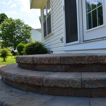
The client needed steps to get into the house. Problem solved with Belgard Hardscapes pavers. She chose a curved landing for access to the house.
www.sharpercut.com
 Rhodes Architecture + Light
The renovation of an extensive linear residence and site facing Port Orchard waterway embraces water, greenspace and forested hillside. The home, completed this fall, serves as an artist’s studio, galleries, family space, game room, outdoor living areas and peaceful retreat.
New interiors and exterior spaces and finishes, cabinetry, lighting, paving, landscape and courtyards become settings for the owner’s art + collections, three-generations of family and the wonderful colors and textures of the land + water.
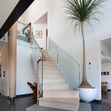
Inside, a monumental central stair and tapered two-story tall red cedar and steel column was designed as the residence’s entry focal point and internal landmarks, guiding the visitor’s eye to the main atrium…. and upward. Heavy wide-flange steel moment frames support the house and enable whole walls of glass. Rough, mill-finished steel contrasts refined cabinetry, stone, wood structure and defining dropped ceilings, reflecting the opener’s love of the tension between highly polished and detailed + rough, found art.
Outside, A new southern “dining room” was designed for warm summer evening gatherings under a heavy-timber trellis. The focus, opposite water and island views, is a metal perforated screen. The final screen is composed of the lyrics from a Joe Cocker song of great meaning to the owners, cut from ½” marine bronze, set into dark-fired brick. “Oh My Darling, Be Home Soon….”
Natural daylight and high-efficiency lighting are central players as in any gallery. From a high clerestory and extensive southern and eastern window-walls to carefully selected up-lighting, pendants, and accent fixtures, Rhodes Architecture + Light worked closely with the owner to ensure that their dark existing house would become one filled with light…. night and day.
The owners, Ken and Jane, allowed us to interview them about their experience working with Rhodes Architecture + Light, and how they are feeling about living with the architecture today.
What was your experience like, working with Rhodes Architecture + Light?
“They worked with us because it was a remodel, an existing thing, and we had to try to make it work for all of our interests and how our family operated. They listened, and we listened, and it was a great communication back and forth.”–Jane
How has the renovation changed the way you live and enjoy your home?
“I remember saying to them that I want the whole floor heated because it gets so chilly down here. And we had the wood burning stove, but it was over there and now we just turn the floor heat on and we can come down. It’s cozy and nice. So we’re looking forward to winter now.”–Ken
“We have 5 kids together and now a bunch of grandchildren. I wanted a marble countertop, but there’s just no way. I didn’t want it to be a place where I had to say, ‘No, no, no. Wipe up your drink, do this, do that.’ I wanted it to be a place where everybody can come with all the kids, and we make a big mess, and I can clean it up. And we can enjoy ourselves here, because that room upstairs, we almost never went in. And now we’re in there eating pizza and watching the game.” –Jane
As an artist, Jane enjoyed the collaborative process.
“I can’t believe it was as positive as it was. I went into it thinking it would be a great, creative, fun, collaborative thing, and I have to say, with our architects, it was. I like that creative process. I always say when I am doing a painting, it’s a series of problem solving so it wasn’t unusual for me. I am completely blown away by them and had fun with that part of it.” –Jane
Architect: Tim James Rhodes RA AIA, Rhodes Architecture + Light
Builder: Fairbank Construction Company
Structural: Swensen Say Faget
38