
Search results for "Entry emergency" in Home Design Ideas
 Christopher Simmonds Architect
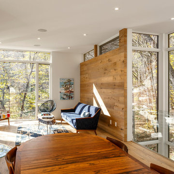
A family cottage in the Gatineau hills infused with Canadiana shifts its way over the edge of a cliff to command views of the adjacent lake. The retreat is gently embedded in the Canadian Shield; the sleeping quarters firmly set in the rock while the cantilevered family room dramatically emerges from this stone base. The modest entry visible from the road leads to an orchestrated, tranquil path entering from the forest-side of the house and moving through the space as it opens up onto the lakeside.
The house illustrates a warm approach to modernism; white oak boards wrap from wall to floor enhancing the elongated shape of the house and slabs of silver maple create the bathroom vanity. On the exterior, the main volume is wrapped with open-joint eastern white cedar while the stairwell is encased in steel; both are left unfinished to age with the elements.
On the lower level, the dormitory style sleeping quarters are again embedded into the rock. Access to the exterior is provided by a walkout from the lower level recreation room, allowing the family to easily explore nature.
Natural cooling is provided by cool air rising from the lake, passing in through the lakeside openings and out through the clerestory windows on the forest elevation. The expanse of windows engages the ephemeral foliage from the treetops to the forest floor. The softness and shadows of the filtered forest light fosters an intimate relationship between the exterior and the interior.
 ZeroEnergy Design
This renovated brick rowhome in Boston’s South End offers a modern aesthetic within a historic structure, creative use of space, exceptional thermal comfort, a reduced carbon footprint, and a passive stream of income.
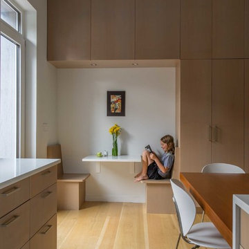
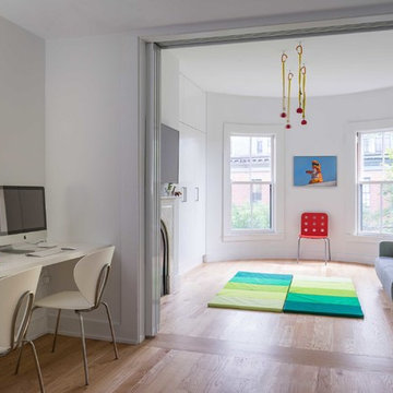
DESIGN PRIORITIES. The goals for the project were clear - design the primary unit to accommodate the family’s modern lifestyle, rework the layout to create a desirable rental unit, improve thermal comfort and introduce a modern aesthetic. We designed the street-level entry as a shared entrance for both the primary and rental unit. The family uses it as their everyday entrance - we planned for bike storage and an open mudroom with bench and shoe storage to facilitate the change from shoes to slippers or bare feet as they enter their home. On the main level, we expanded the kitchen into the dining room to create an eat-in space with generous counter space and storage, as well as a comfortable connection to the living space. The second floor serves as master suite for the couple - a bedroom with a walk-in-closet and ensuite bathroom, and an adjacent study, with refinished original pumpkin pine floors. The upper floor, aside from a guest bedroom, is the child's domain with interconnected spaces for sleeping, work and play. In the play space, which can be separated from the work space with new translucent sliding doors, we incorporated recreational features inspired by adventurous and competitive television shows, at their son’s request.
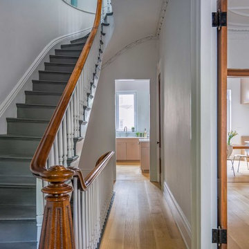
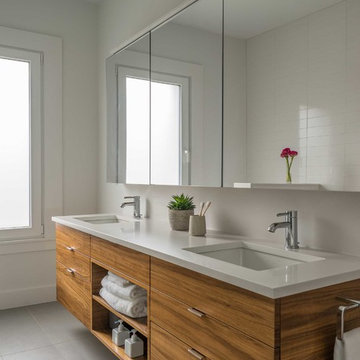
MODERN MEETS TRADITIONAL. We left the historic front facade of the building largely unchanged - the security bars were removed from the windows and the single pane windows were replaced with higher performing historic replicas. We designed the interior and rear facade with a vision of warm modernism, weaving in the notable period features. Each element was either restored or reinterpreted to blend with the modern aesthetic. The detailed ceiling in the living space, for example, has a new matte monochromatic finish, and the wood stairs are covered in a dark grey floor paint, whereas the mahogany doors were simply refinished. New wide plank wood flooring with a neutral finish, floor-to-ceiling casework, and bold splashes of color in wall paint and tile, and oversized high-performance windows (on the rear facade) round out the modern aesthetic.
RENTAL INCOME. The existing rowhome was zoned for a 2-family dwelling but included an undesirable, single-floor studio apartment at the garden level with low ceiling heights and questionable emergency egress. In order to increase the quality and quantity of space in the rental unit, we reimagined it as a two-floor, 1 or 2 bedroom, 2 bathroom apartment with a modern aesthetic, increased ceiling height on the lowest level and provided an in-unit washer/dryer. The apartment was listed with Jackie O'Connor Real Estate and rented immediately, providing the owners with a source of passive income.
ENCLOSURE WITH BENEFITS. The homeowners sought a minimal carbon footprint, enabled by their urban location and lifestyle decisions, paired with the benefits of a high-performance home. The extent of the renovation allowed us to implement a deep energy retrofit (DER) to address air tightness, insulation, and high-performance windows. The historic front facade is insulated from the interior, while the rear facade is insulated on the exterior. Together with these building enclosure improvements, we designed an HVAC system comprised of continuous fresh air ventilation, and an efficient, all-electric heating and cooling system to decouple the house from natural gas. This strategy provides optimal thermal comfort and indoor air quality, improved acoustic isolation from street noise and neighbors, as well as a further reduced carbon footprint. We also took measures to prepare the roof for future solar panels, for when the South End neighborhood’s aging electrical infrastructure is upgraded to allow them.
URBAN LIVING. The desirable neighborhood location allows the both the homeowners and tenant to walk, bike, and use public transportation to access the city, while each charging their respective plug-in electric cars behind the building to travel greater distances.
OVERALL. The understated rowhouse is now ready for another century of urban living, offering the owners comfort and convenience as they live life as an expression of their values.
Eric Roth Photo
 ZeroEnergy Design
This renovated brick rowhome in Boston’s South End offers a modern aesthetic within a historic structure, creative use of space, exceptional thermal comfort, a reduced carbon footprint, and a passive stream of income.
DESIGN PRIORITIES. The goals for the project were clear - design the primary unit to accommodate the family’s modern lifestyle, rework the layout to create a desirable rental unit, improve thermal comfort and introduce a modern aesthetic. We designed the street-level entry as a shared entrance for both the primary and rental unit. The family uses it as their everyday entrance - we planned for bike storage and an open mudroom with bench and shoe storage to facilitate the change from shoes to slippers or bare feet as they enter their home. On the main level, we expanded the kitchen into the dining room to create an eat-in space with generous counter space and storage, as well as a comfortable connection to the living space. The second floor serves as master suite for the couple - a bedroom with a walk-in-closet and ensuite bathroom, and an adjacent study, with refinished original pumpkin pine floors. The upper floor, aside from a guest bedroom, is the child's domain with interconnected spaces for sleeping, work and play. In the play space, which can be separated from the work space with new translucent sliding doors, we incorporated recreational features inspired by adventurous and competitive television shows, at their son’s request.
MODERN MEETS TRADITIONAL. We left the historic front facade of the building largely unchanged - the security bars were removed from the windows and the single pane windows were replaced with higher performing historic replicas. We designed the interior and rear facade with a vision of warm modernism, weaving in the notable period features. Each element was either restored or reinterpreted to blend with the modern aesthetic. The detailed ceiling in the living space, for example, has a new matte monochromatic finish, and the wood stairs are covered in a dark grey floor paint, whereas the mahogany doors were simply refinished. New wide plank wood flooring with a neutral finish, floor-to-ceiling casework, and bold splashes of color in wall paint and tile, and oversized high-performance windows (on the rear facade) round out the modern aesthetic.
RENTAL INCOME. The existing rowhome was zoned for a 2-family dwelling but included an undesirable, single-floor studio apartment at the garden level with low ceiling heights and questionable emergency egress. In order to increase the quality and quantity of space in the rental unit, we reimagined it as a two-floor, 1 or 2 bedroom, 2 bathroom apartment with a modern aesthetic, increased ceiling height on the lowest level and provided an in-unit washer/dryer. The apartment was listed with Jackie O'Connor Real Estate and rented immediately, providing the owners with a source of passive income.
ENCLOSURE WITH BENEFITS. The homeowners sought a minimal carbon footprint, enabled by their urban location and lifestyle decisions, paired with the benefits of a high-performance home. The extent of the renovation allowed us to implement a deep energy retrofit (DER) to address air tightness, insulation, and high-performance windows. The historic front facade is insulated from the interior, while the rear facade is insulated on the exterior. Together with these building enclosure improvements, we designed an HVAC system comprised of continuous fresh air ventilation, and an efficient, all-electric heating and cooling system to decouple the house from natural gas. This strategy provides optimal thermal comfort and indoor air quality, improved acoustic isolation from street noise and neighbors, as well as a further reduced carbon footprint. We also took measures to prepare the roof for future solar panels, for when the South End neighborhood’s aging electrical infrastructure is upgraded to allow them.
URBAN LIVING. The desirable neighborhood location allows the both the homeowners and tenant to walk, bike, and use public transportation to access the city, while each charging their respective plug-in electric cars behind the building to travel greater distances.
OVERALL. The understated rowhouse is now ready for another century of urban living, offering the owners comfort and convenience as they live life as an expression of their values.
Photography Eric Roth Photo
Find the right local pro for your project
 ZeroEnergy Design
This renovated brick rowhome in Boston’s South End offers a modern aesthetic within a historic structure, creative use of space, exceptional thermal comfort, a reduced carbon footprint, and a passive stream of income.
DESIGN PRIORITIES. The goals for the project were clear - design the primary unit to accommodate the family’s modern lifestyle, rework the layout to create a desirable rental unit, improve thermal comfort and introduce a modern aesthetic. We designed the street-level entry as a shared entrance for both the primary and rental unit. The family uses it as their everyday entrance - we planned for bike storage and an open mudroom with bench and shoe storage to facilitate the change from shoes to slippers or bare feet as they enter their home. On the main level, we expanded the kitchen into the dining room to create an eat-in space with generous counter space and storage, as well as a comfortable connection to the living space. The second floor serves as master suite for the couple - a bedroom with a walk-in-closet and ensuite bathroom, and an adjacent study, with refinished original pumpkin pine floors. The upper floor, aside from a guest bedroom, is the child's domain with interconnected spaces for sleeping, work and play. In the play space, which can be separated from the work space with new translucent sliding doors, we incorporated recreational features inspired by adventurous and competitive television shows, at their son’s request.
MODERN MEETS TRADITIONAL. We left the historic front facade of the building largely unchanged - the security bars were removed from the windows and the single pane windows were replaced with higher performing historic replicas. We designed the interior and rear facade with a vision of warm modernism, weaving in the notable period features. Each element was either restored or reinterpreted to blend with the modern aesthetic. The detailed ceiling in the living space, for example, has a new matte monochromatic finish, and the wood stairs are covered in a dark grey floor paint, whereas the mahogany doors were simply refinished. New wide plank wood flooring with a neutral finish, floor-to-ceiling casework, and bold splashes of color in wall paint and tile, and oversized high-performance windows (on the rear facade) round out the modern aesthetic.
RENTAL INCOME. The existing rowhome was zoned for a 2-family dwelling but included an undesirable, single-floor studio apartment at the garden level with low ceiling heights and questionable emergency egress. In order to increase the quality and quantity of space in the rental unit, we reimagined it as a two-floor, 1 or 2 bedroom, 2 bathroom apartment with a modern aesthetic, increased ceiling height on the lowest level and provided an in-unit washer/dryer. The apartment was listed with Jackie O'Connor Real Estate and rented immediately, providing the owners with a source of passive income.
ENCLOSURE WITH BENEFITS. The homeowners sought a minimal carbon footprint, enabled by their urban location and lifestyle decisions, paired with the benefits of a high-performance home. The extent of the renovation allowed us to implement a deep energy retrofit (DER) to address air tightness, insulation, and high-performance windows. The historic front facade is insulated from the interior, while the rear facade is insulated on the exterior. Together with these building enclosure improvements, we designed an HVAC system comprised of continuous fresh air ventilation, and an efficient, all-electric heating and cooling system to decouple the house from natural gas. This strategy provides optimal thermal comfort and indoor air quality, improved acoustic isolation from street noise and neighbors, as well as a further reduced carbon footprint. We also took measures to prepare the roof for future solar panels, for when the South End neighborhood’s aging electrical infrastructure is upgraded to allow them.
URBAN LIVING. The desirable neighborhood location allows the both the homeowners and tenant to walk, bike, and use public transportation to access the city, while each charging their respective plug-in electric cars behind the building to travel greater distances.
OVERALL. The understated rowhouse is now ready for another century of urban living, offering the owners comfort and convenience as they live life as an expression of their values.
Photography: Eric Roth Photo
 ZeroEnergy Design
This renovated brick rowhome in Boston’s South End offers a modern aesthetic within a historic structure, creative use of space, exceptional thermal comfort, a reduced carbon footprint, and a passive stream of income.
DESIGN PRIORITIES. The goals for the project were clear - design the primary unit to accommodate the family’s modern lifestyle, rework the layout to create a desirable rental unit, improve thermal comfort and introduce a modern aesthetic. We designed the street-level entry as a shared entrance for both the primary and rental unit. The family uses it as their everyday entrance - we planned for bike storage and an open mudroom with bench and shoe storage to facilitate the change from shoes to slippers or bare feet as they enter their home. On the main level, we expanded the kitchen into the dining room to create an eat-in space with generous counter space and storage, as well as a comfortable connection to the living space. The second floor serves as master suite for the couple - a bedroom with a walk-in-closet and ensuite bathroom, and an adjacent study, with refinished original pumpkin pine floors. The upper floor, aside from a guest bedroom, is the child's domain with interconnected spaces for sleeping, work and play. In the play space, which can be separated from the work space with new translucent sliding doors, we incorporated recreational features inspired by adventurous and competitive television shows, at their son’s request.
MODERN MEETS TRADITIONAL. We left the historic front facade of the building largely unchanged - the security bars were removed from the windows and the single pane windows were replaced with higher performing historic replicas. We designed the interior and rear facade with a vision of warm modernism, weaving in the notable period features. Each element was either restored or reinterpreted to blend with the modern aesthetic. The detailed ceiling in the living space, for example, has a new matte monochromatic finish, and the wood stairs are covered in a dark grey floor paint, whereas the mahogany doors were simply refinished. New wide plank wood flooring with a neutral finish, floor-to-ceiling casework, and bold splashes of color in wall paint and tile, and oversized high-performance windows (on the rear facade) round out the modern aesthetic.
RENTAL INCOME. The existing rowhome was zoned for a 2-family dwelling but included an undesirable, single-floor studio apartment at the garden level with low ceiling heights and questionable emergency egress. In order to increase the quality and quantity of space in the rental unit, we reimagined it as a two-floor, 1 or 2 bedroom, 2 bathroom apartment with a modern aesthetic, increased ceiling height on the lowest level and provided an in-unit washer/dryer. The apartment was listed with Jackie O'Connor Real Estate and rented immediately, providing the owners with a source of passive income.
ENCLOSURE WITH BENEFITS. The homeowners sought a minimal carbon footprint, enabled by their urban location and lifestyle decisions, paired with the benefits of a high-performance home. The extent of the renovation allowed us to implement a deep energy retrofit (DER) to address air tightness, insulation, and high-performance windows. The historic front facade is insulated from the interior, while the rear facade is insulated on the exterior. Together with these building enclosure improvements, we designed an HVAC system comprised of continuous fresh air ventilation, and an efficient, all-electric heating and cooling system to decouple the house from natural gas. This strategy provides optimal thermal comfort and indoor air quality, improved acoustic isolation from street noise and neighbors, as well as a further reduced carbon footprint. We also took measures to prepare the roof for future solar panels, for when the South End neighborhood’s aging electrical infrastructure is upgraded to allow them.
URBAN LIVING. The desirable neighborhood location allows the both the homeowners and tenant to walk, bike, and use public transportation to access the city, while each charging their respective plug-in electric cars behind the building to travel greater distances.
OVERALL. The understated rowhouse is now ready for another century of urban living, offering the owners comfort and convenience as they live life as an expression of their values.
Eric Roth Photo
 Buildwell
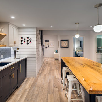
Remodeled basement includes recreational room, craft / sewing room, kids playrooms, music studio, bar, custom steel & wood island, guest bedroom and bath
(Photographs by Daniel O' Connor)
 Klopf Architecture
Malibu Glass Box House by Klopf Architecture
Following the devastating Woolsey Fire of 2018, the site in Malibu offered a unique opportunity to rebuild not just a home, but a new architectural composition that highlighted the property’s potential while navigating strict fire-rebuild codes in the area. Designed by Klopf Architecture, this project embraced a set of limitations and translated them into an architectural asset.
The city’s fire-rebuild process required the new structure to remain close to the original footprint, size and bulk, a constraint that ultimately clarified the architectural direction. Perched near the front of a long, narrow lot, the new home frames and overlooks a private, park-like rear expanse, an uncommon luxury especially in this part of Malibu .
Without a fixed program, the design process allowed for a different kind of creative focus allowing Klopf Architecture the opportunity to explore how a modernist home could best respond to this site. The team approached the project not with a list of requirements, but with a question: How might a modernist live here? What spatial qualities would inspire calm, connection, and a sense of wonder in this setting? The process became less about problem-solving and more about architectural storytelling—letting the site, the light, and the principles of modern design guide the form and flow of the home.
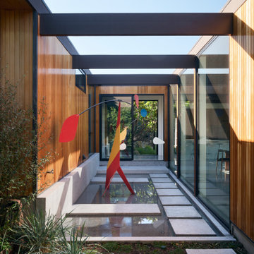
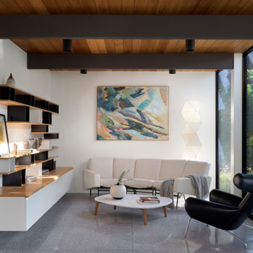
The response emerged in the form of a glass-box pavilion, an open, Mid-Century Modern inspired living, dining, and kitchen space that floats at the edge of the property’s natural descent. Connected to the more enclosed, private areas of the home by a glass-walled hallway, the living pavilion becomes a distinct centerpiece of the design. It opens on all four sides to the landscape with decks and patios on the flanks, an internal garden and water feature to the north, and a dramatic unguarded view of the expansive backyard and ocean horizon to the south.
Because of the mandated footprint, careful planning was required to ensure every space could still engage with light, landscape, or both. Strategic voids in the form of atriums and courtyards allow daylight to filter deep into the home’s core, while offering moments of surprise and retreat. These design gestures allow natural light to filter deep into the interior, creating a sense of brightness and openness throughout the day. At the same time, they expand the perceptual boundaries between inside and out, making the home feel more expansive while anchoring its connection to the surrounding landscape.
The siting of the house is what gives it its unique character. Rather than receding into the backyard like the neighboring homes, the house holds a slight prominence. From the central living pavilion, stepping down into the landscape feels more like entering a secluded park where a separate existing accessory structure, trail, and recreational areas await. The home’s modest street presence gives way to this unfolding drama of space, view, and nature.
Fire-resilient materials and assemblies are integrated seamlessly throughout including triple-pane glazing, under-slab and roof insulation, and locally sourced fire-rated cladding ensure the house not only meets Calfornia’s rigorous wildland-urban interface (WUI) standards, but feels effortlessly aligned with them. While technical decisions like fire-hardening and mechanical systems presented some construction challenges, particularly around the cantilevered glass box, the team found a functional compromise that preserved the integrity of the design.
Inside, a restrained palette and exposed post and beam design celebrate the ethos of mid-century modernism. A central circulation spine extends from the entry to the rear glass wall, offering a continuous visual link from street to ocean. Spaces such as the library and office, though more intimate in scale, are never cut off from nature as each opens to its own unique courtyard or garden view.
Though born out of a strict regulatory framework and developed without a specific client, the rebuild design unfolded with remarkable clarity. Grounded in site logic, refined by limitations and an emphasis on timeless spatial relationships – light, proportion, and a strong connection to nature, the resulting design feels both effortless and uplifting. The home lives lightly on the land, opens generously to its surroundings, and strikes a careful balance between privacy, openness, and calm. For Klopf Architecture, it stands as a compelling case study in how site, code, and circumstantial constraints can inspire enduring, modernist architecture. With years of experience reimagining mid-century modern design for how people live today, the firm took the project’s limitations as an opportunity. The result is a home shaped by open, flowing spaces, strong indoor-outdoor connections, and a calm, clear sense of structure. It’s a good reminder that even with strict constraints, there’s still room for architecture to breathe—and for modernism to keep moving forward.
Klopf Architecture project team: Geoff Campen, John Klopf, AIA, and Sherry Tan
Structural Engineer: ZFA
Contractor: Maison D’Artiste
Photography: ©2025 Mariko Reed
Year Completed: 2023
Sponsored
Sunbury, OH

J.Holderby - Renovations
Franklin County's Leading General Contractors - 2X Best of Houzz!
 Klopf Architecture
Malibu Glass Box House by Klopf Architecture
Following the devastating Woolsey Fire of 2018, the site in Malibu offered a unique opportunity to rebuild not just a home, but a new architectural composition that highlighted the property’s potential while navigating strict fire-rebuild codes in the area. Designed by Klopf Architecture, this project embraced a set of limitations and translated them into an architectural asset.
The city’s fire-rebuild process required the new structure to remain close to the original footprint, size and bulk, a constraint that ultimately clarified the architectural direction. Perched near the front of a long, narrow lot, the new home frames and overlooks a private, park-like rear expanse, an uncommon luxury especially in this part of Malibu .
Without a fixed program, the design process allowed for a different kind of creative focus allowing Klopf Architecture the opportunity to explore how a modernist home could best respond to this site. The team approached the project not with a list of requirements, but with a question: How might a modernist live here? What spatial qualities would inspire calm, connection, and a sense of wonder in this setting? The process became less about problem-solving and more about architectural storytelling—letting the site, the light, and the principles of modern design guide the form and flow of the home.
The response emerged in the form of a glass-box pavilion, an open, Mid-Century Modern inspired living, dining, and kitchen space that floats at the edge of the property’s natural descent. Connected to the more enclosed, private areas of the home by a glass-walled hallway, the living pavilion becomes a distinct centerpiece of the design. It opens on all four sides to the landscape with decks and patios on the flanks, an internal garden and water feature to the north, and a dramatic unguarded view of the expansive backyard and ocean horizon to the south.
Because of the mandated footprint, careful planning was required to ensure every space could still engage with light, landscape, or both. Strategic voids in the form of atriums and courtyards allow daylight to filter deep into the home’s core, while offering moments of surprise and retreat. These design gestures allow natural light to filter deep into the interior, creating a sense of brightness and openness throughout the day. At the same time, they expand the perceptual boundaries between inside and out, making the home feel more expansive while anchoring its connection to the surrounding landscape.
The siting of the house is what gives it its unique character. Rather than receding into the backyard like the neighboring homes, the house holds a slight prominence. From the central living pavilion, stepping down into the landscape feels more like entering a secluded park where a separate existing accessory structure, trail, and recreational areas await. The home’s modest street presence gives way to this unfolding drama of space, view, and nature.
Fire-resilient materials and assemblies are integrated seamlessly throughout including triple-pane glazing, under-slab and roof insulation, and locally sourced fire-rated cladding ensure the house not only meets Calfornia’s rigorous wildland-urban interface (WUI) standards, but feels effortlessly aligned with them. While technical decisions like fire-hardening and mechanical systems presented some construction challenges, particularly around the cantilevered glass box, the team found a functional compromise that preserved the integrity of the design.
Inside, a restrained palette and exposed post and beam design celebrate the ethos of mid-century modernism. A central circulation spine extends from the entry to the rear glass wall, offering a continuous visual link from street to ocean. Spaces such as the library and office, though more intimate in scale, are never cut off from nature as each opens to its own unique courtyard or garden view.
Though born out of a strict regulatory framework and developed without a specific client, the rebuild design unfolded with remarkable clarity. Grounded in site logic, refined by limitations and an emphasis on timeless spatial relationships – light, proportion, and a strong connection to nature, the resulting design feels both effortless and uplifting. The home lives lightly on the land, opens generously to its surroundings, and strikes a careful balance between privacy, openness, and calm. For Klopf Architecture, it stands as a compelling case study in how site, code, and circumstantial constraints can inspire enduring, modernist architecture. With years of experience reimagining mid-century modern design for how people live today, the firm took the project’s limitations as an opportunity. The result is a home shaped by open, flowing spaces, strong indoor-outdoor connections, and a calm, clear sense of structure. It’s a good reminder that even with strict constraints, there’s still room for architecture to breathe—and for modernism to keep moving forward.
Klopf Architecture project team: Geoff Campen, John Klopf, AIA, and Sherry Tan
Structural Engineer: ZFA
Contractor: Maison D’Artiste
Photography: ©2025 Mariko Reed
Year Completed: 2023
 Christopher Simmonds Architect
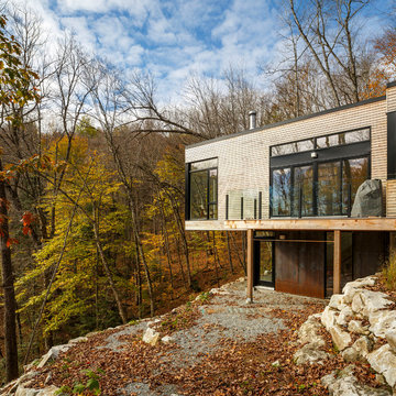
A family cottage in the Gatineau hills infused with Canadiana shifts its way over the edge of a cliff to command views of the adjacent lake. The retreat is gently embedded in the Canadian Shield; the sleeping quarters firmly set in the rock while the cantilevered family room dramatically emerges from this stone base. The modest entry visible from the road leads to an orchestrated, tranquil path entering from the forest-side of the house and moving through the space as it opens up onto the lakeside.
The house illustrates a warm approach to modernism; white oak boards wrap from wall to floor enhancing the elongated shape of the house and slabs of silver maple create the bathroom vanity. On the exterior, the main volume is wrapped with open-joint eastern white cedar while the stairwell is encased in steel; both are left unfinished to age with the elements.
On the lower level, the dormitory style sleeping quarters are again embedded into the rock. Access to the exterior is provided by a walkout from the lower level recreation room, allowing the family to easily explore nature.
Natural cooling is provided by cool air rising from the lake, passing in through the lakeside openings and out through the clerestory windows on the forest elevation. The expanse of windows engages the ephemeral foliage from the treetops to the forest floor. The softness and shadows of the filtered forest light fosters an intimate relationship between the exterior and the interior.
 Klopf Architecture
Malibu Glass Box House by Klopf Architecture
Following the devastating Woolsey Fire of 2018, the site in Malibu offered a unique opportunity to rebuild not just a home, but a new architectural composition that highlighted the property’s potential while navigating strict fire-rebuild codes in the area. Designed by Klopf Architecture, this project embraced a set of limitations and translated them into an architectural asset.
The city’s fire-rebuild process required the new structure to remain close to the original footprint, size and bulk, a constraint that ultimately clarified the architectural direction. Perched near the front of a long, narrow lot, the new home frames and overlooks a private, park-like rear expanse, an uncommon luxury especially in this part of Malibu .
Without a fixed program, the design process allowed for a different kind of creative focus allowing Klopf Architecture the opportunity to explore how a modernist home could best respond to this site. The team approached the project not with a list of requirements, but with a question: How might a modernist live here? What spatial qualities would inspire calm, connection, and a sense of wonder in this setting? The process became less about problem-solving and more about architectural storytelling—letting the site, the light, and the principles of modern design guide the form and flow of the home.
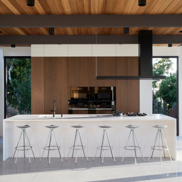
The response emerged in the form of a glass-box pavilion, an open, Mid-Century Modern inspired living, dining, and kitchen space that floats at the edge of the property’s natural descent. Connected to the more enclosed, private areas of the home by a glass-walled hallway, the living pavilion becomes a distinct centerpiece of the design. It opens on all four sides to the landscape with decks and patios on the flanks, an internal garden and water feature to the north, and a dramatic unguarded view of the expansive backyard and ocean horizon to the south.
Because of the mandated footprint, careful planning was required to ensure every space could still engage with light, landscape, or both. Strategic voids in the form of atriums and courtyards allow daylight to filter deep into the home’s core, while offering moments of surprise and retreat. These design gestures allow natural light to filter deep into the interior, creating a sense of brightness and openness throughout the day. At the same time, they expand the perceptual boundaries between inside and out, making the home feel more expansive while anchoring its connection to the surrounding landscape.
The siting of the house is what gives it its unique character. Rather than receding into the backyard like the neighboring homes, the house holds a slight prominence. From the central living pavilion, stepping down into the landscape feels more like entering a secluded park where a separate existing accessory structure, trail, and recreational areas await. The home’s modest street presence gives way to this unfolding drama of space, view, and nature.
Fire-resilient materials and assemblies are integrated seamlessly throughout including triple-pane glazing, under-slab and roof insulation, and locally sourced fire-rated cladding ensure the house not only meets Calfornia’s rigorous wildland-urban interface (WUI) standards, but feels effortlessly aligned with them. While technical decisions like fire-hardening and mechanical systems presented some construction challenges, particularly around the cantilevered glass box, the team found a functional compromise that preserved the integrity of the design.
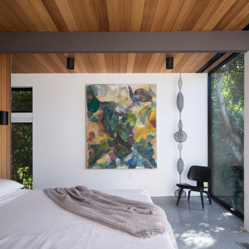
Inside, a restrained palette and exposed post and beam design celebrate the ethos of mid-century modernism. A central circulation spine extends from the entry to the rear glass wall, offering a continuous visual link from street to ocean. Spaces such as the library and office, though more intimate in scale, are never cut off from nature as each opens to its own unique courtyard or garden view.
Though born out of a strict regulatory framework and developed without a specific client, the rebuild design unfolded with remarkable clarity. Grounded in site logic, refined by limitations and an emphasis on timeless spatial relationships – light, proportion, and a strong connection to nature, the resulting design feels both effortless and uplifting. The home lives lightly on the land, opens generously to its surroundings, and strikes a careful balance between privacy, openness, and calm. For Klopf Architecture, it stands as a compelling case study in how site, code, and circumstantial constraints can inspire enduring, modernist architecture. With years of experience reimagining mid-century modern design for how people live today, the firm took the project’s limitations as an opportunity. The result is a home shaped by open, flowing spaces, strong indoor-outdoor connections, and a calm, clear sense of structure. It’s a good reminder that even with strict constraints, there’s still room for architecture to breathe—and for modernism to keep moving forward.
Klopf Architecture project team: Geoff Campen, John Klopf, AIA, and Sherry Tan
Structural Engineer: ZFA
Contractor: Maison D’Artiste
Photography: ©2025 Mariko Reed
Year Completed: 2023
 Klopf Architecture
Malibu Glass Box House by Klopf Architecture
Following the devastating Woolsey Fire of 2018, the site in Malibu offered a unique opportunity to rebuild not just a home, but a new architectural composition that highlighted the property’s potential while navigating strict fire-rebuild codes in the area. Designed by Klopf Architecture, this project embraced a set of limitations and translated them into an architectural asset.
The city’s fire-rebuild process required the new structure to remain close to the original footprint, size and bulk, a constraint that ultimately clarified the architectural direction. Perched near the front of a long, narrow lot, the new home frames and overlooks a private, park-like rear expanse, an uncommon luxury especially in this part of Malibu .
Without a fixed program, the design process allowed for a different kind of creative focus allowing Klopf Architecture the opportunity to explore how a modernist home could best respond to this site. The team approached the project not with a list of requirements, but with a question: How might a modernist live here? What spatial qualities would inspire calm, connection, and a sense of wonder in this setting? The process became less about problem-solving and more about architectural storytelling—letting the site, the light, and the principles of modern design guide the form and flow of the home.
The response emerged in the form of a glass-box pavilion, an open, Mid-Century Modern inspired living, dining, and kitchen space that floats at the edge of the property’s natural descent. Connected to the more enclosed, private areas of the home by a glass-walled hallway, the living pavilion becomes a distinct centerpiece of the design. It opens on all four sides to the landscape with decks and patios on the flanks, an internal garden and water feature to the north, and a dramatic unguarded view of the expansive backyard and ocean horizon to the south.
Because of the mandated footprint, careful planning was required to ensure every space could still engage with light, landscape, or both. Strategic voids in the form of atriums and courtyards allow daylight to filter deep into the home’s core, while offering moments of surprise and retreat. These design gestures allow natural light to filter deep into the interior, creating a sense of brightness and openness throughout the day. At the same time, they expand the perceptual boundaries between inside and out, making the home feel more expansive while anchoring its connection to the surrounding landscape.
The siting of the house is what gives it its unique character. Rather than receding into the backyard like the neighboring homes, the house holds a slight prominence. From the central living pavilion, stepping down into the landscape feels more like entering a secluded park where a separate existing accessory structure, trail, and recreational areas await. The home’s modest street presence gives way to this unfolding drama of space, view, and nature.
Fire-resilient materials and assemblies are integrated seamlessly throughout including triple-pane glazing, under-slab and roof insulation, and locally sourced fire-rated cladding ensure the house not only meets Calfornia’s rigorous wildland-urban interface (WUI) standards, but feels effortlessly aligned with them. While technical decisions like fire-hardening and mechanical systems presented some construction challenges, particularly around the cantilevered glass box, the team found a functional compromise that preserved the integrity of the design.
Inside, a restrained palette and exposed post and beam design celebrate the ethos of mid-century modernism. A central circulation spine extends from the entry to the rear glass wall, offering a continuous visual link from street to ocean. Spaces such as the library and office, though more intimate in scale, are never cut off from nature as each opens to its own unique courtyard or garden view.
Though born out of a strict regulatory framework and developed without a specific client, the rebuild design unfolded with remarkable clarity. Grounded in site logic, refined by limitations and an emphasis on timeless spatial relationships – light, proportion, and a strong connection to nature, the resulting design feels both effortless and uplifting. The home lives lightly on the land, opens generously to its surroundings, and strikes a careful balance between privacy, openness, and calm. For Klopf Architecture, it stands as a compelling case study in how site, code, and circumstantial constraints can inspire enduring, modernist architecture. With years of experience reimagining mid-century modern design for how people live today, the firm took the project’s limitations as an opportunity. The result is a home shaped by open, flowing spaces, strong indoor-outdoor connections, and a calm, clear sense of structure. It’s a good reminder that even with strict constraints, there’s still room for architecture to breathe—and for modernism to keep moving forward.
Klopf Architecture project team: Geoff Campen, John Klopf, AIA, and Sherry Tan
Structural Engineer: ZFA
Contractor: Maison D’Artiste
Photography: ©2025 Mariko Reed
Year Completed: 2023
 Klopf Architecture
Malibu Glass Box House by Klopf Architecture
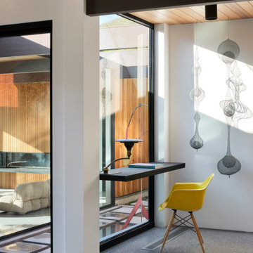
Following the devastating Woolsey Fire of 2018, the site in Malibu offered a unique opportunity to rebuild not just a home, but a new architectural composition that highlighted the property’s potential while navigating strict fire-rebuild codes in the area. Designed by Klopf Architecture, this project embraced a set of limitations and translated them into an architectural asset.
The city’s fire-rebuild process required the new structure to remain close to the original footprint, size and bulk, a constraint that ultimately clarified the architectural direction. Perched near the front of a long, narrow lot, the new home frames and overlooks a private, park-like rear expanse, an uncommon luxury especially in this part of Malibu .
Without a fixed program, the design process allowed for a different kind of creative focus allowing Klopf Architecture the opportunity to explore how a modernist home could best respond to this site. The team approached the project not with a list of requirements, but with a question: How might a modernist live here? What spatial qualities would inspire calm, connection, and a sense of wonder in this setting? The process became less about problem-solving and more about architectural storytelling—letting the site, the light, and the principles of modern design guide the form and flow of the home.
The response emerged in the form of a glass-box pavilion, an open, Mid-Century Modern inspired living, dining, and kitchen space that floats at the edge of the property’s natural descent. Connected to the more enclosed, private areas of the home by a glass-walled hallway, the living pavilion becomes a distinct centerpiece of the design. It opens on all four sides to the landscape with decks and patios on the flanks, an internal garden and water feature to the north, and a dramatic unguarded view of the expansive backyard and ocean horizon to the south.
Because of the mandated footprint, careful planning was required to ensure every space could still engage with light, landscape, or both. Strategic voids in the form of atriums and courtyards allow daylight to filter deep into the home’s core, while offering moments of surprise and retreat. These design gestures allow natural light to filter deep into the interior, creating a sense of brightness and openness throughout the day. At the same time, they expand the perceptual boundaries between inside and out, making the home feel more expansive while anchoring its connection to the surrounding landscape.
The siting of the house is what gives it its unique character. Rather than receding into the backyard like the neighboring homes, the house holds a slight prominence. From the central living pavilion, stepping down into the landscape feels more like entering a secluded park where a separate existing accessory structure, trail, and recreational areas await. The home’s modest street presence gives way to this unfolding drama of space, view, and nature.
Fire-resilient materials and assemblies are integrated seamlessly throughout including triple-pane glazing, under-slab and roof insulation, and locally sourced fire-rated cladding ensure the house not only meets Calfornia’s rigorous wildland-urban interface (WUI) standards, but feels effortlessly aligned with them. While technical decisions like fire-hardening and mechanical systems presented some construction challenges, particularly around the cantilevered glass box, the team found a functional compromise that preserved the integrity of the design.
Inside, a restrained palette and exposed post and beam design celebrate the ethos of mid-century modernism. A central circulation spine extends from the entry to the rear glass wall, offering a continuous visual link from street to ocean. Spaces such as the library and office, though more intimate in scale, are never cut off from nature as each opens to its own unique courtyard or garden view.
Though born out of a strict regulatory framework and developed without a specific client, the rebuild design unfolded with remarkable clarity. Grounded in site logic, refined by limitations and an emphasis on timeless spatial relationships – light, proportion, and a strong connection to nature, the resulting design feels both effortless and uplifting. The home lives lightly on the land, opens generously to its surroundings, and strikes a careful balance between privacy, openness, and calm. For Klopf Architecture, it stands as a compelling case study in how site, code, and circumstantial constraints can inspire enduring, modernist architecture. With years of experience reimagining mid-century modern design for how people live today, the firm took the project’s limitations as an opportunity. The result is a home shaped by open, flowing spaces, strong indoor-outdoor connections, and a calm, clear sense of structure. It’s a good reminder that even with strict constraints, there’s still room for architecture to breathe—and for modernism to keep moving forward.
Klopf Architecture project team: Geoff Campen, John Klopf, AIA, and Sherry Tan
Structural Engineer: ZFA
Contractor: Maison D’Artiste
Photography: ©2025 Mariko Reed
Year Completed: 2023
 ZeroEnergy Design
This renovated brick rowhome in Boston’s South End offers a modern aesthetic within a historic structure, creative use of space, exceptional thermal comfort, a reduced carbon footprint, and a passive stream of income.
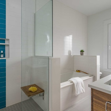
DESIGN PRIORITIES. The goals for the project were clear - design the primary unit to accommodate the family’s modern lifestyle, rework the layout to create a desirable rental unit, improve thermal comfort and introduce a modern aesthetic. We designed the street-level entry as a shared entrance for both the primary and rental unit. The family uses it as their everyday entrance - we planned for bike storage and an open mudroom with bench and shoe storage to facilitate the change from shoes to slippers or bare feet as they enter their home. On the main level, we expanded the kitchen into the dining room to create an eat-in space with generous counter space and storage, as well as a comfortable connection to the living space. The second floor serves as master suite for the couple - a bedroom with a walk-in-closet and ensuite bathroom, and an adjacent study, with refinished original pumpkin pine floors. The upper floor, aside from a guest bedroom, is the child's domain with interconnected spaces for sleeping, work and play. In the play space, which can be separated from the work space with new translucent sliding doors, we incorporated recreational features inspired by adventurous and competitive television shows, at their son’s request.
MODERN MEETS TRADITIONAL. We left the historic front facade of the building largely unchanged - the security bars were removed from the windows and the single pane windows were replaced with higher performing historic replicas. We designed the interior and rear facade with a vision of warm modernism, weaving in the notable period features. Each element was either restored or reinterpreted to blend with the modern aesthetic. The detailed ceiling in the living space, for example, has a new matte monochromatic finish, and the wood stairs are covered in a dark grey floor paint, whereas the mahogany doors were simply refinished. New wide plank wood flooring with a neutral finish, floor-to-ceiling casework, and bold splashes of color in wall paint and tile, and oversized high-performance windows (on the rear facade) round out the modern aesthetic.
RENTAL INCOME. The existing rowhome was zoned for a 2-family dwelling but included an undesirable, single-floor studio apartment at the garden level with low ceiling heights and questionable emergency egress. In order to increase the quality and quantity of space in the rental unit, we reimagined it as a two-floor, 1 or 2 bedroom, 2 bathroom apartment with a modern aesthetic, increased ceiling height on the lowest level and provided an in-unit washer/dryer. The apartment was listed with Jackie O'Connor Real Estate and rented immediately, providing the owners with a source of passive income.
ENCLOSURE WITH BENEFITS. The homeowners sought a minimal carbon footprint, enabled by their urban location and lifestyle decisions, paired with the benefits of a high-performance home. The extent of the renovation allowed us to implement a deep energy retrofit (DER) to address air tightness, insulation, and high-performance windows. The historic front facade is insulated from the interior, while the rear facade is insulated on the exterior. Together with these building enclosure improvements, we designed an HVAC system comprised of continuous fresh air ventilation, and an efficient, all-electric heating and cooling system to decouple the house from natural gas. This strategy provides optimal thermal comfort and indoor air quality, improved acoustic isolation from street noise and neighbors, as well as a further reduced carbon footprint. We also took measures to prepare the roof for future solar panels, for when the South End neighborhood’s aging electrical infrastructure is upgraded to allow them.
URBAN LIVING. The desirable neighborhood location allows the both the homeowners and tenant to walk, bike, and use public transportation to access the city, while each charging their respective plug-in electric cars behind the building to travel greater distances.
OVERALL. The understated rowhouse is now ready for another century of urban living, offering the owners comfort and convenience as they live life as an expression of their values.
Eric Roth Photo

 Wiedemann Architects LLC
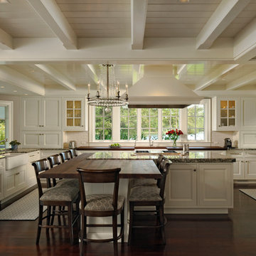
This home on the Eastern Shore of Maryland began as a modest 1927 home with a central hall plan. Renovations included reversing the kitchen and dining room layout , adding a large central island and hood to anchor the center of the kitchen. The island has a walnut counter encircling the working island and accommodates additional seating. The main sink looks out to the north with beautiful water views. The southwest bay window affords a seating area with built-in bookshelves adjoining the breakfast room while the one in the kitchen provides for the secondary sink and clean-up area. By capturing the additional depth in the bay window, a large TV is concealed below the countertop and can emerge with a press of a button or retract out of sight to enjoy views of the water.
A separate butler's pantry and wine bar were designed adjoining the breakfast room. The original fireplace was retained and became the center of the large Breakfast Room. Wood paneling lines the Breakfast Room which helps to integrate the new kitchen and the adjoining spaces into a coherent whole, all accessible from the informal entry.
This was a highly collaborative project with Jennifer Gilmer Kitchen and Bath LTD of Chevy Chase, MD.
Bob Narod, Photographer, LLC
 Spring Creek Design
This old farmhouse (ca. late 18th century) has undergone many renovations over the years. Spring Creek Design added its stamp in 2008, with a small mudroom addition and a complete interior renovation.
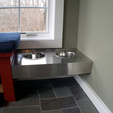
The addition encompasses a 1st floor mudroom with extensive cabinetry and closetry. Upon entering the space from the driveway, cabinet and countertop space is provided to accommodate incoming grocery bags. Next in line are a series of “lockers” and cubbies - just right for coats, hats and book bags. Further inside is a wrap-around window seat with cedar shoe racks beneath. A stainless steel dog feeding station rounds out the amenities - all built atop a natural Vermont slate floor.
On the lower level, the addition features a full bathroom and a “Dude Pod” - a compact work and play space for the resident code monkey. Outfitted with a stand-up desk and an electronic drum kit, one needs only emerge for Mountain Dew refills and familial visits.
Within the existing space, we added an ensuite bathroom for the third floor bedroom. The second floor bathroom and first floor powder room were also gutted and remodeled.
The master bedroom was extensively remodeled - given a vaulted ceiling and a wall of floor-to-roof built-ins accessed with a rolling ladder.
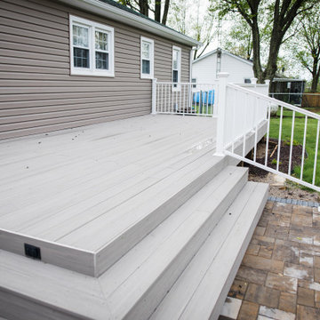
An extensive, multi-level deck and screen house was added to provide outdoor living space, with secure, dry storage below.
Design Criteria:
- Update house with a high sustainability standard.
- Provide bathroom for daughters’ third floor bedroom.
- Update remaining bathrooms
- Update cramped, low ceilinged master bedroom
- Provide mudroom/entryway solutions.
- Provide a window seating space with good visibility of back and side yards – to keep an eye on the kids at play.
- Replace old deck with a updated deck/screen porch combination.
- Update sitting room with a wood stove and mantle.
Special Features:
- Insulated Concrete Forms used for Dude Pod foundation.
- Soy-based spray foam insulation used in the addition and master bedroom.
- Paperstone countertops in mudroom.
- Zero-VOC paints and finishes used throughout the project.
- All decking and trim for the deck/screen porch is made from 100% recycled HDPE (milk jugs, soda, water bottles)
- High efficiency combination washer/dryer.
 Susan Yeley Homes
This gem of a house was built in the 1950s, when its neighborhood undoubtedly felt remote. The university footprint has expanded in the 70 years since, however, and today this home sits on prime real estate—easy biking and reasonable walking distance to campus.
When it went up for sale in 2017, it was largely unaltered. Our clients purchased it to renovate and resell, and while we all knew we'd need to add square footage to make it profitable, we also wanted to respect the neighborhood and the house’s own history. Swedes have a word that means “just the right amount”: lagom. It is a guiding philosophy for us at SYH, and especially applied in this renovation. Part of the soul of this house was about living in just the right amount of space. Super sizing wasn’t a thing in 1950s America. So, the solution emerged: keep the original rectangle, but add an L off the back.
With no owner to design with and for, SYH created a layout to appeal to the masses. All public spaces are the back of the home--the new addition that extends into the property’s expansive backyard. A den and four smallish bedrooms are atypically located in the front of the house, in the original 1500 square feet. Lagom is behind that choice: conserve space in the rooms where you spend most of your time with your eyes shut. Put money and square footage toward the spaces in which you mostly have your eyes open.
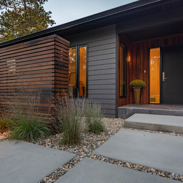
In the studio, we started calling this project the Mullet Ranch—business up front, party in the back. The front has a sleek but quiet effect, mimicking its original low-profile architecture street-side. It’s very Hoosier of us to keep appearances modest, we think. But get around to the back, and surprise! lofted ceilings and walls of windows. Gorgeous.




 New Old, LLC
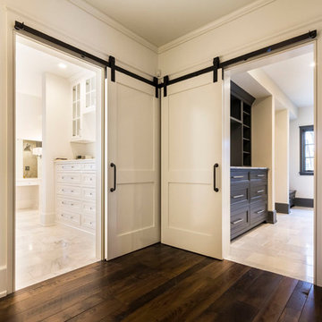
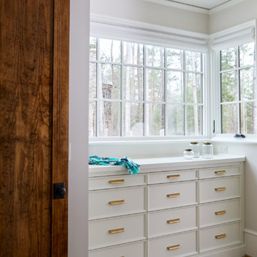
Farmhouse light wood floor bathroom photo in Charlotte with furniture-like cabinets, white cabinets and wood countertops

10