
Search results for "Equal half" in Home Design Ideas

 Massucco Warner Miller Interior Design
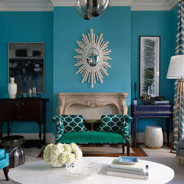
Living room - transitional living room idea in Seattle with blue walls and a standard fireplace
Find the right local pro for your project


 Rees Studio
Inspiration for a contemporary light wood floor and beige floor dining room remodel in Los Angeles with white walls
 Exclusive Home Interiors
Opera Prima
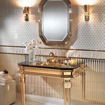
Cubicle, Mirror, Wall Lamps.
Lightness of line for aesthetic incisiveness, classic but contemporary. A recurrent theme, the irregular octagon, is the conceptual protagonist in this composition comprising a cubicle, mirror, and wall lamps. Octagons can be found in the shape of the side surface, the mirror frame, in the refined details of the signature seals. It is also original in the exclusive use of a single material, forged brass in different shapes, tubular and flat, the results of the highest Italian craft skills.
A refined style striking for the effect of tension between a classical confidence of line and the futuristic allusions of the metal.
Every item is made in compliance with the strictest sanitary standards and so guaranteed lead free.
It is available in four surface finishes: chrome, nickel, gold, and bronze in combination with an equal number of marble varieties for the side surface, Carrara white, Marquinia black, Paonazzo, and Portoro.
Visit our showroom at 1180 Coney Island Ave.,
Brooklyn, NY 11230 or call us at 718-434-2111 for more details.
 Safferstone Interiors
Meet Meridith: a super-mom who’s as busy as she is badass — and easily my favorite overachiever. She slays her office job and comes home to an equally high-octane family life.
We share a love for city living with farmhouse aspirations. There’s a vegetable garden in the backyard, a black cat, and a floppy eared rabbit named Rocky. There has been a mobile chicken coop and a colony of bees in the backyard. At one point they even had a pregnant hedgehog on their hands!
Between gardening, entertaining, and helping with homework, Meridith has zero time for interior design. Spending several days a week in New York for work, she has limited amount of time at home with her family. My goal was to let her make the most of it by taking her design projects off her to do list and let her get back to her family (and rabbit).
I wanted her to spend her weekends at her son's baseball games, not shopping for sofas. That’s my cue!
Meridith is wonderful. She is one of the kindest people I know. We had so much fun, it doesn’t seem fair to call this “work”. She is loving, and smart, and funny. She’s one of those girlfriends everyone wants to call their own best friend. I wanted her house to reflect that: to feel cozy and inviting, and encourage guests to stay a while.
Meridith is not your average beige person, and she has excellent taste. Plus, she was totally hands-on with design choices. It was a true collaboration. We played up her quirky side and built usable, inspiring spaces one lightbulb moment at a time.
I took her love for color (sacré blue!) and immediately started creating a plan for her space and thinking about her design wish list. I set out hunting for vibrant hues and intriguing patterns that spoke to her color palette and taste for pattern.
I focused on creating the right vibe in each space: a bit of drama in the dining room, a bit more refined and quiet atmosphere for the living room, and a neutral zen tone in their master bedroom.
Her stuff. My eye.
Meridith’s impeccable taste comes through in her art collection. The perfect placement of her beautiful paintings served as the design model for color and mood.
We had a bit of a chair graveyard on our hands, but we worked with some key pieces of her existing furniture and incorporated other traditional pieces, which struck a pleasant balance. French chairs, Asian-influenced footstools, turned legs, gilded finishes, glass hurricanes – a wonderful mash-up of traditional and contemporary.
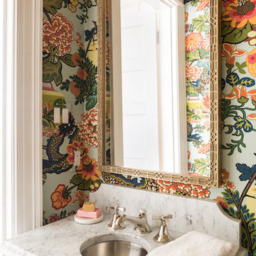
Some special touches were custom-made (the marble backsplash in the powder room, the kitchen banquette) and others were happy accidents (a wallpaper we spotted via Pinterest). They all came together in a design aesthetic that feels warm, inviting, and vibrant — just like Meridith!
We built her space based on function.
We asked ourselves, “how will her family use each room on any given day?” Meridith throws legendary dinner parties, so we needed curated seating arrangements that could easily switch from family meals to elegant entertaining. We sought a cozy eat-in kitchen and decongested entryways that still made a statement. Above all, we wanted Meredith’s style and panache to shine through every detail. From the pendant in the entryway, to a wild use of pattern in her dining room drapery, Meredith’s space was a total win. See more of our work at www.safferstone.com. Connect with us on Facebook, get inspired on Pinterest, and share modern musings on life & design on Instagram. Or, share what's on your plate with us at hello@safferstone.com.
Photo: Angie Seckinger

 McKinney York Architects
This property came with a house which proved ill-matched to our clients’ needs but which nestled neatly amid beautiful live oaks. In choosing to commission a new home, they asked that it also tuck under the limbs of the oaks and maintain a subdued presence to the street. Extraordinary efforts such as cantilevered floors and even bridging over critical root zones allow the design to be truly fitted to the site and to co-exist with the trees, the grandest of which is the focal point of the entry courtyard.
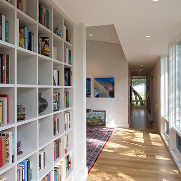
Of equal importance to the trees and view was to provide, conversely, for walls to display 35 paintings and numerous books. From form to smallest detail, the house is quiet and subtle.

 Alair Homes Plano
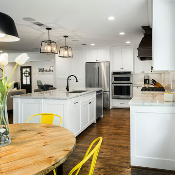
Our clients came to us after recently purchasing this 1967 home in the lovely Spring Creek neighborhood. They originally considered adding on to the master bedroom or possibly putting an addition above the garage. After all considerations, they decided to work within the existing sq. ft. of the home. They wanted to update their kitchen, they needed to add an office, as she works from home and they wanted consistent flooring throughout the front of the house. They had a small galley kitchen that you could enter from the front formal living/dining room or from the other end but it was completely closed off to the main living area, other than a small window. They really wanted to open it up but worried it might be too opened up. In addition to adding new ceiling height cabinets, they wanted to completely gut this outdated kitchen and start over with a cleaner, simpler looking kitchen. They had trouble envisioning what their space would look like opened up, so using our technology and being able to show them a rendering and being able to do a virtual walk-through, really helped them see their future.
We demoed the entire kitchen and all of the flooring throughout the kitchen, family room, living room and formal living room. We removed most of the wall that closed off the kitchen to the living room, with the exception of the half wall that became part of the new island. The doorway that used to go between the formal dining and kitchen was closed off, creating more kitchen wall space and allowing an office to be added at the back of the formal dining that could be closed off, when needed.
White Chandler cabinets were installed with beautiful Macaubus Giotto Quartzite countertops. Our clients chose to install a spice pull out and utensil caddy pull out on either side of the oven and a tray pull out for cookie sheets, as well. A wooden vent-hood was also built by Chandler, creating a nice contrast to the white cabinets. Matte black Stanton pulls and Elara knobs were installed coordinating with the Forge Industrial Pendant Island lights and the Doster Dome kitchen table pendant. A Kohler vault Smart Divide®top-/under-mount double-equal bowl kitchen sink was installed in the island with a Kohler Simplice kitchen faucet, also in matte black. Detailed posts were added to each corner on the back side of the island, giving it a more custom finished look. In the formal dining room, a 4-light Forge Industrial Island Light was installed, which coordinated with the two pendant lights above the island. Adjacent to the living room was an office/wet bar area, leading to the back porch. We replaced the existing wet bar with a new cabinet and countertop and faucet, matching the kitchen and installed a wine refrigerator, too. Hardwood floors were installed throughout the entire front of the house, tying it all together. Recessed lighting was installed throughout the dining room, living room and kitchen, really giving the space some much needed light. A fresh coat of paint to top it all off really brightened up the space and gave our clients exactly what they were wanting.

 Steve Masley Consulting and Design
'Carmello' tomato growing in a 15-gallon terra-cotta pot, week 1. Photo by Steve Masley
Example of an eclectic home design design in San Francisco
Example of an eclectic home design design in San Francisco
 Trove Warehouse
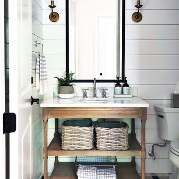
This half bath design by Kelly Scott Interiors is equal parts cozy and stylish! We love the black and white buffalo check tile. The simplistic wood and marble vanity adds warmth and blown glass globe sconces in a toasty bronze finish bring a modern element.
 Visbeen Architects
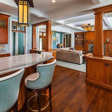
Inspired by the surrounding landscape, the Craftsman/Prairie style is one of the few truly American architectural styles. It was developed around the turn of the century by a group of Midwestern architects and continues to be among the most comfortable of all American-designed architecture more than a century later, one of the main reasons it continues to attract architects and homeowners today. Oxbridge builds on that solid reputation, drawing from Craftsman/Prairie and classic Farmhouse styles. Its handsome Shingle-clad exterior includes interesting pitched rooflines, alternating rows of cedar shake siding, stone accents in the foundation and chimney and distinctive decorative brackets. Repeating triple windows add interest to the exterior while keeping interior spaces open and bright. Inside, the floor plan is equally impressive. Columns on the porch and a custom entry door with sidelights and decorative glass leads into a spacious 2,900-square-foot main floor, including a 19 by 24-foot living room with a period-inspired built-ins and a natural fireplace. While inspired by the past, the home lives for the present, with open rooms and plenty of storage throughout. Also included is a 27-foot-wide family-style kitchen with a large island and eat-in dining and a nearby dining room with a beadboard ceiling that leads out onto a relaxing 240-square-foot screen porch that takes full advantage of the nearby outdoors and a private 16 by 20-foot master suite with a sloped ceiling and relaxing personal sitting area. The first floor also includes a large walk-in closet, a home management area and pantry to help you stay organized and a first-floor laundry area. Upstairs, another 1,500 square feet awaits, with a built-ins and a window seat at the top of the stairs that nod to the home’s historic inspiration. Opt for three family bedrooms or use one of the three as a yoga room; the upper level also includes attic access, which offers another 500 square feet, perfect for crafts or a playroom. More space awaits in the lower level, where another 1,500 square feet (and an additional 1,000) include a recreation/family room with nine-foot ceilings, a wine cellar and home office.
Photographer: Jeff Garland

Sponsored
Sunbury, OH

J.Holderby - Renovations
Franklin County's Leading General Contractors - 2X Best of Houzz!
 Cantoni Irvine
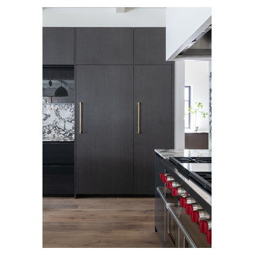
From the street, it’s an impeccably designed English manor. Once inside, the best of that same storied architecture seamlessly meshes with modernism. This blend of styles was exactly the vibe three-decades-running Houston homebuilder Chris Sims, founder and CEO of Sims Luxury Builders, wanted to convey with the $5.2 million show-home in Houston’s coveted Tanglewood neighborhood. “Our goal was to uniquely combine classic and Old World with clean and modern in both the architectural design as well as the interior finishes,” Chris says.
Their aesthetic inspiration is clearly evident in the 8,000-square-foot showcase home’s luxurious gourmet kitchen. It is an exercise in grey and white—and texture. To achieve their vision, the Sims turned to Cantoni. “We had a wonderful experience working with Cantoni several years ago on a client’s home, and were pleased to repeat that success on this project,” Chris says.
Cantoni designer Amy McFall, who was tasked with designing the kitchen, promptly took to the home’s beauty. Situated on a half-acre corner lot with majestic oak trees, it boasts simplistic and elegant interiors that allow the detailed architecture to shine. The kitchen opens directly to the family room, which holds a brick wall, beamed ceilings, and a light-and-bright stone fireplace. The generous space overlooks the outdoor pool. With such a large area to work with, “we needed to give the kitchen its own, intimate feel,” Amy says.
To that end, Amy integrated dark grey, high-gloss lacquer cabinetry from our Atelier Collection. by Aster Cucine with dark grey oak cabinetry, mixing finishes throughout to add depth and texture. Edginess came by way of custom, heavily veined Calacatta Viola marble on both the countertops and backsplash.
The Sims team, meanwhile, insured the layout lent itself to minimalism. “With the inclusion of the scullery and butler’s pantry in the design, we were able to minimize the storage needed in the kitchen itself,” Chris says. “This allowed for the clean, minimalist cabinetry, giving us the creative freedom to go darker with the cabinet color and really make a bold statement in the home.”
It was exactly the look they wanted—textural and interesting. “The juxtaposition of ultra-modern kitchen cabinetry and steel windows set against the textures of the wood floors, interior brick, and trim detailing throughout the downstairs provided a fresh take on blending classic and modern,” Chris says. “We’re thrilled with the result—it is showstopping.”
They were equally thrilled with the design process. “Amy was incredibly responsive, helpful and knowledgeable,” Chris says. “It was a pleasure working with her and the entire Cantoni team.”
Check out the kitchen featured in Modern Luxury Interiors Texas’ annual “Ode to Texas Real Estate” here.
 Atlantis Architects
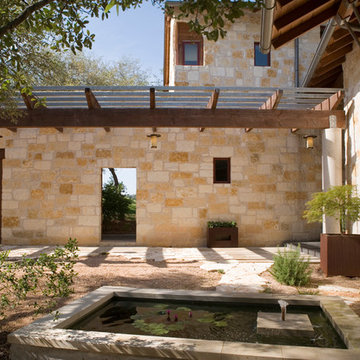
detached garage connected by lit pergola
Inspiration for a small partial sun front yard stone water fountain landscape in Austin.
Inspiration for a small partial sun front yard stone water fountain landscape in Austin.

 Domus Constructors, LLC.
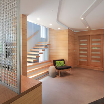
“Compelling.” That’s how one of our judges characterized this stair, which manages to embody both reassuring solidity and airy weightlessness. Architect Mahdad Saniee specified beefy maple treads—each laminated from two boards, to resist twisting and cupping—and supported them at the wall with hidden steel hangers. “We wanted to make them look like they are floating,” he says, “so they sit away from the wall by about half an inch.” The stainless steel rods that seem to pierce the treads’ opposite ends are, in fact, joined by threaded couplings hidden within the thickness of the wood. The result is an assembly whose stiffness underfoot defies expectation, Saniee says. “It feels very solid, much more solid than average stairs.” With the rods working in tension from above and compression below, “it’s very hard for those pieces of wood to move.”
The interplay of wood and steel makes abstract reference to a Steinway concert grand, Saniee notes. “It’s taking elements of a piano and playing with them.” A gently curved soffit in the ceiling reinforces the visual rhyme. The jury admired the effect but was equally impressed with the technical acumen required to achieve it. “The rhythm established by the vertical rods sets up a rigorous discipline that works with the intricacies of stair dimensions,” observed one judge. “That’s really hard to do.”

 Ward Jewell Architect AIA
These clients came to my office looking for an architect who could design their "empty nest" home that would be the focus of their soon to be extended family. A place where the kids and grand kids would want to hang out: with a pool, open family room/ kitchen, garden; but also one-story so there wouldn't be any unnecessary stairs to climb. They wanted the design to feel like "old Pasadena" with the coziness and attention to detail that the era embraced. My sensibilities led me to recall the wonderful classic mansions of San Marino, so I designed a manor house clad in trim Bluestone with a steep French slate roof and clean white entry, eave and dormer moldings that would blend organically with the future hardscape plan and thoughtfully landscaped grounds.
The site was a deep, flat lot that had been half of the old Joan Crawford estate; the part that had an abandoned swimming pool and small cabana. I envisioned a pavilion filled with natural light set in a beautifully planted park with garden views from all sides. Having a one-story house allowed for tall and interesting shaped ceilings that carved into the sheer angles of the roof. The most private area of the house would be the central loggia with skylights ensconced in a deep woodwork lattice grid and would be reminiscent of the outdoor “Salas” found in early Californian homes. The family would soon gather there and enjoy warm afternoons and the wonderfully cool evening hours together.
Working with interior designer Jeffrey Hitchcock, we designed an open family room/kitchen with high dark wood beamed ceilings, dormer windows for daylight, custom raised panel cabinetry, granite counters and a textured glass tile splash. Natural light and gentle breezes flow through the many French doors and windows located to accommodate not only the garden views, but the prevailing sun and wind as well. The graceful living room features a dramatic vaulted white painted wood ceiling and grand fireplace flanked by generous double hung French windows and elegant drapery. A deeply cased opening draws one into the wainscot paneled dining room that is highlighted by hand painted scenic wallpaper and a barrel vaulted ceiling. The walnut paneled library opens up to reveal the waterfall feature in the back garden. Equally picturesque and restful is the view from the rotunda in the master bedroom suite.
Architect: Ward Jewell Architect, AIA
Interior Design: Jeffrey Hitchcock Enterprises
Contractor: Synergy General Contractors, Inc.
Landscape Design: LZ Design Group, Inc.
Photography: Laura Hull
 Bilotta Kitchen & Home
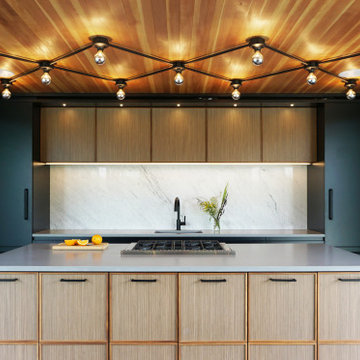
Nestled atop a wooded ridge in the Hudson Highlands, the architect-owner envisioned a reinterpretation of renowned mid-century experimental “Case Study Homes”. An authentic representation of the materials and a clear outdoor-indoor connection were priorities for the design. Heart pine on the ceiling references the forested surroundings. All cabinets are Bilotta’s private Bilotta Collection cabinetry. The island and wall cabinets are distinctive: natural walnut quarter-sawn veneer trimmed with thin strips of natural walnut solid stock. Matte black on the paneled refrigerator, tall pantry and rear base cabinets frame the area and merge into the black structural columns. Balancing the darker finishes is a single slab of Carrera marble on the backsplash, with Caesarstone in “Concrete” topping the cabinetry. Surrounded by walls of glass, the kitchen is flanked by oversized impressive roof overhangs with exposed joists. Inside, a header was placed to align with the outermost joist and delineate the prep area. Within that footprint, natural heart pine planks line the ceiling, parallel to the outdoor joists. This creates the illusion that the overhang enters the kitchen at one end and exits out the other, further obscuring the line between indoors and out. As a counterpoint to strong vertical cabinet lines and horizontal ceiling lines, a unique bronze scissor-armed light fixture creates a diamond pattern across the length of the kitchen. At the intersection of each arm is an individual half-gold exposed light bulb, resulting in pools of illumination that highlight the beautiful grain pattern and coloration of the wood ceiling – a stunning alternative to ubiquitous recessed lighting. Although it’s not large, this kitchen offers an abundance of storage and countertop space for meal prep and serving. The refrigerator and tall pantry bookend the space; making them equal in size imparts pleasing symmetry. With the sink centered along the back wall and the range centered in the island, there’s plenty of elbow room on each side of the appliances. Everything is within arms’ reach for easy use and fast cleanup. The gray hues of the “Concrete” colored quartz tops and the veining of the Carrera backsplash echo the stone outcroppings in the landscape and provide contrast to the variety of wood tones throughout the room.
4