
Search results for "Establishing limits" in Home Design Ideas
 Kitchen Solvers of Fort Lauderdale
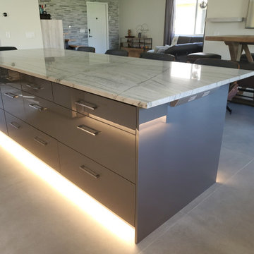
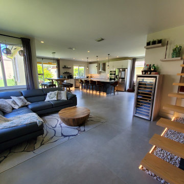
Our client commissioned us to remodel her home. She wanted an open plan concept and for the kitchen to be integrated with the living room and dining room. She also needed a space in which she could work. So we decided to remove the walls that separated the kitchen from the living room and the dining room. We expanded the kitchen space on both sides and made an "L" layout with cabinets on both walls. To complement and establish a virtual limit of space, we placed a large island 10 feet long by 4 feet wide with drawers on the kitchen side and storage cabinets on the sitting side. The cabinets are all prefinished plywood with acrylic doors, white for the cabinets on the walls and gray for the center island. All base cabinets have soft close pullouts. The drawers were complemented with accessories to organize all the kitchen utensils. The corner cabinet was custom made extra long to accommodate a large swing-out and spice rack next to it. At the extreme end of the kitchen cabinets, we placed a "coffee station" with dark gray floating shelves on top, their respective pullouts on the base cabinets. Under the wall and base cabinets we place LED lights that enhance and highlight the kitchen day and night. All ceiling lights were also replaced with recessed LED lights. Over the island and the dining table hanging lights were placed along them. Power strip outlets with USB ports were also placed under the wall cabinets and in the headboards of the island, these are hidden giving a clean aesthetic to the backsplash and very functional on a day-to-day basis. The countertops of the cabinets on the walls were done in gray porcelain as well as the full backsplash that also covers the central area of the hood. The central island countertop was made in Quarzite. The floors were replaced with 48" by 48" rectified porcelain tile. Now this homeowner has the kitchen of their dreams.
 Simply Home Decorating
This beautiful North Vancouver home belongs to a nature-loving and health-conscious couple, Emma and Vince (names changed), their two young children, and their dog, Jasper. When they contacted us about renovating and furnishing their kitchen and family room, we walked in and saw a world of potential waiting to be uncovered.
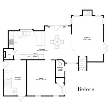
Before: Larkhall Crescent Home:
Like many original North Vancouver homes, the interior was definitely dated. We encountered late ‘80s finishes in powder pink and teal green, old carpet, and a kitchen that wasn’t maximized to suit this family’s modern-day lifestyle. However, the size of the rooms offered us a ton of space with which to get creative.
Knowing our clients’ love of cooking, need for work spaces (Emma and Vince both work remotely), and growing family, we developed a design concept that would increase usable space, optimize storage, and create intimacy in this large area. As for the style, we were inspired by their European roots, inventing a new and modern take on “Belgian Farmhouse” style. Now, the home is truly one-of-a-kind.
After: Warm & Cozy Family Room:
Fresh, bright, and comfortable, this living area has been transformed! We started with the fireplace as a focal point, selecting aged brick tiles for added texture and a crisp wood mantle. The taupe-coloured sectional infuses the room with visual warmth and serves the added purpose of separating the family room from the kitchen.
Emma and Vince were also keen on using non-toxic materials in their home, and we were happy to oblige. To meet their needs, we sourced natural wood elements and sought out Canadian-made products - that adhere to high health standards - whenever possible.
Look closer at the elements of this space, and you will find this stunning, honeycomb-patterned rug in earthy gold, beige, and charcoal tones. It’s plush to the touch and full of visual texture that brings this room’s colour palette together. We sourced these two-tone chairs with caning, petrified wood side table, black sconces, and botanical prints in greyscale from local artist, Heather Johnston.
We topped off the space with this dark wood and rattan console that offers storage facing the kitchen and presents an opportunity to display cherished items. The result is a cozy lounging space brimming with comfort and functionality. It’s perfect for enjoying quality family time, or Emma can simply slide the coffee table away to make room for her morning yoga practice.
Now, let’s turn around and give some attention to the kitchen. Do you remember what the original kitchen looked like? If not, scroll back up, because the transformation is shocking…
Moody & Welcoming Kitchen for Healthy Living:
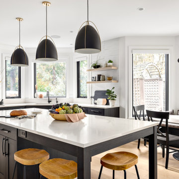
This kitchen looks very different from how it started, right? Though we didn’t touch any walls, the kitchen has almost doubled in usable space! We created a long, extended island with storage, an outlet for small appliances, and seating for comfortable prep, after-school snacking, or mingling among friends.
On the other side of the island, the family has even more storage and an integrated dishwasher within easy reach of the sink, perfect for quick clean-up. From this angle, you can also see the expansive custom Shaker cabinetry in white and the integrated double ovens. These facilitate their cooking experience and gave us the opportunity to add an additional surprise…
A coffee garage station and more hidden storage! Keeping these items located along the perimeter allows them to be accessed by the family or their guests without someone getting under the cook’s feet. These are the little details that make everyday life easier and more enjoyable.
Moving deeper into the kitchen, the seamless induction cooktop topped with a freestanding concealed hood fan commands attention in a soft yet prominent way. The natural wood accent mirrors the fireplace mantle, and the choice of off-black wood-grain cabinets not only continues our black-and-white colour palette but adds a sense of depth and contrast. The corner sink is located to the right and perfectly positioned with a view of their thriving backyard.
To invite more of this family’s character into the space, we mixed metals for interest — matte black, dark pewter, and warm brass — and created open shelves in white oak for their plants and decor. You can also glimpse the tumbled edge of the backsplash tile, which echoes the rustic brick of the fireplace. It adds that farmhouse charm while still feeling timeless and sophisticated.
Last but not least, we designed this dining banquette in the bay window (with integrated bench storage, of course), where the family can share a meal together, the kids can do homework, or Emma and Vince can work and enjoy a change of scenery from their offices. Like the other spaces in the home, it was designed to be beautiful, multi-functional, and long-lasting.
Praise from Our Clients:
It is clear that we love this home, but what did our clients have to say?
“Lori is a visionary and masters execution to the finest detail all at the same time. When she first met us to know more about who we are and how we live, she could right away envision how we could use the space in our kitchen and living room…The results exceeded our expectations.
Lori and her team were also a delight to work with — coordination with all the trades, fast problem-solving, regular updates, professional and friendly attitude of her entire team — made it the dream team. Thank you SHD for making our space so beautiful!”
In turn, we are so grateful for this family’s trust, their open communication, and for being wonderful people with whom to work. (So, thank you!)
Find the right local pro for your project

 Drury Design
The Setup
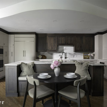
The homeowners of this Barrington Hills residence approached Drury Design with a clear vision: transform their existing kitchen into a space that would better serve their active family of four. With two young children who are homeschooled and love to bake with their mom, plus two dogs, this kitchen needed to function as the true heart of the home.
The existing kitchen was functional but didn’t maximize the potential of the beautiful natural light and scenic views available through the floor-to-ceiling windows. The space was locked between the dining room and family room, which limited structural modifications, but the homeowners wanted to create a more family-friendly environment that would complement the warm walnut built-ins and furnishings in the adjacent dining room while staying true to the home’s overall aesthetic.
Design Objectives:
Create a highly functional workspace that accommodates multiple family members cooking and gathering simultaneously
Maximize the connection to the beautiful outdoor scenery and natural light through thoughtful design choices
Establish a cohesive color palette that complements the existing walnut elements in the adjacent dining room without becoming too tone-on-tone (aka “matchy matchy”)
Improve the seating arrangement to take advantage of the stunning views (rather than facing away from the windows)
Work within the existing architectural constraints, including a curved soffit that could not be removed
Increase storage capacity while maintaining clean, uncluttered sightlines throughout the space
Design Challenges:
The curved soffit presented a design dilemma of whether to echo the curve throughout the kitchen or work with it in a more subtle way
The relatively low ceiling height required careful consideration to avoid making the space feel cramped or cave-like
The existing hardwood floor could not be refinished, which meant the new kitchen footprint had to match or exceed the original layout exactly
Finding the right balance of warm and neutral tones to complement both the existing walnut elements nearby and the natural outdoor views proved challenging
The refrigerator placement was constrained by door swing requirements, which affected the entire layout and prevented centering the sink on the back wall
Rethinking the original seating, which faced inward toward the kitchen (turning backs to the beautiful windows and outdoor views)
Pendant lighting from the previous kitchen obstructed views to the outdoors despite the abundant natural light available
The Renewed Space
Design Solutions:
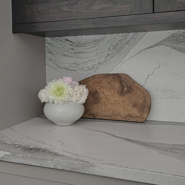
The curved soffit was embraced subtly through the full slab backsplash, which echoes the curve without requiring curved cabinetry or architectural elements that might feel forced
Low ceiling challenges were addressed by using lighter painted cabinets for some tall elements, including the double oven, pantries, and refrigerator area, creating an airy feel while reserving the darker stained walnut for the center section and island
The floor constraint was managed by designing the new layout to cover all previously unfinished areas while maintaining the exact footprint, with only minor touch-ups needed in a few areas
The color palette balances warm walnut stain (harmonizing with the dining room built-ins) with soft, neutral painted cabinets – avoiding stark white that wouldn’t complement the home’s warm aesthetic
Refrigerator placement was optimized with a slim pullout pantry to the left, allowing proper door clearance while maintaining the desired layout flow and enabling the main pantry to be positioned adjacently
The seating was completely reimagined with a built-in banquette facing the windows, allowing diners to enjoy the outdoor views while providing flexible seating for two to four people
Decorative pendant lighting was eliminated in favor of recessed can lights, preserving the unobstructed views to the beautiful outdoor scenery
This kitchen transformation demonstrates how thoughtful design can dramatically improve functionality for a busy family while honoring existing architectural elements. The children immediately began cooking and baking with their mother in the new space, and the window-facing banquette has become a favorite gathering spot where the family can enjoy both meals and the beautiful outdoor views.
 Kitchen Solvers of Fort Lauderdale
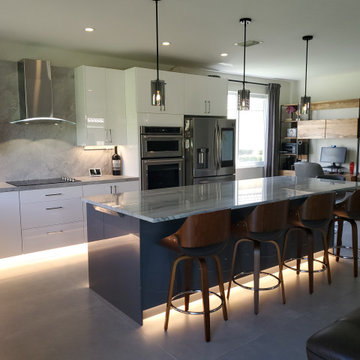
Our client commissioned us to remodel her home. She wanted an open plan concept and for the kitchen to be integrated with the living room and dining room. She also needed a space in which she could work. So we decided to remove the walls that separated the kitchen from the living room and the dining room. We expanded the kitchen space on both sides and made an "L" layout with cabinets on both walls. To complement and establish a virtual limit of space, we placed a large island 10 feet long by 4 feet wide with drawers on the kitchen side and storage cabinets on the sitting side. The cabinets are all prefinished plywood with acrylic doors, white for the cabinets on the walls and gray for the center island. All base cabinets have soft close pullouts. The drawers were complemented with accessories to organize all the kitchen utensils. The corner cabinet was custom made extra long to accommodate a large swing-out and spice rack next to it. At the extreme end of the kitchen cabinets, we placed a "coffee station" with dark gray floating shelves on top, their respective pullouts on the base cabinets. Under the wall and base cabinets we place LED lights that enhance and highlight the kitchen day and night. All ceiling lights were also replaced with recessed LED lights. Over the island and the dining table hanging lights were placed along them. Power strip outlets with USB ports were also placed under the wall cabinets and in the headboards of the island, these are hidden giving a clean aesthetic to the backsplash and very functional on a day-to-day basis. The countertops of the cabinets on the walls were done in gray porcelain as well as the full backsplash that also covers the central area of the hood. The central island countertop was made in Quarzite. The floors were replaced with 48" by 48" rectified porcelain tile. Now this homeowner has the kitchen of their dreams.
 Fiorito Interior Design
It’s rare when a client comes to me with a brief for a complete home from scratch, but that is exactly what happened here. My client, a professional musician and singer, was having a luxury three-story condo built and wanted help choosing not only all the hardscape materials like tile, flooring, carpet, and cabinetry, but also all furniture and furnishings. I even outfitted his new home with plates, flatware, pots and pans, towels, sheets, and window coverings. Like I said, this was from scratch!
We defined his style direction for the new home including dark colors, minimalistic furniture, and a modern industrial sensibility, and I set about creating a fluid expression of that style. The tone is set at the entry where a custom laser-cut industrial steel sign requests visitors be shoeless. We deliberately limited the color palette for the entire house to black, grey, and deep blue, with grey-washed or dark stained neutral woods.
The navy zellige tiles on the backsplash in the kitchen add depth between the cement-textured quartz counters and cerused cabinetry. The island is painted in a coordinating navy and features hand-forged iron stools. In the dining room, horizontal and vertical lines play with each other in the form of an angular linear chandelier, lighted acrylic light columns, and a dining table with a special faceted wave edge. Chair backs echo the shape of the art maps on the wall.
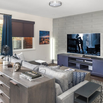
We chose a unique, three dimensional wall treatment for the living room where a plush sectional and LED tunable lights set the stage for comfy movie nights. Walls with a repeating whimsical black and white whale skeleton named Bruce adorn the walls of the powder room. The adjacent patio boasts a resort-like feeling with a cozy fire table, a wall of up-lit boxwoods, and a black sofa and chairs for star gazing.
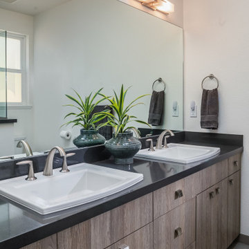
A gallery wall featuring a roster of some of my client’s favorite rock, punk, and jazz musicians adorns the stairwell. On the third floor, the primary and guest bathrooms continue with the cement-textured quartz counters and same cerused cabinetry.
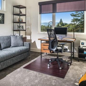
We completed this well-appointed home with a serene guest room in the established limited color palette and a lounge/office/recording room.
All photos by Bernardo Grijalva
 Fiorito Interior Design
It’s rare when a client comes to me with a brief for a complete home from scratch, but that is exactly what happened here. My client, a professional musician and singer, was having a luxury three-story condo built and wanted help choosing not only all the hardscape materials like tile, flooring, carpet, and cabinetry, but also all furniture and furnishings. I even outfitted his new home with plates, flatware, pots and pans, towels, sheets, and window coverings. Like I said, this was from scratch!
We defined his style direction for the new home including dark colors, minimalistic furniture, and a modern industrial sensibility, and I set about creating a fluid expression of that style. The tone is set at the entry where a custom laser-cut industrial steel sign requests visitors be shoeless. We deliberately limited the color palette for the entire house to black, grey, and deep blue, with grey-washed or dark stained neutral woods.
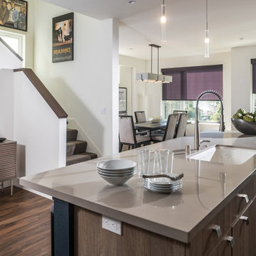
The navy zellige tiles on the backsplash in the kitchen add depth between the cement-textured quartz counters and cerused cabinetry. The island is painted in a coordinating navy and features hand-forged iron stools. In the dining room, horizontal and vertical lines play with each other in the form of an angular linear chandelier, lighted acrylic light columns, and a dining table with a special faceted wave edge. Chair backs echo the shape of the art maps on the wall.
We chose a unique, three dimensional wall treatment for the living room where a plush sectional and LED tunable lights set the stage for comfy movie nights. Walls with a repeating whimsical black and white whale skeleton named Bruce adorn the walls of the powder room. The adjacent patio boasts a resort-like feeling with a cozy fire table, a wall of up-lit boxwoods, and a black sofa and chairs for star gazing.
A gallery wall featuring a roster of some of my client’s favorite rock, punk, and jazz musicians adorns the stairwell. On the third floor, the primary and guest bathrooms continue with the cement-textured quartz counters and same cerused cabinetry.
We completed this well-appointed home with a serene guest room in the established limited color palette and a lounge/office/recording room.
All photos by Bernardo Grijalva
 Kitchen Solvers of Fort Lauderdale
Our client commissioned us to remodel her home. She wanted an open plan concept and for the kitchen to be integrated with the living room and dining room. She also needed a space in which she could work. So we decided to remove the walls that separated the kitchen from the living room and the dining room. We expanded the kitchen space on both sides and made an "L" layout with cabinets on both walls. To complement and establish a virtual limit of space, we placed a large island 10 feet long by 4 feet wide with drawers on the kitchen side and storage cabinets on the sitting side. The cabinets are all prefinished plywood with acrylic doors, white for the cabinets on the walls and gray for the center island. All base cabinets have soft close pullouts. The drawers were complemented with accessories to organize all the kitchen utensils. The corner cabinet was custom made extra long to accommodate a large swing-out and spice rack next to it. At the extreme end of the kitchen cabinets, we placed a "coffee station" with dark gray floating shelves on top, their respective pullouts on the base cabinets. Under the wall and base cabinets we place LED lights that enhance and highlight the kitchen day and night. All ceiling lights were also replaced with recessed LED lights. Over the island and the dining table hanging lights were placed along them. Power strip outlets with USB ports were also placed under the wall cabinets and in the headboards of the island, these are hidden giving a clean aesthetic to the backsplash and very functional on a day-to-day basis. The countertops of the cabinets on the walls were done in gray porcelain as well as the full backsplash that also covers the central area of the hood. The central island countertop was made in Quarzite. The floors were replaced with 48" by 48" rectified porcelain tile. Now this homeowner has the kitchen of their dreams.
 Drury Design
The Setup
The homeowners of this Barrington Hills residence approached Drury Design with a clear vision: transform their existing kitchen into a space that would better serve their active family of four. With two young children who are homeschooled and love to bake with their mom, plus two dogs, this kitchen needed to function as the true heart of the home.
The existing kitchen was functional but didn’t maximize the potential of the beautiful natural light and scenic views available through the floor-to-ceiling windows. The space was locked between the dining room and family room, which limited structural modifications, but the homeowners wanted to create a more family-friendly environment that would complement the warm walnut built-ins and furnishings in the adjacent dining room while staying true to the home’s overall aesthetic.
Design Objectives:
Create a highly functional workspace that accommodates multiple family members cooking and gathering simultaneously
Maximize the connection to the beautiful outdoor scenery and natural light through thoughtful design choices
Establish a cohesive color palette that complements the existing walnut elements in the adjacent dining room without becoming too tone-on-tone (aka “matchy matchy”)
Improve the seating arrangement to take advantage of the stunning views (rather than facing away from the windows)
Work within the existing architectural constraints, including a curved soffit that could not be removed
Increase storage capacity while maintaining clean, uncluttered sightlines throughout the space
Design Challenges:
The curved soffit presented a design dilemma of whether to echo the curve throughout the kitchen or work with it in a more subtle way
The relatively low ceiling height required careful consideration to avoid making the space feel cramped or cave-like
The existing hardwood floor could not be refinished, which meant the new kitchen footprint had to match or exceed the original layout exactly
Finding the right balance of warm and neutral tones to complement both the existing walnut elements nearby and the natural outdoor views proved challenging
The refrigerator placement was constrained by door swing requirements, which affected the entire layout and prevented centering the sink on the back wall
Rethinking the original seating, which faced inward toward the kitchen (turning backs to the beautiful windows and outdoor views)
Pendant lighting from the previous kitchen obstructed views to the outdoors despite the abundant natural light available
The Renewed Space
Design Solutions:
The curved soffit was embraced subtly through the full slab backsplash, which echoes the curve without requiring curved cabinetry or architectural elements that might feel forced
Low ceiling challenges were addressed by using lighter painted cabinets for some tall elements, including the double oven, pantries, and refrigerator area, creating an airy feel while reserving the darker stained walnut for the center section and island
The floor constraint was managed by designing the new layout to cover all previously unfinished areas while maintaining the exact footprint, with only minor touch-ups needed in a few areas
The color palette balances warm walnut stain (harmonizing with the dining room built-ins) with soft, neutral painted cabinets – avoiding stark white that wouldn’t complement the home’s warm aesthetic
Refrigerator placement was optimized with a slim pullout pantry to the left, allowing proper door clearance while maintaining the desired layout flow and enabling the main pantry to be positioned adjacently
The seating was completely reimagined with a built-in banquette facing the windows, allowing diners to enjoy the outdoor views while providing flexible seating for two to four people
Decorative pendant lighting was eliminated in favor of recessed can lights, preserving the unobstructed views to the beautiful outdoor scenery
This kitchen transformation demonstrates how thoughtful design can dramatically improve functionality for a busy family while honoring existing architectural elements. The children immediately began cooking and baking with their mother in the new space, and the window-facing banquette has become a favorite gathering spot where the family can enjoy both meals and the beautiful outdoor views.
 Fiorito Interior Design
It’s rare when a client comes to me with a brief for a complete home from scratch, but that is exactly what happened here. My client, a professional musician and singer, was having a luxury three-story condo built and wanted help choosing not only all the hardscape materials like tile, flooring, carpet, and cabinetry, but also all furniture and furnishings. I even outfitted his new home with plates, flatware, pots and pans, towels, sheets, and window coverings. Like I said, this was from scratch!
We defined his style direction for the new home including dark colors, minimalistic furniture, and a modern industrial sensibility, and I set about creating a fluid expression of that style. The tone is set at the entry where a custom laser-cut industrial steel sign requests visitors be shoeless. We deliberately limited the color palette for the entire house to black, grey, and deep blue, with grey-washed or dark stained neutral woods.
The navy zellige tiles on the backsplash in the kitchen add depth between the cement-textured quartz counters and cerused cabinetry. The island is painted in a coordinating navy and features hand-forged iron stools. In the dining room, horizontal and vertical lines play with each other in the form of an angular linear chandelier, lighted acrylic light columns, and a dining table with a special faceted wave edge. Chair backs echo the shape of the art maps on the wall.
We chose a unique, three dimensional wall treatment for the living room where a plush sectional and LED tunable lights set the stage for comfy movie nights. Walls with a repeating whimsical black and white whale skeleton named Bruce adorn the walls of the powder room. The adjacent patio boasts a resort-like feeling with a cozy fire table, a wall of up-lit boxwoods, and a black sofa and chairs for star gazing.
A gallery wall featuring a roster of some of my client’s favorite rock, punk, and jazz musicians adorns the stairwell. On the third floor, the primary and guest bathrooms continue with the cement-textured quartz counters and same cerused cabinetry.
We completed this well-appointed home with a serene guest room in the established limited color palette and a lounge/office/recording room.
All photos by Bernardo Grijalva
 Fiorito Interior Design
It’s rare when a client comes to me with a brief for a complete home from scratch, but that is exactly what happened here. My client, a professional musician and singer, was having a luxury three-story condo built and wanted help choosing not only all the hardscape materials like tile, flooring, carpet, and cabinetry, but also all furniture and furnishings. I even outfitted his new home with plates, flatware, pots and pans, towels, sheets, and window coverings. Like I said, this was from scratch!
We defined his style direction for the new home including dark colors, minimalistic furniture, and a modern industrial sensibility, and I set about creating a fluid expression of that style. The tone is set at the entry where a custom laser-cut industrial steel sign requests visitors be shoeless. We deliberately limited the color palette for the entire house to black, grey, and deep blue, with grey-washed or dark stained neutral woods.
The navy zellige tiles on the backsplash in the kitchen add depth between the cement-textured quartz counters and cerused cabinetry. The island is painted in a coordinating navy and features hand-forged iron stools. In the dining room, horizontal and vertical lines play with each other in the form of an angular linear chandelier, lighted acrylic light columns, and a dining table with a special faceted wave edge. Chair backs echo the shape of the art maps on the wall.
We chose a unique, three dimensional wall treatment for the living room where a plush sectional and LED tunable lights set the stage for comfy movie nights. Walls with a repeating whimsical black and white whale skeleton named Bruce adorn the walls of the powder room. The adjacent patio boasts a resort-like feeling with a cozy fire table, a wall of up-lit boxwoods, and a black sofa and chairs for star gazing.
A gallery wall featuring a roster of some of my client’s favorite rock, punk, and jazz musicians adorns the stairwell. On the third floor, the primary and guest bathrooms continue with the cement-textured quartz counters and same cerused cabinetry.
We completed this well-appointed home with a serene guest room in the established limited color palette and a lounge/office/recording room.
All photos by Bernardo Grijalva
 Drury Design
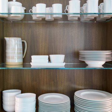
Here shown is the walnut interior of the glass cabinets in the kitchen.
THE SETUP
Our journey began with a familiar face — Alicia had previously transformed the client’s mother’s home, establishing a trusted relationship that naturally led to this personal project. The client desired a kitchen that truly reflected her own style while facilitating seamless entertaining.
Design Vision:
The original kitchen, segregated from the dining area by a wall, hindered the flow of interaction and space. Our client envisioned a unified area where she could engage with guests in both the kitchen and dining room simultaneously. Moreover, the space lacked a central island, relying instead on a floorplan anchored by cabinetry in a u-shaped layout.
Design Objectives:
Open up the space for an airy design conducive to entertaining large gatherings
Modernize the kitchen to be both stylish and functional
Integrate the design with the home’s new black-framed windows and doors
Relocate the cooktop to a central position to enhance usability and interaction
Design Challenges:
Removing the wall between the kitchen and dining room would necessitate the rerouting of existing HVAC ductwork that services the upper floor
Limited pantry space in the existing kitchen
The existing u-shaped layout of the kitchen restricted functionality and storage options
Insufficient space for wine storage
The client desired a raised-furniture look for the island, but without showing a new downdraft vent
THE RENEWED SPACE
Design Solutions:
We added a second HVAC unit to the upper floor and rerouted the existing ductwork in that wall
Created tall pantry pullouts on either side of the fridge to maximize dry goods storage
Designed a long island to facilitate cooking stations and dining moments
Created a stylish open display cabinet for wine
Engineered a dual-design island with a footed floating aesthetic on one side, and a full floor reach on the other to conceal the new downdraft ventilation.
Paired with the newly opened adjacent dining room featuring a wet bar, the kitchen has become a stylish and highly functional space for cooking and entertaining. Following a large baby shower hosted by the client (which seamlessly accommodated an 80-person gathering!), it is clear that the new design not only meets but exceeds the needs for hosting and everyday living. This project was a harmonious blend of the client’s vision and Alicia’s innovative design solutions, resulting in a kitchen that truly embodies personalized elegance and functionality.
 Drury Design
THE SETUP
Our journey began with a familiar face — Alicia had previously transformed the client’s mother’s home, establishing a trusted relationship that naturally led to this personal project. The client desired a kitchen that truly reflected her own style while facilitating seamless entertaining.
Design Vision:
The original kitchen, segregated from the dining area by a wall, hindered the flow of interaction and space. Our client envisioned a unified area where she could engage with guests in both the kitchen and dining room simultaneously. Moreover, the space lacked a central island, relying instead on a floorplan anchored by cabinetry in a u-shaped layout.
Design Objectives:
Open up the space for an airy design conducive to entertaining large gatherings
Modernize the kitchen to be both stylish and functional
Integrate the design with the home’s new black-framed windows and doors
Relocate the cooktop to a central position to enhance usability and interaction
Design Challenges:
Removing the wall between the kitchen and dining room would necessitate the rerouting of existing HVAC ductwork that services the upper floor
Limited pantry space in the existing kitchen
The existing u-shaped layout of the kitchen restricted functionality and storage options
Insufficient space for wine storage
The client desired a raised-furniture look for the island, but without showing a new downdraft vent
THE RENEWED SPACE
Design Solutions:
We added a second HVAC unit to the upper floor and rerouted the existing ductwork in that wall
Created tall pantry pullouts on either side of the fridge to maximize dry goods storage
Designed a long island to facilitate cooking stations and dining moments
Created a stylish open display cabinet for wine
Engineered a dual-design island with a footed floating aesthetic on one side, and a full floor reach on the other to conceal the new downdraft ventilation.
Paired with the newly opened adjacent dining room featuring a wet bar, the kitchen has become a stylish and highly functional space for cooking and entertaining. Following a large baby shower hosted by the client (which seamlessly accommodated an 80-person gathering!), it is clear that the new design not only meets but exceeds the needs for hosting and everyday living. This project was a harmonious blend of the client’s vision and Alicia’s innovative design solutions, resulting in a kitchen that truly embodies personalized elegance and functionality.
 Drury Design
THE SETUP
Our journey began with a familiar face — Alicia had previously transformed the client’s mother’s home, establishing a trusted relationship that naturally led to this personal project. The client desired a kitchen that truly reflected her own style while facilitating seamless entertaining.
Design Vision:
The original kitchen, segregated from the dining area by a wall, hindered the flow of interaction and space. Our client envisioned a unified area where she could engage with guests in both the kitchen and dining room simultaneously. Moreover, the space lacked a central island, relying instead on a floorplan anchored by cabinetry in a u-shaped layout.
Design Objectives:
Open up the space for an airy design conducive to entertaining large gatherings
Modernize the kitchen to be both stylish and functional
Integrate the design with the home’s new black-framed windows and doors
Relocate the cooktop to a central position to enhance usability and interaction
Design Challenges:
Removing the wall between the kitchen and dining room would necessitate the rerouting of existing HVAC ductwork that services the upper floor
Limited pantry space in the existing kitchen
The existing u-shaped layout of the kitchen restricted functionality and storage options
Insufficient space for wine storage
The client desired a raised-furniture look for the island, but without showing a new downdraft vent
THE RENEWED SPACE
Design Solutions:
We added a second HVAC unit to the upper floor and rerouted the existing ductwork in that wall
Created tall pantry pullouts on either side of the fridge to maximize dry goods storage
Designed a long island to facilitate cooking stations and dining moments
Created a stylish open display cabinet for wine
Engineered a dual-design island with a footed floating aesthetic on one side, and a full floor reach on the other to conceal the new downdraft ventilation.
Paired with the newly opened adjacent dining room featuring a wet bar, the kitchen has become a stylish and highly functional space for cooking and entertaining. Following a large baby shower hosted by the client (which seamlessly accommodated an 80-person gathering!), it is clear that the new design not only meets but exceeds the needs for hosting and everyday living. This project was a harmonious blend of the client’s vision and Alicia’s innovative design solutions, resulting in a kitchen that truly embodies personalized elegance and functionality.
 Fiorito Interior Design
It’s rare when a client comes to me with a brief for a complete home from scratch, but that is exactly what happened here. My client, a professional musician and singer, was having a luxury three-story condo built and wanted help choosing not only all the hardscape materials like tile, flooring, carpet, and cabinetry, but also all furniture and furnishings. I even outfitted his new home with plates, flatware, pots and pans, towels, sheets, and window coverings. Like I said, this was from scratch!
We defined his style direction for the new home including dark colors, minimalistic furniture, and a modern industrial sensibility, and I set about creating a fluid expression of that style. The tone is set at the entry where a custom laser-cut industrial steel sign requests visitors be shoeless. We deliberately limited the color palette for the entire house to black, grey, and deep blue, with grey-washed or dark stained neutral woods.
The navy zellige tiles on the backsplash in the kitchen add depth between the cement-textured quartz counters and cerused cabinetry. The island is painted in a coordinating navy and features hand-forged iron stools. In the dining room, horizontal and vertical lines play with each other in the form of an angular linear chandelier, lighted acrylic light columns, and a dining table with a special faceted wave edge. Chair backs echo the shape of the art maps on the wall.
We chose a unique, three dimensional wall treatment for the living room where a plush sectional and LED tunable lights set the stage for comfy movie nights. Walls with a repeating whimsical black and white whale skeleton named Bruce adorn the walls of the powder room. The adjacent patio boasts a resort-like feeling with a cozy fire table, a wall of up-lit boxwoods, and a black sofa and chairs for star gazing.
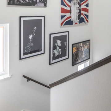
A gallery wall featuring a roster of some of my client’s favorite rock, punk, and jazz musicians adorns the stairwell. On the third floor, the primary and guest bathrooms continue with the cement-textured quartz counters and same cerused cabinetry.
We completed this well-appointed home with a serene guest room in the established limited color palette and a lounge/office/recording room.
All photos by Bernardo Grijalva
 Kitchen Solvers of Fort Lauderdale
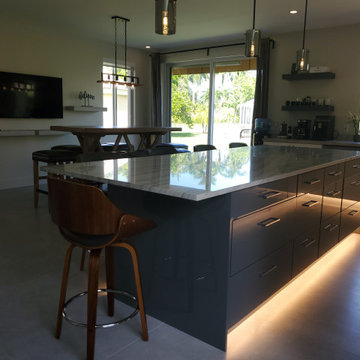
Our client commissioned us to remodel her home. She wanted an open plan concept and for the kitchen to be integrated with the living room and dining room. She also needed a space in which she could work. So we decided to remove the walls that separated the kitchen from the living room and the dining room. We expanded the kitchen space on both sides and made an "L" layout with cabinets on both walls. To complement and establish a virtual limit of space, we placed a large island 10 feet long by 4 feet wide with drawers on the kitchen side and storage cabinets on the sitting side. The cabinets are all prefinished plywood with acrylic doors, white for the cabinets on the walls and gray for the center island. All base cabinets have soft close pullouts. The drawers were complemented with accessories to organize all the kitchen utensils. The corner cabinet was custom made extra long to accommodate a large swing-out and spice rack next to it. At the extreme end of the kitchen cabinets, we placed a "coffee station" with dark gray floating shelves on top, their respective pullouts on the base cabinets. Under the wall and base cabinets we place LED lights that enhance and highlight the kitchen day and night. All ceiling lights were also replaced with recessed LED lights. Over the island and the dining table hanging lights were placed along them. Power strip outlets with USB ports were also placed under the wall cabinets and in the headboards of the island, these are hidden giving a clean aesthetic to the backsplash and very functional on a day-to-day basis. The countertops of the cabinets on the walls were done in gray porcelain as well as the full backsplash that also covers the central area of the hood. The central island countertop was made in Quarzite. The floors were replaced with 48" by 48" rectified porcelain tile. Now this homeowner has the kitchen of their dreams.
 Smithouse Design + Build
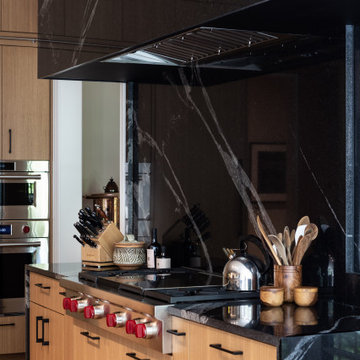
The renovation began in the kitchen, where the original layout and ornate cabinetry limited both functionality and flow. To create the large central island our clients desired, we moved the adjoining wall 18 inches into the living room, opening the space and establishing a more generous footprint for cooking and gathering. The reimagined kitchen features white oak cabinetry with hidden storage, dramatic black stone countertops with bold veining, and a sleek, modern aesthetic that feels both inviting and architectural.
Appliances: Sub Zero Wolf
Lighting: Visual Comfort
Countertops: Rocktops
Photography: Beverly Funkhouser Photography
 Kitchen Solvers of Fort Lauderdale
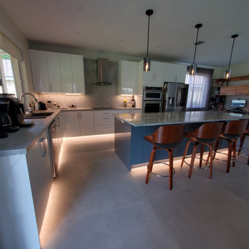
Our client commissioned us to remodel her home. She wanted an open plan concept and for the kitchen to be integrated with the living room and dining room. She also needed a space in which she could work. So we decided to remove the walls that separated the kitchen from the living room and the dining room. We expanded the kitchen space on both sides and made an "L" layout with cabinets on both walls. To complement and establish a virtual limit of space, we placed a large island 10 feet long by 4 feet wide with drawers on the kitchen side and storage cabinets on the sitting side. The cabinets are all prefinished plywood with acrylic doors, white for the cabinets on the walls and gray for the center island. All base cabinets have soft close pullouts. The drawers were complemented with accessories to organize all the kitchen utensils. The corner cabinet was custom made extra long to accommodate a large swing-out and spice rack next to it. At the extreme end of the kitchen cabinets, we placed a "coffee station" with dark gray floating shelves on top, their respective pullouts on the base cabinets. Under the wall and base cabinets we place LED lights that enhance and highlight the kitchen day and night. All ceiling lights were also replaced with recessed LED lights. Over the island and the dining table hanging lights were placed along them. Power strip outlets with USB ports were also placed under the wall cabinets and in the headboards of the island, these are hidden giving a clean aesthetic to the backsplash and very functional on a day-to-day basis. The countertops of the cabinets on the walls were done in gray porcelain as well as the full backsplash that also covers the central area of the hood. The central island countertop was made in Quarzite. The floors were replaced with 48" by 48" rectified porcelain tile. Now this homeowner has the kitchen of their dreams.
 Drury Design
The Setup
The homeowners of this Barrington Hills residence approached Drury Design with a clear vision: transform their existing kitchen into a space that would better serve their active family of four. With two young children who are homeschooled and love to bake with their mom, plus two dogs, this kitchen needed to function as the true heart of the home.
The existing kitchen was functional but didn’t maximize the potential of the beautiful natural light and scenic views available through the floor-to-ceiling windows. The space was locked between the dining room and family room, which limited structural modifications, but the homeowners wanted to create a more family-friendly environment that would complement the warm walnut built-ins and furnishings in the adjacent dining room while staying true to the home’s overall aesthetic.
Design Objectives:
Create a highly functional workspace that accommodates multiple family members cooking and gathering simultaneously
Maximize the connection to the beautiful outdoor scenery and natural light through thoughtful design choices
Establish a cohesive color palette that complements the existing walnut elements in the adjacent dining room without becoming too tone-on-tone (aka “matchy matchy”)
Improve the seating arrangement to take advantage of the stunning views (rather than facing away from the windows)
Work within the existing architectural constraints, including a curved soffit that could not be removed
Increase storage capacity while maintaining clean, uncluttered sightlines throughout the space
Design Challenges:
The curved soffit presented a design dilemma of whether to echo the curve throughout the kitchen or work with it in a more subtle way
The relatively low ceiling height required careful consideration to avoid making the space feel cramped or cave-like
The existing hardwood floor could not be refinished, which meant the new kitchen footprint had to match or exceed the original layout exactly
Finding the right balance of warm and neutral tones to complement both the existing walnut elements nearby and the natural outdoor views proved challenging
The refrigerator placement was constrained by door swing requirements, which affected the entire layout and prevented centering the sink on the back wall
Rethinking the original seating, which faced inward toward the kitchen (turning backs to the beautiful windows and outdoor views)
Pendant lighting from the previous kitchen obstructed views to the outdoors despite the abundant natural light available
The Renewed Space
Design Solutions:
The curved soffit was embraced subtly through the full slab backsplash, which echoes the curve without requiring curved cabinetry or architectural elements that might feel forced
Low ceiling challenges were addressed by using lighter painted cabinets for some tall elements, including the double oven, pantries, and refrigerator area, creating an airy feel while reserving the darker stained walnut for the center section and island
The floor constraint was managed by designing the new layout to cover all previously unfinished areas while maintaining the exact footprint, with only minor touch-ups needed in a few areas
The color palette balances warm walnut stain (harmonizing with the dining room built-ins) with soft, neutral painted cabinets – avoiding stark white that wouldn’t complement the home’s warm aesthetic
Refrigerator placement was optimized with a slim pullout pantry to the left, allowing proper door clearance while maintaining the desired layout flow and enabling the main pantry to be positioned adjacently
The seating was completely reimagined with a built-in banquette facing the windows, allowing diners to enjoy the outdoor views while providing flexible seating for two to four people
Decorative pendant lighting was eliminated in favor of recessed can lights, preserving the unobstructed views to the beautiful outdoor scenery
This kitchen transformation demonstrates how thoughtful design can dramatically improve functionality for a busy family while honoring existing architectural elements. The children immediately began cooking and baking with their mother in the new space, and the window-facing banquette has become a favorite gathering spot where the family can enjoy both meals and the beautiful outdoor views.
9