
Search results for "Ever changing nature" in Home Design Ideas
 ZeroEnergy Design
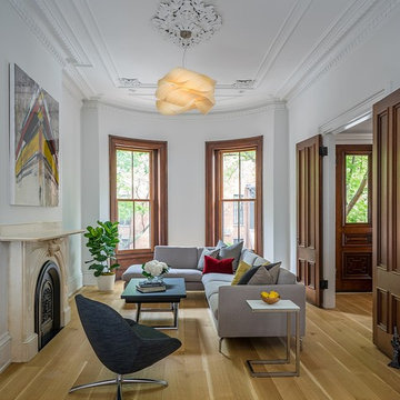
This renovated brick rowhome in Boston’s South End offers a modern aesthetic within a historic structure, creative use of space, exceptional thermal comfort, a reduced carbon footprint, and a passive stream of income.
DESIGN PRIORITIES. The goals for the project were clear - design the primary unit to accommodate the family’s modern lifestyle, rework the layout to create a desirable rental unit, improve thermal comfort and introduce a modern aesthetic. We designed the street-level entry as a shared entrance for both the primary and rental unit. The family uses it as their everyday entrance - we planned for bike storage and an open mudroom with bench and shoe storage to facilitate the change from shoes to slippers or bare feet as they enter their home. On the main level, we expanded the kitchen into the dining room to create an eat-in space with generous counter space and storage, as well as a comfortable connection to the living space. The second floor serves as master suite for the couple - a bedroom with a walk-in-closet and ensuite bathroom, and an adjacent study, with refinished original pumpkin pine floors. The upper floor, aside from a guest bedroom, is the child's domain with interconnected spaces for sleeping, work and play. In the play space, which can be separated from the work space with new translucent sliding doors, we incorporated recreational features inspired by adventurous and competitive television shows, at their son’s request.
MODERN MEETS TRADITIONAL. We left the historic front facade of the building largely unchanged - the security bars were removed from the windows and the single pane windows were replaced with higher performing historic replicas. We designed the interior and rear facade with a vision of warm modernism, weaving in the notable period features. Each element was either restored or reinterpreted to blend with the modern aesthetic. The detailed ceiling in the living space, for example, has a new matte monochromatic finish, and the wood stairs are covered in a dark grey floor paint, whereas the mahogany doors were simply refinished. New wide plank wood flooring with a neutral finish, floor-to-ceiling casework, and bold splashes of color in wall paint and tile, and oversized high-performance windows (on the rear facade) round out the modern aesthetic.
RENTAL INCOME. The existing rowhome was zoned for a 2-family dwelling but included an undesirable, single-floor studio apartment at the garden level with low ceiling heights and questionable emergency egress. In order to increase the quality and quantity of space in the rental unit, we reimagined it as a two-floor, 1 or 2 bedroom, 2 bathroom apartment with a modern aesthetic, increased ceiling height on the lowest level and provided an in-unit washer/dryer. The apartment was listed with Jackie O'Connor Real Estate and rented immediately, providing the owners with a source of passive income.
ENCLOSURE WITH BENEFITS. The homeowners sought a minimal carbon footprint, enabled by their urban location and lifestyle decisions, paired with the benefits of a high-performance home. The extent of the renovation allowed us to implement a deep energy retrofit (DER) to address air tightness, insulation, and high-performance windows. The historic front facade is insulated from the interior, while the rear facade is insulated on the exterior. Together with these building enclosure improvements, we designed an HVAC system comprised of continuous fresh air ventilation, and an efficient, all-electric heating and cooling system to decouple the house from natural gas. This strategy provides optimal thermal comfort and indoor air quality, improved acoustic isolation from street noise and neighbors, as well as a further reduced carbon footprint. We also took measures to prepare the roof for future solar panels, for when the South End neighborhood’s aging electrical infrastructure is upgraded to allow them.
URBAN LIVING. The desirable neighborhood location allows the both the homeowners and tenant to walk, bike, and use public transportation to access the city, while each charging their respective plug-in electric cars behind the building to travel greater distances.
OVERALL. The understated rowhouse is now ready for another century of urban living, offering the owners comfort and convenience as they live life as an expression of their values.
Eric Roth Photo
 FRAME design co.
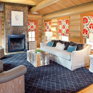
The living room layout allows a couch lounger to chat with someone in the kitchen. We covered the sofa in a casual Pierre Frey fabric and added a few soft faux fur pillows for touchable texture. A graphic David Adler moroccan rug contrasts with red and turquoise Roman shades (one of our favorite color combinations ever). Crisp white side tables, breezy lamps and a modern-meets-rustic wood and acrylic coffee table were picked for ultra-cool “chic cabin” flair.
Design Detail: To break up the long, skinny space and maximize the conversation area, we placed the furniture on opposite walls. Punchy window treatments provide texture and movement for the eye. The gorgeous watercolor titled “Pop” by Peter Haslam-Fox offers a bit of quiet simplicity to an otherwise colorful room. Photographer: Carrie Patterson
 Klopf Architecture
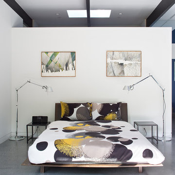
The owners, inspired by mid-century modern architecture, hired Klopf Architecture to design an Eichler-inspired 21st-Century, energy efficient new home that would replace a dilapidated 1940s home. The home follows the gentle slope of the hillside while the overarching post-and-beam roof above provides an unchanging datum line. The changing moods of nature animate the house because of views through large glass walls at nearly every vantage point. Every square foot of the house remains close to the ground creating and adding to the sense of connection with nature.
Klopf Architecture Project Team: John Klopf, AIA, Geoff Campen, Angela Todorova, and Jeff Prose
Structural Engineer: Alex Rood, SE, Fulcrum Engineering (now Pivot Engineering)
Landscape Designer (atrium): Yoshi Chiba, Chiba's Gardening
Landscape Designer (rear lawn): Aldo Sepulveda, Sepulveda Landscaping
Contractor: Augie Peccei, Coast to Coast Construction
Photography ©2015 Mariko Reed
Location: Belmont, CA
Year completed: 2015
Find the right local pro for your project
 FINNE Architects
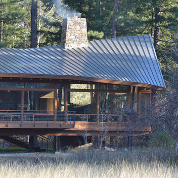
The Mazama house is located in the Methow Valley of Washington State, a secluded mountain valley on the eastern edge of the North Cascades, about 200 miles northeast of Seattle.
The house has been carefully placed in a copse of trees at the easterly end of a large meadow. Two major building volumes indicate the house organization. A grounded 2-story bedroom wing anchors a raised living pavilion that is lifted off the ground by a series of exposed steel columns. Seen from the access road, the large meadow in front of the house continues right under the main living space, making the living pavilion into a kind of bridge structure spanning over the meadow grass, with the house touching the ground lightly on six steel columns. The raised floor level provides enhanced views as well as keeping the main living level well above the 3-4 feet of winter snow accumulation that is typical for the upper Methow Valley.
To further emphasize the idea of lightness, the exposed wood structure of the living pavilion roof changes pitch along its length, so the roof warps upward at each end. The interior exposed wood beams appear like an unfolding fan as the roof pitch changes. The main interior bearing columns are steel with a tapered “V”-shape, recalling the lightness of a dancer.
The house reflects the continuing FINNE investigation into the idea of crafted modernism, with cast bronze inserts at the front door, variegated laser-cut steel railing panels, a curvilinear cast-glass kitchen counter, waterjet-cut aluminum light fixtures, and many custom furniture pieces. The house interior has been designed to be completely integral with the exterior. The living pavilion contains more than twelve pieces of custom furniture and lighting, creating a totality of the designed environment that recalls the idea of Gesamtkunstverk, as seen in the work of Josef Hoffman and the Viennese Secessionist movement in the early 20th century.
The house has been designed from the start as a sustainable structure, with 40% higher insulation values than required by code, radiant concrete slab heating, efficient natural ventilation, large amounts of natural lighting, water-conserving plumbing fixtures, and locally sourced materials. Windows have high-performance LowE insulated glazing and are equipped with concealed shades. A radiant hydronic heat system with exposed concrete floors allows lower operating temperatures and higher occupant comfort levels. The concrete slabs conserve heat and provide great warmth and comfort for the feet.
Deep roof overhangs, built-in shades and high operating clerestory windows are used to reduce heat gain in summer months. During the winter, the lower sun angle is able to penetrate into living spaces and passively warm the exposed concrete floor. Low VOC paints and stains have been used throughout the house. The high level of craft evident in the house reflects another key principle of sustainable design: build it well and make it last for many years!
Photo by NIls Finne
 Ernesto Santalla PLLC
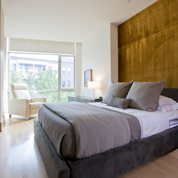
Ernesto Santalla was approached to create a new home for two Washington, DC lawyers wishing to downsize their living space. The move took them from a row house in Washington's historic Dupont Circle neighborhood to a two bedroom apartment in the vibrant, up-and-coming U Street Corridor. Our task was to transform a rather plain and generic apartment into a custom, sophisticated space in a few strategic moves. Ceiling details serve to define functional areas of the living space without creating divisions. Changing some doors from wood to frosted glass, creates a sense of continuity between spaces, and allows light to travel between spaces. Lighting was inserted strategically, to enhance certain functions of the home. The kitchen was partially enclosed with a plane of frosted glass to create visual separation from the main living space while still allowing natural light to filter in from the expansive wall of floor-to-ceiling windows. Color was used to reinforce the architectural intent and simplify spaces, such as the entry, which as many doors and frames. Furniture was selected to blend with the client's collection of heirloom pieces, creating a sophisticated juxtaposition. Statement pieces like a ceiling light from Viabizzuno create impact while maintaining the visual simplicity of our minimal approach.
Photography by Geoffrey Hodgdon
 Matt Fajkus Architecture
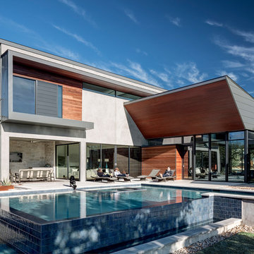
The Control/Shift House is perched on the high side of the site which takes advantage of the view to the southeast. A gradual descending path navigates the change in terrain from the street to the entry of the house. A series of low retaining walls/planter beds gather and release the earth upon the descent resulting in a fairly flat level for the house to sit on the top one third of the site. The entry axis is aligned with the celebrated stair volume and then re-centers on the actual entry axis once you approach the forecourt of the house.
The initial desire was for an “H” scheme house with common entertaining spaces bridging the gap between the more private spaces. After an investigation considering the site, program, and view, a key move was made: unfold the east wing of the “H” scheme to open all rooms to the southeast view resulting in a “T” scheme. The new derivation allows for both a swim pool which is on axis with the entry and main gathering space and a lap pool which occurs on the cross axis extending along the lengthy edge of the master suite, providing direct access for morning exercise and a view of the water throughout the day.
The Control/Shift House was derived from a clever way of following the “rules.” Strict HOA guidelines required very specific exterior massing restrictions which limits the lengths of unbroken elevations and promotes varying sizes of masses. The solution most often used in this neighborhood is one of addition - an aggregation of masses and program randomly attached to the inner core of the house which often results in a parasitic plan. The approach taken with the Control/Shift House was to push and pull program/massing to delineate and define the layout of the house. Massing is intentional and reiterated by the careful selection of materiality that tracks through the house. Voids and relief in the plan are a natural result of this method and allow for light and air to circulate throughout every space of the house, even into the most inner core.
Photography: Charles Davis Smith
 Signature Interior Designs
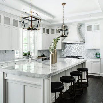
White kitchen with stacked wall cabinets, custom range hood, and large island with plenty of seating.
Huge transitional dark wood floor kitchen photo in New York with an undermount sink, shaker cabinets, white cabinets, quartzite countertops, stainless steel appliances, an island and metallic backsplash
Huge transitional dark wood floor kitchen photo in New York with an undermount sink, shaker cabinets, white cabinets, quartzite countertops, stainless steel appliances, an island and metallic backsplash
Sponsored
Fredericksburg, OH

High Point Cabinets
Columbus' Experienced Custom Cabinet Builder | 4x Best of Houzz Winner
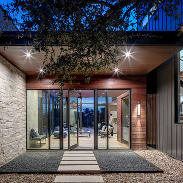 Matt Fajkus Architecture
The Control/Shift House is perched on the high side of the site which takes advantage of the view to the southeast. A gradual descending path navigates the change in terrain from the street to the entry of the house. A series of low retaining walls/planter beds gather and release the earth upon the descent resulting in a fairly flat level for the house to sit on the top one third of the site. The entry axis is aligned with the celebrated stair volume and then re-centers on the actual entry axis once you approach the forecourt of the house.
The initial desire was for an “H” scheme house with common entertaining spaces bridging the gap between the more private spaces. After an investigation considering the site, program, and view, a key move was made: unfold the east wing of the “H” scheme to open all rooms to the southeast view resulting in a “T” scheme. The new derivation allows for both a swim pool which is on axis with the entry and main gathering space and a lap pool which occurs on the cross axis extending along the lengthy edge of the master suite, providing direct access for morning exercise and a view of the water throughout the day.
The Control/Shift House was derived from a clever way of following the “rules.” Strict HOA guidelines required very specific exterior massing restrictions which limits the lengths of unbroken elevations and promotes varying sizes of masses. The solution most often used in this neighborhood is one of addition - an aggregation of masses and program randomly attached to the inner core of the house which often results in a parasitic plan. The approach taken with the Control/Shift House was to push and pull program/massing to delineate and define the layout of the house. Massing is intentional and reiterated by the careful selection of materiality that tracks through the house. Voids and relief in the plan are a natural result of this method and allow for light and air to circulate throughout every space of the house, even into the most inner core.
Photography: Charles Davis Smith
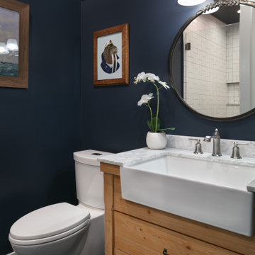
 Metropolis Drafting and Construction Inc
An original 1930’s English Tudor with only 2 bedrooms and 1 bath spanning about 1730 sq.ft. was purchased by a family with 2 amazing young kids, we saw the potential of this property to become a wonderful nest for the family to grow.
The plan was to reach a 2550 sq. ft. home with 4 bedroom and 4 baths spanning over 2 stories.
With continuation of the exiting architectural style of the existing home.
A large 1000sq. ft. addition was constructed at the back portion of the house to include the expended master bedroom and a second-floor guest suite with a large observation balcony overlooking the mountains of Angeles Forest.
An L shape staircase leading to the upstairs creates a moment of modern art with an all white walls and ceilings of this vaulted space act as a picture frame for a tall window facing the northern mountains almost as a live landscape painting that changes throughout the different times of day.
Tall high sloped roof created an amazing, vaulted space in the guest suite with 4 uniquely designed windows extruding out with separate gable roof above.
The downstairs bedroom boasts 9’ ceilings, extremely tall windows to enjoy the greenery of the backyard, vertical wood paneling on the walls add a warmth that is not seen very often in today’s new build.
The master bathroom has a showcase 42sq. walk-in shower with its own private south facing window to illuminate the space with natural morning light. A larger format wood siding was using for the vanity backsplash wall and a private water closet for privacy.
In the interior reconfiguration and remodel portion of the project the area serving as a family room was transformed to an additional bedroom with a private bath, a laundry room and hallway.
The old bathroom was divided with a wall and a pocket door into a powder room the leads to a tub room.
The biggest change was the kitchen area, as befitting to the 1930’s the dining room, kitchen, utility room and laundry room were all compartmentalized and enclosed.
We eliminated all these partitions and walls to create a large open kitchen area that is completely open to the vaulted dining room. This way the natural light the washes the kitchen in the morning and the rays of sun that hit the dining room in the afternoon can be shared by the two areas.
The opening to the living room remained only at 8’ to keep a division of space.
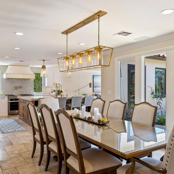
 JRP Design & Remodel
This home had a kitchen that wasn’t meeting the family’s needs, nor did it fit with the coastal Mediterranean theme throughout the rest of the house. The goals for this remodel were to create more storage space and add natural light. The biggest item on the wish list was a larger kitchen island that could fit a family of four. They also wished for the backyard to transform from an unsightly mess that the clients rarely used to a beautiful oasis with function and style.
One design challenge was incorporating the client’s desire for a white kitchen with the warm tones of the travertine flooring. The rich walnut tone in the island cabinetry helped to tie in the tile flooring. This added contrast, warmth, and cohesiveness to the overall design and complemented the transitional coastal theme in the adjacent spaces. Rooms alight with sunshine, sheathed in soft, watery hues are indicative of coastal decorating. A few essential style elements will conjure the coastal look with its casual beach attitude and renewing seaside energy, even if the shoreline is only in your mind's eye.
By adding two new windows, all-white cabinets, and light quartzite countertops, the kitchen is now open and bright. Brass accents on the hood, cabinet hardware and pendant lighting added warmth to the design. Blue accent rugs and chairs complete the vision, complementing the subtle grey ceramic backsplash and coastal blues in the living and dining rooms. Finally, the added sliding doors lead to the best part of the home: the dreamy outdoor oasis!
Every day is a vacation in this Mediterranean-style backyard paradise. The outdoor living space emphasizes the natural beauty of the surrounding area while offering all of the advantages and comfort of indoor amenities.
The swimming pool received a significant makeover that turned this backyard space into one that the whole family will enjoy. JRP changed out the stones and tiles, bringing a new life to it. The overall look of the backyard went from hazardous to harmonious. After finishing the pool, a custom gazebo was built for the perfect spot to relax day or night.
It’s an entertainer’s dream to have a gorgeous pool and an outdoor kitchen. This kitchen includes stainless-steel appliances, a custom beverage fridge, and a wood-burning fireplace. Whether you want to entertain or relax with a good book, this coastal Mediterranean-style outdoor living remodel has you covered.
Photographer: Andrew - OpenHouse VC
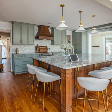
 FineLine Kitchens, Inc.
Hi everyone, I'm Sarah and Ogun we are here with fine line kitchens. So we are a couple working together. I do the interior design and remodeling of the space material selection meeting with the clients. And I handled operations outside, you know meaning all the construction work that is taking place the inside. The houses that we work in. I handle all the aspects of the construction, so today's project is very special. We're in Vienna and the client had a very big family. It's a family of seven that lives here. So we had a few aspects that we needed to keep in mind while designing this one. Having everybody be able to sit on the island. So we wanted plenty of seating all the way around. We didn't want anybody standing or anything like that. So what we did is we maximize the space. The center island is the biggest part of the kitchen. We use a natural stone to kind of give it a beautiful texture versus quartz. It's kind of standard white or kind of fabricated, so I wanted something very natural. We did this because I took my inspiration from the outside, so the inspiration if you look at the view right in front of me is there are so many greens there's a lot of brass accents and I wanted to bring this. Into this kitchen while designing it for my clients. She is very warm very. She wanted a very homey, comfy kind of look for the kitchen. So that's what we did today. As you can see, the cabinets are sage green, very light, so I still think it's a neutral, but it's a lighter color that again brings the outside in and we combine that with the oak right behind me so it's a slightly warm oak. It's not very dark. It's not very light. It's a medium brown and the same color went on the island. To kind of tie these two in and the backsplash, my favorite part is where you can see a little bit of design. It is, in my opinion still classic, but includes a pattern so the outside part is as we said in the beginning, is handled by my husband. I'd like him to speak a little bit about that. Thanks, Sarah, I want to talk to you guys a little bit about the construction part of this project. Originally this kitchen was located mostly in this area. They had their stove there sing. It was more of a peninsula layout in Sarah's and the customer vision they wanted. They wanted to get rid of the peninsula and they want to be able to have a huge island that can at least sit seven people because they're familiar with seven. So we wanted to make sure that we can achieve this design and bring it to life so that they can be happy with this layout. Some of the challenges we had, the house, the home being, you know, old home. There were a lot of you know the older electrical and plumbing that had to be replaced. We had to relocate the stove from here to this area. Over here we had put a nice foot fan that we had to relocate all the ductwork and the plumbing. Was being on the peninsula area. We had to relocate it to the center islands. So we achieved all this and kind of like bring it to bring in this kitchen up to date it looks beautiful. That's true, so yes, the old layout did not function for my clients because everything was kind of gathered on one side of the kitchen. So there was like a peninsula right there. So the end of this island kind of continued straight. And that was just the L shape. Kind of where everything was and there used to be another big table here, so they were using only kind of half of the space. So like I said at the beginning, our vision was to kind of feed everybody at the island, create some symmetry. 'cause I love that. So as you can see behind me, this is kind of the focal point symmetrical. Everything is kind of even we wanted to also panel the fridge here so it mimics the pantry and another size. So when you're looking at it, it is bringing again that symmetry back again. I hope you enjoyed this kitchen and this video and I'll see you soon. So how do you think this project turned out? It's nice. I like the color. I think it turned out nice. It's kind of like a little bit different color than what we always do. So I realize. Are you giving me a little bit of credit here that I did something different? Are you proud? I'm so proud of you. Other than that I like it. That they have kind of like a two sink. So if this was our kitchen, if we ever like you can have your own. I can have mine if we ever get into a fight then this can be like my own kitchen. Why are we gonna bring in a fight right now? So I'm cooking anyway. You're grilling most of the time, So what are you even talking about? My kitchen? That's my kitchen. You can just take the small sink. That's fine. It's always good to have your own space right there, so anyways. Thank you guys for watching. We hope to see you soon and if you have any questions please click the link below. It'll lead you to our website, house, YouTube and all of the social media is so nice to have you guys. We'll see you soon. Thanks bye bye-bye.
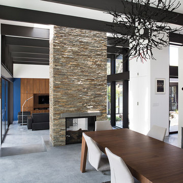 Klopf Architecture
The owners, inspired by mid-century modern architecture, hired Klopf Architecture to design an Eichler-inspired 21st-Century, energy efficient new home that would replace a dilapidated 1940s home. The home follows the gentle slope of the hillside while the overarching post-and-beam roof above provides an unchanging datum line. The changing moods of nature animate the house because of views through large glass walls at nearly every vantage point. Every square foot of the house remains close to the ground creating and adding to the sense of connection with nature.
Klopf Architecture Project Team: John Klopf, AIA, Geoff Campen, Angela Todorova, and Jeff Prose
Structural Engineer: Alex Rood, SE, Fulcrum Engineering (now Pivot Engineering)
Landscape Designer (atrium): Yoshi Chiba, Chiba's Gardening
Landscape Designer (rear lawn): Aldo Sepulveda, Sepulveda Landscaping
Contractor: Augie Peccei, Coast to Coast Construction
Photography ©2015 Mariko Reed
Location: Belmont, CA
Year completed: 2015
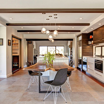
 Jackson Design & Remodeling
Jackson Design and Remodeling
Example of a trendy galley beige floor eat-in kitchen design in San Diego with flat-panel cabinets, white cabinets, stainless steel appliances and an island
Example of a trendy galley beige floor eat-in kitchen design in San Diego with flat-panel cabinets, white cabinets, stainless steel appliances and an island

Sponsored
Columbus, OH

Wannemacher Interiors
Customized Award-Winning Interior Design Solutions in Franklin Cnty OH
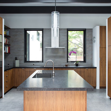 Klopf Architecture
The owners, inspired by mid-century modern architecture, hired Klopf Architecture to design an Eichler-inspired 21st-Century, energy efficient new home that would replace a dilapidated 1940s home. The home follows the gentle slope of the hillside while the overarching post-and-beam roof above provides an unchanging datum line. The changing moods of nature animate the house because of views through large glass walls at nearly every vantage point. Every square foot of the house remains close to the ground creating and adding to the sense of connection with nature.
Klopf Architecture Project Team: John Klopf, AIA, Geoff Campen, Angela Todorova, and Jeff Prose
Structural Engineer: Alex Rood, SE, Fulcrum Engineering (now Pivot Engineering)
Landscape Designer (atrium): Yoshi Chiba, Chiba's Gardening
Landscape Designer (rear lawn): Aldo Sepulveda, Sepulveda Landscaping
Contractor: Augie Peccei, Coast to Coast Construction
Photography ©2015 Mariko Reed
Location: Belmont, CA
Year completed: 2015
 Metropolis Drafting and Construction Inc
An original 1930’s English Tudor with only 2 bedrooms and 1 bath spanning about 1730 sq.ft. was purchased by a family with 2 amazing young kids, we saw the potential of this property to become a wonderful nest for the family to grow.
The plan was to reach a 2550 sq. ft. home with 4 bedroom and 4 baths spanning over 2 stories.
With continuation of the exiting architectural style of the existing home.
A large 1000sq. ft. addition was constructed at the back portion of the house to include the expended master bedroom and a second-floor guest suite with a large observation balcony overlooking the mountains of Angeles Forest.
An L shape staircase leading to the upstairs creates a moment of modern art with an all white walls and ceilings of this vaulted space act as a picture frame for a tall window facing the northern mountains almost as a live landscape painting that changes throughout the different times of day.
Tall high sloped roof created an amazing, vaulted space in the guest suite with 4 uniquely designed windows extruding out with separate gable roof above.
The downstairs bedroom boasts 9’ ceilings, extremely tall windows to enjoy the greenery of the backyard, vertical wood paneling on the walls add a warmth that is not seen very often in today’s new build.
The master bathroom has a showcase 42sq. walk-in shower with its own private south facing window to illuminate the space with natural morning light. A larger format wood siding was using for the vanity backsplash wall and a private water closet for privacy.
In the interior reconfiguration and remodel portion of the project the area serving as a family room was transformed to an additional bedroom with a private bath, a laundry room and hallway.
The old bathroom was divided with a wall and a pocket door into a powder room the leads to a tub room.
The biggest change was the kitchen area, as befitting to the 1930’s the dining room, kitchen, utility room and laundry room were all compartmentalized and enclosed.
We eliminated all these partitions and walls to create a large open kitchen area that is completely open to the vaulted dining room. This way the natural light the washes the kitchen in the morning and the rays of sun that hit the dining room in the afternoon can be shared by the two areas.
The opening to the living room remained only at 8’ to keep a division of space.
 NR Interiors
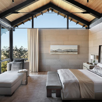
Designing the Master Suite custom furnishings, bedding, window coverings and artwork to compliment the modern architecture while offering an elegant, serene environment for peaceful reflection were the chief objectives. The color scheme remains a warm neutral, like the limestone walls, along with soft accents of subdued greens, sage and silvered blues to bring the colors of the magnificent, long Hill country views into the space. Special effort was spent designing custom window coverings that wouldn't compete with the architecture, but appear integrated and operate easily to open wide the prized view fully and provide privacy when needed. To achieve an understated elegance, the textures are rich and refined with a glazed linen headboard fabric, plush wool and viscose rug, soft leather bench, velvet pillow, satin accents to custom bedding and an ultra fine linen for the drapery with accents of natural wood mixed with warm bronze and aged brass metal finishes. The original oil painting curated for this room sets a calming and serene tone for the space with an ever important focus on the beauty of nature.
The original fine art landscape painting for this room was created by Christa Brothers, of Brothers Fine Art Marfa.
 Corinthian Fine Homes
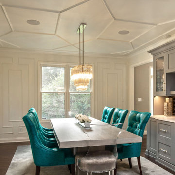
This young family began working with us after struggling with their previous contractor. They were over budget and not achieving what they really needed with the addition they were proposing. Rather than extend the existing footprint of their house as had been suggested, we proposed completely changing the orientation of their separate kitchen, living room, dining room, and sunroom and opening it all up to an open floor plan. By changing the configuration of doors and windows to better suit the new layout and sight lines, we were able to improve the views of their beautiful backyard and increase the natural light allowed into the spaces. We raised the floor in the sunroom to allow for a level cohesive floor throughout the areas. Their extended kitchen now has a nice sitting area within the kitchen to allow for conversation with friends and family during meal prep and entertaining. The sitting area opens to a full dining room with built in buffet and hutch that functions as a serving station. Conscious thought was given that all “permanent” selections such as cabinetry and countertops were designed to suit the masses, with a splash of this homeowner’s individual style in the double herringbone soft gray tile of the backsplash, the mitred edge of the island countertop, and the mixture of metals in the plumbing and lighting fixtures. Careful consideration was given to the function of each cabinet and organization and storage was maximized. This family is now able to entertain their extended family with seating for 18 and not only enjoy entertaining in a space that feels open and inviting, but also enjoy sitting down as a family for the simple pleasure of supper together.
Sponsored
Columbus, OH

Structural Remodeling
Franklin County's Heavy Timber Specialists | Best of Houzz 2020!
 KohlMark Architects and Builders
The design of this home was driven by the owners’ desire for a three-bedroom waterfront home that showcased the spectacular views and park-like setting. As nature lovers, they wanted their home to be organic, minimize any environmental impact on the sensitive site and embrace nature.
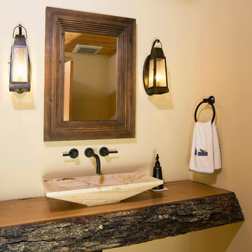
This unique home is sited on a high ridge with a 45° slope to the water on the right and a deep ravine on the left. The five-acre site is completely wooded and tree preservation was a major emphasis. Very few trees were removed and special care was taken to protect the trees and environment throughout the project. To further minimize disturbance, grades were not changed and the home was designed to take full advantage of the site’s natural topography. Oak from the home site was re-purposed for the mantle, powder room counter and select furniture.
The visually powerful twin pavilions were born from the need for level ground and parking on an otherwise challenging site. Fill dirt excavated from the main home provided the foundation. All structures are anchored with a natural stone base and exterior materials include timber framing, fir ceilings, shingle siding, a partial metal roof and corten steel walls. Stone, wood, metal and glass transition the exterior to the interior and large wood windows flood the home with light and showcase the setting. Interior finishes include reclaimed heart pine floors, Douglas fir trim, dry-stacked stone, rustic cherry cabinets and soapstone counters.
Exterior spaces include a timber-framed porch, stone patio with fire pit and commanding views of the Occoquan reservoir. A second porch overlooks the ravine and a breezeway connects the garage to the home.
Numerous energy-saving features have been incorporated, including LED lighting, on-demand gas water heating and special insulation. Smart technology helps manage and control the entire house.
Greg Hadley Photography
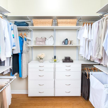
 Organized Living
Organized Living freedomRail is the perfect combination of strength, ease and versatility to save you time, money and stress. The heart of this organization system is its ability to adjust- and readjust – to suit you and your family’s ever-changing needs. Learn more about freedomRail and its unique benefits here: http://organizedliving.com/home/products/freedomrail/about
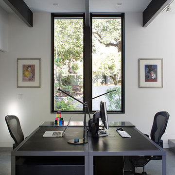 Klopf Architecture
The owners, inspired by mid-century modern architecture, hired Klopf Architecture to design an Eichler-inspired 21st-Century, energy efficient new home that would replace a dilapidated 1940s home. The home follows the gentle slope of the hillside while the overarching post-and-beam roof above provides an unchanging datum line. The changing moods of nature animate the house because of views through large glass walls at nearly every vantage point. Every square foot of the house remains close to the ground creating and adding to the sense of connection with nature.
Klopf Architecture Project Team: John Klopf, AIA, Geoff Campen, Angela Todorova, and Jeff Prose
Structural Engineer: Alex Rood, SE, Fulcrum Engineering (now Pivot Engineering)
Landscape Designer (atrium): Yoshi Chiba, Chiba's Gardening
Landscape Designer (rear lawn): Aldo Sepulveda, Sepulveda Landscaping
Contractor: Augie Peccei, Coast to Coast Construction
Photography ©2015 Mariko Reed
Location: Belmont, CA
Year completed: 2015
4