
Search results for "Evidence" in Home Design Ideas
 Dream Kitchens
CONTACT
These home owners initially contacted their Designer to identify the reason that the floor in their upstairs bedroom suffered from a noticeable slant. The floor problem actually impacted a small bathroom and adjoining study also.
Early on, the decision was made to re-design the footprint for the 3 rooms in conjunction with repairing the uneven floor. The approach was to gut all three spaces of walls and floors and start from scratch. The new spaces were designed with the clients needs for accessibility in mind.
DESIGN
The design effort included identifying the products to be used throughout the spaces. This included everything from the flooring to the wall paint. Kohler plumbing fixtures and Adelphi cabinetry were decided on first. A radiant heat grid was included for the bathroom floor. Lighting, paint and tile soon followed. Wood flooring was installed throughout the adjoining spaces.
The master bedroom was redesigned to allow for entry from the study or the master bath via pocket doors. The study was given an access to the master bath also. The hardwood flooring ties the bedroom and study together and gives each room a very spacious feel. The original master bedroom was changed to incorporate a large walk-in closet that features custom storage throughout. The study that also doubles as the IT center for the home was updated with custom book cases and cabinetry from Adelphi Cabinets.
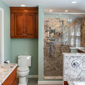
When discussing the reapportioning of the entire space for the individual rooms the bathroom was given priority. The previous small bathroom did not include a window for natural light. The new design corrected that in a big way by incorporating an existing bedroom window into the new space. The decision was made early on to allow for the inclusion of a large shower with full granite walls and custom plate glass surround. The shower system includes both fixed and hand held shower heads. A thermostatic control system was included to eliminate scalding. A large bench seat of matching granite allows for relaxing while getting squeaky clean. A separate air massage tub from Kohler centered under the new windows allows for a relaxed moment while being caressed by all those tiny bubbles. His and her side by side vanity sinks allows for efficient use of the space. The Caxton sinks and coordinated toilet were selected to match the color of the tub and do so beautifully!
CONSTRUCTION
We started the project not knowing what we were going to find. The slanting floor upstairs was not evident in the ceiling of the first floor
Once the demolition had been completed it was evident that the floor joists were at the heart of the problem. The home had been framed with floor joists that had been strung together to increase their length. Over time and with the house settling, the strung together joists started to droop from their connection point. This was concealed on the first floor by a large HVAC duct running through the garage. This was corrected by the addition of two laminated beams in the ceiling of the first floor (luckily in the garage) that re-supported the offending joists.
THE END
The project was a huge success in terms of problem solving and designing with budget and time frame in mind. The overall impact of the new space is impressive both visually and from a practicality point of view. The new master suite with upscale bathroom and study adds significant value to the home and the home owners quality of life!
 Dream Kitchens
CONTACT
These home owners initially contacted their Designer to identify the reason that the floor in their upstairs bedroom suffered from a noticeable slant. The floor problem actually impacted a small bathroom and adjoining study also.
Early on, the decision was made to re-design the footprint for the 3 rooms in conjunction with repairing the uneven floor. The approach was to gut all three spaces of walls and floors and start from scratch. The new spaces were designed with the clients needs for accessibility in mind.
DESIGN
The design effort included identifying the products to be used throughout the spaces. This included everything from the flooring to the wall paint. Kohler plumbing fixtures and Adelphi cabinetry were decided on first. A radiant heat grid was included for the bathroom floor. Lighting, paint and tile soon followed. Wood flooring was installed throughout the adjoining spaces.
The master bedroom was redesigned to allow for entry from the study or the master bath via pocket doors. The study was given an access to the master bath also. The hardwood flooring ties the bedroom and study together and gives each room a very spacious feel. The original master bedroom was changed to incorporate a large walk-in closet that features custom storage throughout. The study that also doubles as the IT center for the home was updated with custom book cases and cabinetry from Adelphi Cabinets.
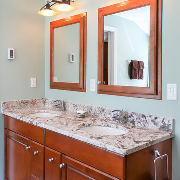
When discussing the reapportioning of the entire space for the individual rooms the bathroom was given priority. The previous small bathroom did not include a window for natural light. The new design corrected that in a big way by incorporating an existing bedroom window into the new space. The decision was made early on to allow for the inclusion of a large shower with full granite walls and custom plate glass surround. The shower system includes both fixed and hand held shower heads. A thermostatic control system was included to eliminate scalding. A large bench seat of matching granite allows for relaxing while getting squeaky clean. A separate air massage tub from Kohler centered under the new windows allows for a relaxed moment while being caressed by all those tiny bubbles. His and her side by side vanity sinks allows for efficient use of the space. The Caxton sinks and coordinated toilet were selected to match the color of the tub and do so beautifully!
CONSTRUCTION
We started the project not knowing what we were going to find. The slanting floor upstairs was not evident in the ceiling of the first floor
Once the demolition had been completed it was evident that the floor joists were at the heart of the problem. The home had been framed with floor joists that had been strung together to increase their length. Over time and with the house settling, the strung together joists started to droop from their connection point. This was concealed on the first floor by a large HVAC duct running through the garage. This was corrected by the addition of two laminated beams in the ceiling of the first floor (luckily in the garage) that re-supported the offending joists.
THE END
The project was a huge success in terms of problem solving and designing with budget and time frame in mind. The overall impact of the new space is impressive both visually and from a practicality point of view. The new master suite with upscale bathroom and study adds significant value to the home and the home owners quality of life!
 Nautilus Architects
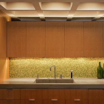
Details take this kitchen from good to great. Mortised chrome edge pulls leave the anigre drawer and door faces unblemished. These are contrasted with integral pulls carved into mahogany cabinetry. Clunky European hinges are replaced by elegant, smooth-working offset pivot hinges with invisible magnet catches embedded in the doors. Outside cabinet corners are mitered so there is no evidence of a door or drawer edge from any angle. A small reveal at wall bases, achieved using matte black plastic laminate, eliminates the need for applied baseboard, and indeed the interior is entirely “trimless.”
Cathedral ceilings and seamless cabinetry complement this home’s river view.
The low ceilings in this ’70s contemporary were a nagging issue for the 6-foot-8 homeowner. Plus, drab interiors failed to do justice to the home’s Connecticut River view. By raising ceilings and removing non-load-bearing partitions, architect Christopher Arelt was able to create a cathedral-within-a-cathedral structure in the kitchen, dining and living area. Decorative mahogany rafters open the space’s height, introduce a warmer palette and create a welcoming framework for light.
The homeowner, a Frank Lloyd Wright fan, wanted to emulate the famed architect’s use of reddish-brown concrete floors, and the result further warmed the interior. “Concrete has a connotation of cold and industrial but can be just the opposite,” explains Arelt. Clunky European hardware was replaced by hidden pivot hinges, and outside cabinet corners were mitered so there is no evidence of a drawer or door from any angle.
Photo Credit: Read McKendree
Find the right local pro for your project
 Neumann & Rudy Architecture
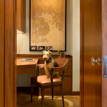
This image performs an act of deliberate spatial framing: we are positioned as intruders in a threshold, the photograph's foreground bracketed by two monumental slabs of mahogany-toned door leaf and jamb that compress the visual field into a portal roughly one-third the width of the frame. The composition is therefore a study in *enfilade* logic — a controlled, telescoping sightline that draws the eye through a narrow aperture into a recessed alcove, a purpose-built writing niche carved from what appears to be a corridor or dressing-room vestibule. The niche itself is architecturally modest in footprint but generous in vertical proportion; the ceiling reads as a plain plastered plane, unadorned save for a surface-mounted linear picture light on a slender drop stem, and the wall is treated as a full-height field for a single dominant object. The joinery is the true architecture here: a continuous run of casework establishes a horizontal datum at desk height, with a cantilevered writing surface returning perpendicular to the left-hand wall and a lower bank of drawers and a shallow ledge running right. That ledge functions as a *cimaise* or picture shelf, resolving the base of the framed nautical chart and giving the composition a plinth. Above, an integrated soffit or upper cabinet with concealed under-lighting terminates the left elevation, reinforcing the sense of an inhabited, tailored recess rather than a room. The herringbone parquet in the foreground introduces a diagonal geometry that runs counter to the orthogonal grid of doors, casework and picture frame, and this friction — chevron against rectilinear — animates what would otherwise be a static, axial composition. The single chair, canted slightly off-axis and pulled away from the desk, is the compositional pivot: it breaks the symmetry, occupies the exact center of the aperture, and converts an architectural vignette into a narrative one.
The palette is a disciplined exercise in the warm end of the spectrum, essentially monochromatic in hue and differentiated almost entirely by value, sheen and grain. The dominant material is timber, deployed in at least three distinct registers: the foreground door and jamb in a deeply saturated, red-brown mahogany or sapele with a high-build lacquer or French-polish sheen that catches light in long vertical highlights; the desk and casework in a lighter, honeyed figured wood — quartered cherry or anigre — finished to a satin rather than gloss, so that the eye reads it as a working surface rather than a ceremonial one; and finally the pale, blond oak of the herringbone floor, cerused or naturally oxidized to a straw tonality that lifts the lower register of the frame. Against this timber triad, the walls provide a chalky, low-saturation ground: a limewashed or flat-emulsion cream with a distinctly yellow-warm undertone that absorbs rather than reflects. The upholstery is the room's chromatic keynote — a saddle-tan or cognac leather, semi-aniline, already developing patina and slight slouch at the seat, its edge articulated by a close-set brass or antique-nickel nailhead trim that reads as a stitched seam of tiny metallic points. Metals are used sparingly and with historical precision: the polished chrome rosette and knob of the door with its heavy escutcheon and mortise strike plate, the slim brushed housing of the picture light. Texturally, the room stages a dialogue between the hard, reflective and the soft, absorbent: lacquer against limewash, taut leather against the friable, foxed paper of the antique chart. That chart — a hydrographic survey rendered in ochre, sepia and faded aqua, its ebonized frame supplying the composition's only true black — is the material anchor, its aged paper introducing a granular, time-worn texture that no new surface in the room could supply. The terrier, coincidentally or not, participates in this material scheme: a wiry tan-and-black coat that reads as a textile in its own right, tonally identical to the leather beneath it.
The lighting design is layered, warm-Kelvin and almost entirely artificial in its narrative effect, though the scene depends on a critical unseen source. A shaft of low, raking daylight enters from the right — presumably a window outside the frame — and lands as a hard-edged parallelogram across the parquet and the chair's front rail, creating the image's strongest contrast and lending the floor a sense of temporal specificity: late afternoon, low sun. Against this, three artificial layers operate. The surface-mounted picture light washes the nautical chart in an even, slightly amber flood, functioning as accent lighting that establishes the chart as the room's hierarchical focus. Concealed strip lighting beneath the upper casework grazes the left-hand desk return, providing task illumination and articulating the millwork's shadow line. Ambient fill is minimal and deliberately so; the corners of the niche fall into soft, unresolved shadow, and the whole tableau is rendered in a narrow tonal band of amber and umber that suppresses cool light almost entirely. The resulting atmosphere is one of burnished interiority — hushed, crepuscular, protective. Stylistically, the room resists easy categorization but sits most comfortably within a contemporary *Warm Traditionalism* or refined **Anglo-American Modern Classic** idiom: the vocabulary is unmistakably tailored-traditional (nailhead-trimmed leather, mortise hardware, framed cartography, a Deco-inflected barrel-back desk chair), yet the detailing is stripped of ornament — no cornice, no panel molding, no applied millwork profile — and the casework is resolved with the flush, planar minimalism of a mid-century yacht interior. It is, in essence, a *cabinet de travail* reimagined through the discipline of modern joinery: a room that borrows the emotional register of the club library while adopting the reductive geometry of contemporary architecture. The dog, unhurried and centrally enthroned, is the final aesthetic argument — evidence that the space is not a set piece but a lived, occupied, and evidently affectionate interior.
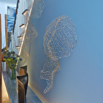
 Dale Cohen Designstudio
Dale was chosen to participate in the 2013 Hampton Designer Showhouse, sponsored by Traditional Home Magazine, because she has built a reputation for precise, elegant, and livable design work in Manhattan. The challenge of the showhouse, essentially a blank canvas with an imaginary client, was not beyond her. The room she was given is the Terrace Level Lounge; she chose a program to embrace a burgeoning art collection, and devise areas of repose to enjoy the work. And Ms. Cohen’s early training as a painter and photographer clearly are clearly a great asset in this particular room. Her method is to analyze the room as an architectural proposition. A Yale Architectural School graduate, she is able to cast a few intelligent moves to make the room a stage rather than a hallway. Creating a platform for her creative collaboration and designing the Monumental Lantern with artist John Houshmand.
The seating areas are a series of compressed compositions with shapes and forms of chairs, a Minotti sofa, a Valerie Goodman Gallery coffee table, and the Holland and Sherry geometric throw pillows that evoke the early modernist paintings of Jean Arp. Accented by ceiling panels covered in a Maharam wallpaper. Her next big move was enrolling the work of artist and furniture maker John Houshmand. Ms. Cohen thrives on creative collaboration and designing the Monumental Lantern that with Houshmand, that she boldly placed in one entire corner of the room. Few designers would welcome a giant rough sawn luminaire but Ms. Cohen’s early apprenticeship with Richard Serra is evident in this wonderful juxtaposition of scale. Ms. Cohen’s reputation as a brave designer has been established with the inclusion of Houshmand’s piece.
Ms. Cohen’s method is to analyze the room as an architectural proposition. A Yale Architectural School graduate, she is able to cast a few intelligent moves to make the room a stage rather than a hallway. The stairway was divided into two events, one behind a scrim and the other revealed. This gave the sitting area a theatrical backdrop as well as choreographing a Hollywood-style entrance for the visitor walking down the stairs. In fact Ms. Cohen uses a series of fabric backdrops throughout the space to denote different spatial conditions.
The color palette, if said aloud, is the prototypical Hamptons beach house cheery; though Ms. Cohen’s take is altogether different. With a sea blue as her base, she treats the envelope of the space with tinted whites and grays, and just as you are comfortable with this resolve she infuses the space with drops of chartreuse. The optic shock of an electric green is a sign of strength in Ms. Cohen’s tool box. The result is a perfect balance of whimsy and sophistication.
Whimsy, bravery, and compositional sophistication will not be evident or sufficient without Ms. Cohen’s razor sharp rigor. Her attention to detail is what makes one want to sit in the Fritz Hansen chair, under the reading light, with cashmere throw at its side. Ms. Cohen’s embrace of the luxury of detail is what makes for valuable moments in the design world and what sets her work apart.
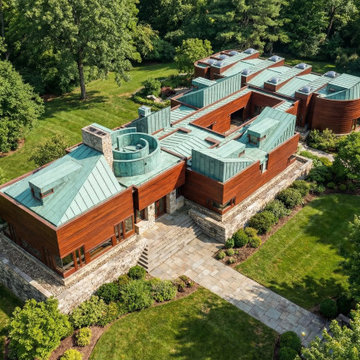
 George Ranalli Architect
George Ranalli Architect's design for this house is a masterpiece in simplicity and serenity. The house is designed to be a quiet retreat in the midst of nature, with a focus on the beauty of the surrounding landscape. The clarity of form, evident in the design, embodies the intention for calmness and tranquility. The use of natural materials, such as wood and stone, is prominent throughout the design, creating a connection between the house and the environment. Large windows offer stunning views of the outdoors and allow natural light to flood the interior. The open floor plan maximizes space and creates a feeling of airiness and flow. The attention to detail is evident in the carefully crafted finishes and fixtures, creating a sense of timelessness and refinement.
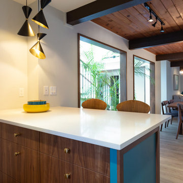
 My House Design|Build|Team
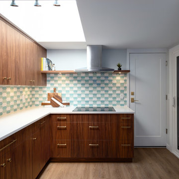
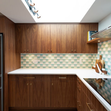
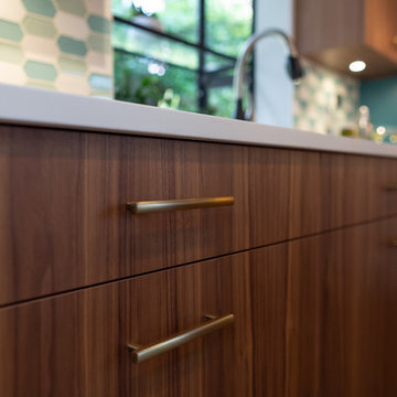
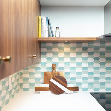
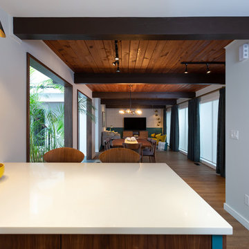
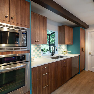
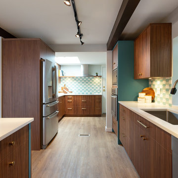
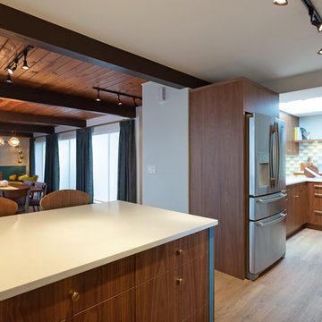
My House Design/Build Team | www.myhousedesignbuild.com | 604-694-6873 | Duy Nguyen Photography -------------------------------------------------------Right from the beginning it was evident that this Coquitlam Renovation was unique. It’s first impression was memorable as immediately after entering the front door, just past the dining table, there was a tree growing in the middle of home! Upon further inspection of the space it became apparent that this home had undergone several alterations during its lifetime... The kitchen was once a space that revealed the home’s layered history. It was evident there had been an addition as the dropped ceiling exposed where garage space had been captured to become part of the kitchen. By re-configuring the layout, we were able to create a gathering area at the peninsula, additional storage space, as well as add a hood fan – something the original space was lacking. Details like the Grand Canal paint colour from Sherwin Williams paired with the vertical grain walnut cabinets create a modern-vintage feel for this kitchen.
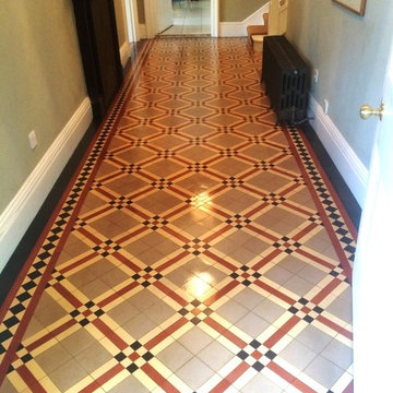
 Tile Doctor Ltd
A client from the village of Heytesbury contacted me to see whether we could improve the look of her Victorian tiled hallway floor. It turns out that a competitor had previously cleaned and sealed it two years prior but she was disappointed with the result once she realised that the floor still had dirt ingrained in the tile. As per our normal practice we ran a test clean and she booked us in immediately.
We started by wetting the floor using a strong solution of Tile Doctor Pro-Clean and left it dwell for ten minutes. We then attached a black stripping pad to a rotary machine and slowly covered the whole area to remove ingrained dirt and any existing seals that may be evident. The dirty slurry was then removed with a wet vacuum and then floor rinsed with the aid of a deck brush and a wet vacuum.
Next we used a heavy duty scraper to remove paint splashes around the edges from years of decorating. Once we were satisfied we’d removed all evident dirt, seal and paint we rinsed the floor thoroughly several times to make sure all contaminants are removed again using the wet vacuum to remove the water.
We returned five days later to let the floor dry out thoroughly. Upon our return we tested with a damp meter which tested fine so we proceeded to seal the floor using six coats of Tile Doctor Seal & Go to provide protection and add a nice sheen to the floor which I think you will agree now looks amazing.
Stuart Ford
Wiltshire Tile Doctor
 My House Design|Build|Team
My House Design/Build Team | www.myhousedesignbuild.com | 604-694-6873 | Duy Nguyen Photography -------------------------------------------------------Right from the beginning it was evident that this Coquitlam Renovation was unique. It’s first impression was memorable as immediately after entering the front door, just past the dining table, there was a tree growing in the middle of home! Upon further inspection of the space it became apparent that this home had undergone several alterations during its lifetime... The kitchen was once a space that revealed the home’s layered history. It was evident there had been an addition as the dropped ceiling exposed where garage space had been captured to become part of the kitchen. By re-configuring the layout, we were able to create a gathering area at the peninsula, additional storage space, as well as add a hood fan – something the original space was lacking. Details like the Grand Canal paint colour from Sherwin Williams paired with the vertical grain walnut cabinets create a modern-vintage feel for this kitchen.
 My House Design|Build|Team
My House Design/Build Team | www.myhousedesignbuild.com | 604-694-6873 | Duy Nguyen Photography -------------------------------------------------------Right from the beginning it was evident that this Coquitlam Renovation was unique. It’s first impression was memorable as immediately after entering the front door, just past the dining table, there was a tree growing in the middle of home! Upon further inspection of the space it became apparent that this home had undergone several alterations during its lifetime... The kitchen was once a space that revealed the home’s layered history. It was evident there had been an addition as the dropped ceiling exposed where garage space had been captured to become part of the kitchen. By re-configuring the layout, we were able to create a gathering area at the peninsula, additional storage space, as well as add a hood fan – something the original space was lacking. Details like the Grand Canal paint colour from Sherwin Williams paired with the vertical grain walnut cabinets create a modern-vintage feel for this kitchen.
 My House Design|Build|Team
My House Design/Build Team | www.myhousedesignbuild.com | 604-694-6873 | Duy Nguyen Photography -------------------------------------------------------Right from the beginning it was evident that this Coquitlam Renovation was unique. It’s first impression was memorable as immediately after entering the front door, just past the dining table, there was a tree growing in the middle of home! Upon further inspection of the space it became apparent that this home had undergone several alterations during its lifetime... The kitchen was once a space that revealed the home’s layered history. It was evident there had been an addition as the dropped ceiling exposed where garage space had been captured to become part of the kitchen. By re-configuring the layout, we were able to create a gathering area at the peninsula, additional storage space, as well as add a hood fan – something the original space was lacking. Details like the Grand Canal paint colour from Sherwin Williams paired with the vertical grain walnut cabinets create a modern-vintage feel for this kitchen.
 My House Design|Build|Team
My House Design/Build Team | www.myhousedesignbuild.com | 604-694-6873 | Duy Nguyen Photography -------------------------------------------------------Right from the beginning it was evident that this Coquitlam Renovation was unique. It’s first impression was memorable as immediately after entering the front door, just past the dining table, there was a tree growing in the middle of home! Upon further inspection of the space it became apparent that this home had undergone several alterations during its lifetime... The kitchen was once a space that revealed the home’s layered history. It was evident there had been an addition as the dropped ceiling exposed where garage space had been captured to become part of the kitchen. By re-configuring the layout, we were able to create a gathering area at the peninsula, additional storage space, as well as add a hood fan – something the original space was lacking. Details like the Grand Canal paint colour from Sherwin Williams paired with the vertical grain walnut cabinets create a modern-vintage feel for this kitchen.
 My House Design|Build|Team
My House Design/Build Team | www.myhousedesignbuild.com | 604-694-6873 | Duy Nguyen Photography -------------------------------------------------------Right from the beginning it was evident that this Coquitlam Renovation was unique. It’s first impression was memorable as immediately after entering the front door, just past the dining table, there was a tree growing in the middle of home! Upon further inspection of the space it became apparent that this home had undergone several alterations during its lifetime... The kitchen was once a space that revealed the home’s layered history. It was evident there had been an addition as the dropped ceiling exposed where garage space had been captured to become part of the kitchen. By re-configuring the layout, we were able to create a gathering area at the peninsula, additional storage space, as well as add a hood fan – something the original space was lacking. Details like the Grand Canal paint colour from Sherwin Williams paired with the vertical grain walnut cabinets create a modern-vintage feel for this kitchen.
 My House Design|Build|Team
My House Design/Build Team | www.myhousedesignbuild.com | 604-694-6873 | Duy Nguyen Photography -------------------------------------------------------Right from the beginning it was evident that this Coquitlam Renovation was unique. It’s first impression was memorable as immediately after entering the front door, just past the dining table, there was a tree growing in the middle of home! Upon further inspection of the space it became apparent that this home had undergone several alterations during its lifetime... The kitchen was once a space that revealed the home’s layered history. It was evident there had been an addition as the dropped ceiling exposed where garage space had been captured to become part of the kitchen. By re-configuring the layout, we were able to create a gathering area at the peninsula, additional storage space, as well as add a hood fan – something the original space was lacking. Details like the Grand Canal paint colour from Sherwin Williams paired with the vertical grain walnut cabinets create a modern-vintage feel for this kitchen.
 My House Design|Build|Team
My House Design/Build Team | www.myhousedesignbuild.com | 604-694-6873 | Duy Nguyen Photography -------------------------------------------------------Right from the beginning it was evident that this Coquitlam Renovation was unique. It’s first impression was memorable as immediately after entering the front door, just past the dining table, there was a tree growing in the middle of home! Upon further inspection of the space it became apparent that this home had undergone several alterations during its lifetime... The kitchen was once a space that revealed the home’s layered history. It was evident there had been an addition as the dropped ceiling exposed where garage space had been captured to become part of the kitchen. By re-configuring the layout, we were able to create a gathering area at the peninsula, additional storage space, as well as add a hood fan – something the original space was lacking. Details like the Grand Canal paint colour from Sherwin Williams paired with the vertical grain walnut cabinets create a modern-vintage feel for this kitchen.
 My House Design|Build|Team
My House Design/Build Team | www.myhousedesignbuild.com | 604-694-6873 | Duy Nguyen Photography -------------------------------------------------------Right from the beginning it was evident that this Coquitlam Renovation was unique. It’s first impression was memorable as immediately after entering the front door, just past the dining table, there was a tree growing in the middle of home! Upon further inspection of the space it became apparent that this home had undergone several alterations during its lifetime... The kitchen was once a space that revealed the home’s layered history. It was evident there had been an addition as the dropped ceiling exposed where garage space had been captured to become part of the kitchen. By re-configuring the layout, we were able to create a gathering area at the peninsula, additional storage space, as well as add a hood fan – something the original space was lacking. Details like the Grand Canal paint colour from Sherwin Williams paired with the vertical grain walnut cabinets create a modern-vintage feel for this kitchen.
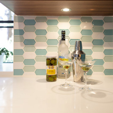 My House Design|Build|Team
My House Design/Build Team | www.myhousedesignbuild.com | 604-694-6873 | Duy Nguyen Photography -------------------------------------------------------Right from the beginning it was evident that this Coquitlam Renovation was unique. It’s first impression was memorable as immediately after entering the front door, just past the dining table, there was a tree growing in the middle of home! Upon further inspection of the space it became apparent that this home had undergone several alterations during its lifetime... The kitchen was once a space that revealed the home’s layered history. It was evident there had been an addition as the dropped ceiling exposed where garage space had been captured to become part of the kitchen. By re-configuring the layout, we were able to create a gathering area at the peninsula, additional storage space, as well as add a hood fan – something the original space was lacking. Details like the Grand Canal paint colour from Sherwin Williams paired with the vertical grain walnut cabinets create a modern-vintage feel for this kitchen.
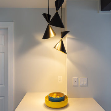 My House Design|Build|Team
My House Design/Build Team | www.myhousedesignbuild.com | 604-694-6873 | Duy Nguyen Photography -------------------------------------------------------Right from the beginning it was evident that this Coquitlam Renovation was unique. It’s first impression was memorable as immediately after entering the front door, just past the dining table, there was a tree growing in the middle of home! Upon further inspection of the space it became apparent that this home had undergone several alterations during its lifetime... The kitchen was once a space that revealed the home’s layered history. It was evident there had been an addition as the dropped ceiling exposed where garage space had been captured to become part of the kitchen. By re-configuring the layout, we were able to create a gathering area at the peninsula, additional storage space, as well as add a hood fan – something the original space was lacking. Details like the Grand Canal paint colour from Sherwin Williams paired with the vertical grain walnut cabinets create a modern-vintage feel for this kitchen.
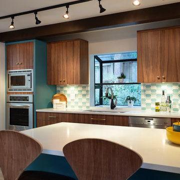 My House Design|Build|Team
My House Design/Build Team | www.myhousedesignbuild.com | 604-694-6873 | Duy Nguyen Photography -------------------------------------------------------Right from the beginning it was evident that this Coquitlam Renovation was unique. It’s first impression was memorable as immediately after entering the front door, just past the dining table, there was a tree growing in the middle of home! Upon further inspection of the space it became apparent that this home had undergone several alterations during its lifetime... The kitchen was once a space that revealed the home’s layered history. It was evident there had been an addition as the dropped ceiling exposed where garage space had been captured to become part of the kitchen. By re-configuring the layout, we were able to create a gathering area at the peninsula, additional storage space, as well as add a hood fan – something the original space was lacking. Details like the Grand Canal paint colour from Sherwin Williams paired with the vertical grain walnut cabinets create a modern-vintage feel for this kitchen.
 Tile Doctor Ltd
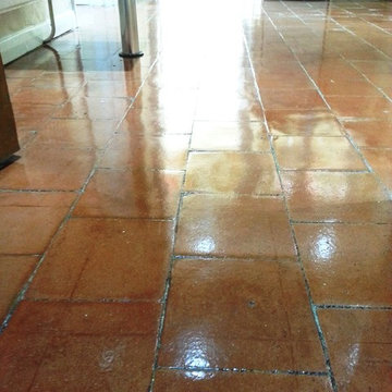
This was an unusual request in that this customer, in the small Bedfordshire village of Cople, had her Kitchen Quarry tiled floor cleaned and sealed six months earlier by another company. The sealer had come off and it soon became evident that after the work had been carried out the client was ill advised as to the correct maintenance of her floor. The cleaning product left by the previous company was totally unsuitable and over the course of six months she had managed in fact to slowly strip the sealer off of the tiles.
I soon realised the problem and advised that the only solution would be to strip any remaining sealer off the floor and re-seal, it’s generally not good practice to apply a different sealer on top of an existing sealer as there can be compatibility issues and the floor may look different in places where there are more layers of seal.
I used a strong dilution of Tile Doctor Pro-Clean to strip any remaining sealer off the tiles and clean them in the process, this involves spreading the solution over the tiles, allow it to dwell and soak in and then scrubbing the solution into the floor using a rotary machine fitted with a black scrubbing pad. The floor was then rinsed with water applied with a mop and bucket and the soiled water extracted using a wet vacuum. One the floor was clean I noticed there was evidence of concrete dust and grout haze on the surface of the tiles from when they were installed so I applied a another Tile Doctor product called Grout Clean-up to remove it, again the floor was thoroughly rinsed with water which was extracted the floor dried using air movers.
Tiled floors need to be dry before sealing and so I left this floor for four days to allow enough time for it to thoroughly dry out before returning to seal it. Choice of sealer for this floor was four coats of Tile Doctor Seal and Go which is a water based sealer so it doesn’t leave a smell and additionally adds a nice subtle shine to the floor. The difference was transformational as the sealer really does bring out the best in the quarry tiles.
Before leaving we have provided the customer a bottle of Tile Doctor Neutral Tile Cleaner which is the correct cleaning agent to maintain a sealed floor. It has a neutral PH formula so it won’t erode the sealer like many of the acidic floor cleaning products you find in the supermarket which are really only meant for use on Vinyl or Ceramic tiles.
Andrew Evans
Bedfordshire Tile Doctor
9