
Search results for "Exaggerated" in Home Design Ideas
 TVL Creative Ltd.
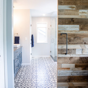
This project is an incredible transformation and the perfect example of successful style mixing! This client, and now a good friend of TVL (as they all become), is a wonderfully eclectic and adventurous one with immense interest in texture play, pops of color, and unique applications. Our scope in this home included a full kitchen renovation, main level powder room renovation, and a master bathroom overhaul. Taking just over a year to complete from the first design phases to final photos, this project was so insanely fun and packs an amazing amount of fun details and lively surprises. The original kitchen was large and fairly functional. However, the cabinetry was dated, the lighting was inefficient and frankly ugly, and the space was lacking personality in general. Our client desired maximized storage and a more personalized aesthetic. The existing cabinets were short and left the nice height of the space under-utilized. We integrated new gray shaker cabinets from Waypoint Living Spaces and ran them to the ceiling to really exaggerate the height of the space and to maximize usable storage as much as possible. The upper cabinets are glass and lit from within, offering display space or functional storage as the client needs. The central feature of this space is the large cobalt blue range from Viking as well as the custom made reclaimed wood range hood floating above. The backsplash along this entire wall is vertical slab of marble look quartz from Pental Surfaces. This matches the expanse of the same countertop that wraps the room. Flanking the range, we installed cobalt blue lantern penny tile from Merola Tile for a playful texture that adds visual interest and class to the entire room. We upgraded the lighting in the ceiling, under the cabinets, and within cabinets--we also installed accent sconces over each window on the sink wall to create cozy and functional illumination. The deep, textured front Whitehaven apron sink is a dramatic nod to the farmhouse aesthetic from KOHLER, and it's paired with the bold and industrial inspired Tournant faucet, also from Kohler. We finalized this space with other gorgeous appliances, a super sexy dining table and chair set from Room & Board, the Paxton dining light from Pottery Barn and a small bar area and pantry on the far end of the space. In the small powder room on the main level, we converted a drab builder-grade space into a super cute, rustic-inspired washroom. We utilized the Bonner vanity from Signature Hardware and paired this with the cute Ashfield faucet from Pfister. The most unique statements in this room include the water-drop light over the vanity from Shades Of Light, the copper-look porcelain floor tile from Pental Surfaces and the gorgeous Cashmere colored Tresham toilet from Kohler. Up in the master bathroom, elegance abounds. Using the same footprint, we upgraded everything in this space to reflect the client's desire for a more bright, patterned and pretty space. Starting at the entry, we installed a custom reclaimed plank barn door with bold large format hardware from Rustica Hardware. In the bathroom, the custom slate blue vanity from Tharp Cabinet Company is an eye catching statement piece. This is paired with gorgeous hardware from Amerock, vessel sinks from Kohler, and Purist faucets also from Kohler. We replaced the old built-in bathtub with a new freestanding soaker from Signature Hardware. The floor tile is a bold, graphic porcelain tile with a classic color scheme. The shower was upgraded with new tile and fixtures throughout: new clear glass, gorgeous distressed subway tile from the Castle line from TileBar, and a sophisticated shower panel from Vigo. We finalized the space with a small crystal chandelier and soft gray paint. This project is a stunning conversion and we are so thrilled that our client can enjoy these personalized spaces for years to come. Special thanks to the amazing Ian Burks of Burks Wurks Construction for bringing this to life!
 Two Navy Lane
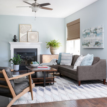
The Family Room included a sofa, coffee table, and piano that the family wanted to keep. We wanted to ensure that this space worked with higher volumes of foot traffic, more frequent use, and of course… the occasional spills. We used an indoor/outdoor rug that is soft underfoot and brought in the beautiful coastal aquas and blues with it. A sturdy oak cabinet atop brass metal legs makes for an organized place to stash games, art supplies, and toys to keep the family room neat and tidy, while still allowing for a space to live.
Even the remotes and video game controllers have their place. Behind the media stand is a feature wall, done by our contractor per our design, which turned out phenomenally! It features an exaggerated and unique diamond pattern.
We love to design spaces that are just as functional, as they are beautiful.
 TVL Creative Ltd.
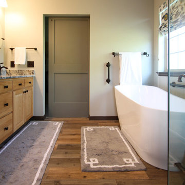
This remodel took a dated and cramped bathroom and transformed it into a classy oasis for our Lowry clients. The clients had a limited budget and wanted to leave the space as in-place as possible. However, the large drop in tub ate valuable floor space and a half wall between the shower and tub had become a holding place for random items without a home. The thick frame on the shower glass made the shower feel extremely small, and the dated lighting and fixtures further depressed the space. We proposed a traditional and elegant design that consider the client's budgetary and spatial constraints. We removed the existing drop-in tub and replaced it with a lovely free-standing soaker. The length of this tub is short, but the depth is exaggerated, making it an ideal replacement in this tiny footprint. The shower glass was swapped for framless glass that boldly expands space. We tore out the existing carpet and installed gorgeous wood-look tile that adds depth and warmth to the room. The clients opted to keep their existing vanity to save cost, so a new top was added to bring the aesthetic up to the level of the new additions. The wall paint was taken from a buttery yellow to a soft gray-green, accented by a darker version of this same color on the siding barn door and toilet room door. New vanity lights, faucets, and storage shelves were installed to help our clients organize and keep things off the counter tops. Finally, new custom up-down window shades were curated for the bathroom to add to the final touch. This space is a simple scope with a dramatic transformation that introduces a timeless look for years to come.
Find the right local pro for your project
 TVL Creative Ltd.
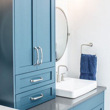
This project is an incredible transformation and the perfect example of successful style mixing! This client, and now a good friend of TVL (as they all become), is a wonderfully eclectic and adventurous one with immense interest in texture play, pops of color, and unique applications. Our scope in this home included a full kitchen renovation, main level powder room renovation, and a master bathroom overhaul. Taking just over a year to complete from the first design phases to final photos, this project was so insanely fun and packs an amazing amount of fun details and lively surprises. The original kitchen was large and fairly functional. However, the cabinetry was dated, the lighting was inefficient and frankly ugly, and the space was lacking personality in general. Our client desired maximized storage and a more personalized aesthetic. The existing cabinets were short and left the nice height of the space under-utilized. We integrated new gray shaker cabinets from Waypoint Living Spaces and ran them to the ceiling to really exaggerate the height of the space and to maximize usable storage as much as possible. The upper cabinets are glass and lit from within, offering display space or functional storage as the client needs. The central feature of this space is the large cobalt blue range from Viking as well as the custom made reclaimed wood range hood floating above. The backsplash along this entire wall is vertical slab of marble look quartz from Pental Surfaces. This matches the expanse of the same countertop that wraps the room. Flanking the range, we installed cobalt blue lantern penny tile from Merola Tile for a playful texture that adds visual interest and class to the entire room. We upgraded the lighting in the ceiling, under the cabinets, and within cabinets--we also installed accent sconces over each window on the sink wall to create cozy and functional illumination. The deep, textured front Whitehaven apron sink is a dramatic nod to the farmhouse aesthetic from KOHLER, and it's paired with the bold and industrial inspired Tournant faucet, also from Kohler. We finalized this space with other gorgeous appliances, a super sexy dining table and chair set from Room & Board, the Paxton dining light from Pottery Barn and a small bar area and pantry on the far end of the space. In the small powder room on the main level, we converted a drab builder-grade space into a super cute, rustic-inspired washroom. We utilized the Bonner vanity from Signature Hardware and paired this with the cute Ashfield faucet from Pfister. The most unique statements in this room include the water-drop light over the vanity from Shades Of Light, the copper-look porcelain floor tile from Pental Surfaces and the gorgeous Cashmere colored Tresham toilet from Kohler. Up in the master bathroom, elegance abounds. Using the same footprint, we upgraded everything in this space to reflect the client's desire for a more bright, patterned and pretty space. Starting at the entry, we installed a custom reclaimed plank barn door with bold large format hardware from Rustica Hardware. In the bathroom, the custom slate blue vanity from Tharp Cabinet Company is an eye catching statement piece. This is paired with gorgeous hardware from Amerock, vessel sinks from Kohler, and Purist faucets also from Kohler. We replaced the old built-in bathtub with a new freestanding soaker from Signature Hardware. The floor tile is a bold, graphic porcelain tile with a classic color scheme. The shower was upgraded with new tile and fixtures throughout: new clear glass, gorgeous distressed subway tile from the Castle line from TileBar, and a sophisticated shower panel from Vigo. We finalized the space with a small crystal chandelier and soft gray paint. This project is a stunning conversion and we are so thrilled that our client can enjoy these personalized spaces for years to come. Special thanks to the amazing Ian Burks of Burks Wurks Construction for bringing this to life!
 Gold Marked Studio
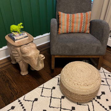
This nursery was inspired by photographs that the mother of the baby took two decades prior in Africa. It is a safari themed nursery designed in a very current way. The exaggerated wicker light fixture shines on a custom emerald green accent wall. It is a space that can easily grow with this baby boy.
 TVL Creative Ltd.
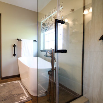
This remodel took a dated and cramped bathroom and transformed it into a classy oasis for our Lowry clients. The clients had a limited budget and wanted to leave the space as in-place as possible. However, the large drop in tub ate valuable floor space and a half wall between the shower and tub had become a holding place for random items without a home. The thick frame on the shower glass made the shower feel extremely small, and the dated lighting and fixtures further depressed the space. We proposed a traditional and elegant design that consider the client's budgetary and spatial constraints. We removed the existing drop-in tub and replaced it with a lovely free-standing soaker. The length of this tub is short, but the depth is exaggerated, making it an ideal replacement in this tiny footprint. The shower glass was swapped for framless glass that boldly expands space. We tore out the existing carpet and installed gorgeous wood-look tile that adds depth and warmth to the room. The clients opted to keep their existing vanity to save cost, so a new top was added to bring the aesthetic up to the level of the new additions. The wall paint was taken from a buttery yellow to a soft gray-green, accented by a darker version of this same color on the siding barn door and toilet room door. New vanity lights, faucets, and storage shelves were installed to help our clients organize and keep things off the counter tops. Finally, new custom up-down window shades were curated for the bathroom to add to the final touch. This space is a simple scope with a dramatic transformation that introduces a timeless look for years to come.
 Western Cabinets
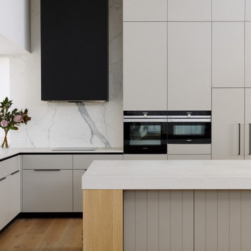
An existing 70’s brick home nestled streets away from the beach, is in dire need of a transformation. The existing home had the bones to accommodate a substantial renovation, some modifications to the layout, adding an extension and exaggerating the existing raked ceilings in the main living area impacts the new home.
The home itself is a relatively disjointed 70’s home, so cleaver planning was imperative to make the most of the interior space. Large open plan living areas with adjoining outdoor entertaining was important. The owners are a young family who enjoy family and entertaining so interaction with the outdoor alfresco was essential not only for quality of living but to appear as a continuation of the main living area to increase the zone visually.
My client’s fresh approach; introduction of modern materials with a hint of Scandinavian and industrial, an improved working area and a functional space for cooking and preparing meals.
 TVL Creative Ltd.
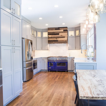
This project is an incredible transformation and the perfect example of successful style mixing! This client, and now a good friend of TVL (as they all become), is a wonderfully eclectic and adventurous one with immense interest in texture play, pops of color, and unique applications. Our scope in this home included a full kitchen renovation, main level powder room renovation, and a master bathroom overhaul. Taking just over a year to complete from the first design phases to final photos, this project was so insanely fun and packs an amazing amount of fun details and lively surprises. The original kitchen was large and fairly functional. However, the cabinetry was dated, the lighting was inefficient and frankly ugly, and the space was lacking personality in general. Our client desired maximized storage and a more personalized aesthetic. The existing cabinets were short and left the nice height of the space under-utilized. We integrated new gray shaker cabinets from Waypoint Living Spaces and ran them to the ceiling to really exaggerate the height of the space and to maximize usable storage as much as possible. The upper cabinets are glass and lit from within, offering display space or functional storage as the client needs. The central feature of this space is the large cobalt blue range from Viking as well as the custom made reclaimed wood range hood floating above. The backsplash along this entire wall is vertical slab of marble look quartz from Pental Surfaces. This matches the expanse of the same countertop that wraps the room. Flanking the range, we installed cobalt blue lantern penny tile from Merola Tile for a playful texture that adds visual interest and class to the entire room. We upgraded the lighting in the ceiling, under the cabinets, and within cabinets--we also installed accent sconces over each window on the sink wall to create cozy and functional illumination. The deep, textured front Whitehaven apron sink is a dramatic nod to the farmhouse aesthetic from KOHLER, and it's paired with the bold and industrial inspired Tournant faucet, also from Kohler. We finalized this space with other gorgeous appliances, a super sexy dining table and chair set from Room & Board, the Paxton dining light from Pottery Barn and a small bar area and pantry on the far end of the space. In the small powder room on the main level, we converted a drab builder-grade space into a super cute, rustic-inspired washroom. We utilized the Bonner vanity from Signature Hardware and paired this with the cute Ashfield faucet from Pfister. The most unique statements in this room include the water-drop light over the vanity from Shades Of Light, the copper-look porcelain floor tile from Pental Surfaces and the gorgeous Cashmere colored Tresham toilet from Kohler. Up in the master bathroom, elegance abounds. Using the same footprint, we upgraded everything in this space to reflect the client's desire for a more bright, patterned and pretty space. Starting at the entry, we installed a custom reclaimed plank barn door with bold large format hardware from Rustica Hardware. In the bathroom, the custom slate blue vanity from Tharp Cabinet Company is an eye catching statement piece. This is paired with gorgeous hardware from Amerock, vessel sinks from Kohler, and Purist faucets also from Kohler. We replaced the old built-in bathtub with a new freestanding soaker from Signature Hardware. The floor tile is a bold, graphic porcelain tile with a classic color scheme. The shower was upgraded with new tile and fixtures throughout: new clear glass, gorgeous distressed subway tile from the Castle line from TileBar, and a sophisticated shower panel from Vigo. We finalized the space with a small crystal chandelier and soft gray paint. This project is a stunning conversion and we are so thrilled that our client can enjoy these personalized spaces for years to come.
 McCall Design & Planning
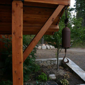
The clients for this project wanted a home with a traditional feel that fit the local aesthetic, but with a contemporary flare. The gabled forms and materials call back, while the exaggerated knee-braces and large banks of windows lend a little modernity. With a northerly exposure towards the lake the design opens up to the view without having concerns about excessive solar gain. A personal touch was added by the client fabricating the brackets for the post and beam connections.
 TVL Creative Ltd.
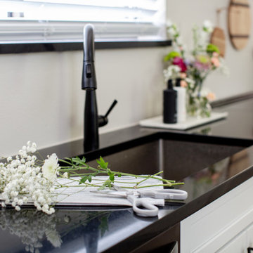
The Oak Street renovation has completely transformed the 70’s era split level home into a sophisticated modern oasis! By extending the kitchen into the existing dining room space, we’re able to maximize functionality and flow between the kitchen and new dining room area. By opening up the wall to create a large pass-through between kitchen and dining, we’ve created the perfect solution to visibly combine all areas and make an ideal design solution for entertaining while providing plenty of seating around the peninsula. High vaulted ceilings exaggerate the ceiling height and work beautifully with the tall cabinetry which brings the down the human scale of vertical space. Slick black Cambria Black quartz countertops and dark metal finishes provide high contrast against the white cabinets and create a high end look. A warm gray stained oak hardwood flooring adds warmth to the space keeping the overall look light and soft. It’s easy to see why this beautiful kitchen transformation has become the heart of the home with a new functional, modern design for the whole family.
 TVL Creative Ltd.
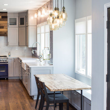
This project is an incredible transformation and the perfect example of successful style mixing! This client, and now a good friend of TVL (as they all become), is a wonderfully eclectic and adventurous one with immense interest in texture play, pops of color, and unique applications. Our scope in this home included a full kitchen renovation, main level powder room renovation, and a master bathroom overhaul. Taking just over a year to complete from the first design phases to final photos, this project was so insanely fun and packs an amazing amount of fun details and lively surprises. The original kitchen was large and fairly functional. However, the cabinetry was dated, the lighting was inefficient and frankly ugly, and the space was lacking personality in general. Our client desired maximized storage and a more personalized aesthetic. The existing cabinets were short and left the nice height of the space under-utilized. We integrated new gray shaker cabinets from Waypoint Living Spaces and ran them to the ceiling to really exaggerate the height of the space and to maximize usable storage as much as possible. The upper cabinets are glass and lit from within, offering display space or functional storage as the client needs. The central feature of this space is the large cobalt blue range from Viking as well as the custom made reclaimed wood range hood floating above. The backsplash along this entire wall is vertical slab of marble look quartz from Pental Surfaces. This matches the expanse of the same countertop that wraps the room. Flanking the range, we installed cobalt blue lantern penny tile from Merola Tile for a playful texture that adds visual interest and class to the entire room. We upgraded the lighting in the ceiling, under the cabinets, and within cabinets--we also installed accent sconces over each window on the sink wall to create cozy and functional illumination. The deep, textured front Whitehaven apron sink is a dramatic nod to the farmhouse aesthetic from KOHLER, and it's paired with the bold and industrial inspired Tournant faucet, also from Kohler. We finalized this space with other gorgeous appliances, a super sexy dining table and chair set from Room & Board, the Paxton dining light from Pottery Barn and a small bar area and pantry on the far end of the space. In the small powder room on the main level, we converted a drab builder-grade space into a super cute, rustic-inspired washroom. We utilized the Bonner vanity from Signature Hardware and paired this with the cute Ashfield faucet from Pfister. The most unique statements in this room include the water-drop light over the vanity from Shades Of Light, the copper-look porcelain floor tile from Pental Surfaces and the gorgeous Cashmere colored Tresham toilet from Kohler. Up in the master bathroom, elegance abounds. Using the same footprint, we upgraded everything in this space to reflect the client's desire for a more bright, patterned and pretty space. Starting at the entry, we installed a custom reclaimed plank barn door with bold large format hardware from Rustica Hardware. In the bathroom, the custom slate blue vanity from Tharp Cabinet Company is an eye catching statement piece. This is paired with gorgeous hardware from Amerock, vessel sinks from Kohler, and Purist faucets also from Kohler. We replaced the old built-in bathtub with a new freestanding soaker from Signature Hardware. The floor tile is a bold, graphic porcelain tile with a classic color scheme. The shower was upgraded with new tile and fixtures throughout: new clear glass, gorgeous distressed subway tile from the Castle line from TileBar, and a sophisticated shower panel from Vigo. We finalized the space with a small crystal chandelier and soft gray paint. This project is a stunning conversion and we are so thrilled that our client can enjoy these personalized spaces for years to come.
 Direct From The Designers | House Plans
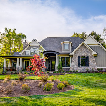
Brand new craftsman cottage house plan 4838 from DFDhouseplans.com.
http://www.dfdhouseplans.com/plan/4838/
 Slater Architects
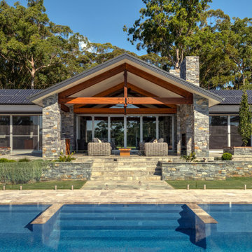
This sprawling pavilion style home with separate bedrooms wings is connected by a central kitchen and living spaces. The kitchen incorporates a large island bench and butler’s pantry, while the living room features floating timber shelves and a dual access, stone fireplace. The kitchen and dining space features exposed hardwood timber trusses with exaggerated connection details which continues outside to the outdoor entertaining area.
Our palette of natural stone and timber was used inside and out to create a comfortable living environment connected to the surrounding bushland.
 Kim Grant Design Inc
Kim Grant, Architect;
Paul Schatz, Interior Designer -Interior Design Imports;
Esther Lowe, Photographer
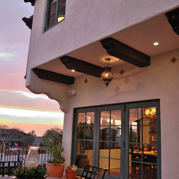
Mediterranean white two-story stucco exterior home idea in San Diego
Mediterranean white two-story stucco exterior home idea in San Diego
 TVL Creative Ltd.
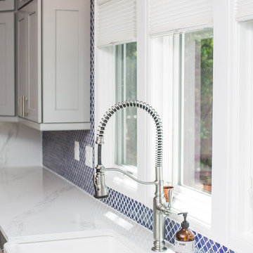
This project is an incredible transformation and the perfect example of successful style mixing! This client, and now a good friend of TVL (as they all become), is a wonderfully eclectic and adventurous one with immense interest in texture play, pops of color, and unique applications. Our scope in this home included a full kitchen renovation, main level powder room renovation, and a master bathroom overhaul. Taking just over a year to complete from the first design phases to final photos, this project was so insanely fun and packs an amazing amount of fun details and lively surprises. The original kitchen was large and fairly functional. However, the cabinetry was dated, the lighting was inefficient and frankly ugly, and the space was lacking personality in general. Our client desired maximized storage and a more personalized aesthetic. The existing cabinets were short and left the nice height of the space under-utilized. We integrated new gray shaker cabinets from Waypoint Living Spaces and ran them to the ceiling to really exaggerate the height of the space and to maximize usable storage as much as possible. The upper cabinets are glass and lit from within, offering display space or functional storage as the client needs. The central feature of this space is the large cobalt blue range from Viking as well as the custom made reclaimed wood range hood floating above. The backsplash along this entire wall is vertical slab of marble look quartz from Pental Surfaces. This matches the expanse of the same countertop that wraps the room. Flanking the range, we installed cobalt blue lantern penny tile from Merola Tile for a playful texture that adds visual interest and class to the entire room. We upgraded the lighting in the ceiling, under the cabinets, and within cabinets--we also installed accent sconces over each window on the sink wall to create cozy and functional illumination. The deep, textured front Whitehaven apron sink is a dramatic nod to the farmhouse aesthetic from KOHLER, and it's paired with the bold and industrial inspired Tournant faucet, also from Kohler. We finalized this space with other gorgeous appliances, a super sexy dining table and chair set from Room & Board, the Paxton dining light from Pottery Barn and a small bar area and pantry on the far end of the space. In the small powder room on the main level, we converted a drab builder-grade space into a super cute, rustic-inspired washroom. We utilized the Bonner vanity from Signature Hardware and paired this with the cute Ashfield faucet from Pfister. The most unique statements in this room include the water-drop light over the vanity from Shades Of Light, the copper-look porcelain floor tile from Pental Surfaces and the gorgeous Cashmere colored Tresham toilet from Kohler. Up in the master bathroom, elegance abounds. Using the same footprint, we upgraded everything in this space to reflect the client's desire for a more bright, patterned and pretty space. Starting at the entry, we installed a custom reclaimed plank barn door with bold large format hardware from Rustica Hardware. In the bathroom, the custom slate blue vanity from Tharp Cabinet Company is an eye catching statement piece. This is paired with gorgeous hardware from Amerock, vessel sinks from Kohler, and Purist faucets also from Kohler. We replaced the old built-in bathtub with a new freestanding soaker from Signature Hardware. The floor tile is a bold, graphic porcelain tile with a classic color scheme. The shower was upgraded with new tile and fixtures throughout: new clear glass, gorgeous distressed subway tile from the Castle line from TileBar, and a sophisticated shower panel from Vigo. We finalized the space with a small crystal chandelier and soft gray paint. This project is a stunning conversion and we are so thrilled that our client can enjoy these personalized spaces for years to come.
 Mid in Mod
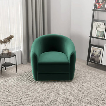
34.2"W x 30"D x 30"H
Italian designer Spring is a fashion-forward accent chair exuding modern charm. Enjoy comfortable wrapped teddy boucle or performance fabric soft foam padded cushioning for reading or watching TV. Sturdy, corner blocked solid wood frame and slightly exaggerated sculptural curves offer a fresh take on the classic lounge chair. Petite in stature, it's perfect for cozy corners and smaller rooms
 sk7 design studios, inc.
Magnolia - Carlsbad, CA - 3,212 SF + 4BD + 3.5 BA
Architectural Style: Modern Farmhouse
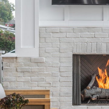
Magnolia is a significant transformation of the owner's childhood home. Features like the steep 12:12 metal roofs softening to 3:12 pitches; soft arch shaped doug fir beams; custom designed double gable brackets; exaggerated beam extensions; a detached arched/ louvered carport marching along the front of the home; an expansive rear deck with beefy brick bases with quad columns, large protruding arched beams; an arched louvered structure centered on an outdoor fireplace; cased out openings and detailed trim work throughout the home; and many other architectural features have created a unique and elegant home along Highland Ave. in Carlsbad, California.
 Nicodemus Design
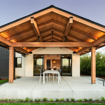
Covered outdoor living off of the kitchen, seen through sliding glass doors. Heavy timber beams span from interior to exterior throughout the project. Purlins were used instead of a ridge beam. Steel king posts were used instead of wood, which helps to exaggerate the purlins' flight towards the exterior
 Glow Lighting
DECEMBER 2014
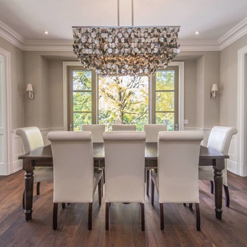
For this project the scale of the Montego Bay oversized rectangular chandelier was perfect for the dining room. The high ceilings, room size as well as the large dining table required a light fixture with substance and presence.
Iridescent Mother of Pearl shell extensions were added to each layer, with the inside tier even more exaggerated. The dramatic customized Mother of Pearl shell chandelier was the focal point of the open concept main floor.

12