
Search results for "Exaggerated" in Home Design Ideas
 Sovereign
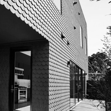
THE SHADOW HOUSE IS A PRODUCT OF THE CONTEXT IT SITS WITHIN, YET IT SUBVERTS IT AT THE SAME TIME. IT’S IMPOSSIBLE TO IGNORE IT UP CLOSE, YET FROM AFAR IT DISAPPEARS INTO THE ETHER. A TINY LOT, A LARGE PROGRAM, RESTRICTIVE ZONING REGULATIONS AND AN INVOLVED NEIGHBORHOOD INTEREST GROUP WERE THE CONSTANT AND UNRELENTING PRESSURES THAT CREATED THIS HOUSE — AND THE RESULT IS BETTER OFF FOR IT.
THE SCALLOPED SHINGLES ARE A COMMON ELEMENT ACROSS THE NEIGHBORHOOD, BUT ARE OFTEN RESERVED FOR DETAIL AREAS UNDER EAVES, AS THE MATERIAL WAS VERY EXPENSIVE ONE HUNDRED YEARS AGO. WE TOOK THAT HIGHLY-SPECIALIZED, VERY EXCLUSIVE MATERIAL AND APPLIED IT AS A BROAD, MASS-PRODUCED TEXTURE ACROSS THE ENTIRE RESIDENCE — TAKING SOMETHING FROM HIGHLIGHT TO BACKGROUND TEXTURE. THE SILHOUETTE DIRECTLY ECHOES THE ITALIANATE HOMES IN THE LARGER NEIGHBORHOOD — BUT WE STRIPPED THE TYPICAL ORNATE, DECORATED FAÇADE BACK TO UTTER MINIMALISM. WE ENLARGED THE TYPICAL WINDOW SIZE TO EXAGGERATE THE RIGID SYMMETRY OF THE STYLE, AND BROUGHT THEM TO THE FLOOR AND THE CEILING TO PROVIDE AS MUCH LIGHT AS POSSIBLE — AND THEN RECESSED THEM DEEP INTO THE FAÇADE TO MIMIC THE HEAVY BRICK AND STONE LINTELS OF THE PAST.
THE HOUSE IS BLACK — THE ONLY COLOR IT COULD BE. IF WE’D PAINTED IT UP LIKE ITS VICTORIAN SISTERS, IT WOULD’VE COMPETED FOR ATTENTION. BLACK CAUSES THE HOUSE TO SIMULTANEOUSLY DISAPPEAR AND STAND OUT — IT IS IMPOSSIBLE TO IGNORE WHILE YOU’RE WALKING PAST, BUT A FEW BLOCKS AWAY IT BECOMES IMPOSSIBLE TO DISCERN AGAINST THE BACKGROUND.
TWO BEDROOMS WITH EN-SUITE BATHS, FLOOR-TO-CEILING WINDOWS, AN AIRY AND OPEN STAIRCASE AND A MASSIVE GLASS ROOF DOOR MAKE THE SHADOW HOUSE IMPOSSIBLY LIGHT AND OPEN — YET IT’S ONLY 1,400 SQUARE FEET ON A 30’ X 50’ LOT.
 Adam Zollinger Interiors
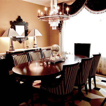
My clients love of the Art Deco design period was the inspiration behind this formal, yet approachable, dining room design.
In order for this room to look "complete" we had to add many elements including chair rail, wallpaper, and custom window treatments to add a feeling of luxury and style. If we kept things too "plan" we would not have been able to achieve this glamorous end result!
Grand host and hostess chairs with exaggerated backs mixed with a fun geometric pattern on the side chairs, plays wistfully with the damask pattern on the wallpaper, as well as the silk drapes.
A shiny centerpiece on the dining table ads a bit of glamour to the tabletop.
 TVL Creative Ltd.
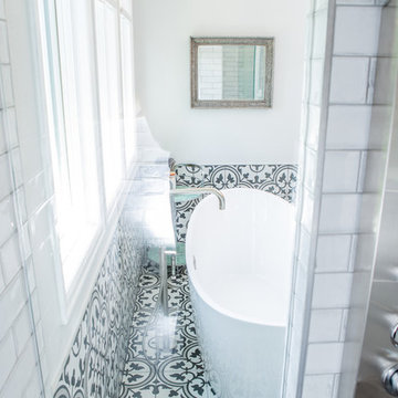
This project is an incredible transformation and the perfect example of successful style mixing! This client, and now a good friend of TVL (as they all become), is a wonderfully eclectic and adventurous one with immense interest in texture play, pops of color, and unique applications. Our scope in this home included a full kitchen renovation, main level powder room renovation, and a master bathroom overhaul. Taking just over a year to complete from the first design phases to final photos, this project was so insanely fun and packs an amazing amount of fun details and lively surprises. The original kitchen was large and fairly functional. However, the cabinetry was dated, the lighting was inefficient and frankly ugly, and the space was lacking personality in general. Our client desired maximized storage and a more personalized aesthetic. The existing cabinets were short and left the nice height of the space under-utilized. We integrated new gray shaker cabinets from Waypoint Living Spaces and ran them to the ceiling to really exaggerate the height of the space and to maximize usable storage as much as possible. The upper cabinets are glass and lit from within, offering display space or functional storage as the client needs. The central feature of this space is the large cobalt blue range from Viking as well as the custom made reclaimed wood range hood floating above. The backsplash along this entire wall is vertical slab of marble look quartz from Pental Surfaces. This matches the expanse of the same countertop that wraps the room. Flanking the range, we installed cobalt blue lantern penny tile from Merola Tile for a playful texture that adds visual interest and class to the entire room. We upgraded the lighting in the ceiling, under the cabinets, and within cabinets--we also installed accent sconces over each window on the sink wall to create cozy and functional illumination. The deep, textured front Whitehaven apron sink is a dramatic nod to the farmhouse aesthetic from KOHLER, and it's paired with the bold and industrial inspired Tournant faucet, also from Kohler. We finalized this space with other gorgeous appliances, a super sexy dining table and chair set from Room & Board, the Paxton dining light from Pottery Barn and a small bar area and pantry on the far end of the space. In the small powder room on the main level, we converted a drab builder-grade space into a super cute, rustic-inspired washroom. We utilized the Bonner vanity from Signature Hardware and paired this with the cute Ashfield faucet from Pfister. The most unique statements in this room include the water-drop light over the vanity from Shades Of Light, the copper-look porcelain floor tile from Pental Surfaces and the gorgeous Cashmere colored Tresham toilet from Kohler. Up in the master bathroom, elegance abounds. Using the same footprint, we upgraded everything in this space to reflect the client's desire for a more bright, patterned and pretty space. Starting at the entry, we installed a custom reclaimed plank barn door with bold large format hardware from Rustica Hardware. In the bathroom, the custom slate blue vanity from Tharp Cabinet Company is an eye catching statement piece. This is paired with gorgeous hardware from Amerock, vessel sinks from Kohler, and Purist faucets also from Kohler. We replaced the old built-in bathtub with a new freestanding soaker from Signature Hardware. The floor tile is a bold, graphic porcelain tile with a classic color scheme. The shower was upgraded with new tile and fixtures throughout: new clear glass, gorgeous distressed subway tile from the Castle line from TileBar, and a sophisticated shower panel from Vigo. We finalized the space with a small crystal chandelier and soft gray paint. This project is a stunning conversion and we are so thrilled that our client can enjoy these personalized spaces for years to come. Special thanks to the amazing Ian Burks of Burks Wurks Construction for bringing this to life!
Find the right local pro for your project
 TVL Creative Ltd.
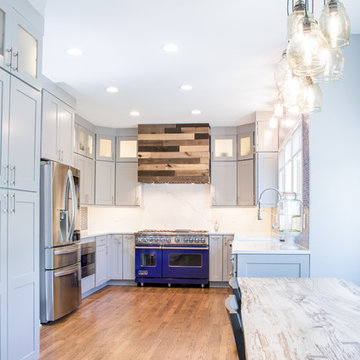
This project is an incredible transformation and the perfect example of successful style mixing! This client, and now a good friend of TVL (as they all become), is a wonderfully eclectic and adventurous one with immense interest in texture play, pops of color, and unique applications. Our scope in this home included a full kitchen renovation, main level powder room renovation, and a master bathroom overhaul. Taking just over a year to complete from the first design phases to final photos, this project was so insanely fun and packs an amazing amount of fun details and lively surprises. The original kitchen was large and fairly functional. However, the cabinetry was dated, the lighting was inefficient and frankly ugly, and the space was lacking personality in general. Our client desired maximized storage and a more personalized aesthetic. The existing cabinets were short and left the nice height of the space under-utilized. We integrated new gray shaker cabinets from Waypoint Living Spaces and ran them to the ceiling to really exaggerate the height of the space and to maximize usable storage as much as possible. The upper cabinets are glass and lit from within, offering display space or functional storage as the client needs. The central feature of this space is the large cobalt blue range from Viking as well as the custom made reclaimed wood range hood floating above. The backsplash along this entire wall is vertical slab of marble look quartz from Pental Surfaces. This matches the expanse of the same countertop that wraps the room. Flanking the range, we installed cobalt blue lantern penny tile from Merola Tile for a playful texture that adds visual interest and class to the entire room. We upgraded the lighting in the ceiling, under the cabinets, and within cabinets--we also installed accent sconces over each window on the sink wall to create cozy and functional illumination. The deep, textured front Whitehaven apron sink is a dramatic nod to the farmhouse aesthetic from KOHLER, and it's paired with the bold and industrial inspired Tournant faucet, also from Kohler. We finalized this space with other gorgeous appliances, a super sexy dining table and chair set from Room & Board, the Paxton dining light from Pottery Barn and a small bar area and pantry on the far end of the space. In the small powder room on the main level, we converted a drab builder-grade space into a super cute, rustic-inspired washroom. We utilized the Bonner vanity from Signature Hardware and paired this with the cute Ashfield faucet from Pfister. The most unique statements in this room include the water-drop light over the vanity from Shades Of Light, the copper-look porcelain floor tile from Pental Surfaces and the gorgeous Cashmere colored Tresham toilet from Kohler. Up in the master bathroom, elegance abounds. Using the same footprint, we upgraded everything in this space to reflect the client's desire for a more bright, patterned and pretty space. Starting at the entry, we installed a custom reclaimed plank barn door with bold large format hardware from Rustica Hardware. In the bathroom, the custom slate blue vanity from Tharp Cabinet Company is an eye catching statement piece. This is paired with gorgeous hardware from Amerock, vessel sinks from Kohler, and Purist faucets also from Kohler. We replaced the old built-in bathtub with a new freestanding soaker from Signature Hardware. The floor tile is a bold, graphic porcelain tile with a classic color scheme. The shower was upgraded with new tile and fixtures throughout: new clear glass, gorgeous distressed subway tile from the Castle line from TileBar, and a sophisticated shower panel from Vigo. We finalized the space with a small crystal chandelier and soft gray paint. This project is a stunning conversion and we are so thrilled that our client can enjoy these personalized spaces for years to come.
 TVL Creative Ltd.
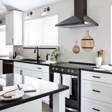
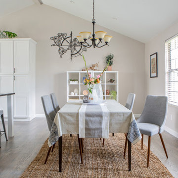
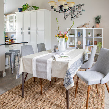
The Oak Street renovation has completely transformed the 70’s era split level home into a sophisticated modern oasis! By extending the kitchen into the existing dining room space, we’re able to maximize functionality and flow between the kitchen and new dining room area. By opening up the wall to create a large pass-through between kitchen and dining, we’ve created the perfect solution to visibly combine all areas and make an ideal design solution for entertaining while providing plenty of seating around the peninsula. High vaulted ceilings exaggerate the ceiling height and work beautifully with the tall cabinetry which brings the down the human scale of vertical space. Slick black Cambria Black quartz countertops and dark metal finishes provide high contrast against the white cabinets and create a high end look. A warm gray stained oak hardwood flooring adds warmth to the space keeping the overall look light and soft. It’s easy to see why this beautiful kitchen transformation has become the heart of the home with a new functional, modern design for the whole family.
 TVL Creative Ltd.
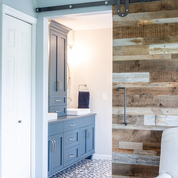
This project is an incredible transformation and the perfect example of successful style mixing! This client, and now a good friend of TVL (as they all become), is a wonderfully eclectic and adventurous one with immense interest in texture play, pops of color, and unique applications. Our scope in this home included a full kitchen renovation, main level powder room renovation, and a master bathroom overhaul. Taking just over a year to complete from the first design phases to final photos, this project was so insanely fun and packs an amazing amount of fun details and lively surprises. The original kitchen was large and fairly functional. However, the cabinetry was dated, the lighting was inefficient and frankly ugly, and the space was lacking personality in general. Our client desired maximized storage and a more personalized aesthetic. The existing cabinets were short and left the nice height of the space under-utilized. We integrated new gray shaker cabinets from Waypoint Living Spaces and ran them to the ceiling to really exaggerate the height of the space and to maximize usable storage as much as possible. The upper cabinets are glass and lit from within, offering display space or functional storage as the client needs. The central feature of this space is the large cobalt blue range from Viking as well as the custom made reclaimed wood range hood floating above. The backsplash along this entire wall is vertical slab of marble look quartz from Pental Surfaces. This matches the expanse of the same countertop that wraps the room. Flanking the range, we installed cobalt blue lantern penny tile from Merola Tile for a playful texture that adds visual interest and class to the entire room. We upgraded the lighting in the ceiling, under the cabinets, and within cabinets--we also installed accent sconces over each window on the sink wall to create cozy and functional illumination. The deep, textured front Whitehaven apron sink is a dramatic nod to the farmhouse aesthetic from KOHLER, and it's paired with the bold and industrial inspired Tournant faucet, also from Kohler. We finalized this space with other gorgeous appliances, a super sexy dining table and chair set from Room & Board, the Paxton dining light from Pottery Barn and a small bar area and pantry on the far end of the space. In the small powder room on the main level, we converted a drab builder-grade space into a super cute, rustic-inspired washroom. We utilized the Bonner vanity from Signature Hardware and paired this with the cute Ashfield faucet from Pfister. The most unique statements in this room include the water-drop light over the vanity from Shades Of Light, the copper-look porcelain floor tile from Pental Surfaces and the gorgeous Cashmere colored Tresham toilet from Kohler. Up in the master bathroom, elegance abounds. Using the same footprint, we upgraded everything in this space to reflect the client's desire for a more bright, patterned and pretty space. Starting at the entry, we installed a custom reclaimed plank barn door with bold large format hardware from Rustica Hardware. In the bathroom, the custom slate blue vanity from Tharp Cabinet Company is an eye catching statement piece. This is paired with gorgeous hardware from Amerock, vessel sinks from Kohler, and Purist faucets also from Kohler. We replaced the old built-in bathtub with a new freestanding soaker from Signature Hardware. The floor tile is a bold, graphic porcelain tile with a classic color scheme. The shower was upgraded with new tile and fixtures throughout: new clear glass, gorgeous distressed subway tile from the Castle line from TileBar, and a sophisticated shower panel from Vigo. We finalized the space with a small crystal chandelier and soft gray paint. This project is a stunning conversion and we are so thrilled that our client can enjoy these personalized spaces for years to come. Special thanks to the amazing Ian Burks of Burks Wurks Construction for bringing this to life!
 JRP Design & Remodel
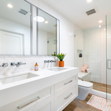
Untouched since 1974, our clients knew the JRP team were the ones to call and help them bring their renovation dreams to fruition. With an awkward closet inside the bathroom, it was determined that a new spatial layout was a must. Moving the closet to a new location and with a rearrangement of the plumbing fixtures, this dull and dated bathroom now has a clean contemporary and spa-like feel designed for relaxation.
This bathroom renovation features wall-mounted cabinetry and an exaggerated countertop detail that really creates a statement. Robern mirrored cabinets, with integrated lights, are not only beautiful but add much need storage. A linear shower drain provides the appropriate slope for the large wood-like porcelain tile throughout the shower pan, add in a solar tube, and you now have a bright, clean-lined, and serene aesthetic.
PROJECT DETAILS:
• Style: Transitional
• Colors: White
• Countertops: Vadara Quartz, Absolute Blanc
• Cabinets: DeWils, Shaker, White
• Hardware/Plumbing Fixture Finish: Polished Chrome
• Lighting Fixtures: Sconces
• Flooring: Porcelain Wood Look Tile
• Tile/Backsplash: Ceramic White Gloss
Photographer: Andrew (Open House VC)
 Stark Carpet
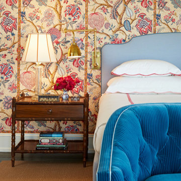
A Clay Stria wool carpet in pecan from the Alexa Hampton Collection adds geometric tone-on-tone pattern that doesn’t compete with the exaggerated florals of the wallpaper in a bedroom by Katie Ridder.
 TVL Creative Ltd.
The Oak Street renovation has completely transformed the 70’s era split level home into a sophisticated modern oasis! By extending the kitchen into the existing dining room space, we’re able to maximize functionality and flow between the kitchen and new dining room area. By opening up the wall to create a large pass-through between kitchen and dining, we’ve created the perfect solution to visibly combine all areas and make an ideal design solution for entertaining while providing plenty of seating around the peninsula. High vaulted ceilings exaggerate the ceiling height and work beautifully with the tall cabinetry which brings the down the human scale of vertical space. Slick black Cambria Black quartz countertops and dark metal finishes provide high contrast against the white cabinets and create a high end look. A warm gray stained oak hardwood flooring adds warmth to the space keeping the overall look light and soft. It’s easy to see why this beautiful kitchen transformation has become the heart of the home with a new functional, modern design for the whole family.
 TVL Creative Ltd.
The Oak Street renovation has completely transformed the 70’s era split level home into a sophisticated modern oasis! By extending the kitchen into the existing dining room space, we’re able to maximize functionality and flow between the kitchen and new dining room area. By opening up the wall to create a large pass-through between kitchen and dining, we’ve created the perfect solution to visibly combine all areas and make an ideal design solution for entertaining while providing plenty of seating around the peninsula. High vaulted ceilings exaggerate the ceiling height and work beautifully with the tall cabinetry which brings the down the human scale of vertical space. Slick black Cambria Black quartz countertops and dark metal finishes provide high contrast against the white cabinets and create a high end look. A warm gray stained oak hardwood flooring adds warmth to the space keeping the overall look light and soft. It’s easy to see why this beautiful kitchen transformation has become the heart of the home with a new functional, modern design for the whole family.
 Just Basements
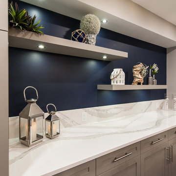
A bar area which boasts beautiful quartz countertops, an exaggerated quartz backsplash, floating shelves and plenty of storage. A great place to entertain.
 Ethan Allen of WNY
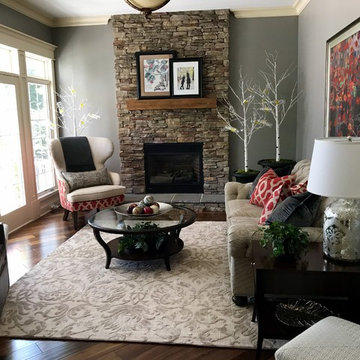
The Rand wing chair. One can hardly find the words for such sinuous curves - they practically speak for themselves. The silhouette is exaggerated in the most stylishly iconic way, with a tight back frame and a welted loose seat cushion. Add nailhead trim? It's almost too hot to handle!
Designer - Cindy Sutton
 sk7 design studios, inc.
Magnolia - Carlsbad, California
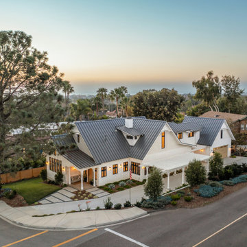
3,000+ sf two-story home, four bedrooms, 3.5 baths, plus a connected two-stall garage/ exercise space with bonus room above.
Magnolia is a significant transformation of the owner's childhood home. Features like the steep 12:12 metal roofs softening to 3:12 pitches; soft arch-shaped Doug-fir beams; custom-designed double gable brackets; exaggerated beam extensions; a detached arched/ louvered carport marching along the front of the home; an expansive rear deck with beefy brick bases with quad columns, large protruding arched beams; an arched louvered structure centered on an outdoor fireplace; cased out openings, detailed trim work throughout the home; and many other architectural features have created a unique and elegant home along Highland Ave. in Carlsbad, California.
 Allure Flooring
- AFTER PHOTO -
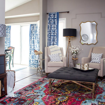
When Ruthie and her husband moved into a new home about three years ago, it didn’t require much fixing up. But the carpeting in the upstairs living room served as a constant reminder that the previous owners had dogs. Ruthie’s No. 1 priority in a new floor was that it had to be easy to install. She remembered her good friend and fellow blogger telling her that she had installed Allure herself in her own home. After Ruthie and her husband installed their new Allure flooring, they realized Tara wasn’t exaggerating. Ruthie says that she loves the way the flooring looks in her home as well as the easy maintenance of it.
Ruthie chose to install Allure Luxury Vinyl Flooring in Brushed Oak Taupe.
Click the link below to find this flooring exclusively through The Home Depot: https://thd.co/2wm4VRE
 TVL Creative Ltd.
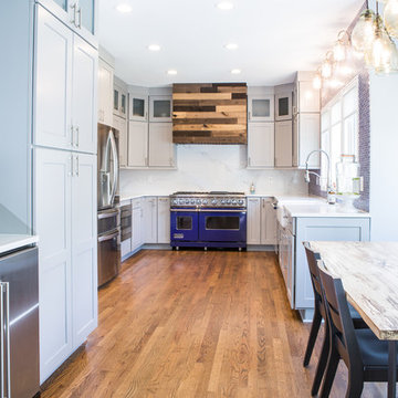
This project is an incredible transformation and the perfect example of successful style mixing! This client, and now a good friend of TVL (as they all become), is a wonderfully eclectic and adventurous one with immense interest in texture play, pops of color, and unique applications. Our scope in this home included a full kitchen renovation, main level powder room renovation, and a master bathroom overhaul. Taking just over a year to complete from the first design phases to final photos, this project was so insanely fun and packs an amazing amount of fun details and lively surprises. The original kitchen was large and fairly functional. However, the cabinetry was dated, the lighting was inefficient and frankly ugly, and the space was lacking personality in general. Our client desired maximized storage and a more personalized aesthetic. The existing cabinets were short and left the nice height of the space under-utilized. We integrated new gray shaker cabinets from Waypoint Living Spaces and ran them to the ceiling to really exaggerate the height of the space and to maximize usable storage as much as possible. The upper cabinets are glass and lit from within, offering display space or functional storage as the client needs. The central feature of this space is the large cobalt blue range from Viking as well as the custom made reclaimed wood range hood floating above. The backsplash along this entire wall is vertical slab of marble look quartz from Pental Surfaces. This matches the expanse of the same countertop that wraps the room. Flanking the range, we installed cobalt blue lantern penny tile from Merola Tile for a playful texture that adds visual interest and class to the entire room. We upgraded the lighting in the ceiling, under the cabinets, and within cabinets--we also installed accent sconces over each window on the sink wall to create cozy and functional illumination. The deep, textured front Whitehaven apron sink is a dramatic nod to the farmhouse aesthetic from KOHLER, and it's paired with the bold and industrial inspired Tournant faucet, also from Kohler. We finalized this space with other gorgeous appliances, a super sexy dining table and chair set from Room & Board, the Paxton dining light from Pottery Barn and a small bar area and pantry on the far end of the space. In the small powder room on the main level, we converted a drab builder-grade space into a super cute, rustic-inspired washroom. We utilized the Bonner vanity from Signature Hardware and paired this with the cute Ashfield faucet from Pfister. The most unique statements in this room include the water-drop light over the vanity from Shades Of Light, the copper-look porcelain floor tile from Pental Surfaces and the gorgeous Cashmere colored Tresham toilet from Kohler. Up in the master bathroom, elegance abounds. Using the same footprint, we upgraded everything in this space to reflect the client's desire for a more bright, patterned and pretty space. Starting at the entry, we installed a custom reclaimed plank barn door with bold large format hardware from Rustica Hardware. In the bathroom, the custom slate blue vanity from Tharp Cabinet Company is an eye catching statement piece. This is paired with gorgeous hardware from Amerock, vessel sinks from Kohler, and Purist faucets also from Kohler. We replaced the old built-in bathtub with a new freestanding soaker from Signature Hardware. The floor tile is a bold, graphic porcelain tile with a classic color scheme. The shower was upgraded with new tile and fixtures throughout: new clear glass, gorgeous distressed subway tile from the Castle line from TileBar, and a sophisticated shower panel from Vigo. We finalized the space with a small crystal chandelier and soft gray paint. This project is a stunning conversion and we are so thrilled that our client can enjoy these personalized spaces for years to come.
 McCall Design & Planning
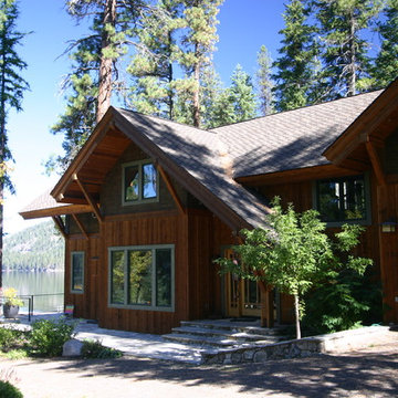
The clients for this project wanted a home with a traditional feel that fit the local aesthetic, but with a contemporary flare. The gabled forms and materials call back, while the exaggerated knee-braces and large banks of windows lend a little modernity. With a northerly exposure towards the lake the design opens up to the view without having concerns about excessive solar gain. A personal touch was added by the client fabricating the brackets for the post and beam connections.
 AMLD INTERIOR INC
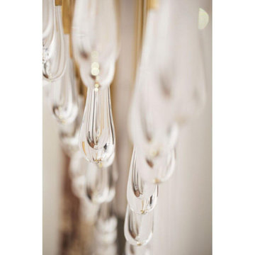
AK4002: "The Pour" Skinny Rain
DESCRIPTION:
The light installation is a teardrop-shaped chandelier with deliciously unique lights that celebrate the fascinating nature of raindrops, where no drop is the same as the next. Each drop is hand-blown by artisans and intricately engineered to house the lighting strategy for the chandelier. When you see a light sculpture designed to increase the visual appeal of a room and define its luminous character, you stop on your way to admire it. It’s the case of the Raindrop chandelier known as “The Pour”, a modern light sculpture meant to illuminate and beautify its chosen location to create an architectural relationship with space. The drop itself is constructed of two parts: the brass screw cap, which houses the light, and the hand-blown crystal reflecting the light to create puddles on the floor below. To replicate the nature of raindrops, no two drops are blown identical. The name “The Pour” derives from the distinctive shape that the chandelier forms: an exaggeration of the dramatic motion of water pouring out of a carafe. Designed by forming a grid mimicking how puddles ripple outward in concentric circles, each teardrop is hung to brass pipes of varying lengths. Placed strategically on the grid, the teardrops lock into the mirrored base that fits seamlessly between the two existing columns. The mirrored base reflects the teardrops endlessly into the sky above and when lit. The chandelier echoes rain frozen in time with ephemeral puddles overlaid on the floor below.
SPECIFICATIONS:
Collection: Organic
Size: 58” Long x 13” Width x 72” Height (112 Lights)
Shape: Rectangular
Frame Finish: Patina Dark Bronze
Materials: Metal, Glass
Extension: 12' feet adjustable wiring available in black or silver
Glass: Hand-blown glass
Bulbs: 112 Bulbs 110V USA/220V Europe 40 W candelabra bulbs (included)
Weight: 135 lbs. (for the 58" L)
Assembly: Some Assembly
Dimmer Switch Compatible: Optional
Rush Order: 4-6 Weeks; 15% added to the total
Regular Lead Time: 8-12 Weeks
Warranty: 5 Years Full Coverage (includes parts replacement)
SIZE OPTIONS:
Size: Price:
30” Long x 13” Width x 66” Height (69 Lights) $3,360.00
36” Long x 13” Width x 66” Height (79 Lights) $4,660.00
42” Long x 13” Width x 66” Height (89 Lights) $6,470.00
58” Long x 16” Width x 72” Height (112 Lights) $7,670.00
71” Long x 20" Width x 82” Height (242 Lights) $9,820.00
Custom Sizes, Finishes, Colors Available Upon Request
Additional Info- Handblown Glass: 2" Width x 4" Height
 TVL Creative Ltd.
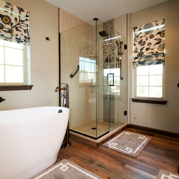
This remodel took a dated and cramped bathroom and transformed it into a classy oasis for our Lowry clients. The clients had a limited budget and wanted to leave the space as in-place as possible. However, the large drop in tub ate valuable floor space and a half wall between the shower and tub had become a holding place for random items without a home. The thick frame on the shower glass made the shower feel extremely small, and the dated lighting and fixtures further depressed the space. We proposed a traditional and elegant design that consider the client's budgetary and spatial constraints. We removed the existing drop-in tub and replaced it with a lovely free-standing soaker. The length of this tub is short, but the depth is exaggerated, making it an ideal replacement in this tiny footprint. The shower glass was swapped for framless glass that boldly expands space. We tore out the existing carpet and installed gorgeous wood-look tile that adds depth and warmth to the room. The clients opted to keep their existing vanity to save cost, so a new top was added to bring the aesthetic up to the level of the new additions. The wall paint was taken from a buttery yellow to a soft gray-green, accented by a darker version of this same color on the siding barn door and toilet room door. New vanity lights, faucets, and storage shelves were installed to help our clients organize and keep things off the counter tops. Finally, new custom up-down window shades were curated for the bathroom to add to the final touch. This space is a simple scope with a dramatic transformation that introduces a timeless look for years to come.
 Glow Lighting
DECEMBER 2014
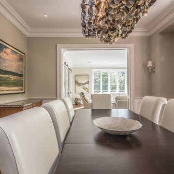
For this project the scale of the Montego Bay oversized rectangular chandelier was perfect for the dining room. The high ceilings, room size as well as the large dining table required a light fixture with substance and presence.
Iridescent Mother of Pearl shell extensions were added to each layer, with the inside tier even more exaggerated. The dramatic customized Mother of Pearl shell chandelier was the focal point of the open concept main floor.
 Adam Zollinger Interiors
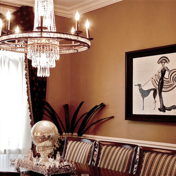
My clients love of the Art Deco design period was the inspiration behind this formal, yet approachable, dining room design.
In order for this room to look "complete" we had to add many elements including chair rail, wallpaper, and custom window treatments to add a feeling of luxury and style. If we kept things too "plan" we would not have been able to achieve this glamorous end result!
Grand host and hostess chairs with exaggerated backs mixed with a fun geometric pattern on the side chairs, plays wistfully with the damask pattern on the wallpaper, as well as the silk drapes.
A shiny centerpiece on the dining table ads a bit of glamour to the tabletop.
14