
Search results for "Exchange traded" in Home Design Ideas


Find the right local pro for your project


 Berry Built and Design, inc.
This house is a 60’s era 3-level with a rancher style main floor that once had walls dividing it into 3 separate spaces. We opened the space up into one large area, moved the kitchen to one end, added a wet bar in the center dining area and completely rearranged the two fireplaces on each end of the new great room. Flat panel textured laminate and natural walnut cabinetry was complimented by stunning quartz countertops and grey tinted oak floors

 Civis USA
The Hannah LED Mirror by Civis USA, Inc. turns your bathroom into a five star hotel! Featuring an easy installation using a polished edge mirror that hangs on a white powder coated chassis. Bright LED backlight shines through the frost interior of the glass to illuminate your room from the top and each side.



 BV Residential
Bureau V
Example of a trendy metal straight open and metal railing staircase design in New York
Example of a trendy metal straight open and metal railing staircase design in New York

 All Phase Home Restorations
Exterior Lighting
Inspiration for a modern exterior home remodel in Manchester
Inspiration for a modern exterior home remodel in Manchester


 Deco Design
This piece can either be an end table next to a couch or side tables for a bed. Elegant custom turned legs with floating shelf midway and table top. Custom two toned finish, espresso stain with hand burnished red paint. Close up of leg detail.
photos by Kimball Ungerman

 Flooring America of Grand Rapids MI
Flooring America
Home design - contemporary gender-neutral carpeted home design idea in Grand Rapids
Home design - contemporary gender-neutral carpeted home design idea in Grand Rapids
 KURV Architecture DPC (Alex Hughes Architects)
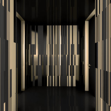
Located in the heart of Manhattan’s Lower East Side, the building was erected on a shallow commercial lot between two 120 year old masonry buildings and a new residential rental building. 330 Grand Street is a mix of 725 SF 1BRs and 1050 SF 2BR apartments. It also contains a 1100 SF two story duplex as well as private and public rooftop space, large private balconies for most units and two large private terraces for the ground floor units.
330 Grand Street was originally designed and approved at the NYC DOB as a prefabricated modular building. During the pandemic, as shipping costs skyrocketed putting the project at risk, we suggested redesigning the building as a reinforced cast-in-place concrete structure. Concrete was readily available and prices had not been affected by the demand increase that many other materials suffered in the pandemic. We took this opportunity to raise floor to ceiling heights, enlarge high performance windows and redistribute the buildings MEPFS and Structural Systems to create very open floor plans.
The challenge was to create a luxurious sensorial living experience with very limited means. In a city with very high construction costs, low cost residential buildings in the area are usually devoid of good quality, design and character. Our approach was to aim high for the end user, prioritizing natural light, open space with long visual perspectives, high ceilings and as always, rejecting the use of predefined building templates.
Our biggest challenge was to ensure that the small spaces feel as clean cut, large and bright as possible. Several unique design decisions were made to ensure low cost and high quality;
Floor plans were laid out so that spaces were wide open and free of clutter from mechanical or structural interruptions. Therefore all infrastructure was placed in lateral demising walls, which in turn act as the unit’s storage and kitchen. The apartments feel wide open, are super quiet and have more storage space than any other comparable apartment in the city.
To solve the problem of the site’s shallow commercial lot which is typically prone to dark interior spaces we focused our attention on the building’s envelope. Instead of the usual small punched window openings, oversized high performance windows were designed to ensure that light penetrated as far as possible into the units. In the smaller 1BR units, the full 50’ depth of the lot is perceived by partitioning spaces with sliding pocket doors that can be retracted to allow deep visual perspectives, making the sight lines in the space feel longer, larger, more ample than normal. In addition to the full height glazing, each unit above the 2nd floor receives a 7 foot covered balcony, adding 120 to 240 sf to each apartment, something unusual in New York City buildings. The space is large enough for a full size dining table, when the weather permits being outside.
We also worked hard to ensure modularity. For example, all kitchen units are all identical throughout the building. The idea of modularity and the economy of the repetitive unit is exercised to the maximum through the building.
Hardware, appliances, flooring, wall coverings and material finishes are all carefully selected to feel bespoke, high quality and unique.
It was important to KURV that the result of this work manifest into something that would deeply connect with the end user and sustain relationships with the consumers of this space.
All images by KURV Architecture ©





 Decorative Philosophy
Our dear friend Delores used to refer to this section as "the lower 40 acres" Quite tongue in cheek considering our property is about a quarter of an acre! Such a great place to sit for a cool breeze.
Karen La Du for Decorative Philosophy
 Bhaus Construction
Home design - mid-sized transitional porcelain tile and white floor home design idea in Vancouver with gray walls

 TVL Creative Ltd.
There’s nothing as wonderful as walking into a mid-century gem with clients who love the character of their new home. Our goal for this project was to incorporate the mid-century bones of this home into a new design that would better meet the contemporary needs of our clients. We started by taking down the walls that had separated this kitchen from the rest of the home and creating a welcoming space that blended seamlessly with the new open concept. The new kitchen design was a win for our clients with increased storage, more work surfaces, and a peninsula with plenty of seating. We utilized wood finishes through out this space with light wood flooring, medium-tones on the cabinetry, and darker wood accents throughout giving us a beautiful balance and a calm backdrop. This home had beautiful horizontal lines that we wanted to accentuate, so we selected a dark wood finish for the central beam and tied it in with the dark finish on the wood fireplace mantel and the stair handrail to emphasize the horizontal features. But we never miss an opportunity for a fun mid-century pop, and this home provided plenty of inspiration! The boomerang hardware on the cabinets and escher backsplash tiles give us great geometric elements to break up the clean lines of the rest of the space. One of our favorite features of this home was the original plaster ceilings with the custom hand troweled texture. We knew from the beginning that this was an element we wanted to maintain and accentuate, so when we opened up the kitchen and added recessed lighting we reached out to a local plaster artisan to carry the texture throughout the space, and we couldn’t be happier with the results. This design brings together the mid-century aesthetics of clean lines and fun patterns with the modern-day functionality our clients were looking for in their new kitchen.

 Charter Oak Landscape Development
Design ideas for a modern drought-tolerant and desert front yard landscaping.

37