
Search results for "Exciting activity" in Home Design Ideas
 BMR BelMax Remodeling
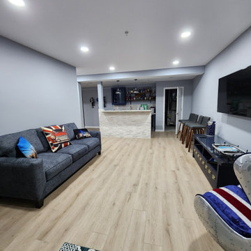
Complete Basement Transformation by Expert Remodeling Contractor in Doylestown, PA
Renovating a basement is exciting, especially when you have a clear vision of a versatile space that fits your lifestyle. We are a basement remodeling contractor in Doylestown, PA.
We are a contractor in Doylestown, PA specializing in basement remodeling. Our most recent project involved transforming a plain basement into a stunning living space. The homeowners can now enjoy this beautiful area for many years to come.
The Initial Phase: Design and Planning
Every successful remodel begins with a well-thought-out plan. Our team started by stripping the basement down to its basic structure, preparing to build it back up from scratch. We designed the layout to maximize the space for its new purposes. These purposes include a fun entertainment area, a peaceful bathroom, and an energizing gym.
Upgrading the Essentials: Installation of Core Systems
The next step was to ensure the basement was ready to support the modern amenities we planned to install:
We created a strong network system for seamless home entertainment and communication in the bar and gym areas.
Plumbing: With the addition of a full bathroom and a bar, new plumbing was essential. Our experts installed a system that promised both efficiency and reliability.
We installed new electrical and HVAC systems in the basement. We installed these systems to control the temperature and create a comfortable environment. The purpose of these systems was to provide a comfortable environment for the gym and bar.
The Build-Out: Constructing the Space
With the infrastructure in place, our focus shifted to constructing the main features:
The bar is the main attraction in the entertainment area. The design aims to look good and serve a purpose, showcasing a stylish counter that is perfect for parties and special occasions.
We built a full bathroom in the basement to provide convenience and comfort for anyone using the space.
We created a modern gym for fitness lovers at home, providing everything needed for various exercise equipment.
Finishing Touches: Aesthetics and Functionality
As we neared completion, our attention turned to the details that would make the space truly shine:
We added special lights to improve the atmosphere, with bright lights for the gym and softer lights for the bar.
Using good materials and finishes, we made the basement strong and aesthetically pleasing. We made these choices to match the homeowners’ style and the purpose of each area.
The Final Reveal: A Basement Built for Enjoyment
The culmination of our efforts was a beautifully remodeled basement that promised endless hours of enjoyment. The new bar, bathroom, and gym areas enhanced the space. They transformed it from a simple basement into a central place for activity and relaxation.
Are you inspired to revitalize your own basement space? As your local basement remodeling contractor in Doylestown, PA, we’re ready to turn your vision into reality. Contact us to begin your home’s transformation today.

 Bartels Doors & Hardware
All closet-cases welcome! You’re obsessed with trying to keep organized. You put so much thought into the design of your closet and now want the perfect finishing touch that does every bit of justice to the contents inside. Whether you prefer a slide, swing, or even a bi-fold, these closet doors offer yet another opportunity to infuse your personal flair into your space.

 Pearl Remodeling
Laura
Inspiration for a large timeless u-shaped dark wood floor kitchen remodel in Los Angeles with a farmhouse sink, shaker cabinets, white cabinets, quartz countertops, white backsplash, porcelain backsplash, stainless steel appliances, an island and white countertops
Inspiration for a large timeless u-shaped dark wood floor kitchen remodel in Los Angeles with a farmhouse sink, shaker cabinets, white cabinets, quartz countertops, white backsplash, porcelain backsplash, stainless steel appliances, an island and white countertops
Find the right local pro for your project
 Green Gorge Construction
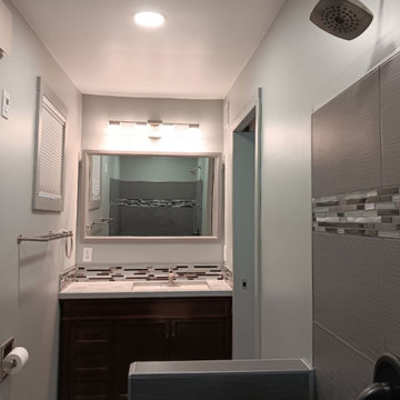
Converting this bare area into a stunning new bathroom was an exciting endeavor. The design features, including a curbless shower with a linear drain, a pocket door, and a pony wall, were thoughtfully implemented to maximize both functionality and aesthetics. Innovative approaches were taken to adapt to the unique layout, with extra care given to ensuring the spacious curbless shower was both practical and visually appealing.
The shower’s design features intricate details, beginning with a stainless-steel linear drain that spans its entire width. This setup accommodates large 12″x24″ tiles and a straight sloped floor, minimizing grout lines and simplifying the cleaning process.
Two shower niches were designed to provide extra storage without clutter. A spacious bench was constructed for comfort, relaxation, and ease of access. A pony wall was added to divide the toilet and shower, eliminating the necessity for a shower curtain. A glass mosaic tile accent band was selected to enhance the aesthetic appeal of the space. Subtle details like edge trim and aligned tile/drywall points contribute to a polished overall appearance.
Our options for vanity selections were somewhat restricted, but we found a mahogany veneer piece on sale at a local big box store that met our requirements perfectly. Given the factory’s light lacquer application and the bathroom’s exposure to humidity and water, I decided to apply two additional coats of lacquer to all exposed wood after a thorough sanding and cleaning.
To achieve a marble-like appearance, we constructed a polished tile countertop and installed an undermount sink for both aesthetics and functionality. After preparing the surface of the sink, I applied an epoxy coating to seamlessly integrate the sink and tile. The same mosaic tile from the shower was used for the backsplash, enhancing the overall luxurious feel. The recessed lighting and vanity bar fixture were connected to a dual dimmer switch for added versatility.
A pocket door featuring latching hardware was installed to maximize space and maintain a sleek appearance. To enhance the sense of openness, a large, full-width mirror was selected. Adequate ventilation was provided by an in-wall fan connected to a standard switch and a programmable humidistat, allowing the fan to activate when humidity levels reached a specified threshold. Additionally, a compact Jeld-Wen window sourced from a local Habitat for Humanity store was fitted with a convenient cordless shade.

 TVL Creative Ltd.
Cramped kitchen be gone! That was the project motto and top priority. The goal was to transform the current layout from multiple smaller spaces into a connected whole that would activate the main level for our clients, a young family of four.
The biggest obstacle was the wall dividing the kitchen and the dining room. Removing this wall was central to opening up and integrating the main living spaces, but the existing ductwork that ran right through the center of the wall posed a design challenge, er design opportunity. The resulting design solution features a central pantry that captures the ductwork and provides valuable storage- especially when compared to the original kitchen's 18" wide pantry cabinet. The pantry also anchors the kitchen island and serves as a visual separation of space between the kitchen and homework area.
Through our design development process, we learned the formal living room was of no service to their lifestyle and therefore space they rarely spent time in. With that in mind, we proposed to eliminate the unused living room and make it the new dining room. Relocating the dining room to this space inherently felt right given the soaring ceiling and ample room for holiday dinners and celebrations. The new dining room was spacious enough for us to incorporate a conversational seating area in the warm, south-facing window alcove.
Now what to do with the old dining room?! To answer that question we took inspiration from our clients' shared profession in education and developed a craft area/homework station for both of their boys. The semi-custom cabinetry of the desk area carries over to the adjacent wall and forms window bench base with storage that we topped with butcher block for a touch of warmth. While the boys are young, the bench drawers are the perfect place for a stash of toys close to the kitchen.
The kitchen begins just beyond the window seat with their refrigerator enclosure. Opposite the refrigerator is the new pantry with twenty linear feet of shelving and space for brooms and a stick vacuum. Extending from the backside of the pantry the kitchen island design incorporates counter seating on the family room side and a cabinetry configuration on the kitchen side with drawer storage, a trashcan center, farmhouse sink, and dishwasher.
We took careful time in design and execution to align the range and sink because while it might seem like a small detail, it plays an important role in supporting the symmetrical configuration of the back wall of the kitchen. The rear wall design utilizes an appliance garage mirrors the visual impact of the refrigerator enclosure and helps keep the now open kitchen tidy. Between the appliance garage and refrigerator enclosure is the cooking zone with 30" of cabinetry and work surface on either side of the range, a chimney style vent hood, and a bold graphic tile backsplash.
The backsplash is just one of many personal touches we added to the space to reflect our client's modern eclectic style and love of color. Swooping lines of the mid-mod style barstools compliment the pendants and backsplash pattern. A pop of vibrant green on the frame of the pantry door adds a fresh wash of color to an otherwise neutral space. The big show stopper is the custom charcoal gray and copper chevron wall installation in the dining room. This was an idea our clients softly suggested, and we excitedly embraced the opportunity. It is also a kickass solution to the head-scratching design dilemma of how to fill a large and lofty wall.
We are so grateful to bring this design to life for our clients and now dear friends.

 CairnsCraft Design & Remodel
 of San Diego
Awarded Best Of Houzz 2021
San Diego, CA January 27, 2021 – CairnsCraft Design & Remodel of San Diego has won a “Best Of Houzz” award for Design, and Customer Service” on Houzz®, the leading platform for home renovation and design. CairnsCraft Design & Remodel is a Design-Build Firm, dedicated to creating functional and beautiful living spaces. Our clients benefit from our years of Design Execution, Project Development, Management, and Construction, complete with a unique ability to envision, create and execute home improvements.
We’re proud to receive the Best of Houzz 2015-2021
Best of Houzz was chosen by the millions of homeowners that comprise the Houzz community from among more than 2.5 million active home building, remodeling and design industry professionals.
“The Best Of Houzz awards are an emblem of trust and credibility for home professionals across the U.S. and around the world, and we are excited to celebrate this year’s winners,” said Liza Hausman, vice president of Industry Marketing for Houzz
You can see more of CairnsCraft Design & Remodel’s work on Houzz at https://www.houzz.com/pro/sdremodeler/__public.
About CairnsCraft Design & Remodel:
We specialize in the design and construction of kitchens, bathrooms, home additions, and full home remodeling, including offering several cabinetry lines from custom to semi-custom for your kitchen, bathroom, and home office space. We serve clients throughout the San Diego metro area. Established in 1990 by Charles & Marie Cairns, owned and operated by highly qualified, trusted experts in home remodeling.
Trust is the foundation we build upon. We take pride in our work and it shows. We are your trusted dependable partners, uniquely qualified to remodel homes to be functional and usable by anyone, regardless of age or ability. We appreciate the trust you are extending us when you invite us to your Home to work in your project.
We at CairnsCraft Design & Remodel use our experience to thoughtfully guide and advise each homeowner throughout the construction process. The result is a project with architectural and design integrity, but also one that articulates “Home” for each client.
Our right Team brings you the finest in results.
About Houzz
Houzz is the leading platform for home renovation and design, providing people with everything they need to improve their homes from start to finish. On Houzz, people can find design inspiration, research and hire home professionals, and shop for products to complete their projects. For home professionals, Houzz Pro (houzz.com/pro) provides an all-in-one software solution that empowers industry pros to stand out, win clients and manage their projects efficiently and profitably. The Houzz community is made up of millions of homeowners, home design enthusiasts and home improvement professionals around the world. Houzz is available on the web and as a top-rated mobile app. Headquartered in Palo Alto, California, Houzz also has international offices in London, Berlin, Sydney, Moscow, Tel Aviv and Tokyo. Houzz is a registered trademark of Houzz Inc. worldwide. For more information, visit houzz.com.


 TVL Creative Ltd.
Cramped kitchen be gone! That was the project motto and top priority. The goal was to transform the current layout from multiple smaller spaces into a connected whole that would activate the main level for our clients, a young family of four.
The biggest obstacle was the wall dividing the kitchen and the dining room. Removing this wall was central to opening up and integrating the main living spaces, but the existing ductwork that ran right through the center of the wall posed a design challenge, er design opportunity. The resulting design solution features a central pantry that captures the ductwork and provides valuable storage- especially when compared to the original kitchen's 18" wide pantry cabinet. The pantry also anchors the kitchen island and serves as a visual separation of space between the kitchen and homework area.
Through our design development process, we learned the formal living room was of no service to their lifestyle and therefore space they rarely spent time in. With that in mind, we proposed to eliminate the unused living room and make it the new dining room. Relocating the dining room to this space inherently felt right given the soaring ceiling and ample room for holiday dinners and celebrations. The new dining room was spacious enough for us to incorporate a conversational seating area in the warm, south-facing window alcove.
Now what to do with the old dining room?! To answer that question we took inspiration from our clients' shared profession in education and developed a craft area/homework station for both of their boys. The semi-custom cabinetry of the desk area carries over to the adjacent wall and forms window bench base with storage that we topped with butcher block for a touch of warmth. While the boys are young, the bench drawers are the perfect place for a stash of toys close to the kitchen.
The kitchen begins just beyond the window seat with their refrigerator enclosure. Opposite the refrigerator is the new pantry with twenty linear feet of shelving and space for brooms and a stick vacuum. Extending from the backside of the pantry the kitchen island design incorporates counter seating on the family room side and a cabinetry configuration on the kitchen side with drawer storage, a trashcan center, farmhouse sink, and dishwasher.
We took careful time in design and execution to align the range and sink because while it might seem like a small detail, it plays an important role in supporting the symmetrical configuration of the back wall of the kitchen. The rear wall design utilizes an appliance garage mirrors the visual impact of the refrigerator enclosure and helps keep the now open kitchen tidy. Between the appliance garage and refrigerator enclosure is the cooking zone with 30" of cabinetry and work surface on either side of the range, a chimney style vent hood, and a bold graphic tile backsplash.
The backsplash is just one of many personal touches we added to the space to reflect our client's modern eclectic style and love of color. Swooping lines of the mid-mod style barstools compliment the pendants and backsplash pattern. A pop of vibrant green on the frame of the pantry door adds a fresh wash of color to an otherwise neutral space. The big show stopper is the custom charcoal gray and copper chevron wall installation in the dining room. This was an idea our clients softly suggested, and we excitedly embraced the opportunity. It is also a kickass solution to the head-scratching design dilemma of how to fill a large and lofty wall.
We are so grateful to bring this design to life for our clients and now dear friends.
 TVL Creative Ltd.
Cramped kitchen be gone! That was the project motto and top priority. The goal was to transform the current layout from multiple smaller spaces into a connected whole that would activate the main level for our clients, a young family of four.
The biggest obstacle was the wall dividing the kitchen and the dining room. Removing this wall was central to opening up and integrating the main living spaces, but the existing ductwork that ran right through the center of the wall posed a design challenge, er design opportunity. The resulting design solution features a central pantry that captures the ductwork and provides valuable storage- especially when compared to the original kitchen's 18" wide pantry cabinet. The pantry also anchors the kitchen island and serves as a visual separation of space between the kitchen and homework area.
Through our design development process, we learned the formal living room was of no service to their lifestyle and therefore space they rarely spent time in. With that in mind, we proposed to eliminate the unused living room and make it the new dining room. Relocating the dining room to this space inherently felt right given the soaring ceiling and ample room for holiday dinners and celebrations. The new dining room was spacious enough for us to incorporate a conversational seating area in the warm, south-facing window alcove.
Now what to do with the old dining room?! To answer that question we took inspiration from our clients' shared profession in education and developed a craft area/homework station for both of their boys. The semi-custom cabinetry of the desk area carries over to the adjacent wall and forms window bench base with storage that we topped with butcher block for a touch of warmth. While the boys are young, the bench drawers are the perfect place for a stash of toys close to the kitchen.
The kitchen begins just beyond the window seat with their refrigerator enclosure. Opposite the refrigerator is the new pantry with twenty linear feet of shelving and space for brooms and a stick vacuum. Extending from the backside of the pantry the kitchen island design incorporates counter seating on the family room side and a cabinetry configuration on the kitchen side with drawer storage, a trashcan center, farmhouse sink, and dishwasher.
We took careful time in design and execution to align the range and sink because while it might seem like a small detail, it plays an important role in supporting the symmetrical configuration of the back wall of the kitchen. The rear wall design utilizes an appliance garage mirrors the visual impact of the refrigerator enclosure and helps keep the now open kitchen tidy. Between the appliance garage and refrigerator enclosure is the cooking zone with 30" of cabinetry and work surface on either side of the range, a chimney style vent hood, and a bold graphic tile backsplash.
The backsplash is just one of many personal touches we added to the space to reflect our client's modern eclectic style and love of color. Swooping lines of the mid-mod style barstools compliment the pendants and backsplash pattern. A pop of vibrant green on the frame of the pantry door adds a fresh wash of color to an otherwise neutral space. The big show stopper is the custom charcoal gray and copper chevron wall installation in the dining room. This was an idea our clients softly suggested, and we excitedly embraced the opportunity. It is also a kickass solution to the head-scratching design dilemma of how to fill a large and lofty wall.
We are so grateful to bring this design to life for our clients and now dear friends.
 The Masons Co and Dionysian Artificers Landscape
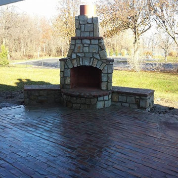
Brick patio Kansas City or paver patios Kansas City are the best investment for improving the landscape and outlook of your yard. Careful selection of the brick pattern and color while keeping in mind the matching backgrounds in your surroundings is very important but it may go waste unless the patio is installed carefully. Though not tough and complicated, ignorance of basics in installation can ruin the patterns besides reducing the life of the patio.
Building a paver patio or remodeling an existing one is an exciting process for any homeowners. The most fun and important decision is choosing a color and shape that meets not only your aesthetic needs but your lifestyle needs as well.
Kansas City Paver Patios and Paver stone installations Kansas City are very popular because of their beauty and ability to enhance any landscape. Paver stones are incredibly versatile and can be designed in any configuration and size to create patios, outdoor kitchens, pool decks, courtyards and walkways to meet client needs and the needs of the landscape. With the wide variety of materials, sizes, colors and patterns available our landscape design experts will help you create the desert oasis of your dreams.
In addition to being an affordable and aesthetically beautiful option, they are quite durable and incredibly low maintenance. A wooden deck needs to be maintained seasonally and may need constant repairs due to damage from weather. With paver patios or paver stone installations, there is almost no maintenance and they are very easy to repair as needed. The advantages of paver patios or paver stone installations are numerous and there are really no drawbacks. Paver patios and paver stone installations are beautiful, versatile, affordable, low maintenance, and enhance the value of your home.
 TVL Creative Ltd.
Cramped kitchen be gone! That was the project motto and top priority. The goal was to transform the current layout from multiple smaller spaces into a connected whole that would activate the main level for our clients, a young family of four.
The biggest obstacle was the wall dividing the kitchen and the dining room. Removing this wall was central to opening up and integrating the main living spaces, but the existing ductwork that ran right through the center of the wall posed a design challenge, er design opportunity. The resulting design solution features a central pantry that captures the ductwork and provides valuable storage- especially when compared to the original kitchen's 18" wide pantry cabinet. The pantry also anchors the kitchen island and serves as a visual separation of space between the kitchen and homework area.
Through our design development process, we learned the formal living room was of no service to their lifestyle and therefore space they rarely spent time in. With that in mind, we proposed to eliminate the unused living room and make it the new dining room. Relocating the dining room to this space inherently felt right given the soaring ceiling and ample room for holiday dinners and celebrations. The new dining room was spacious enough for us to incorporate a conversational seating area in the warm, south-facing window alcove.
Now what to do with the old dining room?! To answer that question we took inspiration from our clients' shared profession in education and developed a craft area/homework station for both of their boys. The semi-custom cabinetry of the desk area carries over to the adjacent wall and forms window bench base with storage that we topped with butcher block for a touch of warmth. While the boys are young, the bench drawers are the perfect place for a stash of toys close to the kitchen.
The kitchen begins just beyond the window seat with their refrigerator enclosure. Opposite the refrigerator is the new pantry with twenty linear feet of shelving and space for brooms and a stick vacuum. Extending from the backside of the pantry the kitchen island design incorporates counter seating on the family room side and a cabinetry configuration on the kitchen side with drawer storage, a trashcan center, farmhouse sink, and dishwasher.
We took careful time in design and execution to align the range and sink because while it might seem like a small detail, it plays an important role in supporting the symmetrical configuration of the back wall of the kitchen. The rear wall design utilizes an appliance garage mirrors the visual impact of the refrigerator enclosure and helps keep the now open kitchen tidy. Between the appliance garage and refrigerator enclosure is the cooking zone with 30" of cabinetry and work surface on either side of the range, a chimney style vent hood, and a bold graphic tile backsplash.
The backsplash is just one of many personal touches we added to the space to reflect our client's modern eclectic style and love of color. Swooping lines of the mid-mod style barstools compliment the pendants and backsplash pattern. A pop of vibrant green on the frame of the pantry door adds a fresh wash of color to an otherwise neutral space. The big show stopper is the custom charcoal gray and copper chevron wall installation in the dining room. This was an idea our clients softly suggested, and we excitedly embraced the opportunity. It is also a kickass solution to the head-scratching design dilemma of how to fill a large and lofty wall.
We are so grateful to bring this design to life for our clients and now dear friends.

 highland
Ever been out in a park, forest, or even just in your backyard and wanted to see just a small side of the picture? Beauty is in the midst of us, but we are not doing enough to see it—we see only at a superficial level. The reality is that there is an entire universe on a scale that is so miniscule yet all around us, waiting to be discovered.
Put the digital microscope camera on the scope, and that little quantum universe you never knew was there awaits your gaze. Makes everyday outdoor activities exciting adventures and learning experiences with leaves, rocks, and bugs that are all interesting. It used to look just the same, and now it's vibrant with patterns, textures, and stories you didn't know before!
What is a Digital Microscope Camera?
A digital microscope camera is a compact device that magnifies very small objects and can display its real-time image on the screen. This new type of microscope can be taken outside and is much easier to transport than a conventional microscope. It is based on three important technologies: the magnification lenses, digital imaging, and As the name implies, snapping up shots of the objects when you bring them close and displaying them clearly on your smartphone, tablet, or its built-in display. This gives you the power to see details of a microworld anywhere you go, with no special equipment.
How a Digital Microscope Camera Works in Real Life
It is easy and yet powerful to operate a digital microscope camera. It brings very small objects closer by employing a system of lenses, and through a digital sensor, it turns the image into a compelling display. After focusing, the image becomes so big that it displays details that the human eye isn't able to see. Whereas, in an actual setting, an individual can simply place the gadget over an object, such as a leaf, insect, or soil surface. This is then performed to get a focus on the details, clear and sharp. In the blink of an eye, you will be exploring a hidden reality with patterns and structures.
Why Nature Looks Completely Different at the Micro Level
If you watch nature with an unbiased eye, it's all straightforward. Leaves are green; insects are tiny and land on a mere brown earth. However, things look so different through the microscope camera's zoom-in. A leaf is more than a leaf: it is a complex system of veins and cells! However, the insect is not merely a tiny insect anymore, but it gradually turns into an object with wings, eyes, and patterns, all of which seem almost like art. From soils a combination of small particles of rock, organic material, and unseen creatures.
Gaining appreciation for the details in leaves and plants.
Plant life is one of the most interesting objects to be examined under the microscope. The details on the leaves, stems, and petals are amazing and would get lost in the details otherwise. By using a digital microscope camera, the vein network that transports water and nutrients can be readily observed. These veins are naturally occurring and run in patterns that resemble roads and/or rivers in the landscape. Every leaf grows differently and is as individual as a fingerprint.
Discovering the Hidden World of Insects
There is no better thing to see under the microscope than one of the many interesting insects. They may appear at first glance to be quite unassuming and tiny, but magnified, they let one in on the whole other universe. They feature fine patterns in their wings – like those found on glass artworks – that are often difficult to see. They have eyes comprised of multiple repeating units. Even their legs and segments of their bodies have special textures.
The Secret Life Inside Soil and Sand
A microscope camera reveals a soil in which activity is taking place in a lively world in the seemingly lifeless soil. The very small particles of rock, decayed plant material, and micro-living organisms are interacting. Sand grains look similar to miniature crystals; all of them are distinctively shaped and structured. As organic matter decomposes, it forms patterns that illustrate how nature continually recycles itself.
Tree Bark: A Natural Storybook
Another interesting area of interest for micro-focusing is the bark of trees. Apparently, this appears to be rough and simple, but under magnification, it is seen as a highly detailed landscape of cracks, lines, and textures. The bark patterns that can be observed on each branch offer a glimpse of the branch's years of growth, weather, and environmental stresses. It's as if someone wrote the history of a tree on its trunk!
Tips for Getting the Best Microscopic Results Outdoors
A few simple techniques can make a big difference in the variety of images you get before getting clear and detailed images. Always make sure that the hands are stable or have a resting surface so that there is no shaking. Moving, even slightly, can cause the picture to become blurry. Lighting is one of the other important ones. This is because natural soft lighting is best suited, as it doesn't create strong reflections and it does show detail. Minimize exposure to strong sunlight/deep shade when possible.
Conclusion:
The digital microscope camera isn't just a camera; it's a new way of viewing life. Makes routine walks outdoors into thrilling explorations of the scientific world and how minute details make a difference. It can teach us something about living by the rules of nature! It is something that we can contemplate, clarify, and enjoy more.
What is a Digital Microscope Camera?
A digital microscope camera is a compact device that magnifies very small objects and can display its real-time image on the screen. This new type of microscope can be taken outside and is much easier to transport than a conventional microscope. It is based on three important technologies: the magnification lenses, digital imaging, and As the name implies, snapping up shots of the objects when you bring them close and displaying them clearly on your smartphone, tablet, or its built-in display. This gives you the power to see details of a microworld anywhere you go, with no special equipment.
How a Digital Microscope Camera Works in Real Life
It is easy and yet powerful to operate a digital microscope camera. It brings very small objects closer by employing a system of lenses, and through a digital sensor, it turns the image into a compelling display. After focusing, the image becomes so big that it displays details that the human eye isn't able to see. Whereas, in an actual setting, an individual can simply place the gadget over an object, such as a leaf, insect, or soil surface. This is then performed to get a focus on the details, clear and sharp. In the blink of an eye, you will be exploring a hidden reality with patterns and structures.
Why Nature Looks Completely Different at the Micro Level
If you watch nature with an unbiased eye, it's all straightforward. Leaves are green; insects are tiny and land on a mere brown earth. However, things look so different through the microscope camera's zoom-in. A leaf is more than a leaf: it is a complex system of veins and cells! However, the insect is not merely a tiny insect anymore, but it gradually turns into an object with wings, eyes, and patterns, all of which seem almost like art. From soils a combination of small particles of rock, organic material, and unseen creatures.
Gaining appreciation for the details in leaves and plants.
Plant life is one of the most interesting objects to be examined under the microscope. The details on the leaves, stems, and petals are amazing and would get lost in the details otherwise. By using a digital microscope camera, the vein network that transports water and nutrients can be readily observed. These veins are naturally occurring and run in patterns that resemble roads and/or rivers in the landscape. Every leaf grows differently and is as individual as a fingerprint.
Discovering the Hidden World of Insects
There is no better thing to see under the microscope than one of the many interesting insects. They may appear at first glance to be quite unassuming and tiny, but magnified, they let one in on the whole other universe. They feature fine patterns in their wings – like those found on glass artworks – that are often difficult to see. They have eyes comprised of multiple repeating units. Even their legs and segments of their bodies have special textures.
The Secret Life Inside Soil and Sand
A microscope camera reveals a soil in which activity is taking place in a lively world in the seemingly lifeless soil. The very small particles of rock, decayed plant material, and micro-living organisms are interacting. Sand grains look similar to miniature crystals; all of them are distinctively shaped and structured. As organic matter decomposes, it forms patterns that illustrate how nature continually recycles itself.
Tree Bark: A Natural Storybook
Another interesting area of interest for micro-focusing is the bark of trees. Apparently, this appears to be rough and simple, but under magnification, it is seen as a highly detailed landscape of cracks, lines, and textures. The bark patterns that can be observed on each branch offer a glimpse of the branch's years of growth, weather, and environmental stresses. It's as if someone wrote the history of a tree on its trunk!
Tips for Getting the Best Microscopic Results Outdoors
A few simple techniques can make a big difference in the variety of images you get before getting clear and detailed images. Always make sure that the hands are stable or have a resting surface so that there is no shaking. Moving, even slightly, can cause the picture to become blurry. Lighting is one of the other important ones. This is because natural soft lighting is best suited, as it doesn't create strong reflections and it does show detail. Minimize exposure to strong sunlight/deep shade when possible.
Conclusion:
The digital microscope camera isn't just a camera; it's a new way of viewing life. Makes routine walks outdoors into thrilling explorations of the scientific world and how minute details make a difference. It can teach us something about living by the rules of nature! It is something that we can contemplate, clarify, and enjoy more.

 TVL Creative Ltd.
Cramped kitchen be gone! That was the project motto and top priority. The goal was to transform the current layout from multiple smaller spaces into a connected whole that would activate the main level for our clients, a young family of four.
The biggest obstacle was the wall dividing the kitchen and the dining room. Removing this wall was central to opening up and integrating the main living spaces, but the existing ductwork that ran right through the center of the wall posed a design challenge, er design opportunity. The resulting design solution features a central pantry that captures the ductwork and provides valuable storage- especially when compared to the original kitchen's 18" wide pantry cabinet. The pantry also anchors the kitchen island and serves as a visual separation of space between the kitchen and homework area.
Through our design development process, we learned the formal living room was of no service to their lifestyle and therefore space they rarely spent time in. With that in mind, we proposed to eliminate the unused living room and make it the new dining room. Relocating the dining room to this space inherently felt right given the soaring ceiling and ample room for holiday dinners and celebrations. The new dining room was spacious enough for us to incorporate a conversational seating area in the warm, south-facing window alcove.
Now what to do with the old dining room?! To answer that question we took inspiration from our clients' shared profession in education and developed a craft area/homework station for both of their boys. The semi-custom cabinetry of the desk area carries over to the adjacent wall and forms window bench base with storage that we topped with butcher block for a touch of warmth. While the boys are young, the bench drawers are the perfect place for a stash of toys close to the kitchen.
The kitchen begins just beyond the window seat with their refrigerator enclosure. Opposite the refrigerator is the new pantry with twenty linear feet of shelving and space for brooms and a stick vacuum. Extending from the backside of the pantry the kitchen island design incorporates counter seating on the family room side and a cabinetry configuration on the kitchen side with drawer storage, a trashcan center, farmhouse sink, and dishwasher.
We took careful time in design and execution to align the range and sink because while it might seem like a small detail, it plays an important role in supporting the symmetrical configuration of the back wall of the kitchen. The rear wall design utilizes an appliance garage mirrors the visual impact of the refrigerator enclosure and helps keep the now open kitchen tidy. Between the appliance garage and refrigerator enclosure is the cooking zone with 30" of cabinetry and work surface on either side of the range, a chimney style vent hood, and a bold graphic tile backsplash.
The backsplash is just one of many personal touches we added to the space to reflect our client's modern eclectic style and love of color. Swooping lines of the mid-mod style barstools compliment the pendants and backsplash pattern. A pop of vibrant green on the frame of the pantry door adds a fresh wash of color to an otherwise neutral space. The big show stopper is the custom charcoal gray and copper chevron wall installation in the dining room. This was an idea our clients softly suggested, and we excitedly embraced the opportunity. It is also a kickass solution to the head-scratching design dilemma of how to fill a large and lofty wall.
We are so grateful to bring this design to life for our clients and now dear friends.

 RailPro of Oregon, Inc.
Example of a mid-sized trendy carpeted curved staircase design in Portland with carpeted risers
 TVL Creative Ltd.
Cramped kitchen be gone! That was the project motto and top priority. The goal was to transform the current layout from multiple smaller spaces into a connected whole that would activate the main level for our clients, a young family of four.
The biggest obstacle was the wall dividing the kitchen and the dining room. Removing this wall was central to opening up and integrating the main living spaces, but the existing ductwork that ran right through the center of the wall posed a design challenge, er design opportunity. The resulting design solution features a central pantry that captures the ductwork and provides valuable storage- especially when compared to the original kitchen's 18" wide pantry cabinet. The pantry also anchors the kitchen island and serves as a visual separation of space between the kitchen and homework area.
Through our design development process, we learned the formal living room was of no service to their lifestyle and therefore space they rarely spent time in. With that in mind, we proposed to eliminate the unused living room and make it the new dining room. Relocating the dining room to this space inherently felt right given the soaring ceiling and ample room for holiday dinners and celebrations. The new dining room was spacious enough for us to incorporate a conversational seating area in the warm, south-facing window alcove.
Now what to do with the old dining room?! To answer that question we took inspiration from our clients' shared profession in education and developed a craft area/homework station for both of their boys. The semi-custom cabinetry of the desk area carries over to the adjacent wall and forms window bench base with storage that we topped with butcher block for a touch of warmth. While the boys are young, the bench drawers are the perfect place for a stash of toys close to the kitchen.
The kitchen begins just beyond the window seat with their refrigerator enclosure. Opposite the refrigerator is the new pantry with twenty linear feet of shelving and space for brooms and a stick vacuum. Extending from the backside of the pantry the kitchen island design incorporates counter seating on the family room side and a cabinetry configuration on the kitchen side with drawer storage, a trashcan center, farmhouse sink, and dishwasher.
We took careful time in design and execution to align the range and sink because while it might seem like a small detail, it plays an important role in supporting the symmetrical configuration of the back wall of the kitchen. The rear wall design utilizes an appliance garage mirrors the visual impact of the refrigerator enclosure and helps keep the now open kitchen tidy. Between the appliance garage and refrigerator enclosure is the cooking zone with 30" of cabinetry and work surface on either side of the range, a chimney style vent hood, and a bold graphic tile backsplash.
The backsplash is just one of many personal touches we added to the space to reflect our client's modern eclectic style and love of color. Swooping lines of the mid-mod style barstools compliment the pendants and backsplash pattern. A pop of vibrant green on the frame of the pantry door adds a fresh wash of color to an otherwise neutral space. The big show stopper is the custom charcoal gray and copper chevron wall installation in the dining room. This was an idea our clients softly suggested, and we excitedly embraced the opportunity. It is also a kickass solution to the head-scratching design dilemma of how to fill a large and lofty wall.
We are so grateful to bring this design to life for our clients and now dear friends.
 TVL Creative Ltd.
Cramped kitchen be gone! That was the project motto and top priority. The goal was to transform the current layout from multiple smaller spaces into a connected whole that would activate the main level for our clients, a young family of four.
The biggest obstacle was the wall dividing the kitchen and the dining room. Removing this wall was central to opening up and integrating the main living spaces, but the existing ductwork that ran right through the center of the wall posed a design challenge, er design opportunity. The resulting design solution features a central pantry that captures the ductwork and provides valuable storage- especially when compared to the original kitchen's 18" wide pantry cabinet. The pantry also anchors the kitchen island and serves as a visual separation of space between the kitchen and homework area.
Through our design development process, we learned the formal living room was of no service to their lifestyle and therefore space they rarely spent time in. With that in mind, we proposed to eliminate the unused living room and make it the new dining room. Relocating the dining room to this space inherently felt right given the soaring ceiling and ample room for holiday dinners and celebrations. The new dining room was spacious enough for us to incorporate a conversational seating area in the warm, south-facing window alcove.
Now what to do with the old dining room?! To answer that question we took inspiration from our clients' shared profession in education and developed a craft area/homework station for both of their boys. The semi-custom cabinetry of the desk area carries over to the adjacent wall and forms window bench base with storage that we topped with butcher block for a touch of warmth. While the boys are young, the bench drawers are the perfect place for a stash of toys close to the kitchen.
The kitchen begins just beyond the window seat with their refrigerator enclosure. Opposite the refrigerator is the new pantry with twenty linear feet of shelving and space for brooms and a stick vacuum. Extending from the backside of the pantry the kitchen island design incorporates counter seating on the family room side and a cabinetry configuration on the kitchen side with drawer storage, a trashcan center, farmhouse sink, and dishwasher.
We took careful time in design and execution to align the range and sink because while it might seem like a small detail, it plays an important role in supporting the symmetrical configuration of the back wall of the kitchen. The rear wall design utilizes an appliance garage mirrors the visual impact of the refrigerator enclosure and helps keep the now open kitchen tidy. Between the appliance garage and refrigerator enclosure is the cooking zone with 30" of cabinetry and work surface on either side of the range, a chimney style vent hood, and a bold graphic tile backsplash.
The backsplash is just one of many personal touches we added to the space to reflect our client's modern eclectic style and love of color. Swooping lines of the mid-mod style barstools compliment the pendants and backsplash pattern. A pop of vibrant green on the frame of the pantry door adds a fresh wash of color to an otherwise neutral space. The big show stopper is the custom charcoal gray and copper chevron wall installation in the dining room. This was an idea our clients softly suggested, and we excitedly embraced the opportunity. It is also a kickass solution to the head-scratching design dilemma of how to fill a large and lofty wall.
We are so grateful to bring this design to life for our clients and now dear friends.

 Jack Calderone
This bedroom and full bathroom are part of an adventuresome project my wife and I embarked upon to create a complete apartment in the basement of our townhouse. We designed a floor plan that creatively and efficiently used all of the 385-square-foot-space, without sacrificing beauty, comfort or function – and all without breaking the bank! To maximize our budget, we did the work ourselves and added everything from thrift store finds to DIY wall art to bring it all together.
A partial double closet bar adds a little extra space while still leaving room for longer hanging clothes.
 TVL Creative Ltd.
Cramped kitchen be gone! That was the project motto and top priority. The goal was to transform the current layout from multiple smaller spaces into a connected whole that would activate the main level for our clients, a young family of four.
The biggest obstacle was the wall dividing the kitchen and the dining room. Removing this wall was central to opening up and integrating the main living spaces, but the existing ductwork that ran right through the center of the wall posed a design challenge, er design opportunity. The resulting design solution features a central pantry that captures the ductwork and provides valuable storage- especially when compared to the original kitchen's 18" wide pantry cabinet. The pantry also anchors the kitchen island and serves as a visual separation of space between the kitchen and homework area.
Through our design development process, we learned the formal living room was of no service to their lifestyle and therefore space they rarely spent time in. With that in mind, we proposed to eliminate the unused living room and make it the new dining room. Relocating the dining room to this space inherently felt right given the soaring ceiling and ample room for holiday dinners and celebrations. The new dining room was spacious enough for us to incorporate a conversational seating area in the warm, south-facing window alcove.
Now what to do with the old dining room?! To answer that question we took inspiration from our clients' shared profession in education and developed a craft area/homework station for both of their boys. The semi-custom cabinetry of the desk area carries over to the adjacent wall and forms window bench base with storage that we topped with butcher block for a touch of warmth. While the boys are young, the bench drawers are the perfect place for a stash of toys close to the kitchen.
The kitchen begins just beyond the window seat with their refrigerator enclosure. Opposite the refrigerator is the new pantry with twenty linear feet of shelving and space for brooms and a stick vacuum. Extending from the backside of the pantry the kitchen island design incorporates counter seating on the family room side and a cabinetry configuration on the kitchen side with drawer storage, a trashcan center, farmhouse sink, and dishwasher.
We took careful time in design and execution to align the range and sink because while it might seem like a small detail, it plays an important role in supporting the symmetrical configuration of the back wall of the kitchen. The rear wall design utilizes an appliance garage mirrors the visual impact of the refrigerator enclosure and helps keep the now open kitchen tidy. Between the appliance garage and refrigerator enclosure is the cooking zone with 30" of cabinetry and work surface on either side of the range, a chimney style vent hood, and a bold graphic tile backsplash.
The backsplash is just one of many personal touches we added to the space to reflect our client's modern eclectic style and love of color. Swooping lines of the mid-mod style barstools compliment the pendants and backsplash pattern. A pop of vibrant green on the frame of the pantry door adds a fresh wash of color to an otherwise neutral space. The big show stopper is the custom charcoal gray and copper chevron wall installation in the dining room. This was an idea our clients softly suggested, and we excitedly embraced the opportunity. It is also a kickass solution to the head-scratching design dilemma of how to fill a large and lofty wall.
We are so grateful to bring this design to life for our clients and now dear friends.
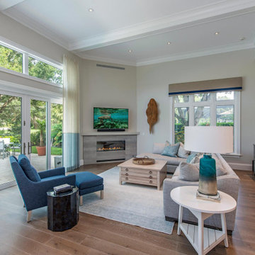
 Signal House
Pelican Bay Home Reborn: A Complete Redesign and Rebuild
Pelican Bay Home Reborn: A Complete Redesign and Rebuild
Blog Introduction: The Pelican Bay community in Naples, Florida has seen many homes come and go, but one house stands out from the rest. Recently, a 3,400 square-foot, four bedroom home underwent a complete renovation that breathed new life into it. With a renewed design and upgraded features, this is the perfect example of what can be done when you take on a full redesign and rebuild of your property. Let’s explore what makes this home so special.
The Open Kitchen & Dining Room
One of the most striking elements of the home is its open kitchen and dining room. The kitchen area was designed to maximize space by utilizing an island with storage underneath as well as bar seating for entertaining guests. The cabinets are made from solid wood with intricate details that add to the overall aesthetic of the kitchen. Adjacent to this area is a spacious dining room with enough seating for six people comfortably. The unique ceiling feature adds drama to the room while still keeping it light and airy.
The Gas Fireplace & Ground Floor Living Room
The cozy living room is anchored by a gas fireplace covered in stone tile that gives off a warm ambiance throughout the whole house. This space was designed to be inviting yet comfortable, allowing visitors to relax while still feeling inspired by its modern touches such as built-in shelves and neutral furniture pieces. There are also two sliding doors that lead out onto the back patio which gives even more options for entertaining guests or just enjoying some fresh air on a nice day!
The dramatic entryway sets the tone for what's to come throughout this newly renovated Pelican Bay home in Naples, Florida. With its inviting living areas, open kitchen/dining area, gas fireplace centerpiece, ceiling features throughout, outdoor patio space—this home has been completely transformed into something truly special! Whether you're looking for inspiration on how to renovate your own property or just want to admire an amazing work of art—this remodeled Pelican Bay home should definitely be at the top of your list!
About Pelican Bay
Pelican Bay in Naples, Florida is known for its stunning beaches and crystal clear turquoise waters. Its ideal location nestled between the Gulf of Mexico and a vast nature preserve ensures that visitors to the area can experience an array of outdoor activities, from fishing and kayaking, to swimming, golfing or hiking through mangrove swamps. With an abundance of luxurious resorts, fine dining establishments, spa treatments and shopping galore, Pelican Bay is one of the premier destinations on the west coast of Florida. Whether you're looking for a relaxing beach vacation or an action packed getaway full of adventure and excitement, Pelican Bay offers something for everyone.
Award-Winning House Builders in Florida
If you're looking for a reliable house builder in Florida, look no further! Every project is important to us and each one is completed with the utmost commitment to quality and attention to detail. With years of experience in the field, our team has the expertise and resources necessary to create whatever kind of home you can imagine. Whether you're building from scratch or remodeling an existing structure, we provide friendly and professional service every step of the way, from initial design and permitting all the way through construction and follow up! Let us help make your dream house a reality today.
18