
Search results for "Existed" in Home Design Ideas
 Spire Integrated Systems Inc.
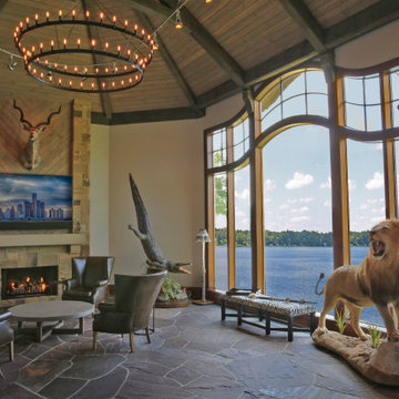
You are walking quietly through the tall grass next to a wide river, brown and fast moving from fresh floods. The hot sun setting slowly overhead. Just as the sun begins to touch the horizon, the whole sky is brushed in a rich orange hue. You emerge from the grass to be greeted by your first sight of African lions in their natural habitat and a Serengeti sunset that will stay with you for the rest of your life.
This was the moment that began this project, inspiring the client to recreate that moment for their sport hunting trophy room in their home. The goal was to be able to recreate that experience as closely as possible, while also ensuring that every mount in the collection had the ideal amount and type of light directed at it.
Nature exhibits an infinite amount of unique color and light environments. From rich color in every hue and temperature, to light of all different intensities and quality. In order to deliver the client’s expectations, we needed a solution that can reflect the diverse lighting environments the client was looking to recreate.
Using a Ketra lighting system, controlled through a Lutron HomeWorks QS system, tied in seamlessly to an existing Lutron HomeWorks Illumination system, we were able to meet all of these challenges. Tying into the existing system meant that we could achieve these results in the space that the client was focused on without having to replace the whole system.
In that focused space, creating dynamic lighting environments was central to several elements of the design, and Ketra’s color temperature settings enabled us to be extremely flexible while still providing high quality light in all circumstances. Using a large track system consisting of 30 S30 lamps, each individually addressed, we were able to create the ideal lighting settings for each mount. Additionally, we designed the system so that it can be set to match the unique warm standard Edison-style bulbs in the main chandelier, it can be set to a “Natural” mode that replicates the outdoor conditions throughout the day, or it can simulate the exact color temperature progression of that unforgettable Serengeti sunset.
Control of the lighting environment and a smooth transition to the lighting systems in the rest of the home was also a priority. As a result, we installed 3 Lutron motorized shades in the space to account for ambient light, and 6 A20 lamps in an adjacent bar area to create a natural transition to the rest of the lighting system. This ensures that all of the lighting transitions, whether from the rest of the home to the trophy room or the trophy room to the outside, are continuous and smooth. The end result is an impressive and flexible display space with an added “wow factor” that is out of this hemisphere!
 Brittany Kiecker
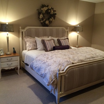
This client had some existing wall decor, bedside tables, and dressers that went with their existing bed. They decided it was time for a king size bed frame. We selected a beautiful upholstered bed frame that complemented their existing case goods along with luxurious bedding to coordinate with the existing drapery and wall decor.
 JRP Design & Remodel
For three years this Westlake Village couple lived in a house that die fiheir needs. With frequent houseguests staying for weeks at a time, the family needed more space, particularly in the cramped kitchen. So began their search for a new home. Though the couple viewed several residences, they realized nothing compared to the space and location of the house they already owned. The family knew JRP by reputation from friends who were JRP clients. After consulting with our team, the couple agreed a whole-home renovation was the way to the dream home they had been searching for. Inspired by top architectural magazines, the couple had a clear vision of how their home should look and feel: a clean, open, modern space with a mix of details that played to the family's lively spirit.
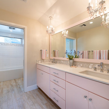
The highlight of this new, open floorplan home is the gorgeous kitchen perfect for hosting. The unified palette is soft and beautiful. Clean, bright surfaces underpin strong visual elements such as polished quartz countertops, brushed oak floors, and glass tiles set in a herringbone pattern. A center-island breakfast bar now sits opposite a giant picture window and a show-stopping view of the Santa Monica mountains. Upstairs, the redesigned master bath is what dreams are made of. The double vanity and freestanding tub were rearranged to maximize space while the wood tile floors and stunning rock backsplash add an elemental feel. Now completely transformed, every detail of this transitional home creates the perfect atmosphere for relaxing and entertaining.
Cabinets (Manufacturer, Door Style, Material, Color/Stain or Finish)
- Dewils, Shaker Frameless, Maple, Just White
- Dewils, Shaker Frameless, Maple, Fashion Grey
- Dewils, Shaker Frameless, Maple, North Sea
Countertops (Material Type - Manufacturer, Collection, Color)
- Quartz – Vadara, Toledo, Calacatta Dorado
Light Fixture (Type - Manufacturer, Collection, Color)
- Dining Chandelier – Existing
- Breakfast Area Pendant – 1213 Madison Collection, Polished Nickel/Royal Cut Crystal
- Dining Wall Mount Sconce – Heart Sconce, Aged Iron with Natural Percale
- Kitchen Island Pendant – Darlana, Polished Chrome
- Master Bath Ceiling – Bling Flushmount
- Master Bath Vanity – Robert Abbey Fine Lighting Double Shade Bath, Polished Nickel over Steel
- Exterior – Primo Lanterns, The Yorkshire Electric Lantern, Custom Graphite Finish
Plumbing Fixture (Type - Manufacturer, Color)
- Freestanding Tub – Existing
- Tubfiller – Existing
- Master Bath Faucets – Existing
- Kitchen Faucets – Hansgrohe, Chrome
Sink (Type – Manufacturer, Material)
- Undermount Single Bowl Kitchen– Kohler, Stainless Steel
- Undermount Single Prep – Elkay, Stainless Steel
- Undermount Bar Sink – Kohler, Stainless Steel
- Ladena Undermount Lavatory – Kohler, Ceramic
Hardware (Type – Manufacturer, Color)
- Deadbolt – Emtek, Satin Nickel
- Dummy - Emtek, Satin Nickel
- Passage & Privacy - Emtek, Stainless Steel
Color of wall:
- Kitchen, Breakfast Area, Family Room – Dunn Edwards Edgecomb Grey
- Master Bath – Dunn Edwards Foggy Day
- Living and Dining – Dunn Edwards Winter Morning
Tile (Location: Material Type – Manufacturer, Collection/Style, Color)
- KITCHEN BACKSPLASH: Glass - Ann Sacks, Jute, Ecru/Gloss
- MASTER BATH FLOORS, TUB ACCENT WALL, & HALL BATH FLOORS: Porcelain – Bedrosians, Tahoe, Frost/Glazed
- ACCENT WALL BEHIND TUB: Mosaic – Daltile, Flat River Pebble, Creamy Sand
- FIREPLACE FLOOR: Porcelain Tile - Agora Surfaces, Almeria, Lava/Matte
Stone/Masonry (Location: Material Type – Manufacturer, Collection/Style, Color)
- FIREPLACE: Stone Veneer – Eldorado, European Ledge, Zinc/Dry Stacked
Wood Floor (Type – Manufacturer, Collection/Style, Color/Wash)
- Siberian Oak – Provenza, Heirloom, Light Wire Brushed
Windows/Exterior Doors (Type - Manufacturer)
- 2 Wide Casement – Jeld-Wen
- 3 Wide Casement – Jeld-Wen
- Awning – Jeld-Wen
- Single Casement – Jeld-Wen
- Stationary – Jeld-Wen
Photographer: Andrew Abouna
Find the right local pro for your project
 SDM Design, Inc.
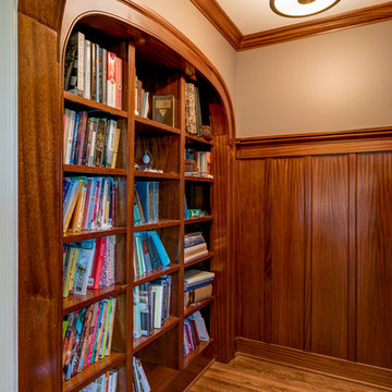
This was and still is a 2,700 s.f. brick rancher yet this project resulted in a complete makeover while still maintaining the original footprint and exterior structure. The house was built in 1954 in a lovely location across the street from the Grove Park Inn Golf Club.
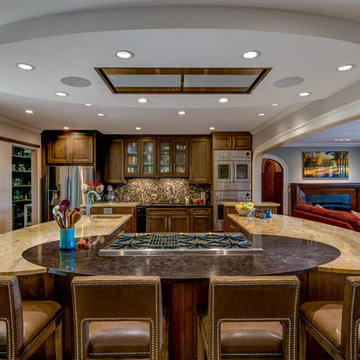
During our initial meeting, my clients, who had recently moved to Asheville, expressed that they enjoyed cooking and engaging with their family and friends while doing so. They wanted the bathrooms updated, a more functional master bedroom and a larger kitchen. The house had a traditional layout with 3 bedrooms, 2 baths, a small kitchen, separate dining and living rooms with an adjoining 570 s.f. family room. It didn’t take long before we all agreed that the large family room would be converted to their master bedroom suite. In order to expand the kitchen, a wall between the existing kitchen and dining was removed, stairs leading to the basement were relocated, a bump out in the existing kitchen became a pantry and one of the adjacent bedrooms was opened up to the new kitchen as the new dining room. Both baths were redesigned and a powder room was created by rearranging existing closets. An existing curved wall in the hallway prompted the design of large open arches between the newly created spaces. This concept extended to the design on curved counter surfaces in the kitchen along with a reflected curved dropped ceiling over the cooking area.
The exterior of the house was enhanced with bay windows, a new copper-roofed front porch overlooking the Grove Park Inn properties with the Blue Ridge Mountains beyond. A circular drive was designed for the convenience of guests. Exterior double-hung windows were replaced with French patio doors in the new kitchen/dining and living areas. This allows easy access to the new front porch and back deck while enhancing the openness of the home.
 Division 9 Inc.
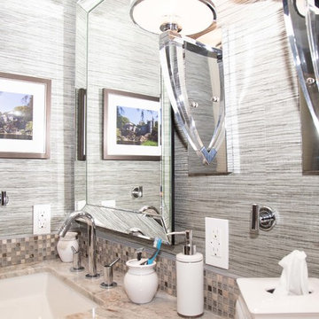
The guest bathroom plays an important role on how your guests will perceive the architecture and style of your home. In this house we totally transformed the outdated bathroom. In collaboration with Roberto Lugo a daring designer from New York, the design process was focused on creating a contemporary space that could be elegant and comfortable.
The initial renovation on this project started with the demolition of entire bathroom including doors, vanity, floor, plumbing and light fixture, toilet, tub, tile switches and outlet. An existing wall between toilet/shower room and vanity room was also removed. The existing door frame was expanded to 27" wide (interior) and the existing floor was inspected to determine a depression on the vanity side.
The existing door frame was converted into a pocket door frame (door opens to the right). To accommodate for standard crown molding the ceiling above the shower was dropped 4".
For the vanity, a furniture-like cabinet style with soft close hardware was installed. The grain stain was paired perfectly with a gray marble countertop.
The shower turned out beautifully. A Shower/Bathtub combination with a sliding door was installed. Porcelain tile was installed vertically on the returns walls, glass mosaic for the long walls, glass mosaic was also used along leading edge of tub enclosure. Porcelain tile was used on the floor.
 MasterDecks, LLC
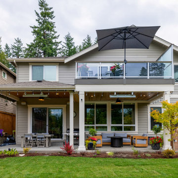
This Sammamish, WA project transformed the existing outdoor living space with a new elevated deck designed to align seamlessly with the home's interior floor height and a newly installed exterior door.
The deck features TimberTech Terrain decking in Silver Maple with matching fascia and borders, complemented by white surface-mounted glass railing with an Azek Coastline top cap. Custom flashing was incorporated to integrate the deck with the existing patio cover and gutter system.
The space was further enhanced with new electrical components, including exterior lighting, provisions for two customer-supplied Bromic heaters, outlets for future motorized screens, and a customer-supplied ceiling fan. Low-voltage wiring was also incorporated for future railing post lighting.
A 33-square-foot concrete slab extension was added to match the deck footprint, while the existing patio cover received coordinated beam and post wraps and a new white Undercover system with integrated gutter and drainage.
The finished project creates a cohesive, functional outdoor living area that blends seamlessly with the home's existing architecture while providing a durable and comfortable space for entertaining and enjoying the outdoors.
 Benson Homes LLC
This remodeling story is a wonderful example of how removing and shifting walls can have an amazing impact on the functionality and visual appeal of an entire level of a home. When our clients reached out to us, they were looking to create an open concept Kitchen that would allow for easy entertaining. The couple had recently purchased this townhome so his mother could be closer to the family.
The existing floorplan offered first floor living, but the Kitchen was tucked in the back and was separated from the rest of the living space by a full wall with a small pass through into the Dining Room. Our design involved removing the dividing wall between the Dining Room and Kitchen as well as the fake columns and beam that separated the Dining Room and Living Room. The entire space was opened up to allow for easy flow and view throughout the first floor living space. The wall shared by the Kitchen and large Master Bedroom was shifted back just enough to provide a full wall of additional cabinetry including a much-needed large double Pantry cabinet. Now that we had opened up the Kitchen area we could focus on the cabinetry layout and selections.
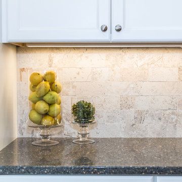
The existing wood toned cabinets were replaced with white cabinets and crown molding to match the rest of the home. The larger, open space allowed for more cabinetry and the addition of an island with new undermount sink, dishwasher and convenient trash pullout along with seating for the grandchildren. A new range hood was installed and vented to the exterior of the house to replace the old recirculating hood. We were able to repurpose the some of the existing cabinets for use above the washer and dryer in the adjoining Laundry Room and swapped out the existing swinging door for a pocket door to free up traffic flow when doing Laundry and working in the Kitchen. The slate-look ceramic tile was replaced with a pre-engineered hardwood floor that creates a sense of warmth while easy to clean. The new Cambria countertop compliments the slate-look tile found in the Dining Room and Living Room and a natural field tile backsplash offsets the cabinets beautifully.
The single fluorescent ceiling light was outdated and did not provide adequate lighting for the new Kitchen. The new lighting plan was carefully thought out to provide general illumination through well placed recessed lighting; task lighting through pendant lighting over the island and under cabinet lighting; and aesthetic fluidity with an eye-catching chandelier for the Dining Room table. Special details include a touch faucet, under counter microwave and glass front cabinetry for displaying dishes.
By removing and shifting walls, we improved the entire flow of the first floor visually as well as functionally and created a beautiful, light-filled space for cooking and entertaining. Grandma can easily prepare meals in her new Kitchen and still chat with her guests and grandchildren who love to sit at the island as well as in the adjoining Dining Room and Living Room.
The Benson Homes team really enjoyed creating this space for this family and we hope they will enjoy spending time with friends and family for years to come.

Sponsored
Columbus, OH

Hope Restoration & General Contracting
Columbus Design-Build, Kitchen & Bath Remodeling, Historic Renovations
 Deep River Partners
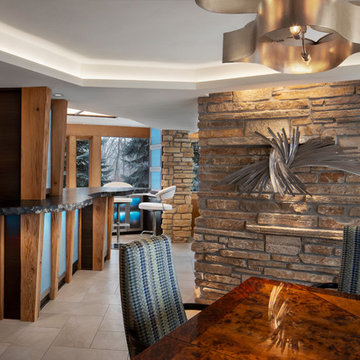
This home was originally designed by a contemporary of Frank Lloyd Wright, Russell Barr Williamson. To stay true to Wright's design principles, open living spaces that flow together needed to be created. Astute space planning that included existing structural elements was essential to ensure a functional kitchen and entertainment area. The existing barriers were diminished by removing walls. Design of the kitchen (and beyond) needed to respect the style of the home and existing finishes. Following Wright's lead: fire became the "heart of home" by adding a fireplace. Pecky cypress and Lannon stone were repeated, and strong horizontal lines of stained walnut cabinetry were crafted. The herringbone pattern of the floor tile echoed the pattern of the existing flooring and angles of the floorplan.
 Daniel Scerri Periti
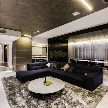
We were approached with a request to design the furnishings for an existing ‘finished’ apartment. The intention was to move in relatively fast, and the property already had an existing marble floor, kitchen and bathrooms which had to be kept. The property also boasted a fantastic 270 degree view, seen from most of the apartment. The clients had a very important role in the completion of the project. They were very involved during the design process and through various decoration choices. The final design was kept as a rigid guideline when faced with picking out all the different elements.
Once clear of all previous furniture, the space felt cold and bare; so we immediately felt the need for warmth, and raw, natural elements and textures to complement the cold marble floor while visually tying in the design of the whole apartment together.
Since the existing kitchen had a touch of dark walnut stain, we felt this material was one we should add to the palette of materials to contest the stark materials. A raw cement finish was another material we felt would add an interesting contrast and could be used in a variety of ways, from cabinets to walls and ceilings, to tie up the design of various areas of the apartment.
To warm up the living/dining area, keeping the existing marble floor but visually creating zones within the large living/dining area without hindering the flow, a dark timber custom-made soffit, continuous with a floor-to-ceiling drinks cabinet zones the dining area, giving it a degree of much-needed warmth.
The various windows with a stupendous 270 degree view needed to be visually tied together. This was done by introducing a continuous sheer [drape] which also doubled up as a sound-absorbing material along 2 of the 4 walls of the space.
A very large sofa was required to fill up the space correctly, also required for the size of the young family.
Services were integrated within the units and soffits, while a customized design in the corner between the kitchen and the living room took into consideration the viewpoints from the main areas to create a pantry without hindering the flow or views. A strategically placed floor-to-ceiling mirror doubles up the space and extends the view to the inner parts of the apartment.
The daughter’s bedroom was a small challenge in itself, and a fun task, where we wanted to achieve the perception of a cozy niche with its own enclosed reading nook [for reading fairy tales], behind see-through curtains and a custom-ordered wall print sporting the girl’s favorite colors.
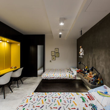
The sons’ bedroom had double the requirements in terms of space needed: more wardrobe, more homework desk space, a tv/play station area… “We combined a raised platform area between the boys’ beds to become an area with cushions where the kids can lay down and play, and face a hidden screen behind the homework desk’s sliding back panel for their play station”. The color of the homework desk was chosen in relation to the boys’ ages. A more masculine material palette was chosen for this room, in contrast to the light pastel palette of the girl’s bedroom. Again, this colour can easily be changed over time for a more mature look.
PROJECT DATA:
St. Paul’s Bay, Malta
DESIGN TEAM:
Perit Rebecca Zammit, Perit Daniel Scerri, Elyse Tonna
OTHER CREDITS:
Photography: Tonio Lombardi
Styling : TKS
 SDM Design, Inc.
This was and still is a 2,700 s.f. brick rancher yet this project resulted in a complete makeover while still maintaining the original footprint and exterior structure. The house was built in 1954 in a lovely location across the street from the Grove Park Inn Golf Club.
During our initial meeting, my clients, who had recently moved to Asheville, expressed that they enjoyed cooking and engaging with their family and friends while doing so. They wanted the bathrooms updated, a more functional master bedroom and a larger kitchen. The house had a traditional layout with 3 bedrooms, 2 baths, a small kitchen, separate dining and living rooms with an adjoining 570 s.f. family room. It didn’t take long before we all agreed that the large family room would be converted to their master bedroom suite. In order to expand the kitchen, a wall between the existing kitchen and dining was removed, stairs leading to the basement were relocated, a bump out in the existing kitchen became a pantry and one of the adjacent bedrooms was opened up to the new kitchen as the new dining room. Both baths were redesigned and a powder room was created by rearranging existing closets. An existing curved wall in the hallway prompted the design of large open arches between the newly created spaces. This concept extended to the design on curved counter surfaces in the kitchen along with a reflected curved dropped ceiling over the cooking area.
The exterior of the house was enhanced with bay windows, a new copper-roofed front porch overlooking the Grove Park Inn properties with the Blue Ridge Mountains beyond. A circular drive was designed for the convenience of guests. Exterior double-hung windows were replaced with French patio doors in the new kitchen/dining and living areas. This allows easy access to the new front porch and back deck while enhancing the openness of the home.
 Daniel Scerri Periti
We were approached with a request to design the furnishings for an existing ‘finished’ apartment. The intention was to move in relatively fast, and the property already had an existing marble floor, kitchen and bathrooms which had to be kept. The property also boasted a fantastic 270 degree view, seen from most of the apartment. The clients had a very important role in the completion of the project. They were very involved during the design process and through various decoration choices. The final design was kept as a rigid guideline when faced with picking out all the different elements.
Once clear of all previous furniture, the space felt cold and bare; so we immediately felt the need for warmth, and raw, natural elements and textures to complement the cold marble floor while visually tying in the design of the whole apartment together.
Since the existing kitchen had a touch of dark walnut stain, we felt this material was one we should add to the palette of materials to contest the stark materials. A raw cement finish was another material we felt would add an interesting contrast and could be used in a variety of ways, from cabinets to walls and ceilings, to tie up the design of various areas of the apartment.
To warm up the living/dining area, keeping the existing marble floor but visually creating zones within the large living/dining area without hindering the flow, a dark timber custom-made soffit, continuous with a floor-to-ceiling drinks cabinet zones the dining area, giving it a degree of much-needed warmth.
The various windows with a stupendous 270 degree view needed to be visually tied together. This was done by introducing a continuous sheer [drape] which also doubled up as a sound-absorbing material along 2 of the 4 walls of the space.
A very large sofa was required to fill up the space correctly, also required for the size of the young family.
Services were integrated within the units and soffits, while a customized design in the corner between the kitchen and the living room took into consideration the viewpoints from the main areas to create a pantry without hindering the flow or views. A strategically placed floor-to-ceiling mirror doubles up the space and extends the view to the inner parts of the apartment.
The daughter’s bedroom was a small challenge in itself, and a fun task, where we wanted to achieve the perception of a cozy niche with its own enclosed reading nook [for reading fairy tales], behind see-through curtains and a custom-ordered wall print sporting the girl’s favorite colors.
The sons’ bedroom had double the requirements in terms of space needed: more wardrobe, more homework desk space, a tv/play station area… “We combined a raised platform area between the boys’ beds to become an area with cushions where the kids can lay down and play, and face a hidden screen behind the homework desk’s sliding back panel for their play station”. The color of the homework desk was chosen in relation to the boys’ ages. A more masculine material palette was chosen for this room, in contrast to the light pastel palette of the girl’s bedroom. Again, this colour can easily be changed over time for a more mature look.
PROJECT DATA:
St. Paul’s Bay, Malta
DESIGN TEAM:
Perit Rebecca Zammit, Perit Daniel Scerri, Elyse Tonna
OTHER CREDITS:
Photography: Tonio Lombardi
Styling : TKS
 HA Architecture
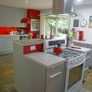
Within the confines of a strict budget, we assisted a South Austin client who desired an updated kitchen and dining area as well as a new private master bedroom with ensuite and laundry / mudroom area. The existing ranch style home was transformed with only a modest addition but a clever reorganization of space.
The existing fireplace compartmentalized the kitchen and was removed to open the space into the dining and living areas. Existing cabinetry and counter tops were replaced with all new custom cabinetry. Adding a new kitchen island with stainless steel hood over the range and sleek stainless cabinet hardware gave this existing kitchen a fresh modern aesthetic.
 George Ocampo
Sunset Heights Renovation
This Victorian style home was beautifully designed from the interior to the exterior. Our clients were looking to update the outdoor space, not only was it not functional, but it did not complement their Victorian home.
Although we had a yearlong waiting list for design, our clients were patient and hired us for 3D design.
Many times, our clients already have all the components in place, such as a pool, outdoor kitchen, fireplace, pergola etc., but they just don’t feel right.
The most important feature of our client’s new space was not only the components, but to be able to have a space that would allow them to create a lifetime of memories. From a visual perspective their existing space seemed limited and confined. Our design team was able to see past this and expanded its space to its full potential which allowed us to create multiple destinations for relaxation, enjoyment and most importantly entertainment.
As we began the design process, we were able to take a closer look at the existing space and noticed many safety concerns and how the existing materials did not accentuate the home either.
At the completion of their 3D design, we were able to present new ideas and materials that would enhance the value of the home as well as help them visualize the new space created with multiple destinations.
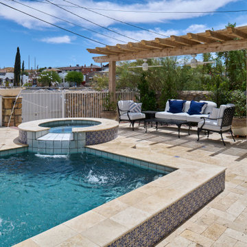
Ivory travertine coping & decking was a must as was the Talavera blue highlighted tiles for the newly renovated pool. A new working spa and functional outdoor kitchen with bar were two spaces we are sure they would enjoy while spending time outdoors. We enlarged the existing covered patio to expand the seating area to include chaise lounges, a loveseat and chairs under the pergola shade accent.
Newest favorite additions are the gas firepit and cabin play fort which can be highly utilized year-round. Our clients say, “The adults love hanging out in the fort too!”
Nestled in the Historic District, our client’s home is now filled with plenty of space and great energy for family gatherings, parties, watching sports, graduations and so much more. Who knows, maybe a future wedding or two! Memories of a lifetime will be made here for years to come!
Architecture and lifestyle are always our focus when designing feel good and functional spaces for our clients!
Sponsored
Columbus, OH

Trish Takacs Design
Award Winning & Highly Skilled Kitchen & Bath Designer in Columbus
 Robin's Nest Interiors
The fabulous Kitchen we shared with you earlier is open to the Breakfast Area & Hearth Room. We kept most of the homeowner’s existing furniture including the table and chairs, small bookcase, leather chair & ottoman and the rugs.
In order to unify the existing pieces with our new color scheme, we installed valances in a colorful paisley print on the 3 large windows along the back wall. They pop off our walls in Sherwin Williams’ White Heron (SW7627). The chandelier in the Breakfast Area was slightly off center and unfortunately could not be moved. We install this oversized, dimensional chandelier that fills the space nicely. We added cushions in a fun denim stripe to the chairs.
In the Hearth Room, we paired a sofa with chaise in a sharp tweed fabric with the existing leather chair. We finished off the seating area with unique tables and a colorful lamp.
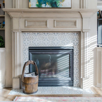
The most impactful change in this area was painting the bookshelves and adding a patterned tile around the fireplace that coordinates with our Kitchen backsplash. Kelly Sisler with Creative Finishes by Kelly did a “Restoration Hardware” treatment to the built-ins making them feel more like furniture. We added texture by installing grass cloth to the back of the shelves. We filled in some colorful accessories with the homeowner’s existing pieces to finish them off.
This is a warm and inviting space that along with the Kitchen is definitely “the heart of the home!”
 Kaplan Architects, AIA
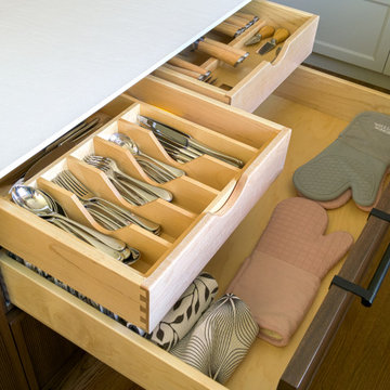
Our client purchased an apartment on the top floor of an old 1930’s building with expansive views of the San Francisco Bay from the palace of Fine Arts, Golden Gate Bridge, to Alcatraz Island. The existing apartment retained some of the original detailing and the owner wished to enhance and build on the existing traditional themes that existed there. We reconfigured the apartment to add another bedroom, relocated the kitchen, and remodeled the remaining spaces.
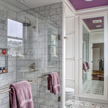
The design included moving the kitchen to free up space to add an additional bedroom. We also did the interior design and detailing for the two existing bathrooms. The master bath was reconfigured entirely.
We detailed and guided the selection of all of the fixtures, finishes and lighting design for a complete and integrated interior design of all of the spaces.
 Drury Design
THE SETUP
Our journey began with a familiar face — Alicia had previously transformed the client’s mother’s home, establishing a trusted relationship that naturally led to this personal project. The client desired a kitchen that truly reflected her own style while facilitating seamless entertaining.
Design Vision:
The original kitchen, segregated from the dining area by a wall, hindered the flow of interaction and space. Our client envisioned a unified area where she could engage with guests in both the kitchen and dining room simultaneously. Moreover, the space lacked a central island, relying instead on a floorplan anchored by cabinetry in a u-shaped layout.
Design Objectives:
Open up the space for an airy design conducive to entertaining large gatherings
Modernize the kitchen to be both stylish and functional
Integrate the design with the home’s new black-framed windows and doors
Relocate the cooktop to a central position to enhance usability and interaction
Design Challenges:
Removing the wall between the kitchen and dining room would necessitate the rerouting of existing HVAC ductwork that services the upper floor
Limited pantry space in the existing kitchen
The existing u-shaped layout of the kitchen restricted functionality and storage options
Insufficient space for wine storage
The client desired a raised-furniture look for the island, but without showing a new downdraft vent
THE RENEWED SPACE
Design Solutions:
We added a second HVAC unit to the upper floor and rerouted the existing ductwork in that wall
Created tall pantry pullouts on either side of the fridge to maximize dry goods storage
Designed a long island to facilitate cooking stations and dining moments
Created a stylish open display cabinet for wine
Engineered a dual-design island with a footed floating aesthetic on one side, and a full floor reach on the other to conceal the new downdraft ventilation.
Paired with the newly opened adjacent dining room featuring a wet bar, the kitchen has become a stylish and highly functional space for cooking and entertaining. Following a large baby shower hosted by the client (which seamlessly accommodated an 80-person gathering!), it is clear that the new design not only meets but exceeds the needs for hosting and everyday living. This project was a harmonious blend of the client’s vision and Alicia’s innovative design solutions, resulting in a kitchen that truly embodies personalized elegance and functionality.
 George Ocampo
Sunset Heights Renovation
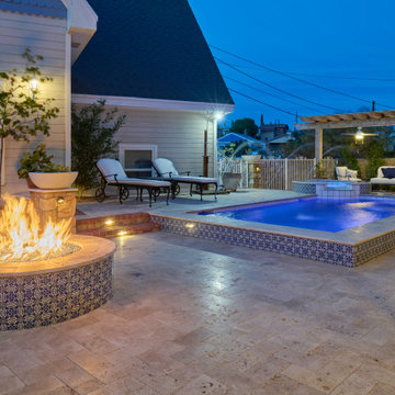
This Victorian style home was beautifully designed from the interior to the exterior. Our clients were looking to update the outdoor space, not only was it not functional, but it did not complement their Victorian home.
Although we had a yearlong waiting list for design, our clients were patient and hired us for 3D design.
Many times, our clients already have all the components in place, such as a pool, outdoor kitchen, fireplace, pergola etc., but they just don’t feel right.
The most important feature of our client’s new space was not only the components, but to be able to have a space that would allow them to create a lifetime of memories. From a visual perspective their existing space seemed limited and confined. Our design team was able to see past this and expanded its space to its full potential which allowed us to create multiple destinations for relaxation, enjoyment and most importantly entertainment.
As we began the design process, we were able to take a closer look at the existing space and noticed many safety concerns and how the existing materials did not accentuate the home either.
At the completion of their 3D design, we were able to present new ideas and materials that would enhance the value of the home as well as help them visualize the new space created with multiple destinations.
Ivory travertine coping & decking was a must as was the Talavera blue highlighted tiles for the newly renovated pool. A new working spa and functional outdoor kitchen with bar were two spaces we are sure they would enjoy while spending time outdoors. We enlarged the existing covered patio to expand the seating area to include chaise lounges, a loveseat and chairs under the pergola shade accent.
Newest favorite additions are the gas firepit and cabin play fort which can be highly utilized year-round. Our clients say, “The adults love hanging out in the fort too!”
Nestled in the Historic District, our client’s home is now filled with plenty of space and great energy for family gatherings, parties, watching sports, graduations and so much more. Who knows, maybe a future wedding or two! Memories of a lifetime will be made here for years to come!
Architecture and lifestyle are always our focus when designing feel good and functional spaces for our clients!

Sponsored
Columbus, OH
Hope Restoration & General Contracting
Columbus Design-Build, Kitchen & Bath Remodeling, Historic Renovations
 Martin Lennox
Is 'Fleishman Is In Trouble' Season 2 On The Cards? "Fleishman Is In Trouble" is an action sequel that debuted on Hulu and also enticed viewers to engage. Once the story is complete viewers are curious about what happens to the intention of Fleishman's account. And we're here to give an explanation.
To put it in perspective, Fleishman exists in Hazard and is a witness to divorced Toby Fleishman whose power is generosity to persuade when he is able to win a winning streak in the planet of love. The joy he experiences is fleeting when his ex-wife mysteriously disappears leaving him with two children.
As the story progresses, it is revealed that he lies about numerous accounts, including the way he raised his children. He must figure out why the marriage broke up before making a decision on what happened to the ex-wife. It's almost a double season. Let's get more effective.
Here's Why 'Fleishman Is In Trouble' Season 2 Won't Transpire
Fleishman The Fleishman Trouble season 2 - a second preference will not be a reality. The series is already established as an untrue miniseries/sequence. We're all aware that miniseries are only rerun to a double season when they're as good in quality as Big Little Lies.
Most likely, they have reached the end of their days. The lives of the survivors will still attract a lot of observers.
The structure of the sequence slowed the concerns about a possible revival or a growth into a regular sequence.
Brodesser-Akner was joking about presenting another season of "Fleishman Is In Trouble" via a tweet.
The tweet reads "The double season of FLEISHMAN IS IN TROUBLE stands predicated on the thought that the Fleishman's intention exists for a forthcoming household within five years."
She stated, Apparently, I'm fooling and merely observing GODFATHER II, which is not a Christmas film despite including an ensemble of youngsters who stand extremely Christmassy. There is no double season of FLEISHMAN!"
Although we know the situation, it's not going to be resolved, Unfortunately.
The Cast Of 'Fleishman Exists In Situation' Lectured Almost The Future Possibility
Brodesser Akner stated that the succession follows in a narrow order that also is complete.
Brodesser-Akner has recently described, "It's an unreasonable succession. This account stands the textbook's capacity, and I suppose it's concluded."
In addition, I remarked, "I'm likewise seduced to never tolerate these consistencies. It's heartbreaking. Whatever I register, the following choice exists a negligibly undersized climax to my bones than this, correct? This was willingly and considerably important, something I can discern in my belly."
Claire did manage, "Oh, I consider that it should stand as it is. I think it communicated what it promised. Although I loved everyone I worked with, I'm still messaging out. They're real friends who only talk with regard to the subject.
This happens only occasionally. It's only a sign that the project succeeds! This is why I received significant assistance from this source. Continuous companionship is a crucial one. A huge and succulent cherry in the tree."
In the end, we will allow for a continuation following the initial confirmation of succession Brodesser-Akner said, "I'm overjoyed to live and expand the energy of Fleishman's on the web with such intelligent, thoughtful and brave members.
When I wrote this book I was looking to discover on my own the enigmatic nature and the politics of marriage and the median generation. The registration of the textbook helped tremendously, and I am confident that this concert will fulfill the goal."
What do you think of your reflections on the ongoing miniseries? It is possible to reduce your feelings and musings in the exposition region downwards. Additionally, remember to stay in tune with us to receive better information.
 KITCHEN SOLVERS - La Crosse
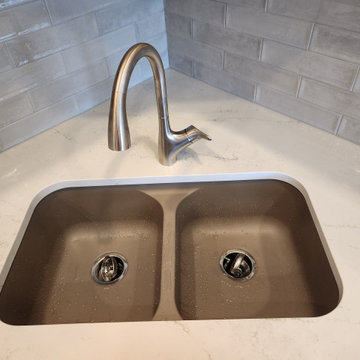
Our clients contacted us to help them update their kitchen. They wanted to first update the countertops, while also adding a backsplash and pullout drawers to their existing pantries. Some of their existing drawers were falling apart and they wanted to update those to soft closed drawer boxes as well. There was also an old appliance garage that they no longer used and wanted to know what we could do to remove that. We proposed to remove the existing cabinet and cut the appliance garage down. This really opened up the space for them, which they loved. We were now ready to install a new Calacatta Lucia quartz countertop and a Raku silver glossy tile backsplash. We also replaced the main and prep sink with new concrete undermount sinks. To finish this transformation, we installed all new dovetailed wood drawer boxes with full-extension undermount soft-close glides in all their existing drawers and the two pantries. Now our homeowners finally have the kitchen of their dreams!
 Landis Architects | Builders
Michael Wilkinson
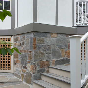
The existing home has stucco siding. Matching the exterior of the addition to the Tudor home's stucco was outside the client's budget. Instead, we used Hardiepanel that has a stucco pattern. Wide Tru Exterior trim matches the width of the trim on the existing house. We mimicked the trim pattern of the existing house.
We removed the existing rear deck as well as a 4-foot wide segment along the side of the house that led to a sliding door to a small office. The clients didn’t need outdoor access from the office, so we replaced the sliding door with a casement window.
The foundation of the addition is piers. The pizza oven base acts as one of the piers.
103