
Search results for "Experience to face speak" in Home Design Ideas

 Cantoni Atlanta
One can say that the redesign job on this Atlanta-area home was just what the doctor ordered, since physician Jim Linnane chose Cantoni designer Kohl Sudnikovich to help him re-imagine his 50s ranch-style residence.
Online browsing, and a fondness for modern design, led the medical professional into our Georgia store/" title="Cantoni Modern Furniture Stores" class="crosslinking">showroom after purchasing the 50s-built home in early 2011. Since then, walls were torn down, the kitchen got a facelift, a lone loft morphed in to a music room, and the fireplace got haute while the pool became cool.
As always, step one of the design process began with Kohl visiting the home to measure and scale-out floor plans. Next, ideas were tossed around and the client fell in love with the Mondrian sectional, in red. “Jim’s selection set the color scheme for the home’s living areas,” explains Kohl, “and he loves the punchy accents we added with art, both inside and out.”
“Kohl worked closely with me, from start to finish, and guided me through the entire process,” explains Jim. “He helped me find a great contractor, and I’m particularly fond of the plan he conceived to replace the dated fireplace with a more contemporary linear gas box set in striated limestone.”
Adds Kohl, “I love how we opened the loft and staircase walls by replacing them with metal and cable railings, and how we created a sitting area (in what was the dining room) to open to the living room we enhanced with mirrors.”
A creative fix, like re-facing the cabinets, drawers and door panels in the kitchen, illustrates how something simple (and not too pricey) can make a big impact.
The project, on a whole, is also a good example of how our full-service design studio and talented staff can help re-imagine and optimize your living space while working within your budget.
“Meeting and working with Kohl was such a great experience,” says Jim, in closing. “He is so talented. He came up with great design ideas to completely change the look of my home’s interior, and I think the results are amazing.” Guess what, Jim? We think the results of your collaboration with Kohl are pretty amazing, too.
 Drury Design
THE SETUP
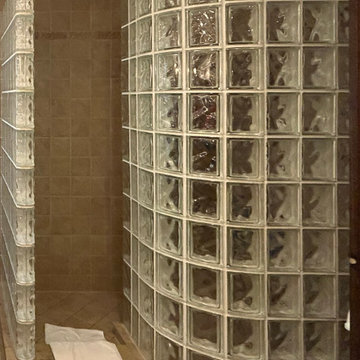
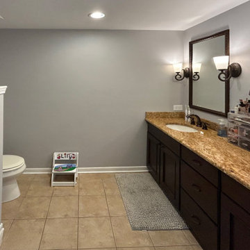
The original primary bathroom was characterized by a disjointed and segmented layout. The shower featured a bulky glass-block enclosure that overwhelmed the space visually. There was a considerable amount of open, unused space, and despite having a his and hers vanity, the arrangement lacked personal space for each user, as they shared the conjoined space between the sinks. The toilet was inconveniently located right by the door, with a half-wall partition meant to provide privacy but instead contributing to a cramped and unbalanced feel. Overall, the bathroom’s layout and design were fragmented, failing to make the most of the available space and lacking adequate storage solutions.
Design objectives:
- Reconfigure the layout to enhance functionality and flow.
- Create an elegant, upscale aesthetic that is light and bright.
- Incorporate specialized storage solutions for female hair care needs.
- Increase overall storage capacity.
- Develop a spa-like shower experience.
- Provide a significant wow factor to the space.
THE REMODEL
Design challenges to be solved:
- Repositioning the toilet to a more suitable location.
- Designing hair care storage solutions without cluttering the elegant space.
- Balancing an upscale, elegant design with a feminine touch in the color palette.
- Increasing the brightness of the room without adding windows.
- Completely replacing the existing shower to create a spa-like experience.
- Planning new storage solutions without adding bulkiness or clutter to the cabinetry.
THE RENEWED SPACE
Design solutions:
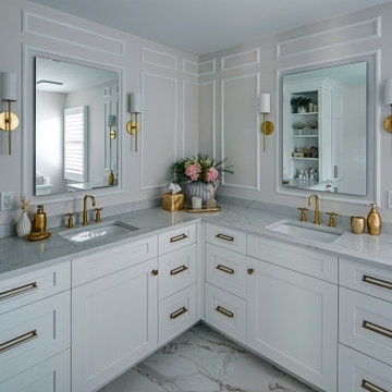
Toilet Relocation: Moved the toilet by the window, creating a better overall layout that also opened up two full walls for cabinetry and storage solutions.
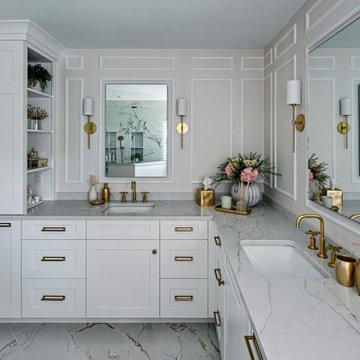
Specialized Vanity Storage: The left side of the left vanity is the wife’s. Open shelves facing across the vanity can be used for decorative or daily needs items. Pull-out docking drawers with power outlets and metal basins handle hot hair appliances.
Bright and Elegant Color Scheme: White cabinets, countertops, floors, and shower walls keep the space bright. The just-off-white wall color with a hint of pink adds a feminine touch. Thin wainscoting with white trim offers traditional-leaning elegance.
Layered Lighting Strategy: Ceiling can lights, sconces, lighted mirrors, and toe-kick lighting were installed. Natural light-rated bulbs keep the space bright and natural-feeling.
Spa-Like Shower: An extra-large shower was created using the same floor tile materials for continuity. Equipped with a Kohler Anthem system with a shower head, hand-held, and four body sprays. His and Hers niches for separate body care product storage.
Enhanced Storage Solutions: Added a linen cabinet within the vanity area for efficient storage of towels and bathroom essentials.
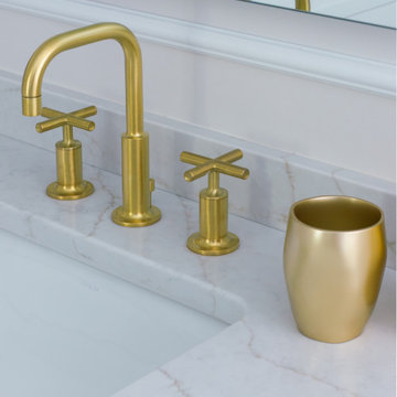
This elegant bathroom feels incredibly spacious now. The color palette and lights keep the room bright and cheery. Gold fixtures, the herringbone pattern on the floor, and exquisite trim work add an elegant touch. With the husband and wife having their own vanity wall sections joined at the corner, each user truly has their own space within the space. The clients are very happy with the final result.
 Drury Design
THE SETUP
The original primary bathroom was characterized by a disjointed and segmented layout. The shower featured a bulky glass-block enclosure that overwhelmed the space visually. There was a considerable amount of open, unused space, and despite having a his and hers vanity, the arrangement lacked personal space for each user, as they shared the conjoined space between the sinks. The toilet was inconveniently located right by the door, with a half-wall partition meant to provide privacy but instead contributing to a cramped and unbalanced feel. Overall, the bathroom’s layout and design were fragmented, failing to make the most of the available space and lacking adequate storage solutions.
Design objectives:
- Reconfigure the layout to enhance functionality and flow.
- Create an elegant, upscale aesthetic that is light and bright.
- Incorporate specialized storage solutions for female hair care needs.
- Increase overall storage capacity.
- Develop a spa-like shower experience.
- Provide a significant wow factor to the space.
THE REMODEL
Design challenges to be solved:
- Repositioning the toilet to a more suitable location.
- Designing hair care storage solutions without cluttering the elegant space.
- Balancing an upscale, elegant design with a feminine touch in the color palette.
- Increasing the brightness of the room without adding windows.
- Completely replacing the existing shower to create a spa-like experience.
- Planning new storage solutions without adding bulkiness or clutter to the cabinetry.
THE RENEWED SPACE
Design solutions:
Toilet Relocation: Moved the toilet by the window, creating a better overall layout that also opened up two full walls for cabinetry and storage solutions.
Specialized Vanity Storage: The left side of the left vanity is the wife’s. Open shelves facing across the vanity can be used for decorative or daily needs items. Pull-out docking drawers with power outlets and metal basins handle hot hair appliances.
Bright and Elegant Color Scheme: White cabinets, countertops, floors, and shower walls keep the space bright. The just-off-white wall color with a hint of pink adds a feminine touch. Thin wainscoting with white trim offers traditional-leaning elegance.
Layered Lighting Strategy: Ceiling can lights, sconces, lighted mirrors, and toe-kick lighting were installed. Natural light-rated bulbs keep the space bright and natural-feeling.
Spa-Like Shower: An extra-large shower was created using the same floor tile materials for continuity. Equipped with a Kohler Anthem system with a shower head, hand-held, and four body sprays. His and Hers niches for separate body care product storage.
Enhanced Storage Solutions: Added a linen cabinet within the vanity area for efficient storage of towels and bathroom essentials.
This elegant bathroom feels incredibly spacious now. The color palette and lights keep the room bright and cheery. Gold fixtures, the herringbone pattern on the floor, and exquisite trim work add an elegant touch. With the husband and wife having their own vanity wall sections joined at the corner, each user truly has their own space within the space. The clients are very happy with the final result.
Find the right local pro for your project
 Drury Design
THE SETUP
The original primary bathroom was characterized by a disjointed and segmented layout. The shower featured a bulky glass-block enclosure that overwhelmed the space visually. There was a considerable amount of open, unused space, and despite having a his and hers vanity, the arrangement lacked personal space for each user, as they shared the conjoined space between the sinks. The toilet was inconveniently located right by the door, with a half-wall partition meant to provide privacy but instead contributing to a cramped and unbalanced feel. Overall, the bathroom’s layout and design were fragmented, failing to make the most of the available space and lacking adequate storage solutions.
Design objectives:
- Reconfigure the layout to enhance functionality and flow.
- Create an elegant, upscale aesthetic that is light and bright.
- Incorporate specialized storage solutions for female hair care needs.
- Increase overall storage capacity.
- Develop a spa-like shower experience.
- Provide a significant wow factor to the space.
THE REMODEL
Design challenges to be solved:
- Repositioning the toilet to a more suitable location.
- Designing hair care storage solutions without cluttering the elegant space.
- Balancing an upscale, elegant design with a feminine touch in the color palette.
- Increasing the brightness of the room without adding windows.
- Completely replacing the existing shower to create a spa-like experience.
- Planning new storage solutions without adding bulkiness or clutter to the cabinetry.
THE RENEWED SPACE
Design solutions:
Toilet Relocation: Moved the toilet by the window, creating a better overall layout that also opened up two full walls for cabinetry and storage solutions.
Specialized Vanity Storage: The left side of the left vanity is the wife’s. Open shelves facing across the vanity can be used for decorative or daily needs items. Pull-out docking drawers with power outlets and metal basins handle hot hair appliances.
Bright and Elegant Color Scheme: White cabinets, countertops, floors, and shower walls keep the space bright. The just-off-white wall color with a hint of pink adds a feminine touch. Thin wainscoting with white trim offers traditional-leaning elegance.
Layered Lighting Strategy: Ceiling can lights, sconces, lighted mirrors, and toe-kick lighting were installed. Natural light-rated bulbs keep the space bright and natural-feeling.
Spa-Like Shower: An extra-large shower was created using the same floor tile materials for continuity. Equipped with a Kohler Anthem system with a shower head, hand-held, and four body sprays. His and Hers niches for separate body care product storage.
Enhanced Storage Solutions: Added a linen cabinet within the vanity area for efficient storage of towels and bathroom essentials.
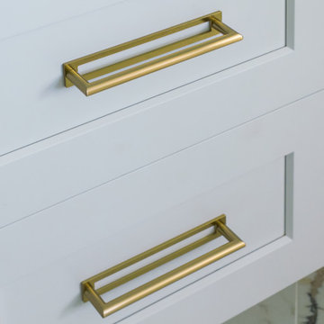
This elegant bathroom feels incredibly spacious now. The color palette and lights keep the room bright and cheery. Gold fixtures, the herringbone pattern on the floor, and exquisite trim work add an elegant touch. With the husband and wife having their own vanity wall sections joined at the corner, each user truly has their own space within the space. The clients are very happy with the final result.
 Ziegler Doors Inc.
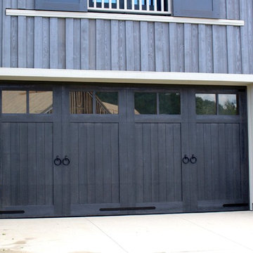
In this photo you see a hand crafted garage door to replicate a Carriage Door which is also traditional barn style. We added a faux stain finish to replicate wood grains, Iron ornaments and hinges with wire glass windows. This barn door / Carriage design goes well with the rustic colonial design. The straight edge finishes and clean lines also make this a great design for traditional and Modern homes too!
A garage door makes up 25% of the face of the home in most cases and some even more, so why not use this area of the home to display your own style and creativity. We have been building garage doors out of ECO friendly materials for more than 20 years. We are one of the first garage door manufactures in California to take a stand on our natural resources ecology by offering a real wood alternative. That is how the ECO-DOOR was developed in the late 80’s. We have always built our doors with Artisan craftsman; we do mass produce any of our doors. Built by hand with care, we never waste materials and always recycle leftover building materials that go back to processors and are reconstituted into new building materials.
Designed to be rustic and old world, we faux finished it in grey tones to bring the styles together. Ziegler ECO- Alternative composite garage doors can be built in almost any architectural design and have a lifetime warranty against cracking, splitting or de-laminating.
We have been in business since 1971 and the Ziegler Family has been in the garage door industry for a lot longer than that! Our in-house designers have more experience than any other California based company when it comes to custom designing your garage door. 714-437-0870 or in Northern California (415) 505-8612.
 Simply Home Decorating
This beautiful North Vancouver home belongs to a nature-loving and health-conscious couple, Emma and Vince (names changed), their two young children, and their dog, Jasper. When they contacted us about renovating and furnishing their kitchen and family room, we walked in and saw a world of potential waiting to be uncovered.
Before: Larkhall Crescent Home:
Like many original North Vancouver homes, the interior was definitely dated. We encountered late ‘80s finishes in powder pink and teal green, old carpet, and a kitchen that wasn’t maximized to suit this family’s modern-day lifestyle. However, the size of the rooms offered us a ton of space with which to get creative.
Knowing our clients’ love of cooking, need for work spaces (Emma and Vince both work remotely), and growing family, we developed a design concept that would increase usable space, optimize storage, and create intimacy in this large area. As for the style, we were inspired by their European roots, inventing a new and modern take on “Belgian Farmhouse” style. Now, the home is truly one-of-a-kind.
After: Warm & Cozy Family Room:
Fresh, bright, and comfortable, this living area has been transformed! We started with the fireplace as a focal point, selecting aged brick tiles for added texture and a crisp wood mantle. The taupe-coloured sectional infuses the room with visual warmth and serves the added purpose of separating the family room from the kitchen.
Emma and Vince were also keen on using non-toxic materials in their home, and we were happy to oblige. To meet their needs, we sourced natural wood elements and sought out Canadian-made products - that adhere to high health standards - whenever possible.
Look closer at the elements of this space, and you will find this stunning, honeycomb-patterned rug in earthy gold, beige, and charcoal tones. It’s plush to the touch and full of visual texture that brings this room’s colour palette together. We sourced these two-tone chairs with caning, petrified wood side table, black sconces, and botanical prints in greyscale from local artist, Heather Johnston.
We topped off the space with this dark wood and rattan console that offers storage facing the kitchen and presents an opportunity to display cherished items. The result is a cozy lounging space brimming with comfort and functionality. It’s perfect for enjoying quality family time, or Emma can simply slide the coffee table away to make room for her morning yoga practice.
Now, let’s turn around and give some attention to the kitchen. Do you remember what the original kitchen looked like? If not, scroll back up, because the transformation is shocking…
Moody & Welcoming Kitchen for Healthy Living:
This kitchen looks very different from how it started, right? Though we didn’t touch any walls, the kitchen has almost doubled in usable space! We created a long, extended island with storage, an outlet for small appliances, and seating for comfortable prep, after-school snacking, or mingling among friends.
On the other side of the island, the family has even more storage and an integrated dishwasher within easy reach of the sink, perfect for quick clean-up. From this angle, you can also see the expansive custom Shaker cabinetry in white and the integrated double ovens. These facilitate their cooking experience and gave us the opportunity to add an additional surprise…
A coffee garage station and more hidden storage! Keeping these items located along the perimeter allows them to be accessed by the family or their guests without someone getting under the cook’s feet. These are the little details that make everyday life easier and more enjoyable.
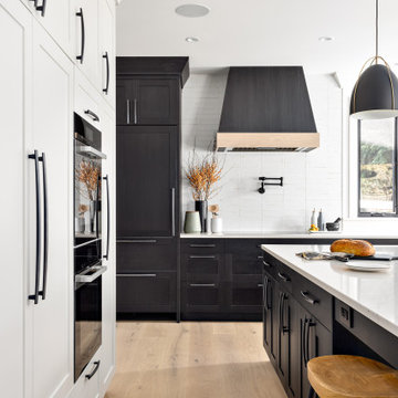
Moving deeper into the kitchen, the seamless induction cooktop topped with a freestanding concealed hood fan commands attention in a soft yet prominent way. The natural wood accent mirrors the fireplace mantle, and the choice of off-black wood-grain cabinets not only continues our black-and-white colour palette but adds a sense of depth and contrast. The corner sink is located to the right and perfectly positioned with a view of their thriving backyard.
To invite more of this family’s character into the space, we mixed metals for interest — matte black, dark pewter, and warm brass — and created open shelves in white oak for their plants and decor. You can also glimpse the tumbled edge of the backsplash tile, which echoes the rustic brick of the fireplace. It adds that farmhouse charm while still feeling timeless and sophisticated.
Last but not least, we designed this dining banquette in the bay window (with integrated bench storage, of course), where the family can share a meal together, the kids can do homework, or Emma and Vince can work and enjoy a change of scenery from their offices. Like the other spaces in the home, it was designed to be beautiful, multi-functional, and long-lasting.
Praise from Our Clients:
It is clear that we love this home, but what did our clients have to say?
“Lori is a visionary and masters execution to the finest detail all at the same time. When she first met us to know more about who we are and how we live, she could right away envision how we could use the space in our kitchen and living room…The results exceeded our expectations.
Lori and her team were also a delight to work with — coordination with all the trades, fast problem-solving, regular updates, professional and friendly attitude of her entire team — made it the dream team. Thank you SHD for making our space so beautiful!”
In turn, we are so grateful for this family’s trust, their open communication, and for being wonderful people with whom to work. (So, thank you!)
 Christensen Design Management
History:
Client was given a property, that was extremely difficult to build on, with a very steep, 25-30' drop. They tried to sell the property for many years, with no luck. They finally decided that they should build something on it, for themselves, to prove it could be done. No access was allowed at the top of the steep incline. Client assumed it would be an expensive foundation built parallel to the hillside, somehow.
Program:
The program involved a level for one floor living, (LR/DR/KIT/MBR/UTILITY) as an age-in-place for this recently retired couple. Any other levels should have additional bedrooms that could also feel like a separate AirBnB space, or allow for a future caretaker. There was also a desire for a garage with a recreational vehicle and regular car. The main floor should take advantage of the primary views to the southwest, even though the lot faces due west. Also a desire for easy access to an upper level trail and low maintenance materials with easy maintenance access to roof. The preferred style was a fresher, contemporary feel.
Solution:
A concept design was presented, initially desired by the client, parallel to the hillside, as they had originally envisioned.
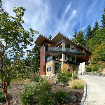
An alternate idea was also presented, that was perpendicular to the steep hillside. This avoided having difficult foundations on the steep hillside, by spanning... over it. It also allowed the top, main floor to be farther out on the west end of the site to avoid neighboring view blockage & to better see the primary southwest view. Savings in foundation costs allowed the installation of a residential elevator to get from the garage to the top, main living level. Stairs were also available for regular exercise. An exterior deck was angled towards the primary SW view to the San Juan Islands. The roof was originally desired to be a hip style on all sides, but a better solution allowed for a simple slope back to the 10' high east side for easier maintenance & access, since the west side was almost 50' high!
The clients undertook this home as a speculative, temporary project, intending for it to add value, to sell. However, the unexpected solution, and experience in living here, has them wanting to stay forever.
Sponsored
Plain City, OH

The Creative Kitchen Company
Columbus Area Kitchen Remodeling and Refacing Professional
 Drury Design
THE SETUP
The original primary bathroom was characterized by a disjointed and segmented layout. The shower featured a bulky glass-block enclosure that overwhelmed the space visually. There was a considerable amount of open, unused space, and despite having a his and hers vanity, the arrangement lacked personal space for each user, as they shared the conjoined space between the sinks. The toilet was inconveniently located right by the door, with a half-wall partition meant to provide privacy but instead contributing to a cramped and unbalanced feel. Overall, the bathroom’s layout and design were fragmented, failing to make the most of the available space and lacking adequate storage solutions.
Design objectives:
- Reconfigure the layout to enhance functionality and flow.
- Create an elegant, upscale aesthetic that is light and bright.
- Incorporate specialized storage solutions for female hair care needs.
- Increase overall storage capacity.
- Develop a spa-like shower experience.
- Provide a significant wow factor to the space.
THE REMODEL
Design challenges to be solved:
- Repositioning the toilet to a more suitable location.
- Designing hair care storage solutions without cluttering the elegant space.
- Balancing an upscale, elegant design with a feminine touch in the color palette.
- Increasing the brightness of the room without adding windows.
- Completely replacing the existing shower to create a spa-like experience.
- Planning new storage solutions without adding bulkiness or clutter to the cabinetry.
THE RENEWED SPACE
Design solutions:
Toilet Relocation: Moved the toilet by the window, creating a better overall layout that also opened up two full walls for cabinetry and storage solutions.
Specialized Vanity Storage: The left side of the left vanity is the wife’s. Open shelves facing across the vanity can be used for decorative or daily needs items. Pull-out docking drawers with power outlets and metal basins handle hot hair appliances.
Bright and Elegant Color Scheme: White cabinets, countertops, floors, and shower walls keep the space bright. The just-off-white wall color with a hint of pink adds a feminine touch. Thin wainscoting with white trim offers traditional-leaning elegance.
Layered Lighting Strategy: Ceiling can lights, sconces, lighted mirrors, and toe-kick lighting were installed. Natural light-rated bulbs keep the space bright and natural-feeling.
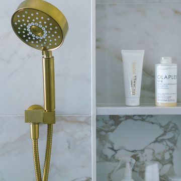
Spa-Like Shower: An extra-large shower was created using the same floor tile materials for continuity. Equipped with a Kohler Anthem system with a shower head, hand-held, and four body sprays. His and Hers niches for separate body care product storage.
Enhanced Storage Solutions: Added a linen cabinet within the vanity area for efficient storage of towels and bathroom essentials.
This elegant bathroom feels incredibly spacious now. The color palette and lights keep the room bright and cheery. Gold fixtures, the herringbone pattern on the floor, and exquisite trim work add an elegant touch. With the husband and wife having their own vanity wall sections joined at the corner, each user truly has their own space within the space. The clients are very happy with the final result.
 Drury Design
THE SETUP
The original primary bathroom was characterized by a disjointed and segmented layout. The shower featured a bulky glass-block enclosure that overwhelmed the space visually. There was a considerable amount of open, unused space, and despite having a his and hers vanity, the arrangement lacked personal space for each user, as they shared the conjoined space between the sinks. The toilet was inconveniently located right by the door, with a half-wall partition meant to provide privacy but instead contributing to a cramped and unbalanced feel. Overall, the bathroom’s layout and design were fragmented, failing to make the most of the available space and lacking adequate storage solutions.
Design objectives:
- Reconfigure the layout to enhance functionality and flow.
- Create an elegant, upscale aesthetic that is light and bright.
- Incorporate specialized storage solutions for female hair care needs.
- Increase overall storage capacity.
- Develop a spa-like shower experience.
- Provide a significant wow factor to the space.
THE REMODEL
Design challenges to be solved:
- Repositioning the toilet to a more suitable location.
- Designing hair care storage solutions without cluttering the elegant space.
- Balancing an upscale, elegant design with a feminine touch in the color palette.
- Increasing the brightness of the room without adding windows.
- Completely replacing the existing shower to create a spa-like experience.
- Planning new storage solutions without adding bulkiness or clutter to the cabinetry.
THE RENEWED SPACE
Design solutions:
Toilet Relocation: Moved the toilet by the window, creating a better overall layout that also opened up two full walls for cabinetry and storage solutions.
Specialized Vanity Storage: The left side of the left vanity is the wife’s. Open shelves facing across the vanity can be used for decorative or daily needs items. Pull-out docking drawers with power outlets and metal basins handle hot hair appliances.
Bright and Elegant Color Scheme: White cabinets, countertops, floors, and shower walls keep the space bright. The just-off-white wall color with a hint of pink adds a feminine touch. Thin wainscoting with white trim offers traditional-leaning elegance.
Layered Lighting Strategy: Ceiling can lights, sconces, lighted mirrors, and toe-kick lighting were installed. Natural light-rated bulbs keep the space bright and natural-feeling.
Spa-Like Shower: An extra-large shower was created using the same floor tile materials for continuity. Equipped with a Kohler Anthem system with a shower head, hand-held, and four body sprays. His and Hers niches for separate body care product storage.
Enhanced Storage Solutions: Added a linen cabinet within the vanity area for efficient storage of towels and bathroom essentials.
This elegant bathroom feels incredibly spacious now. The color palette and lights keep the room bright and cheery. Gold fixtures, the herringbone pattern on the floor, and exquisite trim work add an elegant touch. With the husband and wife having their own vanity wall sections joined at the corner, each user truly has their own space within the space. The clients are very happy with the final result.
 Drury Design
THE SETUP
The original primary bathroom was characterized by a disjointed and segmented layout. The shower featured a bulky glass-block enclosure that overwhelmed the space visually. There was a considerable amount of open, unused space, and despite having a his and hers vanity, the arrangement lacked personal space for each user, as they shared the conjoined space between the sinks. The toilet was inconveniently located right by the door, with a half-wall partition meant to provide privacy but instead contributing to a cramped and unbalanced feel. Overall, the bathroom’s layout and design were fragmented, failing to make the most of the available space and lacking adequate storage solutions.
Design objectives:
- Reconfigure the layout to enhance functionality and flow.
- Create an elegant, upscale aesthetic that is light and bright.
- Incorporate specialized storage solutions for female hair care needs.
- Increase overall storage capacity.
- Develop a spa-like shower experience.
- Provide a significant wow factor to the space.
THE REMODEL
Design challenges to be solved:
- Repositioning the toilet to a more suitable location.
- Designing hair care storage solutions without cluttering the elegant space.
- Balancing an upscale, elegant design with a feminine touch in the color palette.
- Increasing the brightness of the room without adding windows.
- Completely replacing the existing shower to create a spa-like experience.
- Planning new storage solutions without adding bulkiness or clutter to the cabinetry.
THE RENEWED SPACE
Design solutions:
Toilet Relocation: Moved the toilet by the window, creating a better overall layout that also opened up two full walls for cabinetry and storage solutions.
Specialized Vanity Storage: The left side of the left vanity is the wife’s. Open shelves facing across the vanity can be used for decorative or daily needs items. Pull-out docking drawers with power outlets and metal basins handle hot hair appliances.
Bright and Elegant Color Scheme: White cabinets, countertops, floors, and shower walls keep the space bright. The just-off-white wall color with a hint of pink adds a feminine touch. Thin wainscoting with white trim offers traditional-leaning elegance.
Layered Lighting Strategy: Ceiling can lights, sconces, lighted mirrors, and toe-kick lighting were installed. Natural light-rated bulbs keep the space bright and natural-feeling.
Spa-Like Shower: An extra-large shower was created using the same floor tile materials for continuity. Equipped with a Kohler Anthem system with a shower head, hand-held, and four body sprays. His and Hers niches for separate body care product storage.
Enhanced Storage Solutions: Added a linen cabinet within the vanity area for efficient storage of towels and bathroom essentials.
This elegant bathroom feels incredibly spacious now. The color palette and lights keep the room bright and cheery. Gold fixtures, the herringbone pattern on the floor, and exquisite trim work add an elegant touch. With the husband and wife having their own vanity wall sections joined at the corner, each user truly has their own space within the space. The clients are very happy with the final result.
 Drury Design
THE SETUP
The original primary bathroom was characterized by a disjointed and segmented layout. The shower featured a bulky glass-block enclosure that overwhelmed the space visually. There was a considerable amount of open, unused space, and despite having a his and hers vanity, the arrangement lacked personal space for each user, as they shared the conjoined space between the sinks. The toilet was inconveniently located right by the door, with a half-wall partition meant to provide privacy but instead contributing to a cramped and unbalanced feel. Overall, the bathroom’s layout and design were fragmented, failing to make the most of the available space and lacking adequate storage solutions.
Design objectives:
- Reconfigure the layout to enhance functionality and flow.
- Create an elegant, upscale aesthetic that is light and bright.
- Incorporate specialized storage solutions for female hair care needs.
- Increase overall storage capacity.
- Develop a spa-like shower experience.
- Provide a significant wow factor to the space.
THE REMODEL
Design challenges to be solved:
- Repositioning the toilet to a more suitable location.
- Designing hair care storage solutions without cluttering the elegant space.
- Balancing an upscale, elegant design with a feminine touch in the color palette.
- Increasing the brightness of the room without adding windows.
- Completely replacing the existing shower to create a spa-like experience.
- Planning new storage solutions without adding bulkiness or clutter to the cabinetry.
THE RENEWED SPACE
Design solutions:
Toilet Relocation: Moved the toilet by the window, creating a better overall layout that also opened up two full walls for cabinetry and storage solutions.
Specialized Vanity Storage: The left side of the left vanity is the wife’s. Open shelves facing across the vanity can be used for decorative or daily needs items. Pull-out docking drawers with power outlets and metal basins handle hot hair appliances.
Bright and Elegant Color Scheme: White cabinets, countertops, floors, and shower walls keep the space bright. The just-off-white wall color with a hint of pink adds a feminine touch. Thin wainscoting with white trim offers traditional-leaning elegance.
Layered Lighting Strategy: Ceiling can lights, sconces, lighted mirrors, and toe-kick lighting were installed. Natural light-rated bulbs keep the space bright and natural-feeling.
Spa-Like Shower: An extra-large shower was created using the same floor tile materials for continuity. Equipped with a Kohler Anthem system with a shower head, hand-held, and four body sprays. His and Hers niches for separate body care product storage.
Enhanced Storage Solutions: Added a linen cabinet within the vanity area for efficient storage of towels and bathroom essentials.
This elegant bathroom feels incredibly spacious now. The color palette and lights keep the room bright and cheery. Gold fixtures, the herringbone pattern on the floor, and exquisite trim work add an elegant touch. With the husband and wife having their own vanity wall sections joined at the corner, each user truly has their own space within the space. The clients are very happy with the final result.
 Urbanology Designs
A captivating transformation in the coveted neighborhood of University Park, Dallas
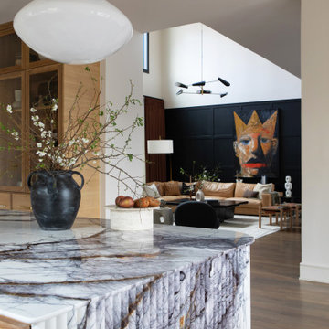
The heart of this home lies in the kitchen, where we embarked on a design endeavor that would leave anyone speechless. By opening up the main kitchen wall, we created a magnificent window system that floods the space with natural light and offers a breathtaking view of the picturesque surroundings. Suspended from the ceiling, a steel-framed marble vent hood floats a few inches from the window, showcasing a mesmerizing Lilac Marble. The same marble is skillfully applied to the backsplash and island, featuring a bold combination of color and pattern that exudes elegance.
Adding to the kitchen's allure is the Italian range, which not only serves as a showstopper but offers robust culinary features for even the savviest of cooks. However, the true masterpiece of the kitchen lies in the honed reeded marble-faced island. Each marble strip was meticulously cut and crafted by artisans to achieve a half-rounded profile, resulting in an island that is nothing short of breathtaking. This intricate process took several months, but the end result speaks for itself.
To complement the grandeur of the kitchen, we designed a combination of stain-grade and paint-grade cabinets in a thin raised panel door style. This choice adds an elegant yet simple look to the overall design. Inside each cabinet and drawer, custom interiors were meticulously designed to provide maximum functionality and organization for the day-to-day cooking activities. A vintage Turkish runner dating back to the 1960s, evokes a sense of history and character.
The breakfast nook boasts a stunning, vivid, and colorful artwork created by one of Dallas' top artist, Kyle Steed, who is revered for his mastery of his craft. Some of our favorite art pieces from the inspiring Haylee Yale grace the coffee station and media console, adding the perfect moment to pause and loose yourself in the story of her art.
The project extends beyond the kitchen into the living room, where the family's changing needs and growing children demanded a new design approach. Accommodating their new lifestyle, we incorporated a large sectional for family bonding moments while watching TV. The living room now boasts bolder colors, striking artwork a coffered accent wall, and cayenne velvet curtains that create an inviting atmosphere. Completing the room is a custom 22' x 15' rug, adding warmth and comfort to the space. A hidden coat closet door integrated into the feature wall adds an element of surprise and functionality.
This project is not just about aesthetics; it's about pushing the boundaries of design and showcasing the possibilities. By curating an out-of-the-box approach, we bring texture and depth to the space, employing different materials and original applications. The layered design achieved through repeated use of the same material in various forms, shapes, and locations demonstrates that unexpected elements can create breathtaking results.
The reason behind this redesign and remodel was the homeowners' desire to have a kitchen that not only provided functionality but also served as a beautiful backdrop to their cherished family moments. The previous kitchen lacked the "wow" factor they desired, prompting them to seek our expertise in creating a space that would be a source of joy and inspiration.
Inspired by well-curated European vignettes, sculptural elements, clean lines, and a natural color scheme with pops of color, this design reflects an elegant organic modern style. Mixing metals, contrasting textures, and utilizing clean lines were key elements in achieving the desired aesthetic. The living room introduces bolder moments and a carefully chosen color scheme that adds character and personality.
The client's must-haves were clear: they wanted a show stopping centerpiece for their home, enhanced natural light in the kitchen, and a design that reflected their family's dynamic. With the transformation of the range wall into a wall of windows, we fulfilled their desire for abundant natural light and breathtaking views of the surrounding landscape.
Our favorite rooms and design elements are numerous, but the kitchen remains a standout feature. The painstaking process of hand-cutting and crafting each reeded panel in the island to match the marble's veining resulted in a labor of love that emanates warmth and hospitality to all who enter.
In conclusion, this tastefully lux project in University Park, Dallas is an extraordinary example of a full gut remodel that has surpassed all expectations. The meticulous attention to detail, the masterful use of materials, and the seamless blend of functionality and aesthetics create an unforgettable space. It serves as a testament to the power of design and the transformative impact it can have on a home and its inhabitants.
Project by Texas' Urbanology Designs. Their North Richland Hills-based interior design studio serves Dallas, Highland Park, University Park, Fort Worth, and upscale clients nationwide.

 Kowalske Kitchen & Bath
A Sussex family hired us as the design build remodel company to makeover this kitchen. This remodeling project had three main goals: improve storage, update the layout/style and enhance the functionality.
IMPROVE STORAGE
The original home builder put in very narrow cabinets. The small, narrow cabinets made it difficult for the homeowners to store items. They also said it was important to have a kitchen that works for their children. The new design incorporates an appliance cabinet and wide drawers for storing items. The kids have easy access to snack drawers and lower dish storage for plastic cups and plates. Also, we added two built-in cabinets in the dining room for more storage.
UPDATE THE LAYOUT & STYLE
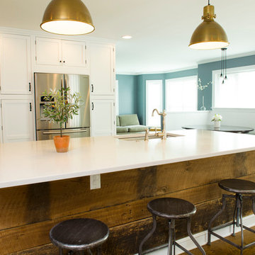
While the area was large, it didn’t maximize the space or fit their contemporary style. They wanted plenty of counter prep space and enough room for friends and family to gather. We added a large wood island with seating – perfect for hosting parties and family dinners. The space is bright with white shaker cabinetry and subway tile backsplash. Warm touches include satin bronze light fixtures and hardware.
ENHANCE THE FUNCTIONALITY
This Sussex kitchen features a Galley Sink Workstation. Having a sink workstation facing the center of the room allows the homeowners to stay part of the conversation while preparing a meal or cleaning up. Sink workstations are one of the hottest kitchen trends.
HOMEOWNER REVIEW
“We recently completed our kitchen remodel with Kowalske and we can’t say enough good things about our experience. Not only was every member of the team amazing, the work that was done in our kitchen was very high quality. We have recommended Kowalske to all of our friends and plan to use them for our master bath remodel in the future!” – Nicole, homeowner (Houzz Review)
 Kowalske Kitchen & Bath
A Sussex family hired us as the design build remodel company to makeover this kitchen. This remodeling project had three main goals: improve storage, update the layout/style and enhance the functionality.
IMPROVE STORAGE
The original home builder put in very narrow cabinets. The small, narrow cabinets made it difficult for the homeowners to store items. They also said it was important to have a kitchen that works for their children. The new design incorporates an appliance cabinet and wide drawers for storing items. The kids have easy access to snack drawers and lower dish storage for plastic cups and plates. Also, we added two built-in cabinets in the dining room for more storage.
UPDATE THE LAYOUT & STYLE
While the area was large, it didn’t maximize the space or fit their contemporary style. They wanted plenty of counter prep space and enough room for friends and family to gather. We added a large wood island with seating – perfect for hosting parties and family dinners. The space is bright with white shaker cabinetry and subway tile backsplash. Warm touches include satin bronze light fixtures and hardware.
ENHANCE THE FUNCTIONALITY
This Sussex kitchen features a Galley Sink Workstation. Having a sink workstation facing the center of the room allows the homeowners to stay part of the conversation while preparing a meal or cleaning up. Sink workstations are one of the hottest kitchen trends.
HOMEOWNER REVIEW
“We recently completed our kitchen remodel with Kowalske and we can’t say enough good things about our experience. Not only was every member of the team amazing, the work that was done in our kitchen was very high quality. We have recommended Kowalske to all of our friends and plan to use them for our master bath remodel in the future!” – Nicole, homeowner (Houzz Review)

 Dream Coast Builders
Welcome to our latest project featuring a stunning all-white kitchen that embodies modern elegance and functionality. This bright and airy kitchen design showcases cabinets extending to the ceiling, complemented by sleek glass-front upper cabinets and a contemporary kitchen chimney. The electric cooktop and modern range hood add a touch of high-tech sophistication, while the long bar pulls and square knob pulls offer a clean, minimalist look.
The medium gray wood flooring contrasts beautifully with the white cabinetry, creating a timeless and stylish aesthetic. Stacked ovens provide convenience and efficiency, seamlessly integrated into the design. The kitchen features a spacious sink and tap, perfect for both daily use and entertaining.
Located in Clearwater, FL, and serving the Tampa area, including the 33756 zip code, this project highlights our expertise in remodeling and interior design. Whether you're interested in remodeling ideas, custom homes, or home additions, we bring a wealth of experience in general contracting and design to make your vision a reality.

 Infinite Home
Custom Home Built for Real Life
Our clients came to us with a clear vision: a home that could adapt to their lifestyle and growing family. They needed a home built with intention, designed with the future in mind, and built around the routines they loved and the people they loved more.
Open-Concept Living With Hosting in Mind
Our clients hosted often and lived actively, so the main level had to be flexible for all of life’s moments. The goal was a space that felt grand without losing its warmth.
Cooking together as a family mattered to our clients – the Wolf range, farmhouse sink, integrated appliances, and large island gave them a kitchen that flowed effortlessly while looking beautiful. This space also served as the bridge between other parts of the main level so that they would stay in view of the next. This created the perfect environment for gathering where everyone had their own spot without ever feeling apart from the whole group.
For the living room, our clients wanted space that felt open without losing its warmth. Soaring ceilings created that sense of scale, while warm tones and materials, like the wood coffered ceiling and fireplace wall, kept it grounded. That same warmth carried outside, where an outdoor lounge with a fireplace and dining area made sure guests felt welcomed the moment they stepped out.
A Backyard Built for Real Rest
Every corner of the backyard was designed with one goal: to be the ultimate outdoor retreat. The elevated, white-brick-framed pool and integrated spa hot tub gave them a place to truly exhale. As the sun set, the fire pit lounge next to the pool became the hangout spot when they hosted their youth groups and family gatherings.
Room to Grow
With kids in the house, “custom” had to also mean flexible. Our clients had 2 young sons and needed their rooms to grow with them through the years. The two bedrooms and a full bath sat beside a loft that served as both their hangout-and-homework spot. The guest suite sat on the same level where a four-poster bed, floor-to-ceiling wood-look tile, and a frameless glass shower welcomed their guests from day one.
A Retreat That’s Actually Theirs
Between hosting and raising kids, this couple needed a suite that felt like a true escape. The wood-planked tray ceiling and French doors grounded the room in warmth the moment you walked in, while the ensuite bathroom carried a spa-like feeling with a freestanding soaking tub, custom double vanity, and a glass-enclosed shower.
This Is What Approachable Luxury Looks Like
The approachable luxury experience meant starting with conversations about how they wanted their space to live with them – how they hosted, how their kids played, how they wanted to feel walking through their own front door, and how we took their goals and experience and used it as the foundation of every decision that was made from start to finish. We wanted our clients to feel taken care of through the process and, most importantly, feel heard.
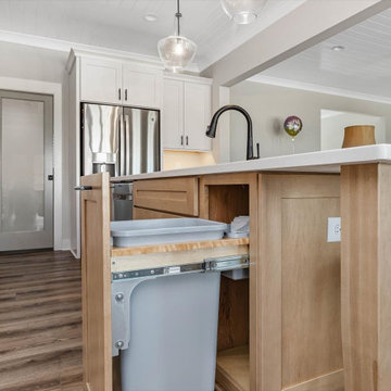
 Reico Kitchen & Bath
Gregg Waller of Reico Kitchen and Bath in Wilmington, NC collaborated with JC Hazelton Builders to design a farmhouse inspired kitchen featuring Green Forest and Masterpiece cabinetry.
The kitchen features Green Forest cabinets in the Park Place door style with a White finish for the perimeter, complemented with an island in the Masterpiece door style Turner in Maple with a Shortbread finish. Appliances and countertops were provided by others.
The client expressed their appreciation saying, “I literally love every aspect of our kitchen. It is exactly what we wanted. We did not have to sacrifice our vision which was a welcome experience. Gregg was so helpful in hearing what we wanted and then delivering. His knowledge about the products available really helped us achieve our design goals. He created digital examples of our kitchen, laundry and bathrooms which helped us in making our final decision.”
“The biggest challenge that I faced was creating the look the client wanted in their new home while staying within a budget that was set prior to our introduction. I decided that Green Forest Park Place cabinets would be the best choice for the majority of the project. Masterpiece cabinets were needed to get the exact color that the client wanted for the kitchen island,” explained Gregg.
“My favorite part of the design is the range wall. I like the way the warm wood tones of the hood balance the white shaker cabinets and brick backsplash. The clients were an absolute pleasure to work with. The excellent communication that I received from the client throughout definitely helped in the successful completion of the project!”
Photos courtesy of ShowSpaces Photography.
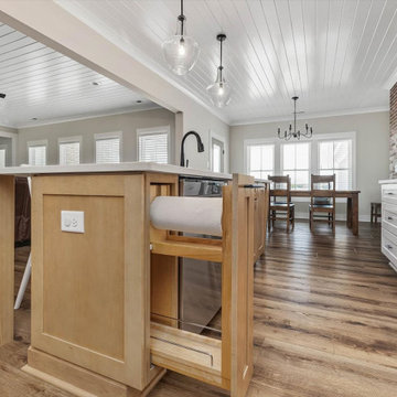 Reico Kitchen & Bath
Gregg Waller of Reico Kitchen and Bath in Wilmington, NC collaborated with JC Hazelton Builders to design a farmhouse inspired kitchen featuring Green Forest and Masterpiece cabinetry.
The kitchen features Green Forest cabinets in the Park Place door style with a White finish for the perimeter, complemented with an island in the Masterpiece door style Turner in Maple with a Shortbread finish. Appliances and countertops were provided by others.
The client expressed their appreciation saying, “I literally love every aspect of our kitchen. It is exactly what we wanted. We did not have to sacrifice our vision which was a welcome experience. Gregg was so helpful in hearing what we wanted and then delivering. His knowledge about the products available really helped us achieve our design goals. He created digital examples of our kitchen, laundry and bathrooms which helped us in making our final decision.”
“The biggest challenge that I faced was creating the look the client wanted in their new home while staying within a budget that was set prior to our introduction. I decided that Green Forest Park Place cabinets would be the best choice for the majority of the project. Masterpiece cabinets were needed to get the exact color that the client wanted for the kitchen island,” explained Gregg.
“My favorite part of the design is the range wall. I like the way the warm wood tones of the hood balance the white shaker cabinets and brick backsplash. The clients were an absolute pleasure to work with. The excellent communication that I received from the client throughout definitely helped in the successful completion of the project!”
Photos courtesy of ShowSpaces Photography.
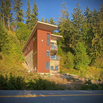 Christensen Design Management
History:
Client was given a property, that was extremely difficult to build on, with a very steep, 25-30' drop. They tried to sell the property for many years, with no luck. They finally decided that they should build something on it, for themselves, to prove it could be done. No access was allowed at the top of the steep incline. Client assumed it would be an expensive foundation built parallel to the hillside, somehow.
Program:
The program involved a level for one floor living, (LR/DR/KIT/MBR/UTILITY) as an age-in-place for this recently retired couple. Any other levels should have additional bedrooms that could also feel like a separate AirBnB space, or allow for a future caretaker. There was also a desire for a garage with a recreational vehicle and regular car. The main floor should take advantage of the primary views to the southwest, even though the lot faces due west. Also a desire for easy access to an upper level trail and low maintenance materials with easy maintenance access to roof. The preferred style was a fresher, contemporary feel.
Solution:
A concept design was presented, initially desired by the client, parallel to the hillside, as they had originally envisioned.
An alternate idea was also presented, that was perpendicular to the steep hillside. This avoided having difficult foundations on the steep hillside, by spanning... over it. It also allowed the top, main floor to be farther out on the west end of the site to avoid neighboring view blockage & to better see the primary southwest view. Savings in foundation costs allowed the installation of a residential elevator to get from the garage to the top, main living level. Stairs were also available for regular exercise. An exterior deck was angled towards the primary SW view to the San Juan Islands. The roof was originally desired to be a hip style on all sides, but a better solution allowed for a simple slope back to the 10' high east side for easier maintenance & access, since the west side was almost 50' high!
The clients undertook this home as a speculative, temporary project, intending for it to add value, to sell. However, the unexpected solution, and experience in living here, has them wanting to stay forever.
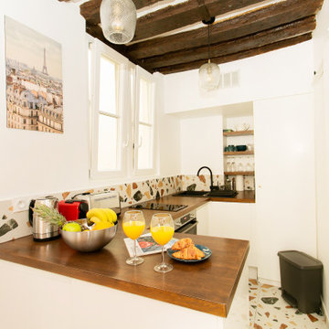
 UpperKey
Experience life in the heart of Paris Le Marais with this cozy studio, 23 square meters apartment located on the 3rd floor of a secure residential building without an elevator. The studio apartment has a living/sleeping area with a sofa (bed) and plenty of storage space. We understand the importance of staying connected, which is why there is a high-speed Wi-Fi (1/Gbps) connection. The fully equipped kitchen has an electric tea kettle, sink, toaster, full refrigerator, stove, Nespresso coffee machine, oven, dishwasher and more. The kitchen also comes with all the cookware, dishes and utensils needed to prepare meals at home. There is a clothes washer and drying rack for your convenience. Cleaning supplies, a vacuum, broom and mop are also provided. The apartment is heated with electric heating. The studio faces rue Budé in Paris. All the necessary bedding and linens are provided and professionally laundered. This property can host up to 2 guests. The flat has one bathroom accessible via the hallway with a shower, toilet and sink. You will find soap, shampoo, toilet paper and paper towels to start off your stay.
Upon confirmation of your stay, you will be provided with all the necessary details regarding the self checkin and checkout procedures. We offer 24/7 support for submit maintenance requests, extra cleanings and linen changes (for a fee) and more. Professional housekeepers clean and sanitize after each checkout.
- Pont Marie (Line 7)
- A refundable deposit will be required before arrival.
- All properties are strictly non-smoking. Excessive noise/parties will not be tolerated.
- Property Reference 1018. Budé
UpperKey also offers valuable resources and information for property owners. Our article, "All You Need to Know About Letting a Property," provides comprehensive guidance on the ins and outs of renting out your property. Be sure to check it out and take the first step towards successfully letting your property with UpperKey here: https://www.theupperkey.com/post/all-you-need-to-know-about-letting-a-property
99