
Search results for "Explains" in Home Design Ideas
 Betty Wasserman Art & Interiors: The Hamptons
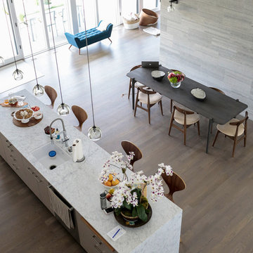
Modern luxury meets warm farmhouse in this Southampton home! Scandinavian inspired furnishings and light fixtures create a clean and tailored look, while the natural materials found in accent walls, casegoods, the staircase, and home decor hone in on a homey feel. An open-concept interior that proves less can be more is how we’d explain this interior. By accentuating the “negative space,” we’ve allowed the carefully chosen furnishings and artwork to steal the show, while the crisp whites and abundance of natural light create a rejuvenated and refreshed interior.
This sprawling 5,000 square foot home includes a salon, ballet room, two media rooms, a conference room, multifunctional study, and, lastly, a guest house (which is a mini version of the main house).
 Betty Wasserman Art & Interiors: The Hamptons
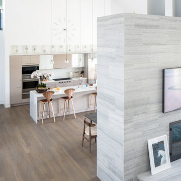
Modern luxury meets warm farmhouse in this Southampton home! Scandinavian inspired furnishings and light fixtures create a clean and tailored look, while the natural materials found in accent walls, casegoods, the staircase, and home decor hone in on a homey feel. An open-concept interior that proves less can be more is how we’d explain this interior. By accentuating the “negative space,” we’ve allowed the carefully chosen furnishings and artwork to steal the show, while the crisp whites and abundance of natural light create a rejuvenated and refreshed interior.
This sprawling 5,000 square foot home includes a salon, ballet room, two media rooms, a conference room, multifunctional study, and, lastly, a guest house (which is a mini version of the main house).
 Betty Wasserman Art & Interiors
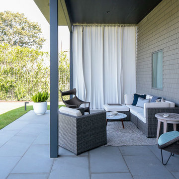
Modern luxury meets warm farmhouse in this Southampton home! Scandinavian inspired furnishings and light fixtures create a clean and tailored look, while the natural materials found in accent walls, casegoods, the staircase, and home decor hone in on a homey feel. An open-concept interior that proves less can be more is how we’d explain this interior. By accentuating the “negative space,” we’ve allowed the carefully chosen furnishings and artwork to steal the show, while the crisp whites and abundance of natural light create a rejuvenated and refreshed interior.
This sprawling 5,000 square foot home includes a salon, ballet room, two media rooms, a conference room, multifunctional study, and, lastly, a guest house (which is a mini version of the main house).
Find the right local pro for your project

 Continental Ponds
Pondless Waterfalls are simply a re-circulating waterfall and/or stream without the presence of a pond. You can enjoy the sight and sound of running water without the maintenance of a pond. The waterfall is undoubtedly the most beautiful and favored feature in a water garden. If space is lacking in your yard or you have safety concerns with a pond, go Pondless! The name basically explains it all. It’s a waterfall and stream, without the pond. So why would you want a waterfall without a pond? The truth is that a Pondless Waterfall isn’t for everyone, but it can be a great alternative for someone who isn’t quite sure if a pond is right for their family.
 Westover Landscape Design
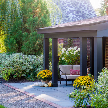
Not everyone would see the hidden beauty in the Yonkers property destined for the wrecking ball in 2000. But one family took the serious fixer-upper under their wing. Crumbling walls, overgrown maples (indeed, saplings were busting through the brick walls), and deer living in the basement was the state of affairs when Westover Landscape Design initially arrived on the scene. A year of intensive, meticulous, thoughtful renovation by the homeowner followed while the house was brought up to speed. When the last construction machine finally rumbled out, that’s when Robert Welsch and his crew began their odyssey.
The goal was to honor the newly restored relic and deliver it into the future with fitting surroundings. “We wanted to bring that treasure back to life,” Robert Welsch explains. Working closely with the homeowner as well as the city of Yonkers to guide the restoration, their first feat was to install a proper drainage system with catchments capable of keeping storm water from the massive roof flowing away. Before anything was visible on the surface, extensive work was accomplished underground. Meanwhile, a plan was drafted to honor the era of the house. Westover chose bluestone as the primary path material for its easy maintenance and simplicity when laying the swank configuration of pathways around the house and outward to an entertaining pavilion. By cleverly hemming the bluestone with period brick that echoes the building material for the house for continuity, the result is a smart and sophisticated finish to a promenade that constantly draws the family and their pets outdoors. Brick was also used to rebuild the walled gardens for the much-needed privacy in a close-knit Yonkers community. And a graceful wrought iron gate enhances the arrival experience. But walls and gates were not the only element to screen and reveal views—plant selection was critical.
Few landscapers would go the extra mile to find period perfect plants for a 19th Century restoration, but Robert Welsch saw the importance of authenticity in creating the mood. He repeated large trees—such as an exquisite London plane tree in the front yard—to balance the expression in the back. Recognizing the need for immediate stature, he selected a weeping willow to gain instant volume, giving the landscape a sense of deep roots. A weeping Camperdown elm adds sophisticated drama to the walled stroll gardens. Hydrangeas were incorporated for their billowy stature, easy maintenance, and long blooming season. Similarly, all the plants in residence play their part in the display that goes beyond the usual spring fling to extend throughout the growing season—offering visual interest even when they are not performing. From spring bulbs to autumn perennials, there is never a dull moment. Meanwhile, every step along the way was a collaboration working hand-in-hand with the homeowner and the city to make certain that the historic landmark status of the property was upheld and honored.
The result goes beyond a landscape that is just old faithful. It adds life to the picture, creating a jewel-like setting for the newly proud house. In a word, it is sublime. By planting wisely and using sustainable elements, the restored house and its surroundings are ready for the next generation and beyond. This Yonkers gem remains meticulously groomed under the watchful eye and skill of Westover Landscape Design’s team of gardeners—It’s a keeper.
 Housetrends Magazine
Since moving into her Dublin home two and a half years ago, Nancy Sanford has been peeling off the decades—quite literally. Built in the 1980s, the home was “very well-maintained, but very little had been done to it” in terms of updating the finishes or style, Sanford says. Plush white carpet ran from wall-to-wall-to-wall, almond-colored laminate coated the kitchen cabinets and wallpaper ran rampant—even covering some ceilings.
Despite her efforts, Sanford knew it was going to take more than cosmetic editing to shake the ‘80s and make the home her own. Although she lives in the traditional-leaning Muirfield community, Sanford adores a minimalist, contemporary style—and admits to devouring design magazines “ad nauseam.”
To implement her thoroughly modern vision, Sanford turned to Brigid Norton, an interior designer and family friend, and Kristi Youles, a kitchen designer with The JAE Company. Working together, the trio created a carefully considered contemporary design that’s easy on the eyes, and the body.
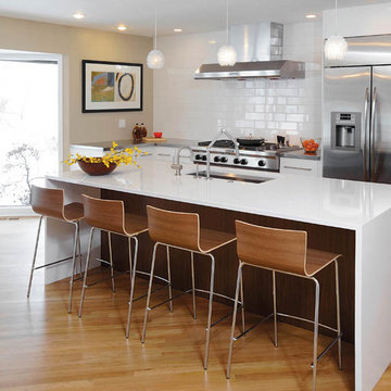
In addition to improving the flow of the kitchen—by removing a V-shaped peninsula that angled out into the room—and adding appliances like a stainless steel refrigerator, Sanford’s short list of must-haves included clean, uncluttered lines and no wall cabinets over the countertops. “I’ve found as I’ve aged, I’ve gotten shorter and just don’t use the upper cabinets,” Sanford explains.
Easy-access, smooth-slide drawers with clean slab fronts were the answer—resulting in strong visual lines, an open, airy feel and enhanced ergonomics. Starting with a “needs assessment,” Youles and Norton designed the space quite literally around Nancy. By looking at factors such as her height and which items she uses most frequently, they were able to determine the optimum placement for everything from canned goods in the pantry to cutlery, pans and plates in the customized drawers, all of which helped to achieve the ultimate kitchen organization.
But there’s more to the kitchen cabinets smooth façade than clean-lined storage. Walnut drawer fronts—found on the oven and the base of the island—are book-matched, allowing the grain to continue from drawer to drawer. And even in spaces where drawers weren’t feasible, beneath the sink and in a desk area, the designers continued the look with cabinet doors crafted to resemble drawers.
The visual continuity of these lines might not be as impactful if it weren’t for the careful selection of contrasting finishes. The designers filled the space with pure, glossy white—using a specific type of quartz, White Cliff by Cambria, to accent the bold rectangular design of the island. Then, to break up the expanse of accompanying white painted drawers, walnut was selected to bring the contrasting warmth and grain of wood without red undertones. It is commonly found in modern furniture design, as well as current productions of mid-century designs like the iconic Eames Lounge Chair from Herman Miller, Youles says.
 Betty Wasserman Art & Interiors: The Hamptons
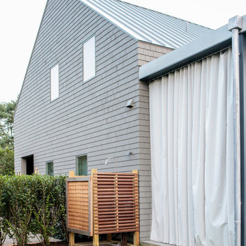
Modern luxury meets warm farmhouse in this Southampton home! Scandinavian inspired furnishings and light fixtures create a clean and tailored look, while the natural materials found in accent walls, casegoods, the staircase, and home decor hone in on a homey feel. An open-concept interior that proves less can be more is how we’d explain this interior. By accentuating the “negative space,” we’ve allowed the carefully chosen furnishings and artwork to steal the show, while the crisp whites and abundance of natural light create a rejuvenated and refreshed interior.
This sprawling 5,000 square foot home includes a salon, ballet room, two media rooms, a conference room, multifunctional study, and, lastly, a guest house (which is a mini version of the main house).
Sponsored
Fredericksburg, OH

High Point Cabinets
Columbus' Experienced Custom Cabinet Builder | 4x Best of Houzz Winner
 Eldorado Stone
Pauline Hartogh of Wetherly’s Interiors was endowed with the task to create a transitional home for a family of four that melded modern luxury with functionality. She divided the home into three residential wings, all of which are structured in clean, contemporary lines.
The heart of the home was created by connecting the indoors to the outdoors using floor-to-ceiling glass, which set an open focus for easy entertainment. The landscape further enhanced the clients’ desire to embrace the indoor/outdoor lifestyle that Florida’s climate offers. Amid warm, tropical landscaping, a Chartes-inspired stone labyrinth provides beauty while also providing a place for meditation and relaxation.
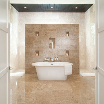
An exceptional home calls for exceptional products, and when researching which stone to use, Hartogh went straight for Eldorado Stone. “I feel strongly that the use of Eldorado Stone’s products greatly enriched two of the areas in this project which won design awards,” Hartogh explained. The joints are seamless and the end result is always exactly what she aimed for. Hartogh chose Dry Creek Stacked Stone for the entire exterior, including patio walls and pillars, because not only looks current but also allows her the flexibility to create any design. The use of this product not only helped establish the overall tone for the home but it also allowed for architectural details, which was validated by winning the American Society of Interior Design Award 2013 – Outdoor Living, Single Family Home.
Accolades:
American Society of Interior Design Award 2013 – Bathroom Design, Transitional
American Society of Interior Design Award 2013 – Single Residential Space, Contemporary
American Society of Interior Design Award 2013 – Outdoor Living, Single Family Home
Eldorado Stone Profile Featured: Exterior Façade – Dry Creek Stacked Stone
Eldorado Stone Profile Featured: Master Bathroom – Pearl White CoastalReef
Interior Design: Pauline Hartogh, Wetherlys Interiors
Website: www.wetherlysinteriors.com
Phone: (561) 691-4707
Architecture: Henry Franky, Franky & Associates Architect, Inc.
Website: www.frankyarchitect.com
Phone: (561) 338-3309
Home Builder: Gary Hartogh, Couture Homes
Website: www.couture-homes.com
Phone: (561) 776-0511
Photographer: David Durbak
Website: www.durbak.com
Phone: (561) 271.0706
 Betty Wasserman Art & Interiors: The Hamptons
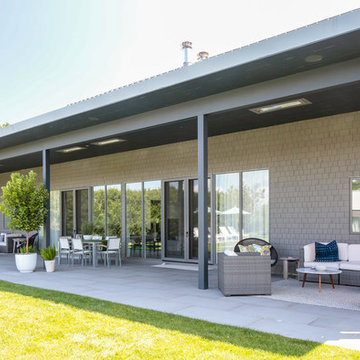
Modern luxury meets warm farmhouse in this Southampton home! Scandinavian inspired furnishings and light fixtures create a clean and tailored look, while the natural materials found in accent walls, casegoods, the staircase, and home decor hone in on a homey feel. An open-concept interior that proves less can be more is how we’d explain this interior. By accentuating the “negative space,” we’ve allowed the carefully chosen furnishings and artwork to steal the show, while the crisp whites and abundance of natural light create a rejuvenated and refreshed interior.
This sprawling 5,000 square foot home includes a salon, ballet room, two media rooms, a conference room, multifunctional study, and, lastly, a guest house (which is a mini version of the main house).
 CHRISTOPHER STROM ARCHITECTS
Sommerhus is a private retreat for two empty-nesters. The clients purchased the previous cabin after falling in love with its location on a private, lakefront peninsula. However, this beautiful site was a challenging site to build on, due to its position sandwiched between the lake and protected wet land. The clients disliked the old cabin because it could only be used in the summer months, due to its lack of both insulation and heat. In addition, it was too small for their needs. They wanted to build a new, larger retreat, but were met with yet another constraint: the new cabin would be limited to the previous cabin’s small footprint. Thus, they decided to approach an architect to design their dream cabin.
As the clients described, “We visited Denmark for a family wedding in 2015, and while biking near Gilleleje, a fishing village on the Baltic Sea, we fell in love with the aesthetic of ‘Sommerhus’: dark exteriors, clean, simple lines, and lots of windows.” We set out to design a cabin that fit this aesthetic while also meeting the site’s constraints.
The clients were committed to keeping all existing trees on their site. In addition, zoning codes required the new retreat to stay within the previous cabin's small footprint. Thus, to maximize the square footage of the cabin without removing trees or expanding the footprint, the new structure had to grow vertically. At the same time, the clients wanted to be good neighbors. To them, this meant that their cabin should disappear into the woods, especially when viewed from the lake. To accomplish both these requests, the architect selected a dark exterior metal façade that would visually retreat into the trees. The metal siding is a modern, low-maintenance, and cost-effective solution, especially when compared to traditional wood siding. Warm wood on the soffits of the large roof overhang contrast with the metal siding. Sommerhus's resulting exterior is just as the clients’ requested: boldly modern yet respectful of the serene surroundings.
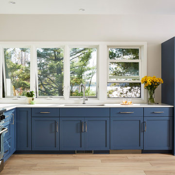
The homeowners desired a beach-house-inspired interior, full of light and warmth, in contrast to the dark exterior. As the homeowner explained, “I wanted it to feel like a porch inside.” To achieve this, the living room has two walls of sliding glass doors that connect to the wrap-around porch. This creates a beautiful, indoor-outdoor living space. The crisp and bright kitchen also connects to the porch with the window that opens to an outdoor counter - perfect for passing food and drinks to those lounging on the porch. The kitchen is open to the rest of the first-floor entertaining space, and brings a playful, beach-house feel to the cabin.
After the completion of the project, the homeowners remarked, “Working with Christopher and Eric [of CSA] was a wonderful experience. We absolutely love our home, and each season on the lake is more special than the last.”
 Paula McDonald Design Build & Interiors
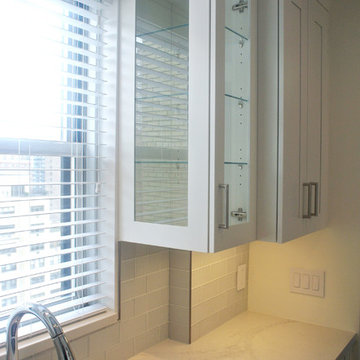
Light spills into this contemporary prewar kitchen makeover with the help of custom designed upper cabinets featuring Starphire glass doors, glass sides and glass shelves. For much needed task oriented lighting we also designed an elegant bridge above the window with recessed lighting. Luminous and light reflecting materials were chosen throughout - Caesarstone Calacatta Nuvo countertops, a Pure White Caesarstone windowsill, and Clear Glass Polar White backsplash tile from Complete Tile.
 Edgewater Design Group
As written in Northern Home & Cottage by Elizabeth Edwards
Sara and Paul Matthews call their head-turning home, located in a sweet neighborhood just up the hill from downtown Petoskey, “a very human story.” Indeed it is. Sara and her husband, Paul, have a special-needs son as well as an energetic middle-school daughter. This home has an answer for everyone. Located down the street from the school, it is ideally situated for their daughter and a self-contained apartment off the great room accommodates all their son’s needs while giving his caretakers privacy—and the family theirs. The Matthews began the building process by taking their thoughts and
needs to Stephanie Baldwin and her team at Edgewater Design Group. Beyond the above considerations, they wanted their new home to be low maintenance and to stand out architecturally, “But not so much that anyone would complain that it didn’t work in our neighborhood,” says Sara. “We
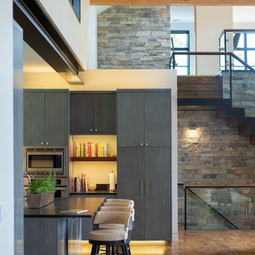
were thrilled that Edgewater listened to us and were able to give us a unique-looking house that is meeting all our needs.” Lombardy LLC built this handsome home with Paul working alongside the construction crew throughout the project. The low maintenance exterior is a cutting-edge blend of stacked stone, black corrugated steel, black framed windows and Douglas fir soffits—elements that add up to an organic contemporary look. The use of black steel, including interior beams and the staircase system, lend an industrial vibe that is courtesy of the Matthews’ friend Dan Mello of Trimet Industries in Traverse City. The couple first met Dan, a metal fabricator, a number of years ago, right around the time they found out that their then two-year-old son would never be able to walk. After the couple explained to Dan that they couldn’t find a solution for a child who wasn’t big enough for a wheelchair, he designed a comfortable, rolling chair that was just perfect. They still use it. The couple’s gratitude for the chair resulted in a trusting relationship with Dan, so it was natural for them to welcome his talents into their home-building process. A maple floor finished to bring out all of its color-tones envelops the room in warmth. Alder doors and trim and a Doug fir ceiling reflect that warmth. Clearstory windows and floor-to-ceiling window banks fill the space with light—and with views of the spacious grounds that will
become a canvas for Paul, a retired landscaper. The couple’s vibrant art pieces play off against modernist furniture and lighting that is due to an inspired collaboration between Sara and interior designer Kelly Paulsen. “She was absolutely instrumental to the project,” Sara says. “I went through
two designers before I finally found Kelly.” The open clean-lined kitchen, butler’s pantry outfitted with a beverage center and Miele coffee machine (that allows guests to wait on themselves when Sara is cooking), and an outdoor room that centers around a wood-burning fireplace, all make for easy,
fabulous entertaining. A den just off the great room houses the big-screen television and Sara’s loom—
making for relaxing evenings of weaving, game watching and togetherness. Tourgoers will leave understanding that this house is everything great design should be. Form following function—and solving very human issues with soul-soothing style.
 Betty Wasserman Art & Interiors
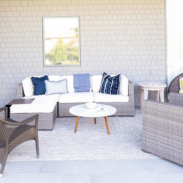
Modern luxury meets warm farmhouse in this Southampton home! Scandinavian inspired furnishings and light fixtures create a clean and tailored look, while the natural materials found in accent walls, casegoods, the staircase, and home decor hone in on a homey feel. An open-concept interior that proves less can be more is how we’d explain this interior. By accentuating the “negative space,” we’ve allowed the carefully chosen furnishings and artwork to steal the show, while the crisp whites and abundance of natural light create a rejuvenated and refreshed interior.
This sprawling 5,000 square foot home includes a salon, ballet room, two media rooms, a conference room, multifunctional study, and, lastly, a guest house (which is a mini version of the main house).
 InnovationLand
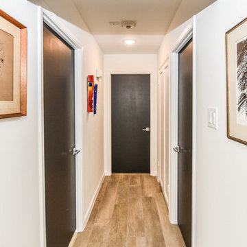
Houston Interior Designer Lisha Maxey took this Museum District condo from the dated, mirrored walls of the 1980s to Mid Century Modern with a gallery look featuring the client's art collection.
"The place was covered with glued-down, floor-to-ceiling mirrors," says Lisha Maxey, senior designer for Homescapes of Houston and principal at LGH Design Services in Houston. "When we took them off the walls, the walls came apart. We ended up taking them down to the studs."
The makeover took six months to complete, primarily because of strict condo association rules that only gave the Houston interior designers very limited access to the elevator - through which all materials and team members had to go.
"Monday through Friday, we could only be noisy from 10 a.m. to 2 p.m., and if we had to do something extra loud, like sawing or drilling, we had to schedule it with the management and they had to communicate that to the condo owners. So it was just a lot of coordination. But a lot of Inner City Loopers live in these kinds of buildings, so we're used to handling that kind of thing."
The client, a child psychiatrist in her 60s, recently moved to Houston from northeast Texas to be with friends. After being widowed three years ago, she decided it was time to let go of the traditionally styled estate that wasn't really her style anyway. An avid diver who has traveled around the world to pursue her passion, she has amassed a large collection of art from her travels. Downsizing to 1,600 feet and wanting to go more contemporary, she wanted the display - and the look - more streamlined.
"She wanted clean lines and muted colors, with the main focus being her artwork," says Maxey. "So we made the space a palette for that."
Enter the white, gallery-grade paint she chose for the walls: "It's halfway between satin and flat," explains Maxey. "It's not glossy and it's not chalky - just very smooth and clean."
Adding to the gallery theme is the satin nickel track lighting with lamps aimed to highlight pieces of art. "This lighting has no wires," notes Maxey. "It's powered by a positive and negative conduit."
The new flooring throughout is a blended-grey porcelain tile that looks like wood planks. "It's gorgeous, natural-looking and combines all the beauty of wood with the durability of tile," says Maxey. "We used it throughout the condo to unify the space."
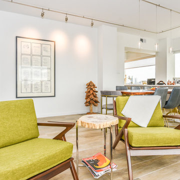
After Maxey started looking at the client's bright, vibrant, colorful artwork, she felt the palette couldn't stay as muted anymore. Hence the Mid Century Modern orange leather sofas from West Elm and bright green chairs from Joybird, plus the throw pillows in different textures, patterns and shades of gold, orange and green.
The concave lines of the Danish-inspired chairs, she notes, help them look beautiful from all the way around - a key to designing spaces for loft living.
"The table in the living room is very interesting," notes Maxey. "It was handmade for the client in 1974 and has a signature on it from the artist. She was adamant about including the piece, which has all these hand-painted black-and-white art tiles on the top. I took one look at it and said 'It's not really going to go.'"
However, after cutting 6 inches off the bottom and making it look a little distressed, the table ended up being the perfect complement to the sofas.
The dining room table - from Design Within Reach - is a solid piece of mahogany, the chair upholstery a mix of grey velvet and leather and the legs a shiny brass. "The side chairs are leather and the end ones are velvet," says Maxey. "It's a nice textural mix that lends depth and texture."
The galley kitchen, meanwhile, has been lightened and brightened, with white quartz countertops and backsplashes mimicking the look of Carrara marble, stainless steel appliances and a velvet green bench seat for a punch of color. The cabinets are painted a cool grey color called "Silverplate."
The two bathrooms have been updated with contemporary white vanities and vessel sinks and the master bath now features a walk-in shower tiled in Dolomite white marble (the floor is Bianco Carrara marble mosaic, done in a herringbone pattern.
In the master bedroom, Homescapes of Houston knocked down a wall between two smaller closets with swing doors to make one large walk-in closet with pocket doors. The closet in the guest bedroom also came out 13 more inches.
The client's artwork throughout personalizes the space and tells the story of a life. There's a huge bowl of shells from the client's diving adventures, framed art from her child psychiatry patients and a 16th century wood carving from a monastery that's been in her family forever.
"Her collection is quite impressive," says Maxey. "There's even a framed piece of autographed songs written by John Lennon." (You can see this black-framed piece of art on the wall in the photo above of two green chairs).
"We're extremely happy with how the project turned out, and so is the client," says Maxey. "No expense was spared for her. It was a labor of love and we were excited to do it."
 Betty Wasserman Art & Interiors
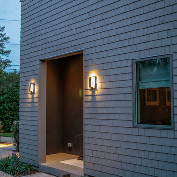
Modern luxury meets warm farmhouse in this Southampton home! Scandinavian inspired furnishings and light fixtures create a clean and tailored look, while the natural materials found in accent walls, casegoods, the staircase, and home decor hone in on a homey feel. An open-concept interior that proves less can be more is how we’d explain this interior. By accentuating the “negative space,” we’ve allowed the carefully chosen furnishings and artwork to steal the show, while the crisp whites and abundance of natural light create a rejuvenated and refreshed interior.
This sprawling 5,000 square foot home includes a salon, ballet room, two media rooms, a conference room, multifunctional study, and, lastly, a guest house (which is a mini version of the main house).
 Dishington Construction - Jensen Hus
roberto farren
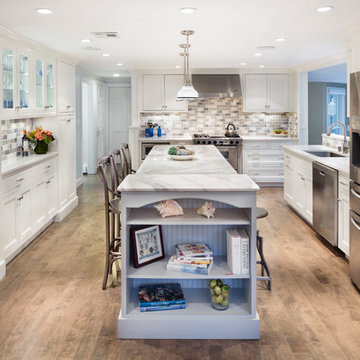
Example of a large beach style u-shaped medium tone wood floor eat-in kitchen design in Boston with an undermount sink, shaker cabinets, white cabinets, marble countertops, blue backsplash, porcelain backsplash, stainless steel appliances and an island
Example of a large beach style u-shaped medium tone wood floor eat-in kitchen design in Boston with an undermount sink, shaker cabinets, white cabinets, marble countertops, blue backsplash, porcelain backsplash, stainless steel appliances and an island
 Highland Design+Build
Photos by Stacy Jett Photography
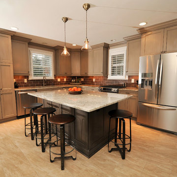
Eat-in kitchen - mid-sized transitional l-shaped porcelain tile eat-in kitchen idea in Birmingham with a single-bowl sink, shaker cabinets, gray cabinets, granite countertops, brown backsplash, ceramic backsplash, stainless steel appliances and an island
Eat-in kitchen - mid-sized transitional l-shaped porcelain tile eat-in kitchen idea in Birmingham with a single-bowl sink, shaker cabinets, gray cabinets, granite countertops, brown backsplash, ceramic backsplash, stainless steel appliances and an island
 InnovationLand
Houston Interior Designer Lisha Maxey took this Museum District condo from the dated, mirrored walls of the 1980s to Mid Century Modern with a gallery look featuring the client’s art collection.
The place was covered with glued-down, floor-to-ceiling mirrors,” says Lisha Maxey, senior designer for Homescapes of Houston and principal at LGH Design Services in Houston. “When we took them off the walls, the walls came apart. We ended up taking them down to the studs."
The makeover took six months to complete, primarily because of strict condo association rules that only gave the Houston interior designers very limited access to the elevator – through which all materials and team members had to go.
“Monday through Friday, we could only be noisy from 10 a.m. to 2 p.m., and if we had to do something extra loud, like sawing or drilling, we had to schedule it with the management and they had to communicate that to the condo owners. So it was just a lot of coordination. But a lot of Inner City Loopers live in these kinds of buildings, so we’re used to handling that kind of thing.”
The client, a child psychiatrist in her 60s, recently moved to Houston from northeast Texas to be with friends. After being widowed three years ago, she decided it was time to let go of the traditionally styled estate that wasn’t really her style anyway. An avid diver who has traveled around the world to pursue her passion, she has amassed a large collection of art from her travels. Downsizing to 1,600 feet and wanting to go more contemporary, she wanted the display – and the look – more streamlined.
“She wanted clean lines and muted colors, with the main focus being her artwork,” says Maxey. “So we made the space a palette for that.”
Enter the white, gallery-grade paint she chose for the walls: “It’s halfway between satin and flat,” explains Maxey. “It’s not glossy and it’s not chalky – just very smooth and clean."
Adding to the gallery theme is the satin nickel track lighting with lamps aimed to highlight pieces of art. “This lighting has no wires,” notes Maxey. “It’s powered by a positive and negative conduit.”
The new flooring throughout is a blended-grey porcelain tile that looks like wood planks. “It’s gorgeous, natural-looking and combines all the beauty of wood with the durability of tile,” says Maxey. “We used it throughout the condo to unify the space.”
After Maxey started looking at the client’s bright, vibrant, colorful artwork, she felt the palette couldn’t stay as muted anymore. Hence the Mid Century Modern orange leather sofas from West Elm and bright green chairs from Joybird, plus the throw pillows in different textures, patterns and shades of gold, orange and green.
The concave lines of the Danish-inspired chairs, she notes, help them look beautiful from all the way around – a key to designing spaces for loft living.
“The table in the living room is very interesting,” notes Maxey. “It was handmade for the client in 1974 and has a signature on it from the artist. She was adamant about including the piece, which has all these hand-painted black-and-white art tiles on the top. I took one look at it and said ‘It’s not really going to go.’”
However, after cutting 6 inches off the bottom and making it look a little distressed, the table ended up being the perfect complement to the sofas.
The dining room table – from Design Within Reach – is a solid piece of mahogany, the chair upholstery a mix of grey velvet and leather and the legs a shiny brass. “The side chairs are leather and the end ones are velvet,” says Maxey. “It’s a nice textural mix that lends depth and texture.”The galley kitchen, meanwhile, has been lightened and brightened, with new, white contemporary cabinetry, quartz countertops mimicking the look of Carrara marble, stainless steel appliances and a velvet green bench seat for a punch of color.The two bathrooms have been updated with contemporary white vanities and vessel sinks and the master bath now features a walk-in shower tiled in Dolomite white marble (the floor is Bianco Carrara marble mosaic, done in a herringbone pattern).In the master bedroom, Homescapes of Houston knocked down a wall between two smaller closets with swing doors to make one large walk-in closet with pocket doors. The closet in the guest bedroom also came out 13 more inches.The client’s artwork throughout personalizes the space and tells the story of a life. There’s a huge bowl of shells from the client’s diving adventures, framed art from her child psychiatry patients and a 16th century wood carving from a monastery that’s been in her family forever.
“Her collection is quite impressive,” says Maxey. “There’s even a framed piece of autographed songs written by John Lennon.” (You can see this black-framed piece of art on the wall in the photo above of two green chairs).
“We’re extremely happy with how the project turned out, and so is the client,” says Maxey. “No expense was spared for her. It was a labor of love and we were excited to do it.”
 Thinkterior LLC
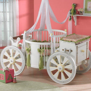
An unusual and exceptionally beautiful
work of art, the Carriage Crib, like the
carriages of old it is modeled after,
transports children to a time and place
where prancing white horses, flowing
gowns, and suits-of-armor are part
of daily life. The crib cleverly holds a
standard round mattress that is perfect
for sleeping, as well as for transporting
Cinderella to the ball.
The carriage, wheels, balustrades and
trim are painted different colors and
accented by customizable fabrics for
the crib cover and pillows. A variety
of accessories, including a colorful,
fringed canopy and assortment of
pillows ensure the Carriage Crib will
enhance fairytale themes and bedroom
designs for both boys and girls.
SAFETY A sturdy railing encloses the
crib to prevent babies and small
children from falling out, and meets
current crib safety standards. Edges are
rounded, and wheels are immobile to
ensure the carriage remains stationary.
The entire railing is removable, and
enables the child to continue to use
the carriage as a bed with a toddler
mattress.
STORAGE The rear suitcase box is used
for both storage and as a changing
table. A standard changing pad fits
perfectly on the top.
 Betty Wasserman Art & Interiors
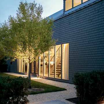
Modern luxury meets warm farmhouse in this Southampton home! Scandinavian inspired furnishings and light fixtures create a clean and tailored look, while the natural materials found in accent walls, casegoods, the staircase, and home decor hone in on a homey feel. An open-concept interior that proves less can be more is how we’d explain this interior. By accentuating the “negative space,” we’ve allowed the carefully chosen furnishings and artwork to steal the show, while the crisp whites and abundance of natural light create a rejuvenated and refreshed interior.
This sprawling 5,000 square foot home includes a salon, ballet room, two media rooms, a conference room, multifunctional study, and, lastly, a guest house (which is a mini version of the main house).
70