Search results for "Exploitation" in Home Design Ideas
Challenging design and engineering, Shell Designer Coffee Table combines monumental and brutal physicality, using stacked and fractured glass. Designed by the legendary British sculptor Danny Lane for Fiam Italia and manufactured in Italy, Shell Cocktail Table exploits the strength of glass under compression and combines sophisticated construction and apparent simplicity. Shell’s glass base is made of 12mm thick curved glass while its hand sculptured top is made of 15mm thick glass.

Bathroom - small transitional white tile and stone tile marble floor bathroom idea in Milwaukee with an undermount sink, raised-panel cabinets, white cabinets, granite countertops, a one-piece toilet and yellow walls

"As if that wasn’t enough, they also needed to store 3 bikes along with yard and craft tools. So how could I fit all of this in 500 square feet with two cars parked in it? I go vertical! A stacked garage system which exploited the 121-inch-high ceiling was the answer. And the details would need to live up to the interior.”
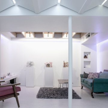
Photography by Karine Weiller
Find the right local pro for your project

Pianca Furniture draws upon traditional local craft, channelling over 500 years of carpentry along the banks of the Pianca stream. Building on its strong history, Pianca combines experience and innovation to bring the culture of modern design to the world.
The Boston is an elegant sofa, combining great comfort with strong visual presence. Its style is characterized by details of the past, made and embellished with a handcrafted workmanship quality declined from a perspective of industrial production. The system is equipped with an electronic automation mechanism that permits to regulate seat depth.
The Abaco coffee table is a versatile side or coffee table that lays the foundations of style.
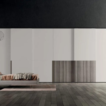
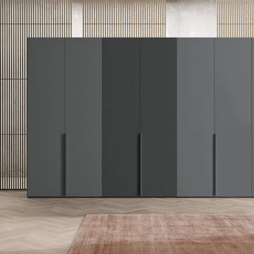
Spazio Pianca modules offer full creative freedom and spectacular impact. Peerlessly handsome solutions that exploit the interplay of solids and spaces; wall-hanging or free-standing storage elements, creating plucky, modern graphic images. A personal lifestyle that knows how to stay one step ahead of the latest trends.

Nestled on a corner lot in the Madrona neighborhood, we chose to exploit the abundance of natural light in this 1905 home. We worked with Board & Vellum to remodel this residence from the dining and living rooms to the kitchen and powder room. Our client loved bold rich colors, perfect in combination with the natural lighting of the home. We used blue hues throughout, mirroring the palette in the details of the accessories and artwork. We balanced the deep shades in the kitchen with coastal grey quartz and honed Calacatta Marble backsplash, extending from the countertop to the ceiling. Filling the main space with comfortable furniture married with a collection of colors, textures, and patterns proved for cohesive balanced style.
DATE COMPLETED – 2016
LOCATION – SEATTLE, WA
PHOTOGRAPHY – JOHN GRANEN PHOTOGRAPHY

Located on a marsh in the upper reaches of the Lieutenant River in Old Lyme, the existing house was well-sited and well-built, but the design failed to exploit the views and more importantly was a confused combination of contemporary and traditional elements. The new homeowners, a successful businesswoman and an accomplished artist and photographer, were interested in creating a fully-contemporary environment to open up space, connect indoors with outdoors, display artwork and showcase the husband’s distinctive photographs.
One glaring deficiency was the curb appeal and approach sequence: the grade sloped down and the path to the house followed, but this led to an uncomfortable dip and abrupt rise to the front door. By creating a virtual “moat,” occupied by a grid of raised-bed grasses contained in aluminum-clad boxes, and spanning the moat with an ipe bridge, the approach becomes level and engaging. The façade of the existing house was blank and bland, and with no cover. Adding a deep overhang with a wide porch creates a welcoming, covered condition, accentuated by a 6’ wide pivoting front door that feels more like a moving piece of wall.
Another deficiency was the connection to the outdoors. By adding glass to the front and back of the house, and removing interior walls selectively, the house takes on a diaphanous quality that allows one to see through to the marsh beyond, even when in the driveway. The raised-bed grasses act as abstract, geometric versions of the marsh beyond. A large, pyramidal skylight establishes a spatial hierarchy around which the rooms revolve.
The house featured several tray-ceilinged spaces – living room, kitchen, and master bedroom – that were poorly-proportioned and with panels at the top that resembled inset flat panel doors. The solution was to use a different strategy for each: the bedroom turns the ceiling into an eggshell through the use of a creative trim detail; the living room has an oversized sculptural, backlit lighting element; and the kitchen has a collage of painted rectangular forms that support or include lighting pieces.
A palette of concrete, blackened steel, stainless steel and colors carefully chosen by homeowner and architect create an interior and exterior environment punctuated by moments that are as artistic as the featured works in the black-ceilinged gallery.

Nestled on a corner lot in the Madrona neighborhood, we chose to exploit the abundance of natural light in this 1905 home. We worked with Board & Vellum to remodel this residence from the dining and living rooms to the kitchen and powder room. Our client loved bold rich colors, perfect in combination with the natural lighting of the home. We used blue hues throughout, mirroring the palette in the details of the accessories and artwork. We balanced the deep shades in the kitchen with coastal grey quartz and honed Calacatta Marble backsplash, extending from the countertop to the ceiling. Filling the main space with comfortable furniture married with a collection of colors, textures, and patterns proved for cohesive balanced style.
DATE COMPLETED – 2016
LOCATION – SEATTLE, WA
PHOTOGRAPHY – JOHN GRANEN PHOTOGRAPHY

Located on a marsh in the upper reaches of the Lieutenant River in Old Lyme, the existing house was well-sited and well-built, but the design failed to exploit the views and more importantly was a confused combination of contemporary and traditional elements. The new homeowners, a successful businesswoman and an accomplished artist and photographer, were interested in creating a fully-contemporary environment to open up space, connect indoors with outdoors, display artwork and showcase the husband’s distinctive photographs.
One glaring deficiency was the curb appeal and approach sequence: the grade sloped down and the path to the house followed, but this led to an uncomfortable dip and abrupt rise to the front door. By creating a virtual “moat,” occupied by a grid of raised-bed grasses contained in aluminum-clad boxes, and spanning the moat with an ipe bridge, the approach becomes level and engaging. The façade of the existing house was blank and bland, and with no cover. Adding a deep overhang with a wide porch creates a welcoming, covered condition, accentuated by a 6’ wide pivoting front door that feels more like a moving piece of wall.
Another deficiency was the connection to the outdoors. By adding glass to the front and back of the house, and removing interior walls selectively, the house takes on a diaphanous quality that allows one to see through to the marsh beyond, even when in the driveway. The raised-bed grasses act as abstract, geometric versions of the marsh beyond. A large, pyramidal skylight establishes a spatial hierarchy around which the rooms revolve.
The house featured several tray-ceilinged spaces – living room, kitchen, and master bedroom – that were poorly-proportioned and with panels at the top that resembled inset flat panel doors. The solution was to use a different strategy for each: the bedroom turns the ceiling into an eggshell through the use of a creative trim detail; the living room has an oversized sculptural, backlit lighting element; and the kitchen has a collage of painted rectangular forms that support or include lighting pieces.
A palette of concrete, blackened steel, stainless steel and colors carefully chosen by homeowner and architect create an interior and exterior environment punctuated by moments that are as artistic as the featured works in the black-ceilinged gallery.

Designed as a country retreat for a young couple from New York City, this compact project plays with the idea of a modern cabin. Containing 3 bedrooms and 2 full bathrooms in under 2,000 sqft, the house exploits the use of glass and outdoors rooms to expand its virtual space and connection to nature.
The aesthetics of the house reflect the nature of its owners; while very modest and private on the outside, it is full of light and openness on the inside.
The project's interior design creates a youthful and relaxed atmosphere, while maintaining a timelessness and simplicity appropriate to its New England heritage.
http://chattmanphotography.com/

Nestled on a corner lot in the Madrona neighborhood, we chose to exploit the abundance of natural light in this 1905 home. We worked with Board & Vellum to remodel this residence from the dining and living rooms to the kitchen and powder room. Our client loved bold rich colors, perfect in combination with the natural lighting of the home. We used blue hues throughout, mirroring the palette in the details of the accessories and artwork. We balanced the deep shades in the kitchen with coastal grey quartz and honed Calacatta Marble backsplash, extending from the countertop to the ceiling. Filling the main space with comfortable furniture married with a collection of colors, textures, and patterns proved for cohesive balanced style.
DATE COMPLETED – 2016
LOCATION – SEATTLE, WA
PHOTOGRAPHY – JOHN GRANEN PHOTOGRAPHY

Pianca Furniture draws upon traditional local craft, channelling over 500 years of carpentry along the banks of the Pianca stream. Building on its strong history, Pianca combines experience and innovation to bring the culture of modern design to the world.
Spazio Pianca modules offer full creative freedom and spectacular impact. Peerlessly handsome solutions that exploit the interplay of solids and spaces; wall-hanging or free-standing storage elements, creating plucky, modern graphic images.
The minimal and contemporary Mono table comes painted in a matte finish with 28 color options, with a metal finish. The Mono table comes in four different dimensions for ultimate versatility.

Nestled on a corner lot in the Madrona neighborhood, we chose to exploit the abundance of natural light in this 1905 home. We worked with Board & Vellum to remodel this residence from the dining and living rooms to the kitchen and powder room. Our client loved bold rich colors, perfect in combination with the natural lighting of the home. We used blue hues throughout, mirroring the palette in the details of the accessories and artwork. We balanced the deep shades in the kitchen with coastal grey quartz and honed Calacatta Marble backsplash, extending from the countertop to the ceiling. Filling the main space with comfortable furniture married with a collection of colors, textures, and patterns proved for cohesive balanced style.
DATE COMPLETED – 2016
LOCATION – SEATTLE, WA
PHOTOGRAPHY – JOHN GRANEN PHOTOGRAPHY

Photography by Deb Scannell
Inspiration for a rustic concrete floor basement remodel in Charlotte

This sun room exploits the great afternoon sun and beautiful view. The plush pillows and cushions invite you to relax and let your cares slip away. Three walls have the same terra cotta paint color as the cushions, combined with a soft cream on the wall with the pass through and doorway to the rest of the home. This has become a favorite gathering space for family and friends.

Designed as a country retreat for a young couple from New York City, this compact project plays with the idea of a modern cabin. Containing 3 bedrooms and 2 full bathrooms in under 2,000 sqft, the house exploits the use of glass and outdoors rooms to expand its virtual space and connection to nature.
The aesthetics of the house reflect the nature of its owners; while very modest and private on the outside, it is full of light and openness on the inside.
The project's interior design creates a youthful and relaxed atmosphere, while maintaining a timelessness and simplicity appropriate to its New England heritage.
http://chattmanphotography.com/

Perfectly poised to exploit zen-like lake views, this modern family home is a convergence of Frank Lloyd Wright’s signature Western architectural notes and 21st-century luxury. A dramatic interplay of a variety of stone, metal and glass, the L-shaped, 2-story, 4,300-square-foot structure proudly takes its place at water's edge in the lush and beautiful country club setting of Bentwater on Lake Conroe in Montgomery, TX.

Located on a marsh in the upper reaches of the Lieutenant River in Old Lyme, the existing house was well-sited and well-built, but the design failed to exploit the views and more importantly was a confused combination of contemporary and traditional elements. The new homeowners, a successful businesswoman and an accomplished artist and photographer, were interested in creating a fully-contemporary environment to open up space, connect indoors with outdoors, display artwork and showcase the husband’s distinctive photographs.
One glaring deficiency was the curb appeal and approach sequence: the grade sloped down and the path to the house followed, but this led to an uncomfortable dip and abrupt rise to the front door. By creating a virtual “moat,” occupied by a grid of raised-bed grasses contained in aluminum-clad boxes, and spanning the moat with an ipe bridge, the approach becomes level and engaging. The façade of the existing house was blank and bland, and with no cover. Adding a deep overhang with a wide porch creates a welcoming, covered condition, accentuated by a 6’ wide pivoting front door that feels more like a moving piece of wall.
Another deficiency was the connection to the outdoors. By adding glass to the front and back of the house, and removing interior walls selectively, the house takes on a diaphanous quality that allows one to see through to the marsh beyond, even when in the driveway. The raised-bed grasses act as abstract, geometric versions of the marsh beyond. A large, pyramidal skylight establishes a spatial hierarchy around which the rooms revolve.
The house featured several tray-ceilinged spaces – living room, kitchen, and master bedroom – that were poorly-proportioned and with panels at the top that resembled inset flat panel doors. The solution was to use a different strategy for each: the bedroom turns the ceiling into an eggshell through the use of a creative trim detail; the living room has an oversized sculptural, backlit lighting element; and the kitchen has a collage of painted rectangular forms that support or include lighting pieces.
A palette of concrete, blackened steel, stainless steel and colors carefully chosen by homeowner and architect create an interior and exterior environment punctuated by moments that are as artistic as the featured works in the black-ceilinged gallery.

Located on a marsh in the upper reaches of the Lieutenant River in Old Lyme, the existing house was well-sited and well-built, but the design failed to exploit the views and more importantly was a confused combination of contemporary and traditional elements. The new homeowners, a successful businesswoman and an accomplished artist and photographer, were interested in creating a fully-contemporary environment to open up space, connect indoors with outdoors, display artwork and showcase the husband’s distinctive photographs.
One glaring deficiency was the curb appeal and approach sequence: the grade sloped down and the path to the house followed, but this led to an uncomfortable dip and abrupt rise to the front door. By creating a virtual “moat,” occupied by a grid of raised-bed grasses contained in aluminum-clad boxes, and spanning the moat with an ipe bridge, the approach becomes level and engaging. The façade of the existing house was blank and bland, and with no cover. Adding a deep overhang with a wide porch creates a welcoming, covered condition, accentuated by a 6’ wide pivoting front door that feels more like a moving piece of wall.
Another deficiency was the connection to the outdoors. By adding glass to the front and back of the house, and removing interior walls selectively, the house takes on a diaphanous quality that allows one to see through to the marsh beyond, even when in the driveway. The raised-bed grasses act as abstract, geometric versions of the marsh beyond. A large, pyramidal skylight establishes a spatial hierarchy around which the rooms revolve.
The house featured several tray-ceilinged spaces – living room, kitchen, and master bedroom – that were poorly-proportioned and with panels at the top that resembled inset flat panel doors. The solution was to use a different strategy for each: the bedroom turns the ceiling into an eggshell through the use of a creative trim detail; the living room has an oversized sculptural, backlit lighting element; and the kitchen has a collage of painted rectangular forms that support or include lighting pieces.
A palette of concrete, blackened steel, stainless steel and colors carefully chosen by homeowner and architect create an interior and exterior environment punctuated by moments that are as artistic as the featured works in the black-ceilinged gallery.
5