
Search results for "Exploited" in Home Design Ideas
 Nautilus Architects
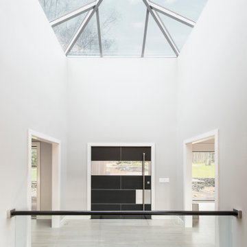
Located on a marsh in the upper reaches of the Lieutenant River in Old Lyme, the existing house was well-sited and well-built, but the design failed to exploit the views and more importantly was a confused combination of contemporary and traditional elements. The new homeowners, a successful businesswoman and an accomplished artist and photographer, were interested in creating a fully-contemporary environment to open up space, connect indoors with outdoors, display artwork and showcase the husband’s distinctive photographs.
One glaring deficiency was the curb appeal and approach sequence: the grade sloped down and the path to the house followed, but this led to an uncomfortable dip and abrupt rise to the front door. By creating a virtual “moat,” occupied by a grid of raised-bed grasses contained in aluminum-clad boxes, and spanning the moat with an ipe bridge, the approach becomes level and engaging. The façade of the existing house was blank and bland, and with no cover. Adding a deep overhang with a wide porch creates a welcoming, covered condition, accentuated by a 6’ wide pivoting front door that feels more like a moving piece of wall.
Another deficiency was the connection to the outdoors. By adding glass to the front and back of the house, and removing interior walls selectively, the house takes on a diaphanous quality that allows one to see through to the marsh beyond, even when in the driveway. The raised-bed grasses act as abstract, geometric versions of the marsh beyond. A large, pyramidal skylight establishes a spatial hierarchy around which the rooms revolve.
The house featured several tray-ceilinged spaces – living room, kitchen, and master bedroom – that were poorly-proportioned and with panels at the top that resembled inset flat panel doors. The solution was to use a different strategy for each: the bedroom turns the ceiling into an eggshell through the use of a creative trim detail; the living room has an oversized sculptural, backlit lighting element; and the kitchen has a collage of painted rectangular forms that support or include lighting pieces.
A palette of concrete, blackened steel, stainless steel and colors carefully chosen by homeowner and architect create an interior and exterior environment punctuated by moments that are as artistic as the featured works in the black-ceilinged gallery.
 David Mitchell Interior Design
Angie Seckinger
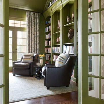
Inspiration for a mid-sized eclectic enclosed dark wood floor family room library remodel in DC Metro with green walls, no fireplace and no tv
Inspiration for a mid-sized eclectic enclosed dark wood floor family room library remodel in DC Metro with green walls, no fireplace and no tv
 catlin stothers design
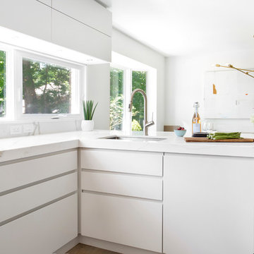
A dysfunctional layout on the main floor included a tiny kitchen and dining room, both of which were disproportionate with other rooms in this sprawling five bedroom home. The spatial constraints didn’t allow for large gatherings nor was the kitchen remotely functional.
The removal of several interior walls, along with opening door entries to their maximum heights and widths provide greater flow and a more inviting atmosphere. Views to the garden were exploited by replacing one small window with a thirteen foot linear window in the kitchen.
Other windows were transformed into exterior doors for easy access to the large terrace leading to a swimming pool during summer months.
The kitchen is a luminous sanctuary, combining a serene palette of muted grey cabinetry and marbled quartz counters. Panels of white oak maintain minimal lines while concealing an abundance of storage. The former dining room gave way to a more casual experience, with a custom built-in banquette spanning the width of the kitchen.
Continuing the oak floors from the living room into the kitchen, creates a visual flow that was integral to the open concept of the main floor.
Find the right local pro for your project
 catlin stothers design
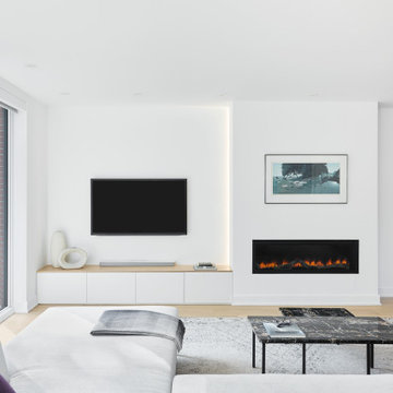
The decision to either renovate the upper and lower units of a duplex or convert them into a single-family home was a no-brainer. Situated on a quiet street in Montreal, the home was the childhood residence of the homeowner, where many memories were made and relationships formed within the neighbourhood. The prospect of living elsewhere wasn’t an option.
A complete overhaul included the re-configuration of three levels to accommodate the dynamic lifestyle of the empty nesters. The potential to create a luminous volume was evident from the onset. With the home backing onto a park, westerly views were exploited by oversized windows and doors. A massive window in the stairwell allows morning sunlight to filter in and create stunning reflections in the open concept living area below.
The staircase is an architectural statement combining two styles of steps, with the extended width of the lower staircase creating a destination to read, while making use of an otherwise awkward space.
White oak dominates the entire home to create a cohesive and natural context. Clean lines, minimal furnishings and white walls allow the small space to breathe.
 Design + Build by Lazar
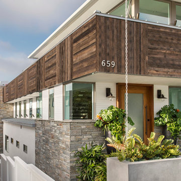
Steve Lazar's newest project, a six-bedroom residence built on a hillside peak of 30th Street in Hermosa Beach for design+build by South Swell, is a study in the functional exploitation of lot size and surrounding beauty. That, and an evolution of the designer’s singular style.
Modernist in its veins, the new home has the earmarks of a Lazar design inside and out. There’s a hint of lifeguard tower in its exterior, though more muted than visible in his past projects, mainly due to a ring of rusticated wood cladding swathed around its mid-section. Other signifiers are there, too, from a row of high-perched observation windows to a slightly raised metal hip roof of soft blue. Jutting out slightly over the home, its underside dressed in tidy shiplap, the roof contrasts smartly against the clean white stucco and earthy wood of the lower levels. In all, it’s still clean-cut Lazar, but more organic than sleek.
“I use a lot of the same ideas,” says Lazar, standing outside the structure while craftsmen and workers buzz around, putting finishing touches on the place. “ “I have a signature vocabulary, but I adapt it with each custom home to meet a client’s needs and maximize the particulars of that space.”
Thoughtfully designed by Steve Lazar design+build by South Swell. designbuildbysouthswell.com Photography by Laura Hull
 catlin stothers design
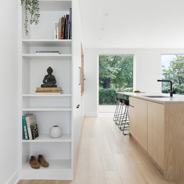
The decision to either renovate the upper and lower units of a duplex or convert them into a single-family home was a no-brainer. Situated on a quiet street in Montreal, the home was the childhood residence of the homeowner, where many memories were made and relationships formed within the neighbourhood. The prospect of living elsewhere wasn’t an option.
A complete overhaul included the re-configuration of three levels to accommodate the dynamic lifestyle of the empty nesters. The potential to create a luminous volume was evident from the onset. With the home backing onto a park, westerly views were exploited by oversized windows and doors. A massive window in the stairwell allows morning sunlight to filter in and create stunning reflections in the open concept living area below.
The staircase is an architectural statement combining two styles of steps, with the extended width of the lower staircase creating a destination to read, while making use of an otherwise awkward space.
White oak dominates the entire home to create a cohesive and natural context. Clean lines, minimal furnishings and white walls allow the small space to breathe.
 Ward+Blake Architects
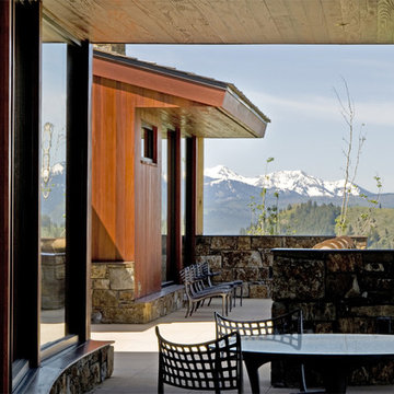
This custom residence exploits its southern exposure with a daylight basement that opens out to unencumbered mountain views. Interior finishes such as inlaid wood ceilings, Oklahoma sandstone masonry, and log wrapped steel columns, carry the ubiquitous natural tones of the site into the interior with a refined touch. Designed by Ward+Blake Architects in Jackson, Wyoming.
Photo Credit: Douglas Kahn
 catlin stothers design
The decision to either renovate the upper and lower units of a duplex or convert them into a single-family home was a no-brainer. Situated on a quiet street in Montreal, the home was the childhood residence of the homeowner, where many memories were made and relationships formed within the neighbourhood. The prospect of living elsewhere wasn’t an option.
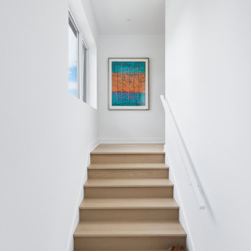
A complete overhaul included the re-configuration of three levels to accommodate the dynamic lifestyle of the empty nesters. The potential to create a luminous volume was evident from the onset. With the home backing onto a park, westerly views were exploited by oversized windows and doors. A massive window in the stairwell allows morning sunlight to filter in and create stunning reflections in the open concept living area below.
The staircase is an architectural statement combining two styles of steps, with the extended width of the lower staircase creating a destination to read, while making use of an otherwise awkward space.
White oak dominates the entire home to create a cohesive and natural context. Clean lines, minimal furnishings and white walls allow the small space to breathe.
12