
Search results for "Exploited" in Home Design Ideas
 Design + Build by Lazar
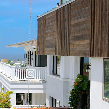
Steve Lazar's newest project, a six-bedroom residence built on a hillside peak of 30th Street in Hermosa Beach for design+build by South Swell, is a study in the functional exploitation of lot size and surrounding beauty. That, and an evolution of the designer’s singular style.
Modernist in its veins, the new home has the earmarks of a Lazar design inside and out. There’s a hint of lifeguard tower in its exterior, though more muted than visible in his past projects, mainly due to a ring of rusticated wood cladding swathed around its mid-section. Other signifiers are there, too, from a row of high-perched observation windows to a slightly raised metal hip roof of soft blue. Jutting out slightly over the home, its underside dressed in tidy shiplap, the roof contrasts smartly against the clean white stucco and earthy wood of the lower levels. In all, it’s still clean-cut Lazar, but more organic than sleek.
“I use a lot of the same ideas,” says Lazar, standing outside the structure while craftsmen and workers buzz around, putting finishing touches on the place. “ “I have a signature vocabulary, but I adapt it with each custom home to meet a client’s needs and maximize the particulars of that space.”
Thoughtfully designed by Steve Lazar design+build by South Swell. designbuildbysouthswell.com Photography by Laura Hull
 Ed Hughey, Architect & Realtor
Photographer: Andrea Calo
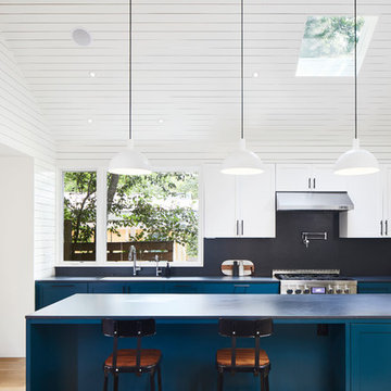
Mid-sized transitional l-shaped medium tone wood floor and brown floor eat-in kitchen photo in Austin with an undermount sink, shaker cabinets, turquoise cabinets, black backsplash, paneled appliances, an island and black countertops
Mid-sized transitional l-shaped medium tone wood floor and brown floor eat-in kitchen photo in Austin with an undermount sink, shaker cabinets, turquoise cabinets, black backsplash, paneled appliances, an island and black countertops
 AIA Pittsburgh
DESIGN + INNOVATION: Award of Excellence
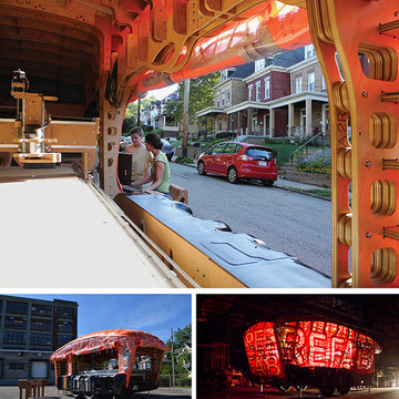
PROJECT: RE_FAB Mobile Fabrication Lab
CLIENT: Ford College Community Challenge and Project RE_
ARCHITECTURE FIRM: Urban Design Build Studio
CONTRACTORS: Urban Design Build Studio
PHOTOGRAPHER: Urban Design Build Studio
DESCRIPTION: RE_FAB is a mobile fabrication lab that functions as an educational and digital fabrication tool with the capacity to serve schools, facilities, and communities. The project is designed to exploit and celebrate the potentials of the tools that it houses, and will house (full size CNC router, laser cutter, vacuum former, digital spatial scanner, and a 3D printer) and was funded by grants from two corporations interested in architecture community outreach projects.
JURY COMMENTS: This is a project that every jury member unanimously loved. Every aspect of its problem-solving design seemed smart and responsive, and it is those responses that resulted in a design that is both innovative and legible to what its function is intended to serve. Why is there not one of these in my neighborhood?
Find the right local pro for your project
 User
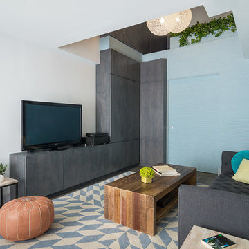
UserIn this living room we created a large storage space behind a pocket door with additional storage cabinets above and along side.
Photo: Bjorg Magnea
Furniture: AbbyElle Style
 Ward+Blake Architects
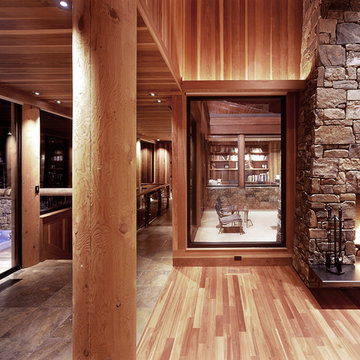
This custom residence exploits its southern exposure with a daylight basement that opens out to unencumbered mountain views. Interior finishes such as inlaid wood ceilings, Oklahoma sandstone masonry, and log wrapped steel columns, carry the ubiquitous natural tones of the site into the interior with a refined touch. Designed by Ward+Blake Architects in Jackson, Wyoming.
Photo Credit: Douglas Kahn
 Brooks + Scarpa Architects
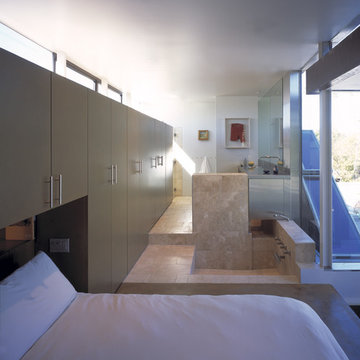
Nestled amidst a neighborhood of single story bungalows in Venice, California, the Solar Umbrella Residence boldly establishes a precedent for the next generation of California modernist architecture. Located on a 41’ wide x 100’-0” long through lot, the Solar Umbrella addition transforms the architects’ existing 650 square foot bungalow into a 1900 square foot residence equipped for responsible living in the twenty-first century.
Inspired by Paul Rudolph’s Umbrella House of 1953, the Solar Umbrella provides a contemporary reinvention of the solar canopy—a strategy that provides thermal protection in climates with intense exposures. In establishing the program for their residence, which accommodates the couple and their one child chose to integrate into the design, principles of sustainability that they strive to achieve in their own practice. The architects carefully considered the entire site, taking advantage of as many opportunities for sustainable living as possible. Passive and active solar design strategies render the residence 100% energy neutral. Recycled, renewable, and high performance materials and products are specified throughout. Hardscape and landscape treatments are considered for their aesthetic and actual impact on the land. The Brooks Scarpa Residence elegantly crafts each of these strategies and materials, exploiting the potential for performance and sensibility while achieving a rich and interesting sensory and aesthetic experience.
 Jill Lewis Architecture
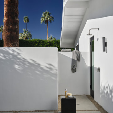
The goal for this mid-century home was to exploit the best features of the property, taking advantage of views, the dramatic light, the potential for an incredible indoor-outdoor experience and the mid-century bones of the house. When we first visited the property, I was struck by the potential for a beautiful mountain view that was currently cut off by a low ceiling height in the main living area. Raising the roof of the main living area became the largest gesture in our scope of work. The former chopped-up side entry and tiny kitchen were combined to make a long, generous kitchen and built-in banquette. The original rhombus-shaped pool was kept, restored and lined with Ann Sacks tiles. In the center of the action, we conceived a large floating desk surface suspended from a black metal screen to define the space and allow filtered light and views to pass between. The clients were drawn to clean lines, pared-down details and highly disciplined palettes of white, grey and matte black. We generally opted for deep, muted colors balanced with crisp white, adding textures to create patterns with the shifting daylight throughout the house. This soothing collection of finishes playing with light and shadow would achieve a peaceful and elegant home that would stand the test of time and honor the landscape of the surrounding area.
Photography: Douglas Friedman
 Design + Build by Lazar
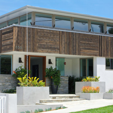
Steve Lazar's newest project, a six-bedroom residence built on a hillside peak of 30th Street in Hermosa Beach for design+build by South Swell, is a study in the functional exploitation of lot size and surrounding beauty. That, and an evolution of the designer’s singular style.
Modernist in its veins, the new home has the earmarks of a Lazar design inside and out. There’s a hint of lifeguard tower in its exterior, though more muted than visible in his past projects, mainly due to a ring of rusticated wood cladding swathed around its mid-section. Other signifiers are there, too, from a row of high-perched observation windows to a slightly raised metal hip roof of soft blue. Jutting out slightly over the home, its underside dressed in tidy shiplap, the roof contrasts smartly against the clean white stucco and earthy wood of the lower levels. In all, it’s still clean-cut Lazar, but more organic than sleek.
“I use a lot of the same ideas,” says Lazar, standing outside the structure while craftsmen and workers buzz around, putting finishing touches on the place. “ “I have a signature vocabulary, but I adapt it with each custom home to meet a client’s needs and maximize the particulars of that space.”
Thoughtfully designed by Steve Lazar design+build by South Swell. designbuildbysouthswell.com Photography by Laura Hull
 User
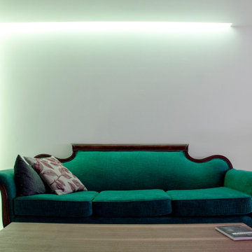
UserGiven the constraints with natural lighting, the design explores artificial lighting as a means to establish atmospheric conditions. Lighting coves are created throughout the gallery alcove and studio and hide LED lighting that wash the walls. Reveals are exploited as an architectural strategy to emphasize form with shadow lines, but also serve as electrical coves and hide the outlets within the gallery and studio.
 Ward+Blake Architects
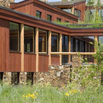
This custom residence exploits its southern exposure with a daylight basement that opens out to unencumbered mountain views. Interior finishes such as inlaid wood ceilings, Oklahoma sandstone masonry, and log wrapped steel columns, carry the ubiquitous natural tones of the site into the interior with a refined touch. Designed by Ward+Blake Architects in Jackson, Wyoming.
Photo Credit: Douglas Kahn
 RoomService 360
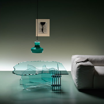
Challenging design and engineering, Shell Designer Coffee Table combines monumental and brutal physicality, using stacked and fractured glass. Designed by the legendary British sculptor Danny Lane for Fiam Italia and manufactured in Italy, Shell Cocktail Table exploits the strength of glass under compression and combines sophisticated construction and apparent simplicity. Shell’s glass base is made of 12mm thick curved glass while its hand sculptured top is made of 15mm thick glass.
 North Shore Kitchen & Bath
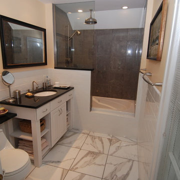
Bathroom - small transitional white tile and stone tile marble floor bathroom idea in Milwaukee with an undermount sink, raised-panel cabinets, white cabinets, granite countertops, a one-piece toilet and yellow walls
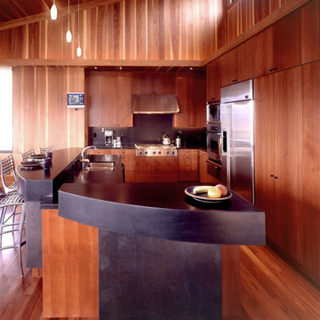 Ward+Blake Architects
This custom residence exploits its southern exposure with a daylight basement that opens out to unencumbered mountain views. Interior finishes such as inlaid wood ceilings, Oklahoma sandstone masonry, and log wrapped steel columns, carry the ubiquitous natural tones of the site into the interior with a refined touch. Designed by Ward+Blake Architects in Jackson, Wyoming.
Photo Credit: Douglas Kahn
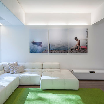
 Hold It Contemporary Home
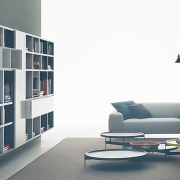
Pianca Furniture draws upon traditional local craft, channelling over 500 years of carpentry along the banks of the Pianca stream. Building on its strong history, Pianca combines experience and innovation to bring the culture of modern design to the world.
The Boston is an elegant sofa, combining great comfort with strong visual presence. Its style is characterized by details of the past, made and embellished with a handcrafted workmanship quality declined from a perspective of industrial production. The system is equipped with an electronic automation mechanism that permits to regulate seat depth.
The Abaco coffee table is a versatile side or coffee table that lays the foundations of style.
Spazio Pianca modules offer full creative freedom and spectacular impact. Peerlessly handsome solutions that exploit the interplay of solids and spaces; wall-hanging or free-standing storage elements, creating plucky, modern graphic images. A personal lifestyle that knows how to stay one step ahead of the latest trends.
 Tammara Stroud Design
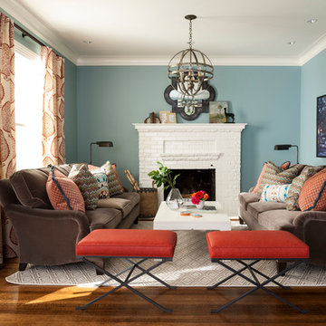
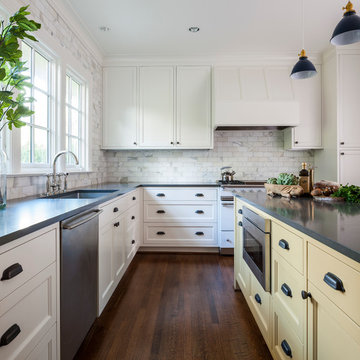
Nestled on a corner lot in the Madrona neighborhood, we chose to exploit the abundance of natural light in this 1905 home. We worked with Board & Vellum to remodel this residence from the dining and living rooms to the kitchen and powder room. Our client loved bold rich colors, perfect in combination with the natural lighting of the home. We used blue hues throughout, mirroring the palette in the details of the accessories and artwork. We balanced the deep shades in the kitchen with coastal grey quartz and honed Calacatta Marble backsplash, extending from the countertop to the ceiling. Filling the main space with comfortable furniture married with a collection of colors, textures, and patterns proved for cohesive balanced style.
DATE COMPLETED – 2016
LOCATION – SEATTLE, WA
PHOTOGRAPHY – JOHN GRANEN PHOTOGRAPHY
 Nautilus Architects
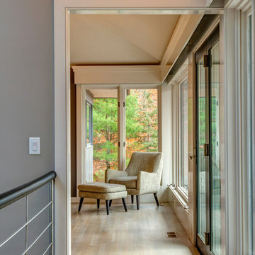
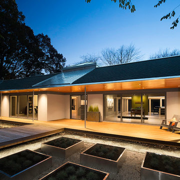
Located on a marsh in the upper reaches of the Lieutenant River in Old Lyme, the existing house was well-sited and well-built, but the design failed to exploit the views and more importantly was a confused combination of contemporary and traditional elements. The new homeowners, a successful businesswoman and an accomplished artist and photographer, were interested in creating a fully-contemporary environment to open up space, connect indoors with outdoors, display artwork and showcase the husband’s distinctive photographs.
One glaring deficiency was the curb appeal and approach sequence: the grade sloped down and the path to the house followed, but this led to an uncomfortable dip and abrupt rise to the front door. By creating a virtual “moat,” occupied by a grid of raised-bed grasses contained in aluminum-clad boxes, and spanning the moat with an ipe bridge, the approach becomes level and engaging. The façade of the existing house was blank and bland, and with no cover. Adding a deep overhang with a wide porch creates a welcoming, covered condition, accentuated by a 6’ wide pivoting front door that feels more like a moving piece of wall.
Another deficiency was the connection to the outdoors. By adding glass to the front and back of the house, and removing interior walls selectively, the house takes on a diaphanous quality that allows one to see through to the marsh beyond, even when in the driveway. The raised-bed grasses act as abstract, geometric versions of the marsh beyond. A large, pyramidal skylight establishes a spatial hierarchy around which the rooms revolve.
The house featured several tray-ceilinged spaces – living room, kitchen, and master bedroom – that were poorly-proportioned and with panels at the top that resembled inset flat panel doors. The solution was to use a different strategy for each: the bedroom turns the ceiling into an eggshell through the use of a creative trim detail; the living room has an oversized sculptural, backlit lighting element; and the kitchen has a collage of painted rectangular forms that support or include lighting pieces.
A palette of concrete, blackened steel, stainless steel and colors carefully chosen by homeowner and architect create an interior and exterior environment punctuated by moments that are as artistic as the featured works in the black-ceilinged gallery.

 Dunn and Associates Inc, Architects
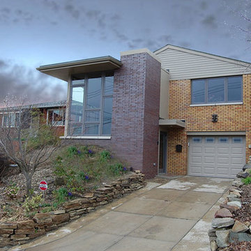
Confronted with the problem of replacing a deteriorated exterior staircase and porch, the Owners of this Pittsburgh Ranch Home asked Dunn and Associates what they recommend. Instead of replacing the Porch in kind, we recommended creating a new Atrium Entry that relocates the entry door at ground level rather than a story above. This not only made for easier and safe access to the home, but created a naturally-lighted volume that exploits a magnificent view of the river valley. The Atrium breathed new life into an otherwise tight and disjointed living area. Once the Owner stains the existing house brick and replaces the gable siding (Phase II), the house will have a totally new and cohesive appearance. The deep overhang provides summer shading and the iron-spot brick lends a rich modern appearance to the stereotypical ranch design
 Tammara Stroud Design
Nestled on a corner lot in the Madrona neighborhood, we chose to exploit the abundance of natural light in this 1905 home. We worked with Board & Vellum to remodel this residence from the dining and living rooms to the kitchen and powder room. Our client loved bold rich colors, perfect in combination with the natural lighting of the home. We used blue hues throughout, mirroring the palette in the details of the accessories and artwork. We balanced the deep shades in the kitchen with coastal grey quartz and honed Calacatta Marble backsplash, extending from the countertop to the ceiling. Filling the main space with comfortable furniture married with a collection of colors, textures, and patterns proved for cohesive balanced style.
DATE COMPLETED – 2016
LOCATION – SEATTLE, WA
PHOTOGRAPHY – JOHN GRANEN PHOTOGRAPHY
 Nautilus Architects
Located on a marsh in the upper reaches of the Lieutenant River in Old Lyme, the existing house was well-sited and well-built, but the design failed to exploit the views and more importantly was a confused combination of contemporary and traditional elements. The new homeowners, a successful businesswoman and an accomplished artist and photographer, were interested in creating a fully-contemporary environment to open up space, connect indoors with outdoors, display artwork and showcase the husband’s distinctive photographs.
One glaring deficiency was the curb appeal and approach sequence: the grade sloped down and the path to the house followed, but this led to an uncomfortable dip and abrupt rise to the front door. By creating a virtual “moat,” occupied by a grid of raised-bed grasses contained in aluminum-clad boxes, and spanning the moat with an ipe bridge, the approach becomes level and engaging. The façade of the existing house was blank and bland, and with no cover. Adding a deep overhang with a wide porch creates a welcoming, covered condition, accentuated by a 6’ wide pivoting front door that feels more like a moving piece of wall.
Another deficiency was the connection to the outdoors. By adding glass to the front and back of the house, and removing interior walls selectively, the house takes on a diaphanous quality that allows one to see through to the marsh beyond, even when in the driveway. The raised-bed grasses act as abstract, geometric versions of the marsh beyond. A large, pyramidal skylight establishes a spatial hierarchy around which the rooms revolve.
The house featured several tray-ceilinged spaces – living room, kitchen, and master bedroom – that were poorly-proportioned and with panels at the top that resembled inset flat panel doors. The solution was to use a different strategy for each: the bedroom turns the ceiling into an eggshell through the use of a creative trim detail; the living room has an oversized sculptural, backlit lighting element; and the kitchen has a collage of painted rectangular forms that support or include lighting pieces.
A palette of concrete, blackened steel, stainless steel and colors carefully chosen by homeowner and architect create an interior and exterior environment punctuated by moments that are as artistic as the featured works in the black-ceilinged gallery.
4