
Search results for "Extended period" in Home Design Ideas
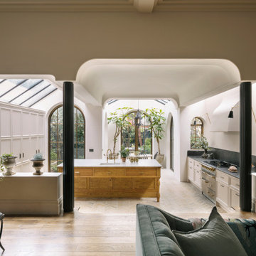
 STUDIO TASHIMA
Keyes Road is a two-storey, semi-detached red brick house dating to around 1890-1910. The focus of our work was on the ground floor where we were asked to improve the layout and use of the main living areas of the house, for an active family of four. Important to the design was to maximise the quality and amount of light as well as connection to the garden and flow to the rest of the house.
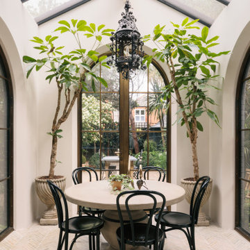
Our proposal introduces three single storey extensions, comprising a central, large space that extends the main outrigger of the house. To each side are smaller volumes, affording a full width kitchen. While defining a series of discrete volumes, it was important for us to ensure that the kitchen, living, family and dining rooms that are interconnecting and continuous. The result is a big space punctuated by a series of differently sized arches, defining spaces to ensure their intimacy.
It was important for our client to have a sense of warmth and comfort - perhaps not dissimilar to the qualities of a hotel lobby. The colour scheme of the rooms are warm white painted plaster, natural wood flooring with black, bronze and brass accents. Indirect and carefully placed light fittings pulls together the atmosphere of the rooms - particularly in the evenings.
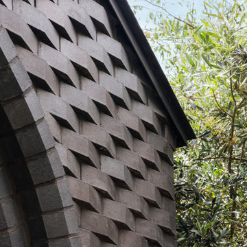
Externally, we felt it important to differentiate the extensions from the main house by using a dark, charcoal grey brick. This sets up a contrasting yet complimentary relationship to the rich red coloured brick house. The facets of the brick play with light and depth as do the graduated brick arches.
During the design process, we grappled with floor levels, the direction of sunlight, and care to not encroach on the neighbouring properties. As the house is in a conservation area, we worked closely with our trusted planning advisor. Throughout, we pursued a sensitive design strategy, using pitched roofs, matching materials and careful detailing. Internally, many of the original details are intact. This has enabled us to create an eclectic ensemble of elements, colours and materials varying in age and period.
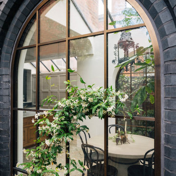 STUDIO TASHIMA
Keyes Road is a two-storey, semi-detached red brick house dating to around 1890-1910. The focus of our work was on the ground floor where we were asked to improve the layout and use of the main living areas of the house, for an active family of four. Important to the design was to maximise the quality and amount of light as well as connection to the garden and flow to the rest of the house.
Our proposal introduces three single storey extensions, comprising a central, large space that extends the main outrigger of the house. To each side are smaller volumes, affording a full width kitchen. While defining a series of discrete volumes, it was important for us to ensure that the kitchen, living, family and dining rooms that are interconnecting and continuous. The result is a big space punctuated by a series of differently sized arches, defining spaces to ensure their intimacy.
It was important for our client to have a sense of warmth and comfort - perhaps not dissimilar to the qualities of a hotel lobby. The colour scheme of the rooms are warm white painted plaster, natural wood flooring with black, bronze and brass accents. Indirect and carefully placed light fittings pulls together the atmosphere of the rooms - particularly in the evenings.
Externally, we felt it important to differentiate the extensions from the main house by using a dark, charcoal grey brick. This sets up a contrasting yet complimentary relationship to the rich red coloured brick house. The facets of the brick play with light and depth as do the graduated brick arches.
During the design process, we grappled with floor levels, the direction of sunlight, and care to not encroach on the neighbouring properties. As the house is in a conservation area, we worked closely with our trusted planning advisor. Throughout, we pursued a sensitive design strategy, using pitched roofs, matching materials and careful detailing. Internally, many of the original details are intact. This has enabled us to create an eclectic ensemble of elements, colours and materials varying in age and period.

Photo: lostinfog, via Flickr, licensed under Creative Commons Attribution-ShareAlike 2.0 Generic
Cleome serrulata / Rocky Mountain Beeplant
Find the right local pro for your project
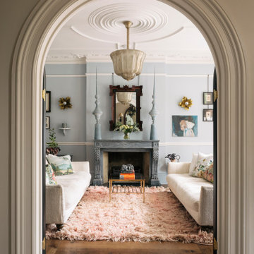 STUDIO TASHIMA
Keyes Road is a two-storey, semi-detached red brick house dating to around 1890-1910. The focus of our work was on the ground floor where we were asked to improve the layout and use of the main living areas of the house, for an active family of four. Important to the design was to maximise the quality and amount of light as well as connection to the garden and flow to the rest of the house.
Our proposal introduces three single storey extensions, comprising a central, large space that extends the main outrigger of the house. To each side are smaller volumes, affording a full width kitchen. While defining a series of discrete volumes, it was important for us to ensure that the kitchen, living, family and dining rooms that are interconnecting and continuous. The result is a big space punctuated by a series of differently sized arches, defining spaces to ensure their intimacy.
It was important for our client to have a sense of warmth and comfort - perhaps not dissimilar to the qualities of a hotel lobby. The colour scheme of the rooms are warm white painted plaster, natural wood flooring with black, bronze and brass accents. Indirect and carefully placed light fittings pulls together the atmosphere of the rooms - particularly in the evenings.
Externally, we felt it important to differentiate the extensions from the main house by using a dark, charcoal grey brick. This sets up a contrasting yet complimentary relationship to the rich red coloured brick house. The facets of the brick play with light and depth as do the graduated brick arches.
During the design process, we grappled with floor levels, the direction of sunlight, and care to not encroach on the neighbouring properties. As the house is in a conservation area, we worked closely with our trusted planning advisor. Throughout, we pursued a sensitive design strategy, using pitched roofs, matching materials and careful detailing. Internally, many of the original details are intact. This has enabled us to create an eclectic ensemble of elements, colours and materials varying in age and period.
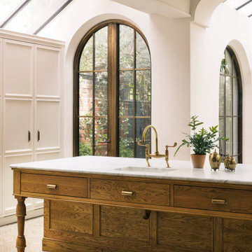 STUDIO TASHIMA
Keyes Road is a two-storey, semi-detached red brick house dating to around 1890-1910. The focus of our work was on the ground floor where we were asked to improve the layout and use of the main living areas of the house, for an active family of four. Important to the design was to maximise the quality and amount of light as well as connection to the garden and flow to the rest of the house.
Our proposal introduces three single storey extensions, comprising a central, large space that extends the main outrigger of the house. To each side are smaller volumes, affording a full width kitchen. While defining a series of discrete volumes, it was important for us to ensure that the kitchen, living, family and dining rooms that are interconnecting and continuous. The result is a big space punctuated by a series of differently sized arches, defining spaces to ensure their intimacy.
It was important for our client to have a sense of warmth and comfort - perhaps not dissimilar to the qualities of a hotel lobby. The colour scheme of the rooms are warm white painted plaster, natural wood flooring with black, bronze and brass accents. Indirect and carefully placed light fittings pulls together the atmosphere of the rooms - particularly in the evenings.
Externally, we felt it important to differentiate the extensions from the main house by using a dark, charcoal grey brick. This sets up a contrasting yet complimentary relationship to the rich red coloured brick house. The facets of the brick play with light and depth as do the graduated brick arches.
During the design process, we grappled with floor levels, the direction of sunlight, and care to not encroach on the neighbouring properties. As the house is in a conservation area, we worked closely with our trusted planning advisor. Throughout, we pursued a sensitive design strategy, using pitched roofs, matching materials and careful detailing. Internally, many of the original details are intact. This has enabled us to create an eclectic ensemble of elements, colours and materials varying in age and period.
 STUDIO TASHIMA
Keyes Road is a two-storey, semi-detached red brick house dating to around 1890-1910. The focus of our work was on the ground floor where we were asked to improve the layout and use of the main living areas of the house, for an active family of four. Important to the design was to maximise the quality and amount of light as well as connection to the garden and flow to the rest of the house.
Our proposal introduces three single storey extensions, comprising a central, large space that extends the main outrigger of the house. To each side are smaller volumes, affording a full width kitchen. While defining a series of discrete volumes, it was important for us to ensure that the kitchen, living, family and dining rooms that are interconnecting and continuous. The result is a big space punctuated by a series of differently sized arches, defining spaces to ensure their intimacy.
It was important for our client to have a sense of warmth and comfort - perhaps not dissimilar to the qualities of a hotel lobby. The colour scheme of the rooms are warm white painted plaster, natural wood flooring with black, bronze and brass accents. Indirect and carefully placed light fittings pulls together the atmosphere of the rooms - particularly in the evenings.
Externally, we felt it important to differentiate the extensions from the main house by using a dark, charcoal grey brick. This sets up a contrasting yet complimentary relationship to the rich red coloured brick house. The facets of the brick play with light and depth as do the graduated brick arches.
During the design process, we grappled with floor levels, the direction of sunlight, and care to not encroach on the neighbouring properties. As the house is in a conservation area, we worked closely with our trusted planning advisor. Throughout, we pursued a sensitive design strategy, using pitched roofs, matching materials and careful detailing. Internally, many of the original details are intact. This has enabled us to create an eclectic ensemble of elements, colours and materials varying in age and period.

 Advance Design Studio, Ltd.
The design challenge was to enhance the square footage, flow and livability in this 1,442 sf 1930’s Tudor style brick house for a growing family of four. A two story 1,000 sf addition was the solution proposed by the design team at Advance Design Studio, Ltd. The new addition provided enough space to add a new kitchen and eating area with a butler pantry, a food pantry, a powder room and a mud room on the lower level, and a new master suite on the upper level.
The family envisioned a bright and airy white classically styled kitchen accented with espresso in keeping with the 1930’s style architecture of the home. Subway tile and timely glass accents add to the classic charm of the crisp white craftsman style cabinetry and sparkling chrome accents. Clean lines in the white farmhouse sink and the handsome bridge faucet in polished nickel make a vintage statement. River white granite on the generous new island makes for a fantastic gathering place for family and friends and gives ample casual seating. Dark stained oak floors extend to the new butler’s pantry and powder room, and throughout the first floor making a cohesive statement throughout. Classic arched doorways were added to showcase the home’s period details.
On the upper level, the newly expanded garage space nestles below an expansive new master suite complete with a spectacular bath retreat and closet space and an impressively vaulted ceiling. The soothing master getaway is bathed in soft gray tones with painted cabinets and amazing “fantasy” granite that reminds one of beach vacations. The floor mimics a wood feel underfoot with a gray textured porcelain tile and the spacious glass shower boasts delicate glass accents and a basket weave tile floor. Sparkling fixtures rest like fine jewelry completing the space.
The vaulted ceiling throughout the master suite lends to the spacious feel as does the archway leading to the expansive master closet. An elegant bank of 6 windows floats above the bed, bathing the space in light.
Photo Credits- Joe Nowak

 STUDIO TASHIMA
Keyes Road is a two-storey, semi-detached red brick house dating to around 1890-1910. The focus of our work was on the ground floor where we were asked to improve the layout and use of the main living areas of the house, for an active family of four. Important to the design was to maximise the quality and amount of light as well as connection to the garden and flow to the rest of the house.
Our proposal introduces three single storey extensions, comprising a central, large space that extends the main outrigger of the house. To each side are smaller volumes, affording a full width kitchen. While defining a series of discrete volumes, it was important for us to ensure that the kitchen, living, family and dining rooms that are interconnecting and continuous. The result is a big space punctuated by a series of differently sized arches, defining spaces to ensure their intimacy.
It was important for our client to have a sense of warmth and comfort - perhaps not dissimilar to the qualities of a hotel lobby. The colour scheme of the rooms are warm white painted plaster, natural wood flooring with black, bronze and brass accents. Indirect and carefully placed light fittings pulls together the atmosphere of the rooms - particularly in the evenings.
Externally, we felt it important to differentiate the extensions from the main house by using a dark, charcoal grey brick. This sets up a contrasting yet complimentary relationship to the rich red coloured brick house. The facets of the brick play with light and depth as do the graduated brick arches.
During the design process, we grappled with floor levels, the direction of sunlight, and care to not encroach on the neighbouring properties. As the house is in a conservation area, we worked closely with our trusted planning advisor. Throughout, we pursued a sensitive design strategy, using pitched roofs, matching materials and careful detailing. Internally, many of the original details are intact. This has enabled us to create an eclectic ensemble of elements, colours and materials varying in age and period.
 STUDIO TASHIMA
Keyes Road is a two-storey, semi-detached red brick house dating to around 1890-1910. The focus of our work was on the ground floor where we were asked to improve the layout and use of the main living areas of the house, for an active family of four. Important to the design was to maximise the quality and amount of light as well as connection to the garden and flow to the rest of the house.
Our proposal introduces three single storey extensions, comprising a central, large space that extends the main outrigger of the house. To each side are smaller volumes, affording a full width kitchen. While defining a series of discrete volumes, it was important for us to ensure that the kitchen, living, family and dining rooms that are interconnecting and continuous. The result is a big space punctuated by a series of differently sized arches, defining spaces to ensure their intimacy.
It was important for our client to have a sense of warmth and comfort - perhaps not dissimilar to the qualities of a hotel lobby. The colour scheme of the rooms are warm white painted plaster, natural wood flooring with black, bronze and brass accents. Indirect and carefully placed light fittings pulls together the atmosphere of the rooms - particularly in the evenings.
Externally, we felt it important to differentiate the extensions from the main house by using a dark, charcoal grey brick. This sets up a contrasting yet complimentary relationship to the rich red coloured brick house. The facets of the brick play with light and depth as do the graduated brick arches.
During the design process, we grappled with floor levels, the direction of sunlight, and care to not encroach on the neighbouring properties. As the house is in a conservation area, we worked closely with our trusted planning advisor. Throughout, we pursued a sensitive design strategy, using pitched roofs, matching materials and careful detailing. Internally, many of the original details are intact. This has enabled us to create an eclectic ensemble of elements, colours and materials varying in age and period.
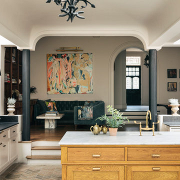 STUDIO TASHIMA
Keyes Road is a two-storey, semi-detached red brick house dating to around 1890-1910. The focus of our work was on the ground floor where we were asked to improve the layout and use of the main living areas of the house, for an active family of four. Important to the design was to maximise the quality and amount of light as well as connection to the garden and flow to the rest of the house.
Our proposal introduces three single storey extensions, comprising a central, large space that extends the main outrigger of the house. To each side are smaller volumes, affording a full width kitchen. While defining a series of discrete volumes, it was important for us to ensure that the kitchen, living, family and dining rooms that are interconnecting and continuous. The result is a big space punctuated by a series of differently sized arches, defining spaces to ensure their intimacy.
It was important for our client to have a sense of warmth and comfort - perhaps not dissimilar to the qualities of a hotel lobby. The colour scheme of the rooms are warm white painted plaster, natural wood flooring with black, bronze and brass accents. Indirect and carefully placed light fittings pulls together the atmosphere of the rooms - particularly in the evenings.
Externally, we felt it important to differentiate the extensions from the main house by using a dark, charcoal grey brick. This sets up a contrasting yet complimentary relationship to the rich red coloured brick house. The facets of the brick play with light and depth as do the graduated brick arches.
During the design process, we grappled with floor levels, the direction of sunlight, and care to not encroach on the neighbouring properties. As the house is in a conservation area, we worked closely with our trusted planning advisor. Throughout, we pursued a sensitive design strategy, using pitched roofs, matching materials and careful detailing. Internally, many of the original details are intact. This has enabled us to create an eclectic ensemble of elements, colours and materials varying in age and period.
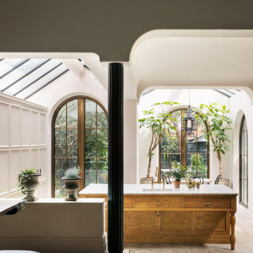 STUDIO TASHIMA
Keyes Road is a two-storey, semi-detached red brick house dating to around 1890-1910. The focus of our work was on the ground floor where we were asked to improve the layout and use of the main living areas of the house, for an active family of four. Important to the design was to maximise the quality and amount of light as well as connection to the garden and flow to the rest of the house.
Our proposal introduces three single storey extensions, comprising a central, large space that extends the main outrigger of the house. To each side are smaller volumes, affording a full width kitchen. While defining a series of discrete volumes, it was important for us to ensure that the kitchen, living, family and dining rooms that are interconnecting and continuous. The result is a big space punctuated by a series of differently sized arches, defining spaces to ensure their intimacy.
It was important for our client to have a sense of warmth and comfort - perhaps not dissimilar to the qualities of a hotel lobby. The colour scheme of the rooms are warm white painted plaster, natural wood flooring with black, bronze and brass accents. Indirect and carefully placed light fittings pulls together the atmosphere of the rooms - particularly in the evenings.
Externally, we felt it important to differentiate the extensions from the main house by using a dark, charcoal grey brick. This sets up a contrasting yet complimentary relationship to the rich red coloured brick house. The facets of the brick play with light and depth as do the graduated brick arches.
During the design process, we grappled with floor levels, the direction of sunlight, and care to not encroach on the neighbouring properties. As the house is in a conservation area, we worked closely with our trusted planning advisor. Throughout, we pursued a sensitive design strategy, using pitched roofs, matching materials and careful detailing. Internally, many of the original details are intact. This has enabled us to create an eclectic ensemble of elements, colours and materials varying in age and period.
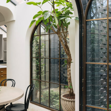 STUDIO TASHIMA
Keyes Road is a two-storey, semi-detached red brick house dating to around 1890-1910. The focus of our work was on the ground floor where we were asked to improve the layout and use of the main living areas of the house, for an active family of four. Important to the design was to maximise the quality and amount of light as well as connection to the garden and flow to the rest of the house.
Our proposal introduces three single storey extensions, comprising a central, large space that extends the main outrigger of the house. To each side are smaller volumes, affording a full width kitchen. While defining a series of discrete volumes, it was important for us to ensure that the kitchen, living, family and dining rooms that are interconnecting and continuous. The result is a big space punctuated by a series of differently sized arches, defining spaces to ensure their intimacy.
It was important for our client to have a sense of warmth and comfort - perhaps not dissimilar to the qualities of a hotel lobby. The colour scheme of the rooms are warm white painted plaster, natural wood flooring with black, bronze and brass accents. Indirect and carefully placed light fittings pulls together the atmosphere of the rooms - particularly in the evenings.
Externally, we felt it important to differentiate the extensions from the main house by using a dark, charcoal grey brick. This sets up a contrasting yet complimentary relationship to the rich red coloured brick house. The facets of the brick play with light and depth as do the graduated brick arches.
During the design process, we grappled with floor levels, the direction of sunlight, and care to not encroach on the neighbouring properties. As the house is in a conservation area, we worked closely with our trusted planning advisor. Throughout, we pursued a sensitive design strategy, using pitched roofs, matching materials and careful detailing. Internally, many of the original details are intact. This has enabled us to create an eclectic ensemble of elements, colours and materials varying in age and period.

 Michael Nash Design, Build & Homes
2010 NATIONAL NARI REGIONAL AWARD WINNER
Project Scope
The owners of this 7,000 square foot colonial in Oakton, Virginia, were seeking a multi-level Mediterranean-style indoor/outdoor living space off the back of their home. They turned to Michael Nash Design, Build & Homes for a design solution that would include a stone patio, a second-story deck, a screened-in porch and linking staircases.
While the structure was designed primarily for family dining and entertaining, it also had to accommodate periodic social gatherings of one hundred guests or more. To meet these needs, the project would include a fully-equipped outdoor kitchen, several serving counters with permanent refrigeration, and well-delineated socializing and dining zones.
The existing home’s setting offered several impressive assets the new outdoor living area was designed to exploit. The sprawling acreage features old stand trees, wooded paths and a private lake. Beautifully landscaped, it unfolds as an idyllic panorama that naturally draws people to the outdoors.
Challenges
Since the rear elevation was situated on a slope that drops away from the house, the Michael Nash team had to raise the grade two feet within in a 2,000 square foot area extending out from the back of the house. Infrastructure plans also called for a sophisticated drainage system that had to accommodate a whole series of water “runoff” considerations to be integrated into the decking itself. Excavation included constructing retaining walls to bolster the elevated grade—which also had to support a concrete slab, the primary foundation for the entire complex.
Solutions
The ground level decking consists of a 2,000 square foot flagstone patio level with the home’s lower level doors. There is a decorative water fountain mid-patio—an ornate collectible acquired in Florida. Food preparation is concentrated within a specially designed semi-circular wall that creates an “outdoor kitchen” equipped with a 60” Viking barbecue grill, a prep sink, a warming drawer, refrigerator and appropriate storage. There is a granite surfaced dining counter with seating for eight.
Wrought iron railing and approximately 20 decorative columns (some encasing steel vertical supports) are incorporated into the design scheme. Many of the columns house accent lights.
The top level—supported by horizontal steel beams– is a 2,500 square foot deck constructed entirely of Trex decking. The open air decking is, again, directly accessible from rooms on the second level of the house including the kitchen, sunroom and family room.
The platform’s most prominent feature is a U-shaped “kitchenette” with cedar shake shingle roofing. Like its counterpart one level below, the facility is equipped with grill, refrigerator and stainless steel cabinetry.
One portion of the deck has been allocated for a 16’ x 16’ octagonal screened-in porch crowned by a pair of 2’ x 4’ skylights. The porch can be accessed from the home’s conservatory via a set of French doors. With its mosaic tile flooring, stained cedar panel ceiling and honed granite counters, the interior is elegant and calming. Hand-painted stenciling and a wall-mounted water feature provide distinctive detailing.
Finally, the design introduced elements to highlight and reinforce an awareness of the lovely bucolic setting. Fountains and water features combined with textured surfaces and mosaic tiling and backsplashes to present a villa-like ambiance well-suited to the Virginia countryside.

 Visbeen Architects
Inspired by the surrounding landscape, the Craftsman/Prairie style is one of the few truly American architectural styles. It was developed around the turn of the century by a group of Midwestern architects and continues to be among the most comfortable of all American-designed architecture more than a century later, one of the main reasons it continues to attract architects and homeowners today. Oxbridge builds on that solid reputation, drawing from Craftsman/Prairie and classic Farmhouse styles. Its handsome Shingle-clad exterior includes interesting pitched rooflines, alternating rows of cedar shake siding, stone accents in the foundation and chimney and distinctive decorative brackets. Repeating triple windows add interest to the exterior while keeping interior spaces open and bright. Inside, the floor plan is equally impressive. Columns on the porch and a custom entry door with sidelights and decorative glass leads into a spacious 2,900-square-foot main floor, including a 19 by 24-foot living room with a period-inspired built-ins and a natural fireplace. While inspired by the past, the home lives for the present, with open rooms and plenty of storage throughout. Also included is a 27-foot-wide family-style kitchen with a large island and eat-in dining and a nearby dining room with a beadboard ceiling that leads out onto a relaxing 240-square-foot screen porch that takes full advantage of the nearby outdoors and a private 16 by 20-foot master suite with a sloped ceiling and relaxing personal sitting area. The first floor also includes a large walk-in closet, a home management area and pantry to help you stay organized and a first-floor laundry area. Upstairs, another 1,500 square feet awaits, with a built-ins and a window seat at the top of the stairs that nod to the home’s historic inspiration. Opt for three family bedrooms or use one of the three as a yoga room; the upper level also includes attic access, which offers another 500 square feet, perfect for crafts or a playroom. More space awaits in the lower level, where another 1,500 square feet (and an additional 1,000) include a recreation/family room with nine-foot ceilings, a wine cellar and home office.
Photographer: Jeff Garland
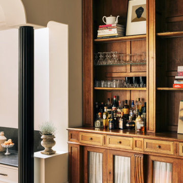 STUDIO TASHIMA
Keyes Road is a two-storey, semi-detached red brick house dating to around 1890-1910. The focus of our work was on the ground floor where we were asked to improve the layout and use of the main living areas of the house, for an active family of four. Important to the design was to maximise the quality and amount of light as well as connection to the garden and flow to the rest of the house.
Our proposal introduces three single storey extensions, comprising a central, large space that extends the main outrigger of the house. To each side are smaller volumes, affording a full width kitchen. While defining a series of discrete volumes, it was important for us to ensure that the kitchen, living, family and dining rooms that are interconnecting and continuous. The result is a big space punctuated by a series of differently sized arches, defining spaces to ensure their intimacy.
It was important for our client to have a sense of warmth and comfort - perhaps not dissimilar to the qualities of a hotel lobby. The colour scheme of the rooms are warm white painted plaster, natural wood flooring with black, bronze and brass accents. Indirect and carefully placed light fittings pulls together the atmosphere of the rooms - particularly in the evenings.
Externally, we felt it important to differentiate the extensions from the main house by using a dark, charcoal grey brick. This sets up a contrasting yet complimentary relationship to the rich red coloured brick house. The facets of the brick play with light and depth as do the graduated brick arches.
During the design process, we grappled with floor levels, the direction of sunlight, and care to not encroach on the neighbouring properties. As the house is in a conservation area, we worked closely with our trusted planning advisor. Throughout, we pursued a sensitive design strategy, using pitched roofs, matching materials and careful detailing. Internally, many of the original details are intact. This has enabled us to create an eclectic ensemble of elements, colours and materials varying in age and period.

 Landmark Homes
This charming 2-story craftsman style home includes a welcoming front porch, lofty 10’ ceilings, a 2-car front load garage, and two additional bedrooms and a loft on the 2nd level. To the front of the home is a convenient dining room the ceiling is accented by a decorative beam detail. Stylish hardwood flooring extends to the main living areas. The kitchen opens to the breakfast area and includes quartz countertops with tile backsplash, crown molding, and attractive cabinetry. The great room includes a cozy 2 story gas fireplace featuring stone surround and box beam mantel. The sunny great room also provides sliding glass door access to the screened in deck. The owner’s suite with elegant tray ceiling includes a private bathroom with double bowl vanity, 5’ tile shower, and oversized closet.
 Michael Nash Design, Build & Homes
2010 NATIONAL NARI REGIONAL AWARD WINNER
Project Scope
The owners of this 7,000 square foot colonial in Oakton, Virginia, were seeking a multi-level Mediterranean-style indoor/outdoor living space off the back of their home. They turned to Michael Nash Design, Build & Homes for a design solution that would include a stone patio, a second-story deck, a screened-in porch and linking staircases.
While the structure was designed primarily for family dining and entertaining, it also had to accommodate periodic social gatherings of one hundred guests or more. To meet these needs, the project would include a fully-equipped outdoor kitchen, several serving counters with permanent refrigeration, and well-delineated socializing and dining zones.
The existing home’s setting offered several impressive assets the new outdoor living area was designed to exploit. The sprawling acreage features old stand trees, wooded paths and a private lake. Beautifully landscaped, it unfolds as an idyllic panorama that naturally draws people to the outdoors.
Challenges
Since the rear elevation was situated on a slope that drops away from the house, the Michael Nash team had to raise the grade two feet within in a 2,000 square foot area extending out from the back of the house. Infrastructure plans also called for a sophisticated drainage system that had to accommodate a whole series of water “runoff” considerations to be integrated into the decking itself. Excavation included constructing retaining walls to bolster the elevated grade—which also had to support a concrete slab, the primary foundation for the entire complex.
Solutions
The ground level decking consists of a 2,000 square foot flagstone patio level with the home’s lower level doors. There is a decorative water fountain mid-patio—an ornate collectible acquired in Florida. Food preparation is concentrated within a specially designed semi-circular wall that creates an “outdoor kitchen” equipped with a 60” Viking barbecue grill, a prep sink, a warming drawer, refrigerator and appropriate storage. There is a granite surfaced dining counter with seating for eight.
Wrought iron railing and approximately 20 decorative columns (some encasing steel vertical supports) are incorporated into the design scheme. Many of the columns house accent lights.
The top level—supported by horizontal steel beams– is a 2,500 square foot deck constructed entirely of Trex decking. The open air decking is, again, directly accessible from rooms on the second level of the house including the kitchen, sunroom and family room.
The platform’s most prominent feature is a U-shaped “kitchenette” with cedar shake shingle roofing. Like its counterpart one level below, the facility is equipped with grill, refrigerator and stainless steel cabinetry.
One portion of the deck has been allocated for a 16’ x 16’ octagonal screened-in porch crowned by a pair of 2’ x 4’ skylights. The porch can be accessed from the home’s conservatory via a set of French doors. With its mosaic tile flooring, stained cedar panel ceiling and honed granite counters, the interior is elegant and calming. Hand-painted stenciling and a wall-mounted water feature provide distinctive detailing.
Finally, the design introduced elements to highlight and reinforce an awareness of the lovely bucolic setting. Fountains and water features combined with textured surfaces and mosaic tiling and backsplashes to present a villa-like ambiance well-suited to the Virginia countryside.
 Dimensions in Wood Inc
This Historical Home was built in the Columbia Country Club in 1925 and was ready for a new, modern kitchen which kept the traditional feel of the home. A previous sunroom addition created a dining room, but the original kitchen layout kept the two rooms divided. The kitchen was a small and cramped c-shape with a narrow door leading into the dining area.
The kitchen and dining room were completely opened up, creating a long, galley style, open layout which maximized the space and created a very good flow. Dimensions In Wood worked in conjuction with the client’s architect and contractor to complete this renovation.
Custom cabinets were built to use every square inch of the floorplan, with the cabinets extending all the way to the ceiling for the most storage possible. Our woodworkers even created a step stool, staining it to match the kitchen for reaching these high cabinets. The family already had a kitchen table and chairs they were happy with, so we refurbished them to match the kitchen’s new stain and paint color.
Crown molding top the cabinet boxes and extends across the ceiling where they create a coffered ceiling, highlighting the beautiful light fixtures centered on a wood medallion.
Columns were custom built to provide separation between the different sections of the kitchen, while also providing structural support.
Our master craftsmen kept the original 1925 glass cabinet doors, fitted them with modern hardware, repainted and incorporated them into new cabinet boxes. TASK LED Lighting was added to this china cabinet, highlighting the family’s decorative dishes.
Appliance Garage
On one side of the kitchen we built an appliance garage with doors that slide back into the cabinet, integrated power outlets and door activated lighting. Beside this is a small Galley Workstation for beverage and bar service which has the Galley Bar Kit perfect for sliced limes and more.
Baking Cabinet with Pocket Doors
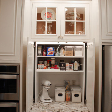
On the opposite side, a baking cabinet was built to house a mixer and all the supplies needed for creating confections. Automatic LED lights, triggered by opening the door, create a perfect baker’s workstation. Both pocket doors slide back inside the cabinet for maximum workspace, then close to hide everything, leaving a clean, minimal kitchen devoid of clutter.
Super deep, custom drawers feature custom dividers beneath the baking cabinet. Then beneath the appliance garage another deep drawer has custom crafted produce boxes per the customer’s request.
Central to the kitchen is a walnut accent island with a granite countertop and a Stainless Steel Galley Workstation and an overhang for seating. Matching bar stools slide out of the way, under the overhang, when not in use. A color matched outlet cover hides power for the island whenever appliances are needed during preparation.
The Galley Workstation has several useful attachments like a cutting board, drying rack, colander holder, and more. Integrated into the stone countertops are a drinking water spigot, a soap dispenser, garbage disposal button and the pull out, sprayer integrated faucet.
Directly across from the conveniently positioned stainless steel sink is a Bertazzoni Italia stove with 5 burner cooktop. A custom mosaic tile backsplash makes a beautiful focal point. Then, on opposite sides of the stove, columns conceal Rev-a-Shelf pull out towers which are great for storing small items, spices, and more. All outlets on the stone covered walls also sport dual USB outlets for charging mobile devices.
Stainless Steel Whirlpool appliances throughout keep a consistent and clean look. The oven has a matching microwave above it which also works as a convection oven. Dual Whirlpool dishwashers can handle all the family’s dirty dishes.
The flooring has black, marble tile inlays surrounded by ceramic tile, which are period correct for the age of this home, while still being modern, durable and easy to clean.
Finally, just off the kitchen we also remodeled their bar and snack alcove. A small liquor cabinet, with a refrigerator and wine fridge sits opposite a snack bar and wine glass cabinets. Crown molding, granite countertops and cabinets were all customized to match this space with the rest of the stunning kitchen.
Dimensions In Wood is more than 40 years of custom cabinets. We always have been, but we want YOU to know just how much more there is to our Dimensions.
The Dimensions we cover are endless: custom cabinets, quality water, appliances, countertops, wooden beams, Marvin windows, and more. We can handle every aspect of your kitchen, bathroom or home remodel.
 Advance Design Studio, Ltd.
The design challenge was to enhance the square footage, flow and livability in this 1,442 sf 1930’s Tudor style brick house for a growing family of four. A two story 1,000 sf addition was the solution proposed by the design team at Advance Design Studio, Ltd. The new addition provided enough space to add a new kitchen and eating area with a butler pantry, a food pantry, a powder room and a mud room on the lower level, and a new master suite on the upper level.
The family envisioned a bright and airy white classically styled kitchen accented with espresso in keeping with the 1930’s style architecture of the home. Subway tile and timely glass accents add to the classic charm of the crisp white craftsman style cabinetry and sparkling chrome accents. Clean lines in the white farmhouse sink and the handsome bridge faucet in polished nickel make a vintage statement. River white granite on the generous new island makes for a fantastic gathering place for family and friends and gives ample casual seating. Dark stained oak floors extend to the new butler’s pantry and powder room, and throughout the first floor making a cohesive statement throughout. Classic arched doorways were added to showcase the home’s period details.
On the upper level, the newly expanded garage space nestles below an expansive new master suite complete with a spectacular bath retreat and closet space and an impressively vaulted ceiling. The soothing master getaway is bathed in soft gray tones with painted cabinets and amazing “fantasy” granite that reminds one of beach vacations. The floor mimics a wood feel underfoot with a gray textured porcelain tile and the spacious glass shower boasts delicate glass accents and a basket weave tile floor. Sparkling fixtures rest like fine jewelry completing the space.
The vaulted ceiling throughout the master suite lends to the spacious feel as does the archway leading to the expansive master closet. An elegant bank of 6 windows floats above the bed, bathing the space in light.
Photo Credits- Joe Nowak
 Advance Design Studio, Ltd.
The design challenge was to enhance the square footage, flow and livability in this 1,442 sf 1930’s Tudor style brick house for a growing family of four. A two story 1,000 sf addition was the solution proposed by the design team at Advance Design Studio, Ltd. The new addition provided enough space to add a new kitchen and eating area with a butler pantry, a food pantry, a powder room and a mud room on the lower level, and a new master suite on the upper level.
The family envisioned a bright and airy white classically styled kitchen accented with espresso in keeping with the 1930’s style architecture of the home. Subway tile and timely glass accents add to the classic charm of the crisp white craftsman style cabinetry and sparkling chrome accents. Clean lines in the white farmhouse sink and the handsome bridge faucet in polished nickel make a vintage statement. River white granite on the generous new island makes for a fantastic gathering place for family and friends and gives ample casual seating. Dark stained oak floors extend to the new butler’s pantry and powder room, and throughout the first floor making a cohesive statement throughout. Classic arched doorways were added to showcase the home’s period details.
On the upper level, the newly expanded garage space nestles below an expansive new master suite complete with a spectacular bath retreat and closet space and an impressively vaulted ceiling. The soothing master getaway is bathed in soft gray tones with painted cabinets and amazing “fantasy” granite that reminds one of beach vacations. The floor mimics a wood feel underfoot with a gray textured porcelain tile and the spacious glass shower boasts delicate glass accents and a basket weave tile floor. Sparkling fixtures rest like fine jewelry completing the space.
The vaulted ceiling throughout the master suite lends to the spacious feel as does the archway leading to the expansive master closet. An elegant bank of 6 windows floats above the bed, bathing the space in light.
Photo Credits- Joe Nowak
22