
Search results for "Extra possibilities" in Home Design Ideas
 RAJ Kitchen and Bath, LLC
**Check out the video of this transformation on our website**
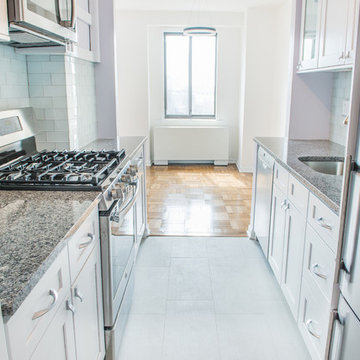
This small kitchen was way too small for this 2 bedrooms, 2 bathrooms apartment. Not only was it a very small kitchen, but the physical location of it made it very difficult to make it any bigger. There wasn't much that could have been done without incurring astronomical cost, which would get little or no return on the investment. The client wanted a kitchen that can be optimized in its current location to add a ton of value for resale.
This was difficult to do, because there was no moving of any mechanical around in the kitchen and even if we wanted to, the management of the building would not allow. For those of you who live in condos, co-ops or apartment building, you know how difficult it is to rework these foot prints. When we showed up, we saw the problems, but we also saw a huge opportunity where we can achieve those goals in the small space. This was accomplished by making some key changes and to incorporate some new things that was not possible when this kitchen was built years ago.
The crucial part of the design that would drive the entire new layout, was selecting the only appliance; that was the Refrigerator. Once we nailed down that refrigerator, we then proceeded to design the kitchen around it. We moved it to the other side of the wall where the sink was so that we can tap into the water line from the sink plumbing. It was crucial that it stays exactly 24" deep, not an inch more because we had to keep the entry as open as possible. Also, it was going to be directly in front of another big storage unit - The pantry. It is not ideal in most cases, but we needed the rest of the space to ramp up the design and open feel towards the side where all of the activities would take place, which happend to be the dining room and the view.
Once all that was figured out, we re-positioned the sink, dishwasher and the range and proceeded to wrap the cabinets around the columns to integrate them into the space. Thirty- six inches cabinets height was used so that they can be installed higher towards the ceiling height to give more room rather than the standard 18" required height between the counter tops. This was done to make the room feel a lot bigger than it really was. Not to mention, we also didn't want the faucet to be buried under the cabinets so that was also a necessary design detail for the space.
We then lowered both knee walls so that the counter top can sit on top of them, by removing that stop point that would have otherwise defined the kitchen area. This allowed us to pick up that extra footprint into the room for added prep space and enabled us to create the illusion of a kitchen that is looking longer than it really is. Every inch mattered when designing this kitchen and we made a conscious decision to use every one of that inch.
White cabinets were selected to do just what white cabinets are design to do; make a small or dark room appear bigger, brighter and more open. In this kitchen, this was amplified the more because of the kitchen location. It was perfect! We knew we did justice to the space because while we were there taking some photos, a few potential buyers walked in and went straight for the kitchen! They said its design just to fit the apartment.
Pantry roll out shelving, Double recycle bin, fancy handles, LED lighting, Quartz counter top, beautiful backslash tiles and grey linen floors finished off the kitchen which looked over a beautiful view of the George Washington Bridge from the top of this lovely 4th floor apartment.
Credit to Masterpiece Tile and Marble (Annmarie on the selection of Tiles and countertop and Val on the Construction to complete this project).
Davor Kokic Photography
 Tile Doctor Ltd
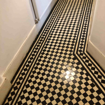
This property was in theLadbroke Grove area of West London near Kensington. The client had found an old and probably original black and white checkered pattern Victorian tiled floor under their cork tiled flooring. They also reported that it was badly damaged so I thought it would be best if I paid them a visit first to see how extensive the damage was and whether it was repairable. The floor was in a quite a state, the tiles were covered in glue from the cork and had several areas had been back filled with cement.
I reassured them that the damage could be rectified, and that it would be possible to completely restore the floor back to a good standard. I would have to remove the glue, remove the cement that had been used to level the floor and replace with reclaimed tiles to match. They were relieved to find out it could be done and happy with my quote I was instructed to go ahead with the work.
We started by taping up the skirting boards to protect the woodwork. With this done attention was turned to the glue which was softened using a strong dilution of Tile Doctor Remove and Go so it could be carefully scraped off. Multiple techniques and tools were needed to remove the glue including hand-held scrappers and a black pad fitted to a buffing machine. For the stubborn areas steam was applied to help lift the adhesive out the tile.
Once all the glue was removed the floor was rinsed and the alkaline cleaner neutralised with Tile Doctor Grout Clean Up which further cleaned the tiles and removed old traces of grout from the floor. Old floors like this generally don’t have a damp proof membrane underneath so the acids in the Grout Clean-up also counter any efflorescent salts trapped in the tile.
Once this was completed the slurry was removed with a wet vacuum and left to fully dry out overnight.
The following day focus turned to repairing the areas of the floor where the tiles were missing or broken. The main issue being the cemented areas, we see this a lot with Victorian Hallways and generally what happens is a heating engineer digs out the floor to install pipework. Not being tilers, your average plumber then repairs the floor with a self-levelling cement that brings the level up to the surface of the tile so it can be covered with lino, carpet of in this case cork.
The sub floor was then rebuilt with rapid setting self-levelling compound but this time to below the level of the tile.
Once the new base was dry it was a just a question of re-tiling with the replacement tiles to match the original checkered pattern. The replacement reproduction tiles were sourced from Original Features in Crouch End North London. After grouting we left the floor to dry out over the weekend.
When we returned to seal the floor our first step was to check the floor was dry using a moisture meter. This is critical as the sealant will not cure correctly if there is too much moisture in the floor. In this case the extra two days we had allowed had done its job and the test had confirmed it was ready to accept a sealer.
The client wanted the floor finish not to be too shiny once sealed so we opted to seal with two coats of Tile Doctor Seal and Go Extra. This is good choice for old Victorian floors such as this example as it’s special acrylic-based formula allows for moisture vapour transmission which as mentioned previously is a concern where no damp proof membrane has been installed.
I’m please to confirm my clients were delighted with the result, as you can see from the pictures the black and white floor restoration makes for a dramatic entrance well in keeping with the style of the property. For aftercare I recommended the use of Tile Doctor Neutral Tile Cleaner which will keep the tiles in good condition going forward without damaging the new sealer.
Jackson Davis
Central London Tile Doctor
 LOVEREALESTATE - Sutton Group West Coast Realty
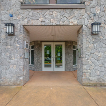
Welcome to St. Andrew's walk! This TOP floor LUXURY studio apartment boasts CHIC trendy finishing’s and is one of the most AFFORDABLE ways to enjoy all that the Bear Mountain RESORT lifestyle has to offer. Just steps to the golf course itself as well as the gym, spa, fine dining, casual cafe/bistros, nature walks, running, and biking trails. BEAR MOUNTAIN offers it all. Enjoy fantastic views of Mt Finlayson from your private extra-large expansive rare patio, which allows BBQs. This EXTENSIVE private space is covered and set up for outdoor living. The 4th floor also includes another shared deck for gatherings which is beautifully surrounded by greenery, serenity & seasonal displays of the mountainside. This location has city convenience that is only a stone's throw away from all amenities. The 14 1/2-foot soaring ceilings make this approx. 700 sq ft (indoor/outdoor combined) space bright, airy, and open. Some of the features in the unit include cherry wood flooring throughout, stainless steel appliances, an electric wall-mounted fireplace, and beautiful granite countertops. This trendy unit has a classic open NY LOFT STYLE layout that offers in-suite laundry, double patio doors, big picture windows, a built-in Murphy Wall Bed, a huge walk-in closet/utility/storage room. Also, you will have secure underground parking, extra communal storage, a bike lock-up, and another separate storage locker. There are no age or rental restrictions, and you can bring your pet. Whether you chose to fall in love and stay or hold it as an investment property. Currently rented for $1400 the month-to-month tenants are extremely flexible and may stay or move out depending on the buyer’s desire. This gorgeous west shore find is where the possibilities are endless, up incoming, and exciting!| Karen Love (250)-727-5868 | RE/MAX Island Properties & www.KarenLove.com |
Find the right local pro for your project
 RAJ Kitchen and Bath, LLC
**Check out the video of this transformation on our website**
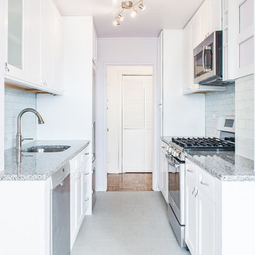
This small kitchen was way too small for this 2 bedrooms, 2 bathrooms apartment. Not only was it a very small kitchen, but the physical location of it made it very difficult to make it any bigger. There wasn't much that could have been done without incurring astronomical cost, which would get little or no return on the investment. The client wanted a kitchen that can be optimized in its current location to add a ton of value for resale.
This was difficult to do, because there was no moving of any mechanical around in the kitchen and even if we wanted to, the management of the building would not allow. For those of you who live in condos, co-ops or apartment building, you know how difficult it is to rework these foot prints. When we showed up, we saw the problems, but we also saw a huge opportunity where we can achieve those goals in the small space. This was accomplished by making some key changes and to incorporate some new things that was not possible when this kitchen was built years ago.
The crucial part of the design that would drive the entire new layout, was selecting the only appliance; that was the Refrigerator. Once we nailed down that refrigerator, we then proceeded to design the kitchen around it. We moved it to the other side of the wall where the sink was so that we can tap into the water line from the sink plumbing. It was crucial that it stays exactly 24" deep, not an inch more because we had to keep the entry as open as possible. Also, it was going to be directly in front of another big storage unit - The pantry. It is not ideal in most cases, but we needed the rest of the space to ramp up the design and open feel towards the side where all of the activities would take place, which happend to be the dining room and the view.
Once all that was figured out, we re-positioned the sink, dishwasher and the range and proceeded to wrap the cabinets around the columns to integrate them into the space. Thirty- six inches cabinets height was used so that they can be installed higher towards the ceiling height to give more room rather than the standard 18" required height between the counter tops. This was done to make the room feel a lot bigger than it really was. Not to mention, we also didn't want the faucet to be buried under the cabinets so that was also a necessary design detail for the space.
We then lowered both knee walls so that the counter top can sit on top of them, by removing that stop point that would have otherwise defined the kitchen area. This allowed us to pick up that extra footprint into the room for added prep space and enabled us to create the illusion of a kitchen that is looking longer than it really is. Every inch mattered when designing this kitchen and we made a conscious decision to use every one of that inch.
White cabinets were selected to do just what white cabinets are design to do; make a small or dark room appear bigger, brighter and more open. In this kitchen, this was amplified the more because of the kitchen location. It was perfect! We knew we did justice to the space because while we were there taking some photos, a few potential buyers walked in and went straight for the kitchen! They said its design just to fit the apartment.
Pantry roll out shelving, Double recycle bin, fancy handles, LED lighting, Quartz counter top, beautiful backslash tiles and grey linen floors finished off the kitchen which looked over a beautiful view of the George Washington Bridge from the top of this lovely 4th floor apartment.
Credit to Masterpiece Tile and Marble (Annmarie on the selection of Tiles and countertop and Val on the Construction to complete this project).
Davor Kokic Photography
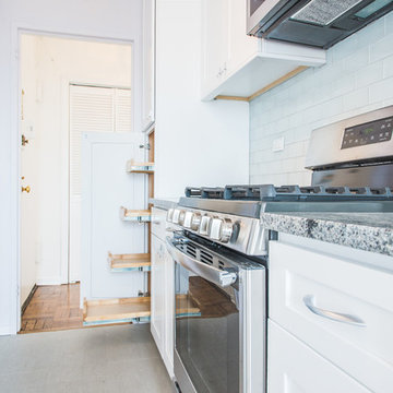 RAJ Kitchen and Bath, LLC
**Check out the video of this transformation on our website**
This small kitchen was way too small for this 2 bedrooms, 2 bathrooms apartment. Not only was it a very small kitchen, but the physical location of it made it very difficult to make it any bigger. There wasn't much that could have been done without incurring astronomical cost, which would get little or no return on the investment. The client wanted a kitchen that can be optimized in its current location to add a ton of value for resale.
This was difficult to do, because there was no moving of any mechanical around in the kitchen and even if we wanted to, the management of the building would not allow. For those of you who live in condos, co-ops or apartment building, you know how difficult it is to rework these foot prints. When we showed up, we saw the problems, but we also saw a huge opportunity where we can achieve those goals in the small space. This was accomplished by making some key changes and to incorporate some new things that was not possible when this kitchen was built years ago.
The crucial part of the design that would drive the entire new layout, was selecting the only appliance; that was the Refrigerator. Once we nailed down that refrigerator, we then proceeded to design the kitchen around it. We moved it to the other side of the wall where the sink was so that we can tap into the water line from the sink plumbing. It was crucial that it stays exactly 24" deep, not an inch more because we had to keep the entry as open as possible. Also, it was going to be directly in front of another big storage unit - The pantry. It is not ideal in most cases, but we needed the rest of the space to ramp up the design and open feel towards the side where all of the activities would take place, which happend to be the dining room and the view.
Once all that was figured out, we re-positioned the sink, dishwasher and the range and proceeded to wrap the cabinets around the columns to integrate them into the space. Thirty- six inches cabinets height was used so that they can be installed higher towards the ceiling height to give more room rather than the standard 18" required height between the counter tops. This was done to make the room feel a lot bigger than it really was. Not to mention, we also didn't want the faucet to be buried under the cabinets so that was also a necessary design detail for the space.
We then lowered both knee walls so that the counter top can sit on top of them, by removing that stop point that would have otherwise defined the kitchen area. This allowed us to pick up that extra footprint into the room for added prep space and enabled us to create the illusion of a kitchen that is looking longer than it really is. Every inch mattered when designing this kitchen and we made a conscious decision to use every one of that inch.
White cabinets were selected to do just what white cabinets are design to do; make a small or dark room appear bigger, brighter and more open. In this kitchen, this was amplified the more because of the kitchen location. It was perfect! We knew we did justice to the space because while we were there taking some photos, a few potential buyers walked in and went straight for the kitchen! They said its design just to fit the apartment.
Pantry roll out shelving, Double recycle bin, fancy handles, LED lighting, Quartz counter top, beautiful backslash tiles and grey linen floors finished off the kitchen which looked over a beautiful view of the George Washington Bridge from the top of this lovely 4th floor apartment.
Credit to Masterpiece Tile and Marble (Annmarie on the selection of Tiles and countertop and Val on the Construction to complete this project).
Davor Kokic Photography
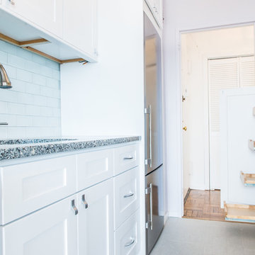 RAJ Kitchen and Bath, LLC
**Check out the video of this transformation on our website**
This small kitchen was way too small for this 2 bedrooms, 2 bathrooms apartment. Not only was it a very small kitchen, but the physical location of it made it very difficult to make it any bigger. There wasn't much that could have been done without incurring astronomical cost, which would get little or no return on the investment. The client wanted a kitchen that can be optimized in its current location to add a ton of value for resale.
This was difficult to do, because there was no moving of any mechanical around in the kitchen and even if we wanted to, the management of the building would not allow. For those of you who live in condos, co-ops or apartment building, you know how difficult it is to rework these foot prints. When we showed up, we saw the problems, but we also saw a huge opportunity where we can achieve those goals in the small space. This was accomplished by making some key changes and to incorporate some new things that was not possible when this kitchen was built years ago.
The crucial part of the design that would drive the entire new layout, was selecting the only appliance; that was the Refrigerator. Once we nailed down that refrigerator, we then proceeded to design the kitchen around it. We moved it to the other side of the wall where the sink was so that we can tap into the water line from the sink plumbing. It was crucial that it stays exactly 24" deep, not an inch more because we had to keep the entry as open as possible. Also, it was going to be directly in front of another big storage unit - The pantry. It is not ideal in most cases, but we needed the rest of the space to ramp up the design and open feel towards the side where all of the activities would take place, which happend to be the dining room and the view.
Once all that was figured out, we re-positioned the sink, dishwasher and the range and proceeded to wrap the cabinets around the columns to integrate them into the space. Thirty- six inches cabinets height was used so that they can be installed higher towards the ceiling height to give more room rather than the standard 18" required height between the counter tops. This was done to make the room feel a lot bigger than it really was. Not to mention, we also didn't want the faucet to be buried under the cabinets so that was also a necessary design detail for the space.
We then lowered both knee walls so that the counter top can sit on top of them, by removing that stop point that would have otherwise defined the kitchen area. This allowed us to pick up that extra footprint into the room for added prep space and enabled us to create the illusion of a kitchen that is looking longer than it really is. Every inch mattered when designing this kitchen and we made a conscious decision to use every one of that inch.
White cabinets were selected to do just what white cabinets are design to do; make a small or dark room appear bigger, brighter and more open. In this kitchen, this was amplified the more because of the kitchen location. It was perfect! We knew we did justice to the space because while we were there taking some photos, a few potential buyers walked in and went straight for the kitchen! They said its design just to fit the apartment.
Pantry roll out shelving, Double recycle bin, fancy handles, LED lighting, Quartz counter top, beautiful backslash tiles and grey linen floors finished off the kitchen which looked over a beautiful view of the George Washington Bridge from the top of this lovely 4th floor apartment.
Credit to Masterpiece Tile and Marble (Annmarie on the selection of Tiles and countertop and Val on the Construction to complete this project).
Davor Kokic Photography
 Cheri Belz, Architect
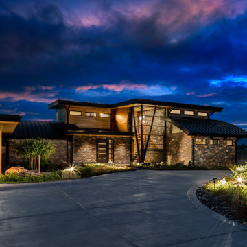
In July 2017, Belz was contacted by the property owner to create a home that met their specific requirements. This included the following items:
An open concept/loft design that takes advantage of the views to the south and west. Separate areas within this open plan are defined by furnishings.
Master Suite on the main level. Bathroom with views. Large shower with rain head and wall shower system. Large walk-in closet with built-ins.
Study/office area with an abundance of built-in bookshelves. Study to be “separate” but somehow connected to main living area.
2 additional bedrooms, each with their own bath.
Extra wide garage that can fit 2 cars side x side with the doors open and extra deep with room for a workbench.
Mud room/laundry room that could include a shower.
Radiant in-floor heat system and air conditioning.
Outdoor living space/courtyard with firepit, water feature, pizza oven, and sunken jetted tub.
Environmentally responsible design alternatives, such as material choices and building orientation, together with other considerations based on requirements and aesthetics were used to develop a design that was consistent with the owner’s vision.
Belz and the owner worked together to choose all materials and finishes and colors. The green stucco picked up on the native grasses on the property. The stone was chosen to contrast with the green stucco and “plant” the house to the ground.
The owner wanted to take advantage of the views as much as possible. Instead of siting the house along north/south/east/west axes, Belz canted the floorplan to a southwest axis for better “head-on” views from the home.
The owner requested an interesting roof/ceiling. Thus, Belz chose an arched ceiling which she found more embracing than an angled vaulted or shed roof.

Sponsored
Columbus, OH

Hope Restoration & General Contracting
Columbus Design-Build, Kitchen & Bath Remodeling, Historic Renovations
 Specialty Home Improvement
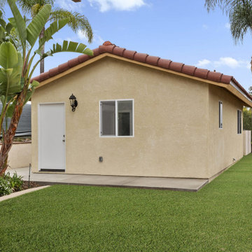
This Escondido area homeowner came to Specialty Home Improvement looking to build a living space for an aging relative. ADUs, also often known as “granny flats” or “in-law suites” are perfect for aging-in-place, short or long-term rentals, or for extra space on your property to increase the value of your home.
The Challenge: Design an Accessory Dwelling Unit (ADU) and living space for an elderly relative on a fixed budget. The space is needed to provide as much complete independence and privacy for the relative as possible. The ADU also needed to fit a specific area in the backyard that did not impede on the existing outdoor entertainment area or pool. Since the area of the build is located in a warmer area of San Diego’s North County, summertime power consumption and indoor temperature were a concern.
The Solution: For budget purposes, the shape of the unit was kept as a basic rectangle, since odd shapes and angles present challenges and additional costs to engineer and build. Since there was the possibility of guests or perhaps more than one person at a time using the ADU, the bathroom was given an independent entry. A closet was placed between the bathroom and the bedroom to help provide a sound buffer.
Floors were designed as polished concrete to help maintain a cooler ambient temperature during the summer months. Light colors on the cabinets, walls, and ceilings along with dual paned vinyl windows provide ample light, temperature control, and ventilation.

 Spire Integrated Systems Inc.
Sustainable Design Meets Smart Technology
This home featured a request from the client to use as many environmentally friendly materials and fabrics as possible. Many common shade manufacturers use materials with PVC plastic, which is known for off-gassing hazardous chemicals that linger in the air in the home for years. The main floor roller shades met the client’s request for an eco-friendly fabric by utilizing motorized shades with GreenScreen fabric. In other rooms, the designer and client wanted the classic look and soft fabrics with roman shades and drapery tracks on several windows in the house. By partnering with the interior designer and fabric workroom, we were able to provide a custom solution for motorization of roman shades and drapery.
Lighting Control
The client is able control all of the lighting and window treatments in the house with a single control system. This eliminates the need for extra devices on the wall or remote controls that clutter up the space and get lost. By utilizing the custom window treatments, the house is able to conserve energy by keeping the house warmer in the winter, and cooler in the summer by providing insulation and blocking sunlight. The lighting control system further helps to conserve energy by beautifully dimming LED lights as well as using quick buttons that turn off all of the lights in the house, or un-occupied rooms, with the press of a single button.
Motorized Window Treatments
Motorized window treatments add a high level of convenience to any project, especially those with many windows in hard to reach places. The challenge with many manufacturers is a limitation of style and fabric selection, some may be a s basic as only roller shades. Often times these come with un-reliable, wireless controls.
On this Birmingham, MI project completed in March 2019, we partnered with the interior designer and drapery workroom to provide a truly unique solution. The homeowner and designer’s requests included many different styles of window treatments including rollers shades, roman shades and motorized draperies. Typically, this would result in a collection of various shade manufacturers with unsightly remotes scattered across each room or stuck to the wall for control. Utilizing standard offerings, coupled with an incredible team effort by the designer and drapery workroom, we provided all of the requested styles of window treatments, and were able to control them all on a single system. This means that each room has a single, elegant keypad built into the wall that controls not only the window treatments, but the lighting as well.
When leaving/entering the home, all of the window coverings can be raised or lowered with a single button press. Shades and draperies can also be set to operate based on the time of day for automatic day-to-day operation using sunlight as a guide. In the end, we achieved convenience, function and sophisticated style.
 Renovisions
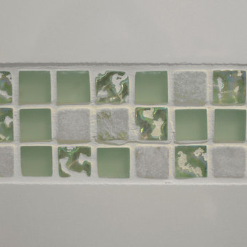
Our client was drawn to the look of subway tile but wanted just a little something extra. We recommended a beveled subway tile to import a different look with added texture. The result, an ordinary tub/shower fiberglass surround turned extra ordinary by installing 4” x 8” white beveled tile. A beautifully cut sea glass tile border added a pop of color and completed the look. A great idea: we furnished and installed a curved shower rod to create additional space inside the shower for our clients. We typically furnish light/vent combination units in each shower to eliminate moisture. In this particular case, the ceiling light bounces off the beveled tile nicely providing the clean and dramatic feel our client was going for.
 Spire Integrated Systems Inc.
Sustainable Design Meets Smart Technology
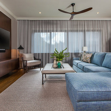
This home featured a request from the client to use as many environmentally friendly materials and fabrics as possible. Many common shade manufacturers use materials with PVC plastic, which is known for off-gassing hazardous chemicals that linger in the air in the home for years. The main floor roller shades met the client’s request for an eco-friendly fabric by utilizing motorized shades with GreenScreen fabric. In other rooms, the designer and client wanted the classic look and soft fabrics with roman shades and drapery tracks on several windows in the house. By partnering with the interior designer and fabric workroom, we were able to provide a custom solution for motorization of roman shades and drapery.
Lighting Control
The client is able control all of the lighting and window treatments in the house with a single control system. This eliminates the need for extra devices on the wall or remote controls that clutter up the space and get lost. By utilizing the custom window treatments, the house is able to conserve energy by keeping the house warmer in the winter, and cooler in the summer by providing insulation and blocking sunlight. The lighting control system further helps to conserve energy by beautifully dimming LED lights as well as using quick buttons that turn off all of the lights in the house, or un-occupied rooms, with the press of a single button.
Motorized Window Treatments
Motorized window treatments add a high level of convenience to any project, especially those with many windows in hard to reach places. The challenge with many manufacturers is a limitation of style and fabric selection, some may be a s basic as only roller shades. Often times these come with un-reliable, wireless controls.
On this Birmingham, MI project completed in March 2019, we partnered with the interior designer and drapery workroom to provide a truly unique solution. The homeowner and designer’s requests included many different styles of window treatments including rollers shades, roman shades and motorized draperies. Typically, this would result in a collection of various shade manufacturers with unsightly remotes scattered across each room or stuck to the wall for control. Utilizing standard offerings, coupled with an incredible team effort by the designer and drapery workroom, we provided all of the requested styles of window treatments, and were able to control them all on a single system. This means that each room has a single, elegant keypad built into the wall that controls not only the window treatments, but the lighting as well.
When leaving/entering the home, all of the window coverings can be raised or lowered with a single button press. Shades and draperies can also be set to operate based on the time of day for automatic day-to-day operation using sunlight as a guide. In the end, we achieved convenience, function and sophisticated style.
 RAJ Kitchen and Bath, LLC
**Check out the video of this transformation on our website**
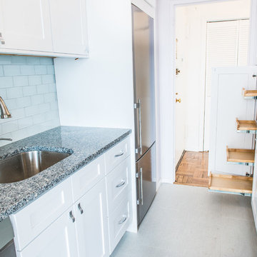
This small kitchen was way too small for this 2 bedrooms, 2 bathrooms apartment. Not only was it a very small kitchen, but the physical location of it made it very difficult to make it any bigger. There wasn't much that could have been done without incurring astronomical cost, which would get little or no return on the investment. The client wanted a kitchen that can be optimized in its current location to add a ton of value for resale.
This was difficult to do, because there was no moving of any mechanical around in the kitchen and even if we wanted to, the management of the building would not allow. For those of you who live in condos, co-ops or apartment building, you know how difficult it is to rework these foot prints. When we showed up, we saw the problems, but we also saw a huge opportunity where we can achieve those goals in the small space. This was accomplished by making some key changes and to incorporate some new things that was not possible when this kitchen was built years ago.
The crucial part of the design that would drive the entire new layout, was selecting the only appliance; that was the Refrigerator. Once we nailed down that refrigerator, we then proceeded to design the kitchen around it. We moved it to the other side of the wall where the sink was so that we can tap into the water line from the sink plumbing. It was crucial that it stays exactly 24" deep, not an inch more because we had to keep the entry as open as possible. Also, it was going to be directly in front of another big storage unit - The pantry. It is not ideal in most cases, but we needed the rest of the space to ramp up the design and open feel towards the side where all of the activities would take place, which happend to be the dining room and the view.
Once all that was figured out, we re-positioned the sink, dishwasher and the range and proceeded to wrap the cabinets around the columns to integrate them into the space. Thirty- six inches cabinets height was used so that they can be installed higher towards the ceiling height to give more room rather than the standard 18" required height between the counter tops. This was done to make the room feel a lot bigger than it really was. Not to mention, we also didn't want the faucet to be buried under the cabinets so that was also a necessary design detail for the space.
We then lowered both knee walls so that the counter top can sit on top of them, by removing that stop point that would have otherwise defined the kitchen area. This allowed us to pick up that extra footprint into the room for added prep space and enabled us to create the illusion of a kitchen that is looking longer than it really is. Every inch mattered when designing this kitchen and we made a conscious decision to use every one of that inch.
White cabinets were selected to do just what white cabinets are design to do; make a small or dark room appear bigger, brighter and more open. In this kitchen, this was amplified the more because of the kitchen location. It was perfect! We knew we did justice to the space because while we were there taking some photos, a few potential buyers walked in and went straight for the kitchen! They said its design just to fit the apartment.
Pantry roll out shelving, Double recycle bin, fancy handles, LED lighting, Quartz counter top, beautiful backslash tiles and grey linen floors finished off the kitchen which looked over a beautiful view of the George Washington Bridge from the top of this lovely 4th floor apartment.
Credit to Masterpiece Tile and Marble (Annmarie on the selection of Tiles and countertop and Val on the Construction to complete this project).
Davor Kokic Photography
 Peter Kostelov
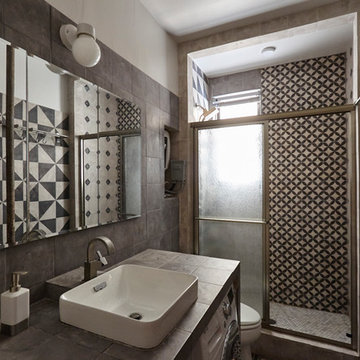
Bathroom. The goal here is to install washer and dryer under countertop. To solve this task, countertop was elevated a little bit higher then average standard. Since space under countertop is busy with washer and dryer, the biggest challenge was to install sink boul. If simply put sink on the countertop, then it goes to high, because countertop already was elevated to allow washer and dryer remain under it. I did not consider shallow sinks, because they are not convenient at all. Also it was not possible to install under mount sink, because there are washer and dryer. Eventually i found sink that is half in, and half above countertop, and increase a little bit of countertop thickness. As a result this solution allow to have both washer and dryer, comfortable pretty deep sink and huge countertop to keep bathroom stuff on it.
Another important element in the bathroom is tankless electrical water heater, Its New York, so water tank for all units installed on the roof. Building is old and big, so sometimes building tank is lack of hot water. To set tankless electrical water heater two extra valves were installed on hot and cold pipes. In case there is no hot water, i close main hot water valve, open cold one that right before heater, to let cold water go inside heater, and open another valve, that deliver hot water into the system after heater. This task also required installation of new electrical cable, because tankless heaters requires a lot of power.
The last thing is pretty big, 48”x30”, embedded wall cabinet, with three big parts and mirror doors. To support this cabinet, extra wood frame structure was built inside wall, that was designed thicker to allow build-in cabinet set inside.
Sponsored
Columbus, OH

HomeCraft Remodeling
Custom Craftsmanship & Build Solutions in Franklin County, Ohio
 Batt + Lear
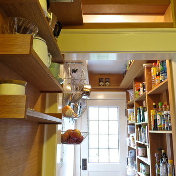
Tiny Kitchen for Small Cakes – Capitol Hill
AWARD: REX AWARD for Kitchen Excellence
Description
Remodel of a boat-like, early 20th Century, condo kitchen that fits one small person who is dedicated to making small cakes.
Challenge
We encountered a small, four-unit condo building with colonial Spanish architecture that doesn’t allow intrusion into existing structures. Limited space existed for kitchen with nowhere to move or expand. Our entrepreneur client was also on a budget. To keep costs down, we had the challenge of not moving exiting infrastructure like plumbing and lights.
Inspiration
We were inspired by our client’s tiny, artistic cakes that combine beauty and delicious functionality. We were also inspired by boats and their ability to efficiently carve space out of every possible spot.
Solution + Innovation
It was clear to us that a boat-like space required boat-like solutions, including storage at every turn – like creating a backsplash with storage and a flip-down counter to expand working space. We also built casework around plumbing stacks to create storage in the stud bay between studs. We were also able to allow for more light into the space by creating an open transom between studs.
How is it sustainable?
We did a whole sale kitchen remodel without moving plumbing or electrical. We reused existing lighting, adding energy efficient LED lights. We also had great appliance choices that were extra small and efficient. We made a commitment to use sustainable forestry products used responsible forestry products wherever possible. This included FSC Core cabinetry with grain-matched oak, and countertops were crafted from local Rich-lite resin (created by a Boeing engineer and also used in skate parks!).
 ODS Architecture
Alongside Jeff King & Company, Marina Blvd., won CotY 2016 National Winner of Landscape Design/Outdoor Living
The project was to transform an existing flat roof and master bedroom suite floor into a dramatic deck with kitchen, dining and living areas leading to a stair to an upper deck for America’s Cup race viewing. The existing home is a 3-story 4,000 square foot Spanish Mission-style home built in the 1920’s and sits directly across from the St. Francis Yacht Club on Marina Boulevard in San Francisco – a prime location. No changes were possible for the historic façade and the new construction was to be out of view from the street, as much as possible. Going up the traditionally detailed stairway with decorative railing, you land at the third floor which becomes contemporary in style for the redesigned master bedroom suite, guest bath, sitting room and the roof deck.
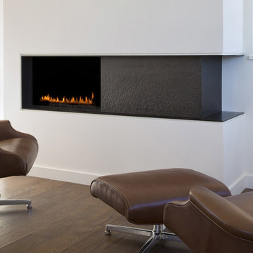
Large roof decks require careful attention to waterproofing and a Bison pedestal system was used to create a level deck surface and easy maintenance. Heavy ceramic tile pavers were interspersed with walkable in-floor skylights on the main deck with ipe wood floors at the upper deck and stairs. From both the master bedroom and the outdoor deck you can access a sitting room with large pocket or sliding doors to enclose it. If watching the fireworks on July 4th and it gets cold, people can move to the sitting room which has a fireplace to watch in a heated environment. The sitting room gas fireplace is surrounded by steel with a figured steel panel re-purposed from old sea pier metal that has been cleaned and sealed.
A guest bath is adjacent to the master bath for guest use. A square recessed pattern tile was used to tie the old Spanish Mission-style feeling into the new more contemporary walls. In a large home that was short on storage, a large built-in armoire was built into the master bathroom for extra capacity. The project took two and a half years to complete including design and construction, in part due to historic reviews by the State of California.
 LOVEREALESTATE - Sutton Group West Coast Realty
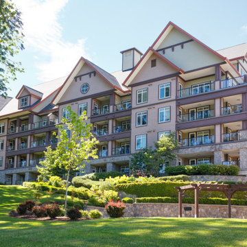
Welcome to St. Andrew's walk! This TOP floor LUXURY studio apartment boasts CHIC trendy finishing’s and is one of the most AFFORDABLE ways to enjoy all that the Bear Mountain RESORT lifestyle has to offer. Just steps to the golf course itself as well as the gym, spa, fine dining, casual cafe/bistros, nature walks, running, and biking trails. BEAR MOUNTAIN offers it all. Enjoy fantastic views of Mt Finlayson from your private extra-large expansive rare patio, which allows BBQs. This EXTENSIVE private space is covered and set up for outdoor living. The 4th floor also includes another shared deck for gatherings which is beautifully surrounded by greenery, serenity & seasonal displays of the mountainside. This location has city convenience that is only a stone's throw away from all amenities. The 14 1/2-foot soaring ceilings make this approx. 700 sq ft (indoor/outdoor combined) space bright, airy, and open. Some of the features in the unit include cherry wood flooring throughout, stainless steel appliances, an electric wall-mounted fireplace, and beautiful granite countertops. This trendy unit has a classic open NY LOFT STYLE layout that offers in-suite laundry, double patio doors, big picture windows, a built-in Murphy Wall Bed, a huge walk-in closet/utility/storage room. Also, you will have secure underground parking, extra communal storage, a bike lock-up, and another separate storage locker. There are no age or rental restrictions, and you can bring your pet. Whether you chose to fall in love and stay or hold it as an investment property. Currently rented for $1400 the month-to-month tenants are extremely flexible and may stay or move out depending on the buyer’s desire. This gorgeous west shore find is where the possibilities are endless, up incoming, and exciting!| Karen Love (250)-727-5868 | RE/MAX Island Properties & www.KarenLove.com |
 Rob Rasmussen
Designed by & photo taken by Rob Rasmussen
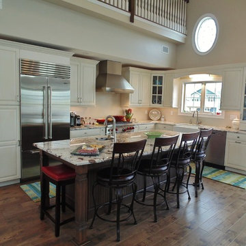
Mid-sized transitional l-shaped medium tone wood floor eat-in kitchen photo in New York with a farmhouse sink, raised-panel cabinets, white cabinets, granite countertops, beige backsplash, stainless steel appliances and an island
Mid-sized transitional l-shaped medium tone wood floor eat-in kitchen photo in New York with a farmhouse sink, raised-panel cabinets, white cabinets, granite countertops, beige backsplash, stainless steel appliances and an island
Sponsored
Columbus, OH
Hope Restoration & General Contracting
Columbus Design-Build, Kitchen & Bath Remodeling, Historic Renovations
 Florida Tile, Inc.
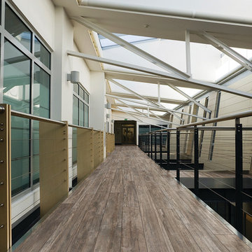
RestoreHDP is the first product line from Florida Tile in a revolutionary new porcelain tile concept. These thin porcelain wood plank tiles are made with the newest manufacturing techniques in the world. Using the finest raw materials in combination with an incredible pressing process, we are able to create a true porcelain tile that is only 5.5mm thick. Thin and incredibly durable, this new product category opens up an enormous possibility of installation options, only some of which we have explored. These 5.5mm porcelain tiles have been Robinson tested at the Tile Council of America labs, receiving an “extra heavy” duty service rating. They are ideal for commercial floor, wall and exterior applications as well as all residential floor, wall, countertop, stairs, and the list goes on.Aesthetically, RestoreHDP utilizes the most technically advanced glazing system in the industry today, digital printing. Like the technology that changed the television industry, HDP-High Definition Porcelain® brings you the most realistic image possible, except it is on a tile. RestoreHDP takes on the look of antique barn planks, one of the most rustic and dramatic reclaimed looking porcelain tile floors available. This rustic wide plank porcelain tile flooring is duplicated from 150-200 year old rustic barn woods. The Restore HDP planks are worn with character from farmers of generations ago. This incredible realistic looking tile has the worn wood flooring feel with dents and dings and evidence of hard work from days gone by. Yet, the ease of maintenance that only innovative high quality porcelain tile can provide.
 LOVEREALESTATE - Sutton Group West Coast Realty
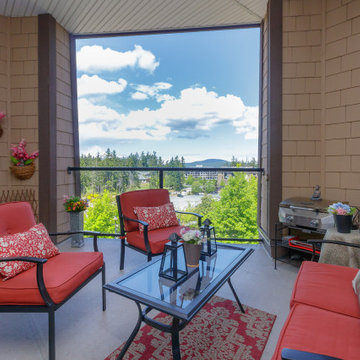
Welcome to St. Andrew's walk! This TOP floor LUXURY studio apartment boasts CHIC trendy finishing’s and is one of the most AFFORDABLE ways to enjoy all that the Bear Mountain RESORT lifestyle has to offer. Just steps to the golf course itself as well as the gym, spa, fine dining, casual cafe/bistros, nature walks, running, and biking trails. BEAR MOUNTAIN offers it all. Enjoy fantastic views of Mt Finlayson from your private extra-large expansive rare patio, which allows BBQs. This EXTENSIVE private space is covered and set up for outdoor living. The 4th floor also includes another shared deck for gatherings which is beautifully surrounded by greenery, serenity & seasonal displays of the mountainside. This location has city convenience that is only a stone's throw away from all amenities. The 14 1/2-foot soaring ceilings make this approx. 700 sq ft (indoor/outdoor combined) space bright, airy, and open. Some of the features in the unit include cherry wood flooring throughout, stainless steel appliances, an electric wall-mounted fireplace, and beautiful granite countertops. This trendy unit has a classic open NY LOFT STYLE layout that offers in-suite laundry, double patio doors, big picture windows, a built-in Murphy Wall Bed, a huge walk-in closet/utility/storage room. Also, you will have secure underground parking, extra communal storage, a bike lock-up, and another separate storage locker. There are no age or rental restrictions, and you can bring your pet. Whether you chose to fall in love and stay or hold it as an investment property. Currently rented for $1400 the month-to-month tenants are extremely flexible and may stay or move out depending on the buyer’s desire. This gorgeous west shore find is where the possibilities are endless, up incoming, and exciting!| Karen Love (250)-727-5868 | RE/MAX Island Properties & www.KarenLove.com |
 RAJ Kitchen and Bath, LLC
**Check out the video of this transformation on our website**
This small kitchen was way too small for this 2 bedrooms, 2 bathrooms apartment. Not only was it a very small kitchen, but the physical location of it made it very difficult to make it any bigger. There wasn't much that could have been done without incurring astronomical cost, which would get little or no return on the investment. The client wanted a kitchen that can be optimized in its current location to add a ton of value for resale.
This was difficult to do, because there was no moving of any mechanical around in the kitchen and even if we wanted to, the management of the building would not allow. For those of you who live in condos, co-ops or apartment building, you know how difficult it is to rework these foot prints. When we showed up, we saw the problems, but we also saw a huge opportunity where we can achieve those goals in the small space. This was accomplished by making some key changes and to incorporate some new things that was not possible when this kitchen was built years ago.
The crucial part of the design that would drive the entire new layout, was selecting the only appliance; that was the Refrigerator. Once we nailed down that refrigerator, we then proceeded to design the kitchen around it. We moved it to the other side of the wall where the sink was so that we can tap into the water line from the sink plumbing. It was crucial that it stays exactly 24" deep, not an inch more because we had to keep the entry as open as possible. Also, it was going to be directly in front of another big storage unit - The pantry. It is not ideal in most cases, but we needed the rest of the space to ramp up the design and open feel towards the side where all of the activities would take place, which happend to be the dining room and the view.
Once all that was figured out, we re-positioned the sink, dishwasher and the range and proceeded to wrap the cabinets around the columns to integrate them into the space. Thirty- six inches cabinets height was used so that they can be installed higher towards the ceiling height to give more room rather than the standard 18" required height between the counter tops. This was done to make the room feel a lot bigger than it really was. Not to mention, we also didn't want the faucet to be buried under the cabinets so that was also a necessary design detail for the space.
We then lowered both knee walls so that the counter top can sit on top of them, by removing that stop point that would have otherwise defined the kitchen area. This allowed us to pick up that extra footprint into the room for added prep space and enabled us to create the illusion of a kitchen that is looking longer than it really is. Every inch mattered when designing this kitchen and we made a conscious decision to use every one of that inch.
White cabinets were selected to do just what white cabinets are design to do; make a small or dark room appear bigger, brighter and more open. In this kitchen, this was amplified the more because of the kitchen location. It was perfect! We knew we did justice to the space because while we were there taking some photos, a few potential buyers walked in and went straight for the kitchen! They said its design just to fit the apartment.
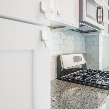
Pantry roll out shelving, Double recycle bin, fancy handles, LED lighting, Quartz counter top, beautiful backslash tiles and grey linen floors finished off the kitchen which looked over a beautiful view of the George Washington Bridge from the top of this lovely 4th floor apartment.
Credit to Masterpiece Tile and Marble (Annmarie on the selection of Tiles and countertop and Val on the Construction to complete this project).
Davor Kokic Photography
41