
Search results for "Extra seemingly" in Home Design Ideas

 Ronnette Riley Architect
This 10,000 sf townhouse sits on one of Manhattan’s most beautiful Upper East Side streets and so the goal of the project was to return the house to its original grandeur. Previously a Kips Bay designer showcase house, the rooms were each designed in a differing style and therefore the lack of cohesion and flow made the house seem choppy. In addition, much of the interior was superficial in the sense that plumbing fixtures were not all connected, walls were “false walls” built in front of existing and much of the construction had to be rebuilt.
The scope included creating a large gourmet kitchen in the rear of the ground floor by closing off the winding corridor and creating a new door opening centered on the main entry hall with a paneled arched pocket door mimicking the original detailing of the parlor floor. The kitchen has a Calacatta Gold stone center island and dinning area flanked by counters that run the length of the east and west walls with glass front upper cabinets. A built-in buffet on the south wall anchors the space. A mud room, with access to the delivery entrance and additional storage space was added off the kitchen. A new slim profile steel and glass French door provides access to a new steel rear deck and stairs to the rear yard. On the second floor, a new tile floor was added throughout and RRA designed new stone mantle pieces fabricated from England in the living and dining rooms.
On the 3rd floor, a new wall was constructed in the 11’ wide central hallway to allow a new 135 sf master closet with custom designed built-in storage units and accessories. This concept was carried through to the 4th floor on a smaller scale and 4 new storage closets were added in the hallway. The existing bathroom on the 4th Floor was gutted and redesigned including a new 5’x5’ extra deep soaking tub and new fixtures. Silver travertine tiles were used throughout to give the room a durable, waterproof finish while also providing a warm, luxurious feel.
The 5th floor was converted into a playroom and TV room for the family’s two young children and was outfitted with chalkboard paint along the entire east wall in the play area and a bold color block wall treatment in the TV room. A new cork floor was installed for durability and resilience to lots of activity yet providing a soft and sustainable floor treatment for its intended user. A full laundry room was also created floor with new cabinetry, plumbing, and floor and wall tile. Additionally, 3 full baths and a powder room were refitted with tumbled travertine tiles on the top two floors. The exterior of the building was refurbished and new lighting and painted doors and frames were installed in accordance with Landmark designation. An additional challenge on the project was that a previously built extension on the PH level was illegally overbuilt and the property had received a violation. A 9 month process of filing drawings, completing zoning analyses and meetings with the DOB Commissioners ensued to get the extension approved allowing us to obtain a permit for the remainder of the work and complete the Certificate of Occupancy.
In spite of the complex process and scattered program, the completed townhouse has a cohesive aesthetic throughout, with upgraded amenities befitting this grand representation of elite New York living.

 Olamar Interiors
These Northern Virginia residents have owned this vacation home for about ten years. With retirement imminent, they decided to give the entire home an over-haul. With it’s great bones and amazing location, this seemed like a very sound investment for their future. Paola McDonald from Olamar Interiors had been working with the clients for the past three years, helping them to renovate their Sterling, VA condominium and their Moorefield, WV weekend home. It seemed fitting that they would also hire her to help them renovate this home as well.
For this project we took the home down to the studs and practically rebuilt it. The renovation includes an addition to the basement level and main floor to create a new fitness room, additional guest bedroom and larger kitchen and dining area. It also included a renovation of the facade of the home. The exterior of the home was completely re-sided and painted, and we added the tall windows at the stairs. The lower entry deck was expanded and an upper deck was added just off the kitchen in order for the homeowner to keep his grill away from the strong ocean winds. A new deck was also added off of the master bedroom. New stainless steel railings were added to all the decks. We opened the homes stairwells, adding custom glass railings and new lighting to create a much more open feel and allow for natural light to flood the entire main living area. The original, tiny kitchen was expanded substantially, adding a large custom eat in bar, wine storage area and plenty of storage. We utilized Decora’s Marquis Cabinetry in an espresso finish to give the kitchen a very clean, contemporary feel. Carrara marble countertops paired with a grey quartz, single slap marble backsplash, and stainless appliances create a clean look. In the new dining area, a simple Modloft dining table was paired with a Regina Andrew bubbles chandelier and Jessica Charles dining chairs for a sophisticated feel accentuated perfectly by beachy colors and textures that tie in the beautiful views of the Ocean. A custom chandelier from John Pomp is the highlight of the family room, particularly at night when it is reminiscent to fireflies in the sky. A new custom designed, custom made sectional, cozy newly added Spark Modern Fires gas fireplace, custom rug by Julie Dasher and Lee Industries chairs create a cozy place to lounge and watch television after a long day at the beach. Guests feel like they are in a luxurious boutique hotel complete with spectacular views, comfortable Ann Gish linens and beautiful and unique lighting fixtures. All three full baths and the powder room received complete facelifts with new glass, marble and ceramic tiles, Decora cabinetry, new lighting fixtures, quartz countertops and unique features that make unique statements in each one. Phillip Jeffries mica wallpaper are used in the entryway and family room fireplace walls to add a sandy texture to each space. Phillip Jeffries grasscloth was added to the master bedroom accent wall to create a delicate feature. New flooring throughout includes gorgeous dark stained hardwood floors, ceramic tile and Karastan carpeting in the bedrooms. The crisp white and grey walls are accentuated throughout the home by beach inspired turquoises, navies and lime greens. Perfectly appointed furnishings, artwork, accessories and custom made window treatments complete the look and feel of this gorgeous vacation home.
Photography by Tinius Photography
 Ronnette Riley Architect
This 10,000 sf townhouse sits on one of Manhattan’s most beautiful Upper East Side streets and so the goal of the project was to return the house to its original grandeur. Previously a Kips Bay designer showcase house, the rooms were each designed in a differing style and therefore the lack of cohesion and flow made the house seem choppy. In addition, much of the interior was superficial in the sense that plumbing fixtures were not all connected, walls were “false walls” built in front of existing and much of the construction had to be rebuilt.
The scope included creating a large gourmet kitchen in the rear of the ground floor by closing off the winding corridor and creating a new door opening centered on the main entry hall with a paneled arched pocket door mimicking the original detailing of the parlor floor. The kitchen has a Calacatta Gold stone center island and dinning area flanked by counters that run the length of the east and west walls with glass front upper cabinets. A built-in buffet on the south wall anchors the space. A mud room, with access to the delivery entrance and additional storage space was added off the kitchen. A new slim profile steel and glass French door provides access to a new steel rear deck and stairs to the rear yard. On the second floor, a new tile floor was added throughout and RRA designed new stone mantle pieces fabricated from England in the living and dining rooms.
On the 3rd floor, a new wall was constructed in the 11’ wide central hallway to allow a new 135 sf master closet with custom designed built-in storage units and accessories. This concept was carried through to the 4th floor on a smaller scale and 4 new storage closets were added in the hallway. The existing bathroom on the 4th Floor was gutted and redesigned including a new 5’x5’ extra deep soaking tub and new fixtures. Silver travertine tiles were used throughout to give the room a durable, waterproof finish while also providing a warm, luxurious feel.
The 5th floor was converted into a playroom and TV room for the family’s two young children and was outfitted with chalkboard paint along the entire east wall in the play area and a bold color block wall treatment in the TV room. A new cork floor was installed for durability and resilience to lots of activity yet providing a soft and sustainable floor treatment for its intended user. A full laundry room was also created floor with new cabinetry, plumbing, and floor and wall tile. Additionally, 3 full baths and a powder room were refitted with tumbled travertine tiles on the top two floors. The exterior of the building was refurbished and new lighting and painted doors and frames were installed in accordance with Landmark designation. An additional challenge on the project was that a previously built extension on the PH level was illegally overbuilt and the property had received a violation. A 9 month process of filing drawings, completing zoning analyses and meetings with the DOB Commissioners ensued to get the extension approved allowing us to obtain a permit for the remainder of the work and complete the Certificate of Occupancy.
In spite of the complex process and scattered program, the completed townhouse has a cohesive aesthetic throughout, with upgraded amenities befitting this grand representation of elite New York living.
Find the right local pro for your project

 Advance Design Studio, Ltd.
The major kitchen renovation of this old country farmhouse was a task of love, one that had been planned for many years by these Barrington seasoned homeowners. After interviewing no less than five companies, the homeowners chose the design team at Advance Design Studio to make the transformation they had long planned for.
“They had an understanding of the right design for the space almost from the instant they walked in the room”, says Sharon Scott of the design team of Nicole Ryan at Todd Jurs at Advance Design Studio. “They were the only designers who laid out ideas in the first meeting at the house that we really loved”, she says. “It was obvious that they understood the house, and understood us - and from then on the decision to hire them literally made itself”.
The original kitchen had a dividing “wall” of cabinetry…that made the rather large space seem very small, and cut off the kitchen from the eating area that has a beautiful garden view completely hidden from the main kitchen. Circulation was poor, leaving family members on top of one another when entertaining family and friends.
The new kitchen design nearly doubles the kitchen size within the original space; opening it up completely and enjoying an expansive island containing a new Kohler Whitehaven Smart Divide farm sink, a dishwasher, and pull out double trash receptacle. The great new gathering space accommodates four pull out stools beckoning grandchildren and friends alike. Removing the range from the island and relocating it to create a dramatic “feature” wall, completely out of the way of guests; it is now crowned with a beautiful completely customized wood hood designed to ventilate much more efficiently than the original island range containing a limited downdraft system.
The much more efficient use of the space after removing a pantry closet made way for a fully functional “tall wall” housing a double oven and refrigerator, out of the way of guests. Removing the restrictive cabinetry wall now allowed for an expansive floor to ceiling pantry cabinet with full extension pull out shelving, and an elegant display area complete with a beautiful furniture detailed buffet.
Fitting perfectly into the farmhouse charm of the old estate, Medallion Silver Lancaster cabinetry was chosen in a soft white Maple Divinity paint finish lining the perimeter. The stunning island hints to this old home’s past with Medallion Gold’s Maple Devonshire style graced with a Carriage Black Heirloom painted finish. The rubbed off black paint finish reveals the soft wood tones beneath, mimicking furniture you’d see in your grandmother’s home that has lovingly been polished for years to reveal a soft, subtly rubbed-off sheen.
Counter tops reverse contrast with perimeter tops of black “Raven” granite possessing a subtle honed finish, and a shift to Quartz Difinity Viareggio - resembling white Carrera marble on the island. A simple herringbone detail completes the decorative range wall, and subtle porcelain subway tiles grace the backsplash throughout.
The design is finished off with crisp Thermador and Bosch stainless steel appliances, and bright brushed cup pull and handle combination hardware. A pull down Kohler Bellaria faucet makes cleanup a breeze, and soft under-cabinet LED lighting throughout makes every work surface shine softly, and highlights the cabinetry display area with grace.
One special detail was created to make the dramatic ceiling transition to a vaulted area above the breakfast nook extra special. A tongue and groove solid wood ceiling was hung above, and a subtle greenish-grey distressed paint finish was hand developed on site by the talented crew, complementing the new kitchen with a completely unique surface that appears as if it’s been there for many, many years. It’s just one standout feature in the amazing new space that is sure to be in every conversation as newcomers enjoy the newest best hangout in this old home renewed!
After 30 years of renovating homes, this now content homeowner sips a cup of tea enjoying her new garden view, and reminisces projects of past – and lastly reports their experience with Advance Design Studio culminating with their amazing new kitchen to be the most enjoyable and satisfying home experience yet.
Designer: Nicole Ryan
Photographer: Joe Nowak

 Cantoni Irvine
Designed By: Sarah Buehlman
Marc and Mandy Maister were clients and fans of Cantoni before they purchased this harbor home on Balboa Island. The South African natives originally met designer Sarah Buehlman and Cantoni’s Founder and CEO Michael Wilkov at a storewide sale, and quickly established a relationship as they bought furnishings for their primary residence in Newport Beach.
So, when the couple decided to invest in this gorgeous second home, in one of the ritziest enclaves in North America, they sought Sarah’s help in transforming the outdated 1960’s residence into a modern marvel. “It’s now the ultimate beach house,” says Sarah, “and finished in Cantoni from top to bottom—including new custom cabinetry installed throughout.”
But let’s back up. This project began when Mandy contacted Sarah in the midst of the remodel process (in December 2010), asking if she could come take a look and help with the overall design.
“The plans were being drawn up with an architect, and they opted not to move anything major. Instead, they updated everything—as in the small carpeted staircase that became a gorgeous glass and metal sculpture,” Sarah explains. She took photographs and measurements, and then set to work creating the scaled renderings. “Marc and Mandy were drawn to the One and Only Collection. It features a high-gloss brown and white color scheme which served as inspiration for the project,” says Sarah.
Primary pieces in the expansive living area include the Mondrian leather sectional, the Involution sculpture, and a pair of Vladimir Kagan Corkscrew swivel chairs. The Maisters needed a place to house all their electronics but didn’t want a typical entertainment center. The One and Only buffet was actually modified by our skilled shop technicians, in our distribution center, so it could accommodate all the couple’s media equipment. “These artisans are another one of our hidden strengths—in addition to the design tools, inventory and extensive resources we have to get a job done,” adds Sarah. Marc and Mandy also fell in love with the exotic Makassar ebony wood in the Ritz Collection, which Sarah combined in the master bedroom with the Ravenna double chaise to provide an extra place to sit and enjoy the beautiful harbor views.
Beyond new furnishings, the Maisters also decided to completely redo their kitchen. And though Marc and Mandy did not have a chance to actually see our kitchen displays, having worked with Sarah over the years, they had immense trust in our commitment to craftsmanship and quality. In fact, they opted for new cabinetry in four bathrooms as well as the laundry room based on our 3D renderings and lacquer samples alone—without ever opening a drawer. “Their trust in my expertise and Cantoni’s reputation were a major deciding factor,” says Sarah.
This plush second home, complete with a private boat dock right out back, counts as one of Sarah’s proudest accomplishments. “These long-time clients are great. They love Cantoni and appreciate high quality Italian furnishings in particular. The home is so gorgeous that once you are inside and open the Nano doors, you simply don’t want to leave.” The job took almost two years to complete, but everyone seems quite happy with the results, proving that large or small—and in cases necessitating a quick turnaround or execution of a long-term vision—Cantoni has the resources to come through for all clients.
 Cantoni Irvine
Designed By: Sarah Buehlman
Marc and Mandy Maister were clients and fans of Cantoni before they purchased this harbor home on Balboa Island. The South African natives originally met designer Sarah Buehlman and Cantoni’s Founder and CEO Michael Wilkov at a storewide sale, and quickly established a relationship as they bought furnishings for their primary residence in Newport Beach.
So, when the couple decided to invest in this gorgeous second home, in one of the ritziest enclaves in North America, they sought Sarah’s help in transforming the outdated 1960’s residence into a modern marvel. “It’s now the ultimate beach house,” says Sarah, “and finished in Cantoni from top to bottom—including new custom cabinetry installed throughout.”
But let’s back up. This project began when Mandy contacted Sarah in the midst of the remodel process (in December 2010), asking if she could come take a look and help with the overall design.
“The plans were being drawn up with an architect, and they opted not to move anything major. Instead, they updated everything—as in the small carpeted staircase that became a gorgeous glass and metal sculpture,” Sarah explains. She took photographs and measurements, and then set to work creating the scaled renderings. “Marc and Mandy were drawn to the One and Only Collection. It features a high-gloss brown and white color scheme which served as inspiration for the project,” says Sarah.
Primary pieces in the expansive living area include the Mondrian leather sectional, the Involution sculpture, and a pair of Vladimir Kagan Corkscrew swivel chairs. The Maisters needed a place to house all their electronics but didn’t want a typical entertainment center. The One and Only buffet was actually modified by our skilled shop technicians, in our distribution center, so it could accommodate all the couple’s media equipment. “These artisans are another one of our hidden strengths—in addition to the design tools, inventory and extensive resources we have to get a job done,” adds Sarah. Marc and Mandy also fell in love with the exotic Makassar ebony wood in the Ritz Collection, which Sarah combined in the master bedroom with the Ravenna double chaise to provide an extra place to sit and enjoy the beautiful harbor views.
Beyond new furnishings, the Maisters also decided to completely redo their kitchen. And though Marc and Mandy did not have a chance to actually see our kitchen displays, having worked with Sarah over the years, they had immense trust in our commitment to craftsmanship and quality. In fact, they opted for new cabinetry in four bathrooms as well as the laundry room based on our 3D renderings and lacquer samples alone—without ever opening a drawer. “Their trust in my expertise and Cantoni’s reputation were a major deciding factor,” says Sarah.
This plush second home, complete with a private boat dock right out back, counts as one of Sarah’s proudest accomplishments. “These long-time clients are great. They love Cantoni and appreciate high quality Italian furnishings in particular. The home is so gorgeous that once you are inside and open the Nano doors, you simply don’t want to leave.” The job took almost two years to complete, but everyone seems quite happy with the results, proving that large or small—and in cases necessitating a quick turnaround or execution of a long-term vision—Cantoni has the resources to come through for all clients.
 Jeanne Schultz Design Studio
Words by Wilson Hack
The best architecture allows what has come before it to be seen and cared for while at the same time injecting something new, if not idealistic. Spartan at first glance, the interior of this stately apartment building, located on the iconic Passeig de Gràcia in Barcelona, quickly begins to unfold as a calculated series of textures, visual artifacts and perfected aesthetic continuities.
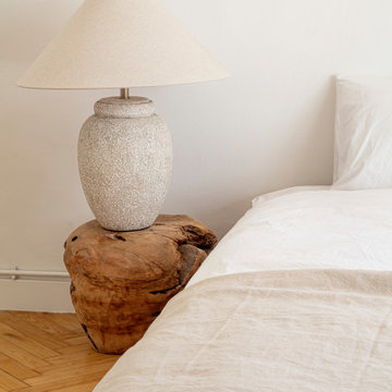
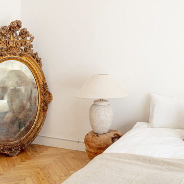
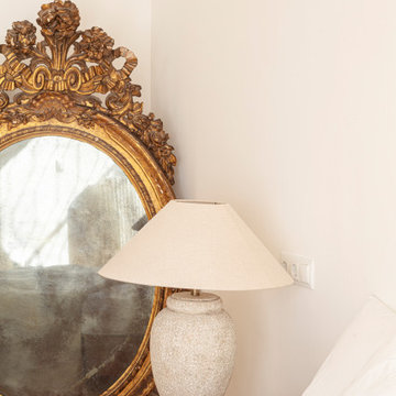
The client, a globe-trotting entrepreneur, selected Jeanne Schultz Design Studio for the remodel and requested that the space be reconditioned into a purposeful and peaceful landing pad. It was to be furnished simply using natural and sustainable materials. Schultz began by gently peeling back before adding only the essentials, resulting in a harmoniously restorative living space where darkness and light coexist and comfort reigns.
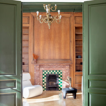
The design was initially guided by the fireplace—from there a subtle injection of matching color extends up into the thick tiered molding and ceiling trim. “The most reckless patterns live here,” remarks Schultz, referring to the checkered green and white tiles, pink-Pollack-y stone and cast iron detailing. The millwork and warm wood wall panels devour the remainder of the living room, eliminating the need for unnecessary artwork.
A curved living room chair by Kave Home punctuates playfully; its shape reveals its pleasant conformity to the human body and sits back, inviting rest and respite. “It’s good for all body types and sizes,” explains Schultz. The single sofa by Dareels is purposefully oversized, casual and inviting. A beige cover was added to soften the otherwise rectilinear edges. Additionally sourced from Dareels, a small yet centrally located side table anchors the space with its dark black wood texture, its visual weight on par with the larger pieces. The black bulbous free standing lamp converses directly with the antique chandelier above. Composed of individual black leather strips, it is seemingly harsh—yet its soft form is reminiscent of a spring tulip.
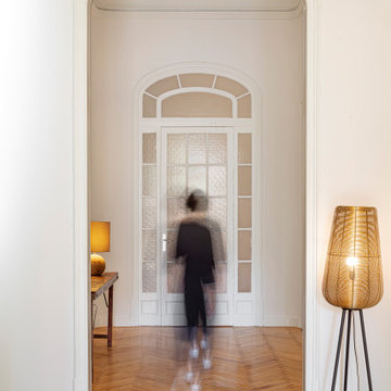
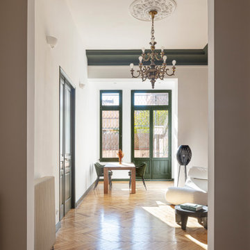
The continuation of the color palette slips softly into the dining room where velvety green chairs sit delicately on a cascade array of pointed legs. The doors that lead out to the patio were sanded down and treated so that the original shape and form could be retained. Although the same green paint was used throughout, this set of doors speaks in darker tones alongside the acute and penetrating daylight. A few different shades of white paint were used throughout the space to add additional depth and embellish this shadowy texture.
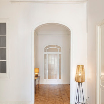
Specialty lights were added into the space to complement the existing overhead lighting. A wall sconce was added in the living room and extra lighting was placed in the kitchen. However, because of the existing barrel vaulted tile ceiling, sconces were placed on the walls rather than above to avoid penetrating the existing architecture.

Sponsored
Sunbury, OH

J.Holderby - Renovations
Franklin County's Leading General Contractors - 2X Best of Houzz!
 Jeanne Schultz Design Studio
Words by Wilson Hack
The best architecture allows what has come before it to be seen and cared for while at the same time injecting something new, if not idealistic. Spartan at first glance, the interior of this stately apartment building, located on the iconic Passeig de Gràcia in Barcelona, quickly begins to unfold as a calculated series of textures, visual artifacts and perfected aesthetic continuities.
The client, a globe-trotting entrepreneur, selected Jeanne Schultz Design Studio for the remodel and requested that the space be reconditioned into a purposeful and peaceful landing pad. It was to be furnished simply using natural and sustainable materials. Schultz began by gently peeling back before adding only the essentials, resulting in a harmoniously restorative living space where darkness and light coexist and comfort reigns.
The design was initially guided by the fireplace—from there a subtle injection of matching color extends up into the thick tiered molding and ceiling trim. “The most reckless patterns live here,” remarks Schultz, referring to the checkered green and white tiles, pink-Pollack-y stone and cast iron detailing. The millwork and warm wood wall panels devour the remainder of the living room, eliminating the need for unnecessary artwork.
A curved living room chair by Kave Home punctuates playfully; its shape reveals its pleasant conformity to the human body and sits back, inviting rest and respite. “It’s good for all body types and sizes,” explains Schultz. The single sofa by Dareels is purposefully oversized, casual and inviting. A beige cover was added to soften the otherwise rectilinear edges. Additionally sourced from Dareels, a small yet centrally located side table anchors the space with its dark black wood texture, its visual weight on par with the larger pieces. The black bulbous free standing lamp converses directly with the antique chandelier above. Composed of individual black leather strips, it is seemingly harsh—yet its soft form is reminiscent of a spring tulip.
The continuation of the color palette slips softly into the dining room where velvety green chairs sit delicately on a cascade array of pointed legs. The doors that lead out to the patio were sanded down and treated so that the original shape and form could be retained. Although the same green paint was used throughout, this set of doors speaks in darker tones alongside the acute and penetrating daylight. A few different shades of white paint were used throughout the space to add additional depth and embellish this shadowy texture.
Specialty lights were added into the space to complement the existing overhead lighting. A wall sconce was added in the living room and extra lighting was placed in the kitchen. However, because of the existing barrel vaulted tile ceiling, sconces were placed on the walls rather than above to avoid penetrating the existing architecture.

 User
The clients enjoy entertaining guests in their home. They enjoy sports events, but don't necessarily enjoy the hustle 'n bustle of going to the stadium, finding a place to park, and in the case of football, freezing to death. They much prefer sharing the ambiance of their comfortable home, offering snacks and drinks from the bar, and enjoying a round of pool during intermissions and halftime, or watching halftime shows on a state-of-the-art home theater.
These clients were so committed to this enterprise, they dedicated their 3,000 sq’ basement, except those areas already used for utility, storage, and mechanical needs, the renovation.To make sure the clients' every wish was met, a complete entertainment area was designed and constructed with ease of movement, lighting, and safety in mind. The area would include a home theater with totally wireless controls, a pool room, and a social area replete with a commercial-grade wet bar.
The home theater consists of a screen within a custom cabinet system that also houses the complete audio-visual equipment center. Speakers are nestled in custom benches with the sound cones discretely hidden behind fabric panels. The motor for the panel that hides the screen when not in use is behind a similar fabric panel.The furniture style cabinet has Shaker style doors with walnut peg inlays and leaded glass panels. There are multiple lighting "scenes" for ambiance; low-voltage lighting inside the crown molding, and recessed can lights are discretely placed so that they can provide an extra level of illumination when required.The pool room was walled with a custom wainscot paneling with clear cherry stiles and rails finished with a clear satin lacquer.
The panels are of Madagascar ebony with a light satin stain and a clear lacquer finish. A custom cue rack was constructed from clear cherry and backed with the Madagascar ebony panel.Drink rails were custom fabricated from cherry and custom crown molding was fabricated to match the rest of the house. The space is lit with a combination of recessed lights and a series of hidden lights behind crown molding for dramatic effect. The bar area is topped with a custom crown detail to contain the lighting.
The bar is constructed in the same manner and fashion as the theater and pool rooms with Shaker style cabinetry with square walnut peg in the door corners and decorative leaded glass door fronts with more than enough front and back bar space to serve and enjoy drinks and snacks. Entry behind the bar is through custom, bi-directional butler doors. A custom bottle display and storage area takes up the bottom half of the bar's back wall. And, for the sake of convenience, a full size automatic dishwasher is installed under the bar for cleaning glasses and stemware. The bar is also tricked out with an espresso machine, its own flat screen TV and AmX video controller.
The bar is lit with puck lights in the upper cabinets that illuminate downward through glass shelves, and low-voltage lighting is used behind the bottle display. The bar itself is lit by a series of earthen tone pendant lights.All three areas complement each other and are in total harmony with the remainder of the house. Moldings were matched, carpeting styles were chosen to complement rather than compromise, and muted, natural colors and textures were chosen that complement the surroundings. There is a seamless transition between the newer areas of the home and those already in everyday use. The entire area is a nebula of electrons operating servos, quietly opening and closing hidden switches, mysteriously dimming and brightening lights, and not only creating an alluring atmosphere, but one that is programmable, available at the touch of a finger to a heat sensitive screen, for an individual, or a group. At a single touch the lights in the theater and bar areas dim as the theater screen lowers into viewing position. Not only does the AMX controller open and close shades and window treatments to facilitate better viewing, but on an entirely different level it controls the very access to the property. It opens and closes entryways, external doors and gates as well.None of this magic came easily. Electrical circuits were at a premium. Over heating plagued the AV rack, and pesky rays of light seemed to creep in where and when they were least welcome. An exhaust fan was installed in the AV cabinet to dissipate the heat. New electrical outlets were scheduled and placed while others were moved. The bar area received custom wire chases hidden within the cabinetry. Exterior roll-a-way shutters, all controlled from the AMX controller, were installed and programmed as the answer to those pesky light rays.

 TaylorPro Design and Remodeling, Inc.
"We took bids from seven or eight companies to remodel our kitchen and bathroom. We had a whole list of improvements we wanted, from 'must-haves' to 'might be nice someday'. We selected TaylorPro Home Services for several reasons, but foremost among those reasons was that the owner, Kerry Taylor, provided us with a detailed breakout of labor/material costs for every option. Nearly every other contractor bundled up the costs of our optional tasks into a single number, which made it quite difficult to select the best options based on our priorities and budget. Kerry's highly detailed proposal wasn't the least expensive we received, but it was organized, thorough, and competitive.
The second reason we selected TaylorPro was the demeanor and experience of Kerry himself. It was refreshing to talk to someone who actually gets his hands dirty rather than yet another designer with his head in a computer. (God bless the designers, though -- we had helpful conversations with many!) Kerry has a good design aesthetic, make no mistake, but it was clear that when problems inevitably popped up, Kerry would know how to address them. He is calm, personable, and competent. In other words, he is just the sort of person you want to work with.
We can't forget to mention the TaylorPro crew. The first thing you notice is how youthful they are. Not a single gray hair among them. Yet after watching them work awhile, you begin to notice how extraordinarily skilful they are. It doesn't matter what is on the day's agenda -- electrical, paint, plumbing, drywall -- these guys tackle it all and do it exceedingly well. They aren't just putting in their time and collecting a check. They take terrific pride in the work they do, a quality that seems more and more difficult to find these days. They are pleasant to be around and I never heard a cross word among them. They took pains to keep the noise and dust to a minimum. They cleaned up at the end of every day, even those days when they put in extra hours and were obviously very tired. This is easily the best work crew we've ever had at our house.
We should also mention that the subcontractors that TaylorPro uses are top-notch. The folks who laid down our new tile floor (Jeff) had every bit as much expertise and integrity as TaylorPro. They did an excellent job on both the flooring and the tile backsplash. These two elements receive compliments from everyone who visits our remodeled kitchen. (We wish Jeff would put his company on Angie's List so that we could give him the recognition he deserves!) In addition, the fellows who fabricated our Caesarstone countertop were also great craftsmen. They did a beautiful job. When we noticed a small blemish a few days after the countertop was installed, they came out immediately and corrected the problem. Nice!
In summary, TaylorPro has lived up to all the glowing recommendations here on Angie's List. Our experience with TaylorPro is right in line with the others. They stayed on task, they communicated well, they stayed on budget, and they gave us more than we had any right to expect. We don't know a better compliment to give Kerry and company than this: when it comes time to remodel the upstairs bathrooms, we won't need to solicit seven or eight bids. We'll just call TaylorPro. "
~ Lysa & Mark W, Clients
Photos by: Kerry W Taylor
 Cantoni Irvine
Designed By: Sarah Buehlman
Marc and Mandy Maister were clients and fans of Cantoni before they purchased this harbor home on Balboa Island. The South African natives originally met designer Sarah Buehlman and Cantoni’s Founder and CEO Michael Wilkov at a storewide sale, and quickly established a relationship as they bought furnishings for their primary residence in Newport Beach.
So, when the couple decided to invest in this gorgeous second home, in one of the ritziest enclaves in North America, they sought Sarah’s help in transforming the outdated 1960’s residence into a modern marvel. “It’s now the ultimate beach house,” says Sarah, “and finished in Cantoni from top to bottom—including new custom cabinetry installed throughout.”
But let’s back up. This project began when Mandy contacted Sarah in the midst of the remodel process (in December 2010), asking if she could come take a look and help with the overall design.
“The plans were being drawn up with an architect, and they opted not to move anything major. Instead, they updated everything—as in the small carpeted staircase that became a gorgeous glass and metal sculpture,” Sarah explains. She took photographs and measurements, and then set to work creating the scaled renderings. “Marc and Mandy were drawn to the One and Only Collection. It features a high-gloss brown and white color scheme which served as inspiration for the project,” says Sarah.
Primary pieces in the expansive living area include the Mondrian leather sectional, the Involution sculpture, and a pair of Vladimir Kagan Corkscrew swivel chairs. The Maisters needed a place to house all their electronics but didn’t want a typical entertainment center. The One and Only buffet was actually modified by our skilled shop technicians, in our distribution center, so it could accommodate all the couple’s media equipment. “These artisans are another one of our hidden strengths—in addition to the design tools, inventory and extensive resources we have to get a job done,” adds Sarah. Marc and Mandy also fell in love with the exotic Makassar ebony wood in the Ritz Collection, which Sarah combined in the master bedroom with the Ravenna double chaise to provide an extra place to sit and enjoy the beautiful harbor views.
Beyond new furnishings, the Maisters also decided to completely redo their kitchen. And though Marc and Mandy did not have a chance to actually see our kitchen displays, having worked with Sarah over the years, they had immense trust in our commitment to craftsmanship and quality. In fact, they opted for new cabinetry in four bathrooms as well as the laundry room based on our 3D renderings and lacquer samples alone—without ever opening a drawer. “Their trust in my expertise and Cantoni’s reputation were a major deciding factor,” says Sarah.
This plush second home, complete with a private boat dock right out back, counts as one of Sarah’s proudest accomplishments. “These long-time clients are great. They love Cantoni and appreciate high quality Italian furnishings in particular. The home is so gorgeous that once you are inside and open the Nano doors, you simply don’t want to leave.” The job took almost two years to complete, but everyone seems quite happy with the results, proving that large or small—and in cases necessitating a quick turnaround or execution of a long-term vision—Cantoni has the resources to come through for all clients.
 TaylorPro Design and Remodeling, Inc.
"We took bids from seven or eight companies to remodel our kitchen and bathroom. We had a whole list of improvements we wanted, from 'must-haves' to 'might be nice someday'. We selected TaylorPro Home Services for several reasons, but foremost among those reasons was that the owner, Kerry Taylor, provided us with a detailed breakout of labor/material costs for every option. Nearly every other contractor bundled up the costs of our optional tasks into a single number, which made it quite difficult to select the best options based on our priorities and budget. Kerry's highly detailed proposal wasn't the least expensive we received, but it was organized, thorough, and competitive.
The second reason we selected TaylorPro was the demeanor and experience of Kerry himself. It was refreshing to talk to someone who actually gets his hands dirty rather than yet another designer with his head in a computer. (God bless the designers, though -- we had helpful conversations with many!) Kerry has a good design aesthetic, make no mistake, but it was clear that when problems inevitably popped up, Kerry would know how to address them. He is calm, personable, and competent. In other words, he is just the sort of person you want to work with.
We can't forget to mention the TaylorPro crew. The first thing you notice is how youthful they are. Not a single gray hair among them. Yet after watching them work awhile, you begin to notice how extraordinarily skilful they are. It doesn't matter what is on the day's agenda -- electrical, paint, plumbing, drywall -- these guys tackle it all and do it exceedingly well. They aren't just putting in their time and collecting a check. They take terrific pride in the work they do, a quality that seems more and more difficult to find these days. They are pleasant to be around and I never heard a cross word among them. They took pains to keep the noise and dust to a minimum. They cleaned up at the end of every day, even those days when they put in extra hours and were obviously very tired. This is easily the best work crew we've ever had at our house.
We should also mention that the subcontractors that TaylorPro uses are top-notch. The folks who laid down our new tile floor (Jeff) had every bit as much expertise and integrity as TaylorPro. They did an excellent job on both the flooring and the tile backsplash. These two elements receive compliments from everyone who visits our remodeled kitchen. (We wish Jeff would put his company on Angie's List so that we could give him the recognition he deserves!) In addition, the fellows who fabricated our Caesarstone countertop were also great craftsmen. They did a beautiful job. When we noticed a small blemish a few days after the countertop was installed, they came out immediately and corrected the problem. Nice!
In summary, TaylorPro has lived up to all the glowing recommendations here on Angie's List. Our experience with TaylorPro is right in line with the others. They stayed on task, they communicated well, they stayed on budget, and they gave us more than we had any right to expect. We don't know a better compliment to give Kerry and company than this: when it comes time to remodel the upstairs bathrooms, we won't need to solicit seven or eight bids. We'll just call TaylorPro. "
~ Lysa & Mark W, Clients
Photos by: Kerry W. Taylor
 Ronnette Riley Architect
This 10,000 sf townhouse sits on one of Manhattan’s most beautiful Upper East Side streets and so the goal of the project was to return the house to its original grandeur. Previously a Kips Bay designer showcase house, the rooms were each designed in a differing style and therefore the lack of cohesion and flow made the house seem choppy. In addition, much of the interior was superficial in the sense that plumbing fixtures were not all connected, walls were “false walls” built in front of existing and much of the construction had to be rebuilt.
The scope included creating a large gourmet kitchen in the rear of the ground floor by closing off the winding corridor and creating a new door opening centered on the main entry hall with a paneled arched pocket door mimicking the original detailing of the parlor floor. The kitchen has a Calacatta Gold stone center island and dinning area flanked by counters that run the length of the east and west walls with glass front upper cabinets. A built-in buffet on the south wall anchors the space. A mud room, with access to the delivery entrance and additional storage space was added off the kitchen. A new slim profile steel and glass French door provides access to a new steel rear deck and stairs to the rear yard. On the second floor, a new tile floor was added throughout and RRA designed new stone mantle pieces fabricated from England in the living and dining rooms.
On the 3rd floor, a new wall was constructed in the 11’ wide central hallway to allow a new 135 sf master closet with custom designed built-in storage units and accessories. This concept was carried through to the 4th floor on a smaller scale and 4 new storage closets were added in the hallway. The existing bathroom on the 4th Floor was gutted and redesigned including a new 5’x5’ extra deep soaking tub and new fixtures. Silver travertine tiles were used throughout to give the room a durable, waterproof finish while also providing a warm, luxurious feel.
The 5th floor was converted into a playroom and TV room for the family’s two young children and was outfitted with chalkboard paint along the entire east wall in the play area and a bold color block wall treatment in the TV room. A new cork floor was installed for durability and resilience to lots of activity yet providing a soft and sustainable floor treatment for its intended user. A full laundry room was also created floor with new cabinetry, plumbing, and floor and wall tile. Additionally, 3 full baths and a powder room were refitted with tumbled travertine tiles on the top two floors. The exterior of the building was refurbished and new lighting and painted doors and frames were installed in accordance with Landmark designation. An additional challenge on the project was that a previously built extension on the PH level was illegally overbuilt and the property had received a violation. A 9 month process of filing drawings, completing zoning analyses and meetings with the DOB Commissioners ensued to get the extension approved allowing us to obtain a permit for the remainder of the work and complete the Certificate of Occupancy.
In spite of the complex process and scattered program, the completed townhouse has a cohesive aesthetic throughout, with upgraded amenities befitting this grand representation of elite New York living.
Sponsored
Sunbury, OH
J.Holderby - Renovations
Franklin County's Leading General Contractors - 2X Best of Houzz!
 Jeanne Schultz Design Studio
Words by Wilson Hack
The best architecture allows what has come before it to be seen and cared for while at the same time injecting something new, if not idealistic. Spartan at first glance, the interior of this stately apartment building, located on the iconic Passeig de Gràcia in Barcelona, quickly begins to unfold as a calculated series of textures, visual artifacts and perfected aesthetic continuities.
The client, a globe-trotting entrepreneur, selected Jeanne Schultz Design Studio for the remodel and requested that the space be reconditioned into a purposeful and peaceful landing pad. It was to be furnished simply using natural and sustainable materials. Schultz began by gently peeling back before adding only the essentials, resulting in a harmoniously restorative living space where darkness and light coexist and comfort reigns.
The design was initially guided by the fireplace—from there a subtle injection of matching color extends up into the thick tiered molding and ceiling trim. “The most reckless patterns live here,” remarks Schultz, referring to the checkered green and white tiles, pink-Pollack-y stone and cast iron detailing. The millwork and warm wood wall panels devour the remainder of the living room, eliminating the need for unnecessary artwork.
A curved living room chair by Kave Home punctuates playfully; its shape reveals its pleasant conformity to the human body and sits back, inviting rest and respite. “It’s good for all body types and sizes,” explains Schultz. The single sofa by Dareels is purposefully oversized, casual and inviting. A beige cover was added to soften the otherwise rectilinear edges. Additionally sourced from Dareels, a small yet centrally located side table anchors the space with its dark black wood texture, its visual weight on par with the larger pieces. The black bulbous free standing lamp converses directly with the antique chandelier above. Composed of individual black leather strips, it is seemingly harsh—yet its soft form is reminiscent of a spring tulip.
The continuation of the color palette slips softly into the dining room where velvety green chairs sit delicately on a cascade array of pointed legs. The doors that lead out to the patio were sanded down and treated so that the original shape and form could be retained. Although the same green paint was used throughout, this set of doors speaks in darker tones alongside the acute and penetrating daylight. A few different shades of white paint were used throughout the space to add additional depth and embellish this shadowy texture.
Specialty lights were added into the space to complement the existing overhead lighting. A wall sconce was added in the living room and extra lighting was placed in the kitchen. However, because of the existing barrel vaulted tile ceiling, sconces were placed on the walls rather than above to avoid penetrating the existing architecture.
 Jeanne Schultz Design Studio
Words by Wilson Hack
The best architecture allows what has come before it to be seen and cared for while at the same time injecting something new, if not idealistic. Spartan at first glance, the interior of this stately apartment building, located on the iconic Passeig de Gràcia in Barcelona, quickly begins to unfold as a calculated series of textures, visual artifacts and perfected aesthetic continuities.
The client, a globe-trotting entrepreneur, selected Jeanne Schultz Design Studio for the remodel and requested that the space be reconditioned into a purposeful and peaceful landing pad. It was to be furnished simply using natural and sustainable materials. Schultz began by gently peeling back before adding only the essentials, resulting in a harmoniously restorative living space where darkness and light coexist and comfort reigns.
The design was initially guided by the fireplace—from there a subtle injection of matching color extends up into the thick tiered molding and ceiling trim. “The most reckless patterns live here,” remarks Schultz, referring to the checkered green and white tiles, pink-Pollack-y stone and cast iron detailing. The millwork and warm wood wall panels devour the remainder of the living room, eliminating the need for unnecessary artwork.
A curved living room chair by Kave Home punctuates playfully; its shape reveals its pleasant conformity to the human body and sits back, inviting rest and respite. “It’s good for all body types and sizes,” explains Schultz. The single sofa by Dareels is purposefully oversized, casual and inviting. A beige cover was added to soften the otherwise rectilinear edges. Additionally sourced from Dareels, a small yet centrally located side table anchors the space with its dark black wood texture, its visual weight on par with the larger pieces. The black bulbous free standing lamp converses directly with the antique chandelier above. Composed of individual black leather strips, it is seemingly harsh—yet its soft form is reminiscent of a spring tulip.
The continuation of the color palette slips softly into the dining room where velvety green chairs sit delicately on a cascade array of pointed legs. The doors that lead out to the patio were sanded down and treated so that the original shape and form could be retained. Although the same green paint was used throughout, this set of doors speaks in darker tones alongside the acute and penetrating daylight. A few different shades of white paint were used throughout the space to add additional depth and embellish this shadowy texture.
Specialty lights were added into the space to complement the existing overhead lighting. A wall sconce was added in the living room and extra lighting was placed in the kitchen. However, because of the existing barrel vaulted tile ceiling, sconces were placed on the walls rather than above to avoid penetrating the existing architecture.
 Jeanne Schultz Design Studio
Words by Wilson Hack
The best architecture allows what has come before it to be seen and cared for while at the same time injecting something new, if not idealistic. Spartan at first glance, the interior of this stately apartment building, located on the iconic Passeig de Gràcia in Barcelona, quickly begins to unfold as a calculated series of textures, visual artifacts and perfected aesthetic continuities.
The client, a globe-trotting entrepreneur, selected Jeanne Schultz Design Studio for the remodel and requested that the space be reconditioned into a purposeful and peaceful landing pad. It was to be furnished simply using natural and sustainable materials. Schultz began by gently peeling back before adding only the essentials, resulting in a harmoniously restorative living space where darkness and light coexist and comfort reigns.
The design was initially guided by the fireplace—from there a subtle injection of matching color extends up into the thick tiered molding and ceiling trim. “The most reckless patterns live here,” remarks Schultz, referring to the checkered green and white tiles, pink-Pollack-y stone and cast iron detailing. The millwork and warm wood wall panels devour the remainder of the living room, eliminating the need for unnecessary artwork.
A curved living room chair by Kave Home punctuates playfully; its shape reveals its pleasant conformity to the human body and sits back, inviting rest and respite. “It’s good for all body types and sizes,” explains Schultz. The single sofa by Dareels is purposefully oversized, casual and inviting. A beige cover was added to soften the otherwise rectilinear edges. Additionally sourced from Dareels, a small yet centrally located side table anchors the space with its dark black wood texture, its visual weight on par with the larger pieces. The black bulbous free standing lamp converses directly with the antique chandelier above. Composed of individual black leather strips, it is seemingly harsh—yet its soft form is reminiscent of a spring tulip.
The continuation of the color palette slips softly into the dining room where velvety green chairs sit delicately on a cascade array of pointed legs. The doors that lead out to the patio were sanded down and treated so that the original shape and form could be retained. Although the same green paint was used throughout, this set of doors speaks in darker tones alongside the acute and penetrating daylight. A few different shades of white paint were used throughout the space to add additional depth and embellish this shadowy texture.
Specialty lights were added into the space to complement the existing overhead lighting. A wall sconce was added in the living room and extra lighting was placed in the kitchen. However, because of the existing barrel vaulted tile ceiling, sconces were placed on the walls rather than above to avoid penetrating the existing architecture.
 Jeanne Schultz Design Studio
Words by Wilson Hack
The best architecture allows what has come before it to be seen and cared for while at the same time injecting something new, if not idealistic. Spartan at first glance, the interior of this stately apartment building, located on the iconic Passeig de Gràcia in Barcelona, quickly begins to unfold as a calculated series of textures, visual artifacts and perfected aesthetic continuities.
The client, a globe-trotting entrepreneur, selected Jeanne Schultz Design Studio for the remodel and requested that the space be reconditioned into a purposeful and peaceful landing pad. It was to be furnished simply using natural and sustainable materials. Schultz began by gently peeling back before adding only the essentials, resulting in a harmoniously restorative living space where darkness and light coexist and comfort reigns.
The design was initially guided by the fireplace—from there a subtle injection of matching color extends up into the thick tiered molding and ceiling trim. “The most reckless patterns live here,” remarks Schultz, referring to the checkered green and white tiles, pink-Pollack-y stone and cast iron detailing. The millwork and warm wood wall panels devour the remainder of the living room, eliminating the need for unnecessary artwork.
A curved living room chair by Kave Home punctuates playfully; its shape reveals its pleasant conformity to the human body and sits back, inviting rest and respite. “It’s good for all body types and sizes,” explains Schultz. The single sofa by Dareels is purposefully oversized, casual and inviting. A beige cover was added to soften the otherwise rectilinear edges. Additionally sourced from Dareels, a small yet centrally located side table anchors the space with its dark black wood texture, its visual weight on par with the larger pieces. The black bulbous free standing lamp converses directly with the antique chandelier above. Composed of individual black leather strips, it is seemingly harsh—yet its soft form is reminiscent of a spring tulip.
The continuation of the color palette slips softly into the dining room where velvety green chairs sit delicately on a cascade array of pointed legs. The doors that lead out to the patio were sanded down and treated so that the original shape and form could be retained. Although the same green paint was used throughout, this set of doors speaks in darker tones alongside the acute and penetrating daylight. A few different shades of white paint were used throughout the space to add additional depth and embellish this shadowy texture.
Specialty lights were added into the space to complement the existing overhead lighting. A wall sconce was added in the living room and extra lighting was placed in the kitchen. However, because of the existing barrel vaulted tile ceiling, sconces were placed on the walls rather than above to avoid penetrating the existing architecture.

 Jeanne Schultz Design Studio
Words by Wilson Hack
The best architecture allows what has come before it to be seen and cared for while at the same time injecting something new, if not idealistic. Spartan at first glance, the interior of this stately apartment building, located on the iconic Passeig de Gràcia in Barcelona, quickly begins to unfold as a calculated series of textures, visual artifacts and perfected aesthetic continuities.
The client, a globe-trotting entrepreneur, selected Jeanne Schultz Design Studio for the remodel and requested that the space be reconditioned into a purposeful and peaceful landing pad. It was to be furnished simply using natural and sustainable materials. Schultz began by gently peeling back before adding only the essentials, resulting in a harmoniously restorative living space where darkness and light coexist and comfort reigns.
The design was initially guided by the fireplace—from there a subtle injection of matching color extends up into the thick tiered molding and ceiling trim. “The most reckless patterns live here,” remarks Schultz, referring to the checkered green and white tiles, pink-Pollack-y stone and cast iron detailing. The millwork and warm wood wall panels devour the remainder of the living room, eliminating the need for unnecessary artwork.
A curved living room chair by Kave Home punctuates playfully; its shape reveals its pleasant conformity to the human body and sits back, inviting rest and respite. “It’s good for all body types and sizes,” explains Schultz. The single sofa by Dareels is purposefully oversized, casual and inviting. A beige cover was added to soften the otherwise rectilinear edges. Additionally sourced from Dareels, a small yet centrally located side table anchors the space with its dark black wood texture, its visual weight on par with the larger pieces. The black bulbous free standing lamp converses directly with the antique chandelier above. Composed of individual black leather strips, it is seemingly harsh—yet its soft form is reminiscent of a spring tulip.
The continuation of the color palette slips softly into the dining room where velvety green chairs sit delicately on a cascade array of pointed legs. The doors that lead out to the patio were sanded down and treated so that the original shape and form could be retained. Although the same green paint was used throughout, this set of doors speaks in darker tones alongside the acute and penetrating daylight. A few different shades of white paint were used throughout the space to add additional depth and embellish this shadowy texture.
Specialty lights were added into the space to complement the existing overhead lighting. A wall sconce was added in the living room and extra lighting was placed in the kitchen. However, because of the existing barrel vaulted tile ceiling, sconces were placed on the walls rather than above to avoid penetrating the existing architecture.
 Jeanne Schultz Design Studio
Written by Wilson Hack
The best architecture allows what has come before it to be seen and cared for while at the same time injecting something new, if not idealistic. Spartan at first glance, the interior of this stately apartment building, located on the iconic Passeig de Gràcia in Barcelona, quickly begins to unfold as a calculated series of textures, visual artifacts and perfected aesthetic continuities.
The client, a globe-trotting entrepreneur, selected Jeanne Schultz Design Studio for the remodel and requested that the space be reconditioned into a purposeful and peaceful landing pad. It was to be furnished simply using natural and sustainable materials. Schultz began by gently peeling back before adding only the essentials, resulting in a harmoniously restorative living space where darkness and light coexist and comfort reigns.
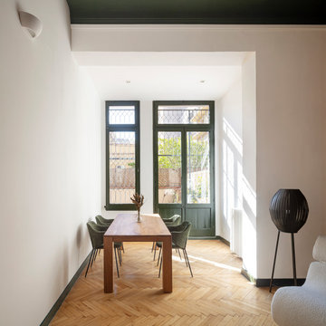
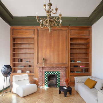
The design was initially guided by the fireplace—from there a subtle injection of matching color extends up into the thick tiered molding and ceiling trim. “The most reckless patterns live here,” remarks Schultz, referring to the checkered green and white tiles, pink-Pollack-y stone and cast iron detailing. The millwork and warm wood wall panels devour the remainder of the living room, eliminating the need for unnecessary artwork.
A curved living room chair by Kave Home punctuates playfully; its shape reveals its pleasant conformity to the human body and sits back, inviting rest and respite. “It’s good for all body types and sizes,” explains Schultz. The single sofa by Dareels is purposefully oversized, casual and inviting. A beige cover was added to soften the otherwise rectilinear edges. Additionally sourced from Dareels, a small yet centrally located side table anchors the space with its dark black wood texture, its visual weight on par with the larger pieces. The black bulbous free standing lamp converses directly with the antique chandelier above. Composed of individual black leather strips, it is seemingly harsh—yet its soft form is reminiscent of a spring tulip.
The continuation of the color palette slips softly into the dining room where velvety green chairs sit delicately on a cascade array of pointed legs. The doors that lead out to the patio were sanded down and treated so that the original shape and form could be retained. Although the same green paint was used throughout, this set of doors speaks in darker tones alongside the acute and penetrating daylight. A few different shades of white paint were used throughout the space to add additional depth and embellish this shadowy texture.
Specialty lights were added into the space to complement the existing overhead lighting. A wall sconce was added in the living room and extra lighting was placed in the kitchen. However, because of the existing barrel vaulted tile ceiling, sconces were placed on the walls rather than above to avoid penetrating the existing architecture.
 Jeanne Schultz Design Studio
Words by Wilson Hack
The best architecture allows what has come before it to be seen and cared for while at the same time injecting something new, if not idealistic. Spartan at first glance, the interior of this stately apartment building, located on the iconic Passeig de Gràcia in Barcelona, quickly begins to unfold as a calculated series of textures, visual artifacts and perfected aesthetic continuities.
The client, a globe-trotting entrepreneur, selected Jeanne Schultz Design Studio for the remodel and requested that the space be reconditioned into a purposeful and peaceful landing pad. It was to be furnished simply using natural and sustainable materials. Schultz began by gently peeling back before adding only the essentials, resulting in a harmoniously restorative living space where darkness and light coexist and comfort reigns.
The design was initially guided by the fireplace—from there a subtle injection of matching color extends up into the thick tiered molding and ceiling trim. “The most reckless patterns live here,” remarks Schultz, referring to the checkered green and white tiles, pink-Pollack-y stone and cast iron detailing. The millwork and warm wood wall panels devour the remainder of the living room, eliminating the need for unnecessary artwork.
A curved living room chair by Kave Home punctuates playfully; its shape reveals its pleasant conformity to the human body and sits back, inviting rest and respite. “It’s good for all body types and sizes,” explains Schultz. The single sofa by Dareels is purposefully oversized, casual and inviting. A beige cover was added to soften the otherwise rectilinear edges. Additionally sourced from Dareels, a small yet centrally located side table anchors the space with its dark black wood texture, its visual weight on par with the larger pieces. The black bulbous free standing lamp converses directly with the antique chandelier above. Composed of individual black leather strips, it is seemingly harsh—yet its soft form is reminiscent of a spring tulip.
The continuation of the color palette slips softly into the dining room where velvety green chairs sit delicately on a cascade array of pointed legs. The doors that lead out to the patio were sanded down and treated so that the original shape and form could be retained. Although the same green paint was used throughout, this set of doors speaks in darker tones alongside the acute and penetrating daylight. A few different shades of white paint were used throughout the space to add additional depth and embellish this shadowy texture.
Specialty lights were added into the space to complement the existing overhead lighting. A wall sconce was added in the living room and extra lighting was placed in the kitchen. However, because of the existing barrel vaulted tile ceiling, sconces were placed on the walls rather than above to avoid penetrating the existing architecture.
105