
Search results for "Extra seemingly" in Home Design Ideas
 Jeanne Schultz Design Studio
Words by Wilson Hack
The best architecture allows what has come before it to be seen and cared for while at the same time injecting something new, if not idealistic. Spartan at first glance, the interior of this stately apartment building, located on the iconic Passeig de Gràcia in Barcelona, quickly begins to unfold as a calculated series of textures, visual artifacts and perfected aesthetic continuities.
The client, a globe-trotting entrepreneur, selected Jeanne Schultz Design Studio for the remodel and requested that the space be reconditioned into a purposeful and peaceful landing pad. It was to be furnished simply using natural and sustainable materials. Schultz began by gently peeling back before adding only the essentials, resulting in a harmoniously restorative living space where darkness and light coexist and comfort reigns.
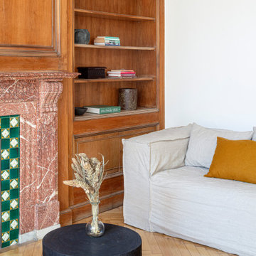
The design was initially guided by the fireplace—from there a subtle injection of matching color extends up into the thick tiered molding and ceiling trim. “The most reckless patterns live here,” remarks Schultz, referring to the checkered green and white tiles, pink-Pollack-y stone and cast iron detailing. The millwork and warm wood wall panels devour the remainder of the living room, eliminating the need for unnecessary artwork.
A curved living room chair by Kave Home punctuates playfully; its shape reveals its pleasant conformity to the human body and sits back, inviting rest and respite. “It’s good for all body types and sizes,” explains Schultz. The single sofa by Dareels is purposefully oversized, casual and inviting. A beige cover was added to soften the otherwise rectilinear edges. Additionally sourced from Dareels, a small yet centrally located side table anchors the space with its dark black wood texture, its visual weight on par with the larger pieces. The black bulbous free standing lamp converses directly with the antique chandelier above. Composed of individual black leather strips, it is seemingly harsh—yet its soft form is reminiscent of a spring tulip.
The continuation of the color palette slips softly into the dining room where velvety green chairs sit delicately on a cascade array of pointed legs. The doors that lead out to the patio were sanded down and treated so that the original shape and form could be retained. Although the same green paint was used throughout, this set of doors speaks in darker tones alongside the acute and penetrating daylight. A few different shades of white paint were used throughout the space to add additional depth and embellish this shadowy texture.
Specialty lights were added into the space to complement the existing overhead lighting. A wall sconce was added in the living room and extra lighting was placed in the kitchen. However, because of the existing barrel vaulted tile ceiling, sconces were placed on the walls rather than above to avoid penetrating the existing architecture.
 Jeanne Schultz Design Studio
Words by Wilson Hack
The best architecture allows what has come before it to be seen and cared for while at the same time injecting something new, if not idealistic. Spartan at first glance, the interior of this stately apartment building, located on the iconic Passeig de Gràcia in Barcelona, quickly begins to unfold as a calculated series of textures, visual artifacts and perfected aesthetic continuities.
The client, a globe-trotting entrepreneur, selected Jeanne Schultz Design Studio for the remodel and requested that the space be reconditioned into a purposeful and peaceful landing pad. It was to be furnished simply using natural and sustainable materials. Schultz began by gently peeling back before adding only the essentials, resulting in a harmoniously restorative living space where darkness and light coexist and comfort reigns.
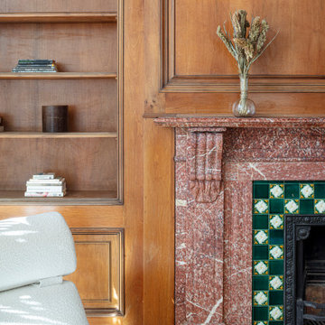
The design was initially guided by the fireplace—from there a subtle injection of matching color extends up into the thick tiered molding and ceiling trim. “The most reckless patterns live here,” remarks Schultz, referring to the checkered green and white tiles, pink-Pollack-y stone and cast iron detailing. The millwork and warm wood wall panels devour the remainder of the living room, eliminating the need for unnecessary artwork.
A curved living room chair by Kave Home punctuates playfully; its shape reveals its pleasant conformity to the human body and sits back, inviting rest and respite. “It’s good for all body types and sizes,” explains Schultz. The single sofa by Dareels is purposefully oversized, casual and inviting. A beige cover was added to soften the otherwise rectilinear edges. Additionally sourced from Dareels, a small yet centrally located side table anchors the space with its dark black wood texture, its visual weight on par with the larger pieces. The black bulbous free standing lamp converses directly with the antique chandelier above. Composed of individual black leather strips, it is seemingly harsh—yet its soft form is reminiscent of a spring tulip.
The continuation of the color palette slips softly into the dining room where velvety green chairs sit delicately on a cascade array of pointed legs. The doors that lead out to the patio were sanded down and treated so that the original shape and form could be retained. Although the same green paint was used throughout, this set of doors speaks in darker tones alongside the acute and penetrating daylight. A few different shades of white paint were used throughout the space to add additional depth and embellish this shadowy texture.
Specialty lights were added into the space to complement the existing overhead lighting. A wall sconce was added in the living room and extra lighting was placed in the kitchen. However, because of the existing barrel vaulted tile ceiling, sconces were placed on the walls rather than above to avoid penetrating the existing architecture.
 Jeanne Schultz Design Studio
Words by Wilson Hack
The best architecture allows what has come before it to be seen and cared for while at the same time injecting something new, if not idealistic. Spartan at first glance, the interior of this stately apartment building, located on the iconic Passeig de Gràcia in Barcelona, quickly begins to unfold as a calculated series of textures, visual artifacts and perfected aesthetic continuities.
The client, a globe-trotting entrepreneur, selected Jeanne Schultz Design Studio for the remodel and requested that the space be reconditioned into a purposeful and peaceful landing pad. It was to be furnished simply using natural and sustainable materials. Schultz began by gently peeling back before adding only the essentials, resulting in a harmoniously restorative living space where darkness and light coexist and comfort reigns.
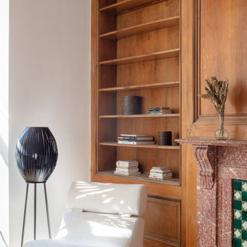
The design was initially guided by the fireplace—from there a subtle injection of matching color extends up into the thick tiered molding and ceiling trim. “The most reckless patterns live here,” remarks Schultz, referring to the checkered green and white tiles, pink-Pollack-y stone and cast iron detailing. The millwork and warm wood wall panels devour the remainder of the living room, eliminating the need for unnecessary artwork.
A curved living room chair by Kave Home punctuates playfully; its shape reveals its pleasant conformity to the human body and sits back, inviting rest and respite. “It’s good for all body types and sizes,” explains Schultz. The single sofa by Dareels is purposefully oversized, casual and inviting. A beige cover was added to soften the otherwise rectilinear edges. Additionally sourced from Dareels, a small yet centrally located side table anchors the space with its dark black wood texture, its visual weight on par with the larger pieces. The black bulbous free standing lamp converses directly with the antique chandelier above. Composed of individual black leather strips, it is seemingly harsh—yet its soft form is reminiscent of a spring tulip.
The continuation of the color palette slips softly into the dining room where velvety green chairs sit delicately on a cascade array of pointed legs. The doors that lead out to the patio were sanded down and treated so that the original shape and form could be retained. Although the same green paint was used throughout, this set of doors speaks in darker tones alongside the acute and penetrating daylight. A few different shades of white paint were used throughout the space to add additional depth and embellish this shadowy texture.
Specialty lights were added into the space to complement the existing overhead lighting. A wall sconce was added in the living room and extra lighting was placed in the kitchen. However, because of the existing barrel vaulted tile ceiling, sconces were placed on the walls rather than above to avoid penetrating the existing architecture.
Find the right local pro for your project

 Ronnette Riley Architect
This 10,000 sf townhouse sits on one of Manhattan’s most beautiful Upper East Side streets and so the goal of the project was to return the house to its original grandeur. Previously a Kips Bay designer showcase house, the rooms were each designed in a differing style and therefore the lack of cohesion and flow made the house seem choppy. In addition, much of the interior was superficial in the sense that plumbing fixtures were not all connected, walls were “false walls” built in front of existing and much of the construction had to be rebuilt.
The scope included creating a large gourmet kitchen in the rear of the ground floor by closing off the winding corridor and creating a new door opening centered on the main entry hall with a paneled arched pocket door mimicking the original detailing of the parlor floor. The kitchen has a Calacatta Gold stone center island and dinning area flanked by counters that run the length of the east and west walls with glass front upper cabinets. A built-in buffet on the south wall anchors the space. A mud room, with access to the delivery entrance and additional storage space was added off the kitchen. A new slim profile steel and glass French door provides access to a new steel rear deck and stairs to the rear yard. On the second floor, a new tile floor was added throughout and RRA designed new stone mantle pieces fabricated from England in the living and dining rooms.
On the 3rd floor, a new wall was constructed in the 11’ wide central hallway to allow a new 135 sf master closet with custom designed built-in storage units and accessories. This concept was carried through to the 4th floor on a smaller scale and 4 new storage closets were added in the hallway. The existing bathroom on the 4th Floor was gutted and redesigned including a new 5’x5’ extra deep soaking tub and new fixtures. Silver travertine tiles were used throughout to give the room a durable, waterproof finish while also providing a warm, luxurious feel.
The 5th floor was converted into a playroom and TV room for the family’s two young children and was outfitted with chalkboard paint along the entire east wall in the play area and a bold color block wall treatment in the TV room. A new cork floor was installed for durability and resilience to lots of activity yet providing a soft and sustainable floor treatment for its intended user. A full laundry room was also created floor with new cabinetry, plumbing, and floor and wall tile. Additionally, 3 full baths and a powder room were refitted with tumbled travertine tiles on the top two floors. The exterior of the building was refurbished and new lighting and painted doors and frames were installed in accordance with Landmark designation. An additional challenge on the project was that a previously built extension on the PH level was illegally overbuilt and the property had received a violation. A 9 month process of filing drawings, completing zoning analyses and meetings with the DOB Commissioners ensued to get the extension approved allowing us to obtain a permit for the remainder of the work and complete the Certificate of Occupancy.
In spite of the complex process and scattered program, the completed townhouse has a cohesive aesthetic throughout, with upgraded amenities befitting this grand representation of elite New York living.
 Ronnette Riley Architect
This 10,000 sf townhouse sits on one of Manhattan’s most beautiful Upper East Side streets and so the goal of the project was to return the house to its original grandeur. Previously a Kips Bay designer showcase house, the rooms were each designed in a differing style and therefore the lack of cohesion and flow made the house seem choppy. In addition, much of the interior was superficial in the sense that plumbing fixtures were not all connected, walls were “false walls” built in front of existing and much of the construction had to be rebuilt.
The scope included creating a large gourmet kitchen in the rear of the ground floor by closing off the winding corridor and creating a new door opening centered on the main entry hall with a paneled arched pocket door mimicking the original detailing of the parlor floor. The kitchen has a Calacatta Gold stone center island and dinning area flanked by counters that run the length of the east and west walls with glass front upper cabinets. A built-in buffet on the south wall anchors the space. A mud room, with access to the delivery entrance and additional storage space was added off the kitchen. A new slim profile steel and glass French door provides access to a new steel rear deck and stairs to the rear yard. On the second floor, a new tile floor was added throughout and RRA designed new stone mantle pieces fabricated from England in the living and dining rooms.
On the 3rd floor, a new wall was constructed in the 11’ wide central hallway to allow a new 135 sf master closet with custom designed built-in storage units and accessories. This concept was carried through to the 4th floor on a smaller scale and 4 new storage closets were added in the hallway. The existing bathroom on the 4th Floor was gutted and redesigned including a new 5’x5’ extra deep soaking tub and new fixtures. Silver travertine tiles were used throughout to give the room a durable, waterproof finish while also providing a warm, luxurious feel.
The 5th floor was converted into a playroom and TV room for the family’s two young children and was outfitted with chalkboard paint along the entire east wall in the play area and a bold color block wall treatment in the TV room. A new cork floor was installed for durability and resilience to lots of activity yet providing a soft and sustainable floor treatment for its intended user. A full laundry room was also created floor with new cabinetry, plumbing, and floor and wall tile. Additionally, 3 full baths and a powder room were refitted with tumbled travertine tiles on the top two floors. The exterior of the building was refurbished and new lighting and painted doors and frames were installed in accordance with Landmark designation. An additional challenge on the project was that a previously built extension on the PH level was illegally overbuilt and the property had received a violation. A 9 month process of filing drawings, completing zoning analyses and meetings with the DOB Commissioners ensued to get the extension approved allowing us to obtain a permit for the remainder of the work and complete the Certificate of Occupancy.
In spite of the complex process and scattered program, the completed townhouse has a cohesive aesthetic throughout, with upgraded amenities befitting this grand representation of elite New York living.

 Advance Design Studio, Ltd.
The major kitchen renovation of this old country farmhouse was a task of love, one that had been planned for many years by these Barrington seasoned homeowners. After interviewing no less than five companies, the homeowners chose the design team at Advance Design Studio to make the transformation they had long planned for.
“They had an understanding of the right design for the space almost from the instant they walked in the room”, says Sharon Scott of the design team of Nicole Ryan at Todd Jurs at Advance Design Studio. “They were the only designers who laid out ideas in the first meeting at the house that we really loved”, she says. “It was obvious that they understood the house, and understood us - and from then on the decision to hire them literally made itself”.
The original kitchen had a dividing “wall” of cabinetry…that made the rather large space seem very small, and cut off the kitchen from the eating area that has a beautiful garden view completely hidden from the main kitchen. Circulation was poor, leaving family members on top of one another when entertaining family and friends.
The new kitchen design nearly doubles the kitchen size within the original space; opening it up completely and enjoying an expansive island containing a new Kohler Whitehaven Smart Divide farm sink, a dishwasher, and pull out double trash receptacle. The great new gathering space accommodates four pull out stools beckoning grandchildren and friends alike. Removing the range from the island and relocating it to create a dramatic “feature” wall, completely out of the way of guests; it is now crowned with a beautiful completely customized wood hood designed to ventilate much more efficiently than the original island range containing a limited downdraft system.
The much more efficient use of the space after removing a pantry closet made way for a fully functional “tall wall” housing a double oven and refrigerator, out of the way of guests. Removing the restrictive cabinetry wall now allowed for an expansive floor to ceiling pantry cabinet with full extension pull out shelving, and an elegant display area complete with a beautiful furniture detailed buffet.
Fitting perfectly into the farmhouse charm of the old estate, Medallion Silver Lancaster cabinetry was chosen in a soft white Maple Divinity paint finish lining the perimeter. The stunning island hints to this old home’s past with Medallion Gold’s Maple Devonshire style graced with a Carriage Black Heirloom painted finish. The rubbed off black paint finish reveals the soft wood tones beneath, mimicking furniture you’d see in your grandmother’s home that has lovingly been polished for years to reveal a soft, subtly rubbed-off sheen.
Counter tops reverse contrast with perimeter tops of black “Raven” granite possessing a subtle honed finish, and a shift to Quartz Difinity Viareggio - resembling white Carrera marble on the island. A simple herringbone detail completes the decorative range wall, and subtle porcelain subway tiles grace the backsplash throughout.
The design is finished off with crisp Thermador and Bosch stainless steel appliances, and bright brushed cup pull and handle combination hardware. A pull down Kohler Bellaria faucet makes cleanup a breeze, and soft under-cabinet LED lighting throughout makes every work surface shine softly, and highlights the cabinetry display area with grace.
One special detail was created to make the dramatic ceiling transition to a vaulted area above the breakfast nook extra special. A tongue and groove solid wood ceiling was hung above, and a subtle greenish-grey distressed paint finish was hand developed on site by the talented crew, complementing the new kitchen with a completely unique surface that appears as if it’s been there for many, many years. It’s just one standout feature in the amazing new space that is sure to be in every conversation as newcomers enjoy the newest best hangout in this old home renewed!
After 30 years of renovating homes, this now content homeowner sips a cup of tea enjoying her new garden view, and reminisces projects of past – and lastly reports their experience with Advance Design Studio culminating with their amazing new kitchen to be the most enjoyable and satisfying home experience yet.
Designer: Nicole Ryan
Photographer: Joe Nowak
 Advance Design Studio, Ltd.
The major kitchen renovation of this old country farmhouse was a task of love, one that had been planned for many years by these Barrington seasoned homeowners. After interviewing no less than five companies, the homeowners chose the design team at Advance Design Studio to make the transformation they had long planned for.
“They had an understanding of the right design for the space almost from the instant they walked in the room”, says Sharon Scott of the design team of Nicole Ryan at Todd Jurs at Advance Design Studio. “They were the only designers who laid out ideas in the first meeting at the house that we really loved”, she says. “It was obvious that they understood the house, and understood us - and from then on the decision to hire them literally made itself”.
The original kitchen had a dividing “wall” of cabinetry…that made the rather large space seem very small, and cut off the kitchen from the eating area that has a beautiful garden view completely hidden from the main kitchen. Circulation was poor, leaving family members on top of one another when entertaining family and friends.
The new kitchen design nearly doubles the kitchen size within the original space; opening it up completely and enjoying an expansive island containing a new Kohler Whitehaven Smart Divide farm sink, a dishwasher, and pull out double trash receptacle. The great new gathering space accommodates four pull out stools beckoning grandchildren and friends alike. Removing the range from the island and relocating it to create a dramatic “feature” wall, completely out of the way of guests; it is now crowned with a beautiful completely customized wood hood designed to ventilate much more efficiently than the original island range containing a limited downdraft system.
The much more efficient use of the space after removing a pantry closet made way for a fully functional “tall wall” housing a double oven and refrigerator, out of the way of guests. Removing the restrictive cabinetry wall now allowed for an expansive floor to ceiling pantry cabinet with full extension pull out shelving, and an elegant display area complete with a beautiful furniture detailed buffet.
Fitting perfectly into the farmhouse charm of the old estate, Medallion Silver Lancaster cabinetry was chosen in a soft white Maple Divinity paint finish lining the perimeter. The stunning island hints to this old home’s past with Medallion Gold’s Maple Devonshire style graced with a Carriage Black Heirloom painted finish. The rubbed off black paint finish reveals the soft wood tones beneath, mimicking furniture you’d see in your grandmother’s home that has lovingly been polished for years to reveal a soft, subtly rubbed-off sheen.
Counter tops reverse contrast with perimeter tops of black “Raven” granite possessing a subtle honed finish, and a shift to Quartz Difinity Viareggio - resembling white Carrera marble on the island. A simple herringbone detail completes the decorative range wall, and subtle porcelain subway tiles grace the backsplash throughout.
The design is finished off with crisp Thermador and Bosch stainless steel appliances, and bright brushed cup pull and handle combination hardware. A pull down Kohler Bellaria faucet makes cleanup a breeze, and soft under-cabinet LED lighting throughout makes every work surface shine softly, and highlights the cabinetry display area with grace.
One special detail was created to make the dramatic ceiling transition to a vaulted area above the breakfast nook extra special. A tongue and groove solid wood ceiling was hung above, and a subtle greenish-grey distressed paint finish was hand developed on site by the talented crew, complementing the new kitchen with a completely unique surface that appears as if it’s been there for many, many years. It’s just one standout feature in the amazing new space that is sure to be in every conversation as newcomers enjoy the newest best hangout in this old home renewed!
After 30 years of renovating homes, this now content homeowner sips a cup of tea enjoying her new garden view, and reminisces projects of past – and lastly reports their experience with Advance Design Studio culminating with their amazing new kitchen to be the most enjoyable and satisfying home experience yet.
Designer: Nicole Ryan
Photographer: Joe Nowak

Sponsored
Sunbury, OH

J.Holderby - Renovations
Franklin County's Leading General Contractors - 2X Best of Houzz!
 Ronnette Riley Architect
This 10,000 sf townhouse sits on one of Manhattan’s most beautiful Upper East Side streets and so the goal of the project was to return the house to its original grandeur. Previously a Kips Bay designer showcase house, the rooms were each designed in a differing style and therefore the lack of cohesion and flow made the house seem choppy. In addition, much of the interior was superficial in the sense that plumbing fixtures were not all connected, walls were “false walls” built in front of existing and much of the construction had to be rebuilt.
The scope included creating a large gourmet kitchen in the rear of the ground floor by closing off the winding corridor and creating a new door opening centered on the main entry hall with a paneled arched pocket door mimicking the original detailing of the parlor floor. The kitchen has a Calacatta Gold stone center island and dinning area flanked by counters that run the length of the east and west walls with glass front upper cabinets. A built-in buffet on the south wall anchors the space. A mud room, with access to the delivery entrance and additional storage space was added off the kitchen. A new slim profile steel and glass French door provides access to a new steel rear deck and stairs to the rear yard. On the second floor, a new tile floor was added throughout and RRA designed new stone mantle pieces fabricated from England in the living and dining rooms.
On the 3rd floor, a new wall was constructed in the 11’ wide central hallway to allow a new 135 sf master closet with custom designed built-in storage units and accessories. This concept was carried through to the 4th floor on a smaller scale and 4 new storage closets were added in the hallway. The existing bathroom on the 4th Floor was gutted and redesigned including a new 5’x5’ extra deep soaking tub and new fixtures. Silver travertine tiles were used throughout to give the room a durable, waterproof finish while also providing a warm, luxurious feel.
The 5th floor was converted into a playroom and TV room for the family’s two young children and was outfitted with chalkboard paint along the entire east wall in the play area and a bold color block wall treatment in the TV room. A new cork floor was installed for durability and resilience to lots of activity yet providing a soft and sustainable floor treatment for its intended user. A full laundry room was also created floor with new cabinetry, plumbing, and floor and wall tile. Additionally, 3 full baths and a powder room were refitted with tumbled travertine tiles on the top two floors. The exterior of the building was refurbished and new lighting and painted doors and frames were installed in accordance with Landmark designation. An additional challenge on the project was that a previously built extension on the PH level was illegally overbuilt and the property had received a violation. A 9 month process of filing drawings, completing zoning analyses and meetings with the DOB Commissioners ensued to get the extension approved allowing us to obtain a permit for the remainder of the work and complete the Certificate of Occupancy.
In spite of the complex process and scattered program, the completed townhouse has a cohesive aesthetic throughout, with upgraded amenities befitting this grand representation of elite New York living.
 Advance Design Studio, Ltd.
The major kitchen renovation of this old country farmhouse was a task of love, one that had been planned for many years by these Barrington seasoned homeowners. After interviewing no less than five companies, the homeowners chose the design team at Advance Design Studio to make the transformation they had long planned for.
“They had an understanding of the right design for the space almost from the instant they walked in the room”, says Sharon Scott of the design team of Nicole Ryan at Todd Jurs at Advance Design Studio. “They were the only designers who laid out ideas in the first meeting at the house that we really loved”, she says. “It was obvious that they understood the house, and understood us - and from then on the decision to hire them literally made itself”.
The original kitchen had a dividing “wall” of cabinetry…that made the rather large space seem very small, and cut off the kitchen from the eating area that has a beautiful garden view completely hidden from the main kitchen. Circulation was poor, leaving family members on top of one another when entertaining family and friends.
The new kitchen design nearly doubles the kitchen size within the original space; opening it up completely and enjoying an expansive island containing a new Kohler Whitehaven Smart Divide farm sink, a dishwasher, and pull out double trash receptacle. The great new gathering space accommodates four pull out stools beckoning grandchildren and friends alike. Removing the range from the island and relocating it to create a dramatic “feature” wall, completely out of the way of guests; it is now crowned with a beautiful completely customized wood hood designed to ventilate much more efficiently than the original island range containing a limited downdraft system.
The much more efficient use of the space after removing a pantry closet made way for a fully functional “tall wall” housing a double oven and refrigerator, out of the way of guests. Removing the restrictive cabinetry wall now allowed for an expansive floor to ceiling pantry cabinet with full extension pull out shelving, and an elegant display area complete with a beautiful furniture detailed buffet.
Fitting perfectly into the farmhouse charm of the old estate, Medallion Silver Lancaster cabinetry was chosen in a soft white Maple Divinity paint finish lining the perimeter. The stunning island hints to this old home’s past with Medallion Gold’s Maple Devonshire style graced with a Carriage Black Heirloom painted finish. The rubbed off black paint finish reveals the soft wood tones beneath, mimicking furniture you’d see in your grandmother’s home that has lovingly been polished for years to reveal a soft, subtly rubbed-off sheen.
Counter tops reverse contrast with perimeter tops of black “Raven” granite possessing a subtle honed finish, and a shift to Quartz Difinity Viareggio - resembling white Carrera marble on the island. A simple herringbone detail completes the decorative range wall, and subtle porcelain subway tiles grace the backsplash throughout.
The design is finished off with crisp Thermador and Bosch stainless steel appliances, and bright brushed cup pull and handle combination hardware. A pull down Kohler Bellaria faucet makes cleanup a breeze, and soft under-cabinet LED lighting throughout makes every work surface shine softly, and highlights the cabinetry display area with grace.
One special detail was created to make the dramatic ceiling transition to a vaulted area above the breakfast nook extra special. A tongue and groove solid wood ceiling was hung above, and a subtle greenish-grey distressed paint finish was hand developed on site by the talented crew, complementing the new kitchen with a completely unique surface that appears as if it’s been there for many, many years. It’s just one standout feature in the amazing new space that is sure to be in every conversation as newcomers enjoy the newest best hangout in this old home renewed!
After 30 years of renovating homes, this now content homeowner sips a cup of tea enjoying her new garden view, and reminisces projects of past – and lastly reports their experience with Advance Design Studio culminating with their amazing new kitchen to be the most enjoyable and satisfying home experience yet.
Designer: Nicole Ryan
Photographer: Joe Nowak
 Ronnette Riley Architect
This 10,000 sf townhouse sits on one of Manhattan’s most beautiful Upper East Side streets and so the goal of the project was to return the house to its original grandeur. Previously a Kips Bay designer showcase house, the rooms were each designed in a differing style and therefore the lack of cohesion and flow made the house seem choppy. In addition, much of the interior was superficial in the sense that plumbing fixtures were not all connected, walls were “false walls” built in front of existing and much of the construction had to be rebuilt.
The scope included creating a large gourmet kitchen in the rear of the ground floor by closing off the winding corridor and creating a new door opening centered on the main entry hall with a paneled arched pocket door mimicking the original detailing of the parlor floor. The kitchen has a Calacatta Gold stone center island and dinning area flanked by counters that run the length of the east and west walls with glass front upper cabinets. A built-in buffet on the south wall anchors the space. A mud room, with access to the delivery entrance and additional storage space was added off the kitchen. A new slim profile steel and glass French door provides access to a new steel rear deck and stairs to the rear yard. On the second floor, a new tile floor was added throughout and RRA designed new stone mantle pieces fabricated from England in the living and dining rooms.
On the 3rd floor, a new wall was constructed in the 11’ wide central hallway to allow a new 135 sf master closet with custom designed built-in storage units and accessories. This concept was carried through to the 4th floor on a smaller scale and 4 new storage closets were added in the hallway. The existing bathroom on the 4th Floor was gutted and redesigned including a new 5’x5’ extra deep soaking tub and new fixtures. Silver travertine tiles were used throughout to give the room a durable, waterproof finish while also providing a warm, luxurious feel.
The 5th floor was converted into a playroom and TV room for the family’s two young children and was outfitted with chalkboard paint along the entire east wall in the play area and a bold color block wall treatment in the TV room. A new cork floor was installed for durability and resilience to lots of activity yet providing a soft and sustainable floor treatment for its intended user. A full laundry room was also created floor with new cabinetry, plumbing, and floor and wall tile. Additionally, 3 full baths and a powder room were refitted with tumbled travertine tiles on the top two floors. The exterior of the building was refurbished and new lighting and painted doors and frames were installed in accordance with Landmark designation. An additional challenge on the project was that a previously built extension on the PH level was illegally overbuilt and the property had received a violation. A 9 month process of filing drawings, completing zoning analyses and meetings with the DOB Commissioners ensued to get the extension approved allowing us to obtain a permit for the remainder of the work and complete the Certificate of Occupancy.
In spite of the complex process and scattered program, the completed townhouse has a cohesive aesthetic throughout, with upgraded amenities befitting this grand representation of elite New York living.
 Ronnette Riley Architect
This 10,000 sf townhouse sits on one of Manhattan’s most beautiful Upper East Side streets and so the goal of the project was to return the house to its original grandeur. Previously a Kips Bay designer showcase house, the rooms were each designed in a differing style and therefore the lack of cohesion and flow made the house seem choppy. In addition, much of the interior was superficial in the sense that plumbing fixtures were not all connected, walls were “false walls” built in front of existing and much of the construction had to be rebuilt.
The scope included creating a large gourmet kitchen in the rear of the ground floor by closing off the winding corridor and creating a new door opening centered on the main entry hall with a paneled arched pocket door mimicking the original detailing of the parlor floor. The kitchen has a Calacatta Gold stone center island and dinning area flanked by counters that run the length of the east and west walls with glass front upper cabinets. A built-in buffet on the south wall anchors the space. A mud room, with access to the delivery entrance and additional storage space was added off the kitchen. A new slim profile steel and glass French door provides access to a new steel rear deck and stairs to the rear yard. On the second floor, a new tile floor was added throughout and RRA designed new stone mantle pieces fabricated from England in the living and dining rooms.
On the 3rd floor, a new wall was constructed in the 11’ wide central hallway to allow a new 135 sf master closet with custom designed built-in storage units and accessories. This concept was carried through to the 4th floor on a smaller scale and 4 new storage closets were added in the hallway. The existing bathroom on the 4th Floor was gutted and redesigned including a new 5’x5’ extra deep soaking tub and new fixtures. Silver travertine tiles were used throughout to give the room a durable, waterproof finish while also providing a warm, luxurious feel.
The 5th floor was converted into a playroom and TV room for the family’s two young children and was outfitted with chalkboard paint along the entire east wall in the play area and a bold color block wall treatment in the TV room. A new cork floor was installed for durability and resilience to lots of activity yet providing a soft and sustainable floor treatment for its intended user. A full laundry room was also created floor with new cabinetry, plumbing, and floor and wall tile. Additionally, 3 full baths and a powder room were refitted with tumbled travertine tiles on the top two floors. The exterior of the building was refurbished and new lighting and painted doors and frames were installed in accordance with Landmark designation. An additional challenge on the project was that a previously built extension on the PH level was illegally overbuilt and the property had received a violation. A 9 month process of filing drawings, completing zoning analyses and meetings with the DOB Commissioners ensued to get the extension approved allowing us to obtain a permit for the remainder of the work and complete the Certificate of Occupancy.
In spite of the complex process and scattered program, the completed townhouse has a cohesive aesthetic throughout, with upgraded amenities befitting this grand representation of elite New York living.

 Bill Fry Construction - Wm. H. Fry Const. Co.
Covid During Construction and Making Face Masks
Dear Houzz Folks,
We've started getting back to work and are educating everyone at our projects on how to be safe during COVID, posting signage, and we've been making masks for our employees, colleagues, friends, family etc... Here's some information on what I've learned so far in sewing the best fitting face mask for COVID.
1. Put in a wire at the nose bridge (about 3.5 inches) - it helps with fit and if you wear glasses, it keeps them from fogging up. I found that doorbell wire, available at the hardware store, seems to work well. It isn't too thin or too fat, bends easily and holds its shape. I attach it by using a zigzag stitch on the interior seam of the outside of the mask (so there's a bit more cushion on the inside).
2. For the shaped masks, I make a pocket in case my friends, family, colleagues, want to insert a filter - it also allows for three layers of fabric in the breathing area and less bulk where the ties go. For patterns that don't offer pockets, I just make my own pattern pocket. I also first baste the two inside pieces first and then sew the front on. This way, there's no worries about slipping. No pins are needed and no pins minimizes the number of extra air holes in the fabric.
3. So that the ties/loops can be replaced or modified, I make a channel for rather than sewing it in permanently. Many videos show using a safety pin to pull the elastic through. If you sew much, you might have a bodkin in your sewing box, but it might be a bit too wide. Instead, I use a long hairpin (you could probably make a long loop with a paper clip). I run the hairpin through the channel, loop the elastic through the end of the pin and pull through. That takes much less time than piercing it with a safety-pin.
4. For the inside of the masks, it is nice to have softer fabric inside, so high-thread-count sheets purchased on sale work great. Then you can easily tell what is inside as well.
5. For surgical-style masks, there's a pattern with a pocket on the inside and a wire. I like the ideas in this video but use 2 fabrics and make them bigger. About a 9x9 inch for the outside and 9x8 inch for the inside. 5/8 seam on the nose and 1/4 seam on the bottom.
6. For the fitted masks, there are two patterns that I like. For this one, https://moinliz.de/mundschutz-naehen-mit-schnittmuster it expects you to print on European-sized paper, so if you want to get the size right, print at 100%
I also really like this pattern and I added a pocket and lengthened the ends to make channels https://intermountainhealthcare.org/covid19-coronavirus/homemade-cloth-face-coverings/ (scroll down to a link to download the pdf) Lots of folks sew craftpassion, but I like the fit of these patterns better. There are still some other patterns I have left to try!
6. After breaking lots of needles, I realized that I really didn't need to topstich the fitted masks over the bridge, so I just started skipping the bridge.
7. If you're going to wear a face-covering for a really long time, you might want to skip the ear hangers and go for ties behind the head. Instead of two ties, I'll use one long one so that the bottom one is a loop and the top one ties. Bungee cord works nice.
Happy Sewing!
: ) Rhoda Fry, Bill Fry Construction
 PEDINI NY
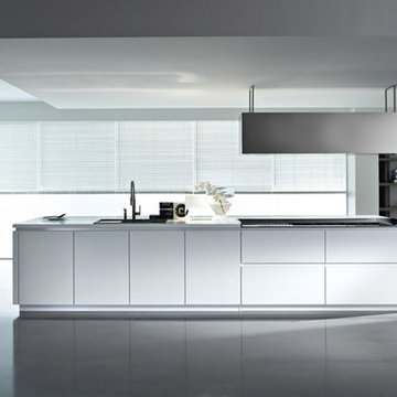
The inspiration for the Dune began with the simple idea to seamlessly connect the kitchen to the living space. Dune is a unique contemporary kitchen cabinet design without handles. It is defined by asymmetrically curved base units and echoing flowing forms found in nature. Opening is achieved by a groove on the edge of the extra thick 23mm front panel (base units) or by a vertical aluminum profile (tall units). Drawers in the curved units allow Pedini to offer this remarkable Italian kitchen design without compromising the environment, ergonomics or functionality.
Dune contemporary kitchens offer a high component of adaptability and individual variations, which allows room for harmony between the functional aspects of the house. Dune truly adapts to the nature of it’s surrounding.
Soft technology. Pedini makes daily living more practical thanks to the quality of the opening systems of doors and drawers, and with an automated closing mechanism, great storage capacity, and the total personalization of the spaces. Dune aesthetics provide attractive contrasts between wood veneers, steel, and quartz worktops. Modern kitchen designs like Dune are a perfect fit in any home. Dune, like all of Pedini’s contemporary kitchens, was designed with ease of function in mind. Dune is a flexible product for diversified solutions. Among the various possibilities of Dune, the option of the island allows complete access from more sides of the working area. Deep drawers are also a staple of the Dune line.
Dune is available in natural or stained eco friendly walnut as well as matte, high gloss and textured lacquer in any color. Aluminum profiles and plinths are available in white, gray, black or matte silver. Complementary glass fronts available with walnut frame and 6 colors of mirror glass.
Sponsored
Sunbury, OH
J.Holderby - Renovations
Franklin County's Leading General Contractors - 2X Best of Houzz!
 Ronnette Riley Architect
This 10,000 sf townhouse sits on one of Manhattan’s most beautiful Upper East Side streets and so the goal of the project was to return the house to its original grandeur. Previously a Kips Bay designer showcase house, the rooms were each designed in a differing style and therefore the lack of cohesion and flow made the house seem choppy. In addition, much of the interior was superficial in the sense that plumbing fixtures were not all connected, walls were “false walls” built in front of existing and much of the construction had to be rebuilt.
The scope included creating a large gourmet kitchen in the rear of the ground floor by closing off the winding corridor and creating a new door opening centered on the main entry hall with a paneled arched pocket door mimicking the original detailing of the parlor floor. The kitchen has a Calacatta Gold stone center island and dinning area flanked by counters that run the length of the east and west walls with glass front upper cabinets. A built-in buffet on the south wall anchors the space. A mud room, with access to the delivery entrance and additional storage space was added off the kitchen. A new slim profile steel and glass French door provides access to a new steel rear deck and stairs to the rear yard. On the second floor, a new tile floor was added throughout and RRA designed new stone mantle pieces fabricated from England in the living and dining rooms.
On the 3rd floor, a new wall was constructed in the 11’ wide central hallway to allow a new 135 sf master closet with custom designed built-in storage units and accessories. This concept was carried through to the 4th floor on a smaller scale and 4 new storage closets were added in the hallway. The existing bathroom on the 4th Floor was gutted and redesigned including a new 5’x5’ extra deep soaking tub and new fixtures. Silver travertine tiles were used throughout to give the room a durable, waterproof finish while also providing a warm, luxurious feel.
The 5th floor was converted into a playroom and TV room for the family’s two young children and was outfitted with chalkboard paint along the entire east wall in the play area and a bold color block wall treatment in the TV room. A new cork floor was installed for durability and resilience to lots of activity yet providing a soft and sustainable floor treatment for its intended user. A full laundry room was also created floor with new cabinetry, plumbing, and floor and wall tile. Additionally, 3 full baths and a powder room were refitted with tumbled travertine tiles on the top two floors. The exterior of the building was refurbished and new lighting and painted doors and frames were installed in accordance with Landmark designation. An additional challenge on the project was that a previously built extension on the PH level was illegally overbuilt and the property had received a violation. A 9 month process of filing drawings, completing zoning analyses and meetings with the DOB Commissioners ensued to get the extension approved allowing us to obtain a permit for the remainder of the work and complete the Certificate of Occupancy.
In spite of the complex process and scattered program, the completed townhouse has a cohesive aesthetic throughout, with upgraded amenities befitting this grand representation of elite New York living.
 Advance Design Studio, Ltd.
The major kitchen renovation of this old country farmhouse was a task of love, one that had been planned for many years by these Barrington seasoned homeowners. After interviewing no less than five companies, the homeowners chose the design team at Advance Design Studio to make the transformation they had long planned for.
“They had an understanding of the right design for the space almost from the instant they walked in the room”, says Sharon Scott of the design team of Nicole Ryan at Todd Jurs at Advance Design Studio. “They were the only designers who laid out ideas in the first meeting at the house that we really loved”, she says. “It was obvious that they understood the house, and understood us - and from then on the decision to hire them literally made itself”.
The original kitchen had a dividing “wall” of cabinetry…that made the rather large space seem very small, and cut off the kitchen from the eating area that has a beautiful garden view completely hidden from the main kitchen. Circulation was poor, leaving family members on top of one another when entertaining family and friends.
The new kitchen design nearly doubles the kitchen size within the original space; opening it up completely and enjoying an expansive island containing a new Kohler Whitehaven Smart Divide farm sink, a dishwasher, and pull out double trash receptacle. The great new gathering space accommodates four pull out stools beckoning grandchildren and friends alike. Removing the range from the island and relocating it to create a dramatic “feature” wall, completely out of the way of guests; it is now crowned with a beautiful completely customized wood hood designed to ventilate much more efficiently than the original island range containing a limited downdraft system.
The much more efficient use of the space after removing a pantry closet made way for a fully functional “tall wall” housing a double oven and refrigerator, out of the way of guests. Removing the restrictive cabinetry wall now allowed for an expansive floor to ceiling pantry cabinet with full extension pull out shelving, and an elegant display area complete with a beautiful furniture detailed buffet.
Fitting perfectly into the farmhouse charm of the old estate, Medallion Silver Lancaster cabinetry was chosen in a soft white Maple Divinity paint finish lining the perimeter. The stunning island hints to this old home’s past with Medallion Gold’s Maple Devonshire style graced with a Carriage Black Heirloom painted finish. The rubbed off black paint finish reveals the soft wood tones beneath, mimicking furniture you’d see in your grandmother’s home that has lovingly been polished for years to reveal a soft, subtly rubbed-off sheen.
Counter tops reverse contrast with perimeter tops of black “Raven” granite possessing a subtle honed finish, and a shift to Quartz Difinity Viareggio - resembling white Carrera marble on the island. A simple herringbone detail completes the decorative range wall, and subtle porcelain subway tiles grace the backsplash throughout.
The design is finished off with crisp Thermador and Bosch stainless steel appliances, and bright brushed cup pull and handle combination hardware. A pull down Kohler Bellaria faucet makes cleanup a breeze, and soft under-cabinet LED lighting throughout makes every work surface shine softly, and highlights the cabinetry display area with grace.
One special detail was created to make the dramatic ceiling transition to a vaulted area above the breakfast nook extra special. A tongue and groove solid wood ceiling was hung above, and a subtle greenish-grey distressed paint finish was hand developed on site by the talented crew, complementing the new kitchen with a completely unique surface that appears as if it’s been there for many, many years. It’s just one standout feature in the amazing new space that is sure to be in every conversation as newcomers enjoy the newest best hangout in this old home renewed!
After 30 years of renovating homes, this now content homeowner sips a cup of tea enjoying her new garden view, and reminisces projects of past – and lastly reports their experience with Advance Design Studio culminating with their amazing new kitchen to be the most enjoyable and satisfying home experience yet.
Designer: Nicole Ryan
Photographer: Joe Nowak

 Cure Design Group
KITCHEN RENOVATION CURRENT CRAFTSMAN
This client started off just being curious about our services - what we could do, and if we could even help her update her kitchen. She and her husband with their two teenage kids have lived in their home for several years without updating anything since the house was originally built. They didn’t quite have a budget in mind yet. They didn’t know their style, or even if they had one. Their timeline was simple, “as fast as you can so we’re not without a kitchen for very long” (usually what we hear for kitchen updates).
After a very productive consultation: determining the scope of work and zeroing in on a budget, I was very excited to update this underwhelming space to something that is modern but timeless, something that is theirs. And, it was easy to see what type of design style they gravitated toward looking at the pieces they already own: Craftsman/Prairie Style. I left the meeting so excited to weave in yet another genre of design to my CDG portfolio! We circled in our contractor to discuss the changes they were looking to make and the scope of work that would be theirs. Then I was off to get designing:
// Because the kitchen’s footprint and the defined breakfast space delineated by the bay, we kept the perimeter cabinetry as it was originally laid out. We updated these cabinets to a beautiful soft Alabaster White with a Barn Wood Glaze to highlight the simplicity of the shaker style doors. We added transom cabinets above the uppers, with only the back wall having seeded glass inserts to highlight some of their collectables.
// The original shaped island was counter-productive (See what I did there?) in functionality and design. We squared this off to reduce some of the angles and gain more storage. We highlighted the new island with a contrasting oak cabinet in a dark finish, to pay our respects to the craftsman style, and topped with a concrete-like countertop as a nod to the Prairie Style, allowing the homeowners to gain two extra seats and a massive -uninterrupted- work surface.
// The small section of cabinetry between the garage entry and fridge now is the perfect dump-station for mail, electronics, whatever is in their hands when they come into the house; and completely hidden by the refrigerator.
// The disconnected cabinetry in the breakfast area makes for a great place to have a working office. Accessible from the kitchen or the adjacent great room, this is the perfect place for the kids to do their homework while mom and dad are putting together dinner. The base cabinets are built out for office-type storage: paper and pencil drawers, filing systems, and cord management. Additionally, the long counter provides a ton of worksurface to spread out.
// The largest transformation was the pantry. We raised the height of the doorway and added huge custom designed bypass sliding barndoors. Finished with a dark stain to compliment the island and cut to inset 4 stained glass windows, typical of this style of design, and driving home the concept for the whole space.
// They were desperate to replace their flooring with something extremely durable to flow throughout the kitchen and the whole main level. This beautiful new flooring is actually a textured LVT(!) Which allowed them to save on overall cost and extend the life of their new flooring purchase.
// They loved their copper table, so we kept it and added new simple, mid-century modern chairs around it and a shiny new craftsman-style chandelier above. We added bright barstools in a burnt orange-red accent, and a bright woven rug to tie it all together.
// Because the kitchen renovation was shaping up to be pretty spectacular, they decided they needed to now replace their ‘now-these-look-a-little-too-old’ upholstered seating in the neighboring great room with 2 new sofas. We found the perfect sage-y-grey fabric which we covered on sofa frames that have and exposed oak-wood base, which we finished in a warm weathered grey.
// As every designer knows, a room isn’t finished until there’s something on the windows. Now that the new flooring was installed and every other room on the main level ‘seemed’ to be updated, we needed to update the window treatments in the dining, and great rooms to reflect their new design concept.
I hope you find the ‘after’ photos refreshing (as refreshing as it was for me to work on something that’s not a “Farm House” style that’s saturating the industry right now!) This was such a fun project and a great collaboration with our contractor.

 SUPERIOR CHIMNEY SERVICES CORPORATION
Let’s be honest. Chimney cleaning probably isn’t the first thing on your spring to-do list. But if you used your fireplace this past winter, scheduling a chimney sweep before warm weather arrives is one of the best home maintenance decisions you can make. Here’s why Spring is the best time to schedule your chimney cleaning.
Your Chimney Just Worked Hard All Winter
It’s tired, simply burnt out! Every time you burned wood this season, creosote, also known as soot, was clinging to the inner walls of your chimney. It’s a natural byproduct of burning wood, but it’s also highly flammable and the leading cause of chimney fires. The longer it sits, the more it builds up. A professional chimney sweep, such as Superior Chimney, takes a look at your chimney flue liner, damper, and firebox — clearing it all out before that creosote becomes a serious issue.
Spring is the Best Time to Take Care of the Chimney
Fall is when everyone panics. The temperature drops, and the fireplace suddenly seems appealing. By scheduling now, in spring, you get to clean your chimney now so your house doesn’t smell from the creosote left in your fireplace and chimney Superior Chimney includes a FREE 14-Point Certified Written Inspection with photo documentation sent straight to your email with every chimney sweep we do. That’s the kind of full-service you want, and you’re more likely to get it when things aren’t hectic.
Catch Problems Before They Get Expensive
Here’s something homeowners don’t regularly remember: a chimney sweep isn’t just about cleaning. It’s about integrity. When a CSIA Certified Chimney Sweep technician pushes rods and brushes through your chimney system, if pieces of fire clay tile, tile joints, or brick start falling, that tells you exactly where a structural issue exists. That’s critical information for fireworthy, continued use of your fireplace.
Avoid Any Obstructions
Obstruction-free chimney systems is another key reason for a spring chimney sweep. Birds, squirrels, and raccoons love a quiet chimney during the warmer (and definitely the cold) months. Nesting, debris, and feces can create blockages, and a simple cleaning alone won’t remove most of them. Knowing what’s going on inside your chimney before critters move in is a whole lot easier than dealing with it in October.
It’s the National Safety Standard — Not Just a Suggestion
The NFPA 211, CSIA, NCSG, and IRC all recommend annual chimney inspections and cleanings for both wood burning and gas fireplaces. It’s not optional; it’s a safety standard. As the CSIA puts it simply: clean chimneys don’t catch fire. Well put CSIA.
Did You Know?
All of Superior Chimney’s technicians are certified by the CSIA, so you know you’re getting expertise you can trust. Then we take the extra step of taking pictures so you can ‘see’ exactly what’s going on with the chimney. Everything looks good from the ground. We’ll email the pictures to you so you can keep your own records of what we all saw during the last visit. Now you know why spring is the best time to schedule your chimney cleaning.
Contact us or give us a call today at 877-244-6349 to get started.

 Cure Design Group
KITCHEN RENOVATION CURRENT CRAFTSMAN
This client started off just being curious about our services - what we could do, and if we could even help her update her kitchen. She and her husband with their two teenage kids have lived in their home for several years without updating anything since the house was originally built. They didn’t quite have a budget in mind yet. They didn’t know their style, or even if they had one. Their timeline was simple, “as fast as you can so we’re not without a kitchen for very long” (usually what we hear for kitchen updates).
After a very productive consultation: determining the scope of work and zeroing in on a budget, I was very excited to update this underwhelming space to something that is modern but timeless, something that is theirs. And, it was easy to see what type of design style they gravitated toward looking at the pieces they already own: Craftsman/Prairie Style. I left the meeting so excited to weave in yet another genre of design to my CDG portfolio! We circled in our contractor to discuss the changes they were looking to make and the scope of work that would be theirs. Then I was off to get designing:
// Because the kitchen’s footprint and the defined breakfast space delineated by the bay, we kept the perimeter cabinetry as it was originally laid out. We updated these cabinets to a beautiful soft Alabaster White with a Barn Wood Glaze to highlight the simplicity of the shaker style doors. We added transom cabinets above the uppers, with only the back wall having seeded glass inserts to highlight some of their collectables.
// The original shaped island was counter-productive (See what I did there?) in functionality and design. We squared this off to reduce some of the angles and gain more storage. We highlighted the new island with a contrasting oak cabinet in a dark finish, to pay our respects to the craftsman style, and topped with a concrete-like countertop as a nod to the Prairie Style, allowing the homeowners to gain two extra seats and a massive -uninterrupted- work surface.
// The small section of cabinetry between the garage entry and fridge now is the perfect dump-station for mail, electronics, whatever is in their hands when they come into the house; and completely hidden by the refrigerator.
// The disconnected cabinetry in the breakfast area makes for a great place to have a working office. Accessible from the kitchen or the adjacent great room, this is the perfect place for the kids to do their homework while mom and dad are putting together dinner. The base cabinets are built out for office-type storage: paper and pencil drawers, filing systems, and cord management. Additionally, the long counter provides a ton of worksurface to spread out.
// The largest transformation was the pantry. We raised the height of the doorway and added huge custom designed bypass sliding barndoors. Finished with a dark stain to compliment the island and cut to inset 4 stained glass windows, typical of this style of design, and driving home the concept for the whole space.
// They were desperate to replace their flooring with something extremely durable to flow throughout the kitchen and the whole main level. This beautiful new flooring is actually a textured LVT(!) Which allowed them to save on overall cost and extend the life of their new flooring purchase.
// They loved their copper table, so we kept it and added new simple, mid-century modern chairs around it and a shiny new craftsman-style chandelier above. We added bright barstools in a burnt orange-red accent, and a bright woven rug to tie it all together.
// Because the kitchen renovation was shaping up to be pretty spectacular, they decided they needed to now replace their ‘now-these-look-a-little-too-old’ upholstered seating in the neighboring great room with 2 new sofas. We found the perfect sage-y-grey fabric which we covered on sofa frames that have and exposed oak-wood base, which we finished in a warm weathered grey.
// As every designer knows, a room isn’t finished until there’s something on the windows. Now that the new flooring was installed and every other room on the main level ‘seemed’ to be updated, we needed to update the window treatments in the dining, and great rooms to reflect their new design concept.
I hope you find the ‘after’ photos refreshing (as refreshing as it was for me to work on something that’s not a “Farm House” style that’s saturating the industry right now!) This was such a fun project and a great collaboration with our contractor.
 Ronnette Riley Architect
This 10,000 sf townhouse sits on one of Manhattan’s most beautiful Upper East Side streets and so the goal of the project was to return the house to its original grandeur. Previously a Kips Bay designer showcase house, the rooms were each designed in a differing style and therefore the lack of cohesion and flow made the house seem choppy. In addition, much of the interior was superficial in the sense that plumbing fixtures were not all connected, walls were “false walls” built in front of existing and much of the construction had to be rebuilt.
The scope included creating a large gourmet kitchen in the rear of the ground floor by closing off the winding corridor and creating a new door opening centered on the main entry hall with a paneled arched pocket door mimicking the original detailing of the parlor floor. The kitchen has a Calacatta Gold stone center island and dinning area flanked by counters that run the length of the east and west walls with glass front upper cabinets. A built-in buffet on the south wall anchors the space. A mud room, with access to the delivery entrance and additional storage space was added off the kitchen. A new slim profile steel and glass French door provides access to a new steel rear deck and stairs to the rear yard. On the second floor, a new tile floor was added throughout and RRA designed new stone mantle pieces fabricated from England in the living and dining rooms.
On the 3rd floor, a new wall was constructed in the 11’ wide central hallway to allow a new 135 sf master closet with custom designed built-in storage units and accessories. This concept was carried through to the 4th floor on a smaller scale and 4 new storage closets were added in the hallway. The existing bathroom on the 4th Floor was gutted and redesigned including a new 5’x5’ extra deep soaking tub and new fixtures. Silver travertine tiles were used throughout to give the room a durable, waterproof finish while also providing a warm, luxurious feel.
The 5th floor was converted into a playroom and TV room for the family’s two young children and was outfitted with chalkboard paint along the entire east wall in the play area and a bold color block wall treatment in the TV room. A new cork floor was installed for durability and resilience to lots of activity yet providing a soft and sustainable floor treatment for its intended user. A full laundry room was also created floor with new cabinetry, plumbing, and floor and wall tile. Additionally, 3 full baths and a powder room were refitted with tumbled travertine tiles on the top two floors. The exterior of the building was refurbished and new lighting and painted doors and frames were installed in accordance with Landmark designation. An additional challenge on the project was that a previously built extension on the PH level was illegally overbuilt and the property had received a violation. A 9 month process of filing drawings, completing zoning analyses and meetings with the DOB Commissioners ensued to get the extension approved allowing us to obtain a permit for the remainder of the work and complete the Certificate of Occupancy.
In spite of the complex process and scattered program, the completed townhouse has a cohesive aesthetic throughout, with upgraded amenities befitting this grand representation of elite New York living.
 Advance Design Studio, Ltd.
The major kitchen renovation of this old country farmhouse was a task of love, one that had been planned for many years by these Barrington seasoned homeowners. After interviewing no less than five companies, the homeowners chose the design team at Advance Design Studio to make the transformation they had long planned for.
“They had an understanding of the right design for the space almost from the instant they walked in the room”, says Sharon Scott of the design team of Nicole Ryan at Todd Jurs at Advance Design Studio. “They were the only designers who laid out ideas in the first meeting at the house that we really loved”, she says. “It was obvious that they understood the house, and understood us - and from then on the decision to hire them literally made itself”.
The original kitchen had a dividing “wall” of cabinetry…that made the rather large space seem very small, and cut off the kitchen from the eating area that has a beautiful garden view completely hidden from the main kitchen. Circulation was poor, leaving family members on top of one another when entertaining family and friends.
The new kitchen design nearly doubles the kitchen size within the original space; opening it up completely and enjoying an expansive island containing a new Kohler Whitehaven Smart Divide farm sink, a dishwasher, and pull out double trash receptacle. The great new gathering space accommodates four pull out stools beckoning grandchildren and friends alike. Removing the range from the island and relocating it to create a dramatic “feature” wall, completely out of the way of guests; it is now crowned with a beautiful completely customized wood hood designed to ventilate much more efficiently than the original island range containing a limited downdraft system.
The much more efficient use of the space after removing a pantry closet made way for a fully functional “tall wall” housing a double oven and refrigerator, out of the way of guests. Removing the restrictive cabinetry wall now allowed for an expansive floor to ceiling pantry cabinet with full extension pull out shelving, and an elegant display area complete with a beautiful furniture detailed buffet.
Fitting perfectly into the farmhouse charm of the old estate, Medallion Silver Lancaster cabinetry was chosen in a soft white Maple Divinity paint finish lining the perimeter. The stunning island hints to this old home’s past with Medallion Gold’s Maple Devonshire style graced with a Carriage Black Heirloom painted finish. The rubbed off black paint finish reveals the soft wood tones beneath, mimicking furniture you’d see in your grandmother’s home that has lovingly been polished for years to reveal a soft, subtly rubbed-off sheen.
Counter tops reverse contrast with perimeter tops of black “Raven” granite possessing a subtle honed finish, and a shift to Quartz Difinity Viareggio - resembling white Carrera marble on the island. A simple herringbone detail completes the decorative range wall, and subtle porcelain subway tiles grace the backsplash throughout.
The design is finished off with crisp Thermador and Bosch stainless steel appliances, and bright brushed cup pull and handle combination hardware. A pull down Kohler Bellaria faucet makes cleanup a breeze, and soft under-cabinet LED lighting throughout makes every work surface shine softly, and highlights the cabinetry display area with grace.
One special detail was created to make the dramatic ceiling transition to a vaulted area above the breakfast nook extra special. A tongue and groove solid wood ceiling was hung above, and a subtle greenish-grey distressed paint finish was hand developed on site by the talented crew, complementing the new kitchen with a completely unique surface that appears as if it’s been there for many, many years. It’s just one standout feature in the amazing new space that is sure to be in every conversation as newcomers enjoy the newest best hangout in this old home renewed!
After 30 years of renovating homes, this now content homeowner sips a cup of tea enjoying her new garden view, and reminisces projects of past – and lastly reports their experience with Advance Design Studio culminating with their amazing new kitchen to be the most enjoyable and satisfying home experience yet.
Designer: Nicole Ryan
Photographer: Joe Nowak
106