
Search results for "Extremely difference" in Home Design Ideas
 CoverMyPatio.com
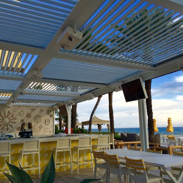
The Arcadia Louvered Roof enhances the beauty of any style home and provides the flexibility of having an open roof when the weather is good or a solid roof to keep the rain off your patio when the weather turns bad.
Eco-friendly Construction
The Arcadia system is made up of recycled aluminum making it an extremely Green product. It is also eco-friendly, helping consumers save on passive solar heating and cooling.
We Think Green
Arcadia is proud to continue the company's tradition with its approach to Environmental Innovation. From the choice of lightweight materials and lean production methods to the efficiency of its drive system and designs, Arcadia is committed to operating as a more sustainable business and reducing its overall environmental impact.
High-quality Building Materials
Each Arcadia system is a work of art, constructed with care and attention to every little detail.
Our system is powered coated, extruded aluminum with stainless steel components giving us the most durable louvered roof on the market today. From our superior drive system, which is UL & CE certified, down to the stainless steel tex screws that secures the system together. Nothing but the best!
Our low-maintenance components eliminate painting, staining, and waterproofing of traditional shading structures. Using powder-coated aluminum construction prevents warping, cracking, and corrosion.
Photographed by: Roger Chafin
 Metropolis Drafting and Construction Inc
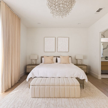
When our client bought this house, it was stuck in limbo between the traditional interior and a 90's modern structure.
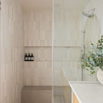
The direction we took was a combination of calm beige color scheme with clean lines and smooth surfaces.
The continuation of the same materials throughout the house finally bonded all the different spaces into a singular home.
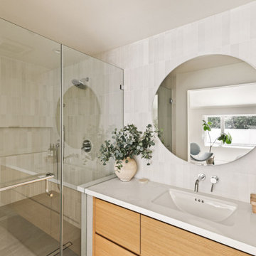
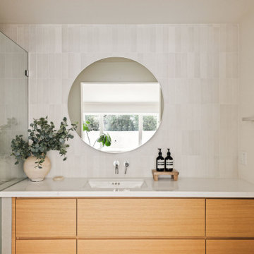
The two guest bathrooms were made with Cloe zellige style tiles and custom floating vanities made from white oak.
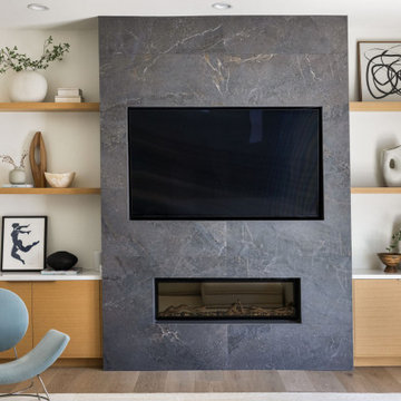
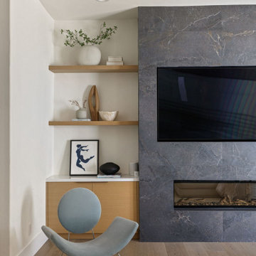
The same oak was used also for the built-in TV wall as floating shelves and base cabinets with a large, tiled center piece for the recessed TV and the electric fireplace.
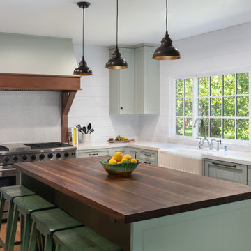
The kitchen also received some of the white oak love in the form of the Island and the recessed cooking area.
The biggest issue with the kitchen space was the lack of proportions between the width and its length vs. the extreme height of the vaulted ceiling.
The solution I came up with was a secondary line of wall cabinets to be the same depth as the full height units to create a wrap around and make the space more proportionate.
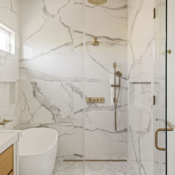
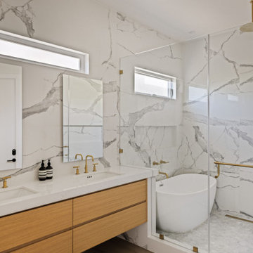
Continuing to the master bathroom, here we have a true walk-in master bath suite, no door needed with this size of space.
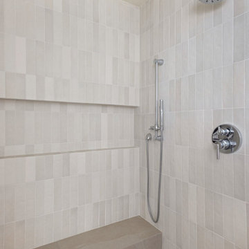
All the walls received porcelain semi slab treatment. (72x36 porcelain tile) a lot of work went into selecting the correct tile pieces to give it the effect of a single slab installation but without the added cost.
All fixtures are by Kohler with their fantastic modern gold finish.
The result was a perfect flow of calm beige colors and warmth of natural wood throughout.
 Valentini Kids Furniture Brooklyn NY
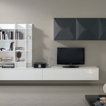
Modern Italian Wall Unit Exential Y13 by Spar
Made in Italy
Exential by Spar is an italian modular wall unit line that could be an excellent design solution for any modern or contemporary styled living room, especially if the space is limited. Individual units allow to organize functionally only those areas you need, which is impossible to do with the joint wall unit compositions. This italian entertainment center will complement your home and the areas of your daily life, not only as an aesthetic, but also as a functional addition, featuring an abundance of storage space, both hidden and exposed, to aid you with the organization of all your belongings, bringing the elegance into your interior. The most impressive feature, making this wall unit composition single out among others, is definitely a three-dimensional development of the doors of the hanging units, that are amusing with the harmonies between lights and shadows, making the whole composition extremely expressive.
The Wall Unit Composition Exential Y13 is shown in the next colors/finishes:
Structure - White Gloss lacquer;
Front - Anthracite and White Gloss lacquers.
PLEASE NOTE: The Exential is a modular wall unit line offering a wide variety of units in different sizes. You can order this wall unit either as a complete composition, as shown in the main picture, or build your own composition according to your own dimensions and preferences. Please contact our office about details on the customization of this wall unit.
MATERIAL/CONSTRUCTION:
Structure: Made with particle board of wood, covered with E1 melamine finishes or high gloss lacquer
Drawers: Made with panels of wood particles in E1-coated finish PVC beech. Metal runners with fine race to fall
Glass: 4mm glass
The starting price is for the Exential Wall Unit Composition Y13 as shown in the main picture.
Dimensions:
Wall Unit Composition: W141.7" x D15" x H72"
Find the right local pro for your project
 Metropolis Drafting and Construction Inc
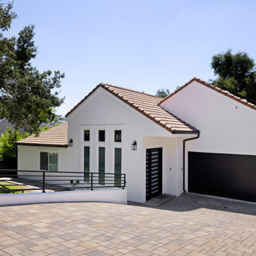
When our client bought this house, it was stuck in limbo between the traditional interior and a 90's modern structure.
The direction we took was a combination of calm beige color scheme with clean lines and smooth surfaces.
The continuation of the same materials throughout the house finally bonded all the different spaces into a singular home.
The two guest bathrooms were made with Cloe zellige style tiles and custom floating vanities made from white oak.
The same oak was used also for the built-in TV wall as floating shelves and base cabinets with a large, tiled center piece for the recessed TV and the electric fireplace.
The kitchen also received some of the white oak love in the form of the Island and the recessed cooking area.
The biggest issue with the kitchen space was the lack of proportions between the width and its length vs. the extreme height of the vaulted ceiling.
The solution I came up with was a secondary line of wall cabinets to be the same depth as the full height units to create a wrap around and make the space more proportionate.
Continuing to the master bathroom, here we have a true walk-in master bath suite, no door needed with this size of space.
All the walls received porcelain semi slab treatment. (72x36 porcelain tile) a lot of work went into selecting the correct tile pieces to give it the effect of a single slab installation but without the added cost.
All fixtures are by Kohler with their fantastic modern gold finish.
The result was a perfect flow of calm beige colors and warmth of natural wood throughout.
 Metropolis Drafting and Construction Inc
An original 1930’s English Tudor with only 2 bedrooms and 1 bath spanning about 1730 sq.ft. was purchased by a family with 2 amazing young kids, we saw the potential of this property to become a wonderful nest for the family to grow.
The plan was to reach a 2550 sq. ft. home with 4 bedroom and 4 baths spanning over 2 stories.
With continuation of the exiting architectural style of the existing home.
A large 1000sq. ft. addition was constructed at the back portion of the house to include the expended master bedroom and a second-floor guest suite with a large observation balcony overlooking the mountains of Angeles Forest.
An L shape staircase leading to the upstairs creates a moment of modern art with an all white walls and ceilings of this vaulted space act as a picture frame for a tall window facing the northern mountains almost as a live landscape painting that changes throughout the different times of day.
Tall high sloped roof created an amazing, vaulted space in the guest suite with 4 uniquely designed windows extruding out with separate gable roof above.
The downstairs bedroom boasts 9’ ceilings, extremely tall windows to enjoy the greenery of the backyard, vertical wood paneling on the walls add a warmth that is not seen very often in today’s new build.
The master bathroom has a showcase 42sq. walk-in shower with its own private south facing window to illuminate the space with natural morning light. A larger format wood siding was using for the vanity backsplash wall and a private water closet for privacy.
In the interior reconfiguration and remodel portion of the project the area serving as a family room was transformed to an additional bedroom with a private bath, a laundry room and hallway.
The old bathroom was divided with a wall and a pocket door into a powder room the leads to a tub room.
The biggest change was the kitchen area, as befitting to the 1930’s the dining room, kitchen, utility room and laundry room were all compartmentalized and enclosed.
We eliminated all these partitions and walls to create a large open kitchen area that is completely open to the vaulted dining room. This way the natural light the washes the kitchen in the morning and the rays of sun that hit the dining room in the afternoon can be shared by the two areas.
The opening to the living room remained only at 8’ to keep a division of space.
 Metropolis Drafting and Construction Inc
When our client bought this house, it was stuck in limbo between the traditional interior and a 90's modern structure.
The direction we took was a combination of calm beige color scheme with clean lines and smooth surfaces.
The continuation of the same materials throughout the house finally bonded all the different spaces into a singular home.
The two guest bathrooms were made with Cloe zellige style tiles and custom floating vanities made from white oak.
The same oak was used also for the built-in TV wall as floating shelves and base cabinets with a large, tiled center piece for the recessed TV and the electric fireplace.
The kitchen also received some of the white oak love in the form of the Island and the recessed cooking area.
The biggest issue with the kitchen space was the lack of proportions between the width and its length vs. the extreme height of the vaulted ceiling.
The solution I came up with was a secondary line of wall cabinets to be the same depth as the full height units to create a wrap around and make the space more proportionate.
Continuing to the master bathroom, here we have a true walk-in master bath suite, no door needed with this size of space.
All the walls received porcelain semi slab treatment. (72x36 porcelain tile) a lot of work went into selecting the correct tile pieces to give it the effect of a single slab installation but without the added cost.
All fixtures are by Kohler with their fantastic modern gold finish.
The result was a perfect flow of calm beige colors and warmth of natural wood throughout.
 Metropolis Drafting and Construction Inc
When our client bought this house, it was stuck in limbo between the traditional interior and a 90's modern structure.
The direction we took was a combination of calm beige color scheme with clean lines and smooth surfaces.
The continuation of the same materials throughout the house finally bonded all the different spaces into a singular home.
The two guest bathrooms were made with Cloe zellige style tiles and custom floating vanities made from white oak.
The same oak was used also for the built-in TV wall as floating shelves and base cabinets with a large, tiled center piece for the recessed TV and the electric fireplace.
The kitchen also received some of the white oak love in the form of the Island and the recessed cooking area.
The biggest issue with the kitchen space was the lack of proportions between the width and its length vs. the extreme height of the vaulted ceiling.
The solution I came up with was a secondary line of wall cabinets to be the same depth as the full height units to create a wrap around and make the space more proportionate.
Continuing to the master bathroom, here we have a true walk-in master bath suite, no door needed with this size of space.
All the walls received porcelain semi slab treatment. (72x36 porcelain tile) a lot of work went into selecting the correct tile pieces to give it the effect of a single slab installation but without the added cost.
All fixtures are by Kohler with their fantastic modern gold finish.
The result was a perfect flow of calm beige colors and warmth of natural wood throughout.

Sponsored
Columbus, OH

Hope Restoration & General Contracting
Columbus Design-Build, Kitchen & Bath Remodeling, Historic Renovations
 Metropolis Drafting and Construction Inc
When our client bought this house, it was stuck in limbo between the traditional interior and a 90's modern structure.
The direction we took was a combination of calm beige color scheme with clean lines and smooth surfaces.
The continuation of the same materials throughout the house finally bonded all the different spaces into a singular home.
The two guest bathrooms were made with Cloe zellige style tiles and custom floating vanities made from white oak.
The same oak was used also for the built-in TV wall as floating shelves and base cabinets with a large, tiled center piece for the recessed TV and the electric fireplace.
The kitchen also received some of the white oak love in the form of the Island and the recessed cooking area.
The biggest issue with the kitchen space was the lack of proportions between the width and its length vs. the extreme height of the vaulted ceiling.
The solution I came up with was a secondary line of wall cabinets to be the same depth as the full height units to create a wrap around and make the space more proportionate.
Continuing to the master bathroom, here we have a true walk-in master bath suite, no door needed with this size of space.
All the walls received porcelain semi slab treatment. (72x36 porcelain tile) a lot of work went into selecting the correct tile pieces to give it the effect of a single slab installation but without the added cost.
All fixtures are by Kohler with their fantastic modern gold finish.
The result was a perfect flow of calm beige colors and warmth of natural wood throughout.
 Metropolis Drafting and Construction Inc
When our client bought this house, it was stuck in limbo between the traditional interior and a 90's modern structure.
The direction we took was a combination of calm beige color scheme with clean lines and smooth surfaces.
The continuation of the same materials throughout the house finally bonded all the different spaces into a singular home.
The two guest bathrooms were made with Cloe zellige style tiles and custom floating vanities made from white oak.
The same oak was used also for the built-in TV wall as floating shelves and base cabinets with a large, tiled center piece for the recessed TV and the electric fireplace.
The kitchen also received some of the white oak love in the form of the Island and the recessed cooking area.
The biggest issue with the kitchen space was the lack of proportions between the width and its length vs. the extreme height of the vaulted ceiling.
The solution I came up with was a secondary line of wall cabinets to be the same depth as the full height units to create a wrap around and make the space more proportionate.
Continuing to the master bathroom, here we have a true walk-in master bath suite, no door needed with this size of space.
All the walls received porcelain semi slab treatment. (72x36 porcelain tile) a lot of work went into selecting the correct tile pieces to give it the effect of a single slab installation but without the added cost.
All fixtures are by Kohler with their fantastic modern gold finish.
The result was a perfect flow of calm beige colors and warmth of natural wood throughout.

 Advance Design Studio, Ltd.
Karen and Chad of Tower Lakes, IL were tired of their unfinished basement functioning as nothing more than a storage area and depressing gym. They wanted to increase the livable square footage of their home with a cohesive finished basement design, while incorporating space for the kids and adults to hang out.
“We wanted to make sure that upon renovating the basement, that we can have a place where we can spend time and watch movies, but also entertain and showcase the wine collection that we have,” Karen said.
After a long search comparing many different remodeling companies, Karen and Chad found Advance Design Studio. They were drawn towards the unique “Common Sense Remodeling” process that simplifies the renovation experience into predictable steps focused on customer satisfaction.
“There are so many other design/build companies, who may not have transparency, or a focused process in mind and I think that is what separated Advance Design Studio from the rest,” Karen said.
Karen loved how designer Claudia Pop was able to take very high-level concepts, “non-negotiable items” and implement them in the initial 3D drawings. Claudia and Project Manager DJ Yurik kept the couple in constant communication through the project. “Claudia was very receptive to the ideas we had, but she was also very good at infusing her own points and thoughts, she was very responsive, and we had an open line of communication,” Karen said.
A very important part of the basement renovation for the couple was the home gym and sauna. The “high-end hotel” look and feel of the openly blended work out area is both highly functional and beautiful to look at. The home sauna gives them a place to relax after a long day of work or a tough workout. “The gym was a very important feature for us,” Karen said. “And I think (Advance Design) did a very great job in not only making the gym a functional area, but also an aesthetic point in our basement”.
An extremely unique wow-factor in this basement is the walk in glass wine cellar that elegantly displays Karen and Chad’s extensive wine collection. Immediate access to the stunning wet bar accompanies the wine cellar to make this basement a popular spot for friends and family.
The custom-built wine bar brings together two natural elements; Calacatta Vicenza Quartz and thick distressed Black Walnut. Sophisticated yet warm Graphite Dura Supreme cabinetry provides contrast to the soft beige walls and the Calacatta Gold backsplash. An undermount sink across from the bar in a matching Calacatta Vicenza Quartz countertop adds functionality and convenience to the bar, while identical distressed walnut floating shelves add an interesting design element and increased storage. Rich true brown Rustic Oak hardwood floors soften and warm the space drawing all the areas together.
Across from the bar is a comfortable living area perfect for the family to sit down at a watch a movie. A full bath completes this finished basement with a spacious walk-in shower, Cocoa Brown Dura Supreme vanity with Calacatta Vicenza Quartz countertop, a crisp white sink and a stainless-steel Voss faucet.
Advance Design’s Common Sense process gives clients the opportunity to walk through the basement renovation process one step at a time, in a completely predictable and controlled environment. “Everything was designed and built exactly how we envisioned it, and we are really enjoying it to it’s full potential,” Karen said.
Constantly striving for customer satisfaction, Advance Design’s success is heavily reliant upon happy clients referring their friends and family. “We definitely will and have recommended Advance Design Studio to friends who are looking to embark on a remodeling project small or large,” Karen exclaimed at the completion of her project.
 Metropolis Drafting and Construction Inc
When our client bought this house, it was stuck in limbo between the traditional interior and a 90's modern structure.
The direction we took was a combination of calm beige color scheme with clean lines and smooth surfaces.
The continuation of the same materials throughout the house finally bonded all the different spaces into a singular home.
The two guest bathrooms were made with Cloe zellige style tiles and custom floating vanities made from white oak.
The same oak was used also for the built-in TV wall as floating shelves and base cabinets with a large, tiled center piece for the recessed TV and the electric fireplace.
The kitchen also received some of the white oak love in the form of the Island and the recessed cooking area.
The biggest issue with the kitchen space was the lack of proportions between the width and its length vs. the extreme height of the vaulted ceiling.
The solution I came up with was a secondary line of wall cabinets to be the same depth as the full height units to create a wrap around and make the space more proportionate.
Continuing to the master bathroom, here we have a true walk-in master bath suite, no door needed with this size of space.
All the walls received porcelain semi slab treatment. (72x36 porcelain tile) a lot of work went into selecting the correct tile pieces to give it the effect of a single slab installation but without the added cost.
All fixtures are by Kohler with their fantastic modern gold finish.
The result was a perfect flow of calm beige colors and warmth of natural wood throughout.
 Metropolis Drafting and Construction Inc
An original 1930’s English Tudor with only 2 bedrooms and 1 bath spanning about 1730 sq.ft. was purchased by a family with 2 amazing young kids, we saw the potential of this property to become a wonderful nest for the family to grow.
The plan was to reach a 2550 sq. ft. home with 4 bedroom and 4 baths spanning over 2 stories.
With continuation of the exiting architectural style of the existing home.
A large 1000sq. ft. addition was constructed at the back portion of the house to include the expended master bedroom and a second-floor guest suite with a large observation balcony overlooking the mountains of Angeles Forest.
An L shape staircase leading to the upstairs creates a moment of modern art with an all white walls and ceilings of this vaulted space act as a picture frame for a tall window facing the northern mountains almost as a live landscape painting that changes throughout the different times of day.
Tall high sloped roof created an amazing, vaulted space in the guest suite with 4 uniquely designed windows extruding out with separate gable roof above.
The downstairs bedroom boasts 9’ ceilings, extremely tall windows to enjoy the greenery of the backyard, vertical wood paneling on the walls add a warmth that is not seen very often in today’s new build.
The master bathroom has a showcase 42sq. walk-in shower with its own private south facing window to illuminate the space with natural morning light. A larger format wood siding was using for the vanity backsplash wall and a private water closet for privacy.
In the interior reconfiguration and remodel portion of the project the area serving as a family room was transformed to an additional bedroom with a private bath, a laundry room and hallway.
The old bathroom was divided with a wall and a pocket door into a powder room the leads to a tub room.
The biggest change was the kitchen area, as befitting to the 1930’s the dining room, kitchen, utility room and laundry room were all compartmentalized and enclosed.
We eliminated all these partitions and walls to create a large open kitchen area that is completely open to the vaulted dining room. This way the natural light the washes the kitchen in the morning and the rays of sun that hit the dining room in the afternoon can be shared by the two areas.
The opening to the living room remained only at 8’ to keep a division of space.
 Metropolis Drafting and Construction Inc
When our client bought this house, it was stuck in limbo between the traditional interior and a 90's modern structure.
The direction we took was a combination of calm beige color scheme with clean lines and smooth surfaces.
The continuation of the same materials throughout the house finally bonded all the different spaces into a singular home.
The two guest bathrooms were made with Cloe zellige style tiles and custom floating vanities made from white oak.
The same oak was used also for the built-in TV wall as floating shelves and base cabinets with a large, tiled center piece for the recessed TV and the electric fireplace.
The kitchen also received some of the white oak love in the form of the Island and the recessed cooking area.
The biggest issue with the kitchen space was the lack of proportions between the width and its length vs. the extreme height of the vaulted ceiling.
The solution I came up with was a secondary line of wall cabinets to be the same depth as the full height units to create a wrap around and make the space more proportionate.
Continuing to the master bathroom, here we have a true walk-in master bath suite, no door needed with this size of space.
All the walls received porcelain semi slab treatment. (72x36 porcelain tile) a lot of work went into selecting the correct tile pieces to give it the effect of a single slab installation but without the added cost.
All fixtures are by Kohler with their fantastic modern gold finish.
The result was a perfect flow of calm beige colors and warmth of natural wood throughout.

 Metropolis Drafting and Construction Inc
When our client bought this house, it was stuck in limbo between the traditional interior and a 90's modern structure.
The direction we took was a combination of calm beige color scheme with clean lines and smooth surfaces.
The continuation of the same materials throughout the house finally bonded all the different spaces into a singular home.
The two guest bathrooms were made with Cloe zellige style tiles and custom floating vanities made from white oak.
The same oak was used also for the built-in TV wall as floating shelves and base cabinets with a large, tiled center piece for the recessed TV and the electric fireplace.
The kitchen also received some of the white oak love in the form of the Island and the recessed cooking area.
The biggest issue with the kitchen space was the lack of proportions between the width and its length vs. the extreme height of the vaulted ceiling.
The solution I came up with was a secondary line of wall cabinets to be the same depth as the full height units to create a wrap around and make the space more proportionate.
Continuing to the master bathroom, here we have a true walk-in master bath suite, no door needed with this size of space.
All the walls received porcelain semi slab treatment. (72x36 porcelain tile) a lot of work went into selecting the correct tile pieces to give it the effect of a single slab installation but without the added cost.
All fixtures are by Kohler with their fantastic modern gold finish.
The result was a perfect flow of calm beige colors and warmth of natural wood throughout.
 Medallion Cabinetry
"The homeowners wanted a kitchen that reflected their personalities and cooking styles. Sophisticated but still elegant." designer Rodney Lee of York, PA.
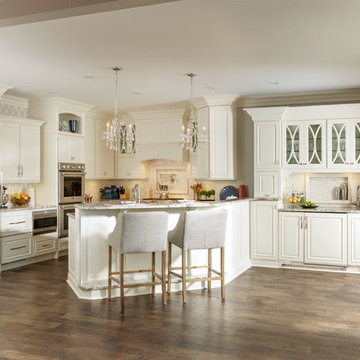
After designing a successful home office space remodel, our same client came back to us to discuss plans and possibilities for their kitchen renovation. After a few discussions with the client, we decided the overall design concept for their kitchen would be “Sophisticated Elegance.” The homeowners wanted a kitchen that reflected their personalities and their cooking styles. Sophisticated but still elegant. The space had to be extremely functional and the color scheme had to have a certain warmth that matched the rest of their home.
The Medallion line has a wide range of architectural elements that helped us achieve that “Sophisticated Elegance”; curved/arched range hood, openings, valances, and corbels and trim. The “Sophistication” lies purely in the detail, the fixtures, the angles in the peninsula, and the changes in height and depth.
We wanted the color scheme to be as warm as possible as it would be in a bright, elegant space. We considered two colors and ended up choosing Divinity over the White Icing. The grey tones in the marble backsplash tile kept the colors modern but warm. We used natural stone versus the more aggregated quartz to maintain the use of natural product and unpredictable patterns and natural elements. We also used a dark rich stain on walnut wood as a good break from all the bright painted finishes. Oak and walnut reflect the “heart” of Pennsylvania and was a great way to maintain the use of natural elements.
The kitchen was divided into individual areas, each one focused on a particular need and/or function. My biggest challenge was transitioning the peninsula into the wet bar/hutch area while maintaining proper separation from the kitchen cabinetry and still tying it into the rest of the space.
A wealth of storage solutions.
•Desk Area. The client wanted a functional work area so we created a furniture look with ogee edging in the walnut, provincial toe space detail in solid walnut, and open display storage at top. The desk has plenty of storage.
•Main Kitchen. We were able to open up this space by creating smart transitions and separations using custom Medallion products that cater to the clients’ lifestyle. Each piece is functional while staying true to the sophisticated elegance design throughout the home.
◦Main Cabinetry: Medallion Gold Wellington Maple Divinity Classic Paint
◦48" uppers around range area; glass eclipse mullion-arched hood design
◦Mixer lift base left of range; drawer warmer with custom panel
•The main work station, or power spot, can hold up to five work stations comfortably. The cook can work within the confines of the peninsula design and access everything needed to prepare complete meals in 1-2 steps. Every cabinet has deluxe roll-out trays and/or drawers, making this kitchen fully accessible. The client wanted to be able to display and stage different pieces and concepts during holidays and gatherings. We chose to go with the more modern Mission arch above the wall oven and fridge, which complimented many of the hard angles and distinct lines used in the kitchen space.
My favorite part of this kitchen remodel came about just by listening to our client talk about how much they adored their daughter’s artwork. After numerous conversations, we landed on installing an artwork wall that was designed as a conversation piece and provides the ability to install different works of art.
 Metropolis Drafting and Construction Inc
When our client bought this house, it was stuck in limbo between the traditional interior and a 90's modern structure.
The direction we took was a combination of calm beige color scheme with clean lines and smooth surfaces.
The continuation of the same materials throughout the house finally bonded all the different spaces into a singular home.
The two guest bathrooms were made with Cloe zellige style tiles and custom floating vanities made from white oak.
The same oak was used also for the built-in TV wall as floating shelves and base cabinets with a large, tiled center piece for the recessed TV and the electric fireplace.
The kitchen also received some of the white oak love in the form of the Island and the recessed cooking area.
The biggest issue with the kitchen space was the lack of proportions between the width and its length vs. the extreme height of the vaulted ceiling.
The solution I came up with was a secondary line of wall cabinets to be the same depth as the full height units to create a wrap around and make the space more proportionate.
Continuing to the master bathroom, here we have a true walk-in master bath suite, no door needed with this size of space.
All the walls received porcelain semi slab treatment. (72x36 porcelain tile) a lot of work went into selecting the correct tile pieces to give it the effect of a single slab installation but without the added cost.
All fixtures are by Kohler with their fantastic modern gold finish.
The result was a perfect flow of calm beige colors and warmth of natural wood throughout.
 Metropolis Drafting and Construction Inc
When our client bought this house, it was stuck in limbo between the traditional interior and a 90's modern structure.
The direction we took was a combination of calm beige color scheme with clean lines and smooth surfaces.
The continuation of the same materials throughout the house finally bonded all the different spaces into a singular home.
The two guest bathrooms were made with Cloe zellige style tiles and custom floating vanities made from white oak.
The same oak was used also for the built-in TV wall as floating shelves and base cabinets with a large, tiled center piece for the recessed TV and the electric fireplace.
The kitchen also received some of the white oak love in the form of the Island and the recessed cooking area.
The biggest issue with the kitchen space was the lack of proportions between the width and its length vs. the extreme height of the vaulted ceiling.
The solution I came up with was a secondary line of wall cabinets to be the same depth as the full height units to create a wrap around and make the space more proportionate.
Continuing to the master bathroom, here we have a true walk-in master bath suite, no door needed with this size of space.
All the walls received porcelain semi slab treatment. (72x36 porcelain tile) a lot of work went into selecting the correct tile pieces to give it the effect of a single slab installation but without the added cost.
All fixtures are by Kohler with their fantastic modern gold finish.
The result was a perfect flow of calm beige colors and warmth of natural wood throughout.
Sponsored
Columbus, OH
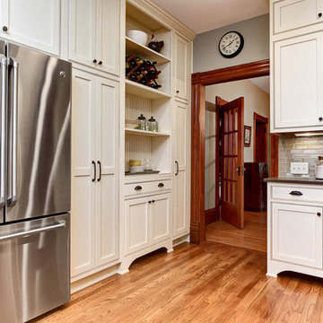
Hope Restoration & General Contracting
Columbus Design-Build, Kitchen & Bath Remodeling, Historic Renovations
 Metropolis Drafting and Construction Inc
When our client bought this house, it was stuck in limbo between the traditional interior and a 90's modern structure.
The direction we took was a combination of calm beige color scheme with clean lines and smooth surfaces.
The continuation of the same materials throughout the house finally bonded all the different spaces into a singular home.
The two guest bathrooms were made with Cloe zellige style tiles and custom floating vanities made from white oak.
The same oak was used also for the built-in TV wall as floating shelves and base cabinets with a large, tiled center piece for the recessed TV and the electric fireplace.
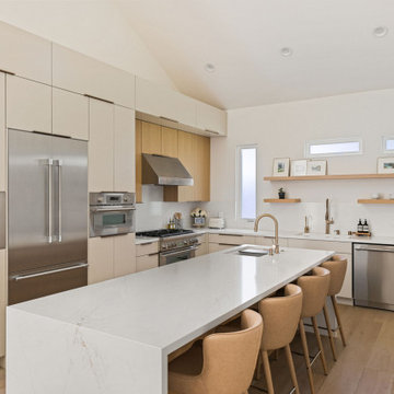
The kitchen also received some of the white oak love in the form of the Island and the recessed cooking area.
The biggest issue with the kitchen space was the lack of proportions between the width and its length vs. the extreme height of the vaulted ceiling.
The solution I came up with was a secondary line of wall cabinets to be the same depth as the full height units to create a wrap around and make the space more proportionate.
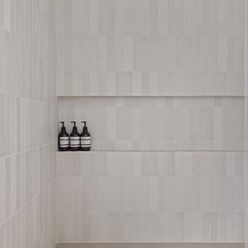
Continuing to the master bathroom, here we have a true walk-in master bath suite, no door needed with this size of space.
All the walls received porcelain semi slab treatment. (72x36 porcelain tile) a lot of work went into selecting the correct tile pieces to give it the effect of a single slab installation but without the added cost.
All fixtures are by Kohler with their fantastic modern gold finish.
The result was a perfect flow of calm beige colors and warmth of natural wood throughout.
 Metropolis Drafting and Construction Inc
When our client bought this house, it was stuck in limbo between the traditional interior and a 90's modern structure.
The direction we took was a combination of calm beige color scheme with clean lines and smooth surfaces.
The continuation of the same materials throughout the house finally bonded all the different spaces into a singular home.
The two guest bathrooms were made with Cloe zellige style tiles and custom floating vanities made from white oak.
The same oak was used also for the built-in TV wall as floating shelves and base cabinets with a large, tiled center piece for the recessed TV and the electric fireplace.
The kitchen also received some of the white oak love in the form of the Island and the recessed cooking area.
The biggest issue with the kitchen space was the lack of proportions between the width and its length vs. the extreme height of the vaulted ceiling.
The solution I came up with was a secondary line of wall cabinets to be the same depth as the full height units to create a wrap around and make the space more proportionate.
Continuing to the master bathroom, here we have a true walk-in master bath suite, no door needed with this size of space.
All the walls received porcelain semi slab treatment. (72x36 porcelain tile) a lot of work went into selecting the correct tile pieces to give it the effect of a single slab installation but without the added cost.
All fixtures are by Kohler with their fantastic modern gold finish.
The result was a perfect flow of calm beige colors and warmth of natural wood throughout.
 Metropolis Drafting and Construction Inc
When our client bought this house, it was stuck in limbo between the traditional interior and a 90's modern structure.
The direction we took was a combination of calm beige color scheme with clean lines and smooth surfaces.
The continuation of the same materials throughout the house finally bonded all the different spaces into a singular home.
The two guest bathrooms were made with Cloe zellige style tiles and custom floating vanities made from white oak.
The same oak was used also for the built-in TV wall as floating shelves and base cabinets with a large, tiled center piece for the recessed TV and the electric fireplace.
The kitchen also received some of the white oak love in the form of the Island and the recessed cooking area.
The biggest issue with the kitchen space was the lack of proportions between the width and its length vs. the extreme height of the vaulted ceiling.
The solution I came up with was a secondary line of wall cabinets to be the same depth as the full height units to create a wrap around and make the space more proportionate.
Continuing to the master bathroom, here we have a true walk-in master bath suite, no door needed with this size of space.
All the walls received porcelain semi slab treatment. (72x36 porcelain tile) a lot of work went into selecting the correct tile pieces to give it the effect of a single slab installation but without the added cost.
All fixtures are by Kohler with their fantastic modern gold finish.
The result was a perfect flow of calm beige colors and warmth of natural wood throughout.
64