
Search results for "Facilitation" in Home Design Ideas
 Matt Fajkus Architecture
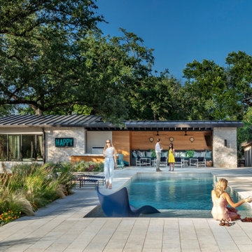
Situated within a one-acre lot in Austin’s Tarry Trail neighborhood, the backyard of this existing 1933- vintage historical house was underutilized. The owners felt that the main drawbacks of the existing backyard were a general disconnection between each outdoor area and a general lack of relationship to the house proper. Therefore, the primary goal of the redesign was a scheme that would promote the use of the outdoor zones, with the pool as a centerpiece.
The first major design move was to frame the pool with a new structure as a backdrop. This cabana is perpendicular to the main house and creates a clear “bookend” to the upper level deck while housing indoor and outdoor activities. Under the cabana’s overhang, an integrated seating space offers a balance of sunlight and shade while an outdoor grill and bar area facilitate the family’s outdoor lifestyle. The only enclosed program exists as a naturally lit perch within the canopy of the trees, providing a serene environment to exercise within the comfort of a climate-controlled space.
A corollary focus was to create sectional variation within the volume of the pool to encourage dynamic use at both ends while relating to the interior program of the home. A shallow beach zone for children to play is located near the family room and the access to the play space in the yard below. At the opposite end of the pool, outside the formal living room, another shallow space is made to be a splash-free sunbathing area perfect for enjoying an adult beverage.
The functional separation set up by the pool creates a subtle and natural division between the energetic family spaces for playing, lounging, and grilling, and the composed, entertaining and dining spaces. The pool also enhances the formal program of the house by acting as a reflecting pool within a composed view from the front entry that draws visitors to an outdoor dining area under a majestic oak tree.
By acting as a connector between the house and the yard, the elongated pool bridges the day-to-day activities within the house and the lush, sprawling backyard. Planter beds and low walls provide loose constraints to organize the overall outdoor living area, while allowing the space to spill out into the yard. Terraces navigate the sectional change in the landscape, offering a passage to the lower yard where children can play on the grass as the parents lounge by the outdoor fireplace.
 Anna Rodé Designs, Inc.
Rancho Photos Real Estate Photography, www.ranchophotos.com
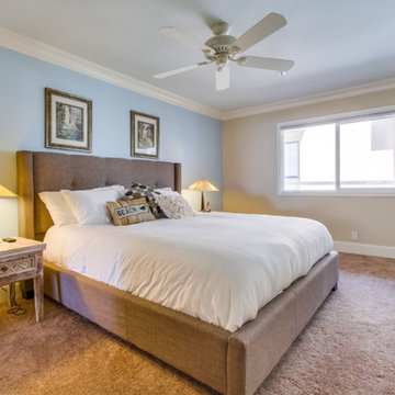
Bedroom - mid-sized coastal master carpeted bedroom idea in San Diego with blue walls and no fireplace
Bedroom - mid-sized coastal master carpeted bedroom idea in San Diego with blue walls and no fireplace
 Houseplay Renovations LLC
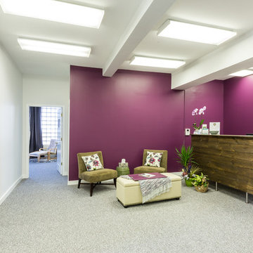
This Jersey City, NJ space was the first permanent ‘home’ for the yoga studio, so it was essential for us to listen well and design a space to serve their needs for years to come. Through our design process, we helped to guide the owners through the fit-out of their new studio location that required minimal demolition and disruption to the existing space.
Together, we converted a space originally used as a preschool into a welcoming, spacious yoga studio for local yogis. We created one main yoga studio by combining four small classrooms into a single larger space with new walls, while all the other program spaces (including designated areas for holistic treatments, massage, and bodywork) were accommodated into pre-existing rooms.
Our team completed all demo, sheetrock, electrical, and painting aspects of the project. (The studio owners did some of the work themselves, and a different company installed the flooring and carpets.) The results speak for themselves: a peaceful, restorative space to facilitate health and healing for the studio’s community.
Looking to renovate your place of business? Contact the Houseplay team; we’ll help make it happen!
Photo Credit: Anne Ruthmann Photography
Find the right local pro for your project
 Drewett Works
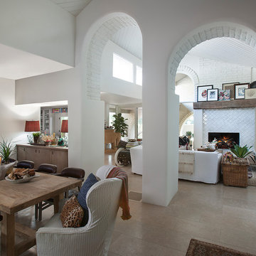
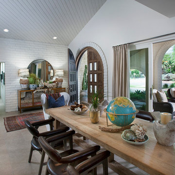
This Paradise Valley stunner was a down-to-the-studs renovation. The owner, a successful business woman and owner of Bungalow Scottsdale -- a fabulous furnishings store, had a very clear vision. DW's mission was to re-imagine the 1970's solid block home into a modern and open place for a family of three. The house initially was very compartmentalized including lots of small rooms and too many doors to count. With a mantra of simplify, simplify, simplify, Architect CP Drewett began to look for the hidden order to craft a space that lived well.
This residence is a Moroccan world of white topped with classic Morrish patterning and finished with the owner's fabulous taste. The kitchen was established as the home's center to facilitate the owner's heart and swagger for entertaining. The public spaces were reimagined with a focus on hospitality. Practicing great restraint with the architecture set the stage for the owner to showcase objects in space. Her fantastic collection includes a glass-top faux elephant tusk table from the set of the infamous 80's television series, Dallas.
It was a joy to create, collaborate, and now celebrate this amazing home.
Project Details:
Architecture: C.P. Drewett, AIA, NCARB; Drewett Works, Scottsdale, AZ
Interior Selections: Linda Criswell, Bungalow Scottsdale, Scottsdale, AZ
Photography: Dino Tonn, Scottsdale, AZ
Featured in: Phoenix Home and Garden, June 2015, "Eclectic Remodel", page 87.
 Drewett Works
This Paradise Valley stunner was a down-to-the-studs renovation. The owner, a successful business woman and owner of Bungalow Scottsdale -- a fabulous furnishings store, had a very clear vision. DW's mission was to re-imagine the 1970's solid block home into a modern and open place for a family of three. The house initially was very compartmentalized including lots of small rooms and too many doors to count. With a mantra of simplify, simplify, simplify, Architect CP Drewett began to look for the hidden order to craft a space that lived well.
This residence is a Moroccan world of white topped with classic Morrish patterning and finished with the owner's fabulous taste. The kitchen was established as the home's center to facilitate the owner's heart and swagger for entertaining. The public spaces were reimagined with a focus on hospitality. Practicing great restraint with the architecture set the stage for the owner to showcase objects in space. Her fantastic collection includes a glass-top faux elephant tusk table from the set of the infamous 80's television series, Dallas.
It was a joy to create, collaborate, and now celebrate this amazing home.
Project Details:
Architecture: C.P. Drewett, AIA, NCARB; Drewett Works, Scottsdale, AZ
Interior Selections: Linda Criswell, Bungalow Scottsdale, Scottsdale, AZ
Photography: Dino Tonn, Scottsdale, AZ
Featured in: Phoenix Home and Garden, June 2015, "Eclectic Remodel", page 87.
 Drury Design
THE SETUP
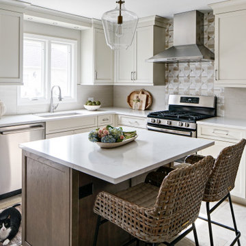
Client Background: Our clients, a couple who have transitioned into the empty nest phase, have cherished their home for over three decades without undergoing any significant renovations. With a newfound desire to adapt their living space to better suit their current lifestyle, they’ve embarked on a journey to reimagine their kitchen — the heart of their home. Their aspiration is to cultivate a serene, neutral-toned sanctuary on the first floor that seamlessly merges with their family room, ensuring a harmonious and inviting environment.
Design Inspiration: The renovation is inspired by the couple’s penchant for soft, calming neutrals, using their cherished family room and the kitchen’s existing tile flooring as the cornerstone for the color scheme. This approach aims to foster a sense of warmth and tranquility throughout.
Design Objectives:
Harmonize the kitchen with the family room by adopting a soothing, neutral color scheme, ensuring a seamless flow across the first floor.
Enhance kitchen functionality with thoughtfully designed cabinetry, providing a designated place for every item and maximizing storage efficiency.
Cultivate an inviting and comfortable atmosphere that reflects the homeowners’ desire for a calm and relaxing space.
Design Challenges:
The homeowners wish to retain the existing kitchen tile flooring and integrate it into a refreshed, modern design.
Accommodating a dining area spacious enough for family visits without compromising the kitchen’s open feel or functional layout.
Despite liking the current placement of plumbing and appliances, the homeowners aspire for a more open floor plan to facilitate better movement and interaction.
The need to amplify natural light in the kitchen, especially around the sink area, where existing lighting is insufficient.
Preserving the half-wall between the kitchen and family room, a feature the homeowners want to keep, while ensuring it complements the new design.
THE RENEWED SPACE
Design Solutions:
By choosing a neutral color palette that complements the existing tile, the design unifies the kitchen with the adjacent spaces. The tile’s grout was cleaned and restored, enhancing the floor’s appearance and integrating it seamlessly with the new kitchen aesthetic.
The inclusion of a larger island with seating for two, alongside maintaining a substantial dining table, was achieved by optimizing the spatial layout. This allowed for a sociable yet functional kitchen, accommodating large family gatherings without feeling crowded.
Minor adjustments to the kitchen’s layout maintained the preferred locations for plumbing and appliances while introducing an ‘open’ design concept. Strategic modifications, such as angling the pantry wall, improved the flow and accessibility within the space.
Replacing the garden window with a broader, standard window significantly increased natural light, transforming the sink area into a bright, welcoming space with enhanced views of the outdoors.
The decision to keep the half-wall was ingeniously leveraged to define the dining area while maintaining an open connection to the family room. This feature not only serves as a visual separator but also ties the two spaces together through the shared color scheme and design elements.
The homeowners are thrilled with their newly remodeled kitchen, which has become a hub of warmth and hospitality. Hosting a wedding shower and a birthday party, they have shared their renewed space with friends and family, who have been equally enamored. This remodel has not only met their functional and aesthetic desires but has also enriched their home with a fresh sense of serenity and joy.
The upstairs part of the home is shaping up nicely. Here’s their newly remodeled primary bathroom.
 Bilotta Kitchen & Home
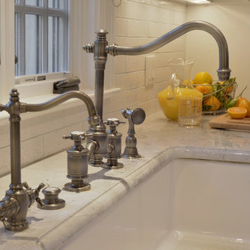
For this project, the entire kitchen was designed around the “must-have” Lacanche range in the stunning French Blue with brass trim. That was the client’s dream and everything had to be built to complement it. Bilotta senior designer, Randy O’Kane, CKD worked with Paul Benowitz and Dipti Shah of Benowitz Shah Architects to contemporize the kitchen while staying true to the original house which was designed in 1928 by regionally noted architect Franklin P. Hammond. The clients purchased the home over two years ago from the original owner. While the house has a magnificent architectural presence from the street, the basic systems, appointments, and most importantly, the layout and flow were inappropriately suited to contemporary living.
The new plan removed an outdated screened porch at the rear which was replaced with the new family room and moved the kitchen from a dark corner in the front of the house to the center. The visual connection from the kitchen through the family room is dramatic and gives direct access to the rear yard and patio. It was important that the island separating the kitchen from the family room have ample space to the left and right to facilitate traffic patterns, and interaction among family members. Hence vertical kitchen elements were placed primarily on existing interior walls. The cabinetry used was Bilotta’s private label, the Bilotta Collection – they selected beautiful, dramatic, yet subdued finishes for the meticulously handcrafted cabinetry. The double islands allow for the busy family to have a space for everything – the island closer to the range has seating and makes a perfect space for doing homework or crafts, or having breakfast or snacks. The second island has ample space for storage and books and acts as a staging area from the kitchen to the dinner table. The kitchen perimeter and both islands are painted in Benjamin Moore’s Paper White. The wall cabinets flanking the sink have wire mesh fronts in a statuary bronze – the insides of these cabinets are painted blue to match the range. The breakfast room cabinetry is Benjamin Moore’s Lampblack with the interiors of the glass cabinets painted in Paper White to match the kitchen. All countertops are Vermont White Quartzite from Eastern Stone. The backsplash is Artistic Tile’s Kyoto White and Kyoto Steel. The fireclay apron-front main sink is from Rohl while the smaller prep sink is from Linkasink. All faucets are from Waterstone in their antique pewter finish. The brass hardware is from Armac Martin and the pendants above the center island are from Circa Lighting. The appliances, aside from the range, are a mix of Sub-Zero, Thermador and Bosch with panels on everything.
 In Detail Interiors
Colorful and rich style
When a repeat client shows up on your doorstep with his third home to furnish and wants to start from scratch and go really bold, you just embrace him, scoot him right up to the resource room, and don’t ask questions! I mean, who does not love a client that embraces velvet, leather, silk and wallcoverings?
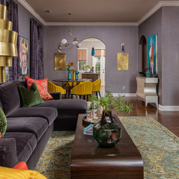
This lush, vibrant lounge space was all created from the want to really deep dive into something different, eclectic and more traveled. The original small, narrow, dimly lit room totally delivered on helping accomplish that mood. Mixing a little of that Ming dynasty-inspired strawberry red with a deep chocolate mohair on the sectional and cladding the room in a soft, amethyst woven wallcovering. We loved the interplay and “non-matchiness” that this space embraced.
Lighting and art were both about telling a story in this room – accenting conversational opportunities and an almost gallery-esque feel. Designating a more dynamic and unusual, sculptural feel – from the harder lines of the statement floor lamp in the living room across to the sprawling, slightly modern bloom of the dining area fixture.
Jewel of a space
The area rug had to ground the already bold furniture and lend itself to the darker wood floors, and a dusky green wool proved the ticket. We loved the almost pixelated pattern the hand-knotted wool lent to the overall design. A little hint of oxblood, chocolate and blue picked up in accents elsewhere, but the tone of almost jade really caught us about this piece.
Not enough can be said about the accent of a dining space either (which in terms of space planning was the only way to balance this long, narrow “hallway” of a room off the kitchen). Citron velvet on the low-profile chairs left the space feeling open, but fun for games and cocktail parties. Plus, the cerused wood dining table was a great complement – offering depth without a conflict to the existing flooring or nearby sectional.
Being able to view this space as a whole was very important to us! From the selection of sconces carried throughout (that wonky placement was existing and with so little opportunity to add cans we had to play up the new fixtures in a way that make them feel purposeful and desirable.), to the balance of color and temperature in each furniture grouping. Sometimes working floor to ceiling in an existing space can pose a lot of unique challenges when it comes to furnishing projects. However, we loved that the client embraced our drive to really punch up the visual feel of this living/dining combo. Also, we know the enjoyment he gets from the finished product is a testament to hunting for the right pieces, designing with unusual and luxe fabric combinations, and managing the inclusion of budget-friendly surprises that always balance a job well done.
What the client says
“From the moment that Cheryl arrived, I felt that she was definitely the designer that I needed to help facilitate & execute my vision for the space. I’m not the “cookie cutter” type, and I immediately realized that Cheryl had a knack for envisioning ideas that were unique, yet tasteful, timeless, and sophisticated.”
From its beginnings as a plain Jane envelope, this combination living/dining space becomes a study in texture and color!
 AIBD - American Institute of Building Design
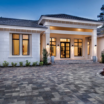
To facilitate the builder's desire to create a successful model home in this large site development with expansive natural preserves, this design creates a sense of presence far greater than its actual size. This was accomplished by a wide yet shallow layout that allows most rooms to look out to rear of home and preserve views beyond. Designed with a West Indies flavor, this thoroughly modern home's layout flows seamlessly from space to space. Each room is bright with lots of natural light, creating a home that takes fullest potential of this unique site.
An ARDA for Model Home Design goes to
The Stater Group, Inc.
Designer: The Sater Group, Inc.
From: Bonita Springs, Florida
 Drewett Works
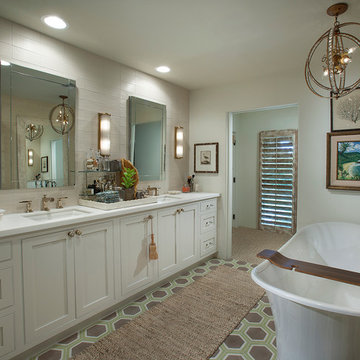
This Paradise Valley stunner was a down-to-the-studs renovation. The owner, a successful business woman and owner of Bungalow Scottsdale -- a fabulous furnishings store, had a very clear vision. DW's mission was to re-imagine the 1970's solid block home into a modern and open place for a family of three. The house initially was very compartmentalized including lots of small rooms and too many doors to count. With a mantra of simplify, simplify, simplify, Architect CP Drewett began to look for the hidden order to craft a space that lived well.
This residence is a Moroccan world of white topped with classic Morrish patterning and finished with the owner's fabulous taste. The kitchen was established as the home's center to facilitate the owner's heart and swagger for entertaining. The public spaces were reimagined with a focus on hospitality. Practicing great restraint with the architecture set the stage for the owner to showcase objects in space. Her fantastic collection includes a glass-top faux elephant tusk table from the set of the infamous 80's television series, Dallas.
It was a joy to create, collaborate, and now celebrate this amazing home.
Project Details:
Architecture: C.P. Drewett, AIA, NCARB; Drewett Works, Scottsdale, AZ
Interior Selections: Linda Criswell, Bungalow Scottsdale, Scottsdale, AZ
Photography: Dino Tonn, Scottsdale, AZ
Featured in: Phoenix Home and Garden, June 2015, "Eclectic Remodel", page 87.
 Edgewater Design Group
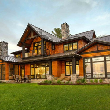
Our clients already had the beautiful lot on Burt Lake, all they needed was the home. We were hired to create an inviting home that had a "craftsman" style of the exterior and a "cottage" style for the interior. They desired to capture a casual, warm, and inviting feeling. The home was to have as much natural light and to take advantage of the amazing lake views. The open concept plan was desired to facilitate lots of family and visitors. The finished design and home is exactly what they hoped for. To quote the owner "Thanks to the expertise and creativity of the design team at Edgewater, we were able to get exactly what we wanted."
-Jacqueline Southby Photography
 Michael Nash Design, Build & Homes
 When the homeowners purchased this traditional colonial in Vienna, Virginia, they were already planning on making some serious changes. The home’s original floor plan was boxy and closed in, making traffic flow from one room to the next virtually non-existent. Additionally, the existing décor left a lot to be desired. Their vision was to open up the layout and create a more contemporary look using lots of light, soft colors and high end materials.
They decided to add a two-story addition to the back of the home’s existing breakfast room and the small upstairs bedroom above it. The old breakfast area was too small for their daily meals and their teenage son needed more space in his bedroom. They also decided to add a sunroom/family room to the left side of their old family room. This new room offers a vaulted ceiling with four skylights and lots of windows with a better view of the side and backyard.
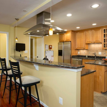
To create a more open floor plan, the team at Michael Nash Design, Build & Homes removed the load bearing wall between the kitchen and family room and installed a large beam to handle the second floor load. Not only did this open up the space, but it allowed for the addition of a breakfast bar.
The right side bearing wall of the old family room was also removed and replaced with structural beams. This action created a continuous flow between the new sunroom and old family room. Separated by a double-sided stone fireplace, this new sunroom is connected to a new outside sun deck built using a maintenance-free decking material. The old family room with new lighting now serves as a casual seating area. It also features an eight-foot long built-in desk.
The newly updated kitchen features granite countertops with matching tile backsplash, professional-quality appliances, a porcelain tile floor and custom cabinets, including a large pantry. The new breakfast room is more spacious and gets daylight from three different angles.
Upstairs, a new 12’ x 20’ bedroom is a great place for this teenage football fan to hang out. It provides significantly more closet space than the old room and lets in more sunlight as well.
The old laundry room was converted to a new mudroom with locker style cabinetry and a place for kids to store their bag packs. New plumbing and electrical were implemented in a new closet in an upper hallway to facilitate the new washer and dryer.
In this remodel, form and function have come together in an open concept design that meets the needs of the entire family.
 Michael Nash Design, Build & Homes
2010 CAPTIAL COTY, HONORABLE MENTION AWARD WINNER, RESIDENTIAL
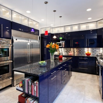
The owners of this single family home were seeking a more colorful, contemporary kitchen style. Other goals for the renovation included having larger appliances, better traffic flow, better lighting and other updated amenities.
To help the couple achieve their goals, the design team at Michael Nash Design, Build & Homes relocated all the electrical and plumbing from the bulk heads to create additional cabinet space. Then, they opened up the bearing wall between the family room and kitchen using structural beams and brought plumbing for a wall mounted faucet and a vessel sink for the wet bar. A new pantry replaced the old doorway to the dining room.
All of the new appliances were relocated to the wall between the kitchen and dining room that was previously blank. It now houses a new 36” refrigerator and 36” freezer, double ovens, and additional cabinets. A central island was installed to accommodate a large cooktop.
The design team then suggested double stack upper cabinetry that contains stainless steel glass door cabinets in upper part with a cobalt blue high-gloss lacquer on the lower part. Use of complementary exotic granite to tie in stainless steel appliances and color of the cabinets is one of the nice features of this job.
The entire kitchen and leading hallway to the front foyer was filled in with very contemporary metallic porcelain tiles. Use of LED lighting, pendant lights and creative paint were just of few of the finishing touches. An old brick fireplace in the family room was covered in granite that complements the kitchen’s colors to facilitate the new connection between the two rooms.
 StoneUnlimited Kitchen and Bath Remodeling
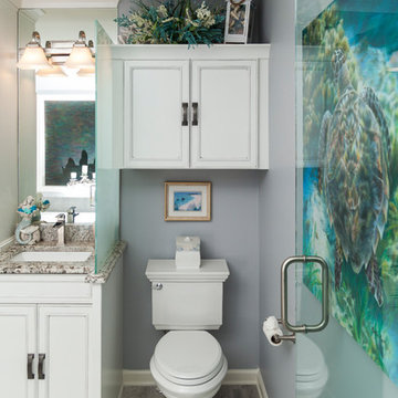
Stoneunlimited Kitchen and Bath can help you design and renovate your bathroom into a seaside oasis that will hold you over until the next time you're able to feel sand between your toes and salty water in your hair. Our Client's desire for their master bathroom was to create a beachy feel that they could enjoy year round and we were more than happy to facilitate the transformation.
The Alaskan White Granite tops mimic the look of wet sand providing contrast to the Waypoint Shaker Style cabinets and storage tower. 3"x17" Porcelain Planks in Vintage Gray add a wood component that is key to any coastal bathroom design and resemble the color of aged board walks and fishing piers. Pebbles in the tub surround, shower accent band and shower floor are similar to ones that can be found on many popular beaches. The decorative details that our client selected for the room such as mermaid dispensers, shells, and beautiful vibrant art work were the perfect touch.
Ample storage space and some privacy to the exposed toilet were needed. The 12" deep tower provides two cabinet pull outs for toiletries and other necessities as well as an 18"x18" cabinet on the top with crown molding finishes and an additional pull out cabinet at the bottom of the tower. Partial privacy for the lavatory was achieved by installing a 45"x29" glass panel.
Here are the items that were utilized in this Stoneunlimited Bathroom Remodel:
Countertops: 3CM Alaskan White Granit with Roman Ogee Edge
Cabinets: WayPoint Living Spaces Door Style: 540F, Maple with painted Pewter Glazed
Cabinet Hardware: Aberdeen Pulls
Sinks: 20"x15" white porcelain rectangular
Tub: 60" Kohler
Tile: 3" x 17" Porcelain Planks in Vintage Gray on the floor
12" x 24 Porcelain Nexus Ice for the shower and tub walls
Island Flat /Stacked Pebbles in the shower and tub surround
Fixtures: Delta in Brushed Nickel Finish
Glass Shower Enclosure: 3/8" Tempered Glass 75" Frameless with standard hinges and D style handle
Mirrors: ¼'" thick topped off with crown molding trim to match the trim finishes on the storage tower
 BDI Furniture
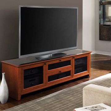
Novia modernizes a traditional design with unique innovations. Features include hidden wheels to ease cabinet movement and facilitate access to the back, cable management to keep your home theater neat and organized, and integrated ventilation to keep your components operating at peak levels.
Novia 8429-2 is a three compartment-wide home theater cabinet perfect for a large TV and home theater system. The versatile center drawer conceals a center channel speaker (up to 7” tall) and media storage or may be removed for speakers up to 8” tall.
 Pinnacle Design & Remodeling
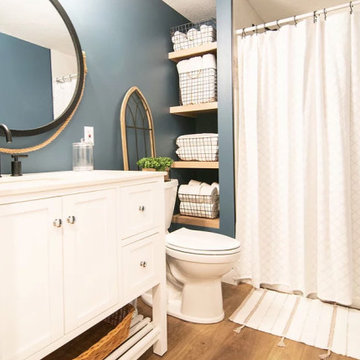
A blank slate and open minds are a perfect recipe for creative design ideas. The homeowner's brother is a custom cabinet maker who brought our ideas to life and then Landmark Remodeling installed them and facilitated the rest of our vision. We had a lot of wants and wishes, and were to successfully do them all, including a gym, fireplace, hidden kid's room, hobby closet, and designer touches.
 Southwest Boulder & Stone
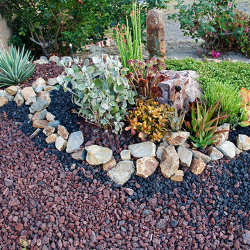
Karen transformed her front yard with 100% drought-tolerant landscaping, using water-wise plants and a wide variety of natural stone materials. Cobble, rubble, pebble, flagstone and crushed rock were combined to create a dry streambed that adds a fluid movement to the yard. A basalt fountain water feature was positioned near the entry.
Since Karen’s home is part of a Homeowner’s Association, speed was essential to the project. She hired Laura Eubanks of Design for Serenity to facilitate the quick turnaround, completing the project in just 5 days. Design for Serenity designed and installed the beautiful landscaping and succulent tapestries, while Karen herself selected the stone.
Karen thinks of landscape rock as a form of art, considering it to be one of the most important elements in her project. She spent several hours with Laura’s team selecting the perfect boulders and materials from our Fallbrook yard. Her hard work paid off: Karen’s guests and HOA neighbors all raved about the impact of natural stone in this total yard transformation.
 Pinnacle Design & Remodeling
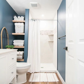
A blank slate and open minds are a perfect recipe for creative design ideas. The homeowner's brother is a custom cabinet maker who brought our ideas to life and then Landmark Remodeling installed them and facilitated the rest of our vision. We had a lot of wants and wishes, and were to successfully do them all, including a gym, fireplace, hidden kid's room, hobby closet, and designer touches.
 Techo-Bloc
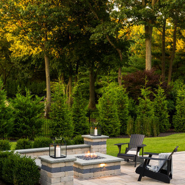
This backyard patio design is inspired by our Blu 60 patio slab. The best-selling Blu slate patio slab was inspired by natural slate stone. This traditional patio stone comes in multiple sizes for your backyard pool decks, patios & walkways. The same lines and rugged texture as our thicker Blu paver, the same opulent colors and traditional look, Blu 60 Slate slab is the choice for pedestrian areas such as on walkways and patios. https://www.techo-bloc.com/shop/slabs/blu-60-slate/
 Drury Design
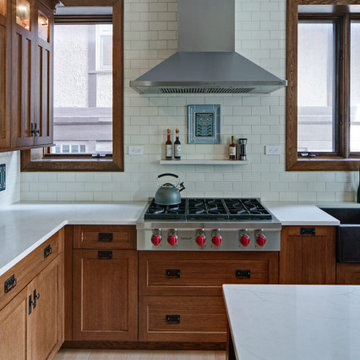
The 100-year old home’s kitchen was old and just didn’t function well. A peninsula in the middle of the main part of the kitchen blocked the path from the back door. This forced the homeowners to mostly use an odd, U-shaped corner of the kitchen.
Design objectives:
-Add an island
-Wow-factor design
-Incorporate arts and crafts with a touch of Mid-century modern style
-Allow for a better work triangle when cooking
-Create a seamless path coming into the home from the backdoor
-Make all the countertops in the space 36” high (the old kitchen had different base cabinet heights)
Design challenges to be solved:
-Island design
-Where to place the sink and dishwasher
-The family’s main entrance into the home is a back door located within the kitchen space. Samantha needed to find a way to make an unobstructed path through the kitchen to the outside
-A large eating area connected to the kitchen felt slightly misplaced – Samantha wanted to bring the kitchen and materials more into this area
-The client does not like appliance garages/cabinets to the counter. The more countertop space, the better!
Design solutions:
-Adding the right island made all the difference! Now the family has a couple of seats within the kitchen space. -Multiple walkways facilitate traffic flow.
-Multiple pantry cabinets (both shallow and deep) are placed throughout the space. A couple of pantry cabinets were even added to the back door wall and wrap around into the breakfast nook to give the kitchen a feel of extending into the adjoining eating area.
-Upper wall cabinets with clear glass offer extra lighting and the opportunity for the client to display her beautiful vases and plates. They add and an airy feel to the space.
-The kitchen had two large existing windows that were ideal for a sink placement. The window closest to the back door made the most sense due to the fact that the other window was in the corner. Now that the sink had a place, we needed to worry about the dishwasher. Samantha didn’t want the dishwasher to be in the way of people coming in the back door – it’s now in the island right across from the sink.
-The homeowners love Motawi Tile. Some fantastic pieces are placed within the backsplash throughout the kitchen. -Larger tiles with borders make for nice accent pieces over the rangetop and by the bar/beverage area.
-The adjacent area for eating is a gorgeous nook with massive windows. We added a built-in furniture-style banquette with additional lower storage cabinets in the same finish. It’s a great way to connect and blend the two areas into what now feels like one big space!
28