
Search results for "Facilitation" in Home Design Ideas
 Barbara Wilson Landscape Architect, LLC
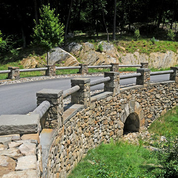
Photos by Barbara Wilson. Bedford equine compound. Mock stone bridge created along the mile long entry drive. Stream channel created with stones to allow runoff from the detention pond on the other side of the bridge flow into an existing wetland and pond downstream.
A lovely equine compound was created out of a 35 acre woodland in Bedford Corners. The design team helped the owners create the home of their dreams out of a parcel with dense woodlands, a pond and NY State wetlands. Barbara was part of the team that helped coordinate local and state wetland permits for building a mile long driveway to the future house site thru wetlands and around an existing pond. She facilitated the layout of the horse paddocks, by obtaining tree permits to clear almost 5 acres for the future grazing areas and an outdoor riding ring. She then supervised the entire development of the landscape on the property. Fences were added enclosing the paddocks. A swimming pool and pool house were laid out to allow easy access to the house without blocking views to the adjacent woodlands. A custom spa was carved out of a piece of ledge at one end of the pool. An outdoor kitchen was designed for the pool area patio and another smaller stand-alone grill was provided at the main house. Mature plantings were added surrounding the house, driveway and outbuildings to create a luxuriant setting for the quaint farmhouse styled home. Mature apple trees were planted along the driveway between the barn and the main house to provide fruit for the family. A custom designed bridge and wood railing system was added along the entry drive where a detention pond overflow connected to an existing pond.

 Simply Home Decorating
This beautiful North Vancouver home belongs to a nature-loving and health-conscious couple, Emma and Vince (names changed), their two young children, and their dog, Jasper. When they contacted us about renovating and furnishing their kitchen and family room, we walked in and saw a world of potential waiting to be uncovered.
Before: Larkhall Crescent Home:
Like many original North Vancouver homes, the interior was definitely dated. We encountered late ‘80s finishes in powder pink and teal green, old carpet, and a kitchen that wasn’t maximized to suit this family’s modern-day lifestyle. However, the size of the rooms offered us a ton of space with which to get creative.
Knowing our clients’ love of cooking, need for work spaces (Emma and Vince both work remotely), and growing family, we developed a design concept that would increase usable space, optimize storage, and create intimacy in this large area. As for the style, we were inspired by their European roots, inventing a new and modern take on “Belgian Farmhouse” style. Now, the home is truly one-of-a-kind.
After: Warm & Cozy Family Room:
Fresh, bright, and comfortable, this living area has been transformed! We started with the fireplace as a focal point, selecting aged brick tiles for added texture and a crisp wood mantle. The taupe-coloured sectional infuses the room with visual warmth and serves the added purpose of separating the family room from the kitchen.
Emma and Vince were also keen on using non-toxic materials in their home, and we were happy to oblige. To meet their needs, we sourced natural wood elements and sought out Canadian-made products - that adhere to high health standards - whenever possible.
Look closer at the elements of this space, and you will find this stunning, honeycomb-patterned rug in earthy gold, beige, and charcoal tones. It’s plush to the touch and full of visual texture that brings this room’s colour palette together. We sourced these two-tone chairs with caning, petrified wood side table, black sconces, and botanical prints in greyscale from local artist, Heather Johnston.
We topped off the space with this dark wood and rattan console that offers storage facing the kitchen and presents an opportunity to display cherished items. The result is a cozy lounging space brimming with comfort and functionality. It’s perfect for enjoying quality family time, or Emma can simply slide the coffee table away to make room for her morning yoga practice.
Now, let’s turn around and give some attention to the kitchen. Do you remember what the original kitchen looked like? If not, scroll back up, because the transformation is shocking…
Moody & Welcoming Kitchen for Healthy Living:
This kitchen looks very different from how it started, right? Though we didn’t touch any walls, the kitchen has almost doubled in usable space! We created a long, extended island with storage, an outlet for small appliances, and seating for comfortable prep, after-school snacking, or mingling among friends.
On the other side of the island, the family has even more storage and an integrated dishwasher within easy reach of the sink, perfect for quick clean-up. From this angle, you can also see the expansive custom Shaker cabinetry in white and the integrated double ovens. These facilitate their cooking experience and gave us the opportunity to add an additional surprise…
A coffee garage station and more hidden storage! Keeping these items located along the perimeter allows them to be accessed by the family or their guests without someone getting under the cook’s feet. These are the little details that make everyday life easier and more enjoyable.
Moving deeper into the kitchen, the seamless induction cooktop topped with a freestanding concealed hood fan commands attention in a soft yet prominent way. The natural wood accent mirrors the fireplace mantle, and the choice of off-black wood-grain cabinets not only continues our black-and-white colour palette but adds a sense of depth and contrast. The corner sink is located to the right and perfectly positioned with a view of their thriving backyard.
To invite more of this family’s character into the space, we mixed metals for interest — matte black, dark pewter, and warm brass — and created open shelves in white oak for their plants and decor. You can also glimpse the tumbled edge of the backsplash tile, which echoes the rustic brick of the fireplace. It adds that farmhouse charm while still feeling timeless and sophisticated.
Last but not least, we designed this dining banquette in the bay window (with integrated bench storage, of course), where the family can share a meal together, the kids can do homework, or Emma and Vince can work and enjoy a change of scenery from their offices. Like the other spaces in the home, it was designed to be beautiful, multi-functional, and long-lasting.
Praise from Our Clients:
It is clear that we love this home, but what did our clients have to say?
“Lori is a visionary and masters execution to the finest detail all at the same time. When she first met us to know more about who we are and how we live, she could right away envision how we could use the space in our kitchen and living room…The results exceeded our expectations.
Lori and her team were also a delight to work with — coordination with all the trades, fast problem-solving, regular updates, professional and friendly attitude of her entire team — made it the dream team. Thank you SHD for making our space so beautiful!”
In turn, we are so grateful for this family’s trust, their open communication, and for being wonderful people with whom to work. (So, thank you!)
 By Design Custom Home Concierge
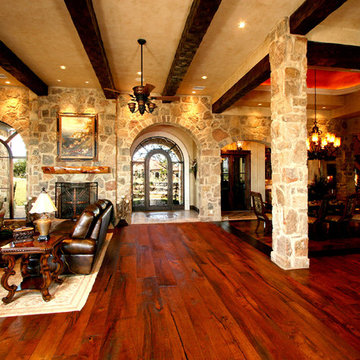
Open and expansive floorplan facilitates easy flow from living, to dining to kitchen while still maintaining a sense of space for each room element.
Inspiration for a huge mediterranean open concept living room remodel in Austin with a stone fireplace
Inspiration for a huge mediterranean open concept living room remodel in Austin with a stone fireplace
Find the right local pro for your project
 MMW Architects
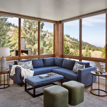
Perched on a forested hillside above Missoula, the Pattee Canyon Residence provides a series of bright, light filled spaces for a young family of six. Set into the hillside, the home appears humble from the street while opening up to panoramic views towards the valley. The family frequently puts on large gatherings for friends of all ages; thus, multiple “eddy out” spaces were created throughout the home for more intimate chats.
Exposed steel structural ribs and generous glazing in the great room create a rhythm and draw one’s gaze to the folding horizon. Smaller windows on the lower level frame intimate portraits of nature. Cedar siding and dark shingle roofing help the home blend in with its piney surroundings. Inside, rough sawn cabinetry and nature inspired tile provide a textural balance with the bright white spaces and contemporary fixtures.
 Stephanie D Poole
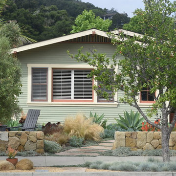
The parkway was designed to provide areas of hardscape where car passengers need to climb in/out. The plant selection is purposely kept low in height so as to facilitate foot traffic, maneuvering cars, and cannot impede car doors.
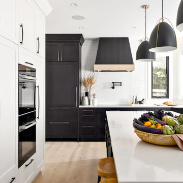 Simply Home Decorating
This beautiful North Vancouver home belongs to a nature-loving and health-conscious couple, Emma and Vince (names changed), their two young children, and their dog, Jasper. When they contacted us about renovating and furnishing their kitchen and family room, we walked in and saw a world of potential waiting to be uncovered.
Before: Larkhall Crescent Home:
Like many original North Vancouver homes, the interior was definitely dated. We encountered late ‘80s finishes in powder pink and teal green, old carpet, and a kitchen that wasn’t maximized to suit this family’s modern-day lifestyle. However, the size of the rooms offered us a ton of space with which to get creative.
Knowing our clients’ love of cooking, need for work spaces (Emma and Vince both work remotely), and growing family, we developed a design concept that would increase usable space, optimize storage, and create intimacy in this large area. As for the style, we were inspired by their European roots, inventing a new and modern take on “Belgian Farmhouse” style. Now, the home is truly one-of-a-kind.
After: Warm & Cozy Family Room:
Fresh, bright, and comfortable, this living area has been transformed! We started with the fireplace as a focal point, selecting aged brick tiles for added texture and a crisp wood mantle. The taupe-coloured sectional infuses the room with visual warmth and serves the added purpose of separating the family room from the kitchen.
Emma and Vince were also keen on using non-toxic materials in their home, and we were happy to oblige. To meet their needs, we sourced natural wood elements and sought out Canadian-made products - that adhere to high health standards - whenever possible.
Look closer at the elements of this space, and you will find this stunning, honeycomb-patterned rug in earthy gold, beige, and charcoal tones. It’s plush to the touch and full of visual texture that brings this room’s colour palette together. We sourced these two-tone chairs with caning, petrified wood side table, black sconces, and botanical prints in greyscale from local artist, Heather Johnston.
We topped off the space with this dark wood and rattan console that offers storage facing the kitchen and presents an opportunity to display cherished items. The result is a cozy lounging space brimming with comfort and functionality. It’s perfect for enjoying quality family time, or Emma can simply slide the coffee table away to make room for her morning yoga practice.
Now, let’s turn around and give some attention to the kitchen. Do you remember what the original kitchen looked like? If not, scroll back up, because the transformation is shocking…
Moody & Welcoming Kitchen for Healthy Living:
This kitchen looks very different from how it started, right? Though we didn’t touch any walls, the kitchen has almost doubled in usable space! We created a long, extended island with storage, an outlet for small appliances, and seating for comfortable prep, after-school snacking, or mingling among friends.
On the other side of the island, the family has even more storage and an integrated dishwasher within easy reach of the sink, perfect for quick clean-up. From this angle, you can also see the expansive custom Shaker cabinetry in white and the integrated double ovens. These facilitate their cooking experience and gave us the opportunity to add an additional surprise…
A coffee garage station and more hidden storage! Keeping these items located along the perimeter allows them to be accessed by the family or their guests without someone getting under the cook’s feet. These are the little details that make everyday life easier and more enjoyable.
Moving deeper into the kitchen, the seamless induction cooktop topped with a freestanding concealed hood fan commands attention in a soft yet prominent way. The natural wood accent mirrors the fireplace mantle, and the choice of off-black wood-grain cabinets not only continues our black-and-white colour palette but adds a sense of depth and contrast. The corner sink is located to the right and perfectly positioned with a view of their thriving backyard.
To invite more of this family’s character into the space, we mixed metals for interest — matte black, dark pewter, and warm brass — and created open shelves in white oak for their plants and decor. You can also glimpse the tumbled edge of the backsplash tile, which echoes the rustic brick of the fireplace. It adds that farmhouse charm while still feeling timeless and sophisticated.
Last but not least, we designed this dining banquette in the bay window (with integrated bench storage, of course), where the family can share a meal together, the kids can do homework, or Emma and Vince can work and enjoy a change of scenery from their offices. Like the other spaces in the home, it was designed to be beautiful, multi-functional, and long-lasting.
Praise from Our Clients:
It is clear that we love this home, but what did our clients have to say?
“Lori is a visionary and masters execution to the finest detail all at the same time. When she first met us to know more about who we are and how we live, she could right away envision how we could use the space in our kitchen and living room…The results exceeded our expectations.
Lori and her team were also a delight to work with — coordination with all the trades, fast problem-solving, regular updates, professional and friendly attitude of her entire team — made it the dream team. Thank you SHD for making our space so beautiful!”
In turn, we are so grateful for this family’s trust, their open communication, and for being wonderful people with whom to work. (So, thank you!)
 Dillon Kyle Architects (DKA)
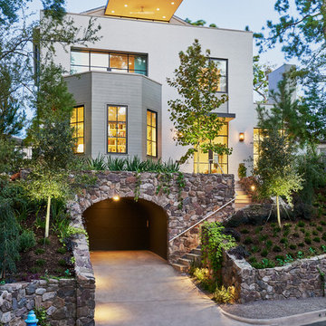
The house’s sloped site on a ravine street is highly unusual in Houston’s typically flat and low-lying landscape. In addition, the site is small, facilitating a strategy that creates a basement that houses a three-car garage, utility room, wine room, and storage. At three-fourths the size of the house’s footprint, it maximizes the available living space at the levels above without overshadowing the 1930s vintage suburb with its single family houses and deed restricted setbacks. In addition, the basement garage is entered by driving into the hillside from the bottom of the ravine, obviating the need for an unsightly and space-consuming ramp.
Peter Molick Photography
 Bilotta Kitchen & Home
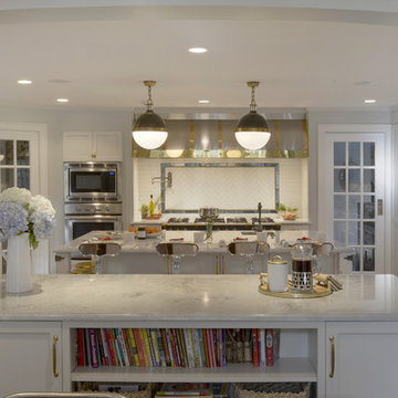
For this project, the entire kitchen was designed around the “must-have” Lacanche range in the stunning French Blue with brass trim. That was the client’s dream and everything had to be built to complement it. Bilotta senior designer, Randy O’Kane, CKD worked with Paul Benowitz and Dipti Shah of Benowitz Shah Architects to contemporize the kitchen while staying true to the original house which was designed in 1928 by regionally noted architect Franklin P. Hammond. The clients purchased the home over two years ago from the original owner. While the house has a magnificent architectural presence from the street, the basic systems, appointments, and most importantly, the layout and flow were inappropriately suited to contemporary living.
The new plan removed an outdated screened porch at the rear which was replaced with the new family room and moved the kitchen from a dark corner in the front of the house to the center. The visual connection from the kitchen through the family room is dramatic and gives direct access to the rear yard and patio. It was important that the island separating the kitchen from the family room have ample space to the left and right to facilitate traffic patterns, and interaction among family members. Hence vertical kitchen elements were placed primarily on existing interior walls. The cabinetry used was Bilotta’s private label, the Bilotta Collection – they selected beautiful, dramatic, yet subdued finishes for the meticulously handcrafted cabinetry. The double islands allow for the busy family to have a space for everything – the island closer to the range has seating and makes a perfect space for doing homework or crafts, or having breakfast or snacks. The second island has ample space for storage and books and acts as a staging area from the kitchen to the dinner table. The kitchen perimeter and both islands are painted in Benjamin Moore’s Paper White. The wall cabinets flanking the sink have wire mesh fronts in a statuary bronze – the insides of these cabinets are painted blue to match the range. The breakfast room cabinetry is Benjamin Moore’s Lampblack with the interiors of the glass cabinets painted in Paper White to match the kitchen. All countertops are Vermont White Quartzite from Eastern Stone. The backsplash is Artistic Tile’s Kyoto White and Kyoto Steel. The fireclay apron-front main sink is from Rohl while the smaller prep sink is from Linkasink. All faucets are from Waterstone in their antique pewter finish. The brass hardware is from Armac Martin and the pendants above the center island are from Circa Lighting. The appliances, aside from the range, are a mix of Sub-Zero, Thermador and Bosch with panels on everything.
 Kevin McManamon Interior Design
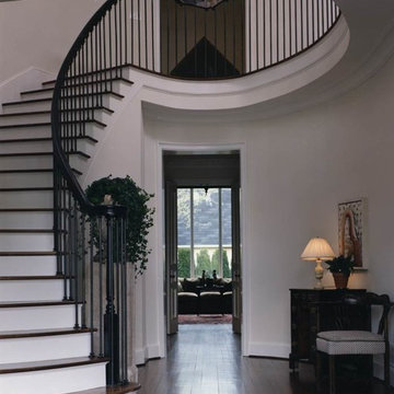
Guests sweep into the home through a set of red double doors. An elliptical Mediterranean staircase awes visitors as their eyes leave the waxed-steel spindles and beech railing to soak up the clean, white walls and dark black walnut floors." The high ceilings of the main-level rooms are intricate part of the home's one and a half story design. To create an ideal sense of scale, the roof was carefully crafted to facilitate the dormers and height of the upper-level rooms.
Providing a view from the front door into the cozy den was just one way Kevin created intimacy while maximizing space and light.
 StoneUnlimited Kitchen and Bath Remodeling
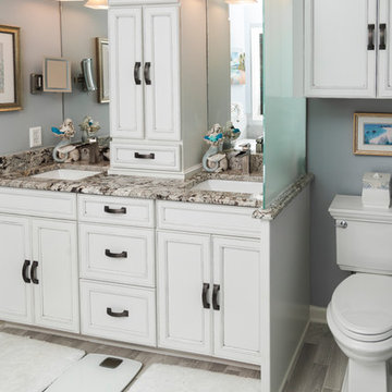
Stoneunlimited Kitchen and Bath can help you design and renovate your bathroom into a seaside oasis that will hold you over until the next time you're able to feel sand between your toes and salty water in your hair. Our Client's desire for their master bathroom was to create a beachy feel that they could enjoy year round and we were more than happy to facilitate the transformation.
The Alaskan White Granite tops mimic the look of wet sand providing contrast to the Waypoint Shaker Style cabinets and storage tower. 3"x17" Porcelain Planks in Vintage Gray add a wood component that is key to any coastal bathroom design and resemble the color of aged board walks and fishing piers. Pebbles in the tub surround, shower accent band and shower floor are similar to ones that can be found on many popular beaches. The decorative details that our client selected for the room such as mermaid dispensers, shells, and beautiful vibrant art work were the perfect touch.
Ample storage space and some privacy to the exposed toilet were needed. The 12" deep tower provides two cabinet pull outs for toiletries and other necessities as well as an 18"x18" cabinet on the top with crown molding finishes and an additional pull out cabinet at the bottom of the tower. Partial privacy for the lavatory was achieved by installing a 45"x29" glass panel.
Here are the items that were utilized in this Stoneunlimited Bathroom Remodel:
Countertops: 3CM Alaskan White Granit with Roman Ogee Edge
Cabinets: WayPoint Living Spaces Door Style: 540F, Maple with painted Pewter Glazed
Cabinet Hardware: Aberdeen Pulls
Sinks: 20"x15" white porcelain rectangular
Tub: 60" Kohler
Tile: 3" x 17" Porcelain Planks in Vintage Gray on the floor
12" x 24 Porcelain Nexus Ice for the shower and tub walls
Island Flat /Stacked Pebbles in the shower and tub surround
Fixtures: Delta in Brushed Nickel Finish
Glass Shower Enclosure: 3/8" Tempered Glass 75" Frameless with standard hinges and D style handle
Mirrors: ¼'" thick topped off with crown molding trim to match the trim finishes on the storage tower
 LAND DEVELOPMENT AND BUILDING, LLC
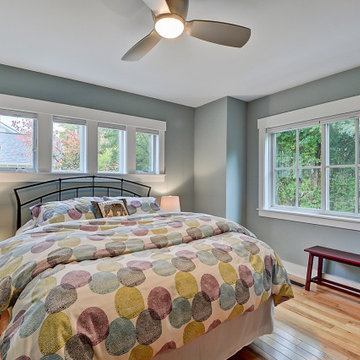
The Betty at Inglenook’s Pocket Neighborhoods is an open two-bedroom Cottage-style Home that facilitates everyday living on a single level. High ceilings in the kitchen, family room and dining nook make this a bright and enjoyable space for your morning coffee, cooking a gourmet dinner, or entertaining guests. Whether it’s the Betty Sue or a Betty Lou, the Betty plans are tailored to maximize the way we live. This is the master bedroom.
 Houseplay Renovations LLC
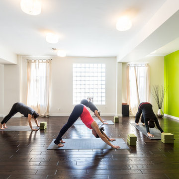
This Jersey City, NJ space was the first permanent ‘home’ for the yoga studio, so it was essential for us to listen well and design a space to serve their needs for years to come. Through our design process, we helped to guide the owners through the fit-out of their new studio location that required minimal demolition and disruption to the existing space.
Together, we converted a space originally used as a preschool into a welcoming, spacious yoga studio for local yogis. We created one main yoga studio by combining four small classrooms into a single larger space with new walls, while all the other program spaces (including designated areas for holistic treatments, massage, and bodywork) were accommodated into pre-existing rooms.
Our team completed all demo, sheetrock, electrical, and painting aspects of the project. (The studio owners did some of the work themselves, and a different company installed the flooring and carpets.) The results speak for themselves: a peaceful, restorative space to facilitate health and healing for the studio’s community.
Looking to renovate your place of business? Contact the Houseplay team; we’ll help make it happen!
Photo Credit: Anne Ruthmann Photography
 Pinnacle Design & Remodeling
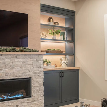
A blank slate and open minds are a perfect recipe for creative design ideas. The homeowner's brother is a custom cabinet maker who brought our ideas to life and then Landmark Remodeling installed them and facilitated the rest of our vision. We had a lot of wants and wishes, and were to successfully do them all, including a gym, fireplace, hidden kid's room, hobby closet, and designer touches.
 Tomecek Studio Architecture
Photography by John Gibbons
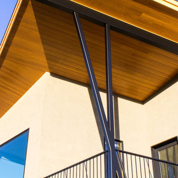
Project by Studio H:T principal in charge Brad Tomecek (now with Tomecek Studio Architecture). This contemporary custom home forms itself based on specific view vectors to Long's Peak and the mountains of the front range combined with the influence of a morning and evening court to facilitate exterior living. Roof forms undulate to allow clerestory light into the space, while providing intimate scale for the exterior areas. A long stone wall provides a reference datum that links public and private and inside and outside into a cohesive whole.
 StoneUnlimited Kitchen and Bath Remodeling
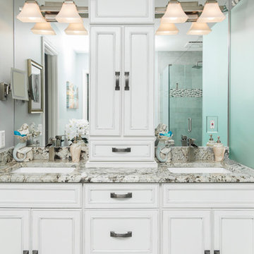
Stoneunlimited Kitchen and Bath can help you design and renovate your bathroom into a seaside oasis that will hold you over until the next time you're able to feel sand between your toes and salty water in your hair. Our Client's desire for their master bathroom was to create a beachy feel that they could enjoy year round and we were more than happy to facilitate the transformation.
The Alaskan White Granite tops mimic the look of wet sand providing contrast to the Waypoint Shaker Style cabinets and storage tower. 3"x17" Porcelain Planks in Vintage Gray add a wood component that is key to any coastal bathroom design and resemble the color of aged board walks and fishing piers. Pebbles in the tub surround, shower accent band and shower floor are similar to ones that can be found on many popular beaches. The decorative details that our client selected for the room such as mermaid dispensers, shells, and beautiful vibrant art work were the perfect touch.
Ample storage space and some privacy to the exposed toilet were needed. The 12" deep tower provides two cabinet pull outs for toiletries and other necessities as well as an 18"x18" cabinet on the top with crown molding finishes and an additional pull out cabinet at the bottom of the tower. Partial privacy for the lavatory was achieved by installing a 45"x29" glass panel.
Here are the items that were utilized in this Stoneunlimited Bathroom Remodel:
Countertops: 3CM Alaskan White Granit with Roman Ogee Edge
Cabinets: WayPoint Living Spaces Door Style: 540F, Maple with painted Pewter Glazed
Cabinet Hardware: Aberdeen Pulls
Sinks: 20"x15" white porcelain rectangular
Tub: 60" Kohler
Tile: 3" x 17" Porcelain Planks in Vintage Gray on the floor
12" x 24 Porcelain Nexus Ice for the shower and tub walls
Island Flat /Stacked Pebbles in the shower and tub surround
Fixtures: Delta in Brushed Nickel Finish
Glass Shower Enclosure: 3/8" Tempered Glass 75" Frameless with standard hinges and D style handle
Mirrors: ¼'" thick topped off with crown molding trim to match the trim finishes on the storage tower
 ODS Architecture
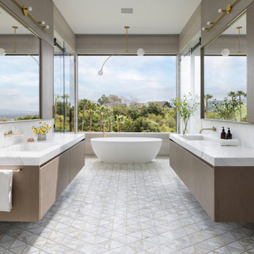
A 6,000 square foot 2-story new home complex in Milpitas was designed to facilitate the owners’ large business parties and gatherings, to have rooms for the kids to come back to upstairs, and a ground floor master suite with a huge walk-in closet. Several separate structures make up the dwelling: The main house, 3-car garage with carport for overflow parking, and a separate entertainment and recreation building separated by a courtyard from the main house.
The business activities include gatherings in the hundreds of people, so parking was maximized and guests can flow in through a separate gate to party in the courtyard and recreation building. Inside this structure is a wet bar, billiard room, workout gym and home theater. The main house ground floor has formal and informal living rooms, open kitchen and master suite with views and expansive windows in every direction. The house is sited on the crestline of a hill with views of the San Francisco Bay and private golf course below. The indoor-outdoor aspect of the house is further accentuated with outside living and dining areas.
High ceilings and expansive glass walls dissolve the sense of enclosure taking advantage of the site’s openness and privacy. The owner’s suite is downstairs in anticipation of aging-in-place, and upstairs there are three bedrooms and four bathrooms plus a sitting area lounge and casual TV loft area.
The house sits on one acre at the top of a low hill range overlooking Milpitas. The city was very cognizant of the importance of keeping a low profile at this crestline and required extensive story poles and photo evidence of the proper height and siting so as not to be seen from certain selected vantage points.
GENERAL CONTRACTOR: JCD Builders Inc.
LANDSCAPE DESIGN: Morf Chang Landscape Architecture / ODS Architecture
PHOTOGRAPHS: Paul Dyer Photography
 Tomecek Studio Architecture
Photography by John Gibbons
Project by Studio H:T principal in charge Brad Tomecek (now with Tomecek Studio Architecture). This contemporary custom home forms itself based on specific view vectors to Long's Peak and the mountains of the front range combined with the influence of a morning and evening court to facilitate exterior living. Roof forms undulate to allow clerestory light into the space, while providing intimate scale for the exterior areas. A long stone wall provides a reference datum that links public and private and inside and outside into a cohesive whole.
 DANE AUSTIN INTERIOR DESIGN Boston & Cambridge
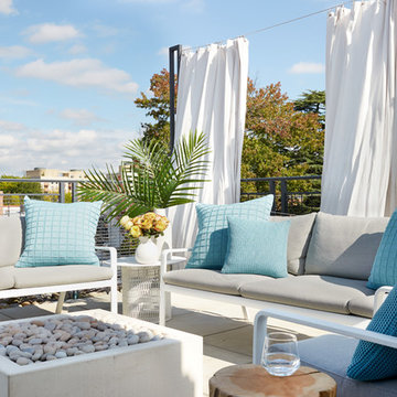
White metal framed seating with gray cushions and turquoise blue throw pillows placed around a fire pit form the entertainment area on the patio. A white dining table set forms the patio's dining area. The patio is surrounded by white outdoor curtains to facilitate privacy.
Stacy Zarin Goldberg Photography
Project designed by Boston interior design studio Dane Austin Design. They serve Boston, Cambridge, Hingham, Cohasset, Newton, Weston, Lexington, Concord, Dover, Andover, Gloucester, as well as surrounding areas.
For more about Dane Austin Design, click here: https://daneaustindesign.com/
To learn more about this project, click here: https://daneaustindesign.com/kalorama-penthouse
 Stone Lion Properties
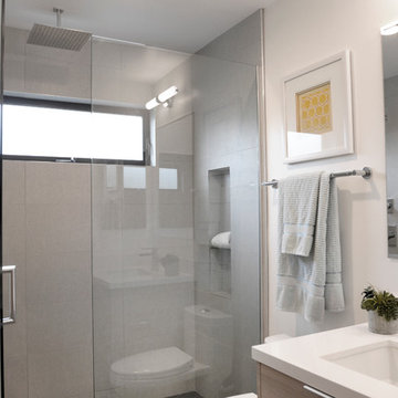
This guest bathroom has a modern aesthetic and clean lines. The shower glass is mounted using U-channels rather than clamps for a clean, uninterrupted appearance. The vanity mirror also uses U-channels at the top and bottom for a clean appearance and to reduce (or cover) the delamination that can occur with bathroom mirrors over time. The undermount sink and single hole faucet facilitate an easy-to-clean surface.
 Barbara Wilson Landscape Architect, LLC
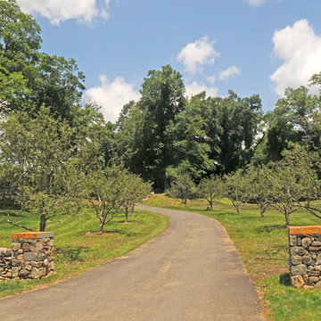
Photos by Barbara Wilson. Bedford equine compound. Apple orchard with new stone walls and driveway leading to the main house.
A lovely equine compound was created out of a 35 acre woodland in Bedford Corners. The design team helped the owners create the home of their dreams out of a parcel with dense woodlands, a pond and NY State wetlands. Barbara was part of the team that helped coordinate local and state wetland permits for building a mile long driveway to the future house site thru wetlands and around an existing pond. She facilitated the layout of the horse paddocks, by obtaining tree permits to clear almost 5 acres for the future grazing areas and an outdoor riding ring. She then supervised the entire development of the landscape on the property. Fences were added enclosing the paddocks. A swimming pool and pool house were laid out to allow easy access to the house without blocking views to the adjacent woodlands. A custom spa was carved out of a piece of ledge at one end of the pool. An outdoor kitchen was designed for the pool area patio and another smaller stand-alone grill was provided at the main house. Mature plantings were added surrounding the house, driveway and outbuildings to create a luxuriant setting for the quaint farmhouse styled home. Mature apple trees were planted along the driveway between the barn and the main house to provide fruit for the family. A custom designed bridge and wood railing system was added along the entry drive where a detention pond overflow connected to an existing pond.
24